Evolution of a Comic Book Page

Along with Spider-Man’s debut story, three other Ditko-Lee collaborations appeared in Amazing Fantasy No. 15, including the five-pager “The One and Only!” According to comics collector James Horvath, however, the story was really drawn by his grandmother, Lydia Horvath, a Golden Age artist who spent her career ghosting for bigger names.

Or at least that’s the premise of my novel The Patron Saint of Superheroes. My agent suggested the manuscript include a sample comic book page, so I went in search of an artist who could pretend to be Lydia Horvath pretending to be Steve Ditko. Sean Michael Robinson swooped to my rescue.

And at the risk of revealing myself to be an Alan Moore-level control freak, I think our email correspondence reveals a few things about the collaborative process of writing and drawing comics.
 

original script (2)

 
SEAN: Your page from the script you shared looks great– just enough stage direction. My only practical concern with it– Ditko very rarely broke more than 9 panels a page. In fact, in my cursory Ditko flip-through this morning (“Essential Spider-man V 1”, “Steve Ditko Archives” V 1 + 2) I’m seeing the majority of the page breakdowns hovering around 6-7 panels, with a few outliers in the 8-9 range.

Was this actually drawn by Ditko? If not, are there any “tells,” or should it look as much like his work as possible?

CHRIS: It sounds like we were looking at Essential Spider-Man simultaneously this morning. And you’re absolutely right, the panel layout is nothing like Ditko’s—and that’s actually the one “tell” I want the page to have. I’m attaching the PAGE THREE script, which includes the layout. (The gutters form a St. James cross, which is the artist’s secret signature, and a big part of the novel.)
 

first layout

 
SEAN: Okay, here are two rough (very rough!) layouts. You’ll notice I make a few script suggestions in the margin for the sake of space. Also, I’m not sure how to approach visually the third panel on the 1st tier– substituted a far-off climbing Jim. Feel free to send a sketch my way. Are we seeing just the hand? The top of his head or pack? The view down the cliff face?

Also substituted a close-up for the 1st p 3rd tier– let me know how it strikes you.
 

Singulus_layoutAlt

 
CHRIS: Yes to trimming the first caption. So it would now read:

Before vanishing, Singulus told Little Jim that he had gained his powers from a guru in Tibet. Nothing left to lose, Little Jim splurges on a one-way ticket!

For panel 1.2, try a downward view from the very top of the cliff with mostly just Jim’s giant hand reaching up.

1.1, 1.3, 2.1, 2.2 all look good–I especially like how the cave opening worked out. 2.3 and 2.4 look good too, but I’d like to move the talk balloons, so that 2.3’s “Singulus?” is at the bottom of the panel with the balloon arrow pointing to the left gutter (and so Jim in 2.2), and Onlyone’s bubble moves to the top of 2.4. I think that way it will be clearer to see that the flashlight is moving up from the discarded costume to Onlyone, because currently the balloons partly block the partial views of Onlyone’s legs and the costume.

For 3.1, I really like the first version, with Onlyone extending his arm with the ring–but try rotating the panel 180 degrees so Onlyone is at the top and Jim at the bottom. Their dialogue can be reversed so Onlyone speaks first and Jim responds with “Me?”

Yes about lowering the hand on 3.2, so we can see more of Onlyone’s face. Also Jim should slide the ring onto his left ring finger, as he would a wedding ring.

The close-up of Onlyone is good though, so could you place it in the final panel instead? There’s no need for Singulus to appear at all in 3.4. And Onlyone’s emphatic talk bubble can go at the the bottom of the panel, ending the page.

For the big Singulus! 3.3 panel, let his talk bubble punch through the top of the panel into the bottom of 2.3 (which could make a nice effect with the previous “Singulus?”) and let his elbows jut into 3.2 and 3.4. Also, if it’s not already, leave 3.3 unframed.

SEAN: Does this work?

Two versions of the 1.3 panel– pls let me know which one is closer.

Singulus_layoutA  Singulus_layoutF (1)

CHRIS: Go with the alt for 1.2. The bigger the hand the better. It should overwhelm all of the other visual information, so 1.3 then is an answer to the implied questions: what’s going on? where are we?

Good talk bubble flip on 2.3.  Flip 2.4 too.

3.1 looks good. Same for 3.2, though maybe make Onlyone a little smaller so 3.4 is more of a revelation.

Nice elbows on 3.3, but I think the “Singulus!” will work better at the top of the panel, especially since the 3.2 and 3.4 talk bubbles are at the bottoms.

I also attached images for combining into the Singulus costume: Superman’s original boots, Amazing Man’s waist and chest belts, Wonderman’s collar and v-neck, plus standard briefs, long sleeves, no gloves, no cape. (I’m not sure about the Ultraman helmet.)

amazing man wonderman ultra man 1940

SEAN: Here’s the promised costume rough (emphasis on rough). Feedback? I have the v-neck and the collar turning into the shoulder of the cape, if it’s not clear. Also added some horizontal stripes in the speedo area. Not sure about that helmet, and the only pics I can find of the character don’t really help in terms of how it’s put together :)

Anyway, all thoughts welcome.

Singulus_costume_RUFF (2)

CHRIS: This looks great, Sean. Some possible fine-tunings:

Gloves or wrist bands that match the boots.

And maybe simplify the lines in the chest by having the v of the shirt merge into the v of the criss-crossing belts?

I’m also debating whether the helmet is too much. Maybe instead add a lone ranger mask?

Singulus_costume_RUFF_C

CHRIS: I really love your face, which is lost with the mask, so let’s not have a mask, and you tell me whether you think the helmet works or not.

The wrist bands, briefs and collar all look good.

Should the wrist bands cover the forearms the way the boots cover the calves?

Ditko_practiceInks (1)

CHRIS: Yes, I can see Ditko coming through in that.

If Singulus’ face is unmasked, young, good-looking, with a full set of hair, Jim should be a bit chubby with a receding hairline.

And keep Onlyone’s body as boney as possible, with almost skeletal arms, definitely a bald head, and a face of ancient raisin-like wrinkles–underneath which is Stan Lee’s face.

Singulus_pencils_full_B     Singulus_pencils_full_C     Singulus_pencils_full_A

SEAN: Three versions here. Thoughts? I’m hoping the rendering will take it into firmer Ditko territory…

CHRIS: Go with Singulus facing left away from the last panel, and with Onlyone’s head larger. Final fine-tunings:

Make Onlyone completely bald and super wrinkly.

Give Jim even more of a gut.

Let the words “Singulus!” burst out of the panel frames in 3.3. His right elbow protrudes into 3.2 well, and so let his left elbow protrude into 3.4 too, maybe slipping slightly behind Onlyone’s head?

To clarify the spatial relationship between 1.3 and 2.1, can you lower the bottom of the cave opening so this becomes the moment that Jim enters the cave? Also, can the same mountain that’s in the background of 1.3 be in the slightly more distant background of 2.1?

SEAN: Okay, here are two versions. I have a strong preference for B, but either one is fine with me!

Things that can be done to make it a bit more “Marvel”:

1. Re-letter this using a font close in style to that decade’s Marvel letters. I can’t get close to that look myself (being left-handed is a big impediment to that, believe it or not :)   ) I can look around on some sites if you want me to find a 60’s Marvel copycat font.

2. appropriate artwork stamps on top

3. color “old page” tint to the page (depending on your needs).

CHRIS: I agree that B, with the elbow cut off by the panel frame, looks better, so let’s go with that. And yes also to “old” tint and the artwork stamps. Oh, and can Onlyone be more wrinkled in that final panel close-up? And if you think refonting would look good, go with that too.

SEAN: Here is the finished color file. Thanks again for working with me on this! It was a lot of fun and quite the challenge :)

singulus_fullcolor_flat

Interview with a Superhero?

 
“A lot of times your neighborhood, your town, your city is being invaded by people who you think are going to hurt your family, your society,” he says. “Well, then you have to act, because the government isn’t going to come help you.”

And there’s the premise of almost every superhero story ever written. Only the speaker isn’t from a comic book. He’s from Iguala, Mexico. Reporter E. Eduardo Castillo interviewed him for the Associated Press late last year (the article is here). “He would appear on camera wearing a ski mask,” explains Castillo, “and his voice would be distorted.” I can’t help but hear Stephen Amell’s distorted voice on Arrow. The set-up also reminds me of the Tom Bissell short story “My Interview with the Avenger” that appeared in the superhero issue of VQR a few years back (that’s Gary Panter’s drawing from the issue above).

Instead of a utility belt, Castillo’s interviewee “wears a bag with a strap over his chest in which he carries several walkie-talkies and cell phones, one of which he used to take calls and issue orders.” Instead of superpowers, “he usually carries a .38-caliber pistol and an AK-47 assault rifle.” He’s a killer—a trait that might put him in the same league as the Punisher or Steve Ditko’s The Question.

Here are more excerpts from Castillo’s article:

In recent years, residents of a number of towns and cities have taken up arms to protect themselves against drug cartels.  “I can’t say I’m a vigilante,” says the killer, “but I am part of a group that protects people, an autonomous group of people who protect their town, their people.”

He says no one forced him to join his organization. His parents and siblings don’t know what he does. He raises cattle for a living. He isn’t married and has no children. Although he would like to have a family, he knows his future is uncertain. “I don’t really see anything,” he said. “I don’t think you can make plans for the future, because you don’t know what will happen tomorrow.”

“It’s not a pretty life,” he says. Life in an area torn by drug disputes is rarely pretty.

The killer has a grade-school education. He wanted to continue studying, but when he was a child there was no middle school in his town. “I would have liked to learn languages … to travel to other places or other countries. I would have liked that,” he said.

He acknowledges that what he does is illegal. He recognizes he would be punished if caught by the authorities. “For them, these (killings) are not justifiable under the laws we have, but my conscience – how can I put this – this is something that I can justify, because I am defending my family.”

He sometimes feels sorry about the work he does but has no regrets, he says, because he is providing a kind of public service, defending his community from outsiders.

If you take a standard definition of a superhero—I like Pete Coogan’s—Castillo’s interviewee seems to hit the mark. He uses his specialized skills to conduct a selfless, pro-social mission. Plus Castillo, like his reporter counterparts in so many comic book tales, provides his interviewee with a codename: The Killer. Though even with the mask, his “jeans and a camouflage T-shirt” aren’t your standard superhero costume, but he does wear a mission-defining iconic symbol on his forehead, the preferred placement before Joe Shuster drew an “S” on Superman’s chest. Castillo writes:

He wore a baseball cap with a badge bearing the face of Sinaloa cartel boss Joaquin “El Chapo” Guzman and “prisoner 3578” – Guzman’s inmate number before he escaped through a tunnel from Mexico’s maximum-security prison in July, cementing his image as a folk hero.

Robin Hood was an outlaw folk hero too, but here things get a lot more complicated. Castillo’s killer works for a drug cartel.

Federal authorities told the AP that several drug gangs in Guerrero, including those that operate on the Costa Grande, act as self-defense groups to generate support from local residents.

“Of all the bad lot,” the killer said, Guzman “seems to be the least bad.”

In several cases, authorities have claimed these vigilantes are allied with rival gangs, and pass themselves off as self-defense groups to gain greater legitimacy.

He says he is defending his people against the violence of other cartels. Things would be much worse if rivals took over.

A rival gang, “would do worse damage.”

Superheroes tend to be more idealistic than that, but if the killer is looking at the big picture—like Ozymandias in Watchmen—is he still one of the pragmatic good guys? Since “violence spikes when cartels are fighting each other for control of territory,” is he making his community safer the only way he can?

Unfortunately, that way makes him “a man who kidnaps, tortures and kills for a drug cartel.”

The killer says he ‘disappeared’ a man for the first time at age 20. Nine years later, he says, he has eliminated 30 people – maybe three in error.

There are many reasons people are disappeared, the killer says. It may be for belonging to a rival gang, or for giving information to one. If a person is considered a security risk for any reason, he may be disappeared. Some are kidnapped for ransom, though he says he does not do this.

In fact, he maintains his own sense of morality in a variety of ways.

Some in his circumstances use drugs, but he says he doesn’t. “When people are on drugs, they’re not really themselves,” he says. “They lose control, their judgment.”

Unlike others, he says, he has standards: He doesn’t kill women or children. He doesn’t make his victims dig their own graves.

He doesn’t consider himself a drug trafficker or a professional killer, although he is paid for disappearing people. He does not see himself as bad.

He sometimes feels sorry about the work he does but has no regrets.

The problem is that people under torture sometimes admit to things that are not true: “They do it in hope that you will stop hurting them. They think it’s a way to get out of the situation.”

That may have happened to him three times, he says, leading him to kill the wrong men.

While Castillo’s interviewee provides a grotesque study in rationalization and self-deception, I’m equally disturbed by how well his tale parallels the tropes of superheroism and what those parallels suggest about the popularity of a genre about violent men who break the law while serving what they call the greater good.

(AP Photo/Dario Lopez-Mills)

(AP Photo/Dario Lopez-Mills)

My Dystopia is Better Than Your Dystopia, Part I

Margaret Atwood’s The Handmaid’s Tale was published in 1985. The first issue of Alan Moore and Dave Gibbon’s Watchmen was published in 1986. Despite that closeness, they’re not two novels that are routinely paired. Which is why I was pleased when a pair of students in my Late 20th Century Fiction course decided to combine them as examples of dystopias. And, even more fun, my students disagree about the definition of “dystopia.”

So here’s round one of their literary match-up.

—Chris Gavaler


Beginning with Thomas Moore’s Utopia, a tradition of idealized societies has existed both in the imaginations of great thinkers and writers as well as in the literary canons of virtually every culture. Yet frequently in these perfect utopian universes, a dark underbelly emerges, characterized by abuses of power, totalitarian regimes, and control of every minutia of a citizens’ lives, usually as an excuse for their protection in the beginning. These types of dystopian universes create environments of fear and isolation, with an evil government and good and innocent citizens. However, what happens in dystopias in which there is no clear oppressor, no direct dichotomy of good and evil? Instead, subtle powers are at work that do not allow for a clear ability to point a finger at the ‘good’ or ‘evil’ power responsible for ‘light’ oppression. In their novels The Handmaid’s Tale and Watchmen, Margaret Atwood and Alan Moore and Dave Gibbons grapple with this question of good and evil and create two dystopian worlds that either reinforce the Manichean dichotomy or blur the line between good and evil. Where The Handmaid’s Tale utilizes total dystopian control of its people to further confine and separate them, creating a Manichean dichotomy between good and evil, Watchmen uses subtle manipulation in order to unite the entire world, blurring the line between good and evil. In showing two radically different uses of dystopia, these authors call into question the assumption that absolute control in a dystopia is necessarily evil.

To formulate my argument, I will begin by exploring two definitions of dystopia. I will then examine how The Handmaid’s Tale fulfills Ketterer’s definition of dystopia. Contrastingly, I will delve into the world of Watchmen, and explore the ways that it fits into Greene’s definition of dystopia. Finally, I will examine the good versus evil dichotomies in each of these novels and their relationship to dystopian literature.

Utopia and dystopia are frequently two sides of the same coin, representing idealized societies that are either perfect or move too far in the direction of creating a perfect world. Greene establishes a simple yet effective definition of utopia as “an ideal society” (Greene 2). Unfortunately, these utopias are rarely idealistic and perfect places in practice, even if their ideals are, in theory. In one of the earliest examples of utopian literature, “Thomas More, in his Utopia (1516), conjures an isolated island to describe a better world but one that in hindsight sounds fascist” (2). By blurring the lines between these two genres, Greene demonstrates that utopia and dystopia are on a continuum and lend themselves to blurring the lines of Manichean dichotomies of good and evil.

Dystopian literature is characterized by a multitude of individual genre characteristics, but is pervaded by a sense of oppression via governmental and totalitarian powers. The opposite of a perfect society, a literary dystopia is an “imaginary society that differs from the author’s own, first, by being significantly worse in important respects, and, second, by being worse because it attempts to reify some utopian ideal” (Beauchamp 11). By Beauchamp’s definition, dystopia perverts positive ideals and the world of the author in order to create a plausible society in which there is no freedom from the government. In order to classify novels and stories as dystopian, Ketterer provides a clear framework of the types of features included in the genre: “lack of freedom, the constant surveillance, the routine, the failed escape attempt” (211). In a different vein, Greene claims that dystopian universes are characterized by a distinct “suffocation of independent thought” (2). Greene’s definition of dystopia may include some of Ketterer’s elements, but focuses its attentions on the atmosphere of control and stifling of non-institutionalized thought amongst its citizens. These two definitions, though not always mutually exclusive, serve as useful categorizations for The Handmaid’s Tale and Watchmen.

Margaret Atwood’s The Handmaid’s Tale’s government of Gilead contains every element of Ketterer’s definition of dystopia. Though there are some elements of stifling of independent thought, its most salient dystopian features belong to Ketterer’s definition and classify it solidly in the dystopian genre through four specific features.

Firstly, Gilead eliminates freedom from the lives of its citizens. When the Gilead government began, “newspapers were censored, and some were closed down, for security reasons they said. The roadblocks began to appear, the Identipasses. Everyone approved of that, since it was obvious you couldn’t be too careful” (Atwood 174). The government closed down the freedoms of its citizens one by one, slowly taking every semblance of freedom they had in a subtle way, at first. Ultimately, Gilead obliterates freedom by creating roles relating to fertility, and women’s “real name[s have] been erased in favor of the form of ‘Of’ plus the first name, possibly abbreviated, of her Commander” (Ketterer 210). As Offred herself states, “my name isn’t Offred, I have another name, which nobody uses now because it’s forbidden. I tell myself it doesn’t matter. I keep the knowledge of this name like something hidden, some treasure I’ll come back to dig up”(Atwood 84). This removal of names dehumanizes women and forces them to become their proscribed roles, as Handmaids, or “two-legged wombs” (136), Aunts, Marthas, Wives, Unwomen, or prostitutes. By removing agency and proscribing roles, Gilead destroys freedom.

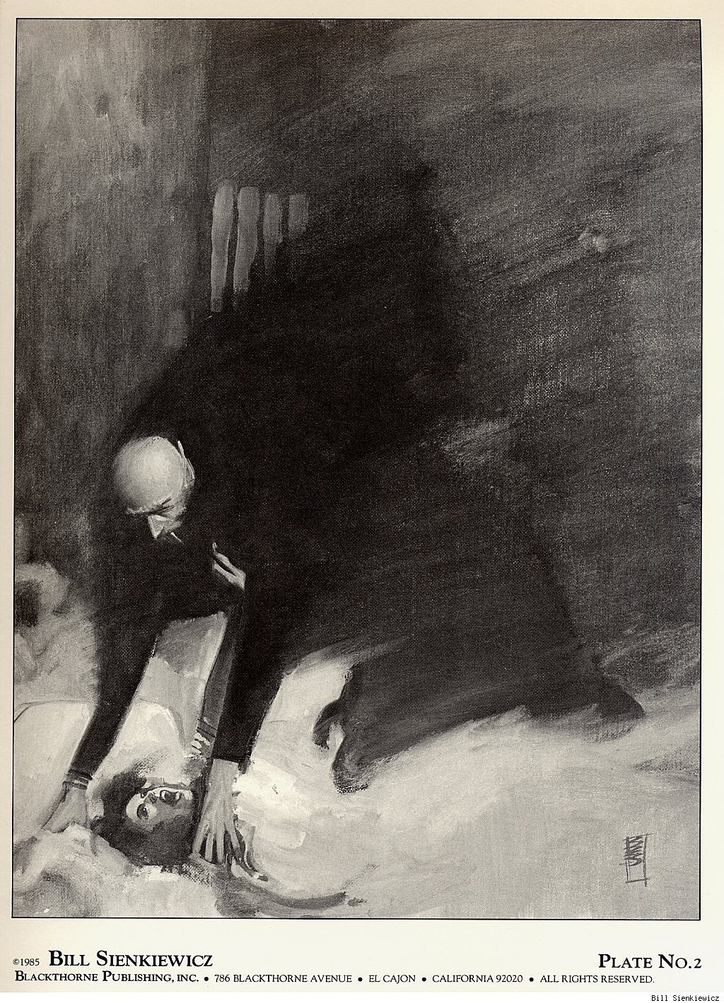
Routines similarly are present in Gilead, from a daily morning walk for the Handmaids, to the Ceremony. The most salient routine of the society is the Ceremony, a brutal moment when the Commander tries to impregnate his Handmaid. Offred does not describe this scene as rape, however, instead calling it “nothing is going on here that I haven’t signed up for. There wasn’t a lot of choice but there was some, and this is what I chose” (94). Through this brutal routine and near sacred ritual, Atwood creates the only alternative a young fertile woman could choose, aside from the oblivion of Unwomanhood. This monthly routine of impregnation, in parallel with other more innocuous routines and rituals, demonstrates the ways that Gilead governs through strict control of its citizens’ freedoms, particularly by organizing their daily lives.

Gilead constantly spies and watches its citizens, as is proven by the many golden eyes found in public places and privates ones, such as the doctor’s office (60), Offred’s room, or on the Soul Scrolls (167). In front of the Soul Scrolls store, Greene’s rules of no independent thought are broken, and readers see the surveillance in place in Gilead. Ofglen, Offred’s walking partner, leans over to Offred and says, “’Do you think God listens,’ she says, ‘to these machines?’ […] In the past this would have been a trivial enough remark, a kind of scholarly speculation. Right now it’s treason,” (168) remarks Offred. Thought and spoken original thought is no longer taken for granted. It is stifled and discouraged through constant surveillance and fear of being taken by the Eyes. To think is treason in Gilead; to birth children is of the highest importance. This government fulfills Ketterer’s category of constant surveillance, and uses it to engage in thought suppression, though that is not necessarily its ultimate goal. Surveillance in Gilead is used to incite fear, not to prevent independent thought.

Finally, The Handmaid’s Tale contains varied escape attempts, including the ending of the novel. There are minor ‘escapes’ found throughout the novel, during which the women of Gilead attempt to communicate with one another while escaping detection. For instance, in the Center where the Handmaids are trained, “in the paint of the washroom cubicle someone unknown had scratched: Aunt Lydia sucks” (222). These clandestine messages, though not directly escape attempts, create distinct groups in Gilead of good and evil. These two categories are even further proven in an actual escape attempt at the end of the novel, when the Eyes come to take Offred. Nick assures her, “It’s all right. It’s Mayday. Go with them” (293). Mayday, signifying a day of rebellion for Gilead, shows the final escape attempt. She must choose to trust the only male in the story not in a position of possession over her and go with the Eyes, not knowing whether or not she should believe Nick. This final attempt, in conjunction with smaller escape attempts found throughout the novel fulfill Ketterer’s definition of dystopia, as people want to leave the evil power regime created by Gilead.

Conversely, Watchmen’s universe contains almost no direct elements of Ketterer’s dystopia, and instead only falls into the category of Greene’s definition of dystopia as preventing independent thought. Instead of creating a directly oppressive and tyrannical government, Moore instead forms a world in which corporations and powerful individuals subtly exert control and manipulate the masses in order to gain power and influence. In Watchmen’s “realistic world, governed by power politics” (Paik 27), the most important elements of control are eerily similar to those of the American present: the media. Thus, thought is controlled by advertising and other media and independent thought is stifled, fulfilling Greene’s definition.

Adrian Veidt, the evil mastermind behind the ultimate destruction of the world of Watchmen in order to create a new world order, controls the entirety of the novel and the world inside of it through media influences. Before Moore reveals that Veidt is at the center of the conspiracy to destroy half of New York in order to unite the world, Veidt’s commercial empire permeates almost every page of the graphic novel. Before the attack on New York, Veidt’s ad campaign for his perfume, Nostalgia, is seen in the background of dozens of panels. It is found over boutiques (Moore 3:7), diners (4: 24), on torn posters on walls (5:18). These nostalgic campaigns reflect back to a time when there were superheroes and no threat of mutually assured nuclear destruction: a utopia. By bombarding the citizens of Watchmen’s world with imagery relating to the past, Veidt controls their thoughts and emotions, forcing them to feel anxious about the threat of the Cold War. After resolving these fears he created in the public through the Nostalgia ad campaign by killing millions of people in New York and ending the Cold War because of a new perceived alien common enemy, Veidt continues to exercise influence over the public through his new “Millennium” campaign, that shows figures facing toward the now bright future(12:31). Veidt even talks about the way that he influences the public through advertisement and media in Chapter 10 on page 8, saying that because of the trends of pre-war times, he is going to invest differently “into the major erotic video companies. That’s short term. Also, we should negotiate controlling shares in selected baby food and maternity goods and manufacturers”(10:8), because of the baby boom he predicts. Veidt’s control is subtle, yet absolute, giving Watchmen the qualities of intellectual control instead of direct oppression as in The Handmaid’s Tale.

Finally, Veidt literally destroys independent thought when he threatens to destroy the world. The superheroes of the novel all agree to follow Veidt’s lead because it is the only way to unite the world, and the deed had already been done (11:27). Yet Rorschach, the one dissenter who wishes to return to America and tell the world that Veidt is behind the destruction is obliterated. Because the rest of the superheroes “must protect Veidt’s new utopia, one more body amongst the foundations makes little difference” (12:24). Rorschach is destroyed because of his refusal to follow what Veidt wants him to believe, and so Veidt continues to exercise influence over thought and independent thinking by literally destroying his enemy and Rorschach’s dissenting opinion. Clearly, Watchmen fits perfectly into Greene’s category of dystopia as being a government that stifles any kind of oppressive thought and serves instead to manipulate thought and control its citizens’ minds.

Not only do The Handmaid’s Tale and Watchmen fulfill two differing definitions of dystopia, but they also represent two different dichotomies between good and evil. The Handmaid’s Tale, which clearly fulfills every feature of Ketterer’s dystopia definition, creates a distinct Manichean dichotomy of good versus evil. Conversely, Watchmen only fulfills Greene’s definition of dystopia, and blurs the lines between good and evil. Though The Handmaid’s Tale contains elements of thought suppression, it is not the most salient dystopian feature of the novel. Instead, Watchmen is distinctly characterized by the repression of independent thinking and in doing so creates a world in which good and evil are on a spectrum and characters and corporations cannot necessarily be placed on one end.

The Handmaid’s Tale grapples with evil in distinct dichotomies that are perceived by not only the reader but also by the citizens of Gilead. This novel’s “Historical Notes” present a perspective from hundreds of years after the Gilead Empire, denouncing the atrocities that were in place at the time. The black and white nature of good and evil is one that is clear because the dystopia was overthrown; it must have been so oppressive and miserable for its citizens because they were controlled by routine, roles, and removal of freedom, that they tried to escape and overthrow the government. The Historical Notes present The Handmaid’s Tale as a true story that was “unearthed on the site of what was once the city of Bangor” (Atwood 301) as “thirty tapes in the collection altogether” (301) having been spoken by the same narrator. Because of this conclusion that the tapes came from someone who escape the Gilead regime, The Handmaid’s Tale’s world is one in which the evil of the Gilead government was overthrown. The novel’s easily identifiable evil characters, such as the Aunts, the Commanders, and some unnamed powers who run the government, create a target that readers are invited to view as evil in nature. Because the novel was told in first person and identifies these characters as evil, readers even further view the women and men forced into their proscribed roles as being good, while those who did the forcing are represented as evil. By fulfilling the necessary components of Ketterer’s dystopia and entrenching herself in the genre, Atwood formulates a world in which the reader’s beliefs about dystopia are reinforced. There is an evil overlord and government who presides over a good citizenry. In order to restore the balance of good over evil, the government must be overthrown. These citizens of the future are able to claim that, “Gileadean society was under a good deal of pressure, demographic and otherwise, and was subject to factors from which we ourselves are happily more free” (302), because of the overthrow of this evil government, further imposing strict categorizations of good and evil.

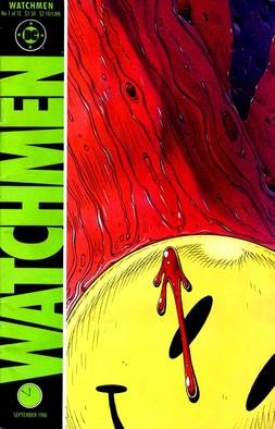
Watchmen, on the other hand, presents a much grayer view of good and evil, particularly in the form of Adrian Veidt. Veidt reaches the height of his control over the world when he chooses to employ dystopian means in order to attempt to create a utopia. Sending an ‘alien’ monster he created through genetic engineering to New York, Veidt causes a cataclysmic neurological disaster, killing millions, with the intention of uniting the world against a common enemy. Moore places the destruction of Times Square on six full pages at the beginning of Chapter 12, ensuring that the reader must take in the entirety of the carnage. Placed amongst the the bodies, Moore places discarded newspapers that read “WAR?” in large typeface (Moore 12:3-6), indicating that the society was on the brink of destruction before this terrorist event, along with a discarded pamphlet for The Veidt Training Method. This pamphlet falls to the ground amongst the destruction, reading “I Will Give You Bodies Beyond Your Wildest Imaginings” (12:6). This darkly almost comical insertion of Veidt’s presence into the scene demonstrates not only his responsibility for the event, but also signifies that perhaps Veidt could truly have meant two things in what he was communicating; he wanted to help the people of the world by literally helping them to perfect their bodies, yet gives the world dead bodies in order to unite them. Though he has murdered countless people, “we are invited to read this extended scene of death and destruction as the signifiers for the near-miraculous founding of a new and peaceful order, a golden age of international cooperation and solidarity” (Paik 35). Instead of viewing Veidt as an inherently evil character, the reader is asked to instead see that perhaps his evil actions serve a higher and ‘good’ purpose.

Moore confuses the question of good and evil further through his characters Rorschach, who represents an idea of justice and the vindication of good and evil, and The Comedian, who seems amoral but in fact sometimes stands for good. After the heroes find out that Veidt has committed this attack, they almost universally agree to cover up his involvement for the betterment of society. Yet Rorschach disagrees, and leaves to return to America because “evil must be punished” (Moore 12:22). As seen earlier in this examination, however, Doctor Manhattan chooses to kill a crying Rorschach instead of allowing him to reveal what Rorschach believes is Veidt’s evil nature. Though in this moment Rorschach represents good, he is imprisoned as a violent criminal earlier in the novel. Similarly, the Comedian is evil in his love of senseless violence, yet says that “Somebody has to save the world” (2:10), even though this perhaps inspired Veidt’s evil deeds. The Comedian is even killed because he uncovers and opposes Veidt’s plot: “He knew my plan would succeed, though its scale terrified him” (11:25). The Comedian is seen murdering his pregnant Vietnamese girlfriend (2:14), yet in some situations clearly takes a moral standpoint. These two characters muddy the waters between good and evil and cause the reader to seriously question the morality of not only the world of Watchmen, but of dystopias and powerful governments as a whole.

Finally, though Veidt commits an evil action of mass murder, he is perhaps good in his attempts to create a true utopia resulting from a common enemy, but Moore complicates this issue further with the final frames of the novel. On page 32 of Chapter 12, a lowly assistant at a newspaper is seen reaching for Rorschach’s journal that reveals every part of Veidt’s plan, as the symbol of the Comedian’s badge lies on his shirt. Though the story ends here, there is an epigraph on the last page, on which is written “Who watches the watchmen?” (12:33). Here, the reader sees that only two confusingly amoral at times and moral at times characters, Rorschach and the Comedian, are the watchers of the world. They selectively condemn evil, and in others moments perpetrate evil, yet they are both silenced because they condemn Veidt’s actions despite the moral gray area they reside in. Their ideas of certain acts as being concretely good or concretely evil demonstrate just how confused the notions of good and evil are in Watchmen. By stifling their voices, Moore indicates that Greene’s definition of a dystopia is one that creates a more realistic world, in which there is never a true dominance of good over evil in the end.

Through their varying uses of dystopia and dystopian features, Atwood and Moore bring to light a hidden feature of each type of dystopia. In fulfilling each of Ketterer’s strict features of dystopia, Atwood reveals that this definition of dystopia creates a world with strict separation between good and evil. In only fulfilling Greene’s definition of dystopia as destroying independent thought, Moore reveals that these sorts of dystopias, that are much less extreme in their manifestations, create a world in which good and evil are not clearly defined. By calling morality into question or creating a hyper-strict definition of good versus evil, Moore and Atwood grapple with questions of the nature of power in dystopia, and challenge readers to question their understandings of this genre. Power is not always inherently evil, and neither is dystopia.

Works Cited

Beauchamp, Gorman. “The Politics of The Handmaid’s Tale.” The Midwest Quarterly 51.1 (2009): 11–25. Print.

Greene, Vivien. “Utopia/Dystopia.” American Art 25.2 (2011): 2–7. JSTOR. Web.

Ketterer, David. “Margaret Atwood’s ‘The Handmaid’s Tale’: A Contextual Dystopia (‘La Servante écarlate’ de Margaret Atwood: Une Dystopie Contextuelle).” Science Fiction Studies 16.2 (1989): 209–217. Print.

Paik, Peter. “Utopia Achieved: The Case of Watchmen.” From Utopia to Apocalypse: Science Fiction and the Politics of Catastrophe. Minneapolis: University of Minnesota Press, 2010. 23–69. Print.

Captain Equilibrium!

Captain Equilibrium-016 (1)

Text: Jeff Fiske with Joan Gavaler

Movement: Joan Gavaler

Dramaturgy: Chris Gavaler

Movement/Vocal Coach: Elizabeth Wiley

Click here for a video of the Oct. 20, 2015 dress rehearsal.

CE1

(Coat rack DL. Run across. Stride in. Run off. Return with some sign of tiredness.)

I am – Captain Equilibrium.

(power lunge)

I fix imbalances in society.

Crime.

Accidents.

Impending disasters.

Wherever life is out of balance …

I restore balance.

Neighborhood arguments.

Returning lost toys to small children.

Even the occasional cat stuck in a tree.

Wherever you find imbalance, you’ll find me.

(run in a box to solve problems.)

Which means I work all the time.

(More and more tired.)

There is always some mugging to prevent.

Some fire to put out.

Some falling person to catch.

It becomes almost impossible to stop.

I used to have a life, a whole other identity.

Captain Equilibrium used to be my secret identity, and now it’s my only identity.

(remove mask.)

I don’t even know why I bother with this thing.

You know, Superman never wears a mask.

He hangs out with the same people in both of his identities, but do they ever notice that Superman and — the other guy — are the same?

His own friends never notice that the guy in the glasses is Superman because they never expect much from him.

They don’t really look at him, even though they see him every day.

We can’t see a hero if we’re not looking.

Folks talk to Captain Equilibrium face to face,

(put on mask)

and an hour later talk to me, and never make the connection.

Nobody believes that I could be Captain Equilibrium.

They don’t see it as a 2 possibility, and now I don’t see it as a possibility either.

(remove mask.)

So I spend all my time as the Captain.

(hang up mask.)

People’s expectations — lack of expectations — is all the mask I need.

Besides, that mask gets really hot.

Sweat pours into my eyes.

It blocks my vision.

I get rashes along here…

(Run reverse path in a box to solve problems. Tangle in cape.)

I want to keep restoring balance, but it seems my abilities have been fading.

For many, losing strength and resilience is an inconvenience.

But for me, this is endangering my livelihood; endangering my LIFE!

I am Captain Equilibrium!

I was afraid of losing my superhero status, so I became a member of the Justice Union.

East Coast Branch.

I was so excited.

I thought that working with other superheroes would give us all greater opportunities to do greater good.

I thought that being part of an elite team, I could be a top superhero again.

You know what happened?

I have been given the job of managing the budgets.

You know, “Let Captain Equilibrium balance the books.”

My most challenging foes aren’t bank robbers or natural disasters or even supervillains.

My greatest foes are

(remove cape. Hang up.)

tax audits, missing receipts, computer glitches.

(playful arc of movement.)

You laugh, but you know what’s really funny?

I am an accountant!

That’s the work I do in my real identity.

And, I’m really, really good at it.

I love helping people correct their financial missteps.

Help them get their lives in order.

Balance their dreams and realities.

You have to be honest with them, take off the kid gloves.

(Push down gauntlets.)

Help them see things clearly.

No blinders.

No cover-ups.

(Pull one gauntlet back up.)

They don’t need Captain Equilibrium for that.

(Power lunge. Tired.)

It’s been so long since I’ve stretched out on the hammock.

Read a good book.

Taken a trip.

Even just a walk around the neighborhood.

Brushed the cat.

Or had a real talk with a friend, face to face.

(pull other gauntlet halfway up. Pause. Remove gauntlets.)

I’m saying goodbye to the Captain for a while.

(hang up gauntlets.)

I’m going to let my real identity be … real.

Unmasked.

Even super.

(circular path.)

That is our equilibrium.

(sway.)

CE4

The Visual Superhero (Analyzing Comics 101)

Having already talked about framing and layout and closure and abstraction, I’m backing up now to what should be square one for “Analyzing Comics 101.” Who are the creators doing all of this framing, etc.? Although Will Eisner’s 1940s Sunday newspaper section The Spirit is a significant exception, superhero comics are typically created by multiple authors, with production divided into five semi-independent roles.

Writer: Creator who conceives the story idea, plots the events, plans the content and sequence of panels typically through a written script, and/or composes the words that appear in caption boxes and word balloons. The various writing roles may involve more than one individual.

Penciler: Artist who sketches the pages, typically based on a writer’s script. A superhero comic typically has only one penciler.

Inker: Artist who finishes the pages by penning over the penciler’s breakdowns. More than one inker may be involved in a single issue, and a penciler sometimes inks her own pencils.

Colorist: Artist who designs or co-designs color or gray tones and adds them to the inked pages.

Letterer: Artist who draws the scripted words (but not sound effects) inside balloons and boxes.

The words and images in a comic book are the product a complex and sometimes overlapping creative process. Although rarely credited, a penciler often co-writes by making encapsulation and layout decisions and sometimes creating content based on the credited writer’s story summary. 1950s Marvelman writer Mick Anglo wrote no scripts, but “would instead suggest a basic plot outline to an artist, giving him a specific number of pages to fit the idea into. Once the art was complete, Mick would then write in the actual wording for the letterer” (“Miracleman Alias Marvelman”). Stan Lee followed the same process in the 60s, dubbing it the Marvel Method. Jack Kirby and Steve Ditko would also sometimes conceive and pencil stories independently, leaving margin notes for Lee to expand into dialogue and narration. Job applicants seeking writing positions were hired based on their ability to fill in four pages of empty talk balloons and caption boxes from Fantastic Four Annual #2, further suggesting that pencilers were often the primary “writers” at Marvel.

Even when working from full scripts, pencilers may exert a great deal of creative control. According to 90s Deathlok writer Dwayne McDuffie, penciler Denys Cowan “felt free to alter my panel breakdowns and shot descriptions whenever he had a better idea” (28).

Neil Gaiman even encouraged Andy Kubert to alter his 2003 scripts: “Feel free to ignore my suggestions if you can see a better way of doing it. (You are the artist.) … Also, there’s an awful lot to cram in here, so let me know if you need more room, and if I’m trying to jam in too much…” (Marvel 1602).

Penciler and inker relationships are complex too. Inker Eric Shanower was notorious for adding details to layouts, while Vince Colletta was notorious for eliminating them. John Byrne even voiced homophobic complaints about Bob Layton’s inking of his work:

I actually feel physically ill when I look at Bob’s stuff. […] It’s like everything is greasy and slimy. […] all his men are queer. They have these bouffant hairdos and heavy eye make-up and an upper lip with a little shadow in the corner which to me says lipstick. Even the Hulk. I will never forgive him for what he did to the Hulk’s face in the annual that we did together.

I remember my father looking at […] the finished inks […] and my father said, “Well this guy’s queer.” No, he didn’t look queer in the pencils, Dad.

When John Byrne inked Steve Ditko in the 80s, their styles clashed queerly too, creating Byrne-detailed figures arranged in signature Ditko poses.

comics 002

Unless the penciler is instead painting in a color medium—Alex Ross prefers gouache watercolors—color is added to comic pages last. Before Photoshop, this was accomplished during the printing process by overlaying color-separation boards and screening ink by percentages in dot patterns. The colorist would select color combinations for each discrete shape, and multiple assistants would cut the shapes from each board. Color decisions might also be indicated by the writer in a script or by the penciler in the margins of the layout. Because the artists’ boards remained black and white, colors can be altered with each publication. Alan Moore and Garry Leach’s first chapters of Marvelman originally appeared in black and white in Warrior magazine in 1982; the retitled Miracleman #1 was reprinted in color in 1985 by Eclipse Comics; and Marvel Comics reprinted it again in 2014 with a new color design by Steve Oliff. (Kevin Melrose discusses this in more detail here.)


The final product of a comic book consists entirely of ink on paper (originally the lowest grade, pulp paper), but the images are the result of multiple processes. At times it is useful to discuss each contribution independently, while at other times such divisions may be burdensome or indeterminable. Nathaniel Goldberg and I in “Economy of the Comic Book Author’s Soul” analyze contributors as a single, pluralistic author whose words and images display unified intentionality. We might also analyze a given comic as though it has agency itself. Unlike a traditional painting—which may be copied and mass distributed—a comic book is its multiple copies. The artboards may be considered works of art too, but the artboards are not the comic book produced from them. A comic book has no single original.

Superhero comics, because they tell stories through representational images, also create tensions between how a subject matter is depicted and the subject itself—in other words, between the story world of the characters (diegesis) and the physical comic book in the world of the reader (discourse). No tension between diegesis and discourse occurs in prose-only texts because the words on the page in no way resemble the world they linguistically evoke. But because comics discourse includes representational images, their diegetic content is ambiguous. Is a drawing of a superhero a photo-like document of the superhero as others in the story see him? Or is the drawing an interpretation of the character which may be in some way diegetically inaccurate?

This tension does not occur (or occurs much less) in the non-fiction of graphic memoirs and graphic journalism because the images represent real-world content and so are understood as interpretations. Graphic novels, because their content is fictional, create a greater tension, and superhero comics, because they are an amalgam genre that includes fantasy and science fiction, heighten it by depicting subject matter that both does not and often cannot exist. The diegesis-discourse tension poses a question: Do comic book superheroes exist as they are depicted, or do they exist independently from their depictions? This is a philosophical question I can’t resolve here, but the tension is a factor when analyzing superhero comics visually.

Words ‘n Pictures

That title means both “words and pictures” and “words in pictures,” because both phrases describe comic books. Although not all comics include words, essentially all superhero comics do. (A near exception, the five-page “Young Miracleman” story in the back of Miracleman #6 includes two talk balloons each containing the transformation-triggering word “Miracleman!” and a range of sound effects, newspaper headlines, and signage.) How images and text work together is one of the most complex and distinctive qualities of the form.

Words in comics have their traditional linguistic meanings, but they are also drawn images that must be understood differently than words in prose-only works. Their line qualities and surroundings influence their meanings. Dialogue and narration are traditionally rendered at a later stage of production by a separate letterer, after the penciler and inker have completed their work. The size, shape, and color of lettering can denote volume, tone, or intensity, especially when representing speech. Bolding is especially common, typically multiple words per sentence. Sound effects, however, are drawn by primary artists as part of the images. These are onomatopoeic words or letters that represent sounds in the story world. Often the lettering style is so expressive it communicates more than the letters’ linguistic meaning.

Words are typically framed within a panel. Spoken dialogue appears in talk balloons (traditionally an oval frame with a white interior), internal monologues in thought balloons (traditionally a cloud-like frame with a white interior), and unspoken narration in caption boxes (traditionally rectangular and colored, though sometimes narration appears in separate caption panels or in white gutters). Adding a pointer to a word container and directing it at an image of a character turns the words into sound representations or, if a thought balloon, into representations of an unspoken but linguistic mental process, both linked to the specific place and time of the depiction.

The absence of a pointer on a caption box indicates that the words originate from outside of the depicted scene. First-person narration with no pointer may be linked to a remote setting if the words are composed by a character from some other, implied moment and location that is not visually depicted. Though the words in talk balloons are understood to be audible to characters, the drawn words and containers are not visible within the story world even when drawn blocking story elements. As with lettering, the size, shape, and color of containers communicate additional meanings about the words. For talk balloons, the graphic quality of the balloon edges denotes how the words are thought, spoken, whispered, shouted, etc. Finally, the containers create semantic units similar to line breaks or stanzas in poetry.

Words also influence and are influenced by surrounding images that are part of the subject content. Pioneering comics artist Will Eisner identifies two kinds of images: a “visual” is a “sequence of images that replace a descriptive passage told only in words,” and an “illustration” is an image that “reinforces (or decorates) a descriptive passage. It simply repeats the text” (132). Scott McCloud goes further, identifying seven “distinct categories for word/picture combinations” (). Two of McCloud’s categories, “word-specific” and “duo-specific,” correspond with Eisner’s “illustration,” while the other five (picture-specific, intersecting, parallel, independent, montage) fall under Eisner’s “visual,” which “seeks to employ a mix of letters and images as a language in dealing with narration” (139).

To indicate the level of image-text integration, we combine and arrange McCloud’s and Eisner’s categories in a spectrum, beginning with the highest level integration.

Montage visual: images include words as part of the depicted subject matter. This is the only instance in comics in which words are part of the story world. All other words are discourse only.

Interdependent visual: images and words communicate different information that combines.

Intersecting visual: images and words communicate some of the same information, while also communicating some information separately.

Image-specific visual: images communicate all information, while words repeat selected aspects.

Word-specific illustration: words communicate all information, while images repeat selected aspects.

McCloud also includes two categories that are not integrated, and we add two more.

Duo-specific illustration: images and words communicate the same information. Although this might appear to be the most integrated category, there is no integration if each element only duplicates the other so that no information is lost if either element is ignored. Words and images are independent.

Image-only visual: isolated images communicate all information. Since comics do not require words, this is the most fundamental aspect of the form.

Word-only text: isolated words communicate all information. This requires the highest level of reader visualization, an approach at odds with graphic narratives as a form.

Parallel visual: images and words communicate different information that do not combine. This requires the same level of reader visualization as word-only texts, but the presence of images complicates and potentially interferes with that visualization.

With the exception of the most integrated category, montage visuals, all combinations of words and pictures produce some level of image-text tension because words, unlike images, exist only as discourse. Though drawn on the page, words are not visually perceptible to the characters in the story. Images, however, depict content that is perceptible to characters, so drawn objects and actions appear as both discourse (ink on paper) and diegesis (the world of the story). A drawing of a superhero flying (discourse) communicates the fact that the superhero is flying in the story (diegesis). The words “the superhero is flying” communicate the same diegetic fact, but the ink-formed letterforms bear no resemblance to their subject matter. There is no overlap between diegesis and discourse. Since both words and images are made of ink lines on paper (because printed words are images), some lines in a comic exist only in the reader’s world and some appear to exist in both the reader’s and the characters’ worlds.

Graphic novels create further image-text tension by highlighting the potential gap between text-narration and image-narration. In graphic memoirs such as Art Spiegelman’s 1980-1991 Maus, Marjane Satrapi’s 2003 Persepolis, and Alison Bechdel’s 2006 Fun Home, the text-narrator and the image-narrator are understood to be the same person, the actual author. When a character in a graphic novel controls the first-person text-narration in caption boxes, it is not necessarily clear whether that character is also controlling the image-narration in panels. If the words are generated by an omniscient third-person text-narrator, does that same narrator generate the images, or are the images generated by a separate narrator?

Unintegrated image-texts imply a separate text-narrator and image-narrator. In the case of a duo-specific image-text, the two modes of narration duplicate information without any integration, as if two narrators are unaware of each other. Integrated image-texts, however, imply a single narrator controlling both words and images in order to combine them for a unified effect. At the center of the spectrum, a word-specific illustration implies an image-narrator aware of text but a text-narrator unaware of image. Similarly, an image-specific visual implies a text-narrator aware of images but an image-narrator unaware of text.

Parallel visuals are more complex; although the two narrations are independent and so seemingly unaware of each other at the level of the panel, the overarching effect is integrated. In such cases, the separate text- and image-narrations may create a double image-text referent, in which a word has one meaning according to its linguistic context but, when read in the context of the image, acquires a second meaning. Alan Moore is best known for this approach, having perfected it with Dave Gibbons in Watchmen.

 Image result for watchmen comic panels

Abstraction Bingo with Bill Sienkiewicz

First time I saw a comic book by Bill Sienkiewicz (I’m told it’s pronounced sinKAVitch), my tiny adolescent brain exploded. It must have been one of his early New Mutants, so summer of 1984, just moments before I stumbled off to college. It wasn’t just that the cover was painted (I’d seen New Defenders do that the year before) but how dizzyingly un-comic-book-like his art looked to me. It took thirty years, but I finally have the words to describe it.

Last week I offered an Abstraction Grid, a 5×5 breakdown of comic art according to amounts of detail and exaggerated contours.  It looks a lot like a bingo board, and since I know of no comic artist with a wider range of styles than Sienkiewicz, he’s my first player.


Bingo starts with a free space, that one right there in the middle, and comics do too. The middle square is 3-3 on the grid, the style of most superhero comics. It combines a medium amount of detail (I call it “translucent” to differentiate from the two ends of the scale, “opaque” and “transparent”) and a medium level of exaggeration (I call it “idealization,” that sweet spot nestled between line-softening “generalization” and shape-warping “intensification”). Sienkiewicz, like most comics artists, started his career in the middle square:

3-3


I vaguely remembering seeing some issues of Moon Knight as a kid, but the art didn’t register as anything special, because that was Marvel’s Bronze Age Prime Directive: draw like Neal Adams.

Perfectly good style, but if you slide over a square to the left, more detail is more interesting:

2-3 


Sliding to the less detailed right is fun too, stripping those idealized forms down to something a little more basic:

4-3 


Sienkiewicz can go even further, reducing subjects to minimal details, sometimes just undifferentiated outline shapes.

5-3:

tumblr_ma7xgf4fWF1r93mfqo1_1280  

1-3 is rare in comics, but disturbingly common in advertising. Photography provides the maximum amount of details, and Photoshop lets you idealize them:

The fourth row of the grid is intensification. Where idealization magnifies and compresses shapes but stays mostly within the bounds naturalism, intensification steps out of bounds, usually by throwing proportions out of whack.

Seinkeiwicz is a pro:

3-4


tumblr_mlsd1dwEtG1rcp7bmo1_1280

The exaggeration is more pronounced with more detail:

2-4


Less detail creates a more of a classic “cartoon” effect:

4-4


Meanwhile, the left half of this Stray Toasters face strips away eve more detail, so only the minimal number of lines remains:

5-4

And the sparse lines of this torso are impossibly regular too:

1-4 is rare, but sometimes a fashion ad blows it by Photoshopping beyond idealization and into inhuman intensification.

I call the top range of exaggeration hyperbole because it breaks reality completely. Sienkiewicz is one of the few comics artists who spends any time this high on the abstraction grid. His minutely detailed yet absurdly proportioned Kingpin from Daredevil: Love and War is one of my all-time favorites:

2-5 

The Demon Bear by itself is 3-4 intensification, and the figure of the New Mutant facing it is your standard 3-3, but the combination steps into hyperbole:

3-5

These scribbles of Joker’s face and body are simpler but exaggerated to a similar level of unreal.

4-5


And then there’s cartoonish chaos of Warlock’s Bill the Cat face:

But, like most superhero artists, Sienkiewicz spends almost no time up in 5-5. That’s South Park terrain:

For 1-5 photography, stop by Celebrity Photoshop Bobbleheads:

Moving back down the grid now, the second row of shape abstraction is generalization, just a slight tweaking of line quality. The New Mutants here have a typical level of detail for a comic book, but the those lines evoke real-world subjects.

3-2

Image result for new mutants 18 demon bear

Some of these New Mutants (not Fireball and Warlock though) look distantly photographic, though with even less detail:

4-2

While this portrait of Lance Henriksen is dense with detail:

2-2

Image result for Bill Sienkiewicz photography

5-2 is rare, a fully realistic human figure in outline only. And most 1-2 photography hides its Photoshopping so well it registers as undoctored photography.

Seinkeiwicz spends time in that photorealistic corner too though.

1-1

This next image from Big Numbers may be an altered photograph, with just a little detailed flattened.

1-2

1-3, 1-4, and 1-5 are rare since it defeats the point of photorealism to strip too many details away.

Finally, notice that many of Seinkeiwicz’s best effects are a result of using more than one kind of abstraction in a single image:

The overall figure is 3-4 intensification (humans are not roughly 2/3rds legs). But while the top half of the figure has a medium level of detail, the legs are flat with not a single line of shadings, so 4-4. And though the gun is intensified too, it is impossibly large in relation to the figure, and so 3-4.

Skim back up the other images for more of these combo effects.

Meanwhile, how well did Bill do on the Abstraction Board?  I count 16 out of 25 squares filled. Let me know if you find an artist with a higher score.