Why Simple Is So Complicated (Analyzing Comics 101: Abstraction)

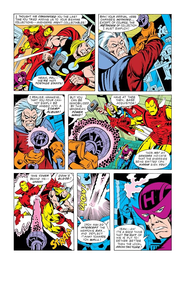
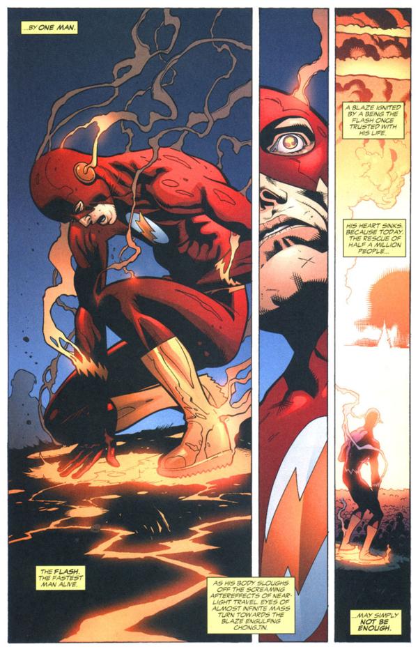
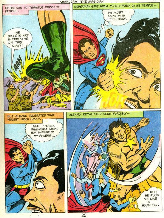
I’m teaching “Superhero Comics” this semester, and so I’m once again pulling out Scott McCloud’s abstraction scale:

Image result for mccloud abstraction scale

It begins with a photograph of a face and ends with a face comprised only of an oval, two dots, and a straight line. McCloud calls that last face a “cartoon” and the middle face the standard for “adventure comics,” ie superheroes. All of the faces to the right of the photograph further “abstract [it] through cartooning” which involves “eliminating details” by “focusing on specific details.” Computer programs can do the same kind of stripping down:
 

clip_image007

 
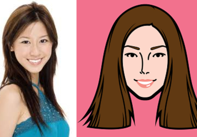
But some “simplification” isn’t so simple. Look at the different between this photograph and its cartoon version.

make a caricature profile picture of you

McCloud’s scale actually combines two kinds simplification. Each step to the right of his spectrum appears simpler because: 1) the image contains fewer lines, and 2) the lines are in themselves less varied. A line becomes smoother by averaging its peaks and lows into a median curve, and so the second kind of simplification is a form of exaggeration. Since exaggeration can extend beyond averaging McCloud’s spectrum actually requires two kinds of abstraction. Each face is altered both in density and in contour quality. Density describes the number of lines; contour quality describes the magnification and compression of line shapes. Abstraction in density reduces the number of lines; abstraction in contour quality warps the line shapes. The less density reduction and the less contour warpage, the more realistic an image appears.

I like McCloud’s five-point scale though, so I’ll offer two of my own.

The Density Scale:

  1. Opacity: The amount of detail is the same or similar to the amount available in photography.
  1. Semi-Translucency: The amount of detail falls below photorealism, while the image still suggests photorealistic subject matter.
  1. Translucency: While reduced well beyond the range of photography, the amount of detail evokes photorealistic subject matter as its source material. This is the standard level of density in superhero comics art.
  1. Semi-Transparency: The sparsity of detail is a dominating quality of the image, and subject matter can evoke only distantly photographic source material. Semi-Transparency is more common in caricature and cartooning.
  1. Transparency: The minimum amount of detail required for an image to be understood as representing real-world subject matter.

The Contour Scale:

  1. Duplication: Line shapes are unaltered for an overall photographic effect. Though naturalistic, reality-duplicating line shapes exceed the norms of superhero art by reproducing too much information.
  1. Generalization: Line shapes are magnified and/or compressed to medians for an overall flattening effect that conforms to naturalistic expectations. Generalization is the standard level of abstraction for objects in superhero art.
  1. Idealization: Some line shapes are magnified and/or compressed to medians while others are magnified and/or compressed beyond their medians for an overall idealizing effect that challenges but does not break naturalism. Idealization is the standard level of abstraction for superhero characters.
  1. Intensification: Line shapes are magnified and/or compressed beyond their medians for an overall exaggerating effect that exceeds naturalistic expectations. If the intensification is explained diegetically, the line shapes are understood to be literal representations of fantastical subject matter within a naturalistic context. If the intensification is not explained diegetically, then the line shapes are understood as stylistic qualities of the image but not literal qualities of the subject matter. Explained or Diegetic Intensification is common for fantastical subject matter in superhero art; unexplained or Non-diegetic Intensification occurs selectively.
  1. Hyperbole: Line shapes are magnified and/or compressed well beyond medians for an overall cartooning effect that rejects naturalism entirely. Hyperbole is uncommon in superhero art because the stylistic qualities of the image dominate and so prevent a literal understanding of the subject matter. Hyperboles in a naturalistic context are understood metaphorically.

The two scales can also be combined into a Density-Contour Grid:

1-5 2-5 3-5 4-5 5-5
1-4 2-4 3-4 4-4 5-4
1-3 2-3 3-3 4-3 5-3
1-2 2-2 3-2 4-2 5-2
1-1 2-1 3-1 4-1 5-1

Both scales take photorealism as the norm that defines variations.

McCloud’s photographed face is the most realistic because it combines Opacity and Duplication, 1-1 on the grid, demonstrating the highest levels of density and unaltered contour. It’s opposite is not McCloud’s fifth, “cartoon” face, which combines Transparency with Idealization, 5-3; its level of density reduction is the highest and so the least realistic possible, but its contour warpage is moderate and so comparatively realistic. Replace the oval with a circle to form a traditional smiley face, the contour quality would rise to Hyperbole, 5-5, the most abstract and so the least realistic position on the grid.

Image result for smiley face

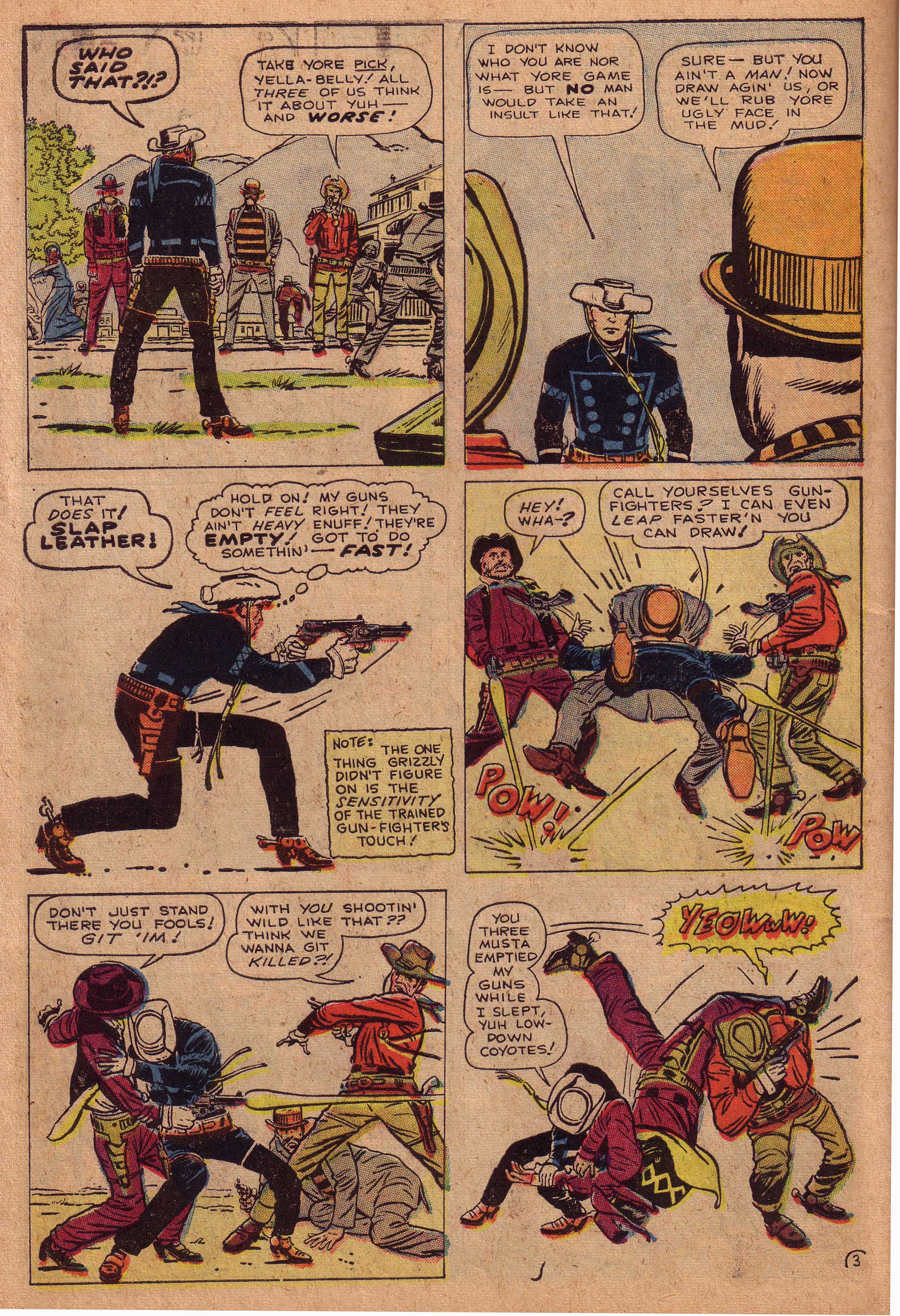
Cartooning covers a range of grid points, but most cartoons fall between 4-4 and 5-5, both high density reduction and high contour warpage. Charles Schulz’s circle-headed and minimally detailed Charlie Brown is a 5-5.


The characters of Archie Comics are some of the most “realistic” of traditional cartoons at 4-4.

 
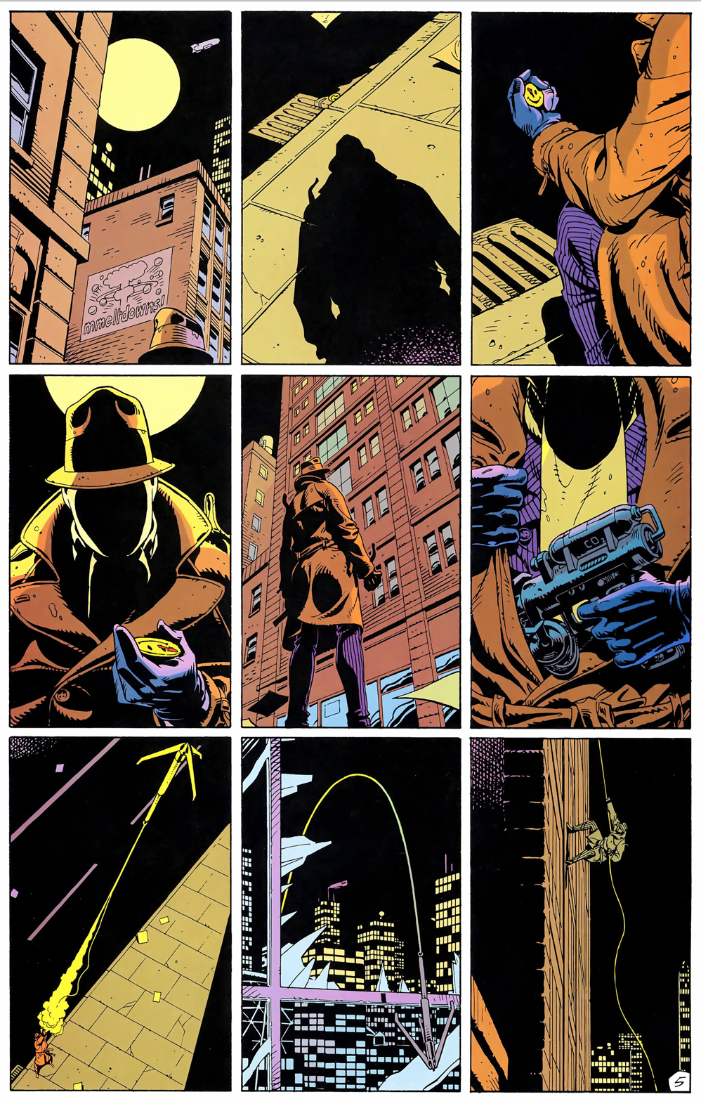
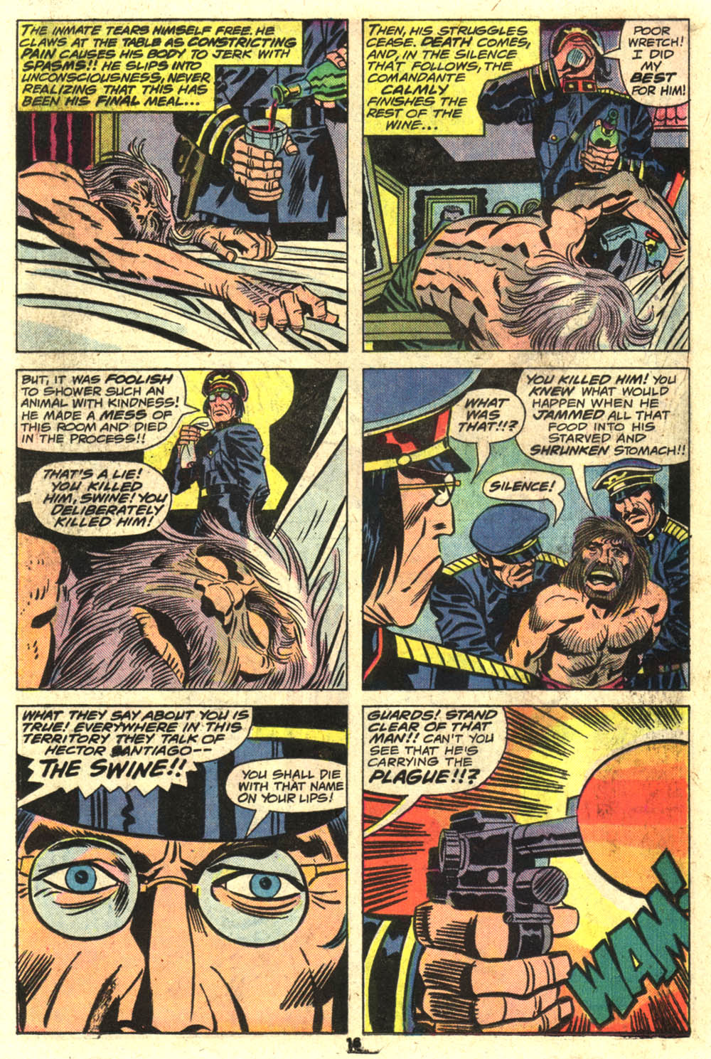
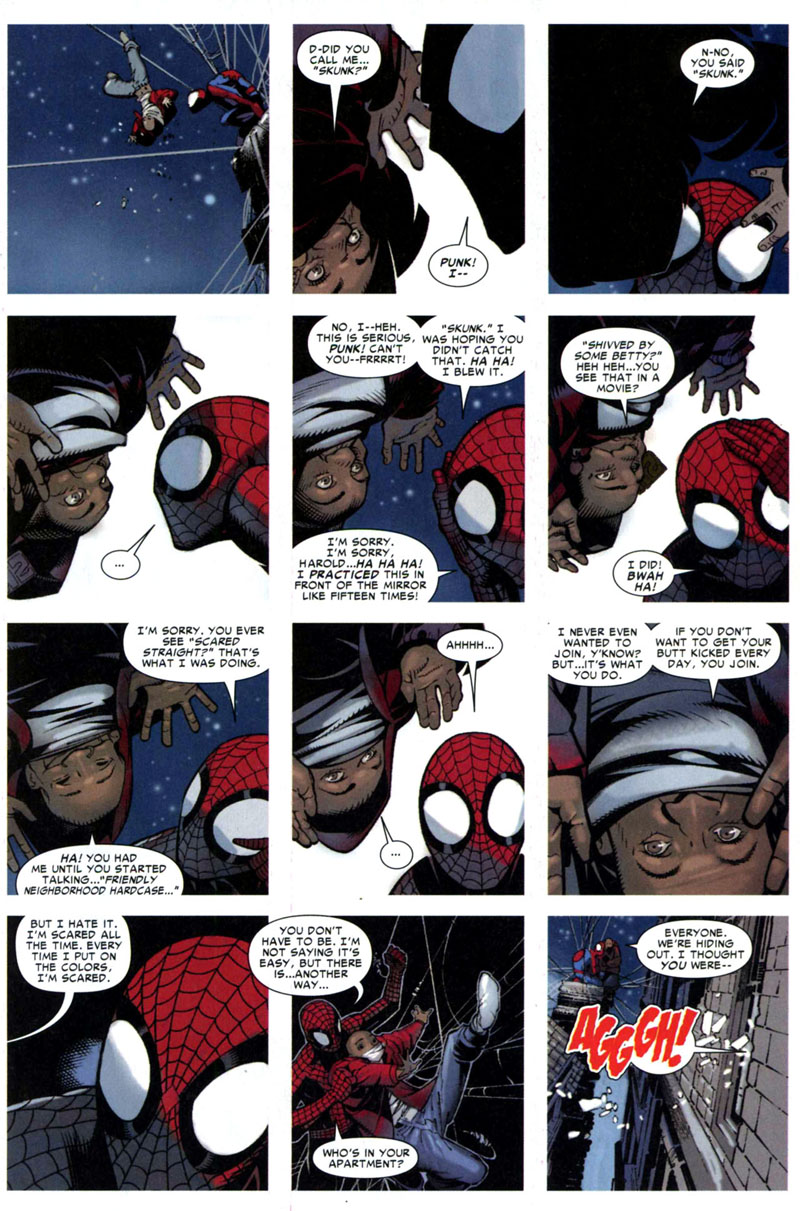
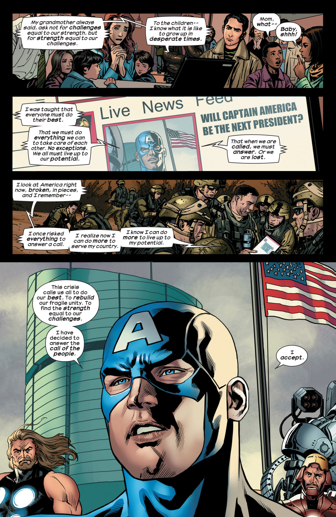
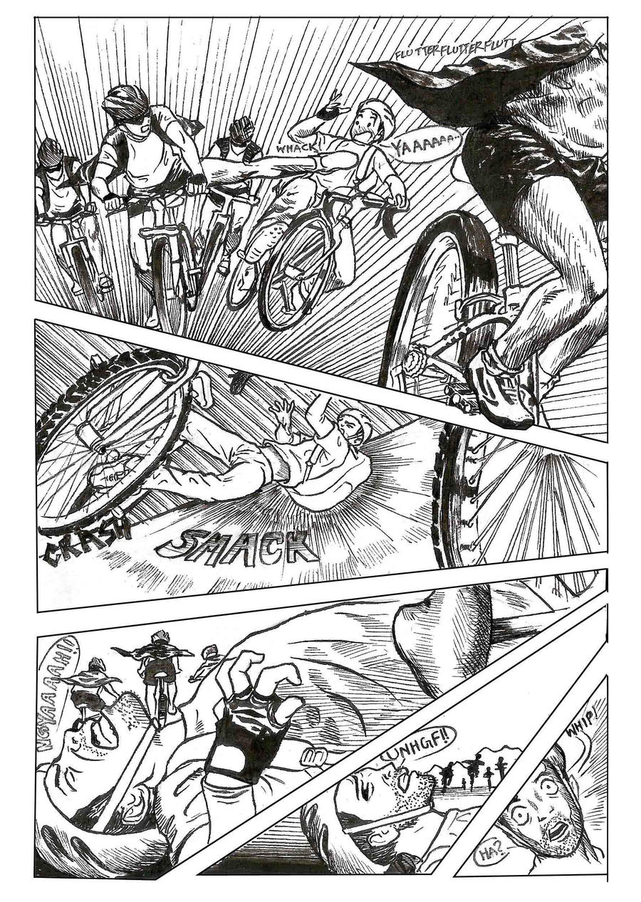
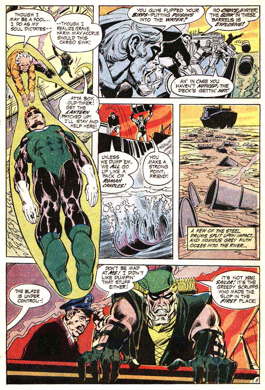
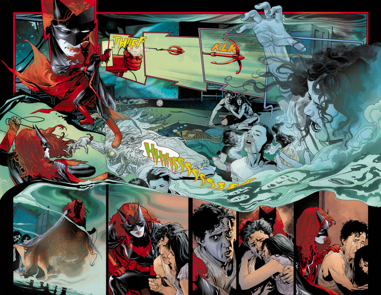
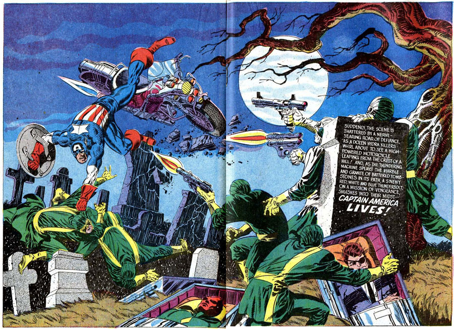
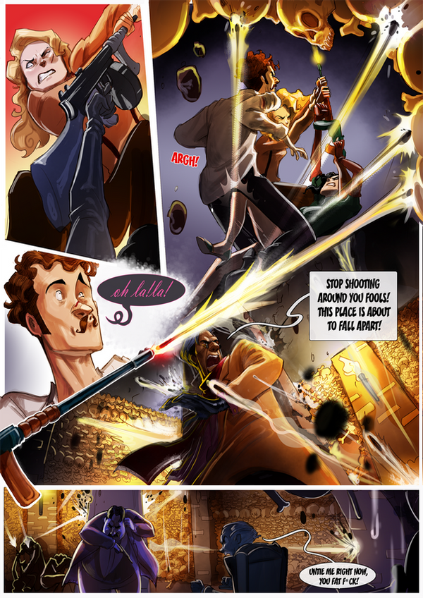
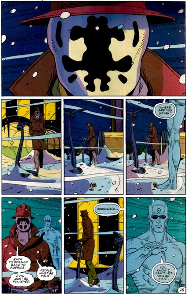
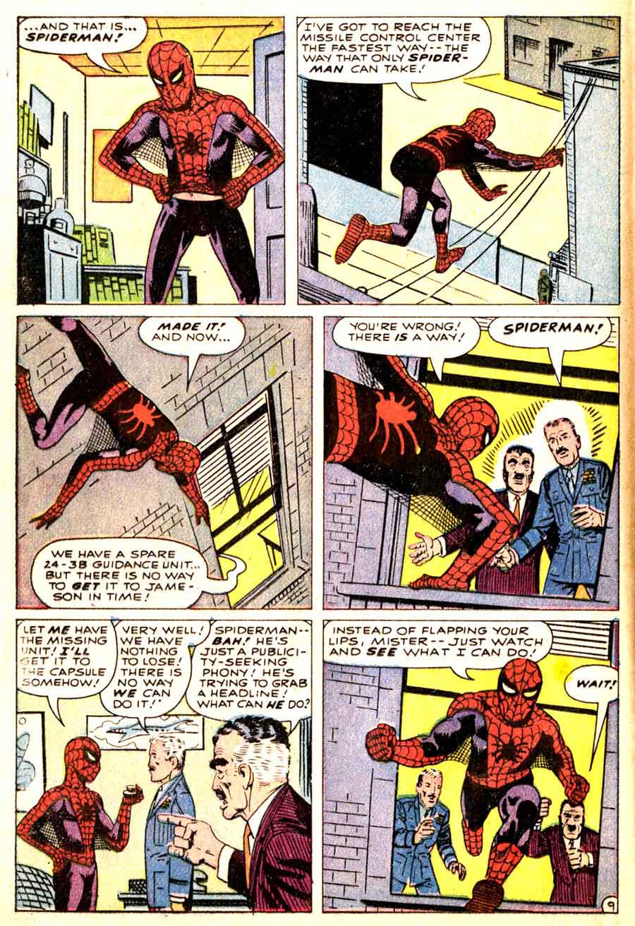
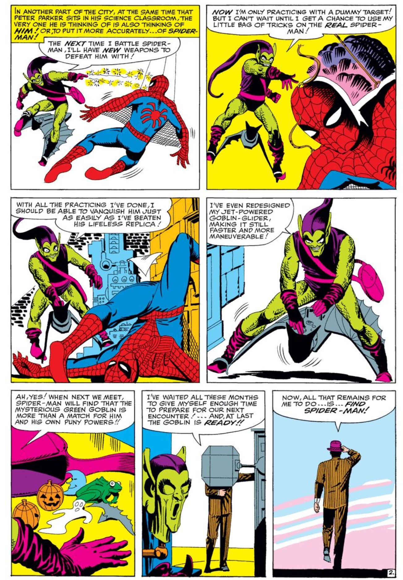
McCloud’s middle, “adventure comics” face combines Translucency and Idealization, 3-3, the center point of the grid and the defining norm of superhero comic art.
 

Image result for superman

Like all grid points, 3-3 allows for a variety of stylistic variation between artists, within a single artist’s work, and even within a single image, but it does provide a starting point for visual analysis by defining areas of basic similarity.

What It Really Takes to Get from Here to There (Analyzing Comics 101: Closure)

Reading a comic book is easy–even when there are no words to be read. You just look at a picture, and then at the next picture, and so on. But why do any of them make sense side-by-side? What is your brain doing as it leaps from image to image?

In Understanding Comics, Scott McCloud defines the Gestalt psychology principle of “closure” as the “phenomenon of observing the parts but perceiving the whole” (though it more specifically indicates a viewer filling in visual gaps between disconnected parts) and applies it to comics gutters: “Nothing is seen between panels, but experience tells you something must be there!” He goes on to explain: “Comics panels fracture both time and space, offering a jagged, staccato rhythm of unconnected moments. But closure allows us to connect these moments and mentally construct a continuous, unified reality.”

McCloud focuses his analysis on gutters and therefore types of transitions possible between panels (though closure is independent of panels and gutters, since insets and interpenetrating images work the same ways). He comes up with six types:

Image result for scott mccloud panel transitions

They work reasonably well, but his focus on panel transition has always struck me as slightly off. When I use it in class, students often don’t come to a clear consensus when analyzing any particular panel sequence. Moment-to-moment and action-and-action, for instance, are often ambiguous, sometimes combining identical leaps in time. And since actions do occur in McCloud’s moment-to-moment examples (a women blinks!), it’s not exactly clear what constitutes an “action.” Aspect-to-aspect can also be indistinguishable from subject-to-subject, both of which may or may not involve a movement in time, and so may or may not also be moment-to-moment or even action-to-action. And scene-to-scene might be a location leap and so also a kind of aspect-to-aspect at the big picture level, or a scene-to-scene can be in the same location but at a different time–so then how much time has to pass for an old scene to become a new scene?

These are annoying questions, but they really do come up when you try to breakdown a panel sequence with a roomful of students. So instead of categorizing transitions, my colleague Nathaniel Goldberg and I categorized types of closure while drafting our essay “Caped Communicators: Conversational Depiction and Superhero Comics.” Instead one all-purpose “perceiving the whole” process, we see four very different kinds of closure, each of which can occur by itself or in combinations.

Spatial:  Subject matter drawn in separate images is depicted as existing in physical relationship to each other, typically as a result of panel framing. (What McCloud identifies as aspect-to-aspect, subject-to-subject, and some scene-to-scene transitions require spatial closure.)

Temporal:  Undrawn events are depicted to take place outside of events drawn in separate images, typically as a result of panel transitions and so occurring as if in gutters. (What McCloud identifies as moment-to-moment, action-to-action, and some subject-to-subject and scene-to-scene transitions require temporal closure.)

Causal: Drawn action is understood to have been caused by an element absent from a current image but drawn in a preceding image. (None of McCloud’s transitions, not even action-to-action, accounts for this type of closure.)

Associative: A metaphorical relationship is depicted between two images in which one image is understood to represent some idea about the other image. (Though McCloud does not identify this type of closure, Jessica Abel and Matt Madden in Drawing Words Writing Pictures add “symbolic” to McCloud’s list of transition types. Such symbolic transitions require associative closure.)

It always helps to look at specific examples, so consider this three-panel sequence at the top of page 28 in Watchmen #8:

In the first image, artist Dave Gibbons draws the shadow of a statuette cast over the face of a frightened man lying on the floor. The second image shows the statuette in the fist of an attacker. Taken together, spatial closure is required to understand that the two images occur within a few feet of each other, each image drawn from one of the two men’s points of view. The second image also requires temporal closure because the statuette is behind the attacker’s head at an angle that would not cast the shadow seen on the victim’s face in the first image. Gibbons therefore also depicts a movement forward in time during which the attacker has cocked his arm back to strike.

The third image depicts a jack-o-lantern crashing to the floor with some falling books. It uses all four forms of closure. The pumpkin exists in the same space as the two now undrawn men (spatial closure). The pumpkin is crushed at a moment immediately following the second image (temporal closure). The falling books have been knocked down by the now undrawn attacker of the previous image (causal). And, because it resembles a human head and breaks open at the moment a reader anticipates the statuette striking the man’s head, Gibbons implies that the man’s head has been similarly damaged (associative).

A close reading of the sequence also reveals some confusion. Regarding causal closure, it is unclear how the attacker overturned the books at this moment since the act of swinging the statuette at the victim on the ground does not clearly involve his intentionally or unintentionally knocking over the bookcase in the same gesture. Instead, Gibbons may have attempted to suggest that the attacker struck his victim and then afterwards overturned the bookcase—an ambiguous two-step action otherwise absent.

I’m guessing Gibbons was fulfilling a directive in Alan Moore’s famously meticulously detailed script, producing this unintended gap in its execution. To address panel transitions that cause only confusion, McCloud includes “non-sequitur” as a type of transition that “offers no logical relationship between panels whatsoever!” So then a non-sequitur produces no closure at all–and so isn’t really type of closure, but is the absence of closure. Which is why we don’t include it as our fifth category.

So our closure types are deeply indebted to McCloud, but I think they also improve on his. I’ll be testing these out in my classroom soon, so hopefully my students will agree. More on that later.

Analyzing Comics 101: Visual Sentence vs. Page Layout

Having taught my spring term seminar Superheroes a half dozen times now, I’m converting it to one of the gateway courses for Washington and Lee students entering the English major. The overhaul means jettisoning the pre-history of the genre (I love that stuff, but I could just hand my students On the Origin of Superheroes and be done with it) and focusing much more on comics as an art medium. So I’m trying to boil down the basics, the must-know criteria for analyzing a comic book.

So now it’s time to invite Neil Cohn to the lectern. If you haven’t read his The Visual Language of Comics, please do. Meanwhile, here’s my boiling down of his visual language grammar.

Narrative panel types: images may be categorized according to the kinds of narrative information they contain and how that information creates a visual sentence when read in sequence:

Orienter: introduces context for a later interaction (no tension).

Establisher: introduces elements that later interact (no tension).

Initial: begins the interactive tension.

Prolongation: continues the interactive tension.

Peak: high point of interactive tension.

Release: aftermath of interactive tension.

Cohn only looks at comic strips, which typically express a single sentence in a linear arrangement of three or four panels, but longer graphic narratives can express multiple sentences on a single page or extend a single visual sentence over multiple pages.  To analyze the different ways that can work, I’m adding some terminology to Cohn’s.

Closed sentences: two sentences that begin and end without sharing panels.

Overlapping sentences: sentences that share panels.

Interrupted sentence: an overlapping sentence that does not complete or initiate its tension before another sentence replaces it; sentences might share an Orienter, or an Establisher may introduce two elements that do not interact until later as a form foreshadowing.

Dual-function panel: in overlapping sentences, one panel performs two narrative functions. A panel may, for example, serve as the Release of one sentence and also the Orienter, Establisher, or Initial of the next. Or an Orienter may  serve as the Establisher of an interrupted sentence that initializes tension later.

Sentence Layout: the relationship of visual sentences to pages.

Page sentence: a sentence that begins with the page’s first panel and ends with the page’s final panel.

Multipage sentence: a sentence that extends beyond one page.

End stop: a page and a visual sentence end simultaneously.

Enjambed: a page ends before the visual sentence ends, also called a visual cliff-hanger.

This is all awfully abstract, so let me give specific examples from The Walking Dead again.

Robert Kirkman and Tony Moore like enjambment. Their first issue includes several cliff-hangers. The bottom row of page five begins with an Establisher (introducing the door to the already established figure of Rick), is followed by an Initial panel (Rick removes the piece of wood holding the door closed), and ends with a Peak (Rick is opening the door).

http://s13.postimage.org/5yqbguo7r/image.jpg

But the Release only appears after turning to page six. That full-page panel is also a dual-function panel because it serves as the Establisher (introducing the zombies to the already established Rick) for the next, overlapping sentence.

http://s13.postimage.org/osc4dumfr/image.jpg

The turn from page nine to ten is similar. The first panel in the bottom row of page nine is an Establisher (Rick and the bicycle), followed by the page-ending Peak of Rick’s shocked reaction. The top of page ten provides the Release (we finally see what he sees).

http://s13.postimage.org/5sh7ri4gn/image.jpg

 http://s13.postimage.org/548d8k5qv/image.jpg

A similar grammatical pattern repeats on pages thirteen and fourteen. The first panel in the bottom row of thirteen is an Orienter. The second is an Establisher (Rick’s face seems to be reacting to something, a sound presumably), and the last panel is an Initial. Turn the page, and there’s the Peak.

http://s9.postimage.org/5ejovcyn3/image.jpg

http://s9.postimage.org/aeh53b49r/image.jpg

The visual grammar also shows that cliff-hangers only work on the final panel of a two-page spread, in order to prevent a reader’s eye from skimming to the critical image prematurely (which happens in my arrangements above).

Also, Moore and Kirkman don’t always enjamb their visual sentences. Page one, for instance, ends on a Peak. The page also begins with an Initial, followed by four Prolongation panels. Page one is a complete page sentence, both beginning and ending on a single page.  

http://s13.postimage.org/q0zzzhedz/image.jpg

Instead of a Release, the next page begins with an Orienter (Rick in his hospital room) for the next visual sentence, which does not overlap.

http://s13.postimage.org/9r9twl3pz/image.jpg

In terms of interrupted sentences, page ten begins a new visual sentence with the top Establisher (introducing the bicycle zombie to the already established Rick), followed by two Initials (Rick and the zombie interact) in the second. The bottom row begins with two Prolongations, followed by a Peak (Rick’s tear) and a Release (the zombie closes its mouth).

http://s13.postimage.org/548d8k5qv/image.jpg

The visual sentence appears to have ended when the next page begins a new sentence with no further interaction between Rick and the zombie. So page ten reads as a complete page sentence, until the bottom of page twenty-three continues the interaction with a Prolongation panel, retroactively showing that the visual sentence was interrupted.

http://s9.postimage.org/5fy82ipun/image.jpg

Page twenty-four provides a new Peak (Rick shoots the zombie), followed by two Release panels (Rick looking down, the zombie with a bullet hole in its forehead).

http://s9.postimage.org/54grpr9en/image.jpg

Rick’s tear is also a Prolongation of his tear on page ten, an additional overlapping sentence that reaches its Peak in the next panel when Rick wipes the tear away. The final three panels are Releases. They’re also their own overlapping, three-panel sentence: Initial (Rick and the car), Peak (Rick gets into the car), and Release (car has driven off).


Analyzing Comics 101: Rhetorical Framing

I’m stealing an idea from Thierry Groensteen, from his 2013 book Comics and Narration. After discussing “regular page layout” (pages with rigid panel grids), Groensteen describes “rhetorical layout, where the size (and sometimes the shape) of each frame is adapted to the content, to the subject matter of the panel.” Groensteen then goes on to talk about the relationships of panels to each other, especially “irregular” layouts that have “no basic structure,” but he doesn’t talk much about subject matter. So his “rhetorical” layout may be the same as any “irregular” layout, in which case the term is superfluous.

Except his definition, “the size (and sometimes the shape) of each frame is adapted to the content,” is really useful. But it doesn’t define a type of layout. It defines a type of framing. In fact, it defines all types of framing, since a frame always has some sort of relationship to its subject matter. And this is true whether panels follow a rigid grid or if the layout is irregular, because the rhetoric has to be analyzed one panel at a time.

So let me offer additions to Groensteen’s term.

Framing rhetoric: the size and shape relationships between frame and subject.

Symmetrical framing: the subject and frame are similar shapes.

Symmetrical and proportionate: the subject and frame are similar shapes, and the subject fits inside the frame; because content and frame are balanced in both size and shape, the effect draws no attention to their relationship and so appears neutral.

Symmetrical and expansive: the subject and frame are similar shapes, but the subject matter is smaller than the frame, so the panel includes surrounding content. The effect is spacious.

 Symmetrical and abridged: the subject and frame are similar shapes, but the subject is larger, so the frame appears to crop out some of the subject. The effect is cramped, as if the subject has been sized too small.

Symmetrical and broken: the subject and frame are similar shapes, but the subject is larger, with elements of the subject extending beyond the frame. The frame-breaking elements are often in movement or otherwise expressing energy, implying that the subject is more powerful or significant than the frame.

Symmetrical and off-centered: although the subject and frame are similar shapes and the subject appears as if it could fit the frame, the frame appears to crop out some of the subject while also including surrounding content. The effect is of a misaimed camera.

Asymmetrical framing: the subject and the frame are dissimilar shapes.

Asymmetrical and proportionate: although the subject fits inside the frame, because of their dissimilar shapes the panel includes surrounding content.

Asymmetrical and expansive: because the subject is smaller than the frame, the panel includes surrounding content, and because of their dissimilar shapes, the panel also includes additional surrounding content.

Asymmetrical and abridged: the subject is larger than the frame in one dimension, creating the impression of the frame cropping out content, and because of their dissimilar shapes, the panel also includes surrounding content. The effect is an image placed in the wrong shaped panel.

Asymmetrical and broken: the subject is larger than the frame, with elements of the subject extending beyond the frame edge; because of their dissimilar shapes, the frame-breaking elements further emphasize imbalance.

Asymmetrical and off-centered: although the subject appears as if it could fit inside the frame, the frame appears to crop out some of the subject while including some surrounding content; and because of their dissimilar shapes, the panel also includes additional surrounding content. The effect is of a misaimed camera.

Unframed image: an image with no frame. (Duh!)

Secondary frame: surrounding panel frames border an unframed panel.

Implied frame: an unframed image implies a symmetrical and proportionate frame, while usually remaining inside its undrawn borders.

Interpenetrating images: adjacent unframed images and their implied frames overlap.

Secondary frames, implied frames, and interpenetrating images may be analyzed in the same rhetorical relationships of size and shape as framed images.

That’s all really abstract, so check out some examples:

Nick Fury’s body fits inside the full-height column but intrudes into the second column. The unframed panel is symmetrical and broken.

With the exception of the top right close-up, each panel shows Beast’s whole (or nearly whole) body, which is drawn to fill the shape of the panel, and so is symmetrical and proportionate. 

Wolverine’s body, however, does not entirely fit; his feet, part of his arm, and the top of his head are cropped. The column panel is symmetrical and abridged.

The top panel is symmetrical and proportionate. The second panel crops the face (part of the lower lip and both eyebrows are missing) but includes a lot of surrounding space. The panel is asymmetrical and abridged, as is the third. The last is symmetrical and proportionate again.

The first panel is asymmetrical and proportionate (or off-centered depending on whether you consider his elbow primary content). The second column is drawn as if too thin to contain all of Flash’s face, so the panel is asymmetrical and abridged. The last is asymmetrical and expansive.

The top panel is asymmetrical and expansive, with detailed elements of the wall in the foreground.  The bottom left panel contains Spider-Man, but with ample additional space around the figure, so that non-essential elements of the city landscape are included in the frame. The panel is symmetrical and expansive.

The bottom, page-width panel includes its two primary subjects, Batman and Alfred on the balcony behind him, but the angle and distance includes additional content, including the entire moon, distant buildings, and the wall below the balcony. The panel is symmetrical and expansive.

The second row includes a face with a corner of an eye and mouth cut off. The panel, however, is large enough to include those complete features, but the subject has been drawn off-center to produce the cropping effect. The panel is symmetrical and off-center.

The face in the bottom left panel is cut off at the mouth, even though the subject matter could be drawn higher in the panel to include the entire mouth. The panel is symmetrical and off-centered.

The top right panel content could be composed to include Cyclops’ face, but instead his head is more than half out of frame. The panel is symmetrical and off-centered.

The top panel is wide like the subject matter of the street and so is symmetrical and proportionate. The subject matter of the second frame (the heads of the passenger and the driver visible through the car window) fit the frame, but the frame shape extends to the left to include the reflection of a building in a backseat window, so the panel is asymmetrical and proportionate.

,

The width of the second panel of “Avengers Mansion” also includes several distant buildings, the front yard, and fence–elements included as if the wide panel shape requires a view of more than the primary subject of the mansion front. The panel is asymmetrical and proportionate.

Not only is the subject of the Hulk much smaller than the frame, the frame itself is shaped so that it must include more than the subject. The panel is asymmetrical and expansive.

Image result for comic book pages

The shape of the full-width panels of  the second and third rows extend beyond the subject of the two figures. The panels are asymmetrical and expansive.

Batman’s leg extends beyond the frame, as if his movement was too fast for the frame to capture. The hand in the final frame also breaks the panel border, again emphasizing action. The panel is asymmetrical and broken.

Every panel of the fight scene but the last is symmetrical and broken. The last is symmetrical and off-centered, cutting off Bucky’s chin while leaving space above his head.

The second row begins with a symmetrical and expansive panel; the second panel is symmetrical and proportionate; and the third symmetrical and abridged. The sequence suggests physical and psychological intensification, but exclusively through framing since the Hulk’s expression remains essentially unchanged.

The first panel of a figure stepping through a door is symmetrical and proportionate. The next symmetrical but expansive panel includes its subject matter (the individuals in the classroom and the classroom itself) but also the darkened top of (presumably) a bookshelf. The spaciousness contrasts the cramped effect of the subsequent panels which are mostly asymmetrical and abridged, except for the second which is symmetrical and abridged.

And, on a last note, I intend to use framing rhetoric instead of film terms for camera distance (close-up, medium shot, etc.), because the film terms don’t account for frame shape (in film the frame shape typically does not change). Also, “camera distance” doesn’t suit a drawn image because there is no camera and so no distance between it and the subject; there’s just the subject and the frame.

The Rhyming Dead (Analyzing Comics 101: Page Schemes)

The Walking Dead Volume 1 “Days Gone Bye” is anti-feminist, anti-government, pro-gun, libertarian fantasy propaganda. So pretty much my opposite on the political spectrum. And yet I teach it every year in my first-year writing seminar. It helps that it pairs so well with George Romero’s Night of the Living Dead (which is nihilistic, anti-everything fantasy propaganda). It helps even more that I like the Walking Dead TV show so much.  I always assign open essay topics, so I get a range of gender critiques, pro-family analysis, and (my favorite) the meaning of Rick’s hat. That one requires a deeper level of visual analysis, and that’s what I want to focus on today.

On a previous blog, I laid out my thoughts on layout, and now I want to apply them a little more systematically to one specific comic: The Walking Dead #1 (October 2003) by Robert Kirkman and Tony Moore. I’ll work through the issue page-by-page first, then follow up with a page scheme analysis: how the layouts of separate pages combine for issue-wide effects. I’m working with the general principle that pages have base patterns, and when those patterns repeat, their pages relate at a formal level (they visually rhyme) and so the content of those pages are connected too.

PAGE 1:

http://s13.postimage.org/q0zzzhedz/image.jpg

Irregular 4-row layout, with top and bottom full-width panels. The bottom panel is also unframed and merges with the underlying page panel, giving it additional significance.

PAGES 2-3:

http://s13.postimage.org/9r9twl3pz/image.jpg     http://s13.postimage.org/3rm2sxixj/image.jpg

Full-page panel and a regular 3×3. Often a comic establishes a single base pattern, but the 3×3 contradicts the 4-row (and the implied 4×2) of page one.  The full-page panel is ambiguous since it can divide into any layout pattern, and so it is an effective bridge between the two base patterns.

PAGES 4-5:

http://s13.postimage.org/ml7vpxh5j/image.jpg     http://s13.postimage.org/5yqbguo7r/image.jpg

The irregular 3-row begins with 3 panels, but then switches to a 2-panel bottom row that breaks the 3×3 pattern established on the previous page. The next page is also a 3-row, but since the top, full-width panel could divide into three panels, I’d say the page is still using 3×3 as its implied base pattern.

PAGES 6-7:

http://s13.postimage.org/osc4dumfr/image.jpg   http://s13.postimage.org/xorhvj2fr/image.jpg

Another full-page panel (on the left side of the spread like the full-page panel of page two, so the positioning rhymes as well) and another 3-row with a top, full-width panel that implies a 3×3 base pattern, same as page five (which was also on the right side of the page spread, so another positioning rhyme).

PAGES 8-9:

http://s13.postimage.org/3y4d9rhg7/image.jpg  http://s13.postimage.org/5sh7ri4gn/image.jpg

And here Moore and Kirkman completely break any base patterning. The bottom row would suit a 3×3, but the top two-thirds could suit an implied 4×2. The top two-thirds also shift to an irregular 2-column layout, with the first column combing three panels to establish the reading path for the paneled second column.  The next page then switches back to an irregular 3-row. The top, full-width panel is unframed and merges with the underlying page panel which slowly darkens to black gutters, a motif continued on the next page.

PAGES 10-11:

http://s13.postimage.org/548d8k5qv/image.jpg  http://s13.postimage.org/c8q6hld07/image.jpg

Another atypical page, a 3-row but now with a bottom, 4-panel row, which is a new layout element. Like the preceding page, the top, full-width panel is unframed and merges with the page panel which darkens to black gutters again. The next page returns to a regular 3×3, same as page three.

PAGES 12-13:

http://s9.postimage.org/6sbbqnxwf/image.jpg  http://s9.postimage.org/5ejovcyn3/image.jpg

A 3-row and implied 3×3, since both the top unframed full-width panel and the middle framed full-width panel would divide accordingly. The implied 3×3 is further suggested by the actual 3×3 of the facing page.

PAGES 14-15:

http://s9.postimage.org/aeh53b49r/image.jpg  http://s9.postimage.org/54c6c0k0v/image.jpg

Atypical again. The bottom row partly evokes 3×3, but the panels are closer to half-page height, and they are also insets over the full-page panel image that dominates the top half of the page. The next page is an irregular 3-row, though now with a bottom, 4-panel row (as first seen on page ten).

PAGES 16-17:

http://s9.postimage.org/hx0abxvmn/image.jpg  http://s9.postimage.org/y9ac1o9y7/image.jpg

Two irregular 3-row pages, with a total of three full-width panels, two 3-panel rows, and one 2-panel row. (That all black background at the bottom of 16 is interesting, but not part of today’s focus.)

PAGES 18-19:

dead  http://s9.postimage.org/g914xahr3/image.jpg

More irregular 3-rows, with three 3-panel rows, two full-widths, and one 2-panel. The second page repeats the exact layout of pages five and seven, with a top, full-width implying the 3×3.

PAGES 20-21:

http://s9.postimage.org/vj104hd9b/image.jpg  http://s9.postimage.org/sqcdy72an/image.jpg

Two more 3-rows with an implied 3×3 base. The first page repeats page nineteen, seven, and five, and the second partially echoes page fourteen, though here the top two-thirds of the page fit a 3×3 pattern by combining two implied rows into a single unframed panel. Also the the bottom panels are insets over the full-page panel which darkens into black gutters–so close to page fourteen, but not an exact match, more of a slant rhyme.

PAGES 22-23:

http://s9.postimage.org/rqm32hn4v/image.jpghttp://s9.postimage.org/5fy82ipun/image.jpg

The fifth iteration of an irregular 3-row with a 3×3-implying top full-width panel. The second page’s irregular 4-row also brings back the implied 4×4 of page one, now with black gutters.

PAGE 24:

http://s9.postimage.org/54grpr9en/image.jpg

Mostly an irregular 4-row, though the first panels of rows one and two are combined into a half-page column, the only column seen since page eight. This is also the sixth page to include black gutters.

So how does any of this combine into any meaningful analysis?

Since well over half of the pages (fourteen or fifteen depending on how you feel about page twenty-one) are irregular 3-rows, there’s a dominant base pattern. Eleven of those pages follow a flexible 3×3, and the two full-page panels can be added to that count too. Those two full-pages deserve special attention, rhyming the two formally largest moments in the narrative layout: Rick waking up for the first time after his apocalypse-triggering injury, and the first, apocalypse-signifying depiction of zombies. Pages fourteen and twenty-one are the next visually significant, with their top panels dominating more than half of their layouts: Rick being struck by a shovel, and a zombie appearing behind a fence. Frankly, the shovel shot seems a bit gratuitous to me since the moment is not that narratively important (a character-introducing misunderstanding patched up by the next page), but page twenty-one is key to Rick’s development since he learns not to waste a bullet by killing a zombie unnecessarily, setting up his character-defining mercy killing on the concluding pages. The two concluding pages also rhyme with page one, creating implied 4×2 bookends to the issue. The black gutter motif also begins on pages nine and ten, when the bicycling zombie is introduced, further linking to page twenty-one’s black gutters and harmless zombie.  

So the page scheme shapes Rick’s character development in different ways than just the words and image content.  There are other angles of interpretation available here (I’d tackle all of those top full-width panels next, or maybe those two brief columns on pages eight and twenty-four), but the point is that layout doesn’t simply transmit narrative. The formal qualities shape the narrative, adding meanings and relating moments that in terms of story alone are not directly linked.

Issue 1

Why Darth Vader is My Favorite Superhero

Okay, maybe not favorite, but as far as morally ambiguous asthmatic cyborgs go, Anakin Skywalker is at the very top.

If you doubt his superhero creds, do the checklist yourself. Superpowers? That lightsaber would be plenty, but he could also go head-to-baldhead with Professor X in a telekinetic wrestling match. Secret double identity? Vader/Skywalker is self-explanatory, and if it wasn’t a secret there’d be no Episode 5 shocker: “Luke, I’m your father!” Masked costume? Can’t get more masked than a grill-mouthed, aviator-lensed Samurai helmet. Plus he struts around in a cape.

Of course the main objection to Vader joining the Guardians of the Far Far Away Galaxy isn’t wardrobe or weapon related. It’s his mission: eradicate all Jedi knights, his Galaxy’s actual Guardians. In fact, it would seem to put him near the top of the supervillain roster, just under his evil mentor, Emperor Palpatine.

But Anakin was born with a larger mission: to bring balance to the universe. He is the highest manifestation of the Force, the immaculately conceived uber-child of the midi-cholorians, those symbiotic lifeforms that surge in the cells of all Jedis. In fact, he has the highest midi-cholorian blood count ever recorded, 20,000 per cell, eight times higher than the 2,500 of mere humans (yeah, I couldn’t stomach Episode One either).

So Anakin is the Chosen One, the guy foretold by ancient legend—basically King Arthur or a laser-wielding Jesus Christ. But what exactly does the prophecy mean? According to the Jedi, those evil Sith lords throw the Force off balance and so it’s a Jedi’s duty to battle them. Thus the Chosen One would “destroy the Sith and bring balance to the Force.” Sounds good, but that’s not exactly the happy ending they got.

Episode Three wedges in the unfortunate phrase “the Jedi and then” between “destroy and “the Sith.” Does that mean the Force and its microscopic avatars are all metaphysical morons?  Oops. Sorry about the annihilation of your entire Jedi Order. Our bad. Thanks for worshipping us though.

I think the Jedi read their prophecies through Jedi-tinted glasses. I think the Force was tired of them and the Sith see-sawing the universe on its back. A never-ending battle between good and evil is fun and all, but after 25,000 years maybe that Manichean match-up starts looking like the problem, not the solution. If war is the enemy, then all warriors, Sith and Jedi alike, are obstacles to peace.

So the Force took things into its microscopic hands, impregnated an unsuspecting slave woman, and released the biggest Force-wielding superhero of them all, letting him and his Sith boss slaughter every Jedi knight in existence, except for his first mentor who chops off three-quarters of his limbs while dunking him in a river of lava, after which his lying boss clamps him into a wheezing cyborg suit. That’s all in the fine print of the Chosen One job description.

Then the Force chills for a couple of decades, letting the Sith-administered Empire explode a few planets and whatnot, until the Chosen One gets around to offing mentor number two, plus himself in the lightning-discharging process, and so finally destroying the conveniently tiny two-guy Sith Order. End of all Force manifestations in the known universe. Balance Accomplished.

That is until the Empire of Disney assumed control of the Lucas Republic and released Darth Abrams on the Star Wars franchise. Episode Seven awakens the Force on December 18th, overturning all of Anakin’s brutally hard work. The guy sacrificed everything for the greater good, and now that little punk son of his, Luke, has been rebuilding the damn Jedi order, throwing the Force off balance again? If I were a midi-cholorian, I’d be pretty pissed right now!

Although George Lucas originally said he had three trilogies in mind, he later admitted the third was less prophecy and more publicity. The catastrophically bad prequels were always more-or-less part of the implied backstory, but he just thought it sounded cool to say later sequels would parallel the actors’ actual ages. Thus Luke Skywalker and Mark Hamill are both 63 now. That’s adorable and all, but not exactly the premise for a three-film blockbuster extravaganza.

In other words, the Force and the creator of the Force both considered the story over. But director J. J. Abrams is a good choice for beating a dead sci-fi horse back to life. He yanked the Star Trek franchise back into existence too, even dragging the late Leonard Nimoy into his parallel continuum reboot. I expect no less from his reborn Star Wars.

Though I do hope he’s noticed that Mr. Hamill bears more than a little resemblance to Senator Palpatine these days. Could it be mere coincidence that the ex-Jedi has made a post-Star Wars career voicing animated supervillains, including that uber-Sith Lord, the Joker?

Sadly, the universe’s greatest superhero, Darth Vader, won’t be there to save the day again.

Analyzing Comics 101 (Layout)

The downside to teaching a course on comics is discovering that no textbook quite matches the way you want to teach the material. The upside is writing that textbook yourself. And so here’s the first draft of an intended series of “Analyzing Comics 101” blogs. My actual course is called “Superhero Comics,” but I’m hoping this will be useful to other students, teachers, fans, etc.

So here goes . . .

ANALYZING LAYOUT

Layout: the arrangement of images on a page, usually in discrete panels (frames of any shape, though typically rectangular) with gutters (white space) between them, though images may also be insets or interpenetrating  images. Page layouts influence the way images interact by controlling their number, shapes, sizes, and arrangement on the page, giving more meaning to the images than they would have if viewed individually. Layouts are the most distinctive and defining element of graphic narratives.

Layouts tend to be designed and read in one of two ways, in rows or in columns.

Rows: panels are read horizontally (and from left to right for Anglophone comics, but right to left for Manga). Types of row layouts include:

Regular 2×2, 2×3, etc.; 3×2, 3×3, etc.; 4×2, 4×3, etc.: vertical panel edges line-up, creating uniform panels in all rows. 3×3, 3×2 and 4×2 are the most common regular  layouts.

3×3:


3×2:


Regular 4×2:


2×3:


2×4:

4×3:

3×4:

4×4:

Irregular 2-row, 3-row, 4-row, etc.: vertical panel edges do not line-up, creating a different number of or differently sized panels in one or more rows. The irregularity may include a full-width panel, which extends horizontally across the whole page, or rows divided into 2, 3, 4 or more panels. Irregular 3-row layouts are among the most common layouts in comics, followed by 4-row and 2-row.

3-row:


4-row:


2-row:


 Image result for comic book pages

Columns: panels are read vertically, from top to bottom. Because of the Anglophone tendency to read horizontally before vertically, columns are less common in Anglophone comics.  Column layouts include:

Regular 1×2, 1×3, 1×4, etc.; 2×2, 2×3, 2×4, etc.; 3×2, 3×3, 3×4, etc.: horizontal panel edges line-up, creating uniform panels in all columns. To counter horizontal reading norms, columns often use one or more full-height panels, which extends vertically down the whole page. The absence of segmented panels within a full-height panel column reduces establishes the column layout, preventing a horizontal reading path.

1×4:

1×3:

1×2:

Irregular 2-column, 3-column, 4-column, etc.: horizontal panel edges do not line-up, creating a different number of or differently sized panels in one or more columns. Because horizontal reading is an accepted default, segmented columns tend to be irregular, with one or more taller panels breaking the left to right norm. Often a single, full-height panel establishes an irregular 2-column layout, with the second column divided into multiple panels. Irregular 2-column are the most common column layouts.

2-column (with establishing full-height panel):


Row and column patterns, however, are indistinguishable without content to determine reading direction. A 4×2 layout, for example, may be read as four rows divided into two panels each, or it may be read as two columns divided into four panels each. However, because Z-path reading (first right then down) is the norm for Anglophone comics, 4×2 is typically read as a 4-row layout not a 2-column.

Rows and columns can also be merged by including only full-width panels within a single column. These are irregular 3×1, 4×1, 5×1, and 6×1:


     Image result for comic book pages

Image result for comic book pages

Combinations: panels must be read both horizontally and vertically, combining rows and columns on a single page. In practice, combinational layouts are always irregular. Common combinational layouts feature one or more paired sub-columns (one sub-column divided into two panels, the other the height of those two panels combined, with the two sub-columns sequenced in either order) or a single, full-height column in an otherwise row-patterned layout. 


Image result for comic book pages'

Diagonal layouts: panels do not follow vertical or horizontal divisions, and so are neither clearly rows nor columns:


Caption panel: a panel that contains only words.  These tend to be smaller, subdivided panels.

Inset: a panel surrounded entirely by another image.


Overlapping panels: a framed panel edge appears to intrude into or to be placed over top another framed panel, with not gutter dividing them.


Broken Frames: image elements of one panel extend beyond its frame into the gutter and/or into the frame of an adjacent panel.


    Image result for comic book pages'

Insets, overlapping panels, and broken frames are often combined:


Interpenetrating images: two or more unframed images with no distinct gutters or borders so that elements of separate images appear to overlap.


Page panel: A page-sized panel, typically visible in the gutters between smaller panels. When white, black, or otherwise uniform, the page panel appears as the page itself and so as a neutral space outside of the actions and events of the drawn images. All other panels are insets superimposed over the page panel. If the page panel includes drawn images, those images should be understood as the underlying and so in some way dominating background element to all other images on the page. If one panel is unframed, its content may be understood as part of the larger page panel.


A page panel with no insets and a single unified image is a full-page panel:

A full-page panel with author credits is a splash page.

Two-page panel: two facing pages designed to be read as a unit. A two-page spread are two facing pages not designed as a unit.

Panel accentuation: a panel may be formally differentiated and therefore given greater importance by its size, frame (including shape, thickness, and color, and by being unframed) or position on the page (first, center, and last panels tend to dominate).

Panels accentuated by border shapes:


Base Layout Pattern: a panel arrangement repeated on multiple pages.

Strict: repetitions from page to page contain no variations in a base pattern.

For the Superman episode of Action Comics #10, Joe Shuster uses a strict 4×2, as does Fletcher Hanks for “Stardust the Super Wizard” in Fantastic Comics #12:


Flexible: some variations, especially through combined panels and divided panels. Often the base pattern is only implied.

Watchmen is the best known example of a flexible 3×3 base pattern:


Comics more often use a flexible 3-row base pattern. Steve Ditko fluctuates between rows of three panels and rows of two panels in Amazing Spider-Man:

      .


Irregular: no base pattern.

The Avengers #174 fluctuates between 3-row and 4-row layouts:


If more than one arrangement repeats, each pattern may be distinguished descriptively (3×3, irregular 2-column, etc.) or by chronological appearance (layout A, B, C, etc.). Pages that repeat earlier layouts may be said to rhyme.  A comic book’s page scheme may be analyzed for layout repetitions, creating a page scheme. But let’s save that topic for later . . .