Yearning for Space: a conversation with Tom Kaczynski

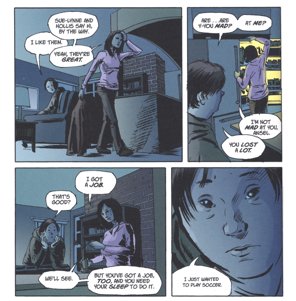
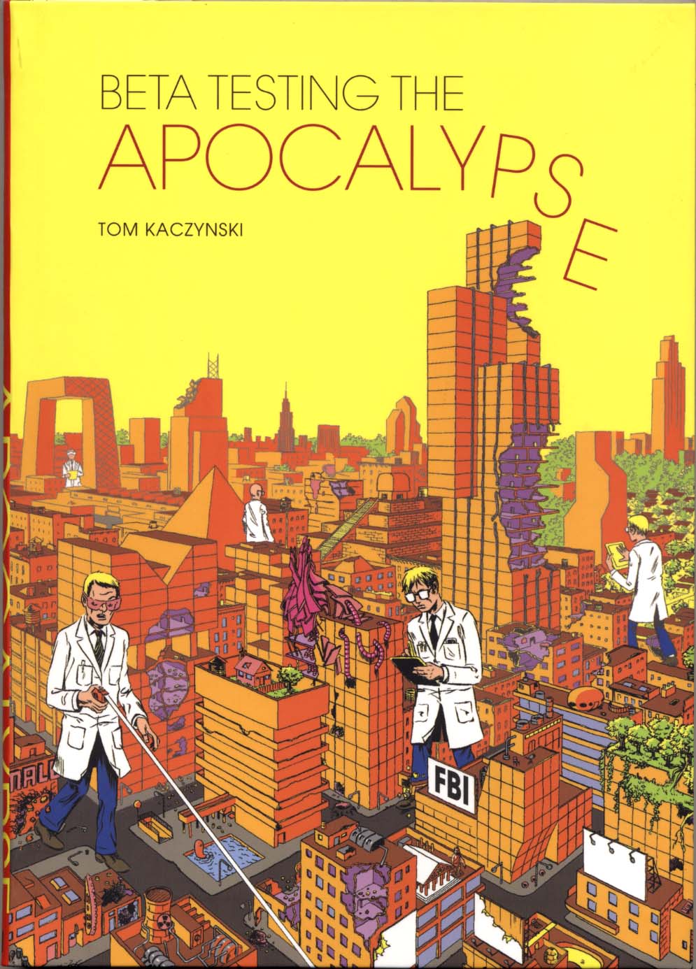
I first encountered Tom Kaczynski’s work while delving into the substantial collection of comics-related materials in Columbia University’s Butler Library stacks, where there is a run of Fantagraphics’ anthology title MOME. I very much liked Kaczynski’s deliberately drawn short stories such as “100,000 Miles” and then, when I was lucky enough to get a story of my own in the final issue of MOME (#22)—and having an certain amount of thespian training—I greatly admired his piece “Music for Neanderthals”, an account of an actor who takes his method a bit too far to go completely native. His work often gives the impression that it spans the entire history of the planet, which reminds me a little of another Polish-American I worked with, the late David Wojnarowicz. I definitely feel sympatico with Tom’s use of the potentials of the comics medium to go beyond entertainment and impart information of a philosophical nature, which is not to say that his stories aren’t entertaining, but that they touch on deeper issues as well. He began Uncivilized Books to publish first his own and others’ minicomics and now it produces critically acclaimed hardcover collections by luminaries of alternative comics such as Gabrielle Bell and Jon Lewis. So, at the Brooklyn Comics and Graphics Festival last year I approached Tom at his table and a year later, he published my comic book Post York. Now Fantagraphics has released a collection of his short stories, Beta Testing for the Apocalypse. For HU, I talked with Tom via email.

________________________________________________________________________
CLICK ON IMAGES TO ENLARGE
________________________________________________________________________

Tom K cover

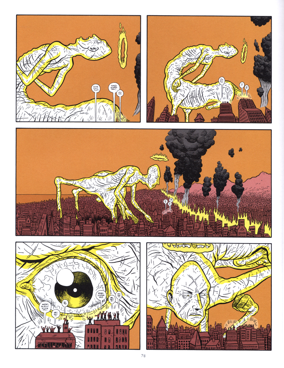
James: You use a single color besides black in the stories, often to great effect. To my eyes, the limited color in your work has a strange feeling, removed from the ostensibly similar use of a single color in a lot of alternative comics, a trend that I think was initiated by Daniel Clowes, Seth and David Mazzucchelli et al. In other words, it is not just for indicating lighting or to hark to old book illustrations. Instead, your single color use at its best is really intrinsic to the storytelling…the color holds or overlays add depth to some images or highlight specific parts of a given drawing to draw attention to something that is going on in the image. Outstanding examples are seen in “100,000 Miles”, “10,000 Years”, “976 Sq. Ft.” and “Million Year Boom”. The color separations can add qualities of delicacy of articulation, or of diagramming, or extradimensional elements. The colors you chose in different stories have varying levels of emotional impact as well. Now, I have to note that in a few of the stories, like for example “Phase Transition” or “Music for Neanderthals”, the color seems to only add lighting, it is almost an afterthought or it isn’t as intrinsic. But in most of the stories, for instance in “The New,” it is absolutely part of how the story is constructed—–and that story may be the most advanced use of the technique, besides being your most ambitious piece to date. Can you articulate why using two colors might sit your purposes more than doing full color artwork, or leaving it in black and white?

Tom: I tend to use color as a storytelling device where in certain instances I can focus-in on certain object or characters. I feel I’m still struggling with color in general. Overall I can cite 3 primary ways I use color in the book.
1. Color as a naturalistic element (as lighting, depth, etc.)
2. Color as pure design element.
3. Color as information.
The three sometimes mix in a single panel, sometimes they don’t. “The New” and “Million Year Boom” are the only two stories that were conceived (and published) with color from the get go and as such work the best for me in that respect. That said, it was fun to go back-in and re-imagine the stories with an added color. Now that I’ve seen the results, I would probably push it a little further next time I have a chance to do that.

James: I note some variations in the stories in Beta Testing the Apocalypse from the way they were originally presented. In the collection, the story “100,00 Miles” has a green overlay that is considerably lighter in shade than the more olive color it is run in in MOME 7.

From "100,000 Miles"

From “100,000 Miles”

The stories “Phase Transition” from MOME 10 and “Music for Neanderthals” from MOME 22 did not have a color in their original printings. In Beta Testing the first page of “Phase Transition” is still black and white, perhaps because it is part of a signature that has pink pages. I see that the olive color goes over zipatone in the other three pages and that the toning is slightly different in the Beta Testing version—on page 4 panel 6 you mottled the tone. I wonder if the color is imposed on some of the stories to unify them for this package, or if, as you suggest in your interview in MOME 10, the lack of color in some stories was a result of not having enough time to do a color separation for them?

Tom: The MOME stories were always vaguely conceived as two-color pieces. But because I often handed in art at the last possible minute ([MOME editor] Eric Reynolds can attest to that!), there was often no time left to think about the color in any meaningful way. I generally focused on having the stories work as black & white pieces (with gray tones) and if there was time, I would add color information. The color changed on the MOME 7 story because the original green wasn’t quite what I wanted. I changed it to the color I originally envisioned, but didn’t get right the first time around. The first page of “Phase Transition” is indeed b&w, partly because it falls on the pink signature (as opposed to the yellow one), but I found that it worked storytelling-wise. The color doesn’t come in until the 2nd page of that story and gradually takes over more of the strip.

James: One of your self-published pamphlets is in full color—-do you think you might do an entire book in full color at some point?

Tom: Maybe… I found full-color very time consuming. I may find a good use for it in the future. I don’t want to rule it out. In the near term I don’t have any specific plans on doing any full color comics.

James: From the example shown in the interview that Gary Groth did with you in MOME 10, the strips from The Drama magazine look to be of a similar level of quality as the work here, along similar lines of subject matter and are also 2-color jobs. Is there a reason why you didn’t include them?

Tom: I didn’t think those strips would’ve worked in the book. They were done at least a year before the 1st MOME story, and they are much more ‘gag’ strips. There are some ‘gag’ strips in the collection (the four 1 page stories from MOME 12) but they work with the larger themes of the book.

James: I also see in that interview that you acknowledge J.G. Ballard as an influence, even if Gary didn’t do any follow up questions about him. I noticed the influence immediately in reading your work.

Tom: Yeah, Ballard is pretty big for me. His earlier books like The Drowned World, Crash, High Rise and The Day of Creation were huge for me. I love a lot of his short stories; “The Ultimate City” may be my favorite. I’ve also come to love his later, post-Empire of The Sun (one of the few I HAVEN’T read) work like Super Cannes and his last novel Kingdom Come.

From "10,000 Years"

From “10,000 Years”

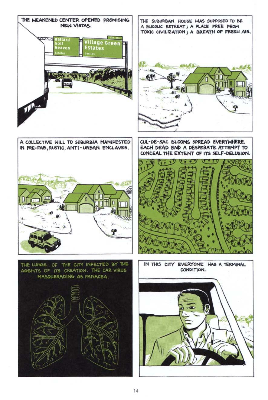
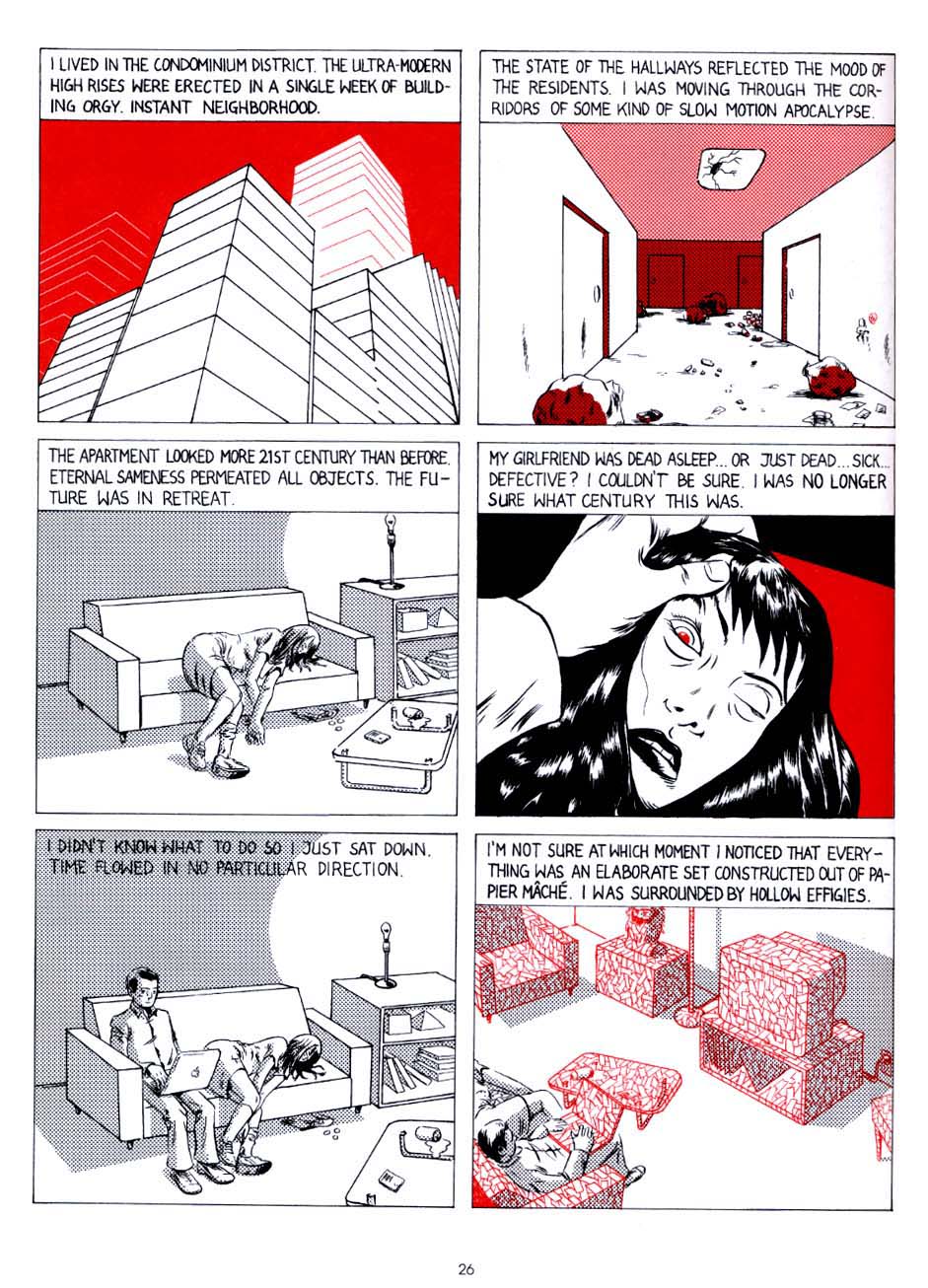
James: There are the obvious correspondences in “100,000 Miles” to Crash, but some of your others like “Million Year Boom” and “976 Sq. Ft.” remind me in particular of a few of his perhaps less-known works such as High Rise and Concrete Island. Both of those books depict protagonists who become subsumed in the constructs of a society that in supposedly advancing has actually broken down, that has taken on the quality of an intolerable new “normalcy”. Is it perhaps that, like Ballard, in transitioning between disparate societies at an early age, you have a unique perspective and are able to remove yourself and see where you are in an overview of sorts, or to see around the corners, so to speak?

Tom: I definitely think that the experience of emigration gives you a different perspective on the idea of society. When you are born into one world (Communist Poland), and then are transplanted into another (USA), and then witness the utter transformation of the first (collapse of USSR & the Eastern Bloc), the idea that society can radically be changed (for better or worse) is not that far fetched. That is one reason that the US (a country of immigrants) has been such a successful and dynamic society. The recent political/economic climate in the US feels like an attempt to freeze and define the US as a specific unchanging idea. History is catching up with us, the US is no longer a ‘young’ undefined country. Even many European countries (not to mention countries in Asia, Africa, the Middle East and South America) have political & economic structures that are more malleable, that may better cope with future challenges (I got away from Ballard here… but it seemed in the end the question was less about Ballard but about ‘society’).

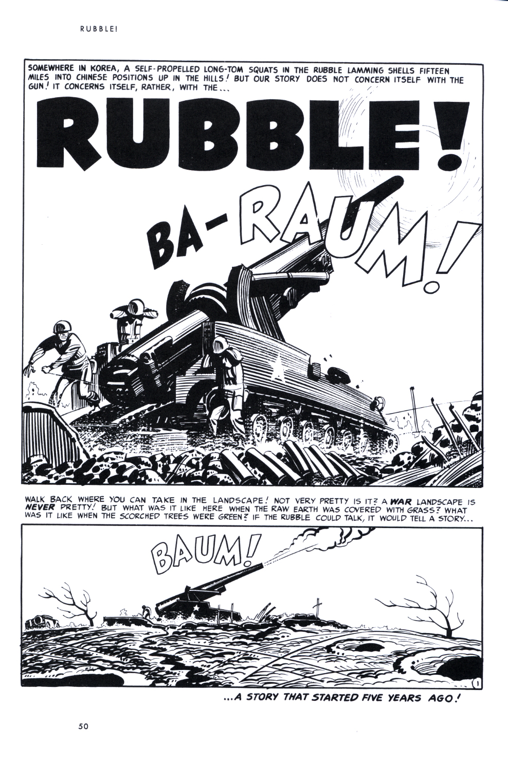
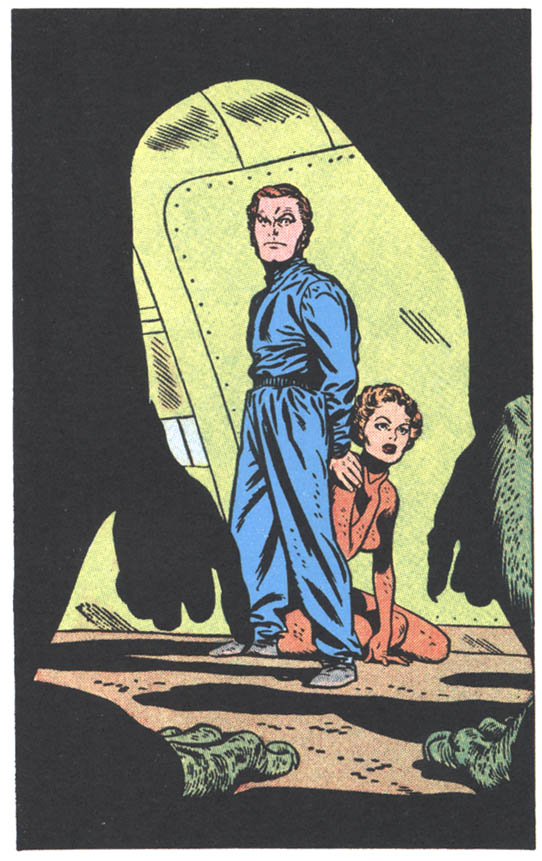
James: I just read another interview with you that Kent Worcester did, where you cited a specific Jack Kirby image from his 2001 comic, a panel of a man walking up to a building that is just a huge wall of windows—it freaked me out because that is one of my favorites of Kirby’s and it is part of a passage that I had actually thought of mentioning to you! The Earth Jack depicts is so polluted and crowded, a world where pure air can only be breathed out of bottles that one must purchase as we do water, an existence so dehumanized that the protagonist feels he must join the space program, to escape in order to realize any sort of life for himself.

Jack Kirby, from "Norton of New York, 2040 A.D.", 2001 #5, Marvel Comics, 1977

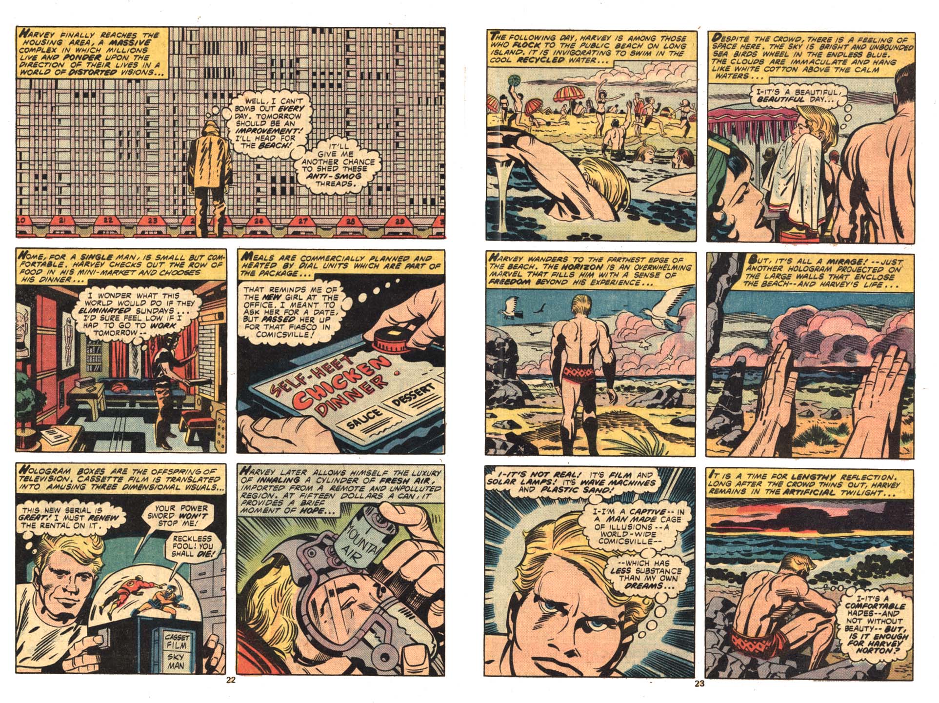
Jack Kirby, from “Norton of New York, 2040 A.D.”, 2001 #5, Marvel Comics, 1977

Your work gives me a similar feeling, as if you are dealing with expressing what it is like to live in a world that has gone beyond the point of no return, but with no escape possible, as if all we can do is construct semblances of sanity for ourselves, that work within the insane structures that we must fit into.

Tom: I love that Kirby image! I believe that was from 2001 #5? I agree with what you’re saying here. One of my favorite J.G. Ballard stories is “Billenium” about an overcrowded world where everyone basically lives on top of everyone else. The protagonists in that story find a hidden room and all that new space is an almost unimaginable luxury. They proceed to share the new space with some friends and family until it fills up and becomes indistinguishable from the rest of the world. We need to find these spaces (whether real or imagined) and inhabit them; to create germs of possible and impossible new worlds… hopefully better ones. There’s a danger in that. Things could get worse… but sometimes not doing anything at all, is worst of all. One thing I hesitate doing in my stories is to destroy the world. If “Billenium” was an Italo Calvino story, that room could be a germ of a new city; an invisible city growing in the midst of the old one… and eventually it would grow to replace it. I think we need a better imagination, one that goes beyond wishing for the apocalypse.

James: I appreciate the format of Beta Testing and the way you have manifested your work so far, because I personally have always preferred to work on short stories, at least partially because of the labor intensive nature of comics—-I like to work on things where I have the opportunity for more variety—for instance, it can get very awkward trying not to be repetitive in the angles and compositions when one is drawing the same characters and backgrounds for many pages.

From "The New"

From “The New”

The last story in Beta Testing, “The New”, is the longest and probably the most ambitious story I have seen you do so far. Do you prefer to work on short pieces or are you working your way towards longer stories?

Tom: I really like the short story (in comics and in fiction) and it’s something I’d like to keep doing in the future. There is something satisfying about a good short comics story. There are more opportunities for a tighter structure… it’s easier to get that certain density of narrative. Dan Clowes’ shorts from Eightball (post-Like A Velvet Glove Cast in Iron), the ones that ran concurrently with the serialized Ghost World, are the pinnacle of the form for me. “Blue Italian Shit”, “Caricature”, “Immortal Invisible”…they all have tight structures, a satisfying density of narrative. They’re just perfect comics. That said…

James: Can you see yourself writing and drawing an entire graphic novel eventually?

Tom: I’m often frustrated I can’t get all my ideas into a short piece… In fact I almost always wish my stories had a few more pages to develop this or that germ of an idea. So, I’d like to do longer comics at some point. My upcoming book TransTerra is probably the closest thing to a novel-length narrative, but that was still constructed episodically. I don’t mind repetition so much. I think it works well in comics… whether it’s a 4 panel gag, or 300 page GN. It’s almost necessary to set up a kind of visual/narrative rhythm. It was nice to be able to stretch a bit in “The New” and not have every page be crammed with information. After doing a bunch of short pieces in a row, I’ve been yearning for a bit more space…like the character in that story “Billenium”!

James: I’ve never seen an index that alphabetically listed every sound effect in a comic before. And Ballard’s entry leads to a highway sign in a panel for “Ballard Golf Heaven”, and I liked how the table of contents is figured on a greater timeline, but isn’t much help in locating the stories. Such details play with the new climate in comics where we should try to accommodate future scholarship, by ensuring that page numbers are included, etc.—-you certainly left a lot of room for examining this thing through different “lenses”….we’ve come a long way!

Tom: Ha! Well, it’s something I’ve always wanted to do with comics. Indices, notes, and glossaries are some of my favorite things in books and I didn’t want my book to be left out! This all comes out of lots of conversations I’ve had with cartoonists and writers over the last few years. In the end I wanted the index to be another story in the book. One that comments and explicates the other stories. Some entries are in there for fun. Like the sound effects, or cars. Others alert the reader to concepts or phrases that have been quoted, mutated or just plain stolen. One thing that is often left out of comics criticism are the images. They are often examined in terms of plot or composition, but rarely do writers get into the complex visual references that often show up in comics. One of my favorites pieces of writing on comics is a Ken Parille piece on Clowes’ David Boring that excavated the connections to Hitchcock’s Vertigo among many other things. I hope in some future edition, the book can be published with an index. Other cartoonists have played with this kind of material. Kevin Huizenga comes to mind with fake indices & glossaries. In fact I was just working with Kevin (& Dan Zettwoch) on the index to their next book, Amazing Facts & Beyond. It’s amazing and goes way beyond my index! In fact they called it the beyondex! Maybe we can start a trend! Index wars!

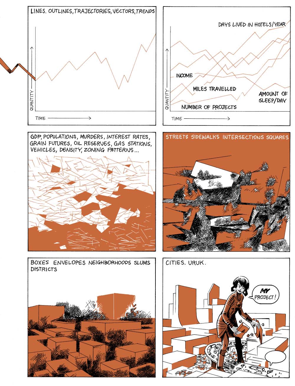
The idea for the table of contents come about organically. A lot of my stories were titled after some kind of measure… “100,000 Miles”, “976 sq. ft.”, “10,000 Years”, etc. when time came I wanted to create a unifying design & organizing principle. Also, I saw all these stories taking place in the same world… in my mind for example, “The Cozy Apocalypse” is a prequel to “976 sq. ft.” In his famous book, SMLXL, architect Rem Koolhaas begins the book with a multipage series of charts that detailed his life: time spent flying, swimming, eating, etc. over a period of a few years. In some ways my chart is much more immodest, spanning from the big bang into the far future and covering vast distances.

James: You wrote and laid out a story that Dash Shaw finished in MOME #17. You also collaborated to some degree with me on Post York—we came up with the cover together; and then at one point you suggested that I delete a few panels on the page with the initial ending and leave white space. I wasn’t sure, but I thought on it for a while—and then I decided to take that idea a lot further. I ended up jettisoning multiple panels on nearly every page that didn’t seem needed and those omissions greatly expedited the storytelling and improved the design of the book. It was great for me to be able to break away from the way that DC, for instance, works, where every inch of what they call the “real estate” of the page must be filled. How do you feel about collaborating with other artists, and do you think you might do more in the future?

Tom: I would love to collaborate more! Too many cartoonists are antisocial! I understand the need to sit alone in a room in absolute focus and work on something. But we’re social creatures and being able to collaborate with someone who’s on the same wavelength is very satisfying. It was really eye-opening to see Dash execute one of my stories. His approach is just so different from mine. I’d love to draw someone else’s story.

James: Your first few full hardcover books have gotten a very encouraging response; Gabrielle’s book was picked as a book of the year by Publisher’s Weekly and both her The Voyeurs and Jon Lewis’ True Swamp were reviewed favorably in PW and elsewhere. Is this resulting in an influx of people wanting to work with you?

Tom: I’m grateful I was able to work with amazing cartoonists almost out of the gate. I’ve admired Gabrielle’s & Jon’s work for a long time (and your work too!) and being able to publish them is an honor. I’ve definitely had an influx of submissions and I have a hard time staying on top of them. At the same time, Uncivilized Books is still a very tiny company and I can’t publish everyone. That also means I have to be very picky and reject projects that I really like. I’m still trying to find my specific publishing groove. I just finished figuring out my third season of books and I think I am maybe getting closer.

James: I know that besides doing your comics, you teach. Do you find that the publishing takes even more time away from your already full schedule, or how do you deal with that issue? I mean, I asked this of Sammy Harkham as well; one can get quite involved in promoting other people’s careers and have to fight to find time to do one’s own work. Particularly when one is young, one is developing in leaps and bounds and so one needs to direct one’s energies carefully.

Tom: This year I had to put teaching on the back burner. I still mentor some students and attend critiques and seminars, but I’m not teaching a full class this year. There just isn’t enough time. My own comics tend to be more esoteric and have made me very little money… So, I’ve always had to have some other job to support my cartooning. I’ve never had the luxury of just focusing on my comics, and I’ve always had to claw back time from other endeavors to create my comics. I pretty much assume I have to do something else… if my comics ever make enough money, I may have to re-evaluate my use of time, but for now I try do projects that are interesting. Uncivilized Books has been very rewarding. I’ve learned so much already and I know there’s a ton of learning left in the future.

Some of the output of Kaczynski's publishing imprint, Uncivilized Books.

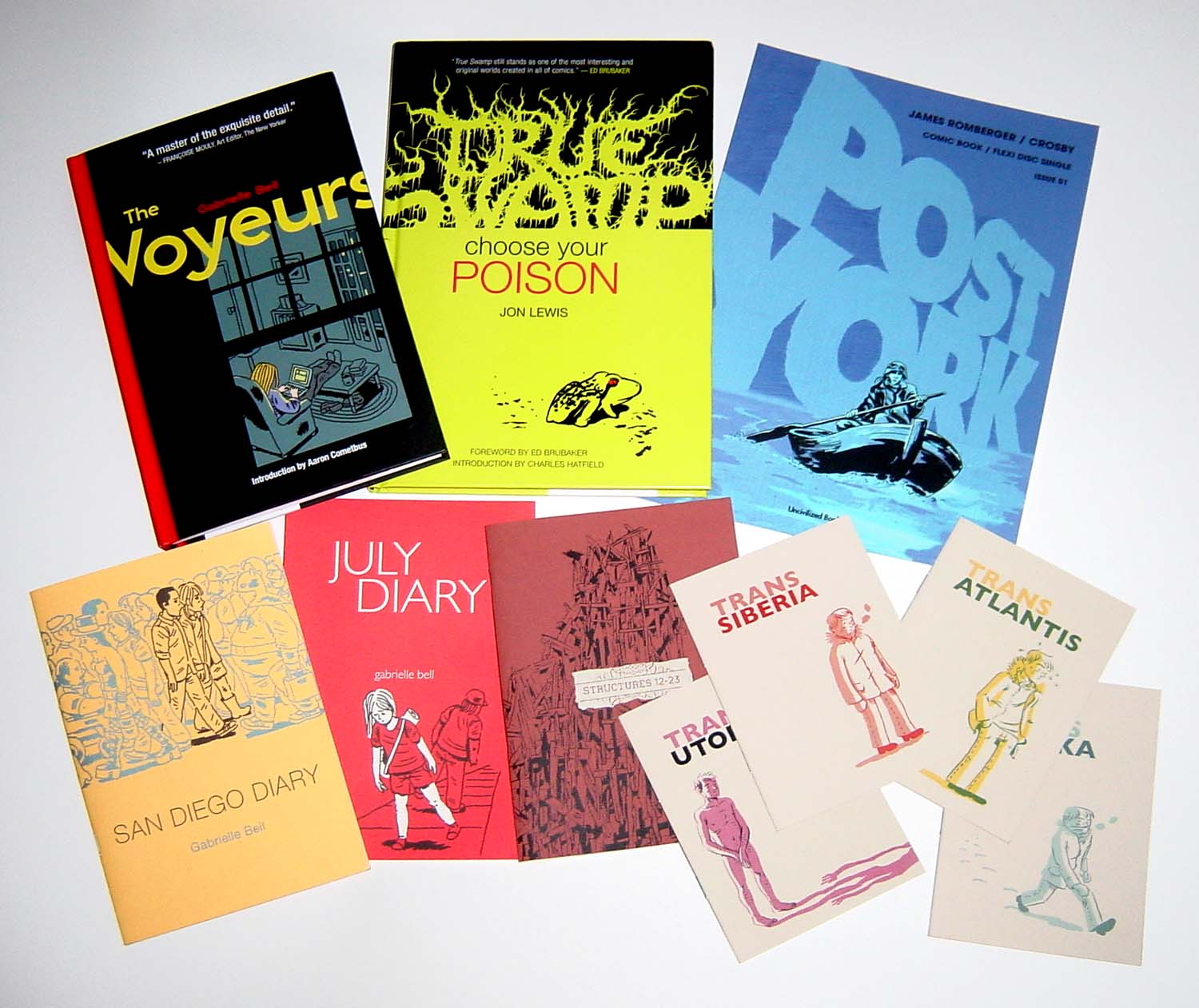
Some of Kaczynski’s publishing output via his imprint Uncivilized Books.

James: Can you give a rundown of the upcoming projects for Uncivilized Books?

Tom: This is the next season of books:
Incidents in the Night by David B. and translated by Brian and Sarah Evenson.
Amazing Facts and Beyond by Kevin Huizenga and Dan Zettwoch
Sammy The Mouse Book 2 by Zak Sally
Over the Wall by Peter Wartman

James: Will you continue to produce minicomics and “floppy comics” such as the one I did for you?

Tom: I want to! I really see mini-comics as my research & development department. I can work with artists on a smaller scale trying out formats and media like flexi-discs [Post York includes a flexi-disc by my son Crosby–JR] that may be more difficult to do in larger quantities. I wish there was a better distribution network for these formats. I think they are vital formats that I hope will live on.

James: How do you see comics developing in the future? I am encouraged to see people like Joe Sacco using comics for journalistic purposes, or you using them to what I would call philosophical ends.

Tom: I certainly hope comics will embrace a variety of genres and formats. I listened to an interview with Gary Groth (disclosure: he’s our publisher) recently (on BoingBoing) and he said that the boom of comics in the wider book market was a strange thing. He said that most people read comics, not because they are ‘comics’ but only because they deal with some subject matter they’re interested in (like Maus by Spiegelman, or Palestine by Sacco, etc.). They’re not interested in comics ‘as comics.’ I think he’s right, but that’s not necessarily a bad thing. We need those people! We need the reader who is interested in a subject, and chooses to read about it in comics form. They may not be interested in them ‘as comics’ but some of them will grow into that ideal reader… especially if there are many good comics on lots of different subjects. I think the same could be said for books, movies and other media. Most people want something very specific from movies: a blockbuster spectacle, something funny, gory, or emotionally engaging. But only a minority is interested in film ‘as film.’ There’s just a lot more of them because there are more movie goers overall. Books…literature in general is an ancient art form that has gone through many of its own crises and mutations over millennia. Comics as such have been around for only a fraction of that time. Comics emerged from an ephemeral medium. All those floppy comics were not supposed to be kept and written about. Comics in service of something other than commercial entertainment have been around for even less time! It’s going to take sometime to develop and find an audience that appreciates them for what they are. We’ve made great strides over the last decade and a half. We need to be patient and keep producing better and better work. I’m pretty hopeful.

_________________________________________________________

Freedom

I recently deserted the mainstream of comics and this month, the first product of my emancipation, an improvised comic with a flexidisc attached called Post York done in collaboration with my son Crosby is being released by artist Tom Kaczynski’s alternative imprint, Uncivilized Books. Although there may be little financial compensation forthcoming, I couldn’t be happier. Because I am free now, free of digital fonts and color, free of the dictates of corporate editors, marketers and number-crunchers, all fearful of offending middling demographics. Some of my contemporaries have likewise abandoned corporate comics; perhaps because of the increased visibility of inequities like the Kirby family’s loss in court to Marvel/Disney’s crush of lawyers (largely due to testimony by an invested individual with a famously faulty memory), as well as anti-creative projects like DC’s Before Watchmen.

While the mainstream seems locked into a suicidal transition into collector-unfriendly digital formats;  the print alternatives are taking advantage of the fact that comics and graphic novels are a fast-growing portion of the dwindling book market. As the mainstream devalues individual accomplishment in favor of collective product that is actually primarily intended for adaptation to other entertainment forms, the alternative gains ground in sales and critical attention. In fact, by their near-universal acceptance, the leading luminaries of the alternative like Art Spiegelman and Chris Ware now risk becoming a new establishment, which will eventually need to be overthrown in order for the next alternative to be formed.
___________________________________________________

But that revolution is still a ways off. And, some alternatives have not yet completely divorced from the look of the mainstream. In 1999 I drew one of writer Greg Rucka’s earliest comics scripts, “Guts” for Vertigo’s late horror title Flinch. Rucka writes stories that might as easily be realized in the mediums of film or television, but he became an acclaimed comics writer for DC and Marvel. However, he has in recent times taken a stand against their abuses and his newest work Stumptown is published by a small alt-comics firm Oni Press. While it has a digital surface similar to that of the mainstream, it is bereft of the focus-group mentality of the corporate comics product purveyors. The story has a downscale title, it features a female lead character of funky agency and wry humor and Rucka’s collaborator, the artist Matthew Southworth is not slick, but still gives the work the seemingly effortless video realism that it needs to be believable, and more: Southworth is capable of hard-to-accomplish nuance. For instance, he manages to make it quite clear that the lead character’s brother has Down’s Syndrome without resorting to caricature.

Matthew Southworth’s video realism

Southworth’s layouts are exceedingly clear and his inking is contemporaneous but organic, and although I have an aversion to digital color, here it works and is particularly effective in the nocturnal concluding sequence. As with many recent book trade repackagings of periodical comics, the $29.99 hardcover of the first four issues can seem an overly upscale presentation of what is essentially pulp crime fiction, but the book gives the reader a complete story that is as absorbing as an HBO miniseries and also has the appeal of pure comics storytelling.
___________________________________________________

Koyama Press puts out elegantly designed books that are more distantly removed from the look of mainstream comics. Koyama’s recent output shows quite an extreme range of publications, their only unifying factor their beautiful production values. I have been taken aback by the prices of alternative comics, but as Marguerite Van Cook points out, Koyama’s efforts and those of other alt/lit comic books reflect a sensibility that opposes the mainstream model. Mainstream pricing is not cheap either and is supported by advertising. Their books are apparently geared primarily as concept generators, to which end they privilege character/property and devalue artists. The comics can be published at a loss because they are underwritten by the corporation as pools for movie ideas. By contrast, a Koyama comic, for instance, is an individual accomplishment that is facilitated by the publisher;  the final product is all about the value of the artist, all about being the most clear expression of the person who made the book.

Eat More Bikes by Nathan Bulmer is a collection of one or two-page jokes, literally a “funny-book”. The book is nicely printed and although digitally toned,  the art is scratchy and clearly drawn by hand—it reminds me a little of early Peter Bagge.  I found the pages to be sometimes mystifying, at times disturbing, some were hilarious even, but I’m thinking that I may not be the ideal audience for this thing.

Nathan Bulmer: the tribe clown

The photograph of the author on the back page depicts him with the beard that he grew while drawing the book, thus he takes ownership of his product and self-identifies as a member of a tribe, a generation perhaps, of shared sensibility—-who more than I may greatly appreciate his humor and want to support his efforts by paying 10 dollars for the comic he made.

I can relate better to another, identically priced Koyama offering, Sunday in the Park With Boys by Jane Mai. The striking cover depicts a black and white figure of a young girl decked out as Sailor Moon with a monstrous bug crawling over her head, on a blue ground. This image and the quiet desperation of the contents counter the sweetness of the title. The protagonist is a teenaged girl, however she is not well socialized with her peers but rather a terribly isolated individual who often wears an eyepatch (whether by necessity or for affect is unclear) and works a job in a rarely used wing of a library. The pain of her loneliness, however self imposed, is palpable.

Jane Mai: the ache of isolation

The panels are stark and simple but heavily inked with a drybrush technique and each short sequence in the story begins with a more realistically rendered drawing of an object: a key, a cellphone, a quill, a hand mirror, a pair of panties; these and the bug motif that creeps through the comic anchor the narrative to the “real world”. The first time I read the comic, I found it depressing; on rereading I began to see how the character comes to grips with what is going on in her mind to transcend it and that the story expresses a sort of universality of lonesome youth.

Two other Koyama books, entitled Wax Cross and Baba Yaga and the Wolf, are the work of a collaborative duo, Pat Shewchuk and Marek Colek, that call themselves Tin Can Forest. These full color magazines are astounding efforts and disorienting reads.  They are “comics” only in a broad and strangely fluid sense, because the panels run together, due to faint or nonexistent boundaries between them and across the spread of the pages. The panels themselves are done in techniques that I am unable to identify; they look to be full paintings, perhaps partially done with stencils.

Tin Can Forest: finely wrought

Beautiful and confusing, the levels of thought, skill and effort involved in these publications justifies their cost of $20.00 each and they surely push towards the realm of finely printed art.

___________________________________________________

Fantagraphics Press is the standard-bearer and highest exemplar of alternative comics in America. Not only did they bring the greatest of the current generations of literary cartoonists to prominence in the first place, plus they continue to fearlessly publish groundbreaking new talents as they emerge,  but they also have made it their business to ensure that the greatest works in the history of the medium are put back in print in handsome, durable volumes. In fact, to continue the tone of blatant self-promotion that I started this piece with, in a few months they will release a new edition of 7 Miles a Second, another work of mine (with Marguerite and the late David Wojnarowicz)  first seen at DC/Vertigo.  But I digress. A project that Fantagraphics have undertaken recently is a set of hardcover books reprinting the stories of select E.C. Comics artists, in black and white. I imagine the series will be quite satisfying for anyone who wants to see the linework of various artists represented such as Jack Davis, Wallace Wood and Al Williamson unadorned by Marie Severin’s very well done but sometimes obscuring colors. I have the Harvey Kurtzman volume, Corpse on the Imjin and as usual the design and printing of the book are beyond reproach. Now, here’s a little criticism about the Kurtzman book.  Perhaps I should have read the copy on the solicitation more carefully, because when the book came it was close to comic book size…I had expected something a bit oversized, to be better able to appreciate the drawings.

Kurtzman solo forms a standard unto itself

And while I greatly admire the beautifully constructed and moving solo stories by Kurtzman from his two war titles Two-Fisted Tales and Frontline Combat that are included and anyone who knows me, knows I absolutely LOVE the sophisticated stories he did with Alex Toth, and that I admire as well the stories finished by other artists that Kurtzman wrote and laid out that are included, I had somehow assumed this book would first and foremost be a collection of solo stories! He did other stories on his own at that company that are NOT included: the first thing he did for E.C., the V.D. story “Lucky Fights it Through” that can only be found in an old issue of John Benson’s fanzine Squa Tront(#7); and he did solo tales for other titles in E.C.s horror and science fiction lines, some that have seriously detailed artwork, all show his singular and distinctive style. In my opinion, including them would have made for a more comprehensive and essential collection of Kurtzman’s E.C. comics work than including works finished by others. But all that being as it may, still at $28.99 the book is a goodly chunk of high-quality material.

The publishers are at their best, though, when they display the courage needed to print books like Josh Simmons’ horrific The Furry Trap. I realize I am a little belated in reviewing this, but for some unknown reason, I only just got to it—and then, I was stricken by its contents! Let’s not even go near how they got away with printing the story about a certain caped crusader; suffice to say that as degraded as it is, it is the most accurate depiction I have seen of what I know in my heart of hearts the nature of America’s favorite fascist vigilante hero to be in essence. But to get there, first one has to endure Simmons’ initial foray: an elf, wizard and dragon story of such onerous and persistent perversity that it is nearly enough to inspire one to burn the book with the remainder unread. It is as if  the penis-hacking doctors smashing their patient’s faces with huge mallets in Chester Brown’s Ed the Happy Clown were taken as the starting point to a brave new world of semi-humorous but unfettered graphic ultraviolence.

Josh Simmons’ “In a Land of Magic”: you don’t want to go there

My personal favorite of the stories is “Jesus Christ,” reprinted from where I somehow missed its original appearance in MOME. Loving as I do extravagant crypto-religious statements, this apocalyptic vision certainly suits my preferred image of the fate that awaits the throngs of pious middle American fake-Christians when and if the Lord returns. It is funny that the Publisher’s Weekly review of the book dismissed this story as “flimsier than (the) others”, when to me this is the most obvious masterpiece of the book, a short but densely drawn epic of utterly fearsome aspect and attenuated gesture that the artist apparently labored on over the course of two years!

Josh Simmons: Jesus fucking Christ

There is plenty more; the $24.99 book is packed cover to cover with shudders that cannot be anticipated, that grow worse as they progressively become less clearly defined. The last narrative is the most frightening because it is a straightforwardly articulated bit of cinematography on paper that, as with the most effective of suspenseful creations, gains in impact from what is never shown, the reader’s mind having already been prepared by the foregoing tales to expect the worst. And so this is where the freedom of the alternative leads, not just to horror but to push further, into the unknown, good and bad and never-before-seen.

________________________________________________________________________

Genius, Clarified


CLICK ON IMAGES TO ENLARGE

Greg Sadowski and Fantagraphics’ Setting the Standard is perhaps the best book on Alex Toth that has been published thus far, because it represents the complete body of Toth’s 1950s work for Standard Comics, reproduced as closely as possible to its original printed color form (1). Toth did his art with the intent that it be colored and so, even though the colorists at the time ignored the artist’s color notations and most often made uninspired color choices, still the art can only be considered complete in the form for which it was intended. For this volume, editor/designer Greg Sadowski meticulously cleaned up the pages of the original comic books.

Sadowski takes a straightforward, comprehensive approach and so Setting the Standard can rest comfortably on the bookshelf next to Fantagraphics’ other excellent recent collections of essential comics such as Hal Foster’s Prince Valiant, Roy Crane’s Captain Easy and Buz Sawyer and Carl Barks’ Disney epics. The Valiant and Easy volumes set a high bar for the reproduction of classic, beautifully colored Sunday strip pages, but comic books present a different set of difficulties, due to cheap, misaligned printing and often perfunctory coloring.

Recoloring might help, but as can be seen by various reprints where older works have been slathered with airbrushy digital effects, restraint is to be desired. Some options are the semi-faithful recoloring that Barks recieves in the handsome, just released Lost in the Andes, or the recoloring that Sadowski has been having Marie Severin do for his Bernard Krigstein books, though these approaches are dependent on access to clean copies of the black and white art. For Setting the Standard, Sadowski went back to the source to provide another practical model for the reproduction of old school four-color comics.

I have Best Romance #5 which contains Toth’s first job for Standard, “My Stolen Kisses”, which is also the first story in the Fantagraphics book.  This particular comic is dog-eared and scotch-taped but the color is actually not badly registered, however,  comparisons of panels from it and from the collection still show the effort that Sadowski put in:

Left: panels from the original comic. Right: Sadowski's cleanups

Sadowski painstakingly corrected the images where the color in the original comics was off-register, minimized the bleed-through of “ghost” images from the printing on the reverse sides of the pages (in some cases he replaced mottled single color backgrounds with clean areas of color) and restored the areas around the images and behind most of the lettering from the color of decomposing newsprint to white—daunting efforts when one considers that he did some 400 pages worth.

The stories themselves are not stellar, but that was “standard” for the time. This type of presentation is effective for the work of non-writing art stylists of 4-color comic books such as Toth, who all worked with scripts that were rarely intended to be more than cheap pulp entertainment; the onus was largely on the artists to make the material resonate. Here we are treated to many tales that are dignified only by Toth’s determination to wring feeling from them.

Even the best stories here are redolent of the banal false consciousness of 1950s America. They are mostly forgettable junk—humans prevail over the world domination plans of implausibly gullible aliens, foolish criminals get their just desserts, a woman is charmed when her suitor names a cow after her:

Or, they can be offensive junk: vengeful soldiers bury dehumanized “gooks” alive with a bulldozer, a woman struggles to prove to her husband that she can do better housework in order to preserve her marriage.

Toth’s oft-cited praise for the Standard scripts of Kim Aamodt falls flat when one actually reads them. A story described as one of Aamodt’s best portrays a woman torn between an older and a younger man. The dilemma is resolved when the older man bows out because “you kids…belong together.” Okay, it’s efficiently written and it is a great art job:

Page with my favorite Toth montage, from Man of My Heart

But, as in the other stories here, women are not allowed to make their own decisions. More so than Toth’s other assignments, the romance comics do give the artist a chance to draw a range of emotions and choreograph more intimate stagings, but they are also intended to program young girls to be subservient. In most cases, it is only that Toth drew these stories that elevates them from a justified place in the dustbin of comics history.

There are a few interesting stories though and thanks to Toth, many passages of thoughtful comics storytelling. The romance work is often brilliantly articulated and visualized with glamorous drawings that rival those of the illustrators famous for depictions of beautiful women who inspired Toth’s interpretations, Al Parker and Jon Whitcomb.

Toth’s handling of horror and suspense is intuitive, sometimes harrowing and exhibits his more radical inventions. “Grip On Life” is one story that sticks with me; it is a brutal rendering of an abusive husband who brings his wife back from the dead to serve him. Here and also in the shadowy peripheries of “The Shoremouth Horror” and “Galloping Chad Burgess”, Toth’s compositions are partially obscured and his extremes of emotion barely glimpsed.

A simultaneously realistic and abstract splash leads to atypically explicit abuse

IDW’s Toth biography proves its value as a companion to collections like this. In examining Genius, Isolated‘s appended timeline of published work for this period, one begins to see the progression of Toth’s efforts to address the critique of DC production ace Sol Harrison: “You don’t know what to leave out.” One sees the artist vacillating over years as he goes back and forth from clutter to simplicity and back and forth again.  1952 sees him end his first tenure at DC Comics with some beautifully realized collaborations with inker Sy Barry including the affecting “Queen of the Snows”, to move on to these works for Standard and his concurrent collaborations with Harvey Kurtzman at EC.

The three EC stories are spread over the same three years Toth was at Standard and form a learning curve of themselves. Kurtzman’s practice was much more sophisticated than anyone else Toth ever worked with and it seems that he absorbed a lot of storytelling information from acting in the subservient role that Kurtzman’s autonomy demanded of his artists. In the first, “Dying City” from 1951, Kurtzman inked Toth’s pencils and Toth appreciated that the inking “simplified my drawings and dropped in some blacks that I hadn’t even figured on. He made it simple, and powerful.”

Thunderjet, 1952: together, Kurtzman and Toth achieve a high level of realism.

Kurtzman knew his stuff and Toth took the lesson on board, to the point that he alienated Kurtzman on their third co-effort two years later by dropping in some blacks that his writer/designer/editor hadn’t figured on in “F-86 Sabre Jet”, 1953. To further the narrative intent, Toth’s silhouettes accentuate the disorientation experienced by the pilot protagonist (2).

At Standard, with a sympathetic art director/ inker in the person of Mike Peppe and with publishers who seemed to appreciate the value of Toth’s efforts, in the space of a few years profound changes take place in the artist. In particular, he has an epiphany of idiosyncratic simplicity in 1952 with his interpretation of the unfortunately now-anonymously written “The Crushed Gardenia”, which allows him to transcend his influences and find his own most pure style.

The Crushed Gardenia

The storytelling and drawing in this story is minimalist and oblique, with extremely cropped images in panels that are clearly designed with the interrelationships of the whole page compositions in mind. It furthers a tendency for distortion seen earlier, for example in the misproportioned splash of “Triumph Over Terror”:

Um, that's weird

The characters in “The Crushed Gardenia” have squarish heads with the features crushed into the center, which remind me of Milton Caniff’s year or so on Terry and the Pirates where everyone takes on what I’ll call a Flip Corkin aspect: compressed figures with boxy heads.

Caniff's Flip Corkin

The art in “The Crushed Gardenia” is so freshly reductive that it looks as if it might have been drawn yesterday, but a few months later Toth is drawing the densely composed “Geronimo Joe” which reflects the influence of Albert Dorne, later still the elaborately detailed “Lonesome for Kisses” which begins to resemble Neal Adams(!). There are plenty of experiments throughout the Standard stories, but the attenuated drawing of “The Crushed Gardenia”, that represents Toth at his most innovative, will hardly rear its head again until the 1960s.

Toth’s Standard period ends when he is conscripted into the Army, where he formulates his more elegant mature style in his solo Jon Fury strips for his post’s newsletter. After his discharge, he works on book-length stories for Dell and is forced to simplify further, at times drawing with a breezy, nearly generic realism, sans experimentation, then in the early 1960s he begins working for DC again and the drawings become more muscular, the panels become overstuffed with detail. This clutter may have been dictated by Toth’s DC editors, but Sol Harrison must have been scratching his head. Soon though, as the decade progresses through to the cusp of the seventies, Toth will hone it down.

Back at Standard, Mike Peppe is one of Toth’s better inkers and he does a credible job on such concisely pencilled stories as “The Eggbeaters”, “Geronimo Joe”, “Free My Heart” and “The House That Jackdaw Built”. Still, the greatest stylistic cohesion is seen in the instances where Toth inks and letters his own pages such as in “The Crushed Gardenia”, “I Fooled My Heart” and “Too Many Cooks”. But it was Toth’s romance work that was most influential to his contemporaries; John Romita and Ross Andru are noted here, but also for example one can see echoes of Toth’s “I Want Him Back” from Intimate Love #22, 1953 in Frank Frazetta’s Standard romance tale “Empty Heart” from Personal Love #28, 1954:

Toth and Frazetta did some hella good kissing scenes

I’m not claiming this is a swipe, but the first time I saw the Frazetta panel years ago, I immediately thought he’d been looking at Toth. I am inclined to think that Toth exhibits some influence himself, from Bernard Krigstein, in the linear qualities of “The Mask of Graffenwehr” and “Images of Sand”. Then, there is the odd 4-panel split image in “The Phantom Ship”:

The singular tier

This compound panel is a single image broken to imply the passage of time between the individual component panels; the sound effect superimposed on the whole thusly becomes more protracted and the frenzied scene takes on the qualities of an epic battle. It’s a very unusual effect that resembles Krigstein and probes into areas later explored by Steranko. Toth did a romance story with Peppe, “I Do…” in 1955 for Atlas that also has some layouts that remind me of Krigstein.

I had believed that a clue to Mike Peppe’s inking was that it was he who would ink noses with a line along the edge of the nostril that defines a plane between the side of the nose and the underside of the nostril. It is present in the stories attributed to Peppe and it looks wrong to me….it wasn’t something that Toth would do, I thought.

Inked by Peppe, with too-sharp nostrils

Yet in “I Want Him Back”, which Toth signed alone and so is thought to have inked, there’s lines on the nostrils! And maybe I’m crazy, but the main figure in the opening panel of that story looks to me like someone else drew it. Perhaps Toth didn’t ink everything in some of the stories he is credited with?  Or, maybe there were editorial changes to his work?

Toth inked five full stories and a few odd pages here. Apart from the two episodes of Joe Yank, which are inked by his best DC inker Sy Barry (with the main characters’ faces reworked by Art Saaf), the rest are credited or attributed to Mike Peppe and John Celardo.  The hands of Mike Sekowsky and Mike Esposito are noted as present in some of the many stories attributed to Peppe; the book also mentions Ross Andru as a possible inking assist, plus I believe I see Carmine Infantino in a few places as well. I noticed this previously in Greg Theakston’s two-volume black and white Standard collections Toth: Edge of Genius, but I was unable to get Infantino to confirm or deny this when I asked him at a con a few years ago. Some of these questions may be addressed now that this work is readily available to be absorbed by the public and comics scholars.

In Setting the Standard, the choice of supporting material is excellent. The fairly comprehensive interview with Toth from Graphic Story Magazine (and later, The Comics Journal #98) is reprinted with a new selection of reproductions, including appropriate pages by artists who influenced Toth such as Irwin Hasen:

Left: the Hasen repro. Right: my scan of Toth's much later, very Golden Ageish and Hasenesque version of the character

The stories are also annotated in the back with a selection of relevant or at least semi-relevant quotes from Toth’s letters (3).

In the end, interpretive cartoonists such as Toth must be judged by the quality of their realizations of the scripts they were given, good or bad. Isolated or excerpted pages don’t give any idea of the work; only whole stories can provide the intended reading experience. In Sadowski’s book, Toth’s work speaks for itself and the artist likewise. The book’s assemblage and design are very well done to make a package which is pulpy but tasteful, not cheap nor overly slick, not high/low cute or old-boy sentimental. It provides a complete and important body of work by a great cartoonist.

___________________________________________________

Footnotes

1. My other favorite Toth book is Manuel Auad’s One for the Road, which collects all of the black and white comics Toth did for Pete Millar’s 1960s hot rod magazines, which I like for similar reasons: it collects an entire body of often-outstanding comics from obscure periodicals, that would be exceedingly difficult and expensive to track down, which can now be read/appreciated in their entirety. Similar collections of Toth’s Warren and DC Comics work should now be published.

2. I only found one mistake, one that has been replicating in Toth books for a while: Frontline Combat # 12 is actually dated May/June 1953, rather than November 1952 as it is listed in Jim Vandeboncoeur’s Toth index; when corrected, “F-89 Sabre Jet” comes after “The Crushed Gardenia” in the timeline. Their proper placement clarifies Toth’s progression; that is, apart from the possibility that either story was held for a time in inventory by their editors.

3. In Setting the Standard there are references to Toth’s annoyance with the efforts of Standard’s chief letterer Herb Fields. In researching this article, I came upon a letter in John Hitchcock’s compendium of his Toth postcards, Dear John, which amusingly depicts and describes a visit the artist had with Fields: