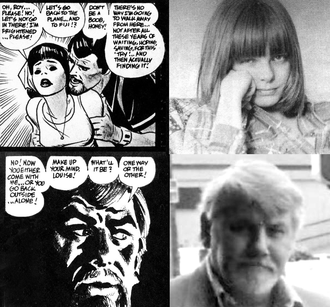
Singer and composer Diamanda Galas goes off in the comments section to James Romberger’s post about David Wojnarowicz.
Really go read it. It’s awesome.

Singer and composer Diamanda Galas goes off in the comments section to James Romberger’s post about David Wojnarowicz.
Really go read it. It’s awesome.
by James Romberger
Since I am precisely the type of brutally obsessive yet overly sensitive observer that qualifies me to write for The Hooded Utilitarian, I am unable to ignore a few references I have seen online to my “fannish adoration” of the work of genius cartoonist Alex Toth. Answering them also gives me the opportunity to address some critical shortfalls that I have seen in the literature about Toth.
I do feel that Toth’s work is head and shoulders above that of most artists who have worked in the medium thus far. I and many other artists find Toth to be a great teacher. It is instructive to figure out how and why his odd approach works so well. Artists may not see his art in the same way as someone who is not an artist, but there are also many, many non-artists who appreciate the depth of Toth’s skills—and some who do not.
A critique that is often leveled at Toth should be dispensed with. Unfortunately, in order to appreciate his work, one must overlook the quality of the writing in most of the stories he drew. That can be said for every four-color comic book artist that worked with writers. But some seem to blame the artist for this. Even though Toth had higher artistic standards than his contemporaries, he was not any more responsible than they were for the texts they worked with. If not for bad scripts, there would be no Toth comic book art and in fact, there would be no comics at all.
by James Romberger
“Ants are the only insects to keep pets, use tools, make war and capture slaves.” — David Wojnarowicz
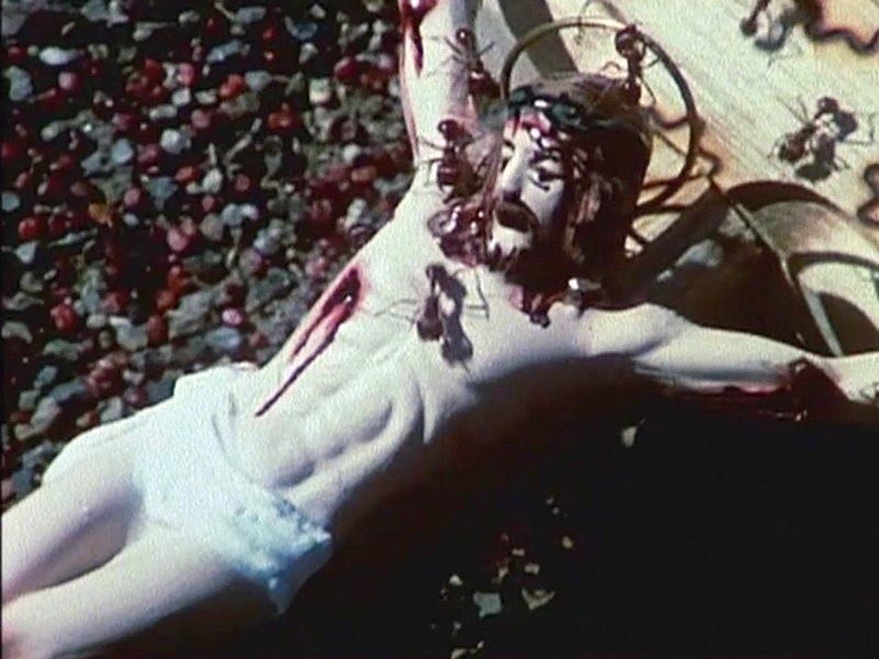
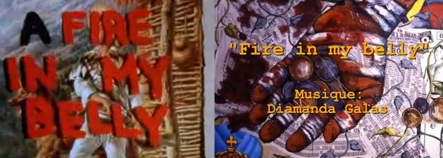
A Fire in My Belly, a film with a depiction of fire ants swarming over a crucifix, was removed from the Hide/Seek exhibition at the National Portrait Gallery of the Smithsonian through the intercession of the president of the Catholic League, William Donahue and the Ohio Republican and House Minority Leader John Boehner, who had not seen the film in question. In the center of the current controversy over this act of censorship is the late artist David Wojnarowicz, who did attack the Catholic Church and other politically active religious institutions repeatedly—and for good reasons.
David’s oeuvre was never only about his reactions to organized religion, nor was it ever only about the AIDS crisis. Certainly the disease that would kill him in 1992 gave his work a powerful impetus, but David always took a greater global view. He examined the way that the natural world works and how our relationships with each other and the planet fit within the continually shifting narrative of history. He also expressed a complex interiority as he engaged with different media to make his sometimes lyrical, sometimes enraged or explicit, but always thoughtful and heartfelt art.
David took on heroic proportions because of his outspoken response to the AIDS epidemic. He watched his friends falling around him. After his own diagnosis in 1988, he made a concerted effort to understand the disease and to combat the people and institutions that he was able to identify as enablers of the virus through their homophobia and suppression of information. David protested the New York archdiocese with Act-Up at St. Patrick’s Cathedral, for the Church’s closure of health care clinics in the middle of an epidemic and for their condemnation of condoms, safe sex, birth control and reproductive rights. When in 1989 David described Cardinal O’Conner as a “fat cannibal from that house of walking swastikas up on fifth avenue” in his essay for the catalog of Witnesses: Against Our Vanishing, a exhibition funded by the NEA, he faced censorship and a subsequent national reaction not unlike the current turmoil.
But even earlier, in 1986 and 1987 as he watched his mentor, the photographer Peter Hujar, waste away and die, David believed the Roman Catholic Church had abandoned everyone he loved. He knew that some gay men find closeted refuge in priesthood, while their Church publicly preaches against homosexuality. David wrote in a biographical outline that he “remembered beatings and having to kneel on bags of marbles” in Catholic school at the age of eight. The imagery of Catholicism suffused his work from the beginning. David’s friend and my partner, the interdisciplinary artist Marguerite Van Cook says he had “a crisis of faith,” certainly his beliefs were sorely tested. He knew even then of the widespread pedophiliac component of the Church, and mentioned to us that he knew the infamous Father Bruce Ritter of Covenant House. In 1990, Wojnarowicz became national news once more after his work was used by the Reverend Donald Wildmon’s American Family Association to lobby against NEA funding for the arts. After successfully suing the Christian fundamentalists for defamation, David posed questions about the separation of church and state:
“Do some politicians have a direct communication with God?…Should one person’s interpretation of God determine whether another person lives or dies?…How many members of minorities are afraid to speak if they think they are the only ones who feel the way they do?…Does the denial of information that causes people to become ill and die a permissible thing?…Would it be a crime if that denial of information only killed people you didn’t feel comfortable with?”
A Fire in My Belly has been defended as being about AIDS and not about his anger towards the Church, but David’s later motivations should not be retrospectively applied to a film that he made earlier. The Smithsonian has posted a “Q&A” on their website which claims, “This imagery was part of a surrealistic video collage filmed in Mexico expressing the suffering, marginalization and physical decay of those who were afflicted with AIDS.” However, what is being shown on Youtube and elsewhere online is not the original film, its intent has been changed because elements have been added that are misplaced in time. The versions in circulation now both have imposed soundtracks and their meaning is altered with added imagery that was made years later. David made A Fire in My Belly in 1986, before he was diagnosed with AIDS.
I am one of the few who saw David’s original film. He showed it to me privately at his apartment (formerly Hujar’s residence, over the movie theater on 2nd Avenue) in 1987 when we began collaboration on our graphic novel Seven Miles a Second. He had me sit in front of his big TV, next to his baby elephant’s skeleton and insisted that I watch his Mexican film. What followed was an assault on my senses, a view of a world completely out of control. The strobed, often violent scenes of wrestlers, cock and bull fights, lurid icons, impoverished dwellings, clanking engines, an enslaved monkey, cripples begging for coins, for bread, a burning, spinning globe—it was a picture of indifference to the value of life, Mexico as a grinding machine of poverty and cruel spectacle. I didn’t enjoy the experience. The images and soundtrack combined to create a powerful feeling of unease and angst. I was obviously shaken as it ended, but David just laughed. We moved on to discuss our intention for the comic book, still the afteraffects were hard to shake. He told me later that he had disassembled that first version.
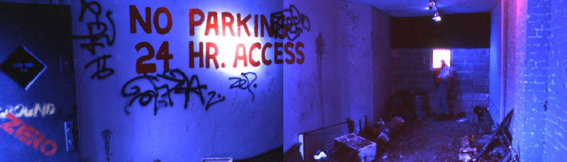
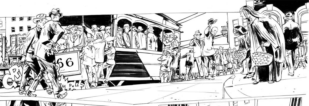
The film in all its incarnations connects strongly to Mexican Diaries, the second show David did at Ground Zero, the gallery that Marguerite Van Cook and I co-directed from 1984 to 1987 (obviously, named long before 9/11). David showed with us because he liked our own artwork and because we offered him shows unfettered by any restraints at a time when he was disillusioned with the art world system. In their quest for success, the galleries of the East Village were turning away from their initial wildness. The Neo-Geo movement encouraged highly polished presentations, more like the staid Soho scene that we all reacted against in the first place. Marguerite embodies the punk ethic of embracing change and encouraged our artists to make concise conceptual statements as gallery-transformative installations. For my part I wanted their most intense expression, to befit a gallery called Ground Zero, the epicenter.
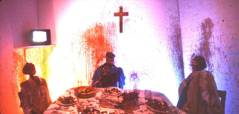
David’s first show with us in December 1985, You Killed Me First, gave us both our wish. It was a horrific, anti-commercial installation that David said had an intended similarity to Marcel Duchamp’s voyeuristic final work. The gallery was made over to resemble an empty garbage-strewn lot, lit only by a broken window. The patrons could enter this forbidding alley to look though the window and see a scene that resembled a panel from E.C. Comics’ Tales from the Crypt. Three dessicated corpses sat around a decomposing thanksgiving feast, their blood spattered on the walls, while a TV in the corner played a looped film, also titled You Killed Me First.
The Cinema of Transgression’s most sophisticated photographer, Richard Kern, directed the film that stands as one of the most effective works of the entire movement. David channeled his own father to play the violent patriarch, while Karen Finley did a piercing performance as the mother. An ingenue called Lung Leg played their gothish daughter. After a series of conflicts with her family, the girl murders them all at dinner. The installation was contextualized by the film, which revealed to the viewer that the putrid crime scene before them was the result of a violent reaction to bullying and abuse. Also, David in effect kills his Dad and himself, since it is his cadaver slumped to the right.
In Semiotext(e), David’s confidante, the photographer Marion S. expressed the artist’s satisfaction with the piece: “he really loved making that movie with Richard…and the installation at James and Marguerite’s that related to the film. It was so scary, so great, and so exciting.”
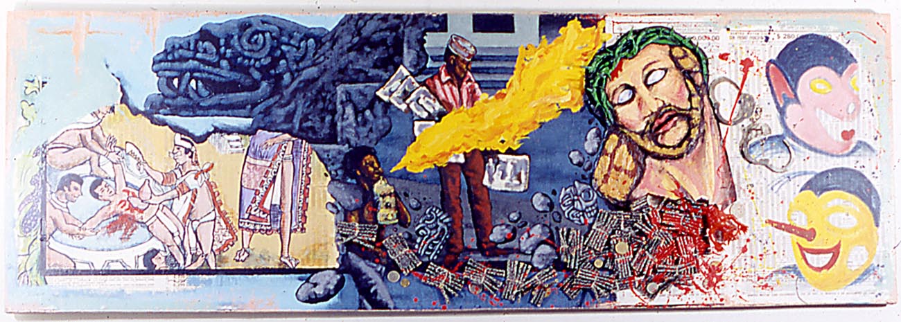
For his next solo show at Ground Zero a year later, David made five paintings. They were inspired by a trip to Mexico where he shot A Fire in My Belly, his next film project. Mexican Diaries opened in January of 1987, so the images in the show were all painted in 1986, despite the later dating that has been ascribed to them in books about David. The paintings share their imagery with the film, which is dated in its credits as done in 1986.
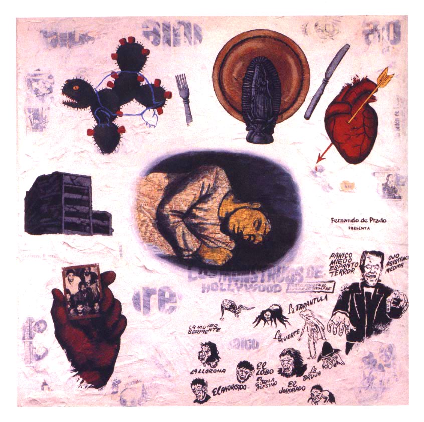
The paintings and the film inform each other. Portrait of Bishop Landa, the painting with the paper-mache head of Jesus seen exploding in the video, had a substantial number of live fireworks glued to it. The opening reception for the show was packed. We had to guard the painting against the self-immolating artist Joe Coleman, who insisted in lurking nearby, waving his lit cigar. The piece survived the opening, only to be destroyed for the filming of A Fire in My Belly. Our slide shows the relationships between the painting and the film, in the prominent fire-breather, also seen to dramatic effect in the film, in the overarching intent of the piece as a portrait and in the significance of its destruction.
Bishop Landa is profiled on Wikipaedia:
Diego de Landa (12 November 1524–1579) was a Spanish Bishop of the Roman Catholic Archdiocese of Yucatán. He left valuable information on pre-Columbian Maya civilization, and…destroyed much of that civilization’s history, literature, and traditions…Landa was in charge of bringing the Roman Catholic faith to the Maya peoples after the Spanish conquest…After hearing of Roman Catholic Maya who continued to practice idol worship, he ordered an Inquisition in Mani ending with a ceremony called auto de fé. During the ceremony on July 12, 1562, at least forty Maya codices and approximately 20,000 Maya cult images were burned.
Portrait of Bishop Landa was a literally explosive piece about the destruction of culture as a means of control, in other words, about censorship. David uses Landa to represent the way the Church’s views are still pressed on the world. Landa takes on the face of Christ to do violence. Christ breaks out of the flatness of the painting, the modern, the 3-dimensional supplants the flat visual iconography of the Incan civilization. It is a collision of cultures, each with their own chaotic violence. In the film, David consigns religion with its politics and theater, its suffering and sacrifice to the flames.
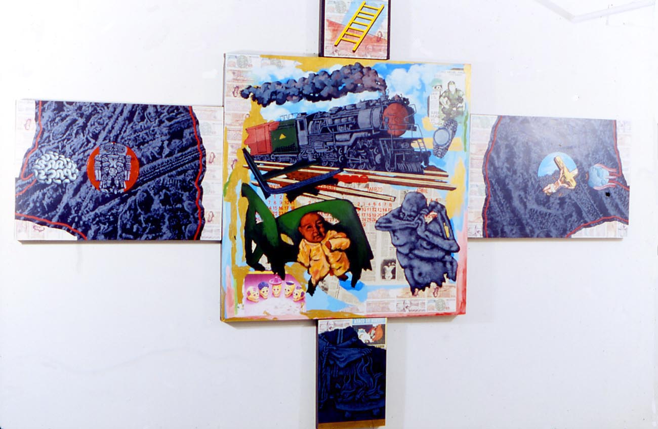
The large multitych Mexican Crucifix furthers the theme that Catholicism functions in Mexico as a means of control, to indoctrinate people from a young age through just enough religious education to have a passive acceptance of their state of poverty and ignorance. The religious components in the paintings of Mexican Diaries are more prominent than any reference to AIDS, and this could also be said of his original version of A Fire in My Belly.
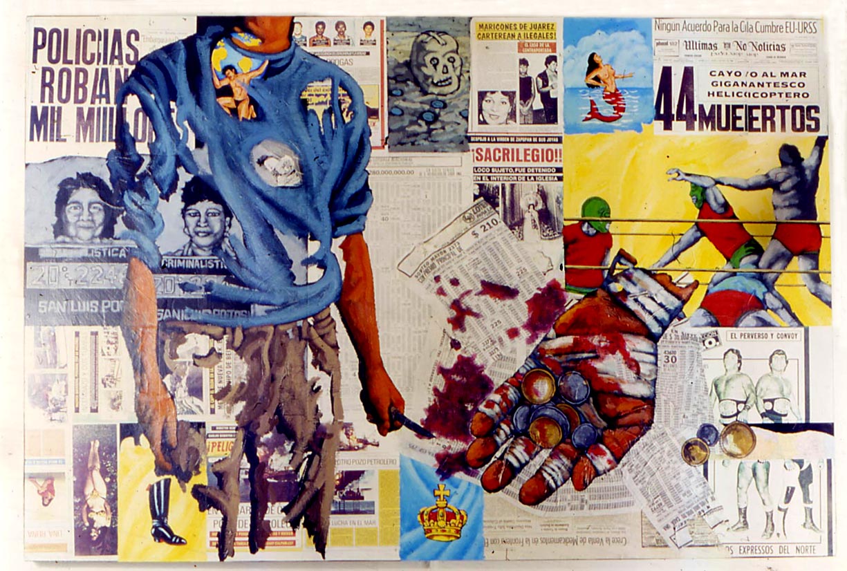
A large piece called Street Kid that alludes to David’s own often-homeless adolescence was papered with Mexican wanted posters and overlaid with wrestling graphics and a giant bandaged hand holding a few coins that is seen in the Youtube edit of the film. The painting was reproduced in the Art In America review of our exhibition, but years later I saw it again in the back room of PPOW and it had been completely altered. David had covered the entire piece with a dense lattice of winding green vines, nearly obscuring the original image.
David began his travels in Mexico with filmmaker Tommy Turner. In our show was a painting called Tommy’s Illness, a pale color field with the likeness of our mutual friend sleeping in the center while eidetic imagery floats about him: a place setting, the meal a Virgin Mary icon, a linear turtle superimposed on a cactus, a heart with an arrow through it and a procession of monsters such as Frankenstein. At Ground Zero, a Mexican marionette identical to the one seen dancing and burning in the film was suspended over the painting as part of the work.
David wrote that driving through Mexico, he felt as if he was “passing through the future of New York City…rolling through neighborhoods more and more desperate until suddenly in the middle of it all we rolled into a spanking new section.” He describes “a day filled with rich people and poor people; a day of diamond rings on lifeless fingers, a day of armless and legless men in the dawn…” He later worked on various photomontages using isolated imagery from the footage he shot there. He made a tiny painting of a suited organ grinder’s monkey, also seen in the film, that he told us was Hujar’s favorite of the pieces in the show.
There was a soundtrack on the film David showed me in 1986, he turned it up loud. The original score was a collection of his tape-recorded incidental noise mixed with snatches of industrial music, which was equally as chaotic as the images. It was not the tape-recorded ACT-UP demo that the National Portrait Gallery’s curators added to their edit. The Diamanda Galás score that is attached to the Youtube version is also a later addition, but one which is more in keeping with the feel of the original soundtrack. According to the Washington City Paper, Galás’ “music was part of a seven-minute edit of the 13-minute work made after Wojnarowicz died in 1992.” But, Galás was David’s friend and the symbolism she adds is apt:
“THIS IS THE LAW OF THE PLAGUE was composed in 1986. I will presume this is the music composition upon which David’s film FIRE IN THE BELLY was based, or with which he felt a strong affinity…My liturgical treatment of LEVITICUS is a march of the priests and lawmakers forcing the unclean from the gates of the City into warehouses out of town, and is very gently illustrated by David’s depiction of the crucified Christ covered with ants. Ants are only one of the many insects and animals that would cover a man removed from his village and deposited in a leper asylum.”
When David shot the film that he used in A Fire in My Belly, he was traveling through Mexico shooting whatever caught his eye. He made a script for editing purposes (with no indications for the soundtrack) which is in the collection of NYU’s Fales Library, along with the fragments of David’s film that were chosen for the exhibition at the Smithsonian’s National Portrait Gallery by curators Jonathan Katz and David C. Ward. I have not been able to find information about their process to know if Katz and editor Bart Everly used the script to guide the editing of their version.
I did once see a document that David made for a film that was left in the care of his friend and collaborator Marion S. It was a very carefully worked-out storyboard elaborating how disparate bits of film would be montaged, to form a sort of moving version of what his later photographic art pieces look like, the ones that have the circular insets, i.e. all parts of the film would be moving and shifting, within the insets as well as the overall backgrounds. Marion says that “life didn’t give us enough time to go through with the project.” She prefers not to continue a joint work in the absence of her partner.
But not everyone is as concerned as Marion with ensuring the integrity of David’s art. Even before the film was removed from the show, David’s voice had been recontextualized. The Smithsonian’s curator Katz says that the film was “edited in terms of length, not to remove content. We felt the imperative to represent David Wojnarowicz’s work as he designed it. We included every scene that’s in the video, we just truncated the length.” Notwithstanding this explanation, the fragments of A Fire in My Belly from the Fales collection were altered and an anachronistic soundtrack was added to a film that was thought to be silent. The images of David with his lips sewn shut are also misplaced in time. They are from Rosa von Praunheim and Phil Zwickler’s 1989 film Silence=Death and impose a focus on the AIDS crisis on a work from a time just before David primarily dedicated his work to his ordeal with AIDS. Unfortunately, some of the response to the Smithsonian’s subsequent removal of the film from Hide/Seek has thus far also suppressed David’s intent regarding religion.
David Wojnarowicz’s own feelings about nationalism and the imposed borders of “the preinvented world” aside, he was a great American artist and so his work has a place in any institution dedicated to presenting and preserving the American experience. It would be difficult if not impossible to find a work by Wojnarowicz that does not address religion on some level, let alone other controversial issues. Still, whether or not freedom of religion entitles religious institutions to be exempt from criticism should be subject to debate, as well as if the Smithsonian failed in their trust.
__________________________________
Photographs by Karen Ogle
You Killed Me First David Wojnarowicz w/Richard Kern, Ground Zero, 10/12/1985-1/05/1986
Mexican Diaries David Wojnarowicz, Ground Zero, 1/07/1987-1/25/1987
Courtesy of Ground Zero/The Arteries Group
A Fire in My Belly copyright 2011 by the Wojnarowicz Estate
Wojnarowicz’s final painting: Why the Church Can’t/Won’t Be Separated from the State. Mixed media, 1991. Courtesy of PPOW and the Wojnarowicz Estate.
Seven Miles a Second copyright 2011 by Romberger /Van Cook and the Wojnarowicz Estate
____________________________________
SOURCES
David Wojnarowicz: A Definitive History of Five or Six Years on the Lower East Side. Interviews by Sylvère Lotringer. Ed. Giancarlo Ambrosino. NY: Semiotext(e), 2006.
Scholder, Amy, ed. Fever: The Art of David Wojnarowicz. NY: Rizzoli, 1999.
Smith, Paul, “David Wojnarowicz at Ground Zero,” Art in America, 9/1987, pg. 182-83.
Wojnarowicz, David. “Postcards From America: X-Rays from Hell.” Witnesses: Against Our Vanishing (catalog) NY: Artist’s Space, 1989.
Wojnarowicz, David. In the Shadow of Forward Motion (catalog). NY: PPOW, 1989.
Wojnarowicz, David. Tounges of Flame. (catalog) Illinois State University, 1990.
Wojnarowicz, David. Brush Fires in the Social Landscape. NY: Aperature, 1994.
Wojnarowicz, David, James Romberger and Marguerite Van Cook. Seven Miles a Second. NY: DC/Vertigo Verite, 1996.
Diamanda Galás’ statement about A Fire in My Belly
Q&A with “Hide/Seek” curators Jonathan Katz and David C. Ward
by James Romberger
In “Man of Rock,” Bill Schelly’s recent biography of Joe Kubert, the well-respected graphic novelist and former DC editor says that he and Alex Toth knew each other well from “way, way back” in the 1940s when they were teenaged cartoonists. Kubert is two years older than Toth, which may have seemed like a lot to them then. He says that at sixteen Toth worked “like a dog–his intensity overwhelming.” While I don’t get the sense that Kubert and Toth were ever especially close as friends, they shared studios and social contacts, and both artists worked for early DC editor Sheldon Mayer. A talented artist in his own right, Mayer was a volatile editor. Toth recalled that Mayer tore up one of his early stories. Kubert says that he saw Mayer “verbally rip a guy apart…and take original pages and fling them right across the room,” but notes that he was not treated in this way, perhaps because he was “bigger.”
Both artists claim Mayer as a key formative influence. In later years when Kubert acheived editorial positions, his relationship with Toth changed as it became one of management and labor. Toth’s efforts for editor Kubert on two stories appears to be the key to their mutual disaffection. Neither party understood the other’s motivations, but as a result, a major Toth work was rejected to be lost to posterity, their friendship ended and in later years Kubert was criticized by Toth. Kubert’s own accounts of their conflicts are inconsistent.
At St. John in 1954 Toth drew a 5 page story for editor Kubert’s title Tor Vol. 1 #3. Danny Dreams was done in a fertile period of discovery for Toth, contemporaneous with his early masterpiece The Crushed Gardenia, as he was formulating his mature pared-down style. Kubert says in a letter printed in 1999 in Toth: Black and White that the story was “drawn close to printed page size—beautiful tight artwork,” but in an interview done in 2006 for Alter Ego Kubert says he was “shocked” and “disappointed” with the work when he first saw it. Perhaps because the original art was so small, or maybe because its simplicity at that time was not what the more detail-oriented Kubert expected, he mistook the economy of line that marks Toth’s great later work for laziness. Or, perhaps it was because Toth omits the folds of most of the ears of the characters in Danny Dreams and draws them as empty curved shapes.
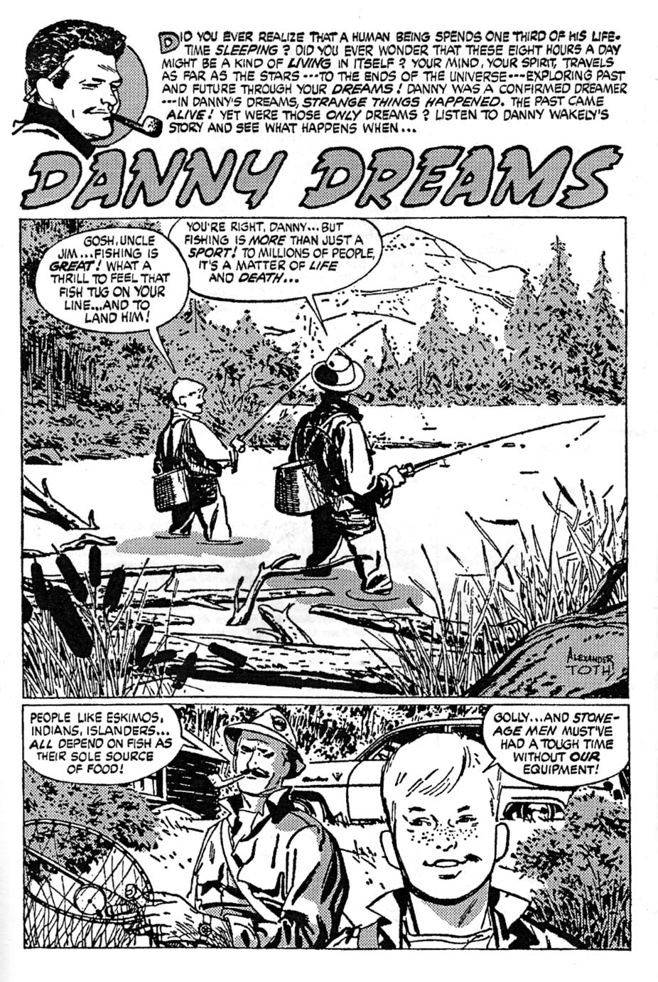
Danny Dreams: flat ears, small art. Tones by Bill Black.
Fear and suspense can be effectively created by the inference of the unknown. What is shown can be less harrowing than what is implied and then forms in the imagination of the reader. The late cartoonist Alexander Toth disliked drawing explicit horror and violence in the style of E.C., what he called “gore-gulping grind and grunge.” His preferred taste was for adventure fare appropriate for general audiences. However, throughout his career as an interpretive comic artist, he worked mainly on short stories for anthology titles and so he drew many horror stories. The artists of Toth’s generation drew comics primarily for children. When called upon to actually show ghouls and demons, he most often made them as flimsy as the harmless monsters he designed for children’s TV cartoons. Still, Toth is one of the greatest of America’s horror comics stylists because he believably renders the emotions of characters who face shadowy, barely-seen terrors.
As a cartoonist, Toth remains in a league of his own. His succinct, seemingly effortless realism is underlaid with intuitive storytelling and a consummate artistry gained from observation, research, inspiration and dedicated effort. At his best, Toth’s stories fully immerse the reader because he found a way to believe the stories himself. His characters act. Their gestures, movements and expressions are thoughtfully rendered. Everything in his comics is elegantly composed in deep space and insofar as it was in his power to do so, accurately drawn.
Toth’s son Eric recalls that his father “would never use scrap for anything,” that any research he did was committed only to his memory. Toth was like a human camera akin to his primary influence, the brilliant draftsman and graphic journalist Noel Sickles, but with a much more pronounced talent than his idol for dramatic narrative and oblique design. Because of the breadth of his abilities, Toth was highly in demand for designs and storyboards in the much more lucrative field of television animation, but he continued to draw comics because he loved the form.
In the mid-1970s, Toth’s wife Guyla suffered through an initial round of cancer treatments. His general aspect understandably darkened and he had already felt that values were declining in the world. He began to speak and write against the antihero image, which was then becoming prevalent throughout popular culture. He saw it as a negative influence in comics, and in the scripts he was asked to draw. As his wife’s condition worsened, Toth began to withdraw from comics and from the world in general. His work for Warren’s magazines Creepy and Eerie stands as some of the best of his career, but a look at his late works for that publisher also shows the narrowing of his sensibilities.
In 1975, a time Toth called an “awful trauma” for his wife and himself, he drew a pair of stories written for Eerie by Steve Skeates about The Hacker, a Jack the Ripper clone. It was impossible for Toth to avoid rendering the bloodletting that the stories demanded. Both episodes also show extensive editorial tampering with Toth’s artwork. During Bill Dubay’s tenure as editor of the Warren magazines, panel borders and lettered captions were often reversed to negative by the production staff. On Tothfans.com in the early 2000s, Toth annotated several of his Warren stories from this period and repeatedly excoriated “damn Dubay” because the alterations interfered with his painstaking orchestration of word and image.
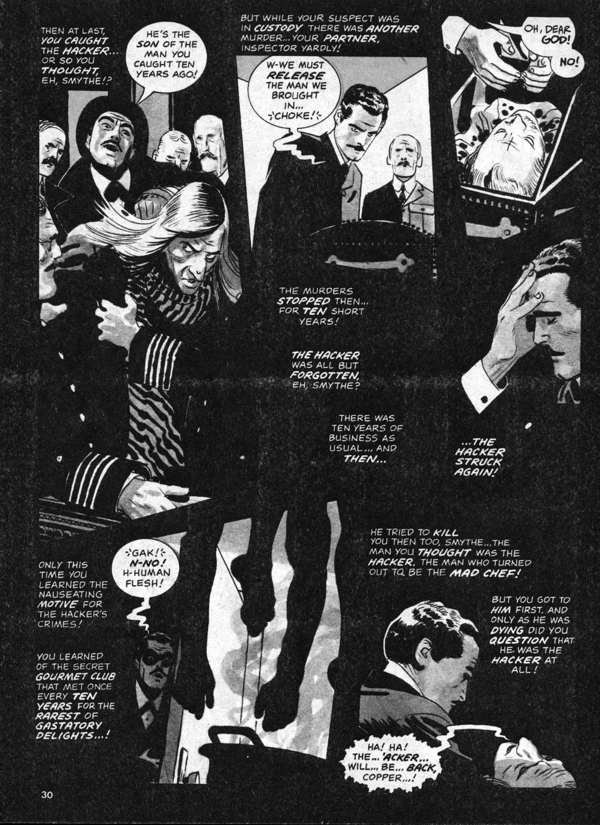
Reversed borders and captions destroy continuity, from The Hacker’s Last Stand.
In his first installment, The Hacker Is Back in Creepy #65, Toth used linear crosshatching to create tonal values, a technique rarely seen in his work. However, the printed story has additional watery grey tones that are clearly applied by another hand. To my eyes, it has the look of a halftoned version of color art. At this time, Warren was running color sections in their magazines and this story might have originally been intended for that purpose. Toth applied tones himself to the second story, The Hacker’s Last Stand in Creepy #67, but the reversed borders and captions muddy his designs and in some places make the work nearly unreadable.
He liked DuBay’s successor, Louise Jones (now Simonson) much better, even though his captions continued to be reversed. Toth wrote his next four Warren stories, all involving subjects of interest to the artist such as U.F.O.s, photography and the early days of film, all without any gruesome spectacle. The artist apparently had something of a phone crush on his editor. In a column written in 1999, his comments about Jones-Simonson are over the top: he calls her “deliciously-irresistibly-sweet,” says he would “walk on hot coals for her” and refers to Walt Simonson as a “lucky devil.” His story Kui from Creepy #79 (1976) features a heroine named Louise, who looks remarkably like Jones (albeit with blackened eyeballs) and becomes caught in a trap-laden pyramid with her explorer lover, who in turn seems to be drawn as a self-portrait.
This is not meant to imply that Jones intended any seduction. She was cajoling work from a notoriously difficult artist, but traumatized people can act oddly and a lonely and obsessive artist might grasp at any sign of appreciation or affection. Perhaps Guyla’s illness and hospitalizations deprived him of his muse, so Toth deflected that role to a friendly feminine voice on the telephone. Regardless, given the end of Kui, Toth seems to have punished them both for his own wayward imagination. Ironically, the same issue of Comic Book Artist that features Toth’s still-enraptured descriptions of his former editor also has an interview with Jones-Simonson, who describes Toth as “brilliant” and as “a very cool guy,” but then claims she had a “long-distance crush” on John Severin. One can only imagine Toth’s reaction when he read this, as he surely did: “damn Severin!”
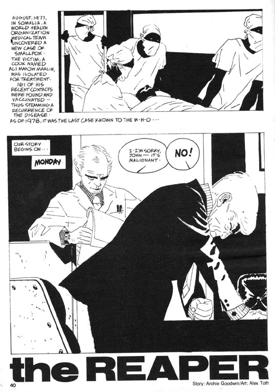
Toth’s comics work ceased for several years, until he finally returned in Creepy #114 (1980) with The Reaper, his last great horror masterpiece. He both drew and lettered Archie Goodwin’s effective story about a biotech lab worker stricken by a tumor. The Reaper is an impressive piece which bookends Toth’s career as a reflection of, and advancement upon, his early masterpiece The Crushed Gardenia from Who Is Next? #5 (1953), which was done just prior to his conscription into the Army. A short crime story by an unknown writer, The Crushed Gardenia is Toth’s breakthrough of high design in psychological comics narrative.
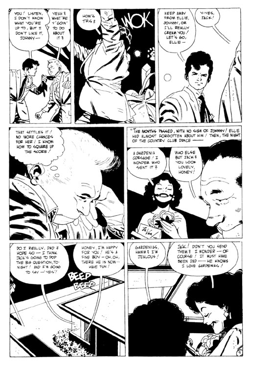
In The Crushed Gardenia, Toth transcends Sickles and Caniff to find his own way.
The spare script inspired Toth’s most plastic, angular drawing and a singular elegance in sequencing and panel structure. He controls all aspects of his pages, lettering the job himself. The distortions of the character drawings reflect the mental state of the sociopathic protagonist. Of Gardenia, Toth wrote to Greg Theakston, “my drawing/storytelling/ characterizations took a new road in this story. I’d found other ways to approach the script-get the feel of it-low key, really–’til action demanded hotting-up–and, design was used more aggressively–so the work wasn’t ‘newsreel-literal’–but had an abstract element in and out of its strung-together continuity.”
The Reaper also features an antisocial lead and throughout, the attenuated oddness of the drawing echoes the idiosyncratic and also somewhat Baltic appearance of the characters that the Hungarian artist drew in Gardenia. However, Reaper pushes farther than Gardenia into the stylization of drawing and page design. It reflects more recent influences: one can see traces of the clear lines of Moebius and the brisk, elegant brushwork of Hugo Pratt, both artists that Toth admired.
The Reaper, page 2: graphic contrast and othering.
As in all the stories that Toth inked and lettered himself, the incorporation of the text is part of the design of the pages. Throughout his career, he experimented with different forms of lettering and sound effects and tried variations on caption, balloon and tail shapes. In comics, a tail is usually a double line that converges to a point, which hangs from a word balloon and aims at a speaking character. In The Crushed Gardenia, the tips of Toth’s balloon tails hang open and at times converge with the characters’ heads. In The Reaper, the speech balloons have interiorized tails, a single line contained inside the balloon that is inclined in the direction of the speaker. They resemble pressure dials, or clock faces ticking away the progress to disaster. They also contain, quarantine or privatize the confidential conversations taking place in a doctor’s office and a secured laboratory.
In many of his works of the 1960s and thereafter, Toth often subdivides character monologues into multiple balloons, which he distributes in such a way as to lead the reader’s eyes through the narrative and create visual rhythms on the page. In Reaper he does this several times so that the speech balloons multiply into curves across the pages. There are no spaces between the panel borders except to accommodate captions. The panels throughout the story press together or overlap and when overlaid with the staccato clock/dial balloons, form a compositional density that compresses time and adds urgency to the narrative.
The Reaper, page 3: speech balloons multiply into curves which lead back to the protagonist’s "breast" in panel 1.
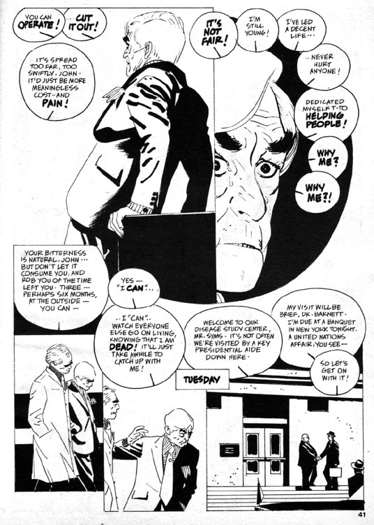
Toth renders the main character unsympathetically as effeminate and bitter. Biolab technician John Andrews’ escalating fear and isolation in his disease create a resentment of the masses of “healthy people” who are oblivious to his suffering, and so he takes a vial of smallpox from his job and looses it in the world. John is a compact, well-dressed and sophisticated man who seems modeled on actor Claude Rains, but also apparently wears eyeliner.
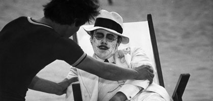
The first time I read this story, John brought to my mind the pedophile played by Dirk Bogarde in the Visconti film Death in Venice, who drains of life on the beach with his makeup running down his face, as the plague closes in.
Skater hater: The Reaper, page 6, an interactive patterned composition with nuanced gestures.
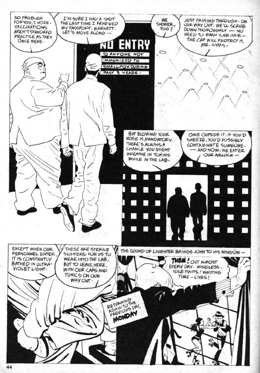
Toth’s depictions in this story indulge in some visual “othering.” In the prologue which depicts Egyptians and Africans dealing with plagues from the past, Toth entirely blackened their skin, which is graphically effective but also serves to obscure and flatten these figures. He also feminizes the eyes of Dr. Barnett, the corpulent head of the lab where John works. The story alternates sequences back and forth in time, between John’s doctor visit and his subsequent grappling with his condition, and a tour of the lab facility that Dr. Barnett gives to a visiting Presidential advisor, Syms. Toth artfully reveals the inept security and lax containment of the lab, as well as the integrity of the atypically badly-drawn (read: ineffectual) Syms.
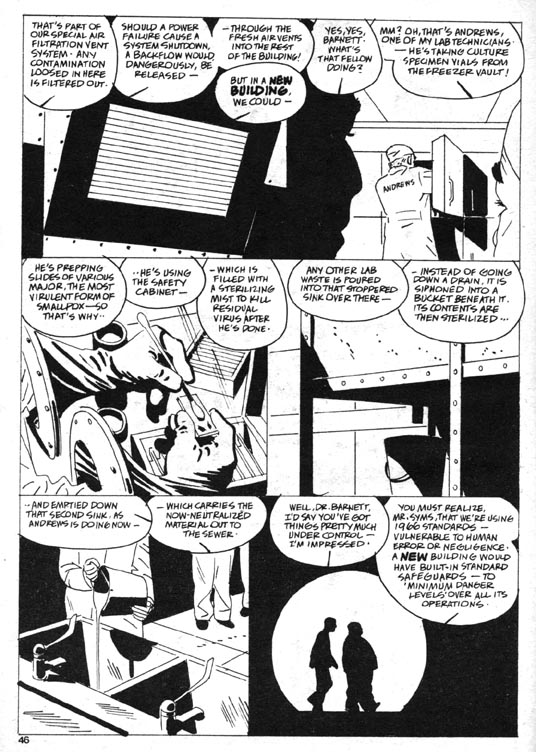
The Reaper, page 8: superlative page architecture, pathetic safety protocols.
The horror of The Reaper is not supernatural but rather is in the realm of the possible, and so the story carries a weight that is rarely seen in Toth’s comics. The artist works here at the height of his abilities, but it was to be his final solo art job on a horror story. Toth tried to draw more comics, but his depression and his perfectionism worked against him. He would be sent scripts and begin to work on them, sometimes drawing multiple versions of the first few pages of the stories, only to abandon them.
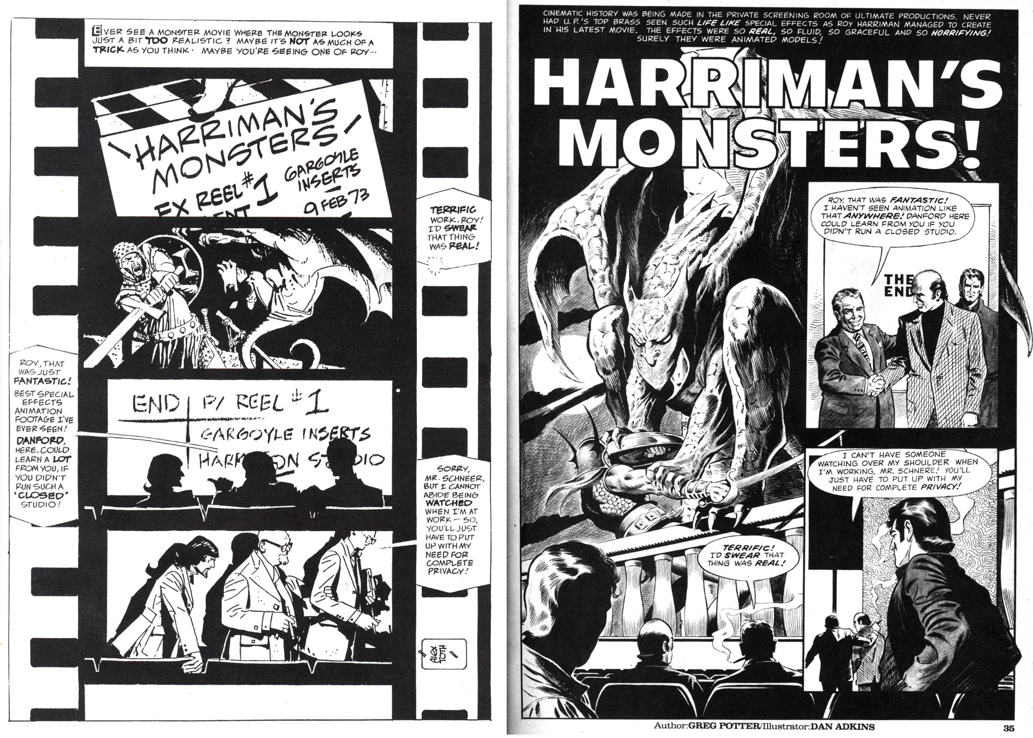
Left: Alex Toth’s self-rejected page. Right: published page by Dan Adkins from Creepy #123 (1980).
It hardly seems fair to hold Dan Adkin’s polished but standard (and unfortunately swipe-laden) effort up against the work of an artist as accomplished and complex as Toth, but a comparison of the two versions of the page above from Harriman’s Monsters is instructive. Toth not only adds a comprehensive design strategy tied to accurate visual references to film production, he also rewrites and refines the captions and dialogue while lettering the story. Still, he gave up and sent the script back to the editor because he felt his art “was too slick and far afield of my usual approach”, a rationale he later could not justify, even to himself. This example of Toth’s inability to complete work emphasizes how terrible his blockage was and how great the loss was to comics as a medium.
Though Jones left and Bill DuBay resumed as editor in 1980, Toth returned to Warren’s pages with his self-written magnum opus Bravo For Adventure (in The Rook #3 and #4, 1980), a fairly straightforward B-movie on paper. He also inked five stories that were pencilled by Leo Duranona, Alexis Romeo, Leo Summers and Carmine Infantino. One can only guess his reasons for doing these. In 1979, Toth had been commissioned by a fan to ink a Jack Kirby drawing. He considered the result to be “inhibited…the whole thing was a mistake,” but perhaps it opened his mind to doing futher collaborations with pencillers. Inking completed pencils might have enabled Toth to avoid the blockage he was experiencing otherwise.
Summers inked by Toth, from the same issue of Creepy as the Adkins page above.
The Toth-inked stories have the feel of experiments and hold clues about his visual thinking. His own sensibilities of light and contrast can be seen in how he chooses to interpret the pencils, especially if one is familiar with the styles of the respective pencillers. Leo Summers’ drawings for an earlier Warren story are clearly influenced by Noel Sickles’ famous illustrations for Hemingway’s The Old Man and The Sea. Perhaps that inspired Toth to ink Summers pages in Kiss of the Plague that are actually far grislier than anything in The Hacker. Several explicitly-drawn impalings are countered by a cartoony but still frightening ghoul at the end. Toth here takes the opportunity to do some unique tonal work, which displays shifts of focus where the artist allowed his markers to bleed.
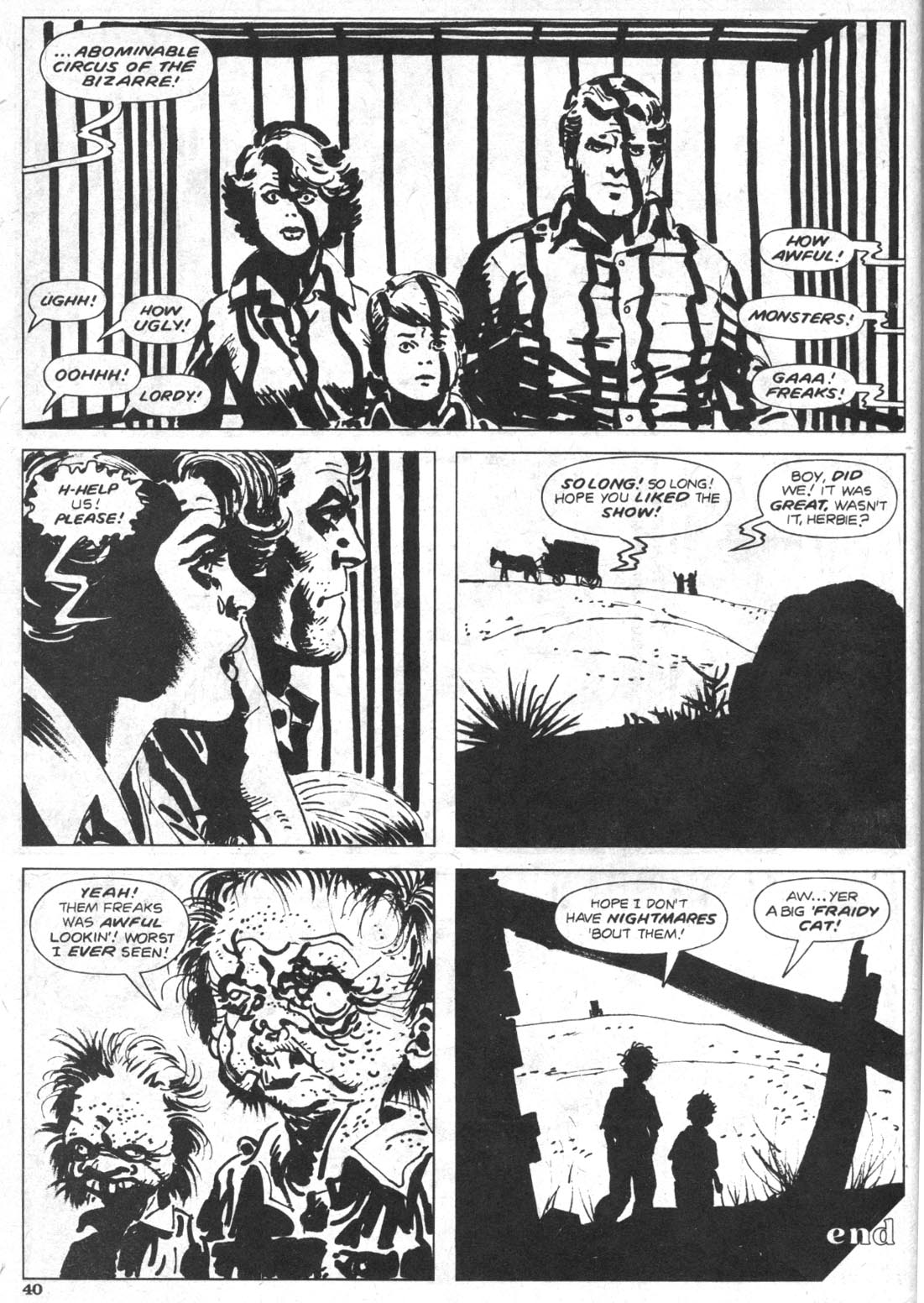
Infantino inked by Toth, from Circus of the Bizarre, Creepy #125 (1981).
The collaboration with his old friend, former DC executive Carmine Infantino is also remarkable in that so much of its loose, expressive cartooning resembles the art of Harvey Kurtzman, and that the caged family on the final page so aptly represent the extinction of Toth’s wholesome American archetypes. This is his last horror comics page. His final efforts for Warren were not in the horror genre, but rather are his two sophisticated Torpedo stories in Vampirella (#108 and #110, 1982). Through 1983 he wrote and drew a few stories for alternative publishers and pencilled several stories for DC, all were in the adventure mode he loved and those were his final completed comics.
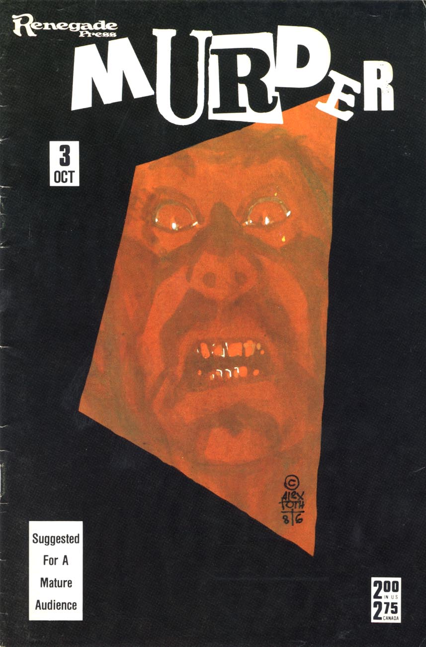
When Guyla died in 1985, he shut down almost completely. He began two decades of letters, mailing a profusion of postcards and sketches to friends and fans until his death in 2006. Toth had written to inker Terry Austin in 1980 that he didn’t want to contribute further to a medium that he believed was destroying itself, “…and so I expectorate, and curse the coming darkness.” Without his wife, for him the world was a bleak and degraded place. His final published horror work was his cover for Robin Snyder’s anthology Murder in 1986. It eloquently embodies his state of isolation. It is a fully rendered color composition of great intensity: a glistening face constricted in a grimace of utmost terror, caught on the tilted, receeding event horizon of a massive black border.
References:
Auad, Manuel. Alex Toth. 1995. Northhampton, Ma.: Kitchen Sink.
Austin, Terry. A.T.T.A. Boy Productions, Inc. Alter Ego, Vol. 3, No. 63, 12/2006.
Cook, David. Alex Toth Biography.
http://www.tothfans.com/adisplay.php?a=359
Cooke, Jon B. Weezie Jones Simonson. Comic Book Artist #4, Spring, 1999.
Hitchcock, John and Alex Toth. Dear John. 2006. Octopus Press.
Theakston, Greg (Ed.) Alex Toth: Edge of Genius Vol. 1. 2007. New York: Pure Imagination.
Toth, Alex. Before I Forget. Comic Book Artist #4, Spring, 1999.
Toth, Alex. Under The Covers. Jack Kirby Collector #34, 3/2002.
Vandeboncoeur, Jim. Alex Toth: a Comic Art Index. Comic Book Artist #11, 1/2001.
Remembering Alex Toth – Part 2, Transcript of panel discussion with David Armstrong (moderator), Irwin Hasen, Dana Palmer, Eric Toth, Mike Royer, Paul Power, Rubén Procopio, John Hitchcock and Tom de Rosier. San Diego Comic-Con, July 23rd, 2006.
http://www.tothfans.com/adisplay.php?a=368
By James Romberger
Thought forms in the mind as a combination of word and image. For that reason, cartooning is a direct, intimate means to communicate subjective thought to a reader. This is why many of the greatest comics are by artists who write their own narratives. Still, it is rare that a single person can both draw and write well, much less produce a work of blinding genius; one can spend a lifetime mastering either discipline. However, a writer’s words can be brought to life by an artist of the prerequisite abilities, one who can accomplish what in a film might require an unlimited budget and even pass beyond, to the unfilmable. The comics form offers infinite possibilities to writers and artists who are willing to work together. But the focus on autonomy in alternative comics has left collaboration largely in the hands of comics’ mainstream, where it has been greatly influenced by the economics and labor/management relationships of periodical publishing. The reader’s indulgence is asked for a short history of those relationships, as a prelude to an explanation of the artist’s contribution to the collaborative process in comics.
Bullpen variations
“Bullpen” comic book production was initiated in 1936 by groundbreaking cartoonist Will Eisner and his partner Jerry Iger to meet the rising demand for content in the new medium of the comic book. Studio staff was divided into an assembly line of piece-workers: writer, penciller (which might subdivide to layout, character and/or background artist), inker, letterer, and colorist. The bullpen became standard for comics because it was expedient to publish books on time and made it so no one creative person was wholly responsible for, or entirely invested in, what was claimed by publishers as properties done by “work-for-hire” employees. Comics history is crowded with “ghost” creators like Carl Barks and Bill Finger, who worked in near or actual anonymity and were not compensated fairly for their contributions. For many years, that was the accepted status quo.
In the early 1950s at E.C. an odd exception to the standard sweatshop mold led to some of the best comics published to date. Editor Harvey Kurtzman recognized that in comics, the crux of storytelling is in the layout or breakdown that integrates text with image, the pencil drawings that establish the structure and style of the design. The layout finds the flow of viewpoint and character interaction. Kurtzman made articulately composed page diagrams for all of his stories with every basic element drawn roughly in place, which his artists then rendered to finish. Still, individual stylists like Wallace Wood and John Severin did some of their finest work for Kurtzman’s war comics “Two-Fisted Tales” and “Frontline Combat.” Kurtzman demanded a high degree of accurate detail for period stories; his artists respected his guiding intent and invested their drawings with research, observational realism and great passion. Kurtzman also grasped the importance of color and worked side-by-side with colorist Marie Severin to enhance his narratives immeasurably. In these atypical collaborations, Kurtzman was the writer and also the primary storytelling artist. His finishing artists acted more as elaborators, but it was they who signed the stories, Kurtzman only took credit as editor.
Another version of the Bullpen was introduced with what became known as the “Marvel method” in the 1960s. Editor Stan Lee enlisted artists such as Jack Kirby, Steve Ditko and Gene Colan to draw their stories from brief plots outlined by Lee in a short note or phone call, or to invent the stories from whole cloth themselves and make notes that described the narrative and suggested dialogue in the page margins. After the fact, Lee added captions and balloons based on those notes, in his words a job often “like filling in a crossword puzzle.” Lee was able to do this because on their own, these experienced storytelling artists could initiate and motivate characters, construct their environments and produce complete comic book page sets. For what often amounted to copy-writing, Lee claimed full writer credit and pay. In this arrangement, the pencillers were also uncredited plotters and co-writers.
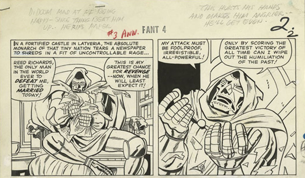
Jack Kirby writes continuity, which Stan Lee ignores, from the original art for Fantastic Four Annual #3, 1963
In particular, Kirby was the single greatest driving force in the foundation of Marvel’s popular multimedia empire; his creative input on “The Fantastic Four” alone encompassed a multitude of imaginative characters and settings. To be fair, Lee helped make the books successful with his unifying voice; in the letters pages and in his “Bullpen Bulletins” he created an illusion of family that resonated with young readers. He did plot and write some of the stories and he credited his artists (for their art) prominently. But Lee also failed to defend his collaborators’ interests to management. According to Kirby biographer Mark Evanier, promises were made to Kirby about royalties that were not kept and Kirby found no one to address his concerns to but Lee, who said, “I have nothing to do with that.” Kirby subsequently left the company rather than be further exploited. Kirby’s children still struggle to gain any portion of the multibillions Marvel makes from the comics, films and merchandising derived from their father’s work.
Too many battles were fought by the artists and writers of comics for their rights to be detailed here, but in the early 1980s, major publishers instituted “creator-owned” contracts for special projects in which artists and writers share copyright as co-authors, on an equal footing. Mainstream comics are still closely overseen by an editor, who selects teams and then acts as intermediary to writer and artist, even in creator-owned projects. The editor can facilitate their best efforts and contribute greatly to the storytelling by honing the creator’s individual contributions, depending on the sensitivity and sensibility of their recommendations or dictates. Some other holdovers from the bullpen days are still present in mutated form. While some artists finish their own pencil drawings in ink, others still have their pencils inked or finished by other artist. Inexplicably, though color makes a profound impact on the reader, the colorist still holds the lowest-paid job in comics. Perhaps as a consequence, few artists in comics do their own color, which is now most often applied by digital artists, with mixed results. Also, while alternative cartoonists often prefer to letter in their hand, mainstream artists do not and digital fonts have supplanted hand lettering almost entirely, not least because digital balloons and captions are editable until the last moments before publication. Whatever the rationale for their use, digital typesetting loses the qualities of illumination that are an important advantage of the comics form. Inkers, colorists and letterers of varying degrees of skill and artistry can greatly enhance, or ruin a book. But, it should be reiterated that the penciller controls the layout and storytelling and so is the primary artist.
Make It So
Currently in mainstream comics, an editor works with a writer to provide an artist with a document that resembles a movie script. This text describes the settings, the personalities, speech and actions of the depicted characters, as well as the trajectory and intent of the scenes. However complete this may sound, it’s not; the artist’s job is daunting. In a film, the lion’s share of the credit does not usually go to the writer, but to the director, the person in charge of the product of a largely visual medium. In comics, the artist must engage complex skills that approximate everything that would be involved in making a movie: direction, cinematography, casting, actors, production design, set design, lighting, costume, makeup, special effects and every other function, including that of the person who tapes around the actor’s feet to mark where they were standing.
One challenge for the cartoonist is that one’s “actors” must play their parts with well-timed reactions and believable emotions, expressions and gestures. That is no small feat of itself. The characters must reflect the diverse variability of human form. They must also be recognizable (“on-model”) from all angles or lines of sight, as must the settings, objects, vehicles and fashions, which also must all be true as possible to the time and place depicted, down to the smallest necessary detail. All of the depicted persons, environs and objects must also be executed in perspective and reflect the influences of light and the natural elements. In other words, the artist must understand and render everything that in a film is recorded by a cameraman. Like animators, cartoonists visualize movement within three-dimensional space as they simulate the viewpoint of a weightless steadicam; they engage a complex form of draftsmanship that can be described as “motion perspective.”
Alex Toth, motion perspective from the original art for “Torpedo.”
Quintessential moments must be chosen to freeze in panels. A further complication is that the characters must be composed in each panel in their order of speaking, as indicated by the script. The refined composition of each panel acknowledges not only the design of the images viewed simultaneously in direct proximity on the page and on the facing page (a two-page “spread”), but also those throughout the entire narrative. The illusion of movement occurs in the spaces between panels, where positive and negative space flip, creating visual rhythms that sync with the beats of the broken-down blocks of words, as the reader’s eye is led where the artist wants it to go. At the layout stage, artists might expand upon, or deviate significantly from a script in order to make a story work effectively. For instance, the addition of panels can serve to compress time or make actions clearer, captions can be bumped to panels behind or forward in order to gain room for a larger drawing, captions can be added or deleted to clarify character. In truth, it would be difficult if not impossible to find a cartoonist who did not add many acting characters, objects, architecture, flora and fauna of their own device throughout the execution of a given story, all of which contribute substance to the narrative.
Artist Tony Salmons notes three seemingly innocent words often seen in scripts, “a crowd gathers.” Salmons says, “A writer scripts or merely plots this line down on paper and goes on to the next scene. I spend an entire day researching, casting, lighting and acting out that crowd. Is it an opium den? SF or Hong Kong? Texas? German beer garden? Rainbow room at 30 Rock? What kind of crowd? If I do it with total commitment the considerations can go way beyond this. And the writer’s contribution is 3 words, ‘A crowd gathers.'” No matter what the story requires, the artist must make it so.
Tony Salmons, detail from the original art for “The Strange Adventures of H.P. Lovecraft.”
Additionally, ideas occur in the process of drawing. The artist may see a better way to articulate a scene after it has been laid out, when the story has achieved sufficient form that new visual potentials emerge. Artist P. Craig Russell has detailed one of the artist’s many unique contributions to comics storytelling, a technique he aptly calls “parallel narrative,” sequences invented by the artist that diverge from the script to depict scenes that are not in the text, that are intended by the artist to counterpoint the text. In comics, the onus is on the artist to make the story work. For that, the artist must find ways to “believe” what they are drawing, to feel the motivations of the players, the touch of a lover, the heat of battle or the cold night wind of the desert and express them to the reader.
Comics demand an immersion on the part of the artist that goes far beyond the job description of an illustrator. Illustrations are derivative entities that are subordinate to text, isolated visualizations which can operate either as redundant to the words or as commentary on the words, ranging from literal to oblique. In comics, the text is most often visually subordinate. The images are imbedded with far more information than the words. The words represent sounds and qualify the images. The text need not say something that is clearly shown in the pictures. Illustrations can enhance or challenge the reader’s visualization of prose, but comics are a full-blown realization of narrative, with the intimate interactivity of a book and with more potential for expansive spectacle than film.
For most of comics’ short history, the writing was often the weakest element and so highly skilled interpretive cartoonists have longed to work with better scripts. As the graphic novel gains ground in the book trade, more serious writers will want to explore the form. This could result in more sophisticated and revelatory collaborative efforts. It should be made clear that comic artists are usually paid more per page than writers, but for as long as credits have been given, artists have willingly shared them equally with writers. But now, the equilibrium of credit has slipped askew. Increasingly one sees collaborative books credited and publicized with the emphasis on the writer alone. Such selective crediting causes further chain reactions. In the catalog listings of libraries and booksellers, the “Author” is listed first. In the case of graphic novels, it is assumed that the name credited as “writer” is the “author,” unless specified otherwise. The artist might not even be included in bibliographic data unless credited by the publisher as a “co-author.” Amazon’s default system for graphic novels lists writers as “author” while artists are diminished to “illustrator”, a subordinate creator and in no way a “co-author.”
This diminution of the artist’s perceived role in comics has repercussions for alternative and mainstream artists alike. Artist Jillian Tamaki spoke of her process collaborating on the graphic novel “Skim” with her cousin, the writer Mariko Tamaki: “(Mariko) was not precious about it. It was basically just a play and there was no description of what they were doing when they said something, or where they were…it was me putting the pacing in, and the rhythms and the timing and the backgrounds….it took about two years.” But when “Skim” was nominated for a Canadian book award, the writer was the only one cited for the honor. Writer Alan Moore makes sure that his artists share equal credit, but Neil Gaiman’s name dominates the cover of the exquisite book P. Craig Russell made of “Coraline.” It can and has been claimed that it is Gaiman’s name that sells books, but a case can also be made that Russell’s mastery of the comics medium is such that his adaptations of Gaiman’s prose stories are more resonant in their form than the comic books that the writer has scripted. Even as the medium is poised to evolve into a sophisticated art form, critics often closely analyze what they perceive as “the writing” of a given book, but ignore or barely describe the art, perhaps because they are unaware of the interrelativity of text and art in comics, or perhaps because the publisher’s packaging and promotion tells them that the writer is the primary creator.
This trend will discourage thoughtful non-writing or interpretive artists from involvement with the medium. Because of the labor-intensive nature of comic art, a graphic novel can take an artist years, even decades to complete. In the current climate, collaborative comics become much less worthwhile for the artist. The remedy to this situation falls to the individuals who work in comics. Artists should avoid the “illustrator” label and stipulate a co-authorship credit for themselves in their contracts. They might find that there already is a co-authorship stipulation in their contracts, which has not been honored by the publisher’s packaging and publicity arms, or that there is some ambiguity in the distinction between “co-creator” and “co-author,” or they could discover that there is a contractual clause which calls for “credit according to current practice.” This means that the more artists allow themselves to get less credit, the more it becomes current practice. Also, writers could heed Alan Moore’s positive example and not allow their credit to override that of their partners. Both creators should ensure that their publishers direct their design and promotional departments to incorporate the contractually stipulated credits and see that book trade entities correctly list them. The alternative is that artists accept a diminished role and lose their hard-won rights.
In the end, the credit issue is about more than just the bruised egos of artists and writers. Debates about the validity of authorship itself are set aside when the realities of book publishing and movie deals come into play. A great comic need not ever be made into a movie if it resonates sufficiently within the parameters of its form, but when films are made and when book royalties accrue, artists and writers should share in the credit and proceeds as co-authors. For the artist, comics are a difficult form and the work involved in a graphic novel is not undertaken lightly. If his or her contributions to the whole experience of reading are seen as expendable tools of the writer, the evolution of comics is at risk.
Sources
Jack Kirby scan courtesy of the Howell-Kalish collection. From the Jack Kirby Museum’s Original Art Digital Archive.
Evanier, Mark. Kirby: King of Comics. New York: Abrams, 2008. p. 157.
Green, Karen. Words and Music…er, Images. Comic Adventures in Academia, column on Comixology website, 4/3/2009:
http://www.comixology.com/articles/212/Words-and-Music-er-Images
Lee, Stan with George Mair. Excelsior! The Amazing Life of Stan Lee. 2002. New York: Fireside/Simon and Schuster, p.146.
Russell, P. Craig. Parallel Narrative. Video series posted online: www.pcraigrussell.net
or http://vodpod.com/watch/1296908-pcr-tv-parallel-narrative-murder-mysteries-part-1
Salmons, Tony. Quote from private correspondence. August, 2010.
Tamaki, Jillian. Quote from transcript of panel discussion: Inside Out: Self and Society in Comic Art. Moderator: Calvin Reid. St. Mark’s Church, Howl! Festival, 9/10/2008:
http://www.comicsculture.net/