Darkness Blazed My Name: Basquiat’s Poetics

Whoever would not understand me would not understand any better the roaring of a tiger. Aimé Césaire

I never knew Jean-Michel Basquiat, although we were of the same time and place and had friends in common, but I recognized his abilities the moment I saw his work. I can still recall how his painting resonated from the wall in a closely hung group show at CHARAS in the early eighties. It rivaled the intensity of the Alice Neel portrait across from it. Although his paintings have singular appeal in terms of their brilliant coloring alone and their marks always feel fresh, there is much more going on than just a painterly surface. They articulate a position in regards to art and history, often elucidated in a textual form where what is obscured or erased is given the same weight as what is visibly spelled out.

Basquiat’s work emerged in the early 1980s as his contemporaries in Graffiti achieved their too-brief moment of American Art world acceptance, but even when he was spraypainting on the street he did not share that movement’s form and goals. The graffiti entity SAMO created by Basquiat and his friends Al Diaz and Shannon Dawson wrote poetic sentences on the streets of Soho, with a obliquely critical tone directed at the wealthy people who lived and shopped there. Basquiat’s work was never about the evolution of illuminated lettering forms that characterizes aerosol art. The late theorist of weaponized letters Rammellzee commented that his friend’s writing was “unreadable…(he) crosses out words, doesn’t spell them right, doesn’t even write the damn thing right.” Nor does Basquiat have common ground with the decorative confections of his friends Keith Haring and Kenny Sharf, despite that he is most often placed in their context by Art pundits.

Instead, his paintings relate better to the guerilla subversions practiced by another of his East Village peers, David Wojnarowicz. Basquiat and Wojnarowicz were both subject to inversion of identification. As Wojnarowicz’s multimedia works expose and excoriate a culture that refuses to accept or acknowledge his homosexuality, Basquiat’s paintings layer and refashion the racist cultural signifiers imposed on him that did not reflect his image. Like Wojnarowicz, he used his art to highlight the disparities, omissions, and lies in the histories of Art and Civilization. According to bell hooks, to reach his goals Basquiat “assumed the role of explorer/ colonizer,” he “journeyed into the heart of whiteness. White territory he named as a savage and brutal place.” Our mutual friend the painter Stephen Lack says, “Jean-Michel gave his paintings great import.” Once ensconced in the pantheon, Basquiat pursued the purposes of information dissemination. His messages were radical but effectively composed within specific referents to pass through the filtering apparatus of white art appreciation as guided aesthetic missiles.

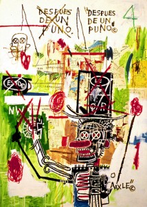
The textual aspects of Basquiat’s works incorporate a sophisticated multilingual approach. His use of Spanish relates in poetical terms to the linguistic claims of the Nuyorican movement, in that he deliberately use languages and the purposeful obscuring of written text to address, or privatize his words from, specific aspects of his audience. This paradoxical offering and withholding of understanding is seen in the painting “Despues De Un Puno,” where the text prominent in the piece is intended to block comprehension, as in comments he was known to make in Spanish to acquaintances in the presence of presumably ignorant patrons. Conversely, Basquiat does not close off the option of expansion of language. Typically his text operates in the opposite direction too, in order to self-proclaim his multilingual fluency and expand the linguistic possibility of his reach. On the interchange of language, the fluid switching between Spanish and English within a sentence seen in bilingual Puerto Ricans, Juan Flores writes, “rather than compensating for monolingual deficiency, code switching often signals an expansion of communicative and expressive potential.” As such a code switcher, Basquiat is able to draw from a wider reservoir of signifiers with the languages at his command.


Basquiat, Despues De Un Puno, 1987

Basquiat knows the history of the conqueror and the actualities of his current position within it, how it relates to his body. His quoting of corporate symbology and recurring impositions of trademark and copyright symbols speak to issues of ownership: of the land, of his ancestors, of himself, his body and the products of his brain and hand. His methodology is a form of layering of textual and visual signifiers that resembles the approach of other artists of his generation such as Wojnarowicz and Christof Kohlhofer, whose images consist of a profuse visual and textual “namedropping” invested with a multitude of sub-signifiers of shared experience. Basquiat communicated directly with the art world using their referents, their signifiers. In his paintings Basquiat links the significance of words or phrases set in proximity to each other in their context within the pictorial field. This allows associations to be followed by the viewer/ reader in a type of narrative of assimilated ideas. Basquiat contexualizes the Diasporan experience with the Western canon as Aimé Césaire did with Shakespeare’s “The Tempest,” while he also bridges the gap between visual and textual signification.

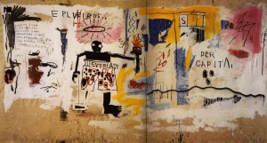
In the relatively spare piece “Per Capita” large lettering in Latin dominates the background field or storefront space. Basquiat uses Latin like other poets to point to his scholarship and to place himself amongst the great classical poets, but perhaps also like Elisabeth Barrett Browning, who as a marginalized female poet uses a Latin header on a poem to demonstrate her equality to the male Victorian poets, Basquiat claims equality across racial lines. He affirms that he knows the canon and claims a stand on even ground. Further, the work is surmounted on the left by the inscription “e pluribus,” or “out of many” (sans unum or “one”) as on coins and currency and on the right by “per capita” or “per head.” In this way he points to the way white classicism hides the ugly truth of people counted like numbers, in a nation built with slavery.


Basquiat, Per Capita, 1981

Down the left side are listed the names of states and figures in dollars. The highest amounts are tallied by predominantly white states, Connecticut and Alaska and the lowest to states with large African American populations such as Alabama. This listing taken with the title might indicate a sliding scale of income or funding allocation for each individual in the respective states. It might also reflect a type of ordering that allays the anxiety of those who are displaced. On a pictorial level, the painting depicts a boxer with a halo holding the torch of liberty. The shrunken, attenuated black figure with blank eyes wears oversized shorts with the logo “Everlast” emblazoned on it conspicuously. It is typical of the ambiguity and self-ironizing of Basquiat’s work. “Everlast” places the black male as enduring forever as the champ, who can withstand a pounding as well as deal one out, yet in the end still answer to the sponsors and handlers who see him only as a commodity. Basquiat points to the endurance of people of color as they are used by the dominant culture. The text qualifies the terrible skepticism of the piece with extreme brevity.

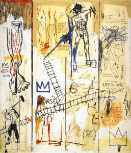
In “Leonardo Da Vinci’s Greatest Hits,” on four vertical strips of canvas Basquiat arranges distorted renditions from “Gray’s Anatomy” and Leonardo’s notebooks with an emphasis on legs and feet. The title suggests that Da Vinci also was pressed by his patrons to produce on demand and even repeat his most popular works, his “hits.” Basquiat refers to “the bad foot, the left foot” and with “Return of the Prodigal” he identifies as the bad son. “Heel” is repeated, which might define as being under a heel, or down at the heel, a heel in the sense of bad, a villain, or a flaw or weakness as in an Achilles’ heel. In the bottom left is a muscular figure with a mallet like John Henry, building the railroad tracks that the whole is crossed with, “hits” to make tracks perhaps as references to drugs, tracks that mark a slave to a habit, marks which take on the form of text themselves, used semantically to represent history. They unify the piece and lead on one path to Latin again with “Latissimus”, muscles of a strong back, on the other track to “studies of human leg plus the bone of the leg in man and dog.” A dog can be trained to “heel.” Perhaps the influence of Césaire’s line, “that it is enough for us to heel the world, whereas the work of man has only begun” is here as Basquiat feels the inherited burden. Yet perhaps it also recalls the anxiety caused by the sense of alienation from the body as a legacy of slavery.

Basquait, Leonardo Da Vinci’s Greatest Hits, 1983

The sense of the physical body is also in the piece as he refers to Shelley’s poem, “Prometheus Unbound” about the bringer of fire Prometheus’ emancipation from torment as “Prometheus Bound,” prefiguring release and again locating himself within the framework of revolutionary poets, but here insisting himself as both Prometheus the bringer of fire, a metaphor for the fire of his message and a reference to freeing himself from the long suppression, now pushed back into even earlier times. The poem cements the images of fighting back and rebellion together with flight and escape. The flight might be seen like Prometheus to claim his due or perhaps as away from the brutalization of exploitation. Basquiat trades in ambiguity and this is a hallmark of his work.

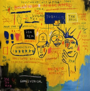
Correspondences can be found throughout the text of Basquiat’s work, as in “Hollywood Africans,” a caustic piece painted mostly yellow with the footprints and portraits of his writer friends, Toxic and Rammellzee, with his own likeness simultaneously valorized as “hero.ism,” villianized as “heel #3” and animalized with “paw.” There were few Africans in Hollywood that were not racist representations of savages and servants. The reader is asked, “what is bwana” in the form of a question as in the TV game show “Jeopardy” and crossed out. Basquiat is ventriloquizing white concerns, it’s not real. The lines of races and assimilation are crossed and blurred. Seven stars is too many, it’s pop, it’s corn, Idi Amin may be a black dictator in the real Africa but the sugar cane in Haiti is incorporated and copyrighted to be exploited, it all adds up to the sum of white on black “gangsterism,” it’s real and the piece is priced at 200 yen.


Basquiat, Hollywood Africans, 1983

Belying the portrayal of him in Julian Schnabel’s film biography as a mumbling, bumbling junkie, the volume of work Basquiat produced in his short life is that of a dedicated painter, with little time for anything but work. Stephen Lack suggests that when Basquiat’s dealers requested that he switch from painting in acrylics to make more valuable products in the medium of oil, the prolonged drying time of oil paints adversely affected the artist. Lack posits that Basquiat then had to wait for a layer of pigment to dry before adding successive layers, depriving the work of spontaneity and the artist of his most valued rush, the more immediate pleasures and gratifications of creating large-scale works quickly in fast-drying acrylic. And, the paradoxes of his position and the fickle and judgmental nature of celebrity in the art world overwhelmed him. Frances Negron-Muntaner observes,

While Basquiat envisioned commodification as a way out of the racialized body to the extent that it socially valorized him, the requirements of steady output undermined his independence and relationship to painting, making the artist fatally aware of his shameful status as a racialized subject, even under privileged conditions.

Basquiat had truly believed that he would be able to scale the heights on his abilities and worth, but the tipping point was reached when the critical reaction to his collaborations with Andy Warhol hurt him. He was othered, treated as a novelty brought to life by Warhol’s divine intervention. He could not accept the sidekick role, could not be subordinate—it was he who had invigorated Warhol with his love and energy. It was now clear that in order to continue he would have to subsume himself and his art further into a system which did not regard him as an equal.

In less than a decade, Jean-Michel Basquiat sealed his fame with a large body of work and sacrificed himself in the process. He felt the oppressions of millenia, he internalized the damage done no less than did the tragic Puerto Rican poet laureate Julia Burgos. Like Burgos, in the end he died alone, and although they didn’t cut his limbs off to fit him into a pauper’s coffin as was done to her corpse, he was also dismembered. Parts of him are in many public and private collections. His art stands as a painterly, eloquent, accusatory text, a litany of sure marks which express the weight of centuries of dislocation, testimony and evidence presented against the culture that ate him.

It’s as if I’d like to return,
and yet can’t discover why, now where to.
Julia Burgos

____________________________________________________________________


Thanks to Marguerite Van Cook, Frances Negron-Muntaner, Stephen Lack and Sur Rodney Sur.

Kirby: Approaching the Threshold

Click on images to enlarge

The status of American comics pioneer and creative fount Jack Kirby slipped badly in the space of  a few short years in the early 1970s. His highly successful resume at Marvel had led DC to promote his defection to them as their greatest triumph, but their support quickly waned. There was  some resentment directed at Kirby by people who were highly placed at DC, that contributed to making his time there uncomfortable. For instance, DC’s  production manager and excellent colorist at the time, Jack Adler, considered Kirby to be an “egotist.” And, the company was struggling to deal with the fact that reader’s tastes were changing, largely due to the revolution that Kirby had created with Stan Lee. DC’s lack of faith was not not solely with Kirby, though. Many DC books were begun, then rapidly canceled at that time. That DC would ask or allow Kirby to waste his talents on Jimmy Olsen is indicative of the level of taste and sensibility they had going on. The audience was more sophisticated, DC was seen as conservative and staid and they were. In addition, Marvel broke away from the distribution deal they had with DC in 1968  and tripled their production by the mid-1970s, from 20 to 60 titles. After Kirby left Marvel, they flooded the market with reprints of his work. So, there was a deluge of old Marvel Kirby on the spinner racks, drowning out his few new DC books.

For their part, DC used Kirby as Marvel had. He initiated multiple titles, each full of ideas and characters that could and would be later exploited, but all of his books except for Kamandi were canceled and by the end, DC expected him to invent first issues for series concepts for a title called 1st Issue Special. He did not renew his DC contract, but made an also initially-promoted but ill-supported return to Marvel. By 1978, a dispirited Kirby had retreated from the “snake pit” of Marvel into the television animation industry, where he was well paid for his conceptual efforts and finally got a health plan. However, in making animation presentations, little of what he drew made it to the small screen and in fact few people actually saw his drawings, meaning that neither his storytelling Jones nor his ego were served. So, in 1981 he returned once more to the comic book format, with a pair of titles for the fledgling independent publisher Pacific Comics.

To some, Kirby had fallen far. Captain Victory and Silver Star were the butt of many jokes and disparagements in their time. However, Kirby’s work for Pacific Comics was potent enough to launch the direct market system, which became the predominant structure of comics distribution and began the dissolution of Marvel and DC’s dominance over American comics. He was also concurrently involved in legal battles with Marvel involving his original artwork and it has been alleged that he was the victim of corporate slander and blacklisting. Often cited as evidence of Kirby’s failing powers at the end of his career, the Pacific books are rarely examined, but they can sustain a closer look. They are about freedom, Kirby’s freedom to do comics as he pleases, after a long career of creating to please others. Yes, they are often extreme and inconsistent, but they also offer some awesome pleasures and some of what seems ridiculous is the artist reaching to convey concepts that are beyond his (or perhaps anyone’s) powers of description.

At Pacific, Kirby fully realized his transformation into a proto-alternative comics auteur, as he wrote and drew stories that were free of editorial interference. In Captain Victory, Kirby displays extremes of his personal textual and artistic tics that might not have survived an editor’s scrutiny, for better or worse. His writing and art can be obtuse and is sometimes parodic of his own stylistic tropes and of what became of his prior work, now out of his control. Some of the sloppiest panels he ever drew are in direct proximity to panels as good as  peak work on Thor. Kirby’s writing veers wildly from unbelievable silliness to heartbreaking irony. There is much that it would be deceptive to praise, but there are also moments that offer an unrestrained expression of his magisterial vision. One has the feeling that Kirby owes nothing, but is still giving.

In Jack’s late work a different set of priorities emerge that diverge from the aims of his earlier efforts. Kirby’s drawings often seem to be as much about the nature of his marks on paper as they are about the narrative, which further confounds matters. Marks that denote abstracts like movement and energy take on the same weight as those representing bodies in real space, light becomes patterns which interlock in a dialogue with marks and patterns in other panels. The pages are drawn small, so the work cannot have the sweeping space of his great twice-up original Marvel masterworks. Kirby’s own physicality has diminished and so he does not draw the lithe, bulging, hyperenergized forms that pressed the borders of the pages in his prime, now he makes stressed, compressed figures that sometimes seem to barely hold together, crushed into hermetic tableaux. It is the comic book as an encrypted and encoded personal illumination.

As can be seen throughout Kirby’s career, the ink interpretation of his drawings is largely dependent on the ability of the inker to understand the principles of volume, space and light that are imbedded in his deceptively simple lines and shadings. If an inker does not understand, for instance, that the interior “blobs” on a Kirby figure are meant to represent lighting from multiple sources, they will ink them as arbitrary abstracted marks. Artists like Joe Sinnott, Frank Giacoia, Syd Shores and even Vince Colletta are on solid enough ground in drawing and composition as pencillers themselves to reinforce and even enhance the structural solidity and linear nuance of Kirby’s drawings.The accomplished Mike Royer inked the initial pages of Captain Victory, that had been completed years before as a proposal for what would have been an early graphic novel. These were split between the two first issues. Royer’s own style is essentially flat and cartoony, but he is able to realize Jack’s intent and add a polished, professional sheen. The inking on the newer stories done for the Pacific series is by Kirby’s inexperienced protege, Mike Thibodeaux. All of the inking at Pacific is true to Kirby’s pencils, but Thibodeaux does not have the knowledge and skill of Royer; he traces Kirby’s lines carefully, but often misses the nuance of good drawings or even weakens the structure.

Captain Victory displays furious energy. It is not hard to imagine that Kirby might have seen the contemporaneous work of Gary Panter, that he absorbed some of the structuralism of Art Spiegelman and Françoise Mouly’s Raw. Kirby often reflected the state of the culture around him, borrowing from popular books and films. He would also reabsorb the influence taken from him by another artist, as he was known to have evolved his work to suit the interpretation of his inkers like Joe Sinnott, or as in Kirby’s appreciation for Phillipe Druillet from his sojourns to Richard Kyle’s well-stocked comic shop. Both Mister Miracle #2 and Hunger Dogs reflect the influence of the in-turn Kirby-influenced Druillet’s ornate borders.

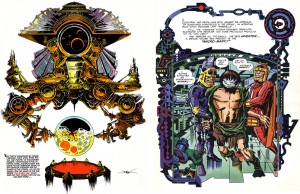
Druillet influences Kirby in The Hunger Dogs

Likewise, the heavily and aggressively cartooned and patterned, nearly abstract linear quality of Jack’s Pacific work has an overtly self-aware surface that seems to me to be similar to that of Panter’s Jimbo.

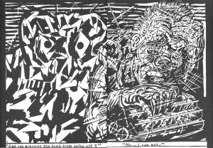
Gary Panter spread from Raw One-shot #1: Jimbo, 1982.
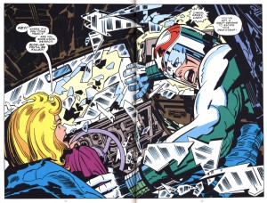
Kirby and Royer spread from Silver Star #3, 1983.

Panter has not only spoken of Kirby’s impact on his work, it is clearly visible. The fierce, slashing, almost punk energy of both Captain Victory and Silver Star drove me to speculate that the influence was reciprocal, that Kirby had been looking at Panter, when I first saw them at the time. Now, I have not found the smoking gun, in that I haven’t yet been able to place that 1982 cardboard-covered Jimbo in Kirby’s hands. But at any rate, the faithful, flat surface of Thibodeaux is not altogether inappropriate on Kirby’s late efforts and regardless, the young inker does manage some very strong pages and passages.

The first six issues of Captain Victory boast some of the most dramatic and effective coloring that Kirby ever got in comics besides his own, by Steve Oliff. Kirby rarely had sympathetic colorists, nor did he often have control of the coloring. When he did, he was brilliant but he rarely had time to do it. The same rules apply: if a colorist comprehends the space and light in Kirby’s art, they can enhance it greatly.

Thibodeaux and Oliff make Jack look pretty good in Captain Victory #4.

Oliff’s color is often inspired, but he was replaced by Janice Cohen, who did a fine if standard job. For the final issues Pacific changed over to fully rendered color while they simultaneously experimented with paper stocks, causing a mutating product which made Tom Luth’s late airbrushed efforts appear garish and inconsistent.

The initial 48 pages of Captain Victory were intended by Kirby as a response to the Steven Spielberg film “Close Encounters of the Third Kind.”  Dogface Pvt. Jack Kirby could not assume that aliens intrepid enough to cross the galaxies would be any less opportunistic that we humans would be in a similar situation.

Not cute: I don’t feel very tasty, from Captain Victory #2
(panels reconfigured for continuity).

He advocated a full defensive mode. He envisioned an attack on Earth by an aggressive species and created Captain Victory as the vanguard of an advanced force that guards the galaxy from such predatory races. Though the lead character resembles two of Kirby’s signature heroes, Thor and Kamandi, he is a less an individual than a soldier tool of an interplanetary governmental body, like Captain Kirk of the Federation but with a harder, dehumanized edge more like the recent series of “Battlestar Galactica.”

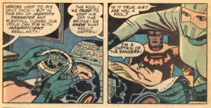
“Victory is sacrifice, sacrifice is continuity, continuity is tribulation” is Captain Victory’s mantra. This might relate to the fact that all the characters Kirby created for Marvel Comics were sacrificed by their creator to the corporation to become properties, to be continued by other artists. By making them successful, Kirby was shut out of his creations, time and time again. Kirby places Captain Victory as belonging to the Galactic Rangers, his being is their property. The current version is a clone. He sacrifices himself to the Rangers’ cause by repeat-offending suicide. He dies, but there is no real continuity… when he is killed in combat, his recorded memories are transferred via a “storage unit” to a fresh clone of his body. A new Captain Victory arises, a thing that thinks it is him but is a copy (incidentally, this is also a compelling argument against “Star Trek”-style transport). The moment of the previous incarnation’s death has been erased, so the copy has no memory of suffering, that might give it pause before it re-ups.

A never-ending tour of duty, from Captain Victory #1.

The emphasis on characters as properties that is seen in the most prominent comics publishers is entirely deliberate. Conceptual ownership by way of work-for-hire gives the advantage to the publishing corporation and devalues the unique talents of the individual writers and artists who make the work. The producers of the work are considered to be expendable, other writers and artists might do just as well concocting variations of a given set of ideas and also be more malleable to the corporation’s control. Artists who are kept busy retreading concepts created by others are less invested in the work. They might add new characters within the established parameters (disowned as work-for-hire), but have less time to develop properties of their own that they would be invested in (and the corporation will often stick to safe, proven ground and discourage innovation).

Just good business, from Captain Victory #11.

Thus, a narrow pool of concepts is tightly controlled, harnessed and milked, an endless serial produced through collective effort to become, the corporation hopes, a “new mythology for our times.” A myth is a construct, not a person. The myth is The Silver Surfer, not Jack Kirby. In a corporation, there can be no individuals—no one person can be responsible for success or failure, there are no ethics involved, the overriding consideration is the profit of the collective of stockholders. But, with the last part of the Ranger’s creed, “continuity is tribulation,” Kirby implies empathy with those souls tasked to continue the adventures of the properties he has lost. They must work hard, to have no autonomy. They are clones of himself, who must endure after he is gone. And, Kirby sometimes rejects continuity in these books, he does not seem to care if there are holes in the story or inconsistencies in his drawings from panel to panel—and nor do I. Finally free of micromanagement, Kirby makes some of the most spontaneous comics of his career.

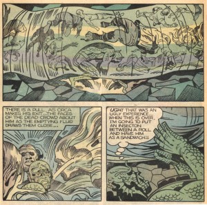
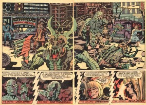
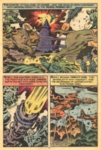
Captain Victory #s 3-13 were drawn in brief bursts, when Kirby could fit them in between his commitments to his animation work, but they still show a high level of  conceptual vigor, there are a lot of ideas put forth. To be sure, there are many weak passages, but there are also killer panels and pages and quite a few double-page spreads that rank with some of the finest Kirby ever did. The first storyline extended from the initial novella. Elaborations of the “Bugs” from the New Gods series that yield many fabulous designs which outshine their previous incarnation, the Insectons come to Earth to exploit its resources. They feed on life energy and the bloated bodies of their human victims are stored in fluid “food-channels,” shown to chilling affect in #5.

A disturbing sequence from Captain Victory #5.

The Rangers waste no time in making a full-on assault on the infestation. Some of the Rangers remind the reader of Kirby’s earlier creations, as in the resemblance of Orca to the Inhuman Triton and Tarin to Kamandi‘s tiger Prince Tuftan, but they are also less individuals than parts of a well-oiled machine, disciplined and equalized in military service. The books are militaristic but it would be a mistake to assume a hardening of Kirby’s humane outlook. Kirby was in the infantry in World War II and did not enjoy the experience. The Rangers’ dialogue is seldom the sort of action patter found in the comics of Marvel and DC, rather Kirby ascribes to them a bizarre mix of poetical expositions of the metaphysical and ethical dilemmas that can be spun from his sci-fi premise, with a sometimes silly and/or anachronistic humor, meant to represent the absurdities that those in dangerous situations indulge to leaven their trauma.

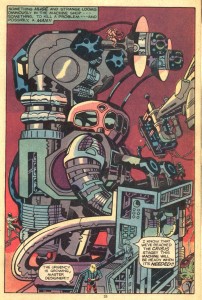
The spread from Captain Victory #6

The Insecton “story arc” culminates in the double-sized and stunningly covered #6, a nearly apocalyptic scenario that sees the good guys win but the Captain first partially blinded, then killed yet again to save our planet, in this case through an overdose of life energy by his operation of a giant “drainer” that sucks the enemy’s essence from their husks. The violence in Captain Victory is more “real” than in other Kirby comics, here he shows the consequences.

In the arcs that follow, the stories begin to take on the quality of tales told late at night by an ancient relative with a thick accent—it’s hard to hear or they don’t quite make sense, but a disquieting enormity is felt, a sense of the weight of millennia and of infinite forces outside one’s control. One cannot understand, but one wants to, because it feels important.

Kirby unstoppers the bottle in Captain Victory #9.

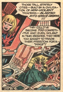
The second,  four-issue storyline deals with the Wonder Warriors, four disparate villains who obey the dictates of a disembodied Voice, that include the cooly armored Bloody Marion and Finarkin the Fearless, Ursan who decomposes matter with his touch and Paranex the Fighting Foetus, an overt reference to then-contemporary challenges to Roe v Wade spurred by right-wing Senator Jesse Helms. The famously liberal Kirby sidesteps the issue of women’s bodily autonomy entirely as the oversized telekinetic embryo inspires moral qualms in the Captain, who says it is not fair to kill something before it officially exists, despite its aggression and that it is independently free-floating, encased in armor and has already been named.

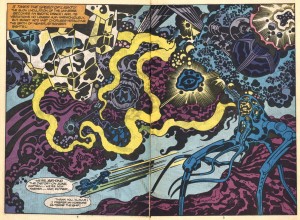
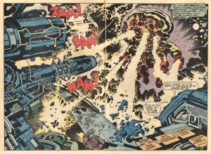
Spread from Captain Victory #10.

The most cryptically magnificent passages in the series take place in #10. In an incredible spread, the sexually indeterminate pre-being Paranex assaults the Ranger’s dreadnaught. Victory’s concern for the criminal Foetus is revealed as a sham intended to draw out the Voice, who the Captain mysteriously knows, and when it does, they proceed to an unclear endgame.

Legerdemain from Captain Victory #10

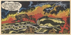
In language dripping with portent, Kirby has his Captain order his crew to remain passive as he is apparently dragged senseless off into space by the Wonder Warriors. Of course that also is a trick and perhaps an excuse for Kirby to draw more unsettling images of his creations pulled to their doom by floating cubes that have all of the “presence” of Donald Judd’s Specific Objects. They all blow up but Victory is fine, he has sent out a robot of himself and he prepares to explain to his crew his prior knowledge of the Voice.

The final story arc is a flashback spread across three issues; these contain themes seen elsewhere in Kirby’s work: a critique of militarism as evolutionary barometer, as in his extrapolations from Kubrick and Clarke’s “2001”; and the question of “nature versus nurture” that he would later return to for his rejected conclusion to the New Gods, “On the Road to Armagetto.”

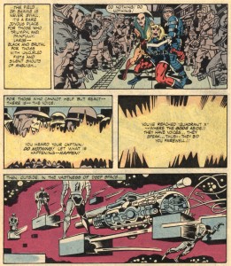
Who says Kirby can’t write? From Captain Victory #11
(panels reconfigured for continuity).

Captain Victory #11 shows a literally monstrous side of the hero as he relates with Shakespearean cadence the story of his (original’s) childhood in the court of his cousin Big Ugly, who has horns and multiple mouths. Though Victory is human and so apparently incompatable with his demonic relative, the 8 year old child easily suggests cruelly innovative ways for Big Ugly to conquer the known universe. Ugly and the rest of the royal family are in thrall to the Voice, which is revealed to be that of Victory’s dead grandfather, Blackmass. Victory’s family follow this incorporeal spirit’s foul will and justify their actions to their victims in religious terms. With typical prescience, Kirby makes the kid’s best friend a computer. The child is the instigator of some of Big Ugly’s most heinous actions, yet seems to find it all horrifying/boring. Victory is a precociously talented architect of genocide, but he disassociates and is able to blame his cousin as if the acts are unconnected to him and then has no problem betraying the bond of blood to murder Big Ugly, heralding his coming of age as a soldier.

Cases have been made for possible correspondences of issue #12 with the New Gods saga by John Morrow and other Kirby fans. It depicts the boy as with the aid of his (um, huge) digital pal he destroys his ancestral planet Hellicost (Apokolips) and flees into space, only to crashland on a planet that is home to yet another militant psychopath, Captain Flane, who may or may not be his father.

A favorite page, from Captain Victory #12.

Flane plays God to the indigenous population, forcing their evolutionary development by facilitating their development of military technology, leading to his own death at the hands of his “students.” For Morrow et al, the issue represents Kirby retaking his creations to give them a more fitting end. They believe that Flane represents Orion and Blackmass represents the ghost of Darkseid. Perhaps, but it also seems appropriate to note that Victory’s future state of serial martyrdom is foreshadowed by Flane’s suicidal manipulations. Victory seems to be the carrier of a murderous genetic package, but Kirby also rejects predisposition to violence with the implication that such an ingenious race as the one Flane corrupted might have used their natural curiousity to more constructive ends, had they been influenced by a less aggressive mentor.

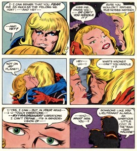
The series ends in a distinct affirmation of the creative power of the artist. In CV #13, Victory cannot act on his clumsy love for his fellow Ranger recruit Lieutenant Alaria. In fact, all of his more individualistic impulses are suppressed and superceded by the demands of his duty.

A little awkward, from Captain Victory #13.

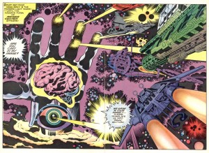
Kirby finally allows Victory to meet his maker, the true “Source:” the hub of the Rangers is depicted as a surreal abstraction of the artist, a humongous floating hand which surmounts an eye and is a container for a brain.

Just so we know who’s in charge, from Captain Victory #13.

Victory and Alaria are revealed as easily manipulable pawns, to be split up for dramatic purposes or “reassigned” to be given yet “more complex duties.” Flashes of compressed adventures follow the ambitious yet loveless career soldier to Alaria’s death and his Captaincy, as he “achieves the reason for his existence,” that he is a cog in a wheel and also the starring hero of the last Kirby epic. He will not procreate, but be a copy of a copy of a copy etc. He is pre-genericized,  the comic is self-aware and takes on the aspect of a loop, we are back where we started and Jack Kirby is done. He has given us a look at our own worst impulses and into the far reaches of his mind.

________________________________________________________

SOURCES

Amash, Jim. Interview with Jack Adler. Alter Ego #56.

Brown, Andy. “In Defense of Our Galaxy.”  Monster Island Three. Conundrum Press, 2007.

Lewis, Jeremy. “In Defense of Our Galaxy.” Jack Kirby Quarterly #8.

Taylor, Stan.  “Why Did the Fourth World Fail?” The Jack Kirby Collector #31.

Genius, Disempowered

Click on images to enlarge

IDW’s Genius, Isolated is a gorgeous, impressively scaled hardcover with many crisp reproductions from original comic pages. The first of a series of three volumes that are being hailed as the definitive statement on the art of Alexander Toth, it continues the high production standards set by Dean Mullaney and Bruce Canwell’s previous excellent, essential collections of Milton Caniff’s Terry and the Pirates and of Noel Sickles’ work. But I must begin my critique to say that the elegant, conservative design that works beautifully for an artist like Caniff feels a bit staid when applied to the daring, moody angles and croppings of Toth—I hope that his great work of the 1960s and 70s, to be covered in the second volume, will be presented with a somewhat more elliptical, dramatic design, as befits that period of the artist’s work.

I have IDW’s Sickles book and admire it greatly. I just read several of Mullaney and Canwell’s Caniff volumes and was hugely impressed, by the quality and scale of Caniff’s achievement and by the the editors’ presentation of his life and work. In one of these incredible collections, though, a passage disturbs me—in his introduction to Terry Vol. 3, Pete Hamill writes of the strip’s millions of readers: “…almost certainly they were not reading it for the increasingly wonderful drawings. They were reading it because of the characters and what they were doing. That is, for the stories.”

This is a basic misapprehension of the comics form. In comics, the reader “reads” the images as much as the text. The art joins with the text to a common purpose, the story—which might be furthered, for example, by a drawn expression that shows an intent that is hidden by what the character is saying in a dialogue balloon. Caniff’s art is not redundant, it communicates nuances that are not expressed in his text, or it supplements the information provided by the text. Cartoonists make decisions in their orchestration of word and image in the form of a page which greatly inform and affect the reader’s perception of the narrative. Hamill discounts the contribution of Caniff’s exhaustively researched imagery to the success of the work as a whole; the precise way, for instance, that he is able to bring the vital, proactive female characters that propel his storylines to life in his drawings. And unfortunately, a similar misconception seems to be held by the editors in their book on Alex Toth.

Rather than an art book, Genius, Isolated is a biography accompanied by a selection of photographs of the artist, along with many of his original pages and happily, a selection of complete graphic stories. Despite the pleasures of Toth’s art, though, a dispirited tone of unresolved conflict and failure to communicate permeates the book. There is precious little upside or sense of aspiration or inspiration, of a dedicated artist breaking boundaries. The greater part of the text tends toward the exposure of the faultlines in Toth’s professional and personal life. We are informed in depth about Toth’s life-long depression, his inability to compromise, his lack of diplomacy and outright rudeness to all and sundry. The artist’s family and friends provide a lot of personal data and observations, all valid grist for the mill in a biography of a man who was a seriously troubled and problematic individual, I’m sure. Still, long-speculated-about issues regarding his parents are laid out but remain unexplained, the names of his first two wives are not established, we read of the pathetic ending of his third marriage, the fight he had with DC editor Julius Schwartz  is forensically examined…some of this is either too little information or too much and sometimes, it feels like no one’s business but the Toths.

Genius, Isolated disempowers its subject by focusing on his personal life while failing to articulate what it is about his storytelling that made it special. In this volume, the text does not make a case for genius. The art does, with some reservations. The artist did much of his formative work for DC Comics, but they seem to be saving their early Toth holdings for a collection of their own, since there is only one DC story (a good choice, though: “Battle Flag of the Foreign Legion”). The group of Standard stories reproduced from the original art herein have been reclaimed from Pure Imagination’s reservoir of bleached and restored public domain reprints, but there is not such a clear demonstration of Toth’s rapid growth within the space of a few years in the early 1950s, or an analysis of his form and practice as Greg Theakston attempted in his two-volume Toth: Edge of Genius. Here, the work must largely stand on its own virtues, while the text portrays a man with deep psychological problems, who happened to also be blessed with superior drawing and design capabilities and simultaneously cursed with OCD.

Some new insights are offered by several of Toth’s contemporaries such as Irwin Hasen, John Romita Sr., Joe Kubert, Mike Esposito and Jack Katz and the artist’s private correspondence with friends like Jerry De Fucchio is quoted, but a significant portion of the information related to Toth’s artistic sensibility and process is liberally culled from interviews with Toth’s contemporaries that were conducted by the dedicated comics historian Jim Amash for the special Toth issues of Twomorrow’s Comic Book Artist (#11) and Alter Ego (#63). Then, the selected quotes often seem intended to support explications of one or another of the artist’s perceived negative qualities.  Toth speaks for himself occasionally (and not in his own hand, his writings have been typeset), but often his detractors are allowed to qualify the work. Kubert takes the opportunity to defend his allegation that Toth hacked out the “Danny Dreams” story in Tor #3 by drawing it at print size, even though it is plain from virtually the rest of the book that it wasn’t ever in Toth’s nature to take the easy way out. Toth’s efforts to improve the material he worked with are presented as proof that he was “difficult” since he wasn’t able to keep to his assigned place as an illustrator. Yet, the book seeks to define Toth as an illustrator and in this buttresses past misconceptions about his work, and by extension that of all comic artists who work with writers.

The authors’ choices of which of Toth’s influences to highlight are unexpected and seem intended to press a view of him as more of the lineage of illustration than of comics. The “influences” section is comprised of images and capsule biographies of several obscure illustrators. While I don’t begrudge them their renewed visibility, I wish there were images of the works of Robert Fawcett and Albert Dorne, illustrators whose work strongly affected Toth, in a book that means to be definitive.

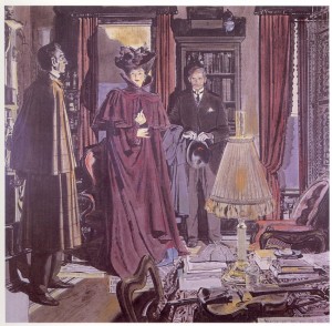
An elegant illustration by Robert Fawcett

Toth is a cartoonist, but his comic artist heroes are placed outside of the “influences” section. A few Scorchy Smith dailies are shown, despite that the impact of Noel Sickles’ later graphic work on Toth’s drawing techniques is as pronounced, or more so.  The authors do show a clear correspondence of his neophyte efforts to Frank Robbins’ early work, yet Roy Crane, arguably Toth’s most overpowering muse, rates only a single repro of a relatively weak Wash Tubbs daily strip.

Buz Sawyer: a more substantial example of Roy Crane’s talents.

Irwin Hasen was a mentor and friend to Toth and by the artist’s own account, another prime influence on his work. Hasen gave the authors many quotes, but his artwork is not deemed worthy of a reproduction. In an interview with the author/editor team on TCJ.com, Dan Nadel hones in on this omission and asks, “What did Toth see in (Hasen), as opposed to the flashier, more obviously influential Meskin?” Mullaney reponds, “It could very well be that Alex admired Irwin because he was a working professional that Alex wanted to be. Irwin was certainly among the better artists at DC at the time. It’s a question only Alex could answer.” If one actually looks at Hasen’s work, though, a connection can be seen—-his storytelling, his internal “camera” and page compositions are clear and succinct, his brushwork is fluid and expressive.

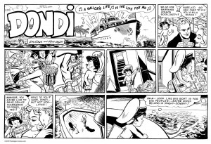
Mad fresh: Dondi daily strip by Irwin Hasen
Breezy brushwork by Hasen on a Sunday.

From childhood,  I always could see that Hasen drew appealing comics pages. I trust Toth when he said he learned something of value from his friend’s work—I’d guess that the calculated and deliberate Toth admired the light freshness of Hasen’s handling.

A case is presented that Toth is not much of a writer himself. This is firstly evidenced by an early, incomplete and unseen story, interesting mainly for the rare look at his pencils. Obviously Toth wasn’t happy with it, since he didn’t finish it. He did a later version, “Tibor Miko” from Creepy #77, that wasn’t much better. Then, there is the interminable exposition of his self-written Jon Fury strips for the Army, included here in their entirety or nearly so, although some strips are presented in a badly retouched form (I feel sorry for the production artist who was charged with this task).

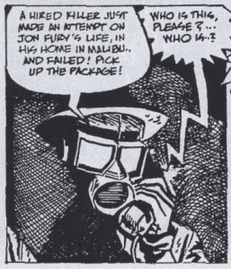
Retouched panel from Jon Fury

In Fury Toth tried to emulate Caniff’s writing but falls flat, most embarrassingly so when he phonetically renders the dialogue of Fury’s Mexican hoax wife in the inexplicably typewritten third storyline. The Jon Fury strips are nearly anomalous in Toth’s corpus in that they are so annoyingly hard to read. Granted, he had a difficult time initiating a script, but usually once he had a script, he was a master at making it work.

In his preface, Mullaney writes that Toth “would accept drawing assignments, ignore the supplied scripts, and unilaterally rewrite at his own discretion.” But—-Toth didn’t ignore scripts and his amendments were never unilateral. Instead, he served the story, he made every effort to find the story’s heart. Any alterations he did on scripts that he accepted were based on his instincts of what the story needed. He did the lettering whenever possible, not only for the aesthetic of his unique hand making the finished page, but for the control lettering gave him to (usually) subtly amend the script and streamline the narrative.  What illustrator has ever taken it upon themselves to alter the text of a story? It isn’t done. But Toth continually proved that he deserved such freedom in interpretation and in his efforts, he certainly shortchanged no one. Ironically, even his least sympathetic editors and writers have been the beneficiaries of Toth’s unpaid improvements—his works are often the jewels of their careers.

The overwhelming majority of the scripts Toth drew would hold no interest today if he had not drawn them. An exception is the transcendent yet faithful enhancement of Harvey Kurtzman’s “Thunderjet” that is reprinted here. However,  Toth was unable to adhere to the writer/editor’s exactingly articulated layouts for their most brilliant collaboration, “F-86 Sabre Jet” from Frontline Combat #12.

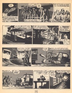
F-86 Sabre Jet: one of the best pieces either man ever did.

As can be seen from the page above, Toth did not alter Kurtzman’s structure. His offense was that he chose to use oblique silhouettes in the upper tiers, a relatively small change but one which greatly augments for the reader the sense of disorientation communicated by the text and experienced by the pilot.  An angry Kurtzman printed the story, but Toth did no more work for E.C.  Joe Kubert’s later outright rejection of Toth’s Enemy Ace story because of the artist’s alterations to the script is atypical—most of Toth’s editors accepted his improvements. However, these anecdotes do “illustrate” precisely why Toth was not an illustrator. He demanded a level of autonomy in interpretation, even if it meant he would get no further work from a company.

Massive popularity in one’s time is not always a barometer of artistic accomplishment. Toth’s avoidance of the repetition and artistic stasis that drawing series or even full issues of the same character require makes his work hard to find, spread out as it is in anthology titles, and he did not make the regular income that series would have given him. Toth’s son Damon explains, “his integrity was way more important to him than dollars and cents, and he lived by that his whole life.” Yet, the editors insist on supporting the emphasis on character/property that constrains the comics industry and marginalizes peripatetic artists like Toth, by focusing the Dell section on Zorro and including an already much-reprinted story. Although he began with high hopes, the artist disliked the scripts, did not consider Zorro to be his best work and it was the source of the conflicts that ended his Dell employment. His fabulous efforts on some of his other rare book-length Dell comics such as Clint and Mac, Paul Revere’s Ride, No Time for Sergeants and The Frogmen are barely mentioned.

Clint and Mac: a particularly beautiful comic book
A memorable panel from The Frogmen #5

Instead, a twenty page story from Toth’s series of 77 Sunset Strip comics is included, one of the few things in this book that I didn’t already have. It is a bizarre choice, drawn in his more humorous style and it has grown on me, although Toth thought the show and characters were idiotic and this informs his disparately absurd panels, any of which might have been an excellent source for Roy Lichtenstein.

77 Sunset Strip: a no-brainer

Maybe Toth was overqualified to work on such disposable children’s entertainment, but he did it because he was driven to use the comics medium as it stood in his time, to experiment with its properties, to our enrichment. He found ways to believe in the scripts enough to transform them, if not into literary masterpieces, certainly into examples of sophisticated comics storytelling. That sophistication most often came from his skills as an interpretive comics storyteller, rather than from an illustrator’s strict adherence and accompaniment to a set-in-stone text. Toth did well-drawn and designed covers and pin-ups up until the time of his death, but what was missed by his disappointed fans for his two final decades was his approach to comics narrative—and that is where his importance lies.

Perhaps some of my problems with Mullaney and Canwell’s approach will be addressed in their future volumes. However, the second book in the series, the one that will represent his greatest comics work, will be titled “Genius, Illustrated,” a title that makes me despair, whatever the editors’ rationale for using it (“it’s about a genius, and it’s illustrated”). I beg them to reconsider that title, even though there would be some effort involved since the book has been solicited. The term “illustration” describes artwork that accompanies a text, but does not impose upon it. An illustrator has a subordinate role to that of the writer and in bibliographic terms is not considered an author, or a co-author along with the writer of a book. Applying this label to the artist’s part of the collaborative process of comics ignores that comics demand many skills not in the job description of an illustrator, such as staging, timing and the emotive acting of “on-model” characters in the sequential representation of shifting vantage points of movement within three-dimensional space.

Toth had a complex skill-set and a consuming dedication to his art that places his work far above that of his contemporaries. If our greatest interpretive cartoonist is saddled with the “illustrator” label, he is denied what he fought for in his many battles with editors, the frustrations of which surely impacted his personal life, conflicts which grew from his efforts to make some of the greatest examples of graphic storytelling to date. If Alex Toth cannot get his due, then all comics artists who do not write their own scripts, but who contribute a great amount of the narrative content of the comics they do within their drawings, are well and truly fucked.

Gene Colan: The Hidden Eye

In 2008, Steve Cohen asked me to contribute to a magazine to honor Gene Colan, to be entitled Genezine. I took the opportunity to arrange with Gene and his late wife Adrienne to tape an interview. We met at a pizza joint in midtown Manhattan while they waited for an appointment Gene had at a hospital nearby. Beforehand, I attempted to ink an elaborate drawing of Gene’s, in order to directly inform myself about his work’s structural properties and to have something to fuel the discussion. It was the last time I saw Adrienne, another reason why I regret that when I transcribed the tape, her many relevant comments were inaudible because the microphone in the little recorder I used had been aimed at Gene. Although the transcript is slightly disjointed without her portion of the interchange, Gene offers some interesting insights. For a reasons outside of Steve’s control, Genezine never came to fruition, so HU is as good a place as any to present this conversation with an important and influential comic book artist. Click on images to enlarge.

______________________________________________

The first time Tom Palmer inked Gene, from Dr. Strange #172

Transcript of an interview conducted on February 7th, 2008.

James: You like to work to music as a sound thing that’s going on…does that affect you compositionally? Your compositions tend to flow, and lead the eye around.

Gene: Let’s say it helps my composition, music helps me get into it.

James: In our earlier interview you said you wanted to find a way to represent music. I think you’ve done it! (laughter)

Gene: Well, Disney did that with Fantasia.

James: Comics don’t have sound, but there is timing, the beats.

Gene: I’ll play anything. I’ll handpick the records. A symphony, whatever it’s going to be, and that launches me right into it. Blocks out anything else, and it kind of blends with what I’m doing. Sometimes I’ll play just sound.

James: Do you find that produces a sort of time warp, you get lost in what you’re doing?

Gene: Ooh, yeah.

James: Like missing time…how long have I been here? (laughter)

Gene: Yes, because music launches me into another time, another space, and that helps me a lot. It’s very hard to describe just what the mental process is…everybody a different way of approaching it. But, that how I approach it.

James: You are able to visualize a three-dimensional environment in your comics, what I call “motion perspective.” In other words, you are able to portray different angled views of a given environment, with some elements in motion. For instance, you vary vantage points within the six sides of a room, on furniture, the people moving through it in time, and what can be seen through the windows and doors. These skills are specific to cartoonists and animators, and you are able to manifest it so realistically, and with your style of graceful, expressive page design.

Gene: I’d get an idea of the form and light from something in a photo or on film, and I’d take it from there. One of the reasons I prefer taking my own reference pictures is because I’m able to shoot pics of some elements from different angles. Especially people. Of course, there’s much more to it. I can tell you also that when I read the script (even if it’s only a page or two), I’m planning the composition of the panels for days in my head, looking for different elements to take pictures of and deciding the best way to portray the words.

James: Photos and film give you light. Would you pose yourself?

Gene: Sometimes, yeah I did.

James: Like the Nightmare drawing I inked, you obviously didn’t have a model for that thing. (laughter)

Gene: Well, sometimes I need a springboard.

James: If you’re doing a long piece with the same guy, like Nathaniel Dusk…at a certain point you’ve got him, you can draw him all the way around.

Gene: Yeah.

James: You would go to different locations, to find something specific that would be a springboard?

Gene: I would get an mental image, right away, or sometimes not right away, but I would get an image of a location and the person in it, what’s in the foreground, what’s in the background, and I would work with that to get a sense of depth. Very often I would use something in the foreground to frame the picture, something recognizable, like a lamp.

James: I see…it’s not really the focus of the image, but something to make the space.

Gene: Right. Then I’ll work into the background, or sometimes I’ll work right up front. I have to have a good notion of where they are. If they are in a tunnel underground, that’s not much to work with.

James: In your story in The Escapist #2 (Vol. 1 of the collections) you draw the characters in a tunnel, and they’ve got no room. You do a claustrophobic thing, and find a place to hide the “camera,” imbedded in the wall back here (holds an imaginary camera behind his head). It’s not a real view, but it works.

Dan Adkins puts a nice polish on Gene’s pencils, from SubMariner

Gene: They’re not complete images, they’re kind of fragmented…but I generally know what it’s going to be. And once I start doing the figure work it becomes clearer and clearer what I’m going to put into the background.

James: Okay, but also you don’t read the entire script, right? You prefer to be surprised?

Gene: Page to page, page to page, or if everything feels like it is leading to a particular page that I don’t know about, then I’ll read forward, to find out what that place is…I have to, or I’ll screw it up, you know. I mean, sometimes it has to do with something that is going to appear later…but they are usually pretty basic. It usually starts out in a basic way, two people talking. You don’t need much more than that.

James: I wanted to get into your acting. I mean, your characters act, within their framework. So even the smallest little guy in the background has a role to play…he’s not there by accident, you already cut out all the extraneous…so each of those would be based on types from film or from your life?

Gene: Yes, things I’d seen on the screen…

James: Or your family…

Gene: Oh yes, my son.

James: You put Adrienne in there?

Gene: I used to, yeah, and my daughter.

James: As goddesses? (laughter)

Gene: Did you see the film Patton? There’s a particular scene in it where there’s a close-up of two Generals, Patton and someone else, talking about their next strategic move. During the thick of the battle, way in the background shells are being lobbed all over the place, explosions, everything, and the camera was focused on these two generals. But, if you looked in the background they were telling another story and that story was, a GI had been shot, wounded, and a medic comes running to him. It has nothing to do with what’s up close, that was the important thing and that was the thing that has dialogue, the generals talking, what they’re going to do next; the background essentially relates to it, to where they are and what they’re about….yeah, we all knew it was wartime, but to see a medic come out and help a wounded soldier and drag him back to safety…they didn’t have to put that in, but boy, what reality. It added to the scene.

James: Okay, for instance at Marvel with Stan Lee, if you have a conversation on the phone, it goes for….how long is it?

Gene: A few minutes. I’d tape it.

James: Right. So you’d actually refer back to the tape while you’re working.

Gene: Yes, that’s what I did.

James: You have to plan out all the action and movement…and that’s actually an optimum kind of freedom for you to design everything.

Gene: It’s not done that way anymore.

James: Okay, now they say, here’s four panels on this page, and the editors do futz around with the balloons…do you pencil the balloons in first? Or leave room for them?

Gene: I try to leave some room at the top.

James: I can’t design a comic page without putting the balloons in first, because I know I’ll need this much space. Anyway, at Marvel you were writing the story on the top, your originals have notes in your handwriting.

Gene: Those books would never have long sentences, just very short captions so it wouldn’t crowd out the art. Stan gave me the ball and let me run with it.

James: Well, for instance in Dr. Strange #182 there was a two page spread with the Juggernaut, a very psychedelic layout, a few panels rippling across a spread with gradating colors on the page behind, a really unusual resolution….you’d make that decision?

Gene: Yes.

James: You’d say, ‘I’m going to do this two-page spread,’ and then for that space you might have to pay on the last page by having to pack in a lot of information for the end.

Anatomies clash over an effective background, in the print Jim Steranko made of the cover he inked for Gene.

Gene: Oh yeah. But sometimes there were issues that the panels weren’t clear enough. Stan would say to me, ‘Find the man in the puzzle.’

James: Yes, but it would make complete sense when it was colored. They just weren’t able to see how it all came together, right away. Marie Severin or whoever colored it would think, ‘Oh, I see what he’s doing here,’ comprehend it, make it clear.

Gene: I did more of what pleased me than what pleased Stan. I didn’t disregard what he wanted, but I worked for many writers, and I did what pleased me. I thought that was the right thing to do.

James: Your body of work has a consistent kind of realization.

Gene: I had some writers that were editors, who were very specific about what they wanted, and that would intimidate me, and then I’d start to worry about the work, and they could never get the best out of me because I had to follow what they wanted.

James: They should want the artist’s vision. Otherwise, why hire you? I find penciling to be the most pleasurable part.

Gene: It is.

James: For a long time I didn’t enjoy the inking, it was like doing the same drawing over again. I’d ask, can’t you get me an inker? But no one else could ink it because they wouldn’t know what the hell it was.

Gene: I inked a few things when they asked me to. But, editors and writers want what they want. They often don’t care what you want.

James: Or, the writer would not understand what the artist was facing. They’d say, give me 200 people standing on a street corner. Thanks for that!

Gene: I’d give the effect. There’s a story I like to tell, about an artist Alexander King who did a painting of a street corner full of figures, and the editor said, ‘Can’t you just turn everybody to the left?’ That meant the whole painting was destroyed. They’re not pawns on a board (laughter). So King just folds the painting in half and dumps it in the trashcan and walks to the elevator. There was another fellow in the room who was watching the proceedings, observing, and he followed King out to the elevator. He said, ‘Let me give you a word of advice. The next time you do something of this nature, paint one of the women with a hairy arm. If you did that, they’d spot that right away, and justify their job’ (laughter).

James: That’s like what I read Adrienne said to you at some point, fixing one of Shooter’s corrections on every page….

Gene: ‘Make him feel like you fixed everything.’

James: And he’s like, ‘That’s more like it.’ I didn’t mean to bring him up (laughter). About inking again, your own inking is very fresh and quick, like you actually did it kind of quickly.

Gene: I have a rough finish with ink.

James: It’s not something you want to be doing, really?

Gene: No, I don’t. I can get a suppleness of tone with a pencil, and let the inker decide whether he wants to put those greys in or not.

My try: I should have used a brush

James: Well, inking your Nightmare drawing I realized that all of your lines are going in a trajectory. When I printed it out I should have flopped it, because I’m left handed…are you right-handed, Gene?

Gene: Yes.

James: Right, well, your directional strokes are going like this (demonstrates). I would have done it better backwards (laughter).

Gene: I’m a stickler for faces. And you got Strange spot on. Overall, a little too scratchy with the lines. But I know that’s very much your style which works brilliantly when doing your own art, but I’d like to see mine with a little more mix of pen and brush work.

James: That was my second try at inking that drawing. I printed it off your site and blew it up on Xerox, then lightboxed it. The lightbox made it very hard to see the lighter lines.

Gene: Your inking is quite good and actually it’s really how I drew it. If you had put a denser line on the back of the monster, it would have improved the confusion. You couldn’t have picked a more complicated picture. (laughter) You should have started with something simple! It’s confusing because that’s how I drew it. Bottom line: ya did good, Joey!

James: Well, thanks, Gene.

Gene: Let me ask you this. Supposing on the page it’s raining, and you’re focusing on some of the characters, rain streaks are coming from right to left. But now you’re focusing on this character, who’s talking more or less to the reader. There’s another panel where he continues to talk, but not from the same angle.

James: You’d have to change the direction of the rain.

Gene: Right. Did you do that?

James: Yeah, my first issue of 2020 Visions started with a rain scene, and I angled it depending on the viewpoint. But in inking you, it’s in the faces that you go, oh my God, that’s really Gene. The way it wraps around the form of the head…

As an inker, Al Williamson 'gets' Gene, from Tomb of Dracula (miniseries) #1.

Gene: When I draw a face with an eyeball in it, very often that eyeball is so bloody outstanding, that it almost looks like they’re looking at you in shock.

James: (laughs) The eyeball!

Gene: I mean just a general face talking, so I try to soften that, so that, if you look twice, maybe the first time you moved to the eyeball, but if you looked at it again more carefully you wouldn’t see it. You know what I mean? I have the eyeball in such a way that it’s not offensive. It doesn’t look like it’s scary-eyed. Do you understand what I mean?

James: You mean a specific piece with an eyeball?

Gene: No, when you draw a face, say a guy…

James: You mean whether it comes to life or not?

Gene: Well, it can come to life, but if you’re frightened, of course, your eyes are wide open and you can’t help it…you have to show the eyeball. But if you want to keep that brave look on a hero, then don’t show the eyeball.

James: Well, certain cartoonists will…and I was doing this. I used to draw an eye, and put a little highlight in the pupil…a little gleam.

Gene: Yeah.

James: Then a couple jobs I just blocked it in. It causes this sort of Charlie Brown effect. It becomes a little more universal, people identify with it in a different sort of way.

Gene: I find when you’re dealing with that specific thing that I’m talking about, the eyeball, it’s either over the top, or it’s hidden, so that it’s not offensive. You don’t get the feeling that this guy is staring at you. It’s all in the eyes, like softening. They could be looking at you but there’s just a hint of an eyeball in there. Just a hint.

______________________________________

My earlier interview with Gene from 2002, at Comic Art Forum: http://www.thearteriesgroup.com/ComicArtForumColan.html

______________________________________

Daredevil, Sub-Mariner, Tomb of Dracula, Dr. Strange, and Nightmare copyright 2011 Marvel Comics. Nightmare drawing copyright 2011 by Gene Colan.

Charles Schulz: High Anxiety

The following was originally done as a presentation for Art Spiegelman’s seminar, “Comix: Marching Into the Canon” at Columbia University in 2007. I think it suited Art’s humor to assign me to do the required audio-visual presentation on a cartoonist we both perceived as far from my usual range of interest. He certainly did me a service in that while I also grew up with Peanuts, the process of making my power point slideshow and commentary added greatly to my appreciation of Charles Schulz’s comics artistry. Click on the images to enlarge.
___________________________________

“Style…should be in a continuing state of some evolution, while at the same time, it embodies a handy set of tools, a vocabulary for dealing with the experience one is describing, or for defining, often obliquely, the special nature of one’s own presence in the midst of this experience.…” -Donald Phelps
___________________________________

An important influence on Charles Schulz was George Herriman’s Krazy Kat, the early zenith of comic art: simplified, expressive ink line drawings in concert with each other and with thoughtful language.
___________________________________

Schulz’s favorite cartoonist was Roy Crane, whose storytelling in Wash Tubbs mixes aspects of cartooning and realism. Crane’s work has a lot of clear white space, a feeling of air around the characters on the pages.
___________________________________

Another key influence, Skippy by Percy Crosby: the class consciousness of children who are vastly separated in terms of education, and a breezy pen and ink style.
___________________________________

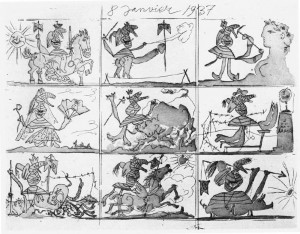
An actual comic strip by Pablo Picasso, another of Schulz’s favorites. I like how the main bandaged figure is kept somewhat on-model.
___________________________________

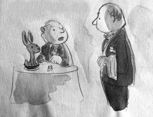
“Waiter! There’s a hare in my soup!”


Schulz wanted to be a New Yorker cartoonist, but didn’t have the nerve to submit his samples, like this one. One of his accomplishments was to successfully fuse the pared-down, elegant drawing and sophisticated irony of the New Yorker cartoon style to comic strips.
___________________________________

A charming drawing from L’il Folks, his precursor strip to Peanuts.
___________________________________


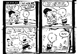
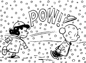
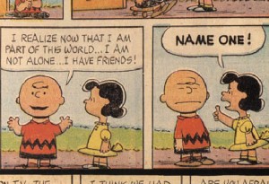
Peanuts debuted in 1950. Schulz immediately began pushing the envelope with his characters. Charlie Brown’s isolation and depression is omnipresent. In this very early strip he has a virtually hysterical reaction to being ostracized. Much humor is based on pain, and Schulz’s children were often all about pain.
___________________________________

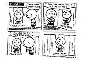
This shows Charlie Brown’s self-image: as a happy kid. This was not borne out by the next 50 years of daily strips.
___________________________________

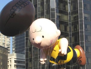
Charlie Brown became instantly recognizable. Contemporary popularity does not ensure one’s place in history, but in addition to creating indelible characters that resonate deeply in the American consciousness, Schulz was able to use his form to express complex sociological and psychological observations.
___________________________________

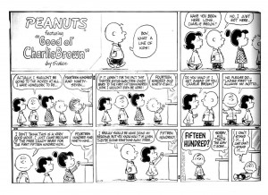
It is often quite a dark picture of life that Schulz give us. In this case Charlie Brown is not paying attention, which the calculating Lucy takes advantage of, along with his chivalry. But what he is saying is that he is neglecting more important matters to go to a bad movie, just to get something for free. Perhaps Lucy does him a favor, he is overreacting and should go home to his homework. As well, if his chivalry was real, he would have been happy to give up his place to his female friend.
___________________________________

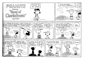
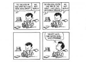
Optimism is unfounded. The manipulative Lucy tells Charlie all women can’t be trusted, specifically their “tears.” The behaviors of Lucy and the other female characters could take their own separate analysis, Schulz still has issues from childhood that he lays out.
___________________________________

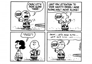
Schulz didn’t like Lucy’s character but she suited his storytelling purposes so well that she became essential. All of his characters have issues themselves, and with each other. Themes of abusive relationships and unrequited love are all over Peanuts. This panel refers back to Krazy and Ignatz.
___________________________________

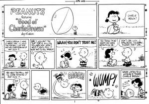
Here Lucy relentlessly corrupts Charlie Brown’s long-awaited moment of pleasure, the first day of baseball season. Schulz decried the decline of American sportsmanship. He refined his concepts and evolved his drawing for clarity and simplicity of expression; ideal as a vehicle for his ideas, and ideal for efficiently producing a daily strip.
___________________________________

Schulz said he thought Charlie Brown deserved some of the abuse he got because he was arrogant. In Marxian terms he is in false consciousness, fixed in a cycle of failure and disconnection. He can never achieve any status. His creator, though, retained the means of production. Schulz controlled his creation and did his own work with no assistants.
___________________________________

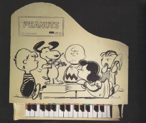
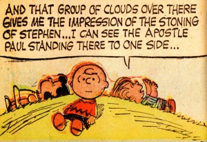
Even the product drawings extend his themes. In this group Schroeder is a prodigy being seduced by the tormentor Lucy. Linus, when he’s not oblivious as he is here, is capable of acts of extraordinary dexterity. Snoopy plays violin, speaks French, and has Van Gogh and Andrew Wyeth paintings in his doghouse. Look at the expression on Charlie Brown’s face. Is it incomprehension? Jealousy? Embarrassment? What can Charlie Brown do? Charlie Brown is in the center, but feels marginalized. He looks at us, or at the void.
___________________________________

This reminds me of the beginning of Maus, where little Art is deserted by his buddies and runs to his dad, crying. Vladek says, “Your friends? Lock them together in a room with no food for a week…then you could see what it is, friends.”
___________________________________

Art Spiegelman’s perfectly timed version.
___________________________________

“It’s kind of a parody of the cruelty that exists among children. Because they are struggling to survive.” -Charles Schulz
___________________________________

“These children affect us because in a certain sense they are monsters…because we realize that if they are monsters it is because we, the adults, have made them so.” -Umberto Eco
___________________________________

Al Capp said: “The Peanuts characters…wound each other with the greatest enthusiasm. Anyone who sees theology in them is a devil-worshiper.”
___________________________________

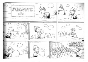
Linus is not a monster, he’s Lucy’s little brother, and we see him here building himself someone that will listen to him. Is it an Army, is that a cannon? No, a congregation and pulpit. Linus has evangelical Lutheran leanings. This reminds me of Roy Crane, it’s a beautiful strip.
___________________________________

Linus humbles Charlie Brown with his visionary imagination. Linus frequently quotes the New Testament in context.
___________________________________

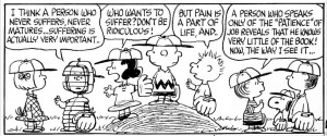
A philosophical debate on the mound, tiny children grappling with crucial issues, Linus contextualizing. This picture has formal and abstract compositional qualities, balanced in harmony (like “The Feast in the House of Levi” or “The Last Supper”).
___________________________________

Schulz’s output was as often more humorous or lyrical strips, but I have chosen to focus on his more serious aspects, because that terrible irony expressed through masterful use of his medium is what elevates his work to Art.
___________________________________

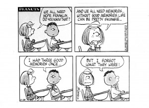
Schulz introduced an African American character in 1968, Franklin, whose father was in Vietnam. Franklin has no memories, which embodies the critiques of colonialism and speaks of the quandary of the descendants of African chattel slaves, cut off from their history. I may be reading into it with hindsight, but Schulz was by all accounts a voracious reader.
___________________________________

Is the Artist influenced by society, or does Art influence society? In Schulz’s case both apply. Schulz explored major issues in his strip, which becomes impressive when you realize that such feelings were delivered to 360 million readers.
___________________________________

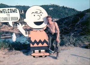
This is Landing Zone Charlie Brown in Vietnam, 1968. I can’t imagine how Schulz felt if he saw this.
___________________________________

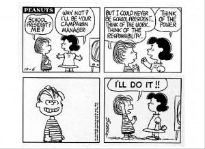
In this hard world, even gentle Linus is momentarily seduced by Lucy’s cynical litany. Even though conceptually adult, Peanuts was on the comics page. Children like me who grew up with this strip were being informed by Schulz’s observations.
___________________________________

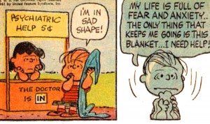
With horrible logic Schulz made truth-teller Lucy a psychiatric therapist. And, sometimes faith is not enough for Linus, who is often overcome by high anxiety. His security blanket has been entered into the psychiatric lexicon. The level of fear of these children, their apprehensions in dealing with a world that seems forever out of their control is what has always stuck with me when I thought of Schulz’s work.
___________________________________

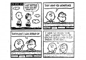
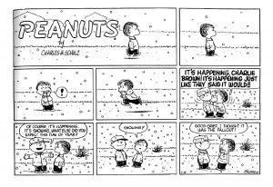
I remember this one well from when I saw it as a child, it was a clear expression of it’s time. This gets right to the “nut” of it, for me. It tormented me for a while in preparing this presentation. What is it about these characters, their shape? It was right there on the edge of my brain, something almost subliminal. I then had a little Peanuts epiphany.

Schulz was drafted in 1943, spent two years training, and then served in Germany as the war wound down. At one point his platoon camped in a swamp near Dachau. He said that what he remembered most about the war was loneliness. But suddenly…


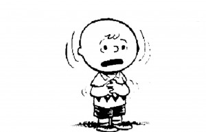
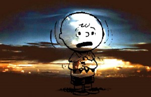
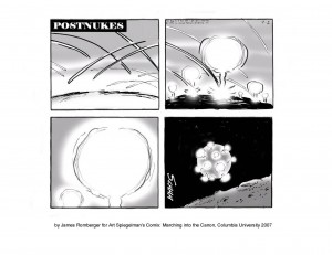
…”everything changed.” I think this monstrous act to end a monstrous war imprinted on Schulz. The form of Charlie Brown, all tied up with fear and guilt, aligns with the alien image. He is the inheritor of the world we have built. Charlie Brown is the bomb.

___________________________________

___________________________________

Sammy Harkham: Naturalism and Specificity

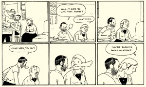
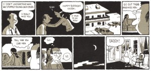
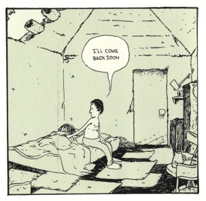
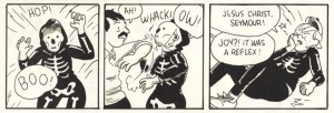
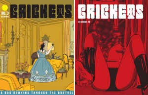
Sammy Harkham’s Crickets #3 rivals in substance and importance two other comics that were published in a similar format: David Mazzucchelli’s Rubber Blanket #3 and Daniel Clowes’ Eightball #23. Harkham seems to be best known for editing the chameleonic, graphically revolutionary anthology Kramer’s Ergot and he has served his artistic community well with those efforts. However, Harkham’s own work is among the best in KE.

A careless moment, from Lubavich, Ukraine 1876

His Lubavitch, Ukraine, 1876 in the sixth issue depicts the artist’s namesake living in an orthodox community way back in the day in an intimate and momentarily heart-stopping tale. Harkham conveys a delicacy of gesture rarely seen in a medium that has been dedicated largely to overstatement and explosive violence. That is not to say he is entirely adverse to spectacle, his sprawling post-apocalyptic cover for the impressively oversized Kramer’s Ergot #7 is gorgeous, but his single page broadsheet strip in that issue has a touch of Hergé and Frank King and reads like a pivotal moment near the end of a very sweet unmade Coen bros. film.

The latest issue of Harkham’s solo comic Crickets is subtitled “Sex Morons” and this is an apt description of the characters in the two major stories inside. The first is a reprint of The New Yorker Story, which probably should have appeared in The New Yorker itself, but instead ran in Vice, the iconoclastic and often disturbing free magazine of fashion, politics and youth culture. In four dense pages, Harkham shows the final crisis in the midlife of a writer and Yale professor as he cheats on his wife, fails to care for his daughter and betrays his colleague. A lot of information is packed into a short piece which seems oddly realistic, given how cartoony the drawings are.

Ogden achieves stasis, from The New Yorker Story.

Harkham’s earlier fantasies and vignettes seem more freeform or improvisational, with hermetic, interiorized visuals. By that I mean non-referenced, non-observational drawings with some apparent influence from artists such as E.C. Seger and other early daily/Sunday comic strip artists, along with hints of Moebius, Chester Brown and Al Columbia. By contrast, the narratives in Crickets #3 are informed by research into the particular times and places shown. The stories veer towards a form of naturalism, perhaps closer in spirit to the more serious and/or historical comics narratives long produced in Europe by artists such as Jacques Tardi and Vittorio Giardino.

The condensed but ultracoherent narrative style of The New Yorker Story carries through into the main story, Blood of a Virgin. Harkham has a talent for dialogue and he draws believable continuity and nuanced expressions. His storytelling is clear and his page designs, panel framings and lettering incorporations are elegantly composed. His hand is light and his line is still cartoony in that it increasingly evokes the direct but fragile emotionality of Charles Schulz, but now it also recalls the vigorous simplicity of Roy Crane’s Wash Tubbs.

I wrote to Harkham with some questions about the work in Crickets #3. “There is an emotional clarity you can get across with characters in comics that can be a hinderance or a real asset depending on what you are doing/aiming for,” he told me. “Cartooning is knowing how to use the sickeningly stupid blunt emotion of each panel and build something emotionally complex of it. This really came together for me working on The New Yorker Story. The panels were so small, the most important thing was that they were easy to read. So that meant I didn’t have room to make beautiful drawings or to be vague about what was happening in a given panel.” Still, for all their functionality the drawings are beautiful, particularly when the visual parameters that they describe are qualified and given body by the color overlay. Harkham often uses a single additional color in his work. Here, the pale olive layer affords the spare drawings considerable weight, space and light.

Harkham's L.A.

Harkham says, “I don’t really strive for realism, but more for specificity.” To that end, he researched the trappings and landscape of the period shown in Blood of a Virgin. He says, “I wanted to do a story about Los Angeles. Much of the inspiration to work on it is driving around the city and day dreaming, looking at old college yearbooks and photos and getting excited to draw a weird pair of woman’s shorts or a haircut or living room.” As someone who came of age in the 1970s and realizing Harkham wasn’t born until the next decade, I’d have to say his story is as close as I’d like to come to reliving those years. Somehow, he perfectly captures the bleak feel of 1972, as the ideals of the 1960s coagulated into opportunism and excess.

Harkham’s protagonist Seymour fights for a chance to write and direct his first feature film while working a day job editing trailers for Val Reed, a producer of exploitation films. He holds his temper as his boss insists on buying his “werewolf script” cheap. Seymour is given to understand that whatever film emerges from the process will bear little resemblance to what he wrote, and that the job of directing the project will most likely be given to another man. He must eat these indignities, because he needs his mentor’s help and connections.

The story is told in a cinematic style, in other words the sequencing and viewing angles chosen by the artist simulate the vantages of a camera moving around the characters and environment. It also deals with cinema. Harkham imbeds the story with specifics of the then-contemporaneous LA and the horror movie culture and filmmaking process of the time. There are several explicitly instructional micropanel passages in Blood of a Virgin, including one that depicts Seymour editing film at his job.

The Moviola grind

“I worked on those manual editing bays at CalArts,” says Harkham. “I went back to refresh my memory when drawing the comic.” I showed Harkham’s editing sequences to my friend, animator and commercial director M. Henry Jones, who said, “That’s a Steenbeck, no, wait…hmmm, maybe it’s a KEM….okay, he’s got that right, but he’s using a flat plate….actually, I think it’s a Moviola. Wow, look, he drew the trim bin. And the bit about trying to use the phone with strips of film hanging around your neck…nice. When I’d hit the floor, I’d just stay there.” As usual, it is a little hard to nail Henry down, but he attests to the basic accuracy of the process that Harkham drew.

“I also spoke with Joe Dante about what the daily life of being an editor back then was like. Very similar to being a cartoonist—solitary hours, bad backs,” Harkham says. He characterizes Dante, director of The Howling, Gremlins and Small Soldiers, as one of “that first wave of ‘monster kids’ who grew up watching Universal horror movies on tv, reading Famous Monsters of Filmland, the generation of guys who wanted to work in horror and sci-fi and didn’t look at it like a stepping stone to legitimate cinema, but a place to BE. Kind of like comics.” As with Seymour, Dante was initially a writer for horror zines like FMoF and Castle of Frankenstein. He began his film career working for exploitation movie mogul Roger Corman in the period Harkham depicts, in a similar capacity to that endured by Seymour. Dante’s early film Hollywood Boulevard was created when Corman bet another producer that he could make a film in a week. Like the project Seymour is unwillingly used for, the movie was assembled using extra footage from other productions. But under examination, there is more to “Blood” than these correspondences.
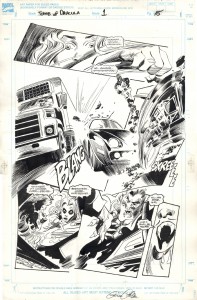
Off he goes, from Poor Sailor

The story explores themes also seen in Harkham’s earlier work Poor Sailor, wherein a young husband realizes his dreams of adventure at the expense of his arm and the lives of his brother and his wife. In Blood, Harkham depicts experiences which might be considered common to young couples who are trying to get ahead in their careers while (supposedly) sharing the responsibilities of small children. He shows both vantage points on the marriage and motivates both partners’ actions. Seymour’s passage through the story is deliberately timed. He keeps a tight schedule for work, always having to considering the delays of LA traffic, but is often late when it comes to his family. At one point, he promises to be home at a certain time and is on his way out the door from work, but then stops to watch some “sadist” footage with a co-worker. Forty-five minutes later, he’s late and has brought the wrong thing home.
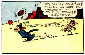
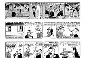
Seymour makes dinner for his wife and himself, but she must eat hers alone because he “has to” take what is ostensibly a business call. Much later, his plate is cold and he’s still on the phone, now simply blabbing about film trivia. Then he is frustrated that his wife does not respond to his advances and that she cannot listen as he reasons a way to tolerate working on his now-adulterated dream project, because she is exhausted from taking care of the baby on her own. Seymour shares some of the childrearing, but his resentment and impatience are obvious when he tries to skip his “turn” and grabs the baby’s leg too tight while changing a diaper.

Seymour keeps his overtired wife awake by watching a version of the then-common pathetically absurd late night horror film hosts on TV until he finally falls asleep. In a moody two-page passage, Harkham renders the tonal-scale test pattern that used to come up after a TV station signed off for the night with a set of square panels of Seymour loudly snoring. His wife finally kicks him out of the room with a dictate to take the garbage out. Seymour sleepwalks outside into the misty wee hours, a scene reminiscent of the fog-enshrouded sets of classic horror films, as well as of the hypnotic dreamscape meditations of Harkham’s friend and contemporary Kevin Huizenga.

Harkham often deals with brittle relations between men and women. In Blood of a Virgin odd things are done to women, often involved with covering their heads and faces. Seymour meets Joy at the house of some “effects guys” who are making a cast from her head. The careless FX artists hurt her by forgetting to apply vasaline to her eyelashes and brows at the beginning of the casting process.* Joy and Seymour worked together on productions in the past and a closer link is implied. She had apparently attempted suicide since he’d last seen her, she has healed cuts on her arm. Was it connected to something he had done?

The costuming of the characters for the Hollywood Halloween party that is the centerpiece of the story is telling. Joy dresses as death, Seymour’s “costume” consists only of a scar on his cheek, his unnamed wife dresses as a clown. Her presence at the party is specifically requested by his boss, but she is unable to attend because the babysitter doesn’t show up. She resignedly removes the clown suit and makup as Seymour leaves alone, and the relief he feels is the first of a series of overt infidelities.

Seymour gets a break and hits a new low.

This three-panel sequence is indicative of the layers of irony that Harkham imbeds in his orchestrations of word and image. The dense overlapping lettering of the first two panels does not close down their general feeling of openness of composition, it represents the apparently chaotic but interconnecting sounds of a family. In the third panel, despite what Seymour is saying as he slithers out, the perspective of the background contracts, encasing him, doors are closed, his arm is behind him in submission to an accusatory click.

At the party, Seymour proceeds to get wasted and becomes involved in a coked-up, sexually violent subparty. The worst of it happens across from a gentle page containing twenty-four square panels that show Seymour’s spouse changing diapers, putting the baby to sleep, making cookies, being made to feel old by a group of trick-or-treaters, smoking a cigarette and being ignored by their neighbor—the contrast of maybe-death and life, of the perverse and the mundane is powerful.

Joy takes her lumps again.

Back at the party and furthering the overarching motif, Seymour “accidentally” elbows Joy in the face when she surprises him while wearing her skeleton mask….there’s much more, but I do not want to continue except to note that Seymour justifies his behavior over the night to himself as a reaction to the oppression of time.

For all of Harkham’s more accessable qualities, such as clarity, accuracy, and his thoughtful handling of human relationships, his work has a transgressive edge that becomes sharper when one considers his comic as an object. The images on the exterior covers are unsavory. They are printed in black underlaid with a reddish purple that amplifies an aura of extreme sleaze…but why does it present so? On the front cover, the white logo is done in a generic psychedelic style of the late 1960s, early 1970s. A woman is drawn with slashing ink brushwork and wash, close to the picture plane reclining against a window, in black panties and vinyl boots, her legs spread and a breast exposed, her head and other breast covered with a checkered cloth. The cover color can then be seen as that of blood or otherwise a color of bodily interiority and in such proximity to female genitalia, evokes the “blood of a virgin” or perhaps menstrual blood. On the back cover, the drawing is done in a cheesey cartoon style like the gags in old men’s magazines. In the foreground, a man in a bonnet or nun’s habit sweats as he ogles the buttocks of a woman in dancer’s tights bending over before him, in apparently refined setting. The subtitle runs in white letters along the bottom, in Italian.

Hidden on the inside front and back covers are two elaborate line drawings printed with full color separations, which have the aspect of illustrations in The New Yorker. The subjects are carefully posed and give the impression of absolute stillness. On the inside front cover, a woman in Victorian dress stands in an elegantly furnished, high-ceilinged room. Her face is covered with a black dripping substance (ink? tar?), reemphasizing the motif of women with obscured faces. She holds a butterfly and the angle of her raised arm echoes that of the pallid, phallic candles leaning from a wall fixture. The inside back cover shows a room with modern furniture and a Van Gogh painting on the wall. A green, cut-off male head is laying on the floor, dripping green gore. A red woman lays on her back on the floor, her legs on a coffee table, her head under the skirt of an easy chair, her arm raised as she makes the peace or V for victory sign.

The images on the covers relate to the stories, if obliquely. Perhaps the head on the floor on the inside back cover is the same as that on the table of the feeble late light TV horror hosts. In three of the four covers, women’s heads are obscured. The scene on the front cover reflects a sequence in the main story, but with some discrepancies. The checkered cloth over her head is different than that seen in the story. In our contemporary context, a covered female head brings to mind the practices of the Taliban and the checkered fabric also reminds one alternatively of Arab headgear and an all-American picnic lunch. Her position and the color might also suggest a return to the womb. The design and images presented to the reader make the package look like a particularly cheap and degraded vintage fetish mag, in seeming denial of the sophistication of the sensitive cartooning bound within.

Right: the published cover

If the covers were stapled inside out, it might be a more commercial product…or not. One wonders, in a time so challenging to print media, what sells more magazines, refined drawings or pornography? Some online vendors are using Harkham’s original cover concept to represent the issue. Harkham’s decision to use the crimson cover was probably only possible because the book is self-published. It affects the possibilities for store display, the impact on the potential customer and the overall reading of the work.

The intended audience comes into question. Truthfully, your standard superhero comic cover is often no less psychosexual, but the cover for Crickets #3 is encoded with some powerful porn signifiers. Is the comic directed to men who read porn, who also might form a significant part of the comics public and who might not be married? In my mind, married or cohabitating readers with small children would be the prime demographic for, and the optimum beneficiaries of the cautionary aspects of, what lies within these covers. Then, are men the only audience for something that looks like porn? Questions and ironies multiply in Sammy Harkham’s strongest work to date.

________________________________________

*Another micropanel “how-to” in Blood of a Virgin explains the process of building an exploding head, using a model cast from the mold made of Joy’s head. Harkham made a short film with similar SFX that is online: at sammyharkham.com or at youtube.com.

________________________________________

Sources

George, Milo. “Moving Pictures:The Sammy Harkham Interview.” The Comics Journal #259. Seattle: Fantagraphics, 4/2004.

Harkham, Sammy. Crickets #3. LA: self-published, 2010.
Harkham, Sammy. Poor Sailor. Madera, CA: Ginko Press, 2005.
Harkham, Sammy. “Lubavitch, Ukraine 1876.” Kramer’s Ergot #6. Buenaventura Press, 7/2006.
Harkham, Sammy. Correspondence with the author, Feb 8-10, 2011.

McConnell, Robin. “Sammy Harkham.” Inkstuds: Interviews with Cartoonists. Greenwich, Nova Scotia, Canada: Conundrum Press, 2010.

Romberger, James. The Affordances of Parametric Images. Online at Comic Art Forum

“Then Protest!”

by James Romberger

François Truffaut’s films are most often analyzed in terms of their cinematic structure and the interpersonal relationships of their stories, and these qualities do account for a good part of their appeal. His films are not considered particularly political in the context of his contemporaries of the French New Wave. However, Truffaut does critique the forces that shaped his world: the destructive nationalism and militarism that crush people and culture in their wake, and the patriarchal structures that keep women the longest-suffering victims of oppression on the planet. Since women do not share equal rights with men, gender relations are political. Truffaut made some sincere efforts to explore those dynamics.

Truffaut’s 1962 film Jules and Jim bears reexamination in this light. In his adaptation of Henri-Pierre Roché’s semi-autobiographical novel Jules et Jim, the director compresses the whole to fit within the confines of a movie that is an hour and three quarters long. Truffaut chooses passages from the book and recombines them to create new meanings unique to his production. He alters the real people and events that inspired the original text, to construct a new narrative about female autonomy and fidelity in love, and affords key correspondences between the early pivotal scene on the bridge and the ending. Truffaut also extends beyond the WWI scenes of the book to incorporate his more personal references in the form of veiled and overt references to WWII: he “post-actively” incorporates his memories of his childhood in occupied Paris and his perception of the deep repercussions in France from the collaboration of some of the country’s citizens with fascism.

The credit sequence immediately foreshadows Truffaut’s intent. It recontextualizes an incidental dart game played in the book to become a metaphor of sexualized violence: a competition to penetrate a target. The title characters of Jules and Jim are young artists of bohemian Paris before World War I, who compete for the love of their lives. They and their relationships mirror Roché’s own experience. Jim is meant to represent Roché, an extremely influential high cultural connector who, among other networking flourishes, introduced Picasso to Gertrude Stein. But Roché’s acute sophistication and legendary promiscuity are not so present in Jim, in the film portrayed as a man without the courage of his convictions and underplayed by the tall, hesitant Henri Serre.
Continue reading