Click on images to enlarge
There can be no doubt that Marie Severin deserves a book about her lifelong efforts in comics. More recognition than that would be appropriate even if she wasn’t one of the few well-known female practitioners in the last century. One would think that for her essential role as E.C.’s colorist alone, Severin should at least have previously had an issue of Squa Tront dedicated to her, since a special edition of that beautifully-produced E.C. fanzine is thus far the only significant acknowledgement that her brother the late John Severin has recieved from the American comics industry to which he dedicated decades of consistently high-quality, naturalistic work. But so far, the only publisher to undertake the rightful honoring of Severin is TwoMorrows, the imprint that fan John Morrow grew from the humble beginnings of his first thin issue of The Jack Kirby Collector in 1994.
Not only is coloring a particularly misunderstood aspect of comics, but the efforts of women have been traditionally discouraged in the medium. And though there is now occurring an explosion of comics scholarship, those scholars are often more interested in analyzing printed comics than they are in talking to the humans who made them. Since the higher-end critical forums such as Fantagraphics’ Comics Journal and Todd Hignite’s Comic Art are now published annually or otherwise infrequently, the bulk of in-print documentation and discussion of previous generations of cartoonists has been left to such publishers as J. David Spurlock’s Vanguard Productions and Morrow’s TwoMorrows, which also puts out Roy Thomas’ zine Alter Ego, the primary venue for many elder cartoonists’ only (or final) interviews.
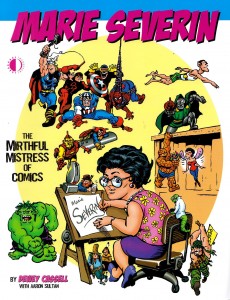
So, TwoMorrows has published a book about Marie Severin and for that I am grateful. Nonetheless, this book, which features interviews by Dewey Cassell and Aaron Sultan with the artist and her contemporaries, shows the best and worst tendencies of the explosion of unapologetically fannish tomes that TwoMorrows has been releasing in the last few decades. The bad is overshadowed by the good, so let me get the few outstanding deficiencies out of the way immediately. The most heinous offense committed here is that the book is subtitled The Mirthful Mistress of Comics.
Severin is known for having a clever and cutting sense of humor. However, in utilizing Marvel overlord Stan Lee’s nickname for Severin (“Mirthful Marie”) and adding the usually pejorative feminine descriptive “Mistress,” the artist’s versatility and the essential nature of her many and varied contributions to comics history are diminished, even as images of a sort of cackling floozy ensconced seductively in the predominantly male confines of the bullpen are conjured.
One is relieved that other books about Marvel’s artists don’t all similarly utilize Lee’s corny alliterations; that, for instance, the many books about Jack Kirby have in their titles avoided Lee’s appending of “Jolly” to the artist’s name, since it is an even less appropriate description of Marvel’s founding dynamo than the unbecomingly anti-democratic royalism of the more familiar “King”. Speaking of Kirby, a bizarre prejudice rears up when co-interviewer Sultan asks Marvel mainstay John Romita, “What about Marie and Jack Kirby? Did she ever resent his ego at all?” Romita sets Sultan straight in short order, telling him of Severin’s (and his other contemporaries’) absolute admiration of the humble and accessible Kirby.
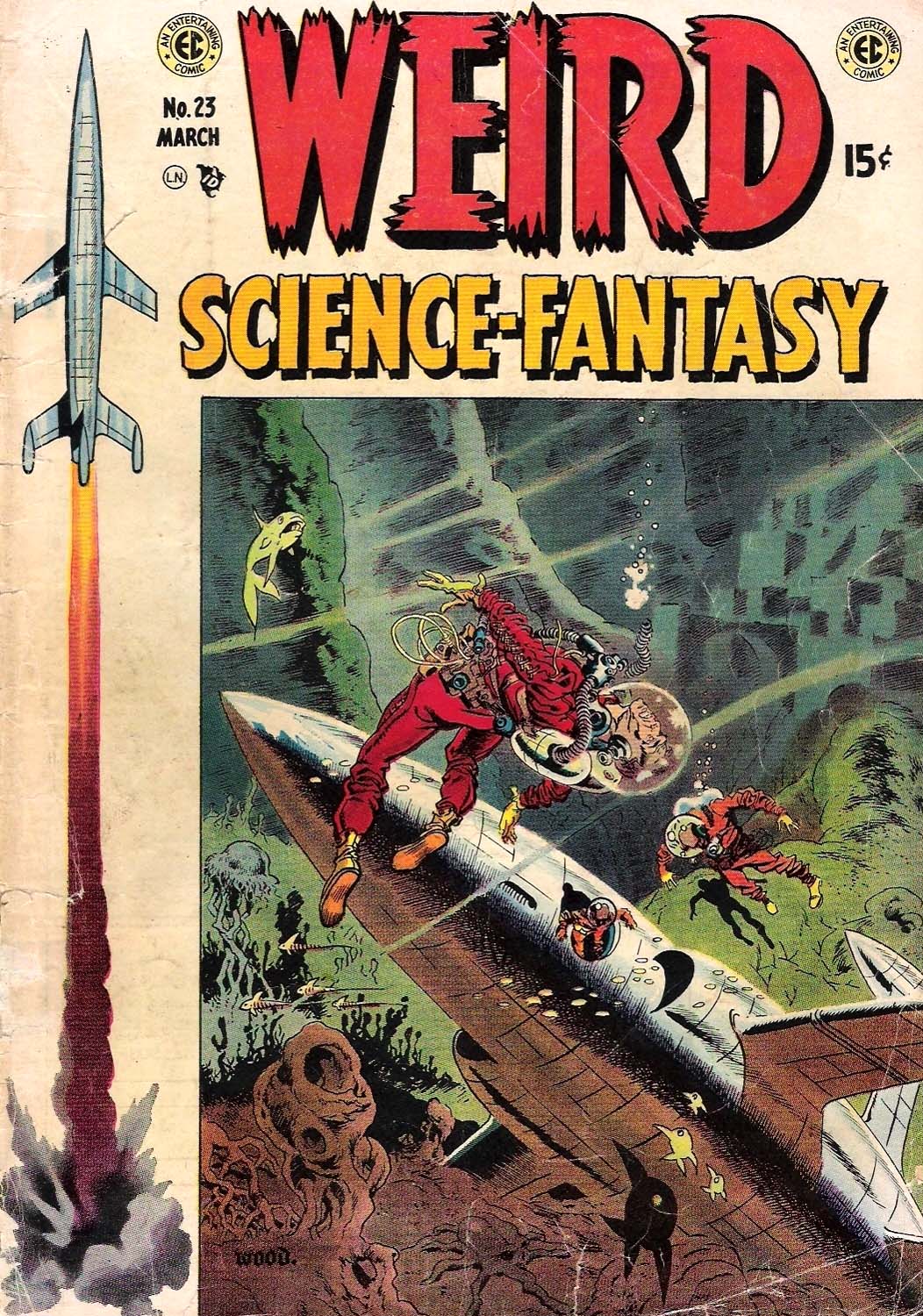
The other drawbacks here are lackluster book design and the counterintuitive use of the color section. For an artist known primarily if dismissively as a colorist, the decisions regarding color here are hard to fathom. Of 16 pages allotted for color reproduction, the equivalent of five of those pages are taken up by reproductions of original art, i.e. black and white linework and the other pages do not well represent Severin’s best work. Her important and exemplary early E.C. coloring is shown in 4 small reproductions on a single page. Perhaps Cassell and TwoMorrows were unable to get the rights to use larger reproductions by those who hold the copyrights to her work for E.C., and so this specific disservice to Severin is not their fault. But as can be seen in the covers below, Severin added significantly to the art of such luminaries as Graham Ingels, Wally Wood and George Evans.
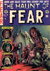
Graham Ingels, cover for Haunt of Fear #14, color by Marie Severin
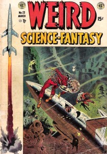
Wallace Wood, cover for Weird Science-Fantasy #23, color by Marie Severin

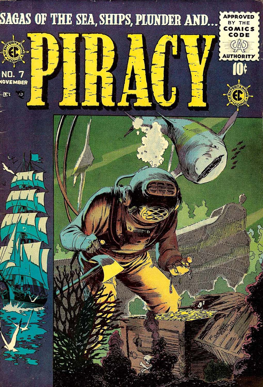
George Evans, cover for Piracy #7, color by Marie Severin
The strength of TwoMorrows’ books is usually in the varied interviews and such is the case with Marie Severin: the Mirthful Mistress of Comics. The authors speak to her brother, to her childhood friends and to her surviving co-workers at E.C. and Marvel. I wish that there were comments by more of the now-deceased artists that Severin colored over the years and who respected her efforts such as Kirby and that her employers such as Stan Lee had graced the book with more than perfunctory tribute. However, there are substantial contributions by such reputable sources as Al Feldstein, Jack Davis, Jack Kamen, John Romita, Roy Thomas, Flo Steinberg, Herb Trimpe, Linda Fite, Ramona Fradon, Trina Robbins, David Anthony Kraft and Mark Evanier.
The E.C. section is particularly well done. Severin began coloring for them when editor Harvey Kurtzman wanted to upgrade the look of the books, in Severin’s words “to look more like Prince Valiant in the newspaper.” For the next few years she colored first Kurtzman’s war books, then the entire line, with the exception of some covers and stories colored by the perfectionist Kurtzman, as well as a few stories colored by the similarly autonomously-minded Bernard Krigstein (both of whom Severin typically characterizes as “artsy-fartsy”). When Cassell tells Severin, “you’ve been credited with a lot of the success of EC because of those vibrant covers,” she effaces herself to credit instead the quality of the “content,” but truly, covers are the primary selling factors on the newsstand and the color is the more significant part of the initial impact of the visuals on the reader. And, Severin’s interior coloring is no less sensitive and considered. Still, assisting Kurtzman on his comprehensive research, drawing caricatures on the fly of her co-workers and coloring were the art Severin was able to do at E.C.
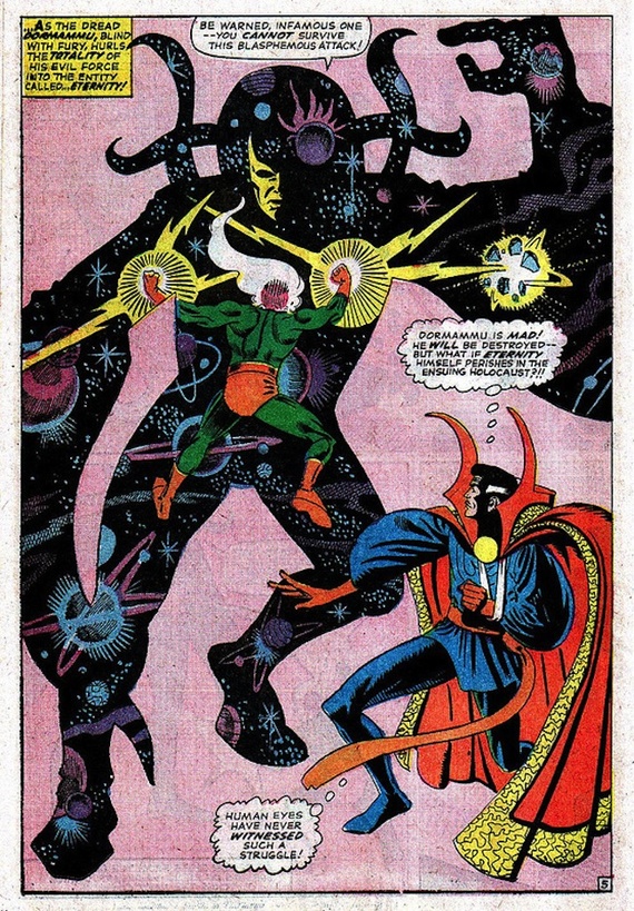
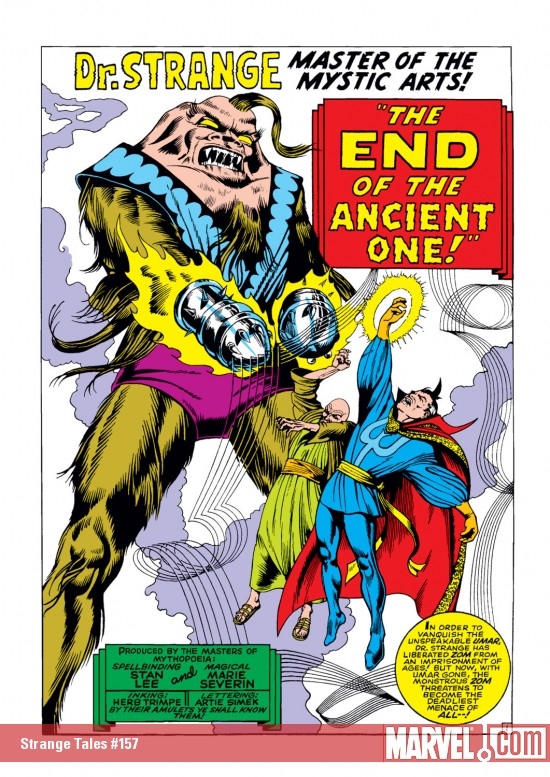
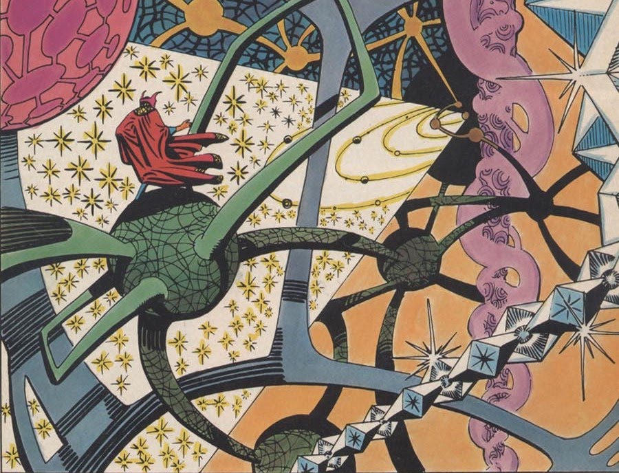
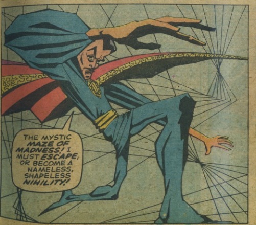
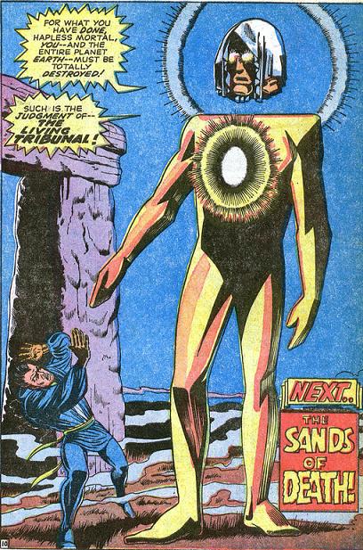
She was always capable of more, but it wasn’t until the 1960s and she had been working at Marvel for a while that she was given the opportunity to draw comics herself. It wasn’t the usually canny Stan Lee who realized her talents, either; instead it was Marvel’s publisher Martin Goodman that noticed how good she was when she did some superhero drawings for Esquire and so Severin began to draw sporadically for the company: a few episodes of Dr. Strange here, issues of The Hulk and Sub-Mariner there. Severin understands the comics medium well and her work can be as energetic and muscular as that of any male superhero artist, even on her many strips for the Marvel humor titles Not Brand Echh and Crazy.
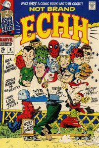
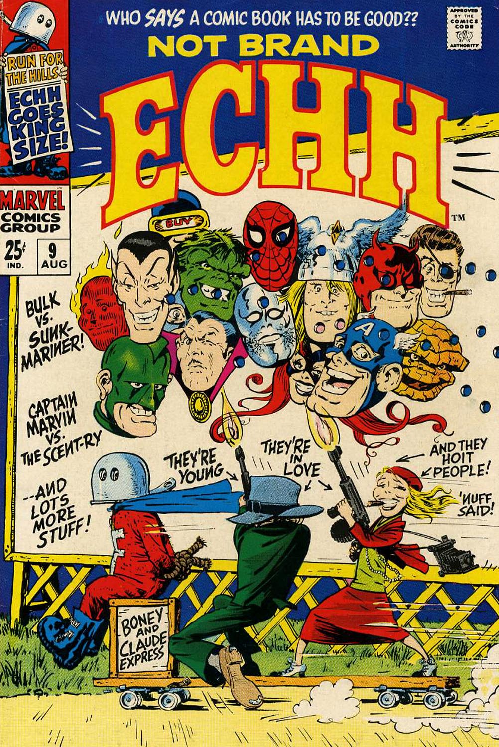
Marie Severin’s cover for Not Brand Echh #9.
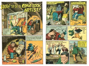
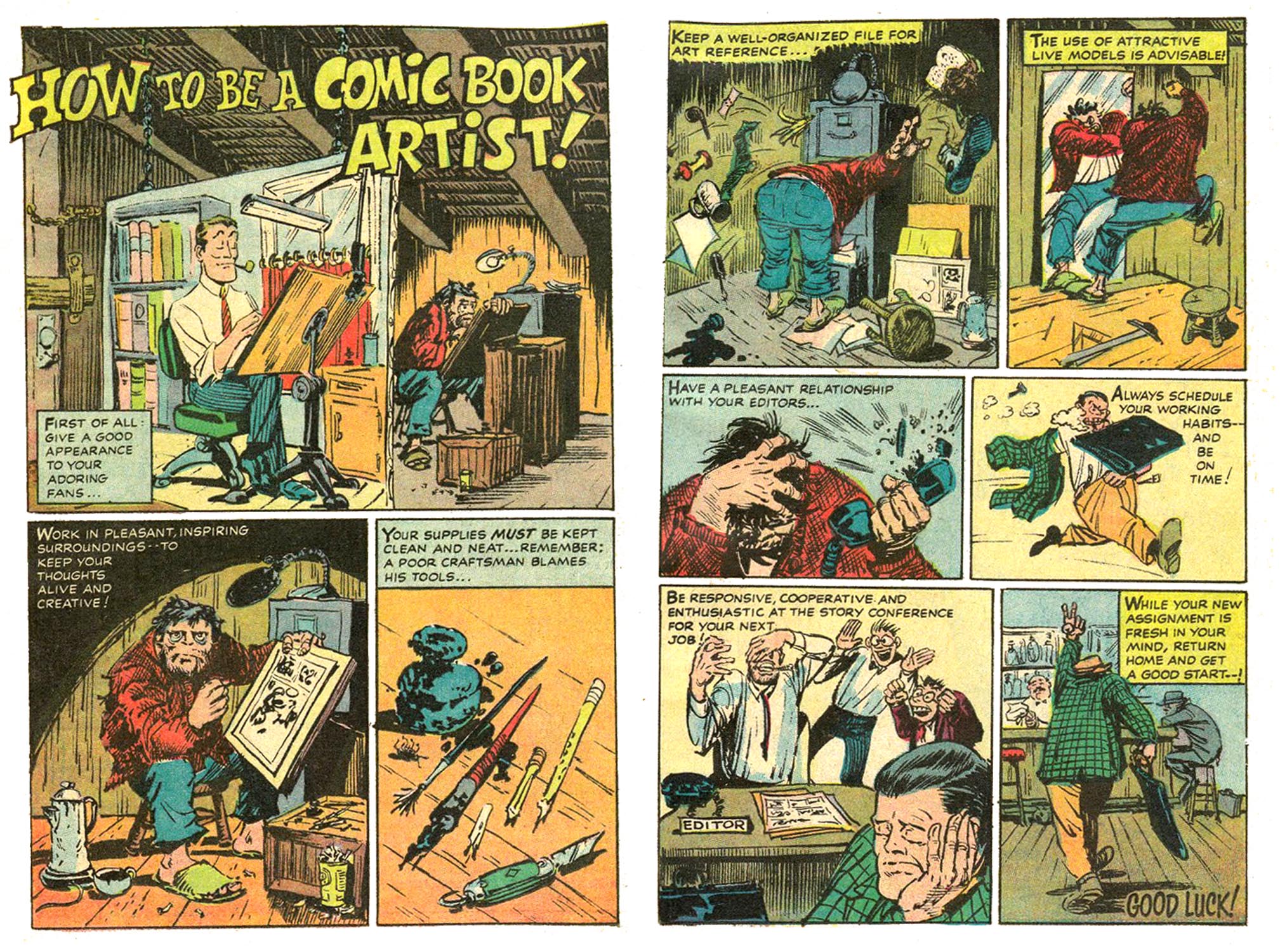
Marie Severin, from Not Brand Echh #3.
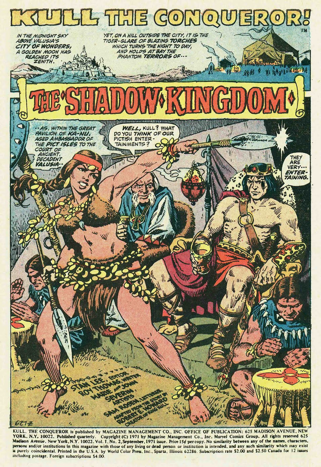
Perhaps her best known Marvel Comics work is her early-seventies tenure on their adaptations of the Robert E. Howard hero Kull the Conqueror; these stories are beautifully inked by her brother John. Their collaborative run is considered to be a classic of adventure comics and both siblings certainly deserve credit, but it is Marie’s great storytelling skills that drive the narratives. And, she is one of the few artists in comics who can match Kirby for compositional thrust, which is why she became the chief cover designer for Marvel for the next few decades.
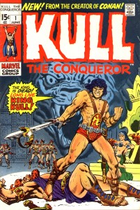
Marie Severin solo cover for Kull #1.
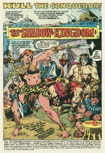
Splash page for Kull #2 by Marie and John Severin.
The interviews in the book give a remarkable account of Severin’s career and personality, but one gets the sense that Cassell and Sultan don’t truly comprehend how difficult and abusive the workplace was for women in the last century. That may be in part because Severin herself tends to diminish progressive issues that might be seen to be about political correctness, but it is sometimes only by reading between the lines that a fairly full picture of what her life in comics was like emerges. There can be little doubt that the sexual innuendos in the office went beyond simply “forgetting” about the presence of women in the room, that unwelcome comments and physical advances were directed to them. And Severin definitely faced a glass ceiling.
She succeeded John Romita to operate as a virtual art director for Marvel, but the position was unheralded as well as unpaid. In the present volume, Romita actually details how in order to gain points with Goodman, Stan Lee took credit for the substantial extra work that he and Severin did in that capacity. This seems typical of Lee’s manipulative treatment of even his most stalwart workers (and there is even mention here of Lee claiming as his property substantial amounts of original artwork, a questionable provenance at best given the subsequent troubled legal status of those pages). Neither Romita nor Severin hold anything against their “fearless leader”—it seems that Lee casts a sort of magic spell of obvious bullshit to make the people he uses, but never sticks up for, still somehow love him. Later, when Jim Shooter cut a vicious swath through Marvel’s elder talent, he also disrespected Severin’s art directorship, calling her instead “head artist” and she had no choice but to endure; as usual, there was no one in upper management to take her side.
Flying against Severin’s conservative nature, Trina Robbins hails her as a true feminist and she surely is an example of a woman excelling in a male-dominated field through sheer perseverance. Severin had a career in comics, but was not facilitated as she should have been; it was with her sense of humor that she was able to shine.

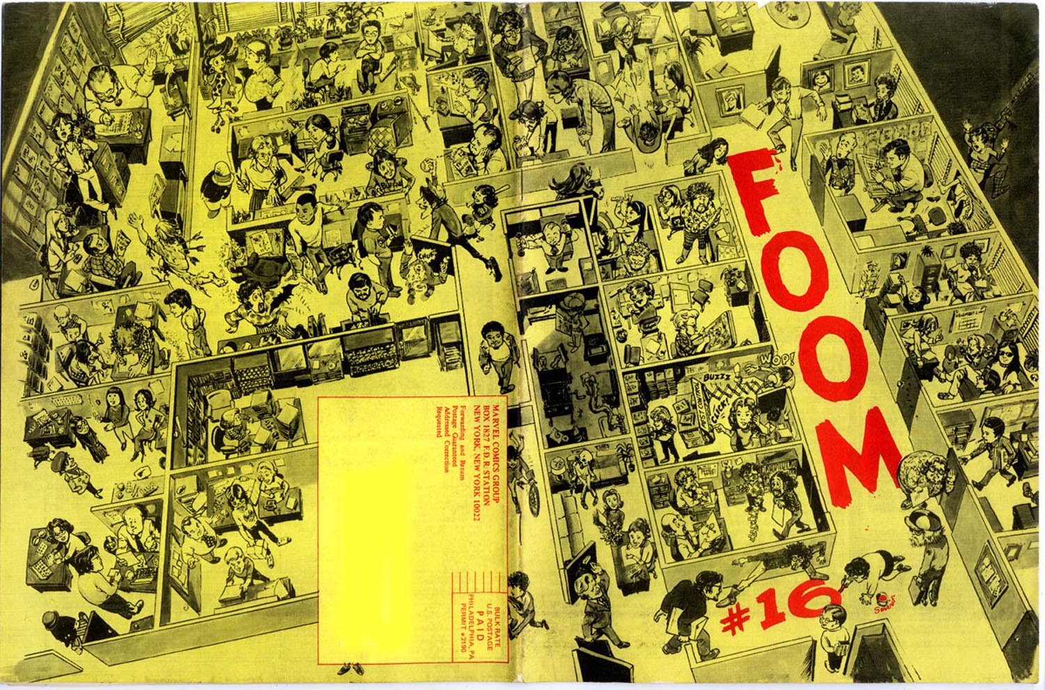
Marvel editor David Anthony Kraft on Marie Severin’s cover for the in-house fanzine FOOM #16: “That is exactly how the office looked….She’s got everyone in character, in the place where they were in the office, doing what they did.”
Severin’s ability to effectively nail her contemporaries is impressive, but these rare skills are unfortunately easy for some to underestimate; in the end she had to take what she was given and put a smiling face to it. Perhaps the most telling testimony to Severin’s skills and the misuse of her talents by the comics companies she worked so faithfully for is provided here by Mark Evanier. Firstly, in reference to MAD magazine, begun under the banner of her first employer E.C. and more recently published by DC Comics:
“People used to always say, ‘Marie belongs in MAD magazine.’ And she did…And I hate to think it’s true, although it possibly is, that the reason that she wasn’t was that she’s a woman. If you noticed, while Bill Gaines was running MAD magazine, they never had a woman artist there…Every so often, they would tap her for a coloring job, or a production job, but they never thought of her as somebody who could actually draw, say, a movie parody. And she would have drawn a better parody than a lot of other people they used. She obviously could do likenesses and at that time, MAD was paying ten times what a Marvel artist was getting paid for a page. It would have been fascinating to have seen her spend two days drawing a page of comics, as opposed to three hours. I would have loved to have seen what she would have done because it would have been amazing…she was considered family up there and they loved her, but she was family for production…I think she should have been drawing for MAD, because she was so good, and if a guy had been doing that same quality of work, probably would have been a regular in MAD. She probably would have had the job that Angelo Torres ended up getting…(doing) movie parodies up there.”
—and at Marvel:
“…I always thought she was an amazingly talented artist. She probably should not have been doing super-hero or adventure comics, but when she did, she always did a very fine job of them. I just thought she had this wonderful sense of humor…it is a shame, to me, that Marvel never really did a project where they let Marie Severin work exclusively on humor material, and develop her style more, and encourage her, and let her be as wonderful as she could be, because she had the skills, obviously, she had the sense of humor, and she had a unique viewpoint.”
Marie Severin by her brother John, detail of a watercolored drawing of Harvey Kurtzman’s E.C. war comics staff, from Squa Tront #9.