So Little Time, So Many TCJ Covers!

Since 1978 I haven’t missed a single isue of The Comics Journal. I won’t go into the many reasons for my devotion, but I’m sure many fellow readers will agree that one of its little pleasures were the numerous lovely, often witty covers it commissioned from some of the best cartoonists and illustrators worldwide.

Below is a small gallery of some of my favorites…


tcj_122

 
This merry drawing by Brian Bolland for #122 graces what is is easily my favorite TCJ cover. Impeccable execution and fine humor, contrasting boozy reveller John Bull with tight-assed Uncle Sam. The British do often like to mock American puritanism; however the illo also comments on the welcome shake-up of U.S. comics brought about by the artists and writers of the early ’80s “British Invasion”. Try to find a copy; the interviews are some of the most entertaining you’ll likely read. The Kevin O’Neill conversation made me laugh out loud.
 

895069

 
One of those Brit invaders was Bolland’s long-time compadre David Gibbons, who truly rocked the comics scene when he and scripter Alan Moore produced the seminal series Watchmen. One of that comic’s recurring motifs was a circular “smiley” face bisected by a blood splatter. The above cover by Gibbons for issue 116, depicting his drawing desk, evokes that image subliminally.
 

2832594-279

 
Two more from across the Atlantic: #279’s crisp composition by Dutch artist Joost Swarte
 

616745

 
…and the incomparable French draftsman Moebius in #118.
 

2352922-bookcover_cj1211

 
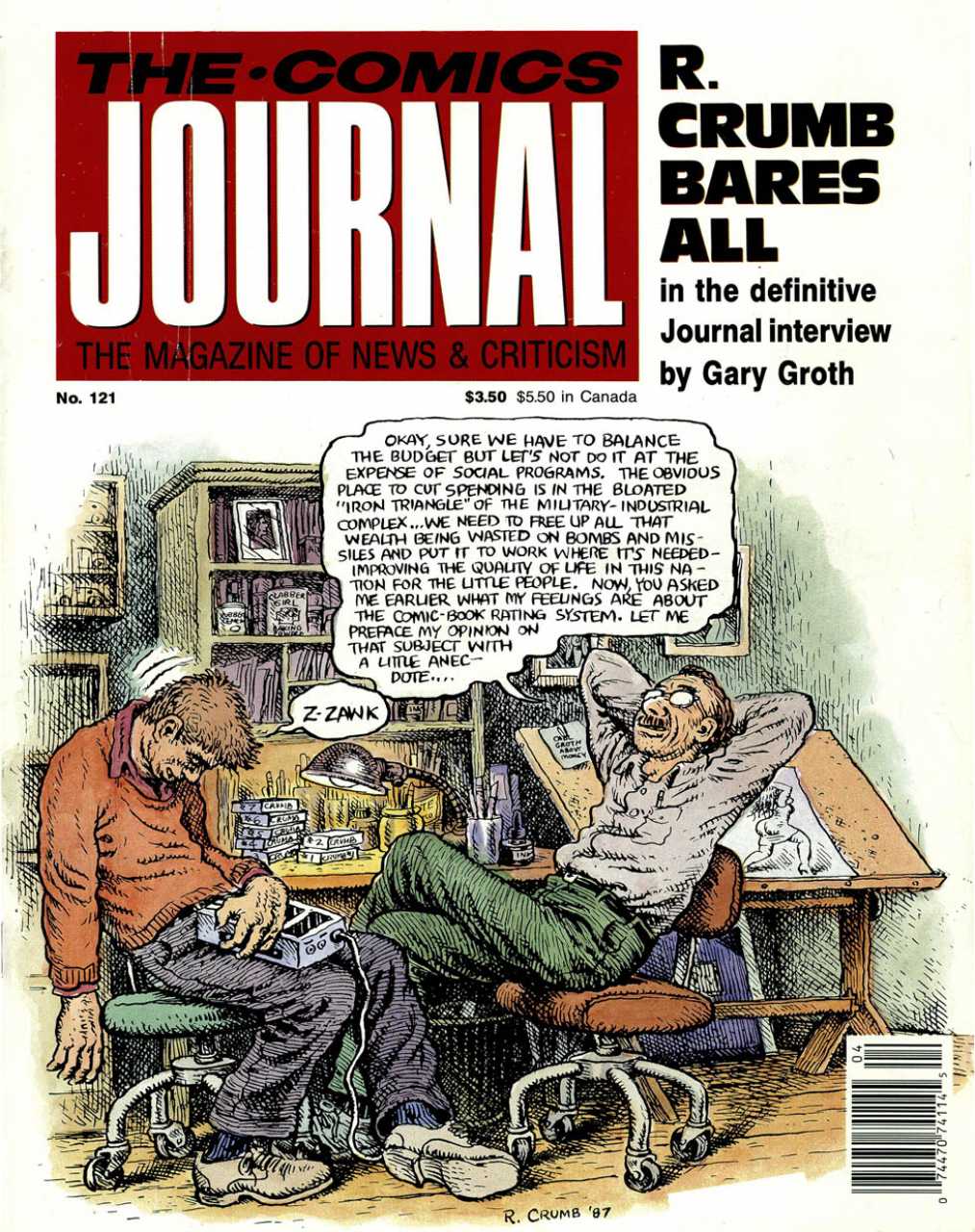
Another very funny cartoon for issue #121 by Robert Crumb. The artist mocks his own pomposity. The chap struggling to stay awake on the left is Journal publisher/editor Gary Groth, who’s made the cover several times — often to be teased… The cover showing the interview process is a recurring theme, one that I enjoy. Three more examples below:
 

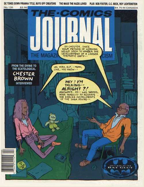
2832477-135

 
Chester Brown, who drew #135, was indeed a somewhat reticent interviewee faced with a garrulous questioner, as shown.
 

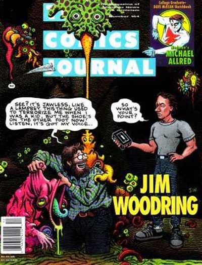
2832503-164a

Gary Groth again, drawn by Jim Woodring –another self-satirising artist…


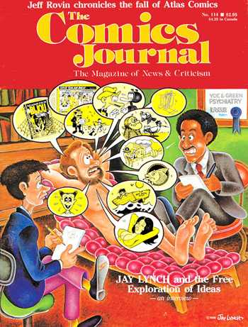
2352802-bookcover_cj114

 
And yet another, the underground comics artist Jay Lynch!
 

1093173

 
We segue to another underground classic cartoonist, the late Spain Rodriguez, whose gritty urban scene with touches of fantasy encapsulates the diversity of his art.
 

1093143

 
Spain was one of the artists who illustrated the naturalistic scripts of Harvey Pekar, as was Crumb, who illoed this slice-of-life for #97. (That’s Pekar in the blue coat, with Crumb next to him.)
 

631627

 
And another Pekar collaborator was the master of grotesque realism Drew Friedman.
 

2831702-181

 
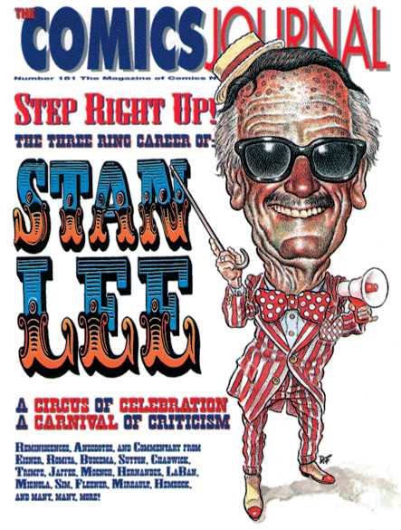
Friedman also contributed this caricature of writer-cum-huckster Stan Lee for #181. Now, sometimes the art direction for the covers is frankly not up to the actual illustration; but this time the AD worked in impeccable harmony with the artist. Below are two more exemplary cases of this.
 

954899

 
A terrific character design by Mike Ploog for #274 elegantly set off…
 

2832003-269

 
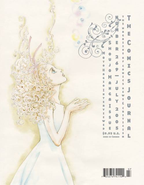
…and a lovely drawing by Moto Hagio for #269; apologies for the light scan, but the cover is truly a delicate confection.

The EC comics from the ’50s were an inspiration to generations of artists.
 

2832505-177

 
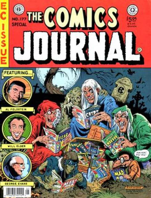
Notable among them was Bill Stout, who pastiched their cover format twice for the Journal; above, for issue 177…
 

1093133

 
…and here, for #81. Those three Journal contributors at left? The Critic Keeper is, I presume, Gary Groth; the Old Bitch is probably Marilyn Bethke, one of the most virulent early writers for the mag; but who is the Fault Keeper? Enquiring minds want to know!
 

719287

 
Topping off this EC-themed trio: a Mad magazine pastiche by frequent Mad cover artist Kelley Freas for #225. Two of Freas’ iconic characters meet here: Mad mascot Alfred E. Neumann in the red spacesuit; and the Martian from Freas’celebrated cover to Fredric Brown’s comic SF novel, Martians Go Home. Freas is considered by some the greatest science-fiction illustrator of all.
 

895223

 
I’m frustrated by this one. Don Simpson drew an awesome wrap-around cover for issue 115, featuring literally dozens of comics characters from around the world. Alas, I could only find a scan for half the cover.
 

2352552-bookcover_cj0981

 
Kevin Nowlan drew this Alternative Comics Cadaver Derby for #98. Apart from Fantagraphics and Last Gasp, all the publishers whose characters are here racing off a cliff are in fact extinct: Eclipse, First, Renegade, Kitchen Sink, and Aardvark-Vanaheim…BTW, Howard Chaykin, the creator of American Flagg, stated that Nowlan’s depiction of that character (2nd from the right) was the best he’d ever seen, including his own.
 

1124755

 
I am very fond of multi-panel comics as covers, and above is a magnificent example by the mighty Frank Thorne for #280. Here the aged cartoonist, famed for his porn and cheesecake, laughs in the face of his own mortality: a joyful victory of Eros over Thanatos.
 

895281

 
Another good comics-as-cover by Dan Clowes.
 

895261

 
I simply enjoy the peacefulness of this drawing by Paul Chadwick for #221. The cross-section of snow with burrowing field mouse is a touch typical of the nature-loving artist. Its soothing blues contrast with…
 

2831728-218

 
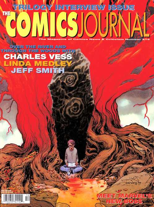
…the fiery eldritch reds of this Charles Vess illustration for #210. It’s hard to compose a symetrical picture that isn’t boring; he pulls it off here.
 

1093141

 
Another tranquil illustration by Stephen Bissette and John Totleben. Swamp Thing meditates on a newt for #93.
 

2350516-bookcover_cj052

 
Something of a fanboy guilty pleasure, this. Three stretching superheroes — Jack Cole‘s Plastic Man, Jack Kirby‘s Mr Fantastic, and Carmine Infantino‘s Elongated Man get tied up in knots… The artist is Dennis Fujitake, a prolific contributor to the early Journals and the artist on Journal publisher Fantagraphics” first color comic, Dalgoda, written by Jan Strnad.

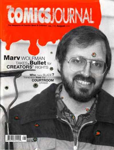
So much for attractive covers. What’s the Journal’s ugliest cover? The late Kim Thompson nominated this:
 

2832577-236

 
I can’t honestly disagree, can you?


697657

 
Let’s finish with a cover from The Comics Journal’s sister publication, Amazing Heroes, by the ever-inventive Bill Sienkiewicz. “Faster than a speedding bullet”, indeed.

Any of your own favorites missing? Browse for them either at mycomicshop or at the Comic Vine.

Prophet, The Incal, and Suggestion in Science Fiction

In the science fiction short story The Island by Peter Watts, a group of human engineers sets out on a mission to build warp gates across the universe. As they travel from one build location to another, they move at such at such high speeds that a few years for the builders is the equivalent of billions of years on earth. Every time they complete another portal, they get a brief look at the offspring of humans that is living at the other end of the gate, where earth once was. “I’ve seen these portals give birth to gods and demons and things we can’t begin to comprehend, things I can’t believe were ever human.”

Over the past few years, dark, intricately-woven science fiction universes have multiplied at Image and other publishers, and many of them tap into the feeling of Watts’s engineers, the wonder of seeing something we are unable to understand. These stories walk a fine line between suggestion and fulfillment. They must depict a universe so different from our own that it stretches our minds to think about it, and then they have to explain it. We aren’t content merely to gaze upon a bizarre creation, we also want to understand it. This is the core challenge that a science fiction world must answer: How do you depict the unimaginable?

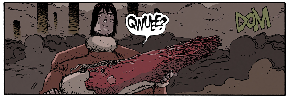
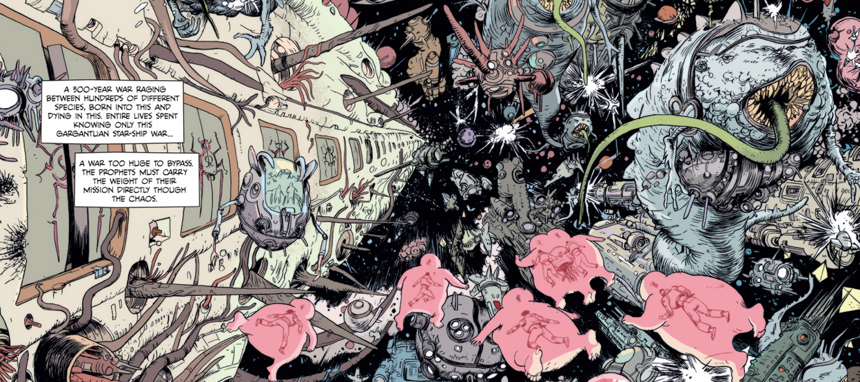
Image 1Prophet

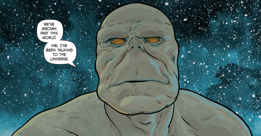
One title that stands out is the Brandon Graham reboot of ProphetGraham has assembled a stunning team of artists to illustrate and write the story with him, which is loosely based on a Rob Liefeld character. The story takes place 10,000 years in the future, and it’s pages are rich with imagined history, from the biological technology to the debris of forgotten wars. The setting and story evoke the nostalgic fascination that European and American painters felt for the ruins of the Greco-Roman empire.

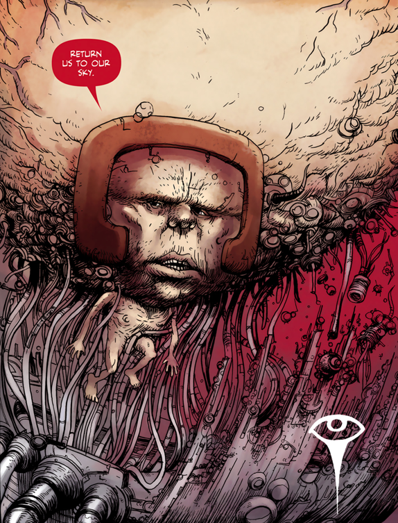
Image 2

Prophet

I am consistently delighted by how bizarre and alien the world of Prophet feels. The hands-off story telling allows me to fill in the gaps of the worlds that Graham describes in a way that feels organically collaborative. It reminds me of another science fiction comic which taps into the infinite, The Incal by Alejandro Jodorowsky and Moebius.

Jodorowsky is best known as the director of the surrealist film the Holy Mountain, and for the ambition of his plans for a film adaptation of Dune. After assembling a team of creators that included Orson Welles, Dali, Moebius, and H. R. Giger, the project went over budget in pre-production and was canceled, it’s components later harvested to make Alien, Blade Runner, David Lynch’s Dune, and others. Jodorowsky’s Dune was too revolutionary to be realized, and that is exactly why the comics that he went on to create are so fascinating.

In comics, Jodorowsky found a medium where he could work without constraints. He said in an interview, “If you want 10,000 cosmic spaceships, it doesn’t cost more money than drawing a horse.”

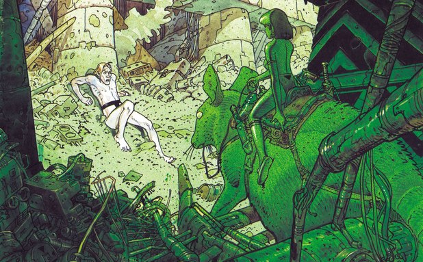
Image 3
The Incal

The Incal, published from 1981 to 1989, is the story of a foolish, selfish white man named John DiFool who is pulled into a journey across space by the metaphysical spirit known as the Incal. DiFool is dragged throughout the adventure not because he is special, but because his genetic code resonates with the Incal. He is a bumbling participant in the cosmic and spiritual war that unfolds.

Both Prophet and The Incal succeed in creating a world that feels at once inconceivable and familiar. To do so, Jodowrosky and Graham (Note: from here on I’m going to refer to the Jodorowsky and Moebius collaboration and the Graham and team collaboration as Jodorowsky and Graham respectively) both use dialogue and narration to suggest a much larger universe than they are ready to spell out on the page. In the Incal, it does not matter that we know little about the Technopriests, the Emperoress, or even the Incal. We understand the roll they play in the story, and can create our own mythology around them. This technique is even more common in Prophet, with dozens of technologies, wars, and worlds (Foam Music, Ambulavit Pod, Lux Glacies Caverns) that appear only for a single line.

Image 4
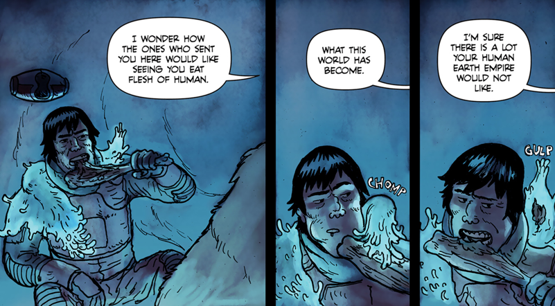
Prophet

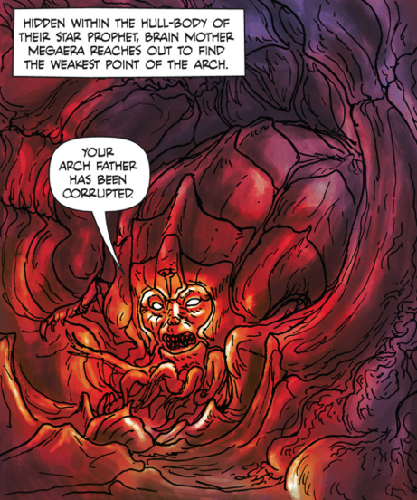
This collaborative world-building technique is not limited to throwaway details, but is also used to drive the plot forward. Prophet waits until the end of issue six to introduce the primary conflict of the series, the battle between the earth empire and Old Man Prophet, a clone who has rebelled. There are several short stories in Prophet that don’t openly announce how they fit into the comic’s overall plot, and the reader  wanders through the pages with the characters, trying to piece together what has happened. Even the first image of an earth empire ruler, though bizarre, cannot be read in a moral framework.


Image 5
Ambiguous depiction of the earth empire in Prophet.

Once the narrative engines get running, it’s clear that the story exists in a binary good versus evil universe, and not even a particularly original one (empire=evil, white-guy-who-fell-in-love-with-a-native-woman=good). Even the character design seems to become more explicit. Where the first images of the earth empire Mothers just look strange, later images portray them as monsters. Once the incremental exposition had filled in enough gaps that I could see the larger arc of the plot, I began to feel nostalgic for the complex, morally ambiguous universe I had been imagining around the characters.

Image 6
The evil of the earth empire.

This is one of the pitfalls of using suggestion to flesh out the world. The Wachowskis have spoken in interviews about the tremendous challenge of realizing and expanding the science fiction universe in Reloaded and Revolutions that they had alluded to in the Matrix. Another manifestation of the gap between expectation and realization occurs when writers who have established a hard science universe introduce elements of spirituality and mysticism (for example, the recent Battlestar Galactica series).

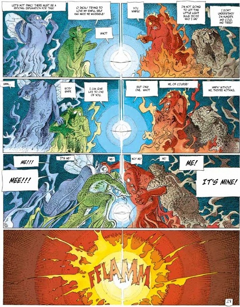
Jodorowsky’s Incal avoids this trap from two different directions. First, it is upfront with the metaphysical, psychedelic weirdness of its world. On page 32, the Incal splits John into four competing gnomelike characters that represent aspects of his personality. It’s a bizarre and awkward turn in the story, but it does an excellent job of signaling the rules of the universe to the reader (no rules). Later, when the battle between light and dark takes center stage, it feels like an extension of the book’s themes instead of a reversal.

Image 7
The four spirits of John DiFool in The Incal.

The second way that The Incal exceeds expectations is by beginning with a relatively straightforward swash-buckling adventure, and then expanding and interrogating parts of the universe until it is much larger. The Incal feels like a small story is growing, while the Prophet feels like a large potential is shrinking.

In later issues of Prophet, Graham pivots the narrative arc by focusing on the a new threat and introducing more characters pulled from the original Liefield Prophet universe. It feels rushed and I didn’t feel any pressing need for the book to be truer to the Liefeld universe, but I’m happy to see the story move in any direction that is not a steady march towards a boring war. One of The Incal’s greatest accomplishments is that even though the story changes direction repeatedly (in the most bizarre turn, the characters must convince all living creatures in the galaxy to fall asleep and enter the Theta-dream together), each iteration feels like a movement closer to story’s core themes. If Graham can make similar course adjustments on Prophet, he will have something truly special.

Image 8
Prophet


Sarah Horrocks on Science-Fiction and Horror Comics

Sarah Horrocks had a great comment about sci-fi and horror in comics (and out. It’s reprinted below.

I’m miscommunicating if I’m putting across that I don’t think sci-fi genre work is as good as anything else.

I’m still reading Dune on the first go through, but there are lines in this book so magical that they are already amongst my favorite. Game of Thrones is an exceptional work. Prophet blows my mind every month. I obviously feel pretty passionate about Druillet’s work. I love Giger and Beksinski’s sci-fi/horror paintings.

And I say all of this as someone whose background in education IS the study of literature.

I think what upsets people about sci-fi is that they feel it’s “merely” escapism, and they’ve been taught to view anything remotely escapist as a pejorative. But it is these fantastic other worlds that most bend and expand your mind, and allow you to change expectations and ideas when you end the work and come back to reality. Sci-fi as a genre is a world shaper. We probably wouldn’t be having this conversation on this thing the internet without science-fiction and it’s mind altering qualities. Sci-fi is good drugs.

And Druillet and Moebius are for me masters of it. I find their works hugely inspirational, and full of ideas that are even today fresh and interesting. Even just technically what they were able to pull off was virtuoso work. There are certain mechanics within western comic art that they absolutely are the gold standard for.

Corben is I feel something of a different beast entirely. I see Corben more in the horror mold–though that’s shaped because most of the Corben I’ve read, and continue to read is horror. And I think horror operates with a completely different set of rules from any other genre but porn. I think great horror is not plot based at all, but rather about generating a particular mind state within the reader–like the example I always use is in the film Texas Chainsaw massacre–the original–there’s this section where he’s chasing the girl through the woods with his chainsaw, and the night is blue, and there’s almost an impossible amount of branches that keep getting in the girl’s way–and leatherface is always like just inches behind her no matter how fast she runs–and the forest actually morphs within this scene and elongates from how we had previously seen it in the film. Suddenly it changes into this seemingly neverending labryinth. She stars running across the screen in directions and at distances that should get her out of the forest–but don’t. In terms of realism it is a failure. But what the work is engaging with is that creepy dream logic that infuses all of the best nightmares.

Most horror work in film and comics of the last 20 years have been failures because they do not understand that this element is what makes horror work. The plot and the realism is what detracts you from the sublime horror moment where art melds with dream. Similar to the moment porn melds with fantasy.

Horror, particularly in comics I think, should be less interested in plot and story compared to any other genre of comics–and be interested in creating these nightmare images and scenarios that come off of the page. More horror comics creators need to be surrealist pornographers.

This got off track. But horror is I feel an instance where adherence to plot and characterization rules that work in other genres produces spectacular failures of horror. The only thing you are left with in a horror work whose focus are those elements is a gore-fest, and trying to out-shock the last person. But true horror is not just gore, or shock–it’s much more subversive than that. And so horror is a huge indictment as a genre of this particular approach.

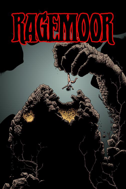
For me an excellent work of true horror did come out in comics this year, and it was done by Richard Corben. It was called Ragemoor. I remember reading the opening pages of that book and that section where the castle history is being explained–gave me chills like a comic hadn’t in a long long time. I think Corben has always had the chops to do great horror, and sometimes he has–but when he has failed it has been because of writing which is overly concerned with itself. Which is why it is hard to explain to people Corben’s place in comics history–because he truly is one of the greats–but he has very few works that are masterworks–and if you don’t get Corben art, and can’t focus in on what he’s doing visually on the page–you won’t understand.

Druillet and Moebius are different in that I think both of them the writing is in concert with the art–probably because they are handling both functions.


Screaming At Heavy Metal

Somewhere in the last thirty-five years, Heavy Metal has earned a reputation as a legendary magazine that printed the best in trippy[1] Eurocomics (the stoner teens of the 70s were apparently deemed too simple to understand the term BD[2]). Part of that came from canny marketing on the part of the editors; issue #2 had an ad proclaiming issue #1 was a collector’s item. A big part of the legend is that the artists they were publishing were legendary – Moebius, Druillet, Corben, Tardi, Chaland, Voss, et al. Of course, there is no easy way to contradict the legend – early Heavy Metal and Miracleman are two series with almost no available back issues in general circulation, which has had had a similar effect on the reputations of both titles.


February 1978 – page 43 Urm by Druillet

 
When the opportunity arose to reread my father’s collection (he was a subscriber for the first twelve years of publication), I jumped at it. I’d read the run when I was in my early teens and don’t remember a lot of it. My delight soon turned to dust – I was appalled when I waded into the first two issues because the art is beautiful, but the stories are lacking. In fact, the word “stories” is generous. In some places, there is an utter lack of concern – bordering on outright disdain – for comprehensible narrative.


June 1977 – page 50 Den by Corben

 
The cognitive dissonance caused by the collision of the magazine’s reputation (especially the early issues, which are generally mentioned in terms of “when it was good”), and the actual work is jarring. It shouldn’t have come as a surprise – the fact that I’d forgotten a lot of it was a clue. But I had high hopes and the determination to look at each issue on its own merits. After a year of reading, I can say this:  the issues from the 70s[3] are very problematic.

The abundance of breasts in the magazine has become somewhat of a running joke over the years, but the amount of rape (and stories where attempted rape drives the action) that appears in those first three years is something else entirely. I really didn’t keep track of how often it happens, but any number more than “none” is usually a bad sign. Tragically, it’s mostly used as just another plot point, with no mention or indication of the consequences. I’m clearly a bad person because I don’t consider the inclusion of rape themes in an anthology as an absolute show-stopper and kept reading.


June 1977 – page 6 Gail by Druillet

 
To keep myself from screaming at some of the weaker pieces, it was important for me to keep in mind that Heavy Metal is very much a product of its time and had a very specific audience. The ideal reader would put Pink Floyd on the turntable, adjust his headphones, take a few bong hits and settle back into a beanbag chair and stare at the new issue for hours. Drug references abound. One of the early marketing taglines came from a reader’s letter “Heavy Metal is better than being stoned. Almost.” And in 1979, Job rolling papers became a regular advertiser.


September 1979 – page 3 Job rolling paper ad

For their part, the creators were mostly European men with Old World attitudes towards women – the usual reaction towards Feminism was the inclusion of full-frontal male nudity, not to cut down on improbable breast-revealing costumes for queens who all seemed to live in tropical climates. (It is very obvious that Richard Corben and Russ Meyer would have had a lot to talk about.) These were comics by stoners who liked titties for stoners who liked titties.


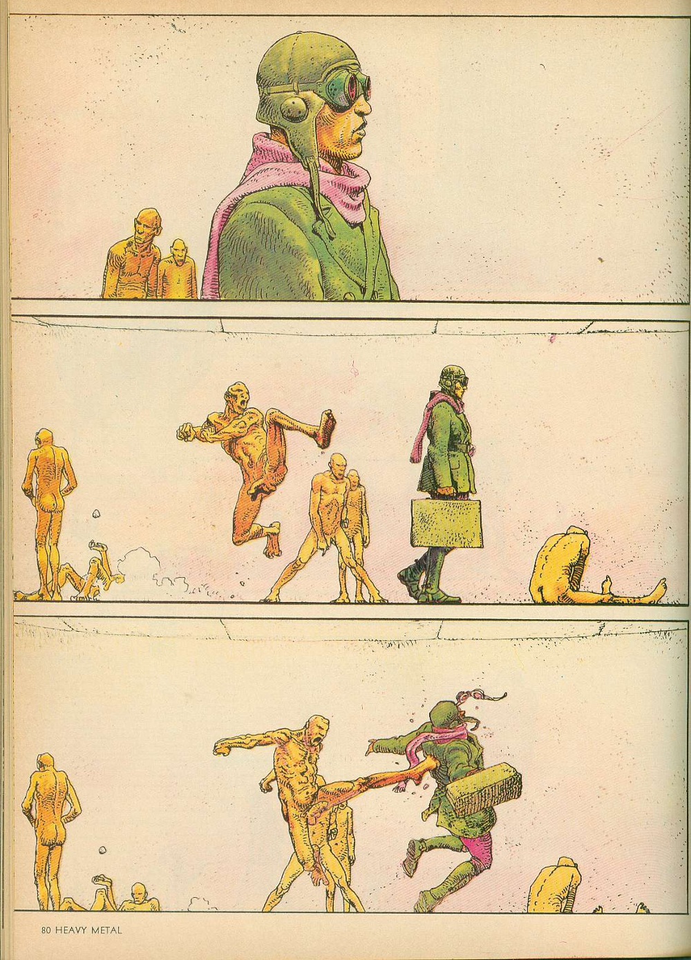
June 1977 – page 80 Harzak by Moebius

 
If that’s your thing, then this is the magazine for you. But if you are one of those heretics, like me, that wants actual stories with your sequential art, this is very hit or miss, with more many more misses than hits. One of the major issues in contemporary art comics (which arguably takes its aesthetic cues from Heavy Metal or what the creators think Heavy Metal represents, including the sex and drugs) is that the art is engaging and interesting, but has almost no narrative continuity from page to page or even panel to panel. The artists are having fun drawing interesting shit, which is fine. But a comic that is worth looking at once with little to no reread value is questionable at best. Unfortunately, that’s Heavy Metal in spades.

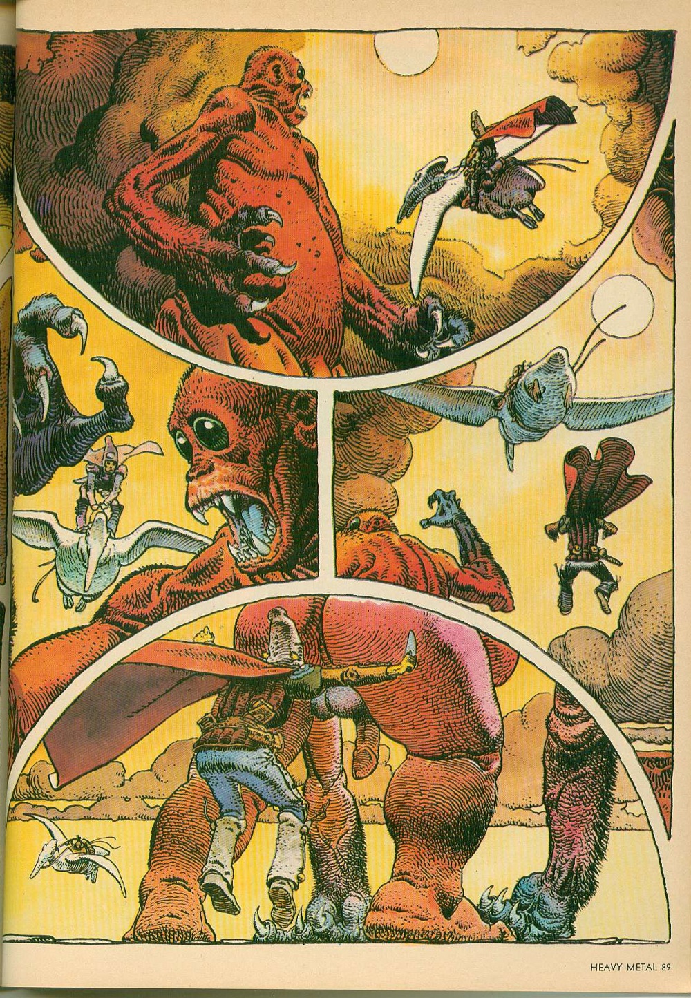
The stories that Moebius was cranking out in these early issues – Arzach[4] and The Airtight Garage – are beautiful works. He was very clearly exploring the limits of his artistic ability and the results speak for themselves. But they make very little sense. Arzach was the first major project that Moebius engaged in after working on Blueberry with Charlier for Pilote, and its wordless pages actually carry some narrative weight, but The Airtight Garage is like a kite without a string.


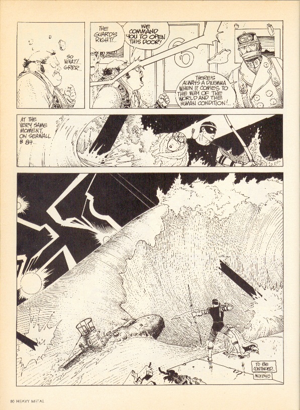
September 1979 – page 80 The Airtight Garage of Jerry Cornelius by Moebius

 
There are intrigues and airstrikes and assassinations and an entire sequence with an archer getting onto a submarine that look like they should be of some consequence. But the narrative stutters so much that the pieces never really come together and the revelations mean nothing. Moebius acknowledges this – one of the chapters is titled The Uptight Garbage of Moebius and a synopsis for another chapter mocks the narrative flailing. Towards the end, Moebius flat-out ignores any of the story he’s written so far and just goes for broke. The results are visually amazing, but severely flawed.

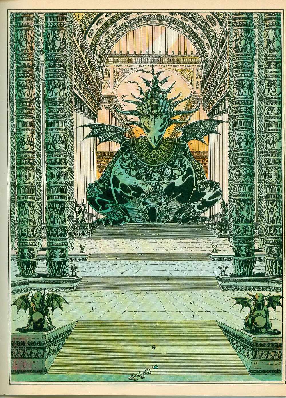
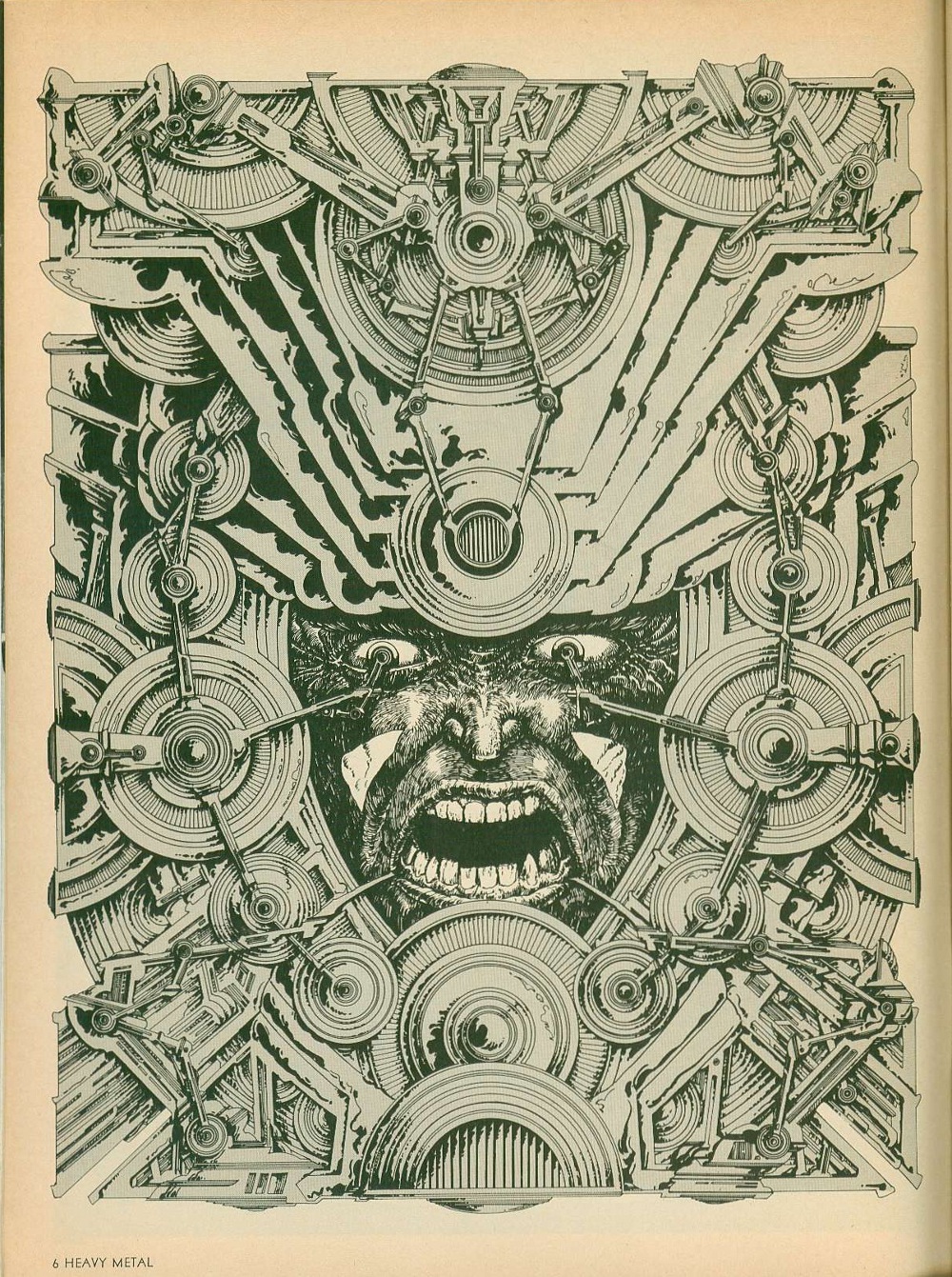
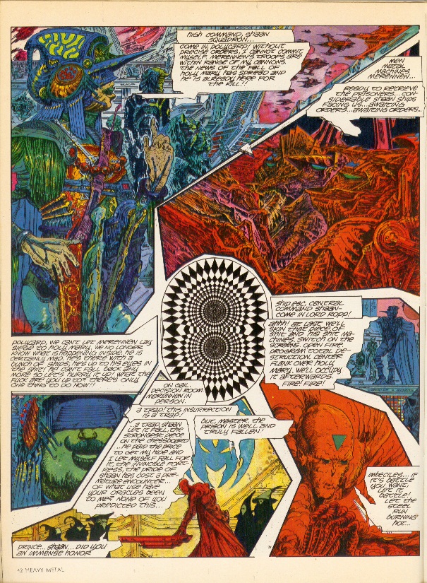
Druillet – one of the original co-Humanoids – is another case in point. His early black and white work is messy, but when he discovered color, it was like he leveled up. The color spreads from Ulm the Mad, Gail and Salammbo are amazing. He did interesting and innovative things with panel borders, incorporating photography into his art and even threw trippy optical illusion pieces into the mix. His design aesthetic owes a lot to Kirby, especially his spaceships and headgear, but it would take someone far more versed in the latter to really do a deep dive on that subject.


November 1978 – page 42 Gail by Druillet

 
One thing that Druillet could have completely left out of his later color work, though, is the words – they just get in the way. In some cases, they are lettered too small to be readable and in others, they just don’t make sense. Either way, they tend to slow down the story unnecessarily – especially the large captions that run to multiple paragraphs. It’s clear from his art that he wanted to produce epic works, but writing is not one of his core skill-sets.

It would be easy to lay the blame for these narrative inadequacies at the feet of poor translation, but the same issues crop up in works by English-speakers as well – Todd Klein, Steve Bissette, Rick Veitch and Charles Vess, I’m looking in your direction. And some of the best stories come from European sources – Jacques Tardi’s work Polonius stands out, as do several of Caza’s allegorical tales. And when these artists are working with honest-to-god writers – Dan O’Bannon/Moebius and Druillet/Picotto are good examples – they actually come out looking very good.


May 1977 – page 89 Arzach by Moebius

 
In the final examination, the art from those early years holds up really, really well. And if that’s what you’re looking for, these are great issues to track down (October of 1979 is probably the best from that period, in my opinion). But if you are one of those people who values actual story with your art, then you are going to be sorely disappointed. Obviously, the disconnect between story and art is something that the contemporary comics reader still has to grapple with and it’s fair to say that Heavy Metal is not where the trend started – it’s just the most obvious, most famous example.

Moebius and Druillet (among others) obviously put a lot of effort into their work. It seems like such a waste that they didn’t take that extra step to find a good writer to really make the work sing. And it’s not like they went out of their way to produce bad stories; they just aren’t good, which was so frustrating that it made me want to scream. As a result, they ended up producing really high-quality art comics at a time when the term didn’t exist.

When Moebius died, Neil Gaiman pointed out that The Airtight Garage was much better in French than it was in English because he had room to imagine how brilliant they were. Accordingly, my advice to young creators who are pining for these works is to go onto amazon.fr[5] and buy them in French, where they are easily available for reasonable prices. You’ll get the best part of the comics without having to put up with the sub-par quality of the writing. Plus, the French archival editions are usually very large, which lets the art breathe. In the unlikely event that these were actually published in English, the current trends tend to indicate that they’ll be shrunk down for some reason that makes no sense – which is another rant entirely.


[1] “I’d like to see an adult magazine that didn’t predominantly feature huge tits, spilled intestines or the sort of brain-damaged acid-casualty gibbering that Heavy Metal is so fond of.” Alan Moore, May 1981

[2] BD is short for Bandes dessinées, which is French for comics. BD:French::Manga:Japanese::Comics:English is the best way to think of it. People who know what to ask for will get much more out of their trips to Brussels and Paris.

[3] The issues from 1977 through 1979 serve as a good scope for this article for two reasons. First, Ted White became the editor in December of 1979, visibly changing the text/art ratio of the individual issues. Second, I’m only halfway through 1980 in my reread and can’t speak definitively about anything past that.

[4] Also spelled Harzak, Arzak, Harzac, Harzakc and Harzack

[5] It’s exactly the same site design as amazon.com, so the language barrier isn’t actually that big of an issue

In Space No One Can Hear You Vomit

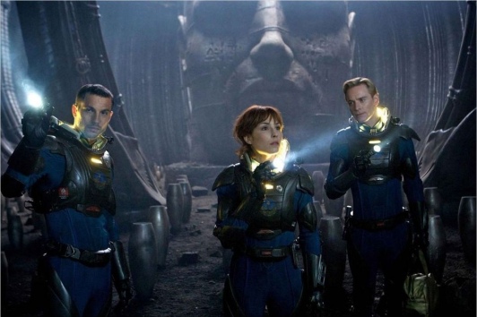
Logan Marshall-Green, Noomi Rapace, and Michael Fassbender in Prometheus

So I’d spent that June 1985 afternoon laying parquet in the future dance-rehearsal room of our Montmartre theater — a quixotic and doomed venture that consumed me and my compadres for two years. The parquet tiles were affixed to the concrete floor by a particularly noxious glue, and I foolishly wore no mask; after two or three hours, my nausea had built up to the point of copious vomiting. So I headed home, expecting the effects to dissipate with rest.

But the nausea continued, for the next three days. I was not only unable to hold down food, but water as well. On the afternoon of the third day I staggered into a clinic, hoping for some healing nostrum to take home — and was immediately hospitalised, with surgery scheduled for the next day; I had appendicitis, which had led to peritonitis and sepsis; my body was poisoning me.

That night, as I lay in bed with a saline drip attached to my arm to reverse my extreme dehydration, I experienced for the first time delirium. It was by no means unpleasant. A haze of uncertain time and odd sensual waves, and curious mental fugues rippling through my consciousness.

And then suddenly that consciousness focussed. I was living the life of a soldier in the Napoleonic period, seemingly cursed to face across the years a mad adversary in duels, wielding rapier, saber, pistol…the intensity of the hallucination was incredible.

Of course, it was no hallucination. The hospital room’s TV was showing director Ridley Scott‘s first feature film, The Duellists, and my fever had thrust me into it.

Ridley Scott directing Keith Carradine and Harvey Keitel in The Duellists (1977)

But how is it that my fever dream never delivered me that same hallucinatory re-incarnation via any of the other TV shows and dramas I watched that night?

Well, ‘fever dream’ is the answer, because fever dreams are what Scott creates at his best, what he seduces us into.

Ridley Scott has always been among the most visually-oriented directors; he studied at the prestigious Royal College of Art in London, and began his career as a set designer for the BBC. An excellent draftsman himself, he exercises over the art direction of his films an almost maniacal attention to visual and aural detail.

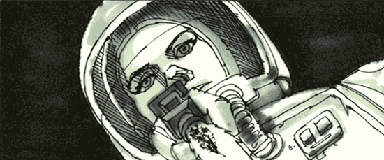
Storyboard drawings by Ridley Scott for Alien

This was apparent from his days as an extremely successful director of commercials; nobody who lived through the seventies in Britain (such as I) has forgotten his series of ads for Hovis bread. (Click through for video.) Observe the lushness of the photography and the thorough recreation of a period, hear Dvorak’s 9th Symphony hypnotise you into sentimental yearning. One of these ads was recently voted Britain’s all-time favorite television advert.

At the same time, the bullshit quotient of these commercials was high (what– bullshit in advertising? Stop the presses). Hovis is an admirable and healthful wholewheat bread, but it is, and has been from the start, an industrial product, not the loving fruit of the local artisanal baker’s craft. The golden glow of nostalgia radiating from these commercials is rooted in an imaginary past: the Depression-era North and Midlands of England were grim places indeed; besides, working-class and lower-middle class Englishwomen traditionally baked their own bread well into the sixties. A loaf of Hovis factory bread would’ve been regarded as a luxury.

Still, we willingly let ourselves be lulled by Scott’s dreamweaving. And I maintain that this holds true not just for his ads, but also for Scott’s most successful films. They are often riddled with logical and narrative incoherency, leave questions unanswered and mysteries unresolved– we don’t care. We want the fever dream.

Scott’s great talent is for the creation of plausible worlds. Note: I say plausible, not realistic or even believable. He can create a romanticised Napoleonic age (The Duellists) or an outrageously baroque Roman Empire (Gladiator); an exoticised techno-Orientalist modern Tokyo (Black Rain); a fairy-tale land (Legend); the science-fictional Earth of Blade Runner and Space of Alien; and we are there with him. Because we want to be!
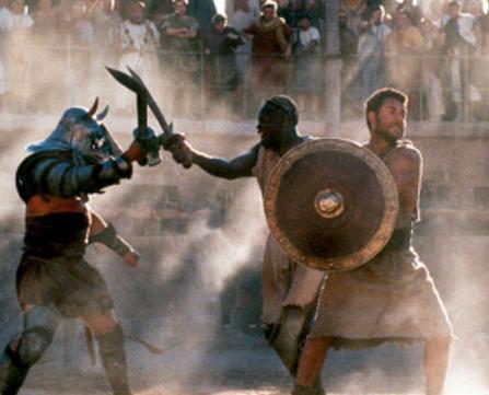
From Gladiator. Note the dust; Scott uses (abuses?) dust and mist lavishly for visual oomph

As a sample of this world-building prowess, consider his famous 1984 Superbowl commercial introducing the Apple Macintosh computer. (Click through for video.) Although it only ever aired once, its impact was extraordinary and resounds down to this day. What we note, behind the rather perfunctory and obvious allegory, is Scott’s skill at implying an entire imaginary world in so brief a span of time.

Scott’s breakthrough film was, of course, Alien in 1979.

It manages a) to show one of the most believable science-fiction worlds ever presented on the screen, and b) to be one of the most frightening movies ever made.

The first is due to Scott’s aforementioned obsessive attention to detail and visual talent. The second is due to his genius for emotional manipulation.

Alien benefited hugely from Scott’s discernment of artistic talent. It’s been said dismissively of him that as a director, he made a great art director; but an art director’s brilliance made the film.

His great coup was to recruit the artist of the grotesque, H.R.Giger, to design the alien monster and the extraterrestrial ruined spaceship.
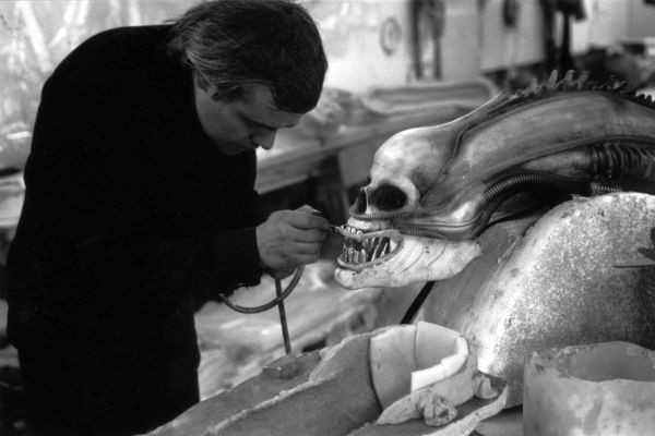
H.R.Giger building the alien

Other marvellous talents were recruited for other aspects of the film, cast like actors; Ron Cobb designed the Earthling spaceship Nostromo, and Jean ‘Moebius’ Giraud designed the spacesuits.
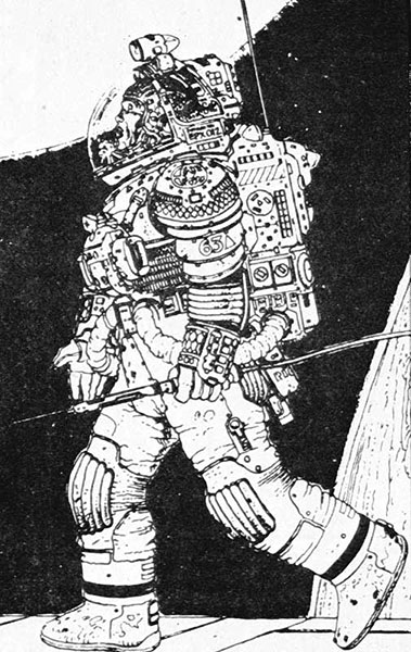

Above: Giraud’s spacesuit design. Below: the suits as seen worn among Giger’s set.

Scott’s gift for manipulation — his dark side, as it were — told him the most effective ways to induce fear and horror. Alien features a nightmarish view of the body’s flesh and fluids. In addition to the usual directorial tools of suspense and pacing, the whole Hitchcockian array, Scott very consciously reaches for the visceral and the subconsciously somatic gripping to create his nightmare.

After Alien, Scott’s science-fiction follow-up was Blade Runner (1982), an adaptation of Philip K.Dick’s Do Androids Dream of Electric Sheep? This was another visual triumph, with Scott again partnering with a design visionary, Syd Mead.
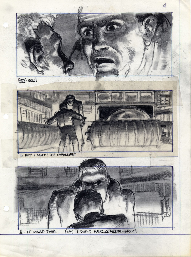
Storyboard from Blade Runner, drawn by Ridley Scott

At the time, Scott declared that the science-fiction film needed its John Ford — that is, a director who could be to the SF genre what Ford was to the Western. And Scott could have well fit the role.

But thirty years passed before he made another science-fiction film: Prometheus.

**********************************************************

Scott’s career during this hiatus soared, creating gems (Thelma and Louise, Gladiator, Black Hawk Down) and duds (Someone to Watch Over Me, G.I.Jane.) The initial box-office failures of Blade Runner and of Legend may have caused him to shy away from the fantastic. He was also vocally displeased with the rather ham-fisted exploitation, by other hands, of the Alien franchise. However, for the past ten years he has been working on a prequel to Alien — only to shy away from that notion in recent years, at least in public.

His and the studio’s coyness about Prometheus has exasperated fans. Is it or isn’t it a prequel?

To answer that question, I was, in the evening of June 1st, Prometheus bound. (Sorry, couldn’t resist.)

So the answer to “is this an Alien prequel” is…?

Yes.

And no.

Yes, for it fits perfectly into the Alien universe, Giger designs and all. No, because the film works perfectly well as a stand-alone. Scott has his cake and eats it; good for him.

Is it a good film? Yes — but only if you are willing to embrace the fever dream — the nightmare. By which I don’t exactly mean the old cliché “check your brain in at the box office and enjoy”.

Science fiction is the most cerebral of genres; but it also works with the unreasoning emotions of awe, wonder and horror — with the sublime. The latter are this film’s strong suits.

Now I want this article to be relatively spoiler-free, so I won’t go into plot details. But, for any savvy SF aficionado, there’s nothing conceptually new on offer here. Von Daniken and Lovecraft seem to be the main inspirational motors. (Lovecraftians will understand this allusion: where Stanley Kubrick’s 2001:A Space Odyssey has been called a shaggy God story, one could call Prometheus a shoggy God story.) The old SF trope of mankind having been seeded on Earth by extraterrestrials has long since run into the problem of Homo Sapiens‘ close genetic kinship with other primates such as chimpanzees and gibbons; to my knowledge, only the writer Larry Niven has worked his way around this inconvenient fact, in his novel Protector. The film ignores this.

There are numerous logical lapses, not just in concept, but in motivation and continuity. The strong, simple storyline of Alien here is complicated by a larger cast and fussy mise-en-scène– people go from ship to ruins to ship to ruins to ship and from chamber to tunnel to chamber to tunnel until the viewer has no sense of place. Many of the characters are stereotypes.

But, you know what? None of these objections amount to much. Let your reptile brain take over, give in to the Scottian dream.

The nightmare works more powerfully than ever off our deep revulsions for the flesh, our imaginative perversions of sex, birth, death, and animality. We are fed one particular abomination that is the ultimate in vaginadentatatentaclepornhermaphroditicmisogynist monsters: it makes the cosmic squid in Watchmen look like a wee twee fairy. This she-he-horror fights its opposite number, an extraterrestrial superphallic Uebermensch, and succeeds in raping him in true classic Alien style. With the usual, unholy, parturient result.

But the most harrowing sequence has one of the female characters, impregnated with an atrocity waiting to burst through her abdomen, racing to have an automated robot surgery pod operate an emergency caesarian/abortion. The extracted monster is a squealing, squirming betentacled mass of boneless flesh, held in the sterile metal grip of the robosurgeon.

Beyond the hideous delights of this sequence, I find it well encapsulates the genesis of Prometheus. We, the audience, are the woman. Inside us resides the secret monster of our Id. Ridley Scott is the robosurgeon, who clinically, mechanically extracts the creature and shows it to us: the creature being, of course, the film.

Some final random notes: the acting level is uniformly above par; great pleasure is derived from Michael Fassbender‘s alternately childlike and malevolent android Dave. He provides an incarnation of the Superego– sandwiching the humans between himself and the Id of the monsters.

This is definitely a star-making turn for Noomi Rapace, as protagonist scientist Elizabeth Shaw. Strength and vulnerability, emotion and will to knowledge, are complexly communicated by her wonderfully expressive features.

Charlize Theron plays yet another ice-queen bitch. Disturbingly, the trailer before the film was for Snow White and the Huntsman, where she plays yet again another ice-queen bitch. Lady better watch out for the stereotype patrol.

The visuals are predictably stunning, and this is one of the very few 3D films I’ve seen that justifies the extra price.

So: welcome to his nightmare, and to yours. Go see it.

++++++++++++++++++++++++++++++++++++++++++++

Scott is not alone in this club of visualists/dreamers. I would group him with Tim Burton, Terry Gilliam and Jean-Pierre Jeunet (all four being graphic artists originally) as cinematic visionaries who triumph over weak story to enthrall us with their worlds; the distant children of Georges Melies.

(In comics, I place Jack Kirby, Steve Ditko, Rick Griffin and Jean Giraud in the same family.)

Still, it should be pointed out that these directors do their best work with quality scripts: The Fisher King for Gilliam, Alien and Thelma and Louise for Scott, Beetlejuice and Big Fish for Burton. And other visualists, such as Jean Cocteau, Stanley Kubrick or David Fincher, have always worked both hemispheres of the brain — investing just as much energy into the writing as into the dreaming. Scott himself has evolved in this direction.

May he continue to do so; he is currently developing a sequel to his other SF masterpiece, Blade Runner. And Prometheus ends with the possibility of a grandiose sequel.

Perhaps science-fiction will have its John Ford, after all.

++++++++++++++++++++++++++++++++++++++++++++

Silly P.S. # 1:
Noomi Rapace was discovered as the star of the Swedish version of The Girl with the Dragon Tattoo, in which she played Lisbeth Salander. The American version stars Rooney Mara.
Those are three cool names!
Silly P.S. #2:
In 1977, I clipped a pretentious review of ‘The Duellists’ and sent it to the Pseud’s Corner column of the satirical magazine Private Eye. They sent me back a cheque for five pounds sterling, enough for a nice dinner at Hamburger Delight.
Thanks for the burger, Ridley!

+++++++++++++++++++++++++++++++++++++

Check out this site for the corporate villainy behind the voyage of the Prometheus
A marvelous blog of science-fiction and fantasy art :
Sci-Fi-O-Rama

The Major’s Testament


Jean Giraud aka. Moebius had been battling cancer for years, cheating death on several occasions before finally letting go on Saturday. His illness marked his creative production in the last decade of his life, leading to the cancellation of certain projects, including two Endless collaborations with Neil Gaiman, and the sad dissipation felt in others, most notably perhaps his last book (2010), in which he revived his classic, mute character Arzak as a talking stiff-headed nobody in particular.

But it is also a strong undercurrent in the late, exhilarating creative surge of his improvised sketchbook comics series Inside Moebius (2000–2008) and his elegiac return to his greatest creation, The Hermetic Garage, in 2008’s Chasseur déprime — works in which he captured for the first time in decades some of the same searching energy that characterized his creative peak in the seventies, delivering it with the urgency of a man with a short lease.

While in a sense youthful, these works are simultaneously very much songs of experience, with Chasseur déprime as resonant a reflection as any in comics on old age. Uncertain, even insecure, and borderline depressed, but also wise. Nothing is ever really over in Moebius and he did love the serial, so it is fitting that the story leaves things open, ending on the obligatory “fin de l’épisode.”

I have previously written at some length about the book and its relation to his 1970s masterpiece, so I will just add a few observations here, pertaining specifically to its character of artistic testament.

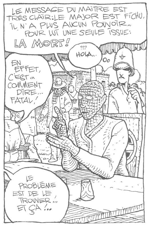
The plot — such that it is in this reiterative, oneiric work — concerns the protagonist, and Moebius’ alter-ego, Major Grubert, the demiurge-like creator of the tripartite world of the Garage, taking out a contract on himself, offered by one of his own creations. From the first pages of the book, we learn that there is only one possible ending for him: death.
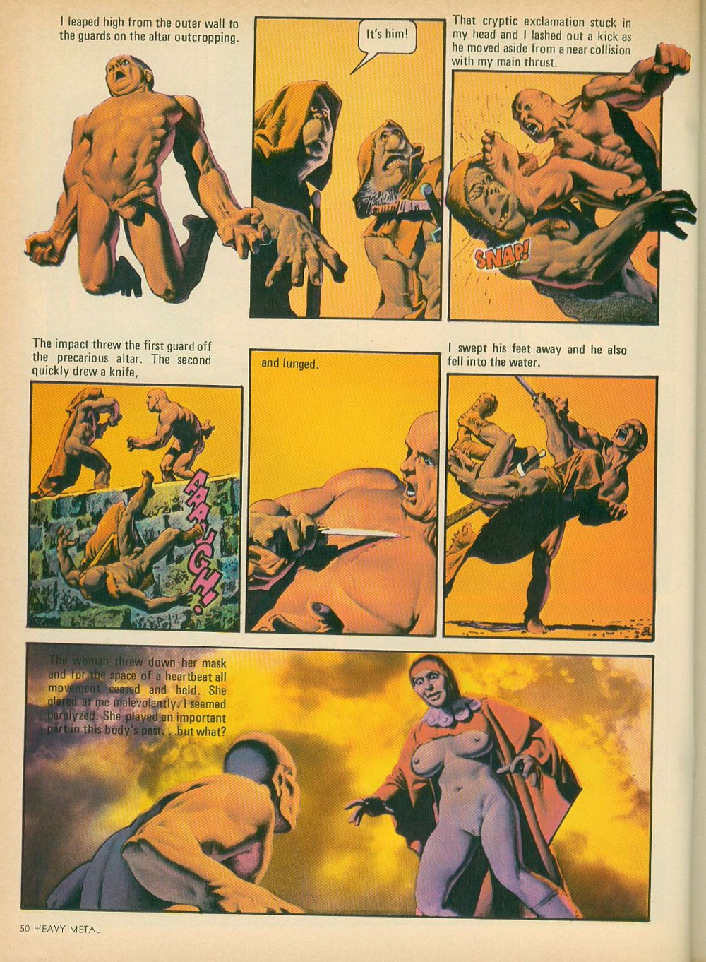
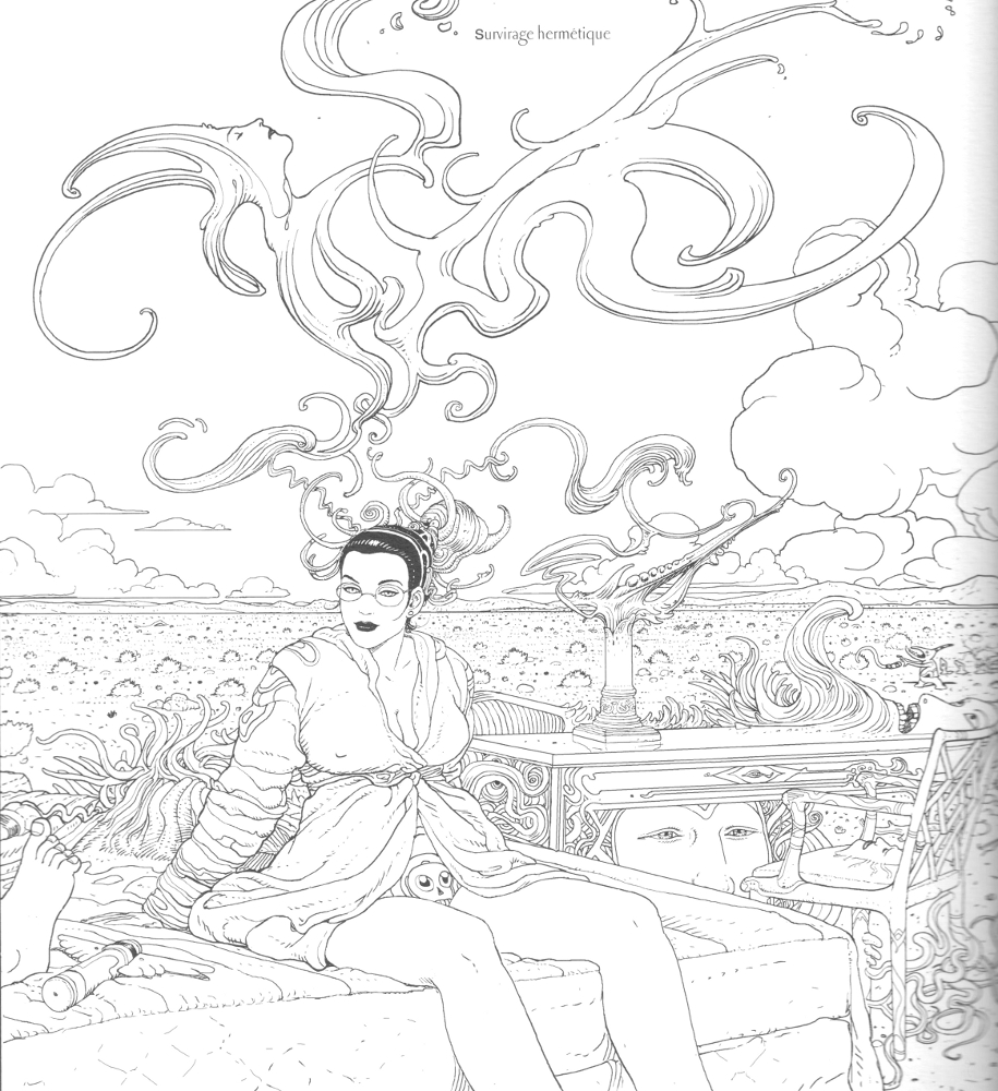
This prompts a personal mise-en-abîme in which the Major finds himself unstuck from the temporal flux, wandering the desert, which — literally as well as symbolically — was ever Giraud’s creative locus amoenus, only to be trapped in the clinical halls of a museum overseen by a dominatrix task-master, the Overturner. Here, he loses himself in his work or, as he describes one of the pieces on the walls, “plays with fire.” The tone is retrospective, describing a creator who, in the words of one of his creations, never delivered to the arid desert floor of his world the Elysian Fields promised in his prime.

This allegorical narrative is woven through with what is clearly personal detail. At one point, the Major expresses a wish to escape to “Good Old Earth,” more precisely the Mountrouge suburb of Paris where Giraud lived with his second wife, Isabelle. And it is tempting to see in the voluptuous Overturner a complex portrayal of his formidable wife and business manager. While superficially presented as a villain, she is simultaneously the most intriguing character in the book, acting the part of the artist’s dark muse and embodying his desire.


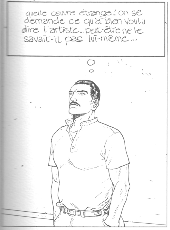
At one point, the action jumps ahead eleven years — eleven years which we sense have personal resonance — and we understand that the Major has spent that time passively as a slumping custodian in the museum of his own work. The initially exuberant and virile, if still menacingly inflected, picture above him (“Playing with Fire”) has morphed into an oppressive conglomeration of biological havoc, reminiscent of the work of Moebius’ fellow designer for Ridley Scott’s Alien (1979), H. R. Giger.

Central to both compositions are the skulls that anchor much of the imagery in this book, as well as in its direct predecessor, the extended creative mediation 40 Days dans le Desert “B” (1999). The skull in art tends to signify vanitas, a symbol of the transience of life, and Moebius in one instance even makes use of the similarly consolidated motif of the artist working with Death looking over his shoulder, but he gives it all a disturbing personal spin.

The skull in these images is often at the center of the kind of mutating forms for which he is famous, the kernel animating the creative metamorphosis that is at the core of his art, and of his creative self-conception. Once beautiful and inspiring, even regenerative, at other times in his career barren and still, these mercurial forms turn tumorous in old age. Fatal.

As has ever been the rule of his art, Moebius knows he cannot escape. Yet he sees an out. The Major, on the run from the Overturner’s murderous rabbit henchmen (don’t ask), decapitates himself, leaving his body at their mercy (a charged representation of his troubled, always slightly alienated sexuality). Hilariously — the silly was ever a saving grace for him — his noggin drops down a rabbit hole, and as is the nature of such apertures, he changes.

From the resultant cancerous mass emerges once again the good old Major wearing his pith helmet, carrying his overnight bag. Meeting him there is his liberated, non-mustachioed alter ego from the ending of the original Garage, who takes him on a journey not toward Montrouge as he initially wishes, and not out of the dream in which he has been suffering, but toward the “six million” doors it still offers him. We thus leave them as they approach not our Good Old Earth, but another.

What better ending? The artist submitting his creativity as redemptive, finding it ever on the event horizon of the Other.

When We Had Moebius in Our Living Room

Moebius was one of the weirdest things my roommate had in our living room. He wasn’t weird in the way that the shrine to my former workplace janitor was weird. That is to say, he wasn’t weird in that stupid way early 20’s ironic décor is weird, which is not weird so much as dopey (think a vintage speculum or the rare can of Storm Malt liquor found at Grocery Outlet in downtown Oakland). Moebius was weird by virtue of his incongruity. He was worth more than everything we owned and maybe even the apartment we lived in. He was definitely prettier than anything else we owned, and we took better care of him as a result. My roommate and I destroyed glassware (glass performs poorly in the hands of drunks), three futons, a couple of lamps, a garbage disposal, and a bathroom sink. Most of our other books had coffee stains on them. The ones that didn’t had been soaked in other liquids, and their spines buckled as a result. Our lives weren’t very pretty either, though they lacked the level of degeneracy necessary to make them really interesting. This is all a long way of saying that while we weren’t miserable we weren’t quite happy, either, which is a way of explaining in advance why we kept Moebius around so long.

My roommate found Moebius on the floor of a movie theater in Sand Diego in 1995. Actually, an employee of his found Moebius. Knowing my roommate (who I’ll call Rob, since that’s his name) read comics, the employee brought him to him. He was a little, 4” by 6” black, and hardbound Moebius. He contained a bunch of little drawings on medium press paper that felt slightly rough to the touch. The drawings were put down in shiny black ink, their line weights uniformly uniform, and their subject matter various. The thing about the drawings is that they were so perfect the employee thought it was a facsimile of Moebius that some conventioneer had dropped. For a second Rob thought the same thing. But before he pitched it on the lost-and-found he realized it was real. A weird little colored-pencil doodle by Bob Burden and some children’s drawings in crayon were what gave it away.

The lost-and-found was no place for such a thing. The San Diego Comic convention had ended earlier that day. This was before everybody was on the Internet. It was before everybody knew what the Internet was. Rob did what was maybe the right thing. He put it in his bag and took it home. He moved into my Oakland apartment a few months later.

I was in the process of a protracted breakup and in need of a roommate. Like many young men my age I was a terrible person, though I maintain I had my charms. The least of these charms (but a charm nonetheless) was that I drew well enough to make others think I had a future in drawing. Although I hadn’t read comics regularly in some time, I was still looking for work in the field. What’s more, I had maintained an interest in the things. So when Rob moved in he unpacked Moebius and placed him in my hand. Upon meeting him I knew exactly who he was. Good to meet you in person, Moebius.

Those little drawings had an amazing way of making the tiny pages seem ten-times their actual size. There was a drawing of a canyon that you all but fell into. The drawing of a man plodding through the desert looked vast. The man was less than an inch tall, but he was fully formed and totally lost. There were lots of crystalline landscapes, many exotic hats, some beautiful women and some less than beautiful men. There were no pencil marks, no erasures. It was totally Moebius.

Moebius lived with Rob and me for almost five years. How the hell did we get so lucky? We certainly didn’t deserve him. More often than not he’d just hang out on the shelf. But he’d come out at critical moments, like when one of us was depressed, or when somebody with an interest in comics was over, when we wanted to show off how random the world could get.

Rob and I understood that Moebius couldn’t stay forever. He certainly wasn’t ours, and we knew we’d need to find him a way home. But we were also too lazy to write letters or call France. About two years later we did take Moebius to the local comic convention. We thought we might connect with a friend of Moebius who could help him out. After a few shady dudes offered to take him off our hands, I asked a friend who dealt in original art what we should do. He and a few pros took a minute with Moebius and they all agreed. Do not give Moebius to anyone other than Moebius.

I moved out the next year, but Rob, Moebius and I still spent a lot of time together. I was back in school and feeling better about my life. Ditto Rob. Moebius was the same as ever, though he was also coming to Oakland for a convention. When Rob found this out he called me to ask if I wanted to give Moebius back to Moebius. I had to work (or something) that weekend, so Rob and Moebius headed to the convention together.

When Rob got to the convention he found Moebius at the end of a long line of autograph seekers. He stepped into line. The guy managing the line, a Mr. Rory Root, was asking people what they were getting signed or explaining the rules or doing whatever he was there to do. I wasn’t there, and while Rob has filled me in on the details, they’re the sort of details that derail a good story. Anyway, Rory did eventually get to Rob, and Rob showed him Moebius. Rory took Rob and Moebius to the front of the line.

Moebius introduced himself to Rob, not knowing why he’d been brought to him. Rob, not knowing how to start the conversation simply introduced Moebius to Moebius. He explained really briefly where he’d been, and what he’d been up to. Moebius didn’t bat an eye at the explanation, but he did tear up. “They’re quite good drawings, no?” He thanked Rob, and Rob called me almost immediately after. We were going to miss Moebius.