The Flaw in Watchmen

In his post last week, James Romberger argued that the “offensive flaw” of Watchmen is its suggestion that a woman could forgive, and even love, her rapist.

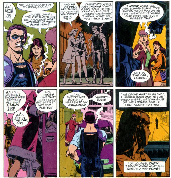
Sally kissing the photo of the late Blake amplifies the flat note in what is otherwise one of the most carefully and sensitively composed comics ever done. In a medium predominantly directed to males, an often overtly misogynistic form oblivious to the consequences of sexual violence, this rare realistic depiction of rape in comics comes to represent a offense a woman could forgive, that she even might even come to love her rapist.

James is certainly correct that the trope of woman-falling-for-her-rapist — the conversion rape — is a standard of misogyny. As I’ve noted before, the ur-conversion rape is probably the notorious scene in Goldfinger where James Bond overpowers Pussy Galore and fucks her. Afterwards, Pussy Galore abandons her lesbianism and betrays her boss, risking her life and the lives of her whole lesbian posse for the love of Bond’s magic penis.

what’s especially offensive about this whole scenario is the extent to which Ms. Galore is so completely beside the point. The rape and transformation is never about her; in fact, we don’t ever get a sense of her as a character except that she’s tough and independent, and then, suddenly, not so much. She falls for Bond because he’s just so darn overwhelmingly attractive, and she abandons her (never quite stated) lesbianism as if she were doffing a hat. There’s no actual psychological progression attempted; it’s just, insert phallus, hello enlightenment. The whole point of the encounter is, in fact, to annihilate her as a character; in entering her, Bond replaces her will with his own, and she becomes simply his catspaw. It’s the crudest kind of male power fantasy, and one which is more than a little pitiable, suggesting as it does a desire to fuck a mannequin, rather than a real person.

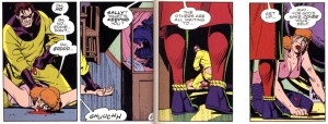
The Bond/Pussy Galore conversion rape is undoubtedly misogynist — but it’s also really, really different from the rape in Watchmen. In the first place, there’s nothing romantic or pleasurable about the sexual violence that Sally experiences. On the contrary, Blake’s assault is bloody and miserable. He himself is anything but cool; Gibbons portrays him pathetically pulling his pants up afterward, and then getting beaten to a pulp by the Hooded Justice.

Moreover, Sally is not converted by the rape. On the contrary, she never forgives Blake.

She hasn’t forgotten, she hasn’t decided what he did was okay. He’s a monster, she knows it, and she’s never going to let him have anything to do with her daughter.

Of course, the part that gets James, and that he feels is misogynist, is that Laurie is Blake’s daughter too. Sally did not forgive him, but she did love him.

James feels that that is problematic. In part, he seems to feel that it is problematic because it is unrealistic (“this rare realistic depiction of rape in comics comes to represent a offense a woman could forgive, that she even might even come to love her rapist.”)

But is Sally’s reaction unrealistic? Women do often love, or are intimately attached, to the people who abuse them, whether husbands or boyfriends. This is an uncomfortable truth, especially for a feminist vision that puts a premium on empowerment and autonomy. Sally Jupiter is certainly not perfectly self-actualized; there’s no question about that. But because she’s not perfectly self-actualized, does that mean she and her choices are necessarily wrong or misogynist?

In James’ reading, Sally’s love becomes the misogynist smoking-gun; the love is wrong. I don’t accept that. It’s not Sally who’s wrong. It’s Blake. It’s not the love that’s at fault; it’s the violence.

James says that:

Even more offensively, Snyder in his film made the fact of Laurie’s very existence through Sally’s forgiveness be the salvation of the world. This concept unfortunately lurks in the book…

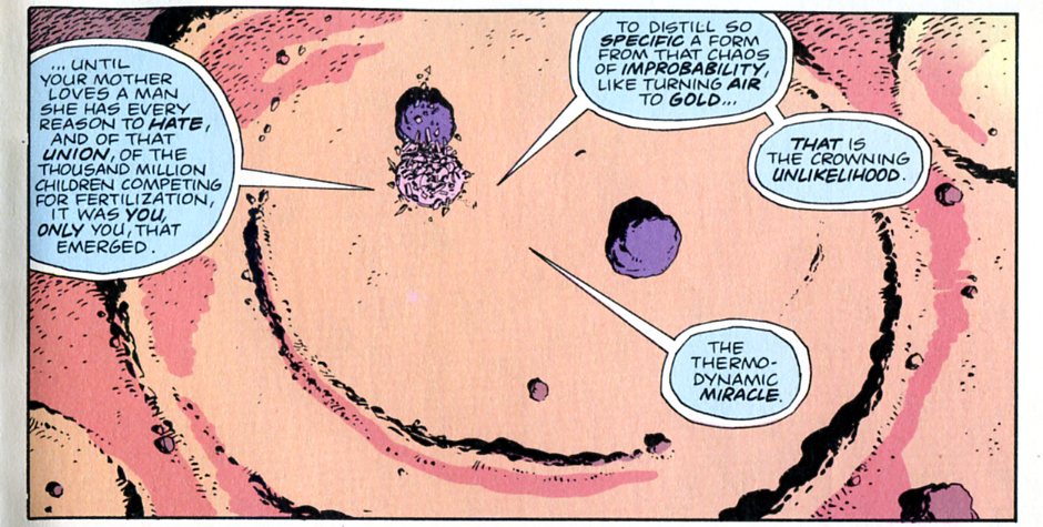
I’m relieved to discover that I’ve almost completely forgotten Snyder’s crappy film. In the book, though, Laurie’s existence is indeed seen as a miracle (though not necessarily as the salvation of the world, as my brother points out). As Dr. Manhattan puts it:

So yes, Sally’s love (though not, as I said, her forgiveness) is seen as transformative, and even beautiful. And it is seen as transformative and beautiful in large part because it produced Laurie, who Sally loves, and who Jon loves.

I think James in part sees Sally’s love as a flaw because he sees it as mitigating, or validating the rape. But I don’t think that’s the case. Just because something good comes from evil doesn’t make evil good. Paul Celan’s poetry is wonderful, but it doesn’t validate or recuperate the Holocaust. Or, as C.S. Lewis says in Voyage to Venus, talking about the fall from Eden:

“Of course good came of it. Is Maleldil a beast that we can stop his path, or a leaf that we can twist His shape? Whatever you do, He will make good of it. But not the good He had prepared for you if you had obeyed Him. That is lost for ever. The first King and first Mother of our world did the forbidden thing; and He brought good of it in the end. But what they did was not good; and what they lost we have not seen. And there were some to whom no good came nor ever will come.” He turned to the body of Weston. “You,” he said, “tell her all. What good came to you? Do you rejoice that Maleldil became a man? Tell her of your joys, and of what profit you had when you made Maleldil and death acquainted”…

The body that had been Weston’s threw up its head and opened its mouth and gave a long melancholy howl like a dog….”

That could be Blake at the end giving that howl, almost. Certainly, he dies ignominiously and alone, having lost even the comfort of his amorality. Laurie, as a living manifestation of her mother’s love, is a standing rebuke to Blake and his life. If Laurie is a miracle, then the Comedian’s cynicism and nihilism truly mean nothing. This is not to say that Moore and Gibbons, or even Laurie herself, entirely reject the Comedian’s evil or his violence. But it is to say that, to the extent that Watchmen does reject it, it’s because of, not despite, Sally and her choices.

I don’t mean to say that those choices are ideal. Sally herself doesn’t think her choices are ideal. But just because a woman fails to make ideal choices, and just because she does not respond to violence with hate (or at least not only with hate), doesn’t make her a failure. If feminism requires perfect women, there won’t be any feminism. Sally may be a flaw, but humans aren’t gems. Flaws don’t make them less precious.

Utilitarian Review 1/18/12

On HU

In our Featured Archive post I look at the blank fugue that is Gantz.

I argue that Joe Shuster’s Superman and Joe Shuster’s fetish comics aren’t all that different.

Ng Suat Tong on the sadomasochism in Alex Raymond’s Flash Gordon.

The new Dr. Manhattan cover appears to have been designed by fools.

I talk about excess meaning in Bert Stabler’s Nanonuts, Frank Miller’s Daredevil,and Hokusai’s 100 views.

I asked how people found this site and how they follow it. Please add your comments if you’d like!

James Romberger on an accelerated production of Hamlet and Before Watchmen.

Kinukitty on Yakuza Café and tea.

A closer, brief look at coloring changes in Watchmen to see if they affected the Sally Jupiter narrative.

Robert Stanley Martin on Godard’s A Married Woman.

A 60s bluegrass gospel mix download.
 
Utilitarians Everywhere

At Splice Today I look at the puzzling nostalgia of Tim McGraw’s Emotional Traffic.

Also at Splice I argue that there is no fancy explanation needed, the GOP candidates just suck.
 
Other Links

Jim Shooter on the Ghost Rider IP mess.

Caroline Small drew my attention to the fact that the Virginia legislature has passed some impressively crappy abortion legislation.

Yan Basque says that 6 issues in the new Wonder Woman series is not any good.

Music For Middle-Brow Snobs: Jesus Was the Stone

Post-60s bluegrass gospel mix: Download Jesus Was the Stone.

1. Looking for the Stone (a cappella) — Dry Branch Fire Squad
2. Waiting the Boatman — Norman & Nancy Blake
3. The First Step to Heaven — Nashville Bluegrass Band
4. The Pale Horse and His Rider — Longview
5. Will You Be Ready to Go Home? — The Seldom Scene
6. Preaching, Praying — Homer Leford and the Cabin Creek Band
7. Calling My Children Home — The Country Gentlemen
8. That Home Above — Bluegrass Cardinals
9. We’ll Still Sing On — The Johnson Mountain Boys
10. Model Church — The Bluegrass Album Band
11. Wayfaring Stranger — Emmylou Harris
12.Remind Me, Dear Lord — Alison Krauss and the Cox Family
13. Peace Like a River — Doyle Lawson and Quicksilver
14. Won’t You Come and Sing for Me — Hot Rize
15. You’re Drifting Away — The Rice Brothers
16. Working on a Building — Patty Loveless and Del McCoury
17. Talk About Suffering — Doc Watson
18. Looking for the Stone — Dry Branch Fire Squad

Watchmen Coloring Update

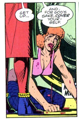
James Romberger argued in this post that the coloring in Watchmen covered up Sally Jupiter’s nudity in this panel. As James puts it, “The colorist has obscured where Gibbons drew Sally’s shorts and stockings pulled down in panel 4, which represents a typical male reaction to rape, at the time and often still.”

My brother Eric suggested in comments that their might have been a coloring change from the original. I have those, so I’ve duly scanned in the panel in question.

Some of the values are slightly different, but I don’t see any significant change…? James, what do you think?

Who Is Under the Hood?

So as folks may or may not have noticed, we are getting fewer and fewer links from comics blogs as time goes on. However, it doesn’t seem to have affected our traffic; on the contrary, we’re getting slightly more hits, if anything.

Which brings up the question — how are you all finding us? I’m curious to know. Do you follow us through twitter or facebook or through our feed? Did you find us through a google search? Do you have us bookmarked?

And, as long as we’re asking, what do you like (or dislike) about the site? Is there something you read us for in particular? Is there something you wish we’d cover that we don’t?

I realize this may not be of interest to anyone else…but I was curious, so I thought I’d ask. In any case, whether y’all want to talk to me here or not, I do really appreciate that you are finding us somehow or other, and that you’re taking the time to read us.

Excess Meaning

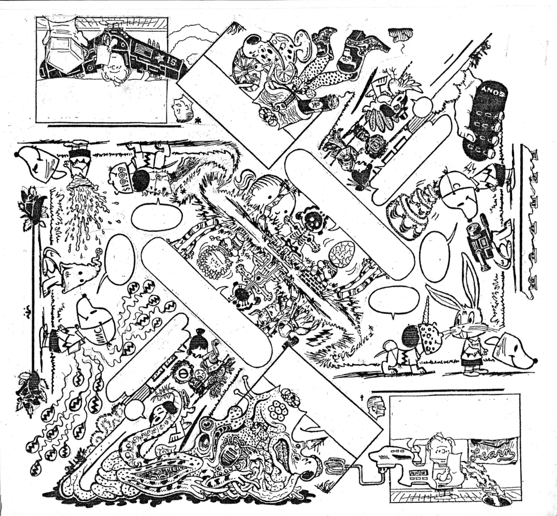
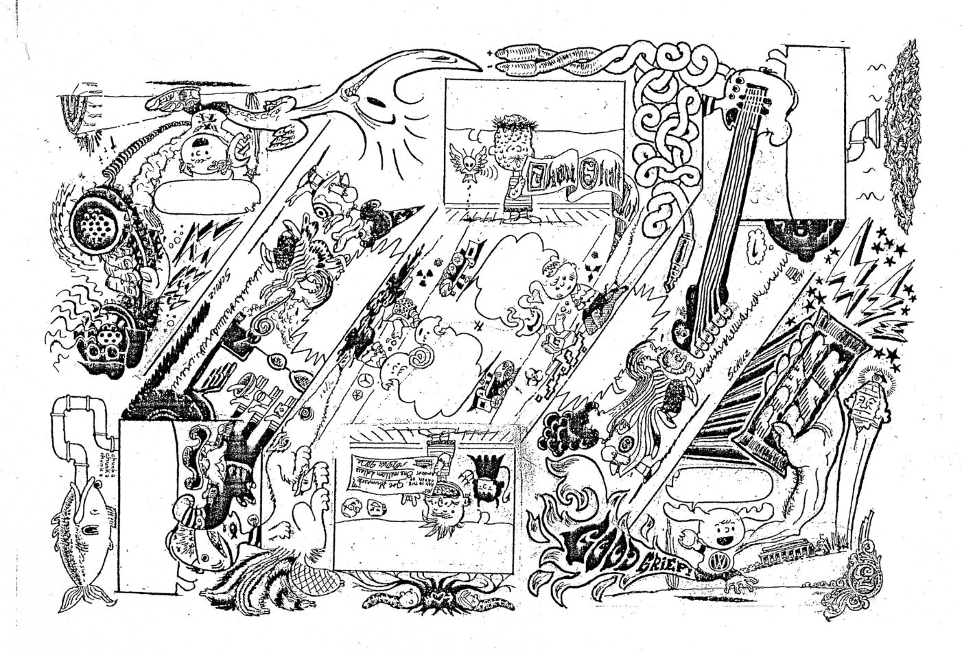
Above is a art project Bert Stabler and I worked on together. I wrote the words and he drew the image.

Except, as you’ve probably noticed, there are no words. When it came down to it, Bert decided that the pictures looked better without the text. So he took them out.

In some versions of comicdom, this could be seen as a cardinal sin. As Joe Matt says, “”I’ve gotta draw minimally to serve the storytelling! The writing always comes before the art!” Similarly, Ed Brubaker argues “I’ve always felt that the writing was far more important than the artwork… As long as the art supports the story…” It’s hard to see how Bert could have more thoroughly violated these precepts.Not only does his art not serve the storytelling, but in the name of the art, he actually went ahead and removed the words altogether!

Of course, in our project, the words were always subordinated to the drawing; Bert did the artwork first, then I provided words…and then he decided the words didn’t fit (in some cases literally — too much text for the boxes.) But that merely underlines the point that art here was not subordinated to storytelling.

Bert’s piece takes several steps towards abstract comics. Appropriately enough, Andrei Molotiu has taken on a lot of these issues at his Abstract Comics blog (from which I pinched the Matt and Brubaker quotes). Specifically, Andrei has argued that art in comics should not be, and often is not, subordinated to the demands of text or narrative. Speaking of the art-must-follow-story meme, Andrei says

This is exactly the logic of illustration–which is a form of logocentrism… And here we can expand the discussion beyond abstract comics, which occupy only the extreme position (like “purely harmonic music”) in a wider range of art that exceeds narrative demands.

In another post, Andrei goes on to look at some examples of non-abstract, art-superfluous comics.

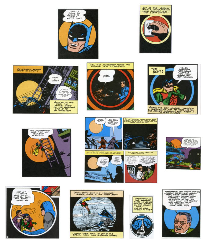
For instance, he talks about a Bob Kane story from 1941, in which Kane used a ton of circular panels, as Andrei shows:

Andrei goes on to say:

Now, what does this mean? Probably nothing. (Which is not to say it’s not significant; just that it’s probably not meant to mean.) One can obviously draw the parallel between the circular panels and the moon–but the resulting interpretation (Batman as creature of the night, etc.), would be generally valid for ANY Batman story: so why specifically this one? Similarly, one can find some connection to the closing words of the story, where Bruce Wayne, with a wink, tells Commissioner Gordon: “I guess the life of Bruce Wayne does depend quite a bit on the existence of the Batman!” There is a kind of circularity implied there, I guess, and we can then claim the circularity is echoed formally in the art… And yet, if that’s the great realization, the theme of the story–again, the Bruce Wayne/Batman dichotomy is a constant throughout the strip. Why this story specifically?

I don’t know. Maybe Bob Kane had a brand new compass he had purchased the day he drew this story, and he was just dying to use it. But my point here is: I’m not so much interested in fully motivated signs, portentous (a la Wagner) leitmotifs charged with meaning as you can find in, say, “Watchmen” or “The Dark Knight Returns”–works in which their creators seem fully in control of their formal language, in which every single (or almost) signifier can be seen as adding something to the story’s theme. Rather, I’m interested in what, at this point, may be called automatisms, tics perhaps, that nevertheless affect our experience of the comic.

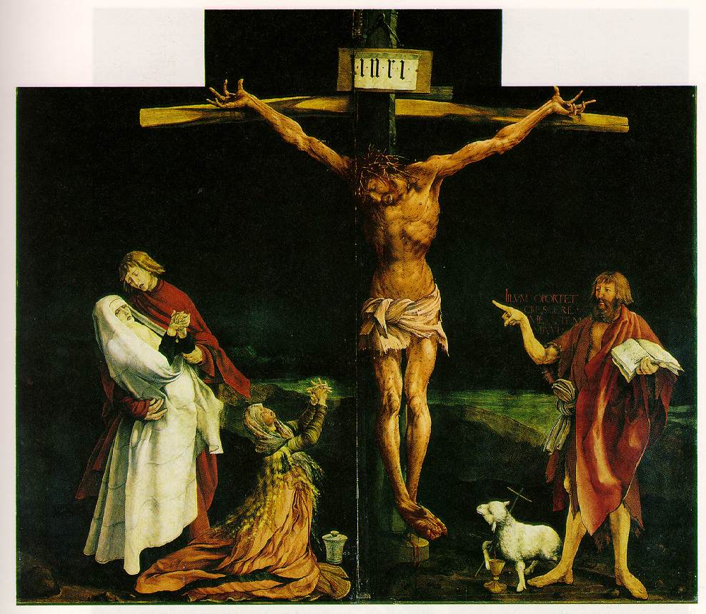
Andrei is drawing a distinction between formal elements that can be collapsed into the theme and formal elements that are tics, excesses over meaning. As an example formal elements linked to theme, you could perhaps take this Gruenwald painting, where the idiosyncratic formal use of scale illustrates the phrase “He must increase, but I must decrease.”

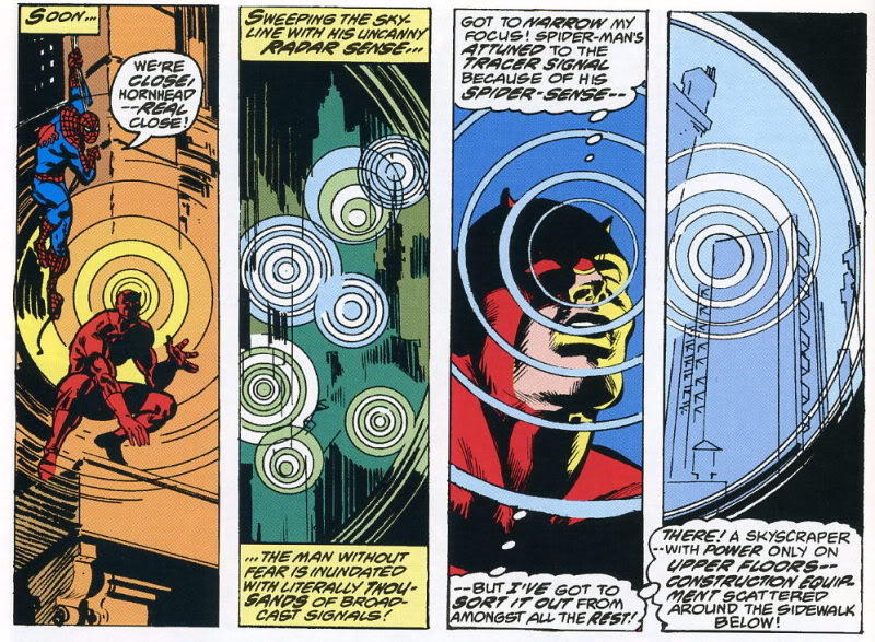
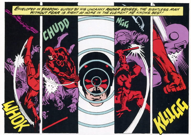
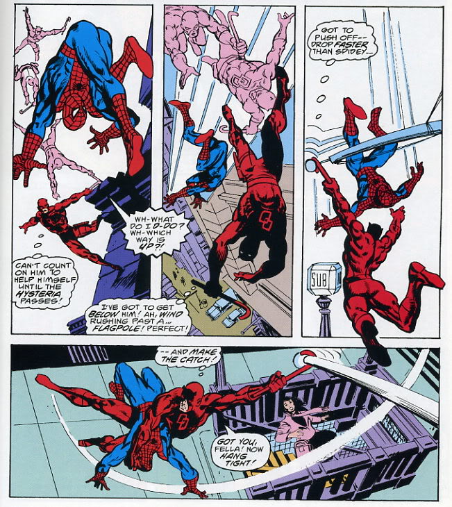
And as an example of formal tics that do not link to theme, you could take the insistent circular repetitions in the Frank Miller Spider-Man/Daredevil crossover which Andrei analyzes.

In Gruenwald, the formal elements relate directly to the spiritual meaning; in the Frank Miller, the circles are just a way of organizing space; an abstract, musical surplus, which contribute to pleasure or experience without, Andrei says, contributing to narrative or meaning.

The question I have here though, is this: are narrative and meaning synonymous? Obviously they aren’t; Gruenwald’s painting isn’t a narrative, but it’s intended as an illustration of a thought or a metaphysical insight. But what about in Miller?

Perhaps one thing that the circular motif does is to insist on its own integrity. It draws a border; looking at those images, it’s hard to avoid the sense of space. In both of the sequences form Miller above, the words are literally pushed off to the edge, allowing the circles to spread — Daredevil’s senses, his “sight”, reaches out across the page, marginalizing the text. Logocentrism is (again, literally) replaced by iconocentrism. This is the case even in instances where the text is more interspersed with the circles, as below.

The spinning multiple figures against the whiteness demand attention. It draws you down into an excessive, vertiginous whirl of motion that makes the banal text (“Got you fella! Hang tight!”) seem like the superfluous bit.

Thus, the image spilling over the words does not exceed meaning. Rather, its meaning (or one meaning) is the excess itself. When Andrei says illustration is excess, he is not illustrating the way in which illustration does not mean; rather, he’s illustrating that very meaning, which is excess. The circle is a hole in narrative — a vortex that escapes the story’s staid linearity and in its place spins out an ever-expanding circumference of pleasure.

Bert’s excision of text can also be seen as a kind of deliberate overtopping, or annihilation, of narrative content.

In Bert’s drawing, the Peanuts characters flow and morph, losing their coherence as they dissolve into a kind of post-modern iconic glop. They don’t cease to mean; rather, their meaning is unanchored from its original context and sent oozing along the chain of signifiers. So Schroeder turns into a guitar which turns into tombstones haunted by a cute little death and Linus and Lucy fuse into a single terrified/terrifying blob of torment and tormenter. It’s a violent detournement — and the violence is not only in the drawing, but in the (lack of) text. The Peanuts characters are all caught in the boiling cauldron of narrative meltdown, and their blank, stunned, failed efforts at speech only emphasize their tortured transformation. The speech bubbles hang emptily in the design — the last, sad trace of the vanished stability of logos, as around them rages the free-associative chaos of the image.

_____________
In the examples so far, Andrei’s conception of the visual as excess (beyond meaning in his formulation, of meaning in mine) has worked fairly well. I think it is possible to find instances that call it into question though. For example:

This is one of Hokusai’s One Hundred Views of Mt. Fuji. It’s title of this particular plate is “Fuji as a Mirror Stand.” The point, or meaning, is, then, a kind of visual pun — the image of Fuji in the background with the sun sitting on top of it recalls a mirror sitting on its base.

If that image is what the print is about, though, what to make of all that action in the foreground? The man with his dog crossing over the bridge can be seen as a visual mirror of the mirror, perhaps — but Hokusai makes it very difficult to see the action there as pure formal doubling. Instead, we want to see it as narrative. What (we ask with the dog) does he have in that bucket? Where is he going, and where are those boatmen going under the bridge? Will they speak to each other? Do they see each other? What’s their story?

In this case, we might say that the narrative, or the demand of narrative, acts as an excess; an addition balancing on top of the mountain. Human stories pass over and pull under the image; what you see is disturbed by the demands of what happens. You can look for your reflection in the serene and distant mountain, and you may even see it, but your dog is still beside you, excessively nuzzling, demanding that you move on.

Here’s another view from the same series which works in somewhat similar ways.

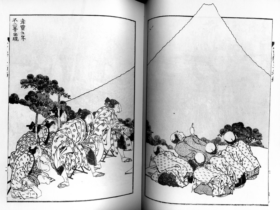
The title is “The Appearance of Mt. Fuji in the Fifth Year of Korei.” It is supposed to show the actual date of the appearance of the mountain. Befitting such a momentous occasion, the figures gathered here are intently focused on Fuji. On the left, government officials stare, their attention riveted — so much so that their hands imitate the curve of the mountain’s top. On the right, a group of villagers gaze with similar single-mindedness…for the most part.

There is one exception though. A single villager has been distracted; he points off to the side at…what? A bird? Falling bird poop? Godzilla?

You could easily read this as in line with the last image. The meaning of the drawing — its purpose and point — is the view of the mountain itself as miraculous and devotional presence. But there’s a story in excess of that image; something has happened, and though we don’t know what it is, it draws us away from the image and on to the next panel, even though, in comic-book terms, there isn’t one.

But while you could read this as narrative excess over the meaning of the image, you could also read it as image excess over the meaning of narrative. The scribe next to the pointing man has been recording the story of the mountain on the day of its new creation. But he is distracted by sight — first of the pointing finger, and then, presumably, of whatever it is over there that we can’t see. For us, the hint of a story is a distraction from the view. But for the writer in the image, the hint of a view is a distraction from the story.

Of course, outside the print, there isn’t really a view or a story — just a mystery waiting to be charged with meaning. Narrative and image both leap at the chance, climbing one on the other, each over each, like Mt. Fuji rising through Hokusai’s frame.

Superthing

This essay first appeared on Comixology.
_________________________

When Craig Yoe first saw the pulp fetish pamphlet Nights of Horror, he instantly gasped, “Oh, my God, Joe Shuster!”

That expression of shock has a couple of levels to it, I think. First, of course, there’s the simple surprise of discovering unknown work by a seminal cartoonist. Artist Shuster and writer Jerry Siegel created the hugely successful Superman for National Comics in 1938. A decade and much legal wrangling later, though, Siegel and Shuster had lost the rights to their character, and were no longer welcome at the company which had been largely built on their creation. That much of the story is well known — but pretty much nobody was aware that the down-and-out Shuster had illustrated a low-budget porn title like Nights of Horror. In fact, given Shuster’s declining eyesight, some historians weren’t even sure that Shuster could see at all by the mid-1950s when Nights of Horror was produced.

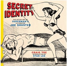
The amazement expressed by Yoe and by other comics professionals he quotes in Secret Identity: The Fetish Art of Superman’s Co-Creator Joe Shuster isn’t simply because the work was unknown, however. It’s because of the type of work it is, and the type of artist Shuster is supposed to be. Stan Lee, with his usual talent for dispensing middle-brow wisdom, pithily sums things up in the introduction. “Whereas everything about the stories and artwork of Superman was positive and uplifting, the pages of Nights of Horror…cater to the basest of man’s character and morals.”

So there you have it. Superman is good. Nights of Horror is evil. How, oh how, can we reconcile the two? Lee does it, characteristically, by genuflecting in the direction of tragic irony: Shuster loved the noble and good, but became “so disillusioned and desperate” that he debased his talents and turned to the dark side. Yoe himself isn’t that prudish, but he too sees a contrast. Superman was too perfect, Yoe argues. The discovery that Shuster had a less savory aspect, therefore, makes him, Yoe says, “someone we, with our own flaws can relate too.” Stan the Man looks on with distaste and Yoe looks on with avuncular amusement, but both agree on the central narrative, viz., it was a big step (whether down or sideways) from drawing Superman to drawing fetish art.

But was it? Not everyone thought so. Anti-comics crusader and psychologist Frederic Wertham for example, hated Superman and fetish pulp more or less equally, and for more or less the same reasons. Wertham believed that Superman encouraged “fantasies of sadistic joy in seeing other people punished.” The hyper-masculine, uniformed supermen were a sexualized, godless fantasy of force; a dream of limitless empowerment. Yoe quotes Wertham in the later’s famous screed, Seduction of the Innocent: “We established the basic ingredients of the most numerous and widely read comic books: violence, sadism, and cruelty; the superman philosophy, an offshoot of Nietzsche’s superman, who said, ‘When you go to women, don’t forget the whip.'”

As it happened, Wertham is on record condemning not only comic-book fetishism in general, but Nights of Horror specifically. The psychologist linked the fetish pamphlets to a series of brutal murders and assaults by a gang of young pseudo-Nazis in New York in 1954. As with super-hero comics, Wertham attacked Nights of Horror for its perversion, its sadism, and its general bad influence. Eventually, his testimony helped get Nights of Horror confiscated and destroyed by the state, in a decision upheld 5-4 by the Supreme Court.

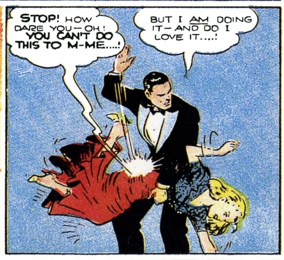
Again, Yoe provides all of this information — but he doesn’t quite connect the dots. Perhaps he thinks too highly of Superman, or perhaps he’s simply unwilling or unable to credit rampant Comstockery. Nonetheless, the fact remains: in Wertham’s analysis, if not in his censorious conclusions, the crusading prude was definitely onto something. Whether it’s superheroes or fetish porn, pulp is pulp. And what pulp is made of, in large part is sadistic and masochistic fantasies. It’s not an accident that one of the earliest successful Batman villains, the Monk, was a vampire hypnotist who controlled the wills of his female victims. Nor is it coincidence that the incredibly popular early Wonder Woman stories featured elaborately bound beauties in just about every other panel. And as for Superman…well, how about this:

That’s a panel from the Superman newspaper strip which Siegel and Shuster worked on in the early ‘40s. It took me about a minute to find it by flipping at random through my volume of Superman: Sunday Classics.

So Shuster was into kink, then? Yoe does manage to uncover some evidence that the artist had an eye for chorus girls and the female form. But while that’s interesting, it’s not really the main issue. The point here isn’t that this or that creator had a personal thing for spanking or sadism or masochism. Rather, the point is that as a genre superhero comics simply aren’t that far removed from the kind of pulp fetish porn that Shuster retailed in Nights of Horror. Read through Yoe’s plot synopses of the sixteen plus issues that Shuster illustrated and you’ll get a definite feeling of déjà vu. Damsels in distress, evil hooligans, manly private dicks, and fiendish torture devices — didn’t Shuster illustrate all of this somewhere before? You’ve even got a fair number of men getting shown up just like that milquetoast Clark Kent…though, admittedly, Kent’s humiliation didn’t usually involve a French maid.

The consistency, though, goes beyond the simple details of the plot or the occasional oversexed Jimmy Olsen look alike. Both Nights of Horror and Superman have Shuster’s trademark, rough and ready stiff poses, forthright compositions, and linework-because-we-need-some-linework. It’s not slick, but it does have a kind of charming mass-market anonymity. The dominatrix on the cover of Secret Identity for example; Shuster drew her breast so it looks like a detachable sack draped over her shoulder. It’s as if he just chucked her together piecemeal for the pose, and plans to disassemble her as soon as you turn the page.

And then there are the picture frames on the walls of some of the dens of iniquity drawn in Nights of Horror — picture frames in which Shuster has neglected to place any actual pictures. Yoe suggests that these vacant blank squares evoke the emptiness and cruelty of the bleak pulp world. Really, though, it seems to me likely that Shuster didn’t draw pictures for the frames hanging in the background because…this is porn. Who’s looking at the damn pictures on the wall? Shuster isn’t creating art; he’s creating a delivery system.

This ability to focus on the main bit and ignore the frills was the genius of Superman too, of course. You want a power fantasy? Okay; we’ll give you a power fantasy. Super strength! Invulnerability! Constantly humiliating the girl you desire! What could be better than that, huh? Shuster knew a thing or two about catering to his audience’s desires. That he’d pander is not surprising — though the blatant obviousness of his vision still has the power to startle.