Strange Windows: Ha, ha, ha, Moooo…! (Ligne Claire 1)

“Allow me to shelter you under my umbrella!”

France is well-known for its strong comic-strip tradition, la bande dessinée;  deeply linked to this is an equally strong  tradition of children’s books –a wondrous one. Much of this literature has crossed over into English; think of Babar and The Little Prince;  or go back two centuries, to when France gave England Mother Goose  (from Les Contes de ma mère l’Oye, by Charles Perrault.) Many of the most beloved fairy tales in the English-speaking world were translated from  French authors’ versions, either invented or re-told: ‘ Puss in Boots’, ‘Sleeping Beauty’, ‘Bluebeard’, ‘Little Red Riding Hood’, ‘Beauty and the Beast’.

Alongside these books grew an army of fine artists to illuminate them, and today I wish to spotlight perhaps the most successful –and charming– of French illustrators  for children: Benjamin Rabier.

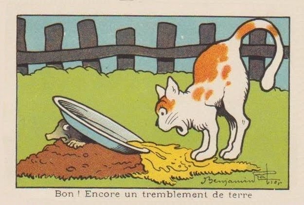
“Well! Another earthquake.”

Rabier (1864-1939) was the author of dozens of children’s books, mostly featuring animals;  he was also an early pioneer of both the comic strip and the animated cartoon; he was a successful playwright; but his greatest claim to international fame derives from a single image of commercial art, as we shall see. Benjamin Rabier: artistic polymath!

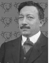
Portrait of Benjamin Rabier

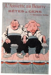
He came up from La Roche-sur-Yonne in 1899 to Paris, where he was employed as an accountant (a job which, despite his vast success as an artist, he kept until 1910, quitting for medical reasons alone.) At the same time, he started contributing to various humorous and satirical magazines such as  La Chronique Amusante , Le Gil Blas Illustré, Le Rire, L’Assiètte au Beurre in France, Scraps in Britain, and Puck in the United States;  in all he’d contribute to over fifty magazines and newspapers over his long career.

However, arguably Rabier’s most important contributions of that time –in light of his subsequent fame– were to the children’s publications of Arthème Fayard (La Jeunesse Illustrée and Les Belles Images). These were weekly anthologies of child-oriented prose and drawings; their success provided the template for the traditional French and Belgian comics magazines. In 1898, he produced his first book, about the adventures of a mischievous boy: Tintin-Lutin:

(If the title seems familiar…wait and see.) It was the first book of many.

In the 1890s, France introduced compulsory free education for all. Thus, millions of children learned how to read– creating a true mass market for children’s literature.

Add to this strong innovations in printing techniques– such as photo–engraving, linotype, and the introduction of cheap, vivid aniline dye-based color inks, and it is obvious that Rabier came along at the ideal time in history for an illustrator: a golden age.

He quickly became sought after for his anthropomorphic depictions of animals; his beasts showed the full range of human passions and emotions, from merriment to sorrow to rage– and yet remained recognisably animals.

He illustrated some of the great classics of animal tales, such as the medieval adventures of the trickster Reynard the Fox– collected in 13th century France under the title Le Roman du Renard:

He also illuminated at length the works of the 18th century father of zoology, Georges-Louis Leclerc de Buffon:

…showing he could be a most competent ‘straight’ animal illustrator, as shown in this scene of a farmyard:

…or this  drawing of an anteater:

Yet even his ‘straight’ illustrations show liveliness and emotion– witness the quiet anger expressed in this show of bearbaiting:

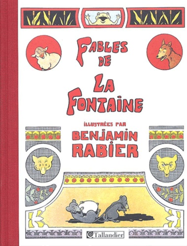
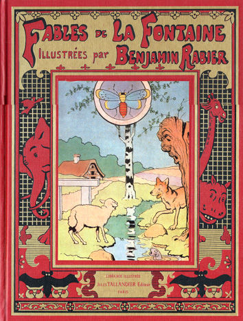
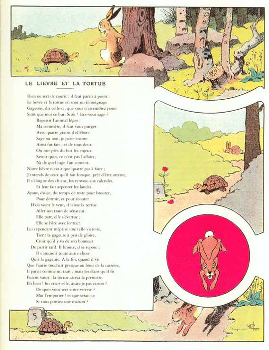
In 1906, he undertook a gigantic new piece of work: He illustrated all 240 of the rhymed fables of Jean de La Fontaine (1621–1695),  perennial classics known and loved by French children for over three centuries:

Some of these he drew in a comics-style sequence, as shown in these “collapsed” examples:

..and others in a ‘picto-fiction’ blend of text and art, such as this version of ‘The Tortoise and the Hare’:

…or of  ‘The Frog that would be as Big as an Ox’: Mark the merry expression on that bovine face: it prefigures Rabier’s most famous creation, to which we’ll turn shortly.

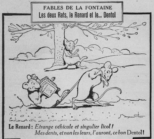
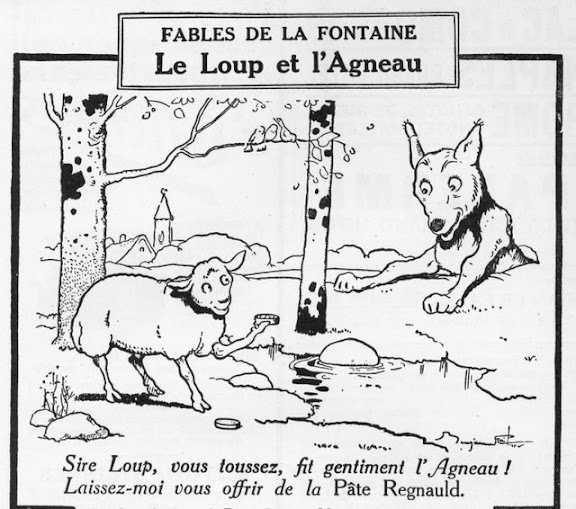
Note that Rabier was also a highly successful advertising artist, as can be seen from the below samples that parody La Fontaine to sell toothpaste, cough medecine, and shotgun shells:

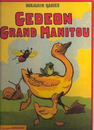
In 1923, Rabier introduced his most enduring creation, Gédeon the Duck, who would go on to star in 16 picture-books and several animated shorts:

As we’ve seen, Rabier was also an early adopter of the new art of the comic strip. This one is titled ‘The Phono-Trap’:

Panel 4: ‘Come, Medor, I’m caught!’ Panel 5: ‘Lunch is served!’

Or consider this oddly touching adventure of a fly: Rabier’s comics begin to take on a familiar look for aficionados of la bande dessinee. With their strong, simple linework trapping flat pastel colors, they seem obvious precursors of the Franco-Belgian school of cartooning known as la ligne claire, the  ‘clear line’, notably exemplified by Hergé, the creator of Tintin.

Hergé freely acknowledged the influence of Rabier:

«His drawings were very simple. Very simple, but sturdy, fresh, joyful and perfectly readable. In a few well-carpentered lines, everything was said: the setting was shown, the actors were in place; the comedy could start (…) And it’s for sure from this encounter that I date my taste for a clear and simple drawing, a drawing to be understood instantaneously. It is, before anything else, this readability that I myself have never ceased to seek”. –Herge, foreword to Rabier’s Fables de La Fontaine (tr:AB)

This influence went as far as stealing gags!

Rabier, 1920: Herge (in Tintin au Congo), 1930:

(Scroll quickly down the Rabier boa cartoon, and you’ll get a great simulation of animation. It demonstrates Rabier’s skill in panel-to-panel design.)

Some say Herge took the name of his hero from Rabier. I suppose it’s possible, though ‘Tintin’ wasn’t that rare a nickname (for ‘Augustin’).


The two Tintins

From 1917, Rabier collaborated with the father of the animated cartoon, Emile Cohl (1857–1938), in a series of cartoon short films. However, animation was to be dominated in the 20th century by a different style:

…a style that would come to dominate “funny animal” comics, as well.  Rabier’s work was to have little influence: another tantalysing possibility shoved aside by the brute force of Hollywood.

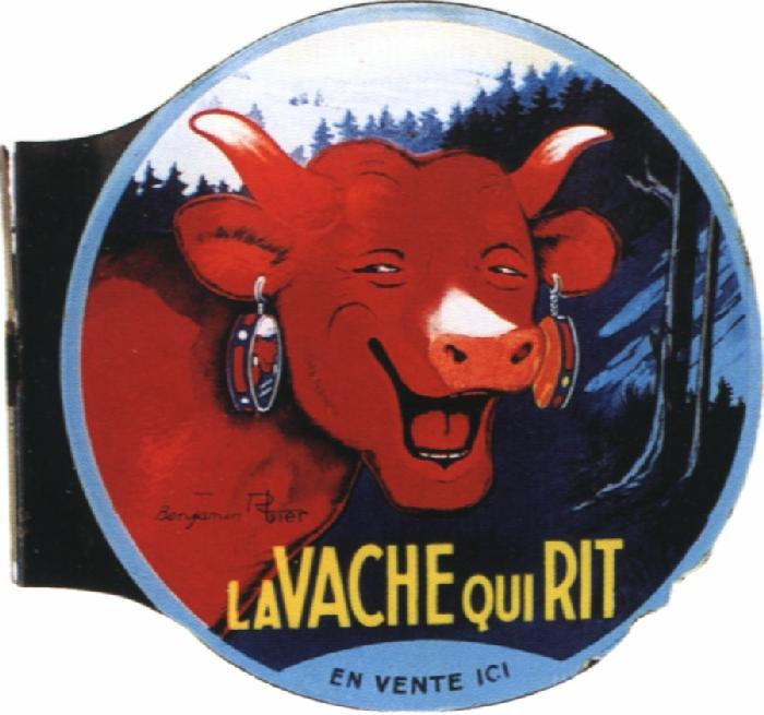
Note the smiling cow below. What would you get if, instead of smiling, the cow were laughing?

Why, you’d get a processed-cheese famous the world over, of course!


In 1921, Léon Bel introduced a new melted cheese packaged in individual, foil-wrapped wedges: La Vache qui Rit, ‘The Laughing Cow’. It was, and remains, an international hit product.

Two years later, Rabier designed the definite image of the hilarious bovine, and it remains– with few adjustments– the one used today:

2011

The origins of the laughing cow are obscure; it’s claimed that Bel’s wife coined the word ‘Wachkyrie” as a mockery of Wagner’s ‘Die Walküre‘. (‘W’ is pronounced like ‘V’ in both French and German.) There subsequently came out a successful dance by that name:


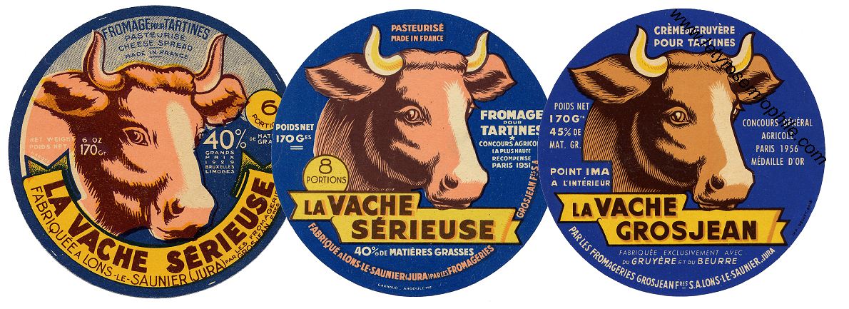
Naturally there were many imitators, and Bel fought numerous lawsuits against cheesemakers who introduced ‘the reading cow’, the smiling cow’, and many others: the Serious Cow (below) lasted as late as 1959.

Even Rabier got into the copycat act, with his Crying Cow:

Fun fact: in Indian restaurants, the fillings for cheese nans are almost always Vache qui Rit!

Over a century after Benjamin Rabier started drawing children’s books, not a single one of them has gone out of print.

Isn’t that a precious sort of immortality for an author– making generation after generation of kids laugh and smile?


Ad for Rabier-based toys:


A Gédéon figurine:

A laughing dog pull-scooter:


Rabier-designed cutlery holders:


A video clip in French about Rabier, with extracts from his animated cartoons.

Strange Windows: Monumental

“Seven cities contended for Homer when dead, Where Homer living had to beg his bread.”

At least three towns are contending for Popeye.

Above, this statue of Popeye was erected in Crystal City, Texas, in 1937.
Below, this six-foot-tall bronze statue stands in Segar Memorial Park in Chester, Illinois.

[…] whose frown
And wrinkled lip and sneer of cold command
Tell that its sculptor well those passions read
Which yet survive, stamped on these lifeless things,
The hand that mocked and the heart that fed.

Ozymandias, Shelley

Chester was the birthplace of Popeye creator E.C. Segar, as recorded on the statue’s plaque:

Now, let’s examine another Popeye statue in  Universal Studio’s  Island of Adventure, in Orlando, Florida:

…where Popeye’s arch-foe Bluto is also menacingly present:

What differentiates these statues from the ones in Crystal City and Chester?

The Florida Popeye is set in an amusement park. It’s a prop, part of the scenery in a hundred-acre show set.

The Texas and Illinois Popeyes aren’t props. They have a weightier function, civically and semiotically. They are monuments.

Chester is obviously honoring a native son, who went forth into the vast world and achieved renown. This tradition goes back millenia; thus the Greeks of Antiquity would perpetuate the glory of a successful warrior, of a victor at the Olympic games, of a winner at the great theater festivals: that glory was also the glory of his city.

What, then, of Crystal City’s statue– considered so important that it stands sentry before City Hall?

Popeye is credited with saving the town.

Crystal City has long billed itself as the World Spinach Capital. The leafy crop dominates the agriculture of the region. But spinach has always been a hard sell, especially to children — it is bitter. Compound this dissatisfaction with the withering effects of the Great Depression, and Crystal City found itself facing disaster.

Along came Popeye, his great strength attributed to his consumption of spinach (less so in the strips, conspicuously so in the animated cartoons.) Kids all over America — over the world– internalized the sailor’s profession of might:

“I’m strong to the finish, ’cause I eat me spinach; I’m Popeye the Sailor Man!” (Toot toot!)

…and they devoured their spinach with gusto. (I, too, fell for the propaganda. In fact, spinach is, of course, no builder of strong bodies– it isn’t even particularly rich in iron, the oft-cited source of its potency.)

The spinach industry was saved. The grateful burghers of Crystal City, thus, put up their statue as a votive thanksgiving– another monumental tradition.

( That statue outside City Hall isn’t, contrary to its plaque’s assertion, the one inaugurated in 1937; it’s a modern copy, while the original is inside the building.

So it’s a simulacrum of a sculpture of an animated cartoon character based on a comic strip character inspired by an acquaintance…I’m getting situationist vertigo, here.)

Crystal City is by no means alone in its gratitude to this cartoon character. Alma, Arkansas, also claims the crown of World Spinach Capital, and celebrates Popeye in bronze:

According to one report:

Popeye Park, built in a former vacant lot, is a big part of Alma’s image makeover. It is a place where people can get out and look at things. The centerpiece statue is glorified atop a fountain, and according to Mark the park will soon have two kiosks with flat screen monitors that will relate the history of Alma and Popeye. A large mural is planned for the wall of the adjacent water company building, with hidden Popeyes to engage children (and maybe the tour bus drivers).

This is getting out of hand, some may think. And why Alma, anyway? Because it’s the site of the Allen Canning Company, producers of Popeye Spinach:


…at one point producers of 63% of the world’s canned spinach.

So the livelihood of many Alman households depend on this brand– this cartoon. What’s wrong with a little sculptural homage?

Yet one might find this unsettling.

As the semioticians remind us, we live in a world of signs; some overt and loud, some whispering, some in the dog-whistle domain of the subliminal.

A monument is a bellowing, gigantic voice in this landscape; it aggressively forces its meaning on us; small wonder monuments are the favorite markers of tyrants’ rule.

Prudence, thus, traditionally presides over the choice and placement of public monuments. Commissions debate them, the public is consulted; they are scrutinized for glorification of the unworthy, or for partisan agendas. Often they are isolated from the city proper, as in cemeteries.

The subjects of monumental statuary tended ever to be divine: gods and saints, the Christ; or heroic– gallant soldiers, philanthropists, poets and other writers. One might legitimately question the sculpted exaltation of corporate cartoon characters. In contrast to the Orlando Popeye, those in Crystal City, Alma, and Chester are free of irony– indeed, almost of playfulness.

Perhaps we should judge these statues by their function. This image of Garfield stands just outside a children’s hospital:


Who can object to an attempt to make a sick child smile, or to allay his fears with a familiar old “friend”?

But it’s still troubling when an online search for ‘Garfield statue’ returns more results for the cartoon cat than for the effigies of James A. Garfield (1831– 1881), America’s 20th president, felled by a deranged assassin’s bullet:

We shall later show sculpture inspired by the strip Peanuts.

A different Peanut can be seen below–‘ Mr Peanut’ , the corporate mascot of the company Planter’s.

Such commercial images are already omnipresent in our visual ecology, so it is not over-curmudgeonly to hope their monuments do not proliferate, unless it be with the wit of an Andy Warhol or of a Jeff Koons:

Well, at least he offers you a seat.


Travel to Metropolis, Illinois, and you find monumentalism tipping slightly towards idolatry.

As readers of the Superman comic know, the mighty hero makes his home in Metropolis– a booming city modeled on Cleveland and New York.

Metropolis, Ill., is a far more modest place. But in 1972, D.C. Comics and the state of Illinois officially declared it to be the hometown of Superman. This was a prelude to a titanically hubristic enterprise: The Amazing World of Superman.

Concept Art by Neal Adams. For more, click here

There were to be a museum and an amusement park dedicated to the ur-superhero,  the whole dominated by a 200-foot-tall statue of Superman. The entire venture collapsed.

Today, Metropolis’ exploitation of Supes is much more modest, but definitely there… as evidenced by this fifteen-foot bronze polychrome statue:


Metropolis celebrates  the Man of Steel every way it can. The local bank is “home of super financial services.” The town newspaper calls itself The Planet. A sign in the grocery store informs customers: “Just as Superman stands for truth, justice and the American Way, Food World stands for quality, convenience and friendly service.”

Below, Bill Griffith‘s pinhead clown Zippy pays the statue a visit:

It’s a typical absurdist Griffith gag, but he makes a larger point: it’s wrong to invest your hopes in a fake idol. There’s no Santa Claus, no Tooth Fairy, no Superman– even metaphorically.

Metropolis seems to have learned this lesson from the 1972 fiasco. Its exploitation of Superman is mostly limited to photo ops for tourists:


…or Supes collector George Hambrich’s ‘Super-Museum’:


… or the annual Superman Celebration:


Special guest star at the 2010 Celebration:

Yep, U.S. President and lifelong comic book fan Barak Obama.

Incidentally, this wasn’t the first Superman statue erected in Metropolis. First came a fiber-glass 7-footer.

Problem was, the locals took to testing the hero’s noted bulletproof powers, resulting in a sorry Swiss cheese of a statue. It was replaced by the current bronze colossus.

Ah, yes, the Colossus. The need to extract awe from sheer size alone, as Emperor Nero did with the giant gold statue of himself in ancient Rome. All over America, you’ll find colossi of another kind: celebrating the folk giant lumberjack, Paul Bunyan:


Bunyan, however, is a prominent example of  ‘fakelore’– artificial modern folklore; in fact, the giant’s tales were all spun by a copywriter for a lumber company. A visual simulacrum (the statue) to represent a conceptual one (the fakelore.)

And the size of the colossus seems to validate this manufactured myth.

In Blue Earth, Minnesota, stands a towering figure drawn from one of our other modern sources of pseudo-icons, advertising:

“Good things from the garden,
Garden in the valley,
Valley of the Jolly Green Giant!
Some are green-snappin’ fresh
Kitchen-sliced to taste the best
Tender beans are comin’ from the valley! (From the valley!)

Good things from the garden,
Garden in the valley,

Valley of the Jolly (‘ho, ho, ho’) Green Giant!”

— Leo Burnett

The Green Giant is the mascot of a vegetable canning company belonging to agribusiness behemoth General Mills.

As with Popeye, the locals in Minnesota show pride and gratitude towards a symbol of their livelihood.


Why, man, he doth bestride the narrow world
Like a Colossus; and we petty men
Walk under his huge legs, and peep about
To find ourselves dishonourable graves.

–William Shakespeare, Julius Caesar

Perhaps popular enthusiasm goes too far, though, when the locals adopt the name of a mass-media character. This has happened at the town of Idaho Springs, when the residents of its Squirrel Gulch district renamed it Steve Canyon, after the comic-strip adventurer created by Milton Caniff.

In 1950, they persuaded the federal government to commission a giant limestone sculpture of the cartoon aviator for their town. Its plaque reads, in part,

“The United States Treasury salutes Steve Canyon and through him, all American cartoon characters who serve the Nation.”

Say what?

Ah, well, perhaps I’m merely indulging in cultural snobbery.  It’s true that a lot of the statues above are way cool, after all.

And at least they don’t celebrate tyrants:

Stalin


Lenin


Kim Il-Sung


Walt Disney

All right, that was a cheap shot… but the juxtaposition of  similar images makes one think.

Disneyland bills itself  “the happiest place on Earth”.  Happiness is mandatory. Well, in what other sort of place is happiness mandatory?  The “workers’ paradises” of Communist countries.

Disneyland also resembles them by its degree of control. The entire park is a panopticon. It even has a ‘secret police’– the security guards are there, but not in uniform.

Disney headquarters, as designed by Michael Graves: the cartoon as slave to the corporation

All four statues show the same gesticulation towards… what?  The glorious future?

Let’s hope Walt and Mickey’s statue doesn’t suffer the same fate as Saddam Hussein’s:

A final farewell to the colossus…with the fearsome effigy of cloud-gathering Zeus in the French ‘Parc Astérix’ amusement park:

;

Yet, pass humbly between his divinely titanic legs and look up:

<

Tch! This is the Underwear of the Gods?    Feh.

Meanwhile, in Philadelphia, we find this effigy of Sylvester Stallone— sorry, of Rocky Balboa:

Bronze, neoclassical pedestal-mounted kitsch or celebration of the human spirit? Celebration of Hollywood, certainly.

And along those lines comes another bad idea.  Detroit will see a statue of Robocop.

What are they thinking over in Motown? The city is depicted in the Robocop films as a hellhole, a behavioral sink rancid with corruption and violence.  (Well, okay, but they don’t have to dwell on it.)

But I suppose such masochism is to be expected. Kneel to our media overlords.

Wow, I’m getting grouchier by the second. Don’t I see any place for public statuary? Actually, I do, as I shall note in my appreciation of the St.Paul Peanuts statues.

St. Paul, Minnesota, is another city that honors a famed native son– Charles Schulz (1922– 2000), creator of the comic strip Peanuts — with a series of bronze sculptures.

But these are anything but monumental: they were specifically designed to be kid-friendly. They exude charm allied with modesty, which was also the case for the strip and its author.


Along these lines, in Hartlepool, England, we find a statue of their own native son Reg Smythe‘s comic strip hero Andy Capp:

The statue was controversial, actually, as Andy was a wife-beater among other things. And note that his ever-present cigarette was censored.

Now, note the proportions of head-to-body in the statue and compare them to those of the drawn Andy:

About three heads tall for the cartoon, about five for the statue.  Why?

So that people can do this:

That’s right– they can hug it, clink glasses with it… interact with it!  People want to be pals with the cartoons!

Note, too, the absence of a pedestal. The character is on the same footing as us.

This is key: people have strong affection for “their” cartoon characters; they literally take them into their homes, with the newspaper or through the tv screen. So the best cartoon sculptures will promote a feeling of affectionate intimacy.

Here, in Dundee, Scotland,  are Desperate Dan and Dawg:

… and Minnie the Minx:

Again in England– in Ipswich– Carl Giles‘  beloved Grandma character:

But my favorite interactive cartoon sculpture is this one of Mort Walker‘s Beetle Bailey: you can actually sit and have a drink with him.


And my favorite non-cartoon interactive public sculpture is in London. A Conversation with Oscar Wilde is designed as a bench; you’re supposed to sit and tell Oscar the latest gossip:

The statue of Tintin in Brussels used to be on a pedestal in a park; when it was moved to a city street, the pedestal was removed, and you can now have a playful chat with the globe-trotting boy reporter:


This more intimate, anti-monumental style seems to be catching on. Here’s James Joyce in Dublin:


As a final example of interactive statuary, consider the much-beloved Alice in Wonderland group in New York’s Central Par, over which I scrambled as a child– a tradition that continues, it would seem:


There is more to be said about the curious class of cartoon sculpture; about its polysemic ambiguity, about the colonisation of public space by corporate imagery,about kitsch and irony, about ….
But :

Now its time to say goodbye
To all our company.

Em-eye-cee-

“See you real soon !”

Kay-ee-wy-


“Why? because we like you!”


Em-oh-you-ess-ee
–signoff song for the Mickey Mouse Club

A great guide and source of information about similar curiosities is http://www.roadsideamerica.com/

Strange Windows: The Suck Fairy will get you if you don’t watch out!


You come across it while cleaning out your attic: a book, a CD, a VHS cassette.

My God, you think, that was one hell of a novel/song/movie! Nostalgia mixes with anticipation as you prepare to savor it anew.

But what’s this? It seems to have gone rotten! Phaughhh! Retch! Ptooey!

How on earth were you ever taken in those long years ago by this foulness that sucks like an electrolux? Was your taste that abysmal?

Worry not. You are the latest victim of a virulent virtual vampire: the Suck Fairy.

Jo Walton revealed all about the little monster in a blog post on Tor.com. Go read the whole thing (and the many comments that amplify it); this extract gives us the gist of her warning to mankind:

The Suck Fairy is an artefact of re-reading. If you read a book for the first time and it sucks, it’s nothing to do with her. It just sucks. Some books do. The Suck Fairy comes in when you come back to a book that you liked when you read it before, and on re-reading—well, it sucks. You can say that you have changed, you can hit your forehead dramatically and ask yourself how you could possibly have missed the suckiness the first time—or you can say that the Suck Fairy has been through while the book was sitting on the shelf and inserted the suck. The longer the book has been on the shelf unread, the more time she’s had to get into it.

I, too, have suffered her bite. The superhero comics I loved as a child count some of her sorriest victims.

These old comics I class into four categories.

The first comprises work that still holds up, mellowed like old port.  Examples would include  Ditko and Lee‘s  Spider-Man, Kirby and Lee’ Fantastic Four and Thor; though I prize them more now for qualities less appreciated by a child, notably humor.

The next category covers those comics that only interest me through nostalgia, or that tickle my camp funny bone, or that still please me for purely formal reasons such as good draftsmanship: 1960s Curt Swan-drawn Superman,  Steranko‘s S.H.I.E.L.D, Gil Kane’s Green Lantern.

A third category consists of work that simply disappoints today, with no strong redeeming features, entertaining enough for a young boy but without interest for the adult me;  say, Sal Buscema-drawn Marvel Team-Up.

And then, the dread fourth category:

The Spawn of the Suck Fairy.

Suck Fairies casting their curses at ComicCon


My library recently acquired a copy of Marvel’s Essential Iron Man, part of that publisher’s welcome line of cheap, phone-book sized black-and-white reprints.

I decided to check out the strips I so enjoyed at age eleven.

Cover art by Bruce Timm

Oh, dear God in Heaven. Zut alors.

After reading a few stories, I felt like gouging my eyes out. That fey bitch had infected every single page with suckiness of a cosmic level.

Ahhh, shut the “!@#§!* up. Take the  Holland Tunnel like everyone else, you douche. Art by Don Heck.


I was mystified by how sucky this printed turd was.

I mean, I certainly have a high tolerance for mediocre comics. Here was far from the worst comics art I’d ever seen. (The most atrocious story in the collection isn’t drawn by the series’ regular, the oft-derided Don Heck, but by the excellent Steve Ditko.  Actually, Heck’s art was better than I remembered.)

The scripts were probably no more moronic ( with their Cold War Commie-bashing and brainless plots) than other non-sucky comics of the time (the mid-60s).

Well, thank you, Ms Walton, for revealing the culprit:  the Suck Fairy.

How that destructive little vermin has blighted literature — blighted my most precious books!

When I was 12, in 1966, I had just finished reading The Lord of the Rings, by J.R.R Tolkien. I lived that book as one can only at that age.

I was jonesing for more, and Ballantine Books (Tolkien’s publisher) was canny enough to offer me the following:

The Worm Ouroboros is an odd duck of a novel.

Written in 1922 by E.R. Eddison (1882–1945), it chronicles the war between Demonland and Witchland on the planet Mercury. Its prose style is a pastiche of Jacobean writing, gorged with archaism that I found near-impenetrable; but I doggedly forged on with frequent recourse to a dictionary, much to the improvement of my vocabulary:

But a great wonder of this chamber, and a marvel to behold, was how the capital of every one of the four-and-twenty pillars was hewn from a single precious stone, carved by the hand of some sculptor of long ago into the living form of a monster: here was a harpy with screaming mouth, so wondrously cut in ochre-tinted jade it was a marvel to hear no scream from her: here in wine-yellow topaz a flying fire-drake: there a cockatrice made of a single ruby: there a star sapphire the colour of moonlight, cut for a cyclops, so that the rays of the star trembled from his single eye: salamanders, mermaids,  chimaeras, wild men o’ the woods, leviathans, all hewn from faultless gems, thrice the bulk of a big man’s body, velvet-dark sapphires, crystolite, beryl, amethyst, and the yellow zircon that is like transparent gold.

The book enthralled me.

Jump forward ten years to 1976. I was 22, doing my military service after three years of university, and I picked the book up again. This time I found it easily readable, but rather slight; an enjoyable fantasy.

Cut to the year 2006. Once again, I plunged into the Worm — and stopped after 50 pages. Her Dread Suckiness had struck again.  The book was now a plodding, cardboard-thin gallimaufry of tushery, Wardour Street pretentiousness and outright plagiarism.

Yet, lo,” she said, as a sweet and wild music stole on the ear, and the guests turned towards the dais, and the hangings parted, “at last, the triple lordship of Demonland! Strike softly, music: smile, Fates, on this festal day! Joy and safe days shine for this world and Demonland! Turn thy gaze first on him who walks in majesty in the midst, his tunic of olive-green velvet ornamented with devices of hidden meaning in thread of gold and beads of chrysolite. Mark how the buskins, clasping his stalwart calves, glitter with gold and amber. Mark the dusky cloak streamed with gold and lined with blood-red silk: a charmed cloak, made by the sylphs in forgotten days, bringing good hap to the wearer, so he be true of heart and no dastard.

Thou suckest, o purple prose. Fie upon thee, sirrah!

(Ah, well, at least the illustrations remain lovely. Here are the Lords of Demonland:)

Art by Keith Henderson

The King of Witchland conjures diabolic forces: art by Keith Henderson


To be fair, over the end of the ’60s and the first half of the ’70s, Ballantine Books (thanks to their crackerjack editor Lin Carter) revived many wonderful classics of fantasy in paperback: Hope MirleesLud-in-the-Mist James Branch Cabell‘s Jurgen, Lord Dunsany‘s The King of Elfland’s Daughter, William Hope Hodgson‘s The House on the Borderland and The Boats of the Glen Carrig… all masterpieces immune to the Suck Fairy’s kiss!

(Touch wood…)

I used to re-read The Lord of the Rings every five years , but haven’t done so for the last two decades; you can guess why I am afraid to.

But the Suck Fairy’s master-stroke was her demolition of one of my most cherished loves:

Like millions of 16-year-olds before and after me,  I read J.D.Salinger‘s novel The Catcher in the Rye and knew– KNEW!– that it was about me, me, ME;  its hero, young Holden Caulfield, was me.

All my adolescent longings and heartache and rage against the goddam phonies of the grown-up world were here. I fell in love with a book.

But the Suck Fairy was lurking, biding its time with demonic patience.

J.D.Salinger

I next read Catcher when I was 34.

I was repelled and enraged.

That little preppy brat  Holden– I’d  kick his snotty rich-kid ass all over Manhattan.

What a nasty, arch, supercilious volume of egotistic peacockery– compounding its silver-spoon ugliness with a bathetic display of mawkish sentimentality.

Damn you, Suck Fairy! Leave me alone with my illusions and my bottle.


*********************************


David L. Ulin, in his reflective essay-book The Lost Art of Reading, is troubled by this phenomenon:

I had lost books by rereading them. Flannery O’Connor’s Wise Blood, for instance, which I had loved in college but not so much later, when I began to see it as a young writer’s pastiche, less about life as it really is than a naïf’s projection about how life might be.

He is afraid to reread The Great Gatsby– and is relieved to find it as superb as he’d remembered. (I, too, find Gatsby to be better at each fresh reading.)

He finds a possible explanation in Anne Fadiman’s 2005 book Rereadings:

The former [reading] had more velocity; the latter [rereading] had more depth. The former shut out the world in order to focus on the story; the latter dragged in the world in order to assess the story. The former was more fun; the latter was more cynical. But what was remarkable about the latter was that it contained the former: even while, as with the upper half of a set of bifocals, I saw the book through the complicated lens of adulthood, I also saw it through the memory of the first time I’d read it.

Anne, Anne, Anne… that’s all true, all very well and good…

…but it doesn’t protect your literary treasures against the relentless despoiling of the vile, gloating Suck Fairy.

Is there no hope, then? As we all age, our personal troves of culture age, too.

And the evil Suck Fairy grows mightier.


Yet… is she so wicked? Doesn’t she serve an essential function in our intellectual ecology…culling the herds?

Let’s end with the heartening words of Demetrios X, commenting on Ms Walton’s blog:

There is also an extremely rare counterpart to the Suck Fairy, the Anti-Suck Fairy. It’s only happened once or twice, but I have encountered books that I was very disappointed in the first time I read them, and then found I quite liked them on a second reading. That’s not a matter of growing up or being older either. It’s happened to me with books I’ve read as an adult with a gap of only a few years.

Yes,  indeed. The Suck Fairy and the Anti-Suck Fairy are locked in constant struggle, and in the course of a reader’s life may, turn by turn, conquer a book.

Suck and Anti-Suck, in gentler days before their all-out war


Like so many children, I was enamoured of L.Frank Baum‘s  Oz books.

An Oz comic strip by its original illustrator, W.W.Denslow


But as an adult, I put them behind me, finding in their simple prose little of the cleverness and charm that keeps Alice in Wonderland or the nonsense verse of Edward Lear so beguiling to grown-ups.

But the Anti-Suck Fairy was on the job! Now I delight again in the Oz books, discerning satire and shrewd political commentary behind the fairy-tale façade.

Likewise, the Edgar Rice Burroughs books I devoured as a teenager seemed unreadable in later life; tedious, racist hackwork.

Art by Frank Frazetta


But good ol’ Anti-Suck showed me the wit and liveliness that ERB masters  at his best.

I particularly recommend Carson of Venus and Tarzan and the Lion Man. Among other pleasures: the former for its sly attack on eugenicism, the latter for its genial self-parody and savage send-up of Hollywood.

Time to give Catcher in the Rye another go? You bet!

So take heart, my fellow culture vultures, the S.F. is not invincible.

Can you tell me of your own encounters with the Suck and Anti-Suck fairies in the comments below?

Strange Windows: Six Degrees of Ezra Pound

Ezra Pound, by Wyndham Lewis

Pound was friends with (former lover of?) HD (he was sort of the Kevin Bacon of modernism)” — Caroline Small

“Wow, I didn’t realize Pound actually knew Beerbohm. It’s that Kevin Bacon thing….” — Noah Berlatsky

What were you thinking, my learnèd colleague and fellow Utilitarian Caro?

What on Earth could connect Ezra Weston Loomis  Pound (1885–1972), the modernist Poetic Master of the Revels, author of the Pisan Cantos…to the respected Hollywood actor Kevin Norwood Bacon (1958–     ), the sensitive megastar of classic films such as  Animal House and My Dog Skip ?

Kevin Bacon wants YOU!

The answer is–

More, much more than you would think!
Continue reading

Strange Windows: Keeping up with the Goonses (Index)

Lexicographer: a writer of dictionaries, a harmless drudge, that busies himself in tracing the original, and detailing the signification of words.

Samuel Johnson, Dictionary (1751)

In a seven-part series, we  surveyed the contributions of comics and cartoons to  English popular language

Part 1, part 2, part 3 looked at American newspaper comic strips; part 4 and part 5 treated comic books;  part 6 reviewed American panel gags and editorial cartoons; part 7 dealt with Britain.

This post serves as an index to the series; after each entry appears a number referring to the series chapter in which it appears.

Continue reading

Strange Windows:Keeping Up with the Goonses (part 7)

This is part seven of our look at comics, cartoons and language– today focussing on Britain

Art by Heath Robinson

Britain has a long, rich tradition of cartooning second to no other land’s. And, as we saw for American English, cartoons have contributed to the country’s popular language.

Continue reading