Re-Inventing Wonder Woman — Again!

This is part of a roundtable on Marston/Peter’s Wonder Woman #28. The roundtable index is here.
_______________________

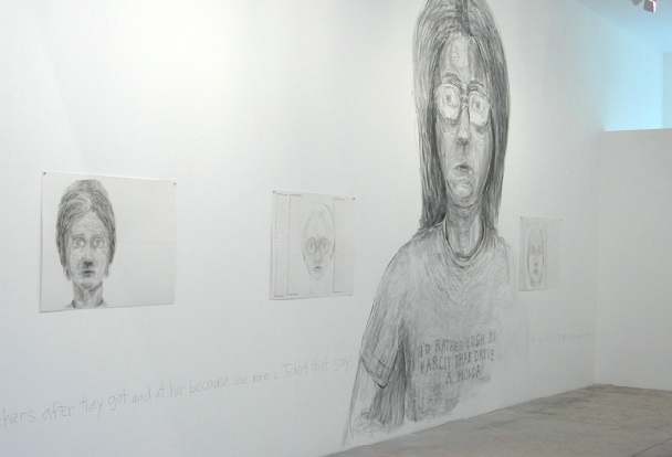
Wonder Woman #28 is a great example of the Marston-Peter team at its most gloriously over-the-top. A group of prisoners on Transformation Island, the Paradise Island reformatory, escape and spend thirty-six pages trying to destroy Wonder Woman, Queen Hippolyta, the Amazons, and Wonder Woman’s sidekicks, the Holliday Girls, only to be (of course) foiled at the end by everybody’s favorite Amazon. The prisoners are a piece of work: almost half of them are drag kings. One of them is an evil snowman.


Could anyone get away with using such wacky characters today? Maybe. In the 1990s, John Byrne resurrected Egg Fu, not only wacky but racist to boot, and got away with it. Personally, I love the beautiful villains — and for the most part, Marston’s and Peter’s villainesses were beautiful — like Giganta, “formerly a gorilla.” In fancy bras and filmy skirts, they resembled a cross between Hollywood harem girls of the period, and all the beautiful but evil women on the cover of every science fiction pulp magazine. Queen Clea of Atlantis and Zara, priestess of the Crimson Flame, are dressed almost alike in outfits like that, except that one’s blonde and the other’s a comic book redhead, with crimson hair.

The plot is as wacky as the villains. Wonder Woman is forced to steal a submarine and tow it with her teeth. But she’s plucky and bounces back with a wisecrack: “You’re so kind, Clea!” Earlier, when the villains had chained the princess and her mother to a pillar with flaming chains, she had quipped, “What sweet girls you are!” Indeed, Wonder Woman rarely seems to be afraid for herself , perhaps because she knows she will win in the end. She fears for the other people in peril: her sister Amazons, the Holliday Girls, who have been shoved into a devolution machine and turned into gorillas, all except for their heads. She even fears for the villain mastermind, Eviless the Saturnian. Attempting to escape while tied to a boat full of villains, Diana pulls the boat under water. But Saturnians can’t swim! So Wonder Woman rescues her: “Aphrodite commands us to save lives always–enemies or not!”

And by the way, Steve Trevor, despite the fact that he always needs to be rescued by Wonder Woman, isn’t as wimpy as he’s been made out to be. When Cleo and Giganta tie him up and threaten to burn his eyes out and cut him to ribbons, he’s brave enough to quip, “You’re certainly playful girls! Go ahead and have your fun!”

And it is fun. You don’t take it seriously. The entire story is fun.

With a few exceptions, Wonder Woman hasn’t been fun for quite some time now, but you still don’t take it seriously. Gale Simone, in my opinion one of the two best Wonder Woman writers (The other is Bill Messner-Loeb) got into the spirit of the original when she gave the amazon princess white talking gorilla sidekicks, to take the place of Etta and the Holliday girls. They move in with her, and apologize for the “flinging incident.”

But more often, it seems that when the almost 100% male writers Wonder Woman has had get their hands on her, they just can’t wait to re-invent her. Sometimes the re-inventing is mild, if annoying, as when Wonder Woman’s suit keeps shrinking while her bust size increases. Depending on the artist, her hair bounces from curly to straight and back again. But sometimes it’s a very violent re-invention, as when in the late 1960s writer Denny O’Neill completely disempowered Princess Diana, removing her from both her powers and from Paradise Island, giving her a male guru (and a what a racist depiction that was!), taking off her iconic starry costume and garbing her in a white Emma Peel-style jumpsuit. The result was a story arc about a karate-using woman in a white jumpsuit with a male guru. What it was not was Wonder Woman.

J. Michael Straczynski gave Diana a wardrobe makeover again, in 2010, putting her into what looked like a 1980s disco outfit with long pants. Fans hated it and amazingly, DC Comics actually listened to them for a change, and restored the Amazon princess’ starry shorts.

And now it’s Brian Azzarello’s turn. He has taken everything that made Wonder Woman special, and done away with it, so that Wonder Woman isn’t special anymore. He can’t shove Princess Diana back into a white jumpsuit — been there, done that — so instead he destroys the Amazon’s very origins, which are as iconic as her star-spangled costume. As Prometheus made mankind out of clay, as the Navajo gods molded all the animals of the Earth from clay, as the supreme deity molds the first man from clay in Judeo-Christian and Islamic mythology, Queen Hippolyta molds her baby from clay. And as if this divine origin, which Wonder Woman shares with the first of all creatures, is not enough, Marston gives it a feminist twist: the goddess Aphrodite breaths life into the statue. Thus, little Diana has two mommies.

It is highly unlikely in Marston’s original version that her tribal sisters would sneer at her for her origins, as they do in Azzarello’s version, and call her “Clay.” In fact, according to the first issue of Marston’s Wonder Woman, Aphrodite originally molded the entire race of Amazons from clay, and breathed life into them.

But Azzarello has taken care of that by demoting Wonder Woman, putting her at the end of a long line of mythic heroes fathered by Zeus, and of course, in taking away her feminist origins, making her a child of the patriarchy. And as for Diana originally being the only baby born on Paradise Island, Azzarello’s nouveau Amazons seduce sailors (and then dump the sailors overboard!), keep the girl babies that result from the union, thus keeping up their tribe’s population, and they sell the boys into slavery. Marston’s Amazons would never seduce or kill anybody, and they have no need to. They drink from a fountain of eternal youth, and as Hippolyta says, “Beauty and happiness are your birthright as long as you remain on Paradise Island.”

Azzarello/ChiangWonder Woman #7

This makes Diana’s sacrifice, when she leaves her island to go to “Man’s World” all the more poignant: she is giving up immortality in order to fight evil in a blighted land.

If Azzarello has demoted the Amazons to mean and ruthless killers, the gods have fared no better. Hera (Remember how Wonder Woman used to say “Great Hera?”) is now a soap opera-style bitch, a kind of Joan Collins dressed in nothing but a peacock cape. Her daughter Eris, the goddess of strife, is a bald anorexic crusty. The other gods look like London hipsters and have become ironic. Diana has no personality at all, and definitely utters no quips. The gods lead her around and show her stuff, and she reacts rather than acts. Her expression changes from a pout to a shout and back again. Diana, who, Jesus-like, gave up her immortality for mankind, has become so vicious that she stabs Eris’ hand with a broken wine glass.

Azzarello/ChiangWonder Woman #4

To many of us, including yours truly, the Amazon princess is almost real. Yet in our saner moments we have to admit that she is a construction, a thing of paper and ink who is a slave to anyone who writes her. Thank Hera for my reprints!

Bound to End: Wonder Woman #28 Index and Introduction

Index
 
Trina Robbins, Re-Inventing Wonder Woman — Again!

Noah Berlatsky, Villainy, Thy Name Is Woman

Noah Berlatsky and son, There’s Something Besides Fire to Contend With Here!

Jones, One of the Jones Boys, How Do You Solve a Problem Like Diana?

Kelly Thompson, Wonder Woman: It’s In Her DNA

Sina, Goddesses of the Lesbiverse

Vom Marlowe, On Wonder Woman, Bondage, and Princess Leia

William Marston, On Sorority Baby Parties

Sharon Marcus, Wonder Woman vs. Wonder Woman

Ben Saunders, Loving Authority: Some Thoughts on Wonder Woman #28

Ben Saunders, on William Marston and Sex

Vom Marlowe, Wonder Woman and the Space Crocs of Nikszkelion

Richard Cook, A Fanboy Denied

Derik Badman, A Peter That Never Existed

Charles Reece, On Second Thought, I Really Don’t Like Wonder Woman, part 1, part 2.


Introduction
 
Three years and a month ago I started a series called Bound to Blog in which I blogged my way through the entire Marston/Peter run on Wonder Woman. It’s taken a while, but I’ve finally come to the last Marston script — Wonder Woman #28. To celebrate, I’ve asked a bunch of friends and fellow Marston/Peter travelers to contribute to a roundtable focusing on this final issue.

And if that all isn’t enough Wonder Woman reading, you can check out my first ever post on Wonder Woman, which coincidentally focuses on Wonder Woman #28.
 

I For One Welcome Our New Superhero Overlords

 
Okay, I’ve just seen The Avengers, Marvel’s and Disney’ latest blockbuster superhero movie, and first I want to state: yes, Jack Kirby does get his name in the credits.

In a half-assed way.

The credit line states: “Based on the comic book by Stan Lee and Jack Kirby.”
True enough, as far as it goes. A more honest credit would have read: “The Hulk, S.H.I.E.L.D., The Avengers and Nick Fury created by Stan Lee and Jack Kirby; Thor and Loki created by Larry Leiber and Jack Kirby; Black Widow created by Stan Lee, Don Rico, and Don Heck; Captain America created by Joe Simon and Jack Kirby.”

(And justice would further be served by the additional line: “Iron Man created by Stan Lee, Larry Leiber, Jack Kirby and Don Heck; Hawkeye and the Black Widow created by Stan Lee and Don Heck.” Don Heck was never a fan-favorite, and has been dead for some years; there’s no constituency for his memory; but his contribution should not be slighted.)

The problem is, as the dominant paradigm now has it, individuals don’t create; only corporations create. And Marvel/Disney would rather slit their entire management’s throats than acknowledge that this fiction, the source of their billions, is based on a lie.

Well, I shan’t continue in my grumpiness — after all, I was hypocrite enough to ignore the boycott of the film initiated by Kirby family supporters such as Steve Bissette.

So how was the movie?

Alan Moore, when asked his opinion of the first Image superhero comics, made an interesting analogy.

He said an old-style superhero comic (say, a Dick Sprang ’50s Batman) could be compared to coca leaf: a mild stimulant. The powerful superhero comics of the seventies, like those drawn by Neal Adams, would be the equivalent of refined cocaine. And the Image comics were the equivalent of crack.

To steal his simile: The Avengers is the crack cocaine of superhero movies. It will stimulate the comics fan into a near-fatal geekasm.

That’s not a criticism, actually; this flick’s an exceptionally well-made distillation of its genre. If you like this sort of thing, this is the sort of thing you’ll like, to quote Abraham Lincoln. It hits all the right notes. Superheroes beating the shit out of each other? Check. Cool, sexy super spy? Check. Neat-oh futuristic equipment and weaponry? Check (The rise of the Shield helicarrier from the ocean to the skies invokes genuine awe.) Nasty-ass aliens, supercilious super villain, awesome costumes (Loki finally gets to see action in his bitchin’ horned helmet), tons of death and destruction, and Cap instructing old Greenskin: “Hulk, smash!”? Check, check, check, check and check!

The film isn’t lacking in non-infantile pleasures, either. The dialogue is crisp and witty — although poor Thor and Captain America are handicapped by having to wax solemn or anguished while the rest of the cast are given all the zingers. The best lines go to Loki (Tom Hiddleston) and Tony ‘Iron Man’ Stark (Robert Downey Jr); one scene between the two makes one think more of Noel Coward than of Stan Lee.

(There are plenty of physical laughs, too, mostly coming from the Hulk. After an incredibly snotty divine put-down by Loki, Greenskin educates him with a beat-down that looks like a violent gag from a classic Popeye cartoon.)

Ah, Loki. An adventure tale is only as good as its villain. The classically-trained British Hiddleston plays the part with such relish that one only sees in hindsight the nuances he brings to the character: there is an under-layer of pain and anguish to his posturing. And, true to both the comics Loki and that of Norse mythology, he relies as much on cunning and the psychological manipulation of his foes as upon brute force.

(I won’t tell why, but the funniest line in the film is Loki’s “I’m listening.”)

Downey somewhat unbalances the flick: as some wags put it, a better title would have been ‘Iron Man III, co-starring the Avengers’. Not that I’m complaining — it’s always a delight when he takes the screen, especially when out of armor.

However, Marvel showed great judgment when they chose Joss Whedon to direct. Whedon has extensive experience in comics and feature films, but I’d wager that he was chosen especially for his experience in television series such as Buffy the Vampire Slayer, where he proved his ability to handle large ensemble casts in fantastic milieus. The script perfectly characterizes every role, far better and more subtly than the comics ever did. It’s a masterpiece of psychological clockwork.

Two of the minor heroes particularly stand out: Hawkeye (Jeremy Renner) and the Black Widow (Scarlett Johansson). There are hints of dark, complex, anguished pasts for both of them. I get the feeling Whedon would have been more than happy to have centered the film on these two.

One surprise, on the other hand, is how overshadowed Thor (Chris Hemsworth) emerges. Frankly, he cuts a poor figure compared to the dashing Stark, the brutish Hulk, the glittering Loki. In Thor, he towered; here, his cape looks tatty, and his previous vikingly cool beard makes you think now that he was too rushed to shave that morning.

The fights, the Hulk-smashing, the repartee are all top-notch. In sum, if you want a summer blockbuster where “you can check your brains in at the door”, this is for you.

But we never can do that, can we?

Art by Jack Kirby and Frank Giacoia

The Avengers has special place in my nostalgic pantheon: issue 5 was the very first Marvel comic I’d ever purchased, back in spring 1964, when I was 9 years old. Sure, I was aware of the marketing hook behind it — “Your favorite heroes TOGETHER!”– and didn’t care a whit. Yeah, I’d already seen it with Justice League of America from DC. Loved it there, too.

Looking back, there were troubling aspects to this comic. The Avengers were the élite, and pretty much also the tools of the élite. They were bankrolled by Tony Stark, comics’ epitome of the military-industrial complex; they lived in a mansion on Fifth Avenue in New York — the swankiest address in the world. ( Of the great mansions built there by the “robber baron” capitalists of the 19th century, only the one housing the Frick Collection remains.) They fought commies and aliens and worked with the government. And they were self-selected: the aristocrats of the superhero world.

They resembled nothing so much as an elite private club, like the Yale or Century clubs, floating high above hoi polloi.

The film carries this conceit to the next step, arguably an even more sinister one.

The last half-hour of the movie shows a gigantic battle between the Avengers and an army of extraterrestrial invaders in the streets of Manhattan. And my childish, fannish joy in these shenanigans was overlaid by a feeling of dread — of appallment.

I realized why halfway through: it was the location of this mass destruction that roiled me. A ten-year-old taboo had been shattered, one dating to 9/11. It’s now acceptable once more to depict buildings in New York, and the people inside them, being destroyed.

And this is where my unease was compounded. This iteration of the Avengers wasn’t the old “gentlemen’s club,” obnoxious though that be.

This one was conceived from the start as the auxiliary of a tremendously powerful secret American government defense agency. This élite cadre of superhumans, following the orders of a wise leader, Nick Fury, was there to protect us from unreasoning, fanatic aliens bent on flying into our greatest city and toppling its skyscrapers.

From Space Al-Quaeda.

So that’s my reading of The Avengers. Its subtext, hardly subtly advanced, is the glorification of Homeland Security and of the current security state. Why, even the Hulk, that powerful adolescent fantasy of revolt against authority, meekly goes along with the program. Who are we to gainsay him?

Hmm… maybe I really should’ve checked my brain in at the door. Then again, maybe I did, and just forgot to check it back out…

P.S. I saw this film in Paris, where it was released on April 25; it won’t be in general release in the States until May 5. Such divergences between international release dates are less common than they once were, for two reasons: a) the studios want to discourage piracy, and b) cultural globalisation. It’s only in the past twenty years that France adopted summer as a movie blockbuster season, as it has always been in America: before, summer was given over to b-films and re-releases. (Hey, if you were spending the summer in France, would you want to waste it in a movie theatre watching Hollywood fare?) And gone are the days as recent as 1989, when Warner Brothers had to launch a whole campaign in advance of the Tim Burton movie explaining who Batman was to the French. The crowd I saw Avengers with was wholly familiar with the characters. La coca-colonization culturelle n’est pas morte, helas!


Spoiler alert:
 
 
The usual post-credits closer reveals who Loki’s mysterious alien ally is. Yep, it’s Thanos.

Utilitarian Review 4/28/12

On HU
 

Our Featured Archive Post this week was my discussion of Moto Hagio’s Half-Drawn.

I talk about the television show Bones’ stupid take on extreme metal.

Me on the crappy Azzarello/Chiang Wonder Woman.

Jeet Heer on why Watchmen isn’t so great.

I talk about the brutal boy’s love of Let Dai.

A NWOBHM download mix.

That incidentally finished up a week long Metal Apocalypse.

Domingos Isabelinho on John Porcellino.

Lindsey Bahr on Dystopian fashions in Hunger Games and Gattaca.

Kailyn Kent on the relationship between comics and galleries.
 
Utilitarians Everywhere
 
At the Chicago Reader, I sneer at a bunch of crappy DC and Marvel titles.

At Splice Today I argue that we won’t get decent health care until we’re willing to see it as an issue of basic equality.
 
For those of you who haven’t, you might check out my old Gay Utopia project. Contributions by Edie Fake, Lilli Carré, Ursula Le Guin, Matt Thorn, Michael Manning, Johnny Ryan, Eric Berlatsky, Julia Serano…and tons more.

Tucker does his thing, with Abhay and Jog guesting.

Chris Roberson on quitting DC over their treatment of Alan Moore and generally shitty creator’s rights practices. Righteous move by Timothy Hodler in getting the interview.
 

Gallery Cartoonists

I didn’t think that comics were very relevant to the contemporary art scene until I started visiting Manhattan’s galleries. Since then, I’ve seen show after show directly engage in techniques, ideas and presentations that would be familiar to the comics community, and sync well with the theories of Scott McCloud. I’ve become intrigued by the gallery space as an alternative publishing format to the book and strip, and by a possible, invisible class of ‘gallery cartoonists’ experimenting and developing sequential art unsupervised by the mainstream, independent and web- comics markets.

By “gallery cartoonists” I’m referring to artists whose practices and approaches resemble or are in dialogue with the practices and approaches historically associated with cartooning and comic books.  I think the present gallery climate is more hospitable to these practices and approaches than its ever been.


Jeff Gabel at Spencer Brownstone Gallery, "I'd rather push my Harley than ride a Honda&quot


For example, as galleries emphasize curating and installation more than ever before, (a shift that largely occurred in the 90s,) curators are increasingly conscious of the gallery space and exhibit as a phenomenological whole. Curators pay attention to the juxtaposition of objects within the show, of objects and accompanying text, (the wall labels, for example,) and how the show is encountered by attendees in both space and time. Some of these decisions have analogues in comics making, and McCloud’s theories can be easily applied to them.

The prevalence of ‘cartooning’ in the gallery might seem like old hat, especially with the popularity of artists like Takashi Murakami. Caricature is one end of a spectrum of figural representation that has been extensively explored by modern and contemporary, Western artists– and in many more periods and places than that. But as the rules about figural and pictorial representation loosen, particularly about what is too indulgently pretty, exploitatively commercial, and genuinely subversive, the full range of cartooning is welcome as relevant artistic practice.

‘Anything goes’ in the art world right now, and marketing continues to perfect itself, so it is revitalizing to find artists examining what makes an object immediately meaningful– what irresistibly draws people to a face, or, when and where and how do people look for and process narrative where it doesn’t obviously exist. Not only does this exploration restore significance to the art world, ( i.e. art that demands to be looked at, art that is rewarding to be looked at,) but it examines how these attractions impact our lives outside of the gallery space. The comics community has been exploring sequence and caricature from the get-go, but I’m attracted to the automatic sociopolitical implications that occur (or are projected) as soon as these explorations are brought into the gallery.

This is not to say that comics or book-arts haven’t been successfully exhibited before. The Cartoon Art Museum and The Museum of Comics and Cartoon Art do great work. Personally, I’ve helped curate a large book-arts show at Carleton College in Northfield, MN. Additionally, “gallery cartooning” doesn’t exclude hanging pages from an existing book on a wall. Interacting with a mounted page can be elucidating and stirring. The re-contextualization can call attention to details that are easy to miss, or that the printing eradicated. The works can benefit from the small amount of effort it takes to walk between each piece, crane your neck, and subconsciously register that you are experiencing it in a public space.


My favorite page-hanging comes from the Walker Art Museum’s retrospective of the work of Alec Soth. Amongst his massive photographic prints, Soth exhibited his artist book, “The Loneliest Man in Missouri.” Rather than mount the book in its entirety, or as an excerpt, Soth adapted the book to the gallery walls, rearranging a selection of pages to create a new but related reading, and ended the series with the video of what was only a still in the book. The two versions of the work, one for exhibition and one for private reading, compliment and complicate each other.

Still, I’m not a fan of just hanging pages and calling it a day. For example, The Portland Art Museum hung R Crumb’s Book of Genesis in its entirety. The show was an unimaginative leviathan that tangled confusingly through several galleries like a doomed game of Snake. Or, when curators excerpt pages from entire careers, too much of the emphasis is placed on the technical skill or historical value of the page– an uncomfortably “natural history” approach to comics. To be honest, I’m not sympathetic to the use of the gallery context to elevate comic art. Not only are there more efficient and inspiring ways to do this, but art history somewhat regards the gallery context as both a joke and a problem. It makes me uncomfortable when the comics community doesn’t register this.

This is also not to dismiss the historic antagonism between the comics and art industries. The comics world has repeatedly found the art world predatorial and bigoted– mocking and making no concessions to forms of labor and nostalgia it neither appreciates nor participates in. Of course I’m talking about Roy Lichtenstein.  The collision course of comics with appropriation art was probably inevitable, fueled by miscommunication, mistaken entitlement and mistaken identities on both sides, and culminated in honest human tragedy. The ghost of Lichtenstein floats over most discussions of comics and fine art. This is partially because people assume that the conversation stops with Lichtenstein.

It doesn’t, at least not in the “art world.”  And it doesn’t stop with superheroes either. Or Peanuts. Or Maus. Or New Yorker cartoons. One gallerist rebuffed my initial gallery+comics skepticism when he told me that he represents “a cartoonist.” I have also been referred to the ubiquity of “cartoonists” in other stables. Celebrity gallerist David Zwirner represents Marcel Dzama, Raymond Pettibon and R. Crumb (!) alongside Donald Judd and Dan Flavin. I personally have not detected much irony, condescension or dismissal in people’s attitudes toward comic art, including in book and narrative form. Rather, its been a reliable and rewarding conversation starter.

It might just be in my head, but I’ve encountered an allure that’s vaguely reminiscent of the neo-primitivist longings of the turn of the 20th century, as if cartoons and comic book artists were spared the corruption of the art-market through their isolation, their blissful ignorance, (and troublingly, their associations with childhood.) I find this both problematic and flattering. Its also possible that people are just being nice. Or think I’m talking about New Yorker cartoons. Or aren’t aware that Marvel and DC still make comic books. Whatever the reason,  I don’t think the ‘art world’ believes that comics and cartoons are an embarrassing thing (de facto) to make, and finds them a stimulating thing to talk about. And while this enthusiasm might be fueled by a general, effusive nostalgia, (i.e. I remember enjoying reading these as a child,) I find it refreshingly separated from a specific, visual nostalgia. In terms of books, many high-brow consumers are only now discovering comics narratives and styles that appeal to them. They are not invested in invoking or reliving comic’s stylistic past– particularly house styles. What made comics kitsch was how they looked. The variety of styles and approaches comics enjoy now make them an art—or simply, art.

In terms of gallery art, artists, critics and collectors are very interested in the strengths and approaches of cartooning and comic making— including but not limited to the psychologizing of figures and environments, unseen but implied causality, text + image, and spacio-temporal experience.  But they do not identify these strengths and approaches as belonging to comic books, and I don’t believe that these approaches are imports from comics into gallery art. They are facets that are common to both, but sometimes have been better studied as ‘caricature,’ ‘cartooning’ and ‘comics.’ The entire history of figural representation is comprised of choices and simplifications that could be referred to as caricature. And a gutter can exist between two paintings.

In a gallery, sequence and character are unmoored from an explicit narrative, but that doesn’t make an application of McCloud’s or any other theorists’ ideas invalid. In any case, I predict that our narrative facility is still engaged without it, and I’d argue that much recent, brilliant work in comics allows its gutters, sequence, and associative qualities to thwart clear storytelling.

This is my current roadmap for wandering through this topic, if that makes any sense. Most immediately, in this column I’ll be covering gallery shows in New York, expanding (or at least extending,) the conversation on Lichtenstein, and applying McCloud’s theories to non-comics art work. I apologize that my definition of “gallery cartooning” is horrifically undefined– all I have right now are a few observations and a hypothesis, and am excited to see my understanding of the situation trumped, trampled and if I’m lucky, ironically supported in these future investigations. I hope you’ll keep reading, and until then, thank you.


Dystopian Fashion

Hollywood loves dystopias. They’re blockbusters with brains – mass market morsels with box office potential just waiting for grad students and culture writers to dissect, contextualize, and elevate. Regardless of whether the movie is meant to be camp or self-serious, the stories and themes need to be as intricately drawn as the world creation of fantasy films and novels, yet still rooted in some recognizable reality. In the simplest, and perhaps most confusing of terms, a dystopia is the opposite of a utopia. Dystopias aren’t the same as post-apocalyptic anarchy. That might be the origin of the dystopia, but after the chaos comes control. In a dystopia, the miserable structures are institutionalized – whether by a government, a corporation, or technology.

On one level, dystopias are entirely artifice. Everything is manufactured and tightly controlled to support whatever claim the controlling force has given for its power, from language, to information, to material goods. Individuals are dehumanized, and uniformity reigns. But with all the deconstruction of the plots and themes and texts and Cave allegories, it’s easy to overlook how the films are styled to show the audience a new and bleak world. What might seem an afterthought can become one of the most important elements of telling the visual story, exposing informative elements and details of the society that’s been created. Along these lines, I’m most interested in how wardrobe choices can illuminate something crucial about the world of a film.

Or: what will we wear when everything turns to shit? And why does it matter?

Why, for example, do all of the characters in the “real world” of The Matrix have to wear thin, holey, ill-fitting sweaters? What, beyond its blatant gesture to noir, is the meaning or significance of Rick Dekard’s trench coat? Why do all of the clothes in Children of Men just look…normal? In this essay I want to examine the great costumes in Gattaca and The Hunger Games — two examples of films with particularly weird dystopian fashion — to suggest some ways to think about costumes in the broader context of Hollywood’s visions of Dystopia.

Just as there are half a dozen varieties of dystopias in films, the costumes are similarly varied. Broadly speaking costumes in these films tend to fit into three categories: minimalist, over-the-top gaudy and garish, or retro poverty. Even something as straightforward as minimalist clothes can mean different things in different films. In Los Angeles Plays Itself Thom Anderson notes that films like to put the bad guys in modernist homes. Though of course not the point of modernist designs, the starkness of the sleek minimalism can easily be manipulated to signify some sort of deranged obsession with the superficial. Perhaps the ubiquity of high design might make that jump more difficult today, but with the right tone and the introduction of a pre-established villain, the minimalist home itself becomes the opposite of the calm utopia it was intended to be. Instead, the home becomes sinister, vapid and empty, not only of furniture, but of tenderness and humanity too. In other words, the good guys are never as well dressed as the bad guys.

Andrew Niccol’s 1997 film Gattaca presents the audience with a “not-too-distant future” where potential is predetermined by genetics. Employment and educational opportunities and advancement are set from birth, and liberal eugenics are used to manipulate genes to ensure the best possible outcome for people before they are even born. In this world, there are the successful and there are the defective and there is no real in between. Your genes tell the only story that employers need to know. Ethan Hawke’s Vincent is one of the defectives, with a life projection of only 30 years due to a heart condition who uses the black market to assume the identity of a genetically ideal person in order to become an astronaut.

The clothes in the world of the genetically superior are sleek, modern, and minimalist. The men wear impeccably tailored suits, All of the colors are either dark or neutral. Men and women wear their hair slicked back neatly and tightly. At the highest level of genetic perfection, and correspondingly prestigious places of employ, everything is pressed and starched. The white cotton shirts that peek out of the somewhat androgynous suits are flawless. In essence, no individuality needs to be shown through the clothing, because anything that you’d ever need to learn about a person you could learn through a simple gene report. Though we never find out where the mandates for these sorts of clothes originate, it would be reasonable to think that it likely started with the government or a corporation. In Gattaca, individual agency is rare. But the clothes represent an implicit acceptance of the world that they’re in – the shame of their flaws and individuality are so deeply ingrained in all of the characters that a different way of life and dress likely does not even occur to them. Even Jude Law’s crippled Jerome who doesn’t leave his home dresses in bespoke suits and vests.

Those outside of this top echelon still dress in muted colors, but the outfits are ever so slightly more rumpled. The cops and private investigators sport noir like Fedoras and unassuming suits. Those at the lowest level, the janitors, wear uniforms too. Everyone has their place, and every place has its predictable dress. No one would be mistaken as being part of an elevated status. Genetic makeup and class are intertwined.

There’s a brief suggestion of subversion when Uma Thurman’s Irene goes out for the night with her hair down and wavy, in a form fitting gold sequin gown. In this scene she even acknowledges that the pianist that they’re watching couldn’t play as beautifully as he does without his flaw (extra fingers). Perhaps the wild hair and seductive gown represent individuality peeking through outside of the workplace. But the shame permeates the night off too. Work, perfection, and the company define and shackle our characters, and it’s where this otherwise “perfect” society starts to crack. Though it might be beneficial for insurance agencies and companies to know the exact genetic potential of all of its employees, once genetic discrimination becomes institutionalized, leaving no room for individual advancement or self-betterment, the individuals begin to falter. Jude Law’s character commits sucidie after realizing that his life in a wheelchair in this society is no life at all. Afraid of their own humanity and fearful of flaws, the characters resign themselves to the standards of their own society, reinforced by dress and presentation. It’s not an injustice, it’s just the way things are. Ethan Hawke’s character subverts the system only for his individual gain by conforming to its expectations – altering himself to meet their demands and exfoliating away as much of himself as possible.

Gary Ross’s adaptation of The Hunger Games is somewhat more simplistic and ultimately more frustrating. In this post-revolution world, there are the haves and the have nots and material goods are the only determinant. In the movie we get no explanation as to why the society is divided as it is. Why do the people in the Capitol get to be there? Intelligence? Money? Birth? Maybe it doesn’t matter. Much has already been made about the disappointment that some avid fans of the book felt upon seeing some of the film’s representations of the costumes, but for our purposes we’re only going to talk about what we actually saw on screen in light of what the movie tells us about the world.

Those in the Capitol dress in lavish and gaudy clothes, reeking of invasive and discriminating excess that suggests both Marie Antoinette and a 1980s Wall Street Banker. The ladies wear puffy sleeves, full faces of white makeup, 1920s bee-stung lips, and neon shade of hair color. The men wear sparkly suits and facial hair so intricate that it resembles a tattoo. Grooming and appearance are clearly of great importance in the Capitol and everyone who resides there has both the money and the time to execute these looks daily.

In contrast, Katniss’s mining town of District 12 looks straight out of Harding-era West Virginia coal towns, with the earthy colored trousers and suspenders for the men, and modest knee length, short sleeved cotton dresses for the women. Makeup is non-existent, hair color is natural, and faces are smeared with soot. This is supposed to be a desperate people. Putting the citizens of District 12 in frocks that look like they were transported from The Great Depression could be a way to keep morale down. Not only do they have to lead miserable, impoverished lives, but they don’t even get any updated poverty clothes. It’s likely this was just an affectation of the movie, though, trying to make poverty look prettier thanks to the blinding revisionism of a style of clothes almost 100 years old.

Excusing the poverty porn of District 12, the initial division is striking. The contrast between Katniss in her drab blue dress and Effie in her magenta power suit sharing the same stage perfectly conveys the vast wealth disparity. Effie has everything, and Katniss has nothing. But once the film moves forward, and the tributes are transported to the capitol, things become less coherent. After examining the controlled and limited options for dress in Gattaca, The Hunger Games looks like it is verging on potential anarchy already. The varieties of dress are just too great. Everyone in the Capitol is so loudly individualistic, authoritarian control is hard to reconcile. But perhaps this is where The Hunger Games is a bold departure from the Gattaca-like uniformity. The control and the power is so pleasing to folks in the Capitol that they are willing to support the state since it allows them a superficial leniency in dress and decoration.

The makeovers for the tributes, though, seem inconsequential to the society in the movie. It’s all for show and entertainment and essentially looks like little more than fattening the pig before the slaughter, and has little to do with the power structures in place. Perhaps the fire costume was indeed more subversive in the books, but in the filmed adaptation it was more difficult to find the significance.

We could assume that the effeminate clothes and seemingly relaxed gender standards in The Capitol represent the government’s half hearted way of convincing those privileged enough to live there that they are indeed part of a liberal society. But when we step back and look at the evil oppressors in The Capitol as those in the districts might, it seems a strange choice on the part of the author and filmmaker to dress the bad guys effeminately. Is the point to just scoff at the excess and stop there, or is there something inherently dangerous in equating gay identity with the immorality of The Capitol? It becomes even more problematic considering the fact that beyond the suggestive clothes and makeup, we don’t see any sort of realized gay identity on screen – things are aggressively heteronormative. The ambiguity of the purpose of putting the bad guys in effeminate clothing ends up hurting the story, because it shouldn’t be a question that we have to ask, and it is irresponsible to leave it to unclear.

There are many other films to investigate. Sometimes clothes are just clothes, but in these dystopian films, they can be as meaningful and telling as a working knowledge of Huxley and Plato, even when the choices don’t quite seem to work.

Monthly Stumblings # 15: John Porcellino

“Christmas Eve” by John Porcellino in King-Cat Comics & Stories # 72

John Porcellino’s mini-comic series King-Cat Comics & Stories is approaching issue # 75. At the current pace it probably will reach that unusual landmark, in the world of zines, in time to celebrate 25 years of continuous publication.

When it started, in 1989, John Porcellino was an art student attending Northern Illinois University. He graduated, but, in his own words in an interview with Zak Sally (The Comics Journal # 241, February 2002, 49):

[…]making paintings involves a lot of stuff I don’t want to be involved with. In order to have that process, you’re dependent on all these other people and institutions[…]

To tell you the truth, I’ve been there too so, I empathize with someone who stopped painting. Like John Porcellino, though, I can’t fully understand why I stopped either. Here’s what he has to say in the next page of the aforementioned interview:

[…]I was a crazy painter, I loved painting. I loved art. And, at some point I just panicked or freaked out or something. I started tearing it all down instead of putting it together. I still wonder about what happened and what was I afraid of.

Artists with poor social skills tend to avoid competition. They may also view the art market as a morally corrupt place eager for them to sell-out. Anyway, what’s interesting is that the rarefied world of self-published comics was, for John Porcellino, an affirmation of integrity, a cry of freedom and a sign of a life style (an attitude), more than anything else: “Drawing your own comic and putting it together in this day and age really is a revolutionary act” (John P. dixit).

I can’t remember when my eyes crossed a Porcellino drawing, but I’m quite sure that his apparent art training and the complete lack of mainstream comics tropes in his work attracted me immediately. John P. cites many influences: the Chicago 60s funk art scene (the Hairy Who group with Jim Nutt et al), post-punk music (Husker Dü, whose song Perfect Example gave John’s first graphic novel its title, etc…). On the comics side of things John Porcellino cites Lynda Barry, Matt Groening, Gary Panter, and a few Fantagraphics publications, but, above all, because of the self-publishing and DIY total control involved, Julie Doucet’s Dirty Plotte (the zine, not the comic).

Well Wread Whead by Jim Nutt, 1967.

John Porcellino’s minimalist art style is a reason for some incomprehension. This is understandable because the comics subculture is incredibly conservative vis-à-vis art styles. Being anti-intellectual it doesn’t accept concepts behind the visual style. John P. felt this and justified himself in a two-pager published in King-Cat # 21 (September 1991): “Well Drawn Funnies # Ø.”

John Porcellino justifies himself in King-Cat # 21.

In an interview with Jeff LeVine (Destroy All Comics # 3, August 1995, 6) Porcellino said that his art style was a conscious choice aimed at a straight-forward, easy to understand, simple, reading. He also characterized his art as populist distancing himself from the high art market. There are two mistakes in the above statements: the first one Porcellino corrected quite humorously in the Sally interview (64) when he said: “People do not say, “Oh, I can’t figure this out, it’s got shading!””; the second mistake is the fact that Porcellino’s art is not populist, on the contrary (his assumption that the average Joe, Porcellino’s words, prefers simpler drawings is completely wrong: most people are more easily attracted by naturalistic, detailed, art showing a display of technique proficiency than to simple, if elegant, drawings).  Because that’s what John Porcellino’s best drawings are: well balanced compositions where graphic patterns (leaves, grass, the asphalt) play a slow rhythm. There’s a low-key sweet, quiet,  melancholic visual music playing in Porcellino’s backgrounds. As he put it, better than I ever could, it’s: “A really simple grace.” A Schulzian ode to suburbia…

John P.’s art style is a delicate balance. So delicate that it stops working (or stops fully working) if some of the components disappears: the supra-mentioned patterns;  the childish descriptive geometry like perspective; the cartoonish, very simple, characters; the transparency given to the drawings by the negative space; the continuous thin lines that always maintain the same width.

Page from “In Walked Bud,” King-Kat Comics and Stories # 50, May 1996.

In the above page, for example, the simple fact that the lines’ width changes changed everything. In my humble opinion these are no longer great Porcellino drawings. On the other hand, the addition of color on the cover below (the use of colored pencils is a smart move on Porcellino’s part because it’s in accordance with the childish perspective) adds a lot to the Porcellino feel of the image.

A German anthology of Porcellino’s comics, September 1998.

The first thirty issues of King-Cat are heavily indebted to Punk aesthetics, but the story “October” in King-Cat # 30, changed it all. According to Porcellino, again (51):

There was a real sensibility shift there… before that story, King-Cat was a little goofier, more of a catch-all, here’s-what-I’m-up-to kind of thing. That strip really marked a shift from the more spontaneous work to a more reflective style of looking back at my life. I remember thinking when I did that story that it was different, in a way that I liked. The mood of that strip was very true. To me. My mentality changed with that strip, about comics and what I could do with them…


Porcellino’s Punk phase: King-Cat Classix Vol. 1, 1990.

 The poetic, quiet, ending of “October” as published in King-Cat Classix Vol. 3, September 1994 (originally published in 1991).

Zen Buddhism entered the picture at some point improving Porcellino’s stories immensely. From then on his little vignettes are like haikus. Tom Gill was kind enough to answer a question of mine about the Zen Buddhist concept of evaporation related to the work of Yoshiharu Tsuge. To quote him:

Evaporation, or jôhatsu in Japanese, is an important cultural trope in Japan. Certainly it relates to the Zen Buddhist idealization of “nothingness” (mu) […]. To disappear, to become nothing: that is the dream of Zen thinkers. In Tsuge’s works, (1) death, (2) escape, (3) enlightenment, (4) laziness/irresponsibility, are intertwined concepts. To evaporate is to die, to escape from responsibility, to disappear to a perhaps more enlightened elsewhere. As well as the philosophical/religious aspect of this metaphor there is also a political/sociological one. Tsuge’s semi-autobiographical heroes reject the materialism of mainstream society, or simply cannot relate to it. To be lazy, to refuse/fail to conform to the socially sanctioned image of the “salaryman” is a kind of statement, aligning one with a romantic, escapist, world-renouncing strand in Japanese culture.

All of the above could be said about the political implications of John Porcellino’s mini-comics run, but it fits like a glove to his story “Christmas Eve” published in King-Cat Comics and Stories # 72. I’ll end this post with the comparison below. As Tsuge put it (in an interview with Susumu Gondô, 1993):

[I travel] not only to get free from daily life, [the point of travel for me] is also in the relationship with nature to become oneself a point in the landscape.

Adding pantheism to the mix it’s difficult to find two more kindred spirits.

 Panel from “Christmas Eve,” King Cat Comics and Stories # 72, November 2011.

Illustration by Yoshiharu Tsuge as published in a special volume of his complete works, 1994.