Against the Ages

Ever since the dawn of time, college undergraduates have started their term papers with the phrase “ever since the dawn of time”. Another thing that’s been happening since then is debates between superhero comics fans about what to call the current “age” of comics. The latest discussion is here, in a roundtable at Comics Alliance involving various comics scholars and critics, which dares to ask the question whether these our times should be called the Second Golden Age, the Prismatic Age or the Second Dark Age.

No, really.

Let’s get the obligatory snobbery out of the way upfront, because I know you’re all thinking it: this is some embarrassing shit to ask grown-ups. It’s like asking a bunch of art historians “what code do you think Da Vinci was using in the Mona Lisa?”, or a bunch of philosophers “on a scale of 1 to 10, with 1 being really awesome and 10 being totally awesome, how awesome is Ayn Rand, and is she more awesome or less awesome than L. Ron Hubbard, ranked on the same scale?

“Also, write your answer in the form of a sequel to Atlas Shrugged.”

All of the scholars/critics in the Comics Alliance article push back, in one way or another, against the presuppositions of the question, with Charles Hatfield voicing the most articulate critique. Said critique will come as no surprise whatsoever to most readers of this site or, indeed, to anyone who’s ever given it a cursory thought — viz. that the division of comics history into Ages Golden, Silver, Bronze, etc. based entirely on the various adventures of such beloved intellectual properties as Ma Hunkel (the original Red Tornado), Brother Power the Geek and Skate Man is risibly parochial. It’s also ridiculous, inane, dunder-headed, fatuous, asinine, feeble-minded, nincompoopish and numskullerific.

(Undergraduates also like to use the thesaurus.)

Categorising the entire history of “comics” based on the developments of this small subgenre is like categorising the entire history of Western narrative art on the basis of developments in Sexy Vampire Fiction. Which, I guess, is probably something they do on the bulletin boards at lestat-l’estate.com and millsandfangs.org: which exact work marks the transition between the Hammer Lesbo Age and the Rice Homo Age? Should 1997-2004 be labelled the Angel Age or the Spike Age? If Edward Cullen and Eric Northman hooked up, who would be the top?

Me, I’m on Team Morbius the Living Vampire.

Anyway, to flog this dead horse any further would be otiose. If you have to be told why it’s silly to parse comics history this way, there’s no point telling you. But that’s not why I’m writing this post. No, I’m writing this post to declare that, even if we go along with this ridiculous, inane etc. division of history, the labelling still doesn’t make sense by its own lights.

And the reason is simple: most “Golden Age” superhero comics — including many of the key texts — are, if you will pardon my French, un complete et total piece de merde.

No one could possibly think that the representative and historically important superhero comics from the 40s (the “Golden Age”) are, on the whole, better than the analogous superhero comics from the “Silver Age” of the late 50s and early 60s. No one. The Silver Age has Carmine Infantino, Steve Ditko, Murphy Anderson, Curt Swan, Gil Kane, Joe Kubert and Stan Lee all at their prime working on superheroes, and Jack Kirby at one of his primes. The Golden Age, to be sure, has Will Eisner, CC Beck, William Moulton Marston and HG Peter, Jack Cole and Bill Everett…but also “Bob Kane”, Siegel and Shuster, Paul Gustavson, early Kirby and Simon, and a million other inept swipes from Alex Raymond.

So, if we absolutely have to have this arbitrary and artificial division of genre-specific material into “ages”, can we at least use the right metaphor? Superhero comics did not degenerate from a fabled, prelapsarian Eden; they evolved from primitive beginnings into a higher and nobler state. It’s not Golden to Silver, it’s Stone to Iron.

…Come to think of it, though, even calling it the Stone Age is being kind to 40s superhero comics, and unkind to stones. I’m just thinking out loud here, but what tools did our hominid ancestors use before stones? Okay, in the Stone Age, they made crude axes out of, well, stone (duh), but before that were they making even crummier axes out of spit and dirt? Was there a Dirt Age? Was there an even earlier Leaf And Stick And Some Bits Of Clay I Found By The River And I Sort Of Smooshed Them All Together And Made A Pretty Good Lump Of Crud To Throw At Somebody Age? Was there an even earlier age where they threw faeces at one another like chimpanzees? Can we call it the Faeces Age? Can I make it through one whole post without resorting to toilet humour?

THE ANSWER IS NO.

(Self-promotional PS: I further discuss the shittiness of the “Golden Age” here and the embarrassment of superherocentric historiography here).

Image attribution: Cover taken from the invaluable comics.org

Virility Agonistes

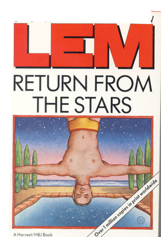
Donald Barthelme calls Stanislaw Lem’s 1961 Return From the Stars “stunning,” according to the little front cover blurb on the edition I’ve got. That seems about right, though not quite in the way that Barthelme meant it.

The book’s about Hal Bregg, an astronaut who returns from distant stars having aged only 10 years while more than 100 years have passed on earth (thanks relativity!) The world has changed a lot, and he’s having trouble adjusting. As he says on the first page:

The bright colors of the women’s clothes I had by now learned to accept, but the men I still suspected, irrationally, of affectation….

That’s pretty much the whole novel there. The problem with the future is that it is terribly, frighteningly effeminate. The world has developed a process, betrization, which is performed on infants and effectively surgically castrates them — they cease being able to even formulate aggressive thoughts. It also apparently reduces their size (the feminine clothing is maybe an unrelated development.) Thus, Hal is cast into a decadent world where he’s the lone virile uber-masculine giant in a world of meek and tiny girly men — and meek and tiny girly women. And if anyone doubts that this is a total adolescent power fantasy, Hal’s uber-masculinity quickly seduces the world’s most beautiful movie star, who he discards in favor of another woman, Eri, who he kind of sort of rapes, but it’s all right because it turns out she likes it.

Lem’s a much-praised author, and this is one of his most-praised books, so you’re probably thinking there must be more to it than that. But nope; that’s all that’s on offer. Hal agonizes at this soft world without risk, performs manly exercise routines and drives dangerously to work off his stress, and wows the womanfolk, or stalks them — Lem doesn’t seem able to tell the difference. Risk and exploration are incessantly, obsessively figured as male (there were no women on Hal’s expedition, of course); home and hearth are just as obsessively figured as feminine, so that Hal’s decision to not go back into space is linked inevitably to his marriage to Eri, a character about whom we know nothing except that she finds the violent, whiny Hal unaccountably attractive (the book delicately suggests that this is because he’s such a good lay; betrization may prevent good sex too, maybe.)

Again, as Barthelme indicates, there is something “stunning” about the blatant idiocy of the gender politics. Sci-fi is almost as notorious as superhero comics for its bone-headed wish fulfillment, but even by the standards of Flash-Gordon-space-opera nonsense, Return from the Stars is eager to shove its virility under your nose. The main difference, and what makes this arty, I guess, is that most space opera revels in its protagonist’s power, whereas Lem coats his power-worship in philosophical hand-wringing (is a non-violent world worth abandoning the human spirit of adventure?!) and hypocritical self-pity (oh nos! I’m bigger and stronger than everyone on earth, and must fuck all the women! What ever will I do?) This is, in short, a dreadful, dishonest, sexist piece of crap, which manages to combine the worst aspects of male mid-life-crisis literary fiction with the worst aspects of stunted male adventure garbage. I’ve read some Lem books before that I’ve enjoyed, but this sure makes me not want to ever read another.

Comics Poetry, Poetry Comics, Graphic Poems

There are times I read something on the internet and feel this immediate need to respond. I think we’ve all felt that way about topics we care about. Thus is created the comments thread, the message board, and other forms of abbreviated, often argumentative discussions. For me, I don’t always feel capable of forming my thoughts and reactions into a coherent text, especially in a way that avoids being combative (I really don’t want to be that way). So I save links and texts in hopes of later returning to them and making some grand statement, some coherent argument, some well thought out response. But waiting for that time to come is often counter-productive as sometimes making the incoherent statement and getting feedback is where the real discussion and learning comes from.

Writing about the idea of comics and poetry has been on my to-do list for quite awhile. I’ve a note in Evernote from December of 2008 labelled “Comics as Poetry.” The note is just a bunch of collected links to people like Tom Hart, Bill Randall, and Gary Sullivan, all dating from early in 2008. I also have one paragraph of a started post from April 2011, and a never completed review of Warren Craghead’s How to Be Everywhere from February of 2011.

I feel strongly that there is a line of comics poetry that runs through the history of comics, but I always end up getting stuck on how to delimit such a feeling. What is comics poetry? What is poetry? Similar to asking “what are comics” or “what is literature” this is rarely the most productive place to start… and thus, the not starting.

What started me up again this time were two recent articles on the topic: Steven Surdiacourt’s “Graphic Poetry: An (im)possible form?” at Comics Forum and an interview with Bianca Stone at The Comics Journal from this past week. Both immediately set off my desire to respond.

First off, Surdiacourt’s article starts with the term “graphic poetry” which I find unfortunate. I can see the desire to parallel the “graphic novel,” (which he explicitly uses in one definition: “graphic poetry is to the graphic novel, what poetry is to prose”), but I don’t think it is a good idea to work from an already contentious misnomer of a term. Also, “graphic poetry” sounds like something a person in the 1950s would have used to describe “Howl.” Don’t let the children read that graphic poem.

Surdiacourt’s text itself starts off on good footing, discussing the inspiration for the article: an exhibit that featured paired up collaborations between comics artists and poets. He immediately notes the tendency to have the artists illustrating poems, rather than the two truly collaborating. We’ve seen this before with the work published by the Poetry Foundation (here’s the last one in the series with links at the bottom to the others) under the rubric of “The Poem as Comic Strip” (that title alone tells you something). What we find there is a bunch of comic artists (some, like Ron Regé Jr., whose regular work is often comics poetry) illustrating poems by famous poets. It’s quite reminiscent of that bastion of comics greatness Classics Illustrated and not particularly inspiring (see Bill Randall’s column about the series). Of course, this model works for people in the poetry world because it maintains the integrity and primacy of the original poem/words.

Back to the essay at hand, it draws heavily on an article by Brian McHale about narrativity and segmentivity (I’ve only managed to read sections of it via Google Books which seems to cleverly only skip the pages where the primary analysis is done). McHale starts with poetry but turns to comics, spending the majority of the article discussing Martin Rowson’s adaption of Eliot’s The Wasteland as way to compare the two forms’ use of segmentivity and narrativity. Surdiacourt summarizes McHale’s theory:

…this segmentivity is defined as “the ability to make meaning by selecting, deploying, and combining segments” (Rachel Blau DuPlessis quoted in McHale 2010, 28). It’s not merely their gapped nature that connects poetic texts and graphic narratives, but also their shared capacity to play off “segments of one kind or scale […] against segments of another kind or different in scale” (McHale 2010, 28). The best known example of this kind of poetic configuration is obviously the enjambement, a trope in which the grammatical unit of the sentence (measure) is disrupted by the unit of the verse (countermeasure). A similar textual device is used in comics to create or maintain tension by the interruption of the action (measure) at the end of the end of the right hand page (countermeasure). [DB: Those are his ellipses and references.]

Surdiacourt rightly notes that this single criterion is not enough to compare comics and poetry. So, he also (briefly) brings up poetic rhyme in comparison with visual rhyme, braiding, as well as Barthes’ hermeneutic code. All of these can be gappy aspects of comics. In McHale’s article he also briefly discusses film, comparing filmic cuts to poetic segmentivity and the gaps in comics, noting the tendency of classical Hollywood style films to make cuts/gaps as invisible as possible (though one can argue against that when there is a desire to provoke mystery or suspense) in contrast to an Eisensteinian montage where gaps are introduced to force viewers to “make meaning.” I think the latter use of gaps is one place where comics can foreground their constitutive elements (images in sequence) in a similar way that much poetry foregrounds words and sounds.

Unfortunately Surdiacourt focuses on textual segmentivity, and his only example (from Nicolas Mahler) is primarily about the text. He ends on a strange note: “In the end, what and how graphic poetry can be (if it can be at all) remains to be imagined, and drawn of course.” He seems completely unaware of the existence of work that would fit his category, that would even better fit his category than his or McHale’s examples.

Certainly, looking at any comic by Warren Craghead provides a great example of segmentivity, a gappy aesthetic, and usage of various tactics Surdiacourt mentions. Craghead almost never uses text in the traditional way it is used in comics (balloons, captions), instead he fragments sentences and words into pieces (the word, the letter, respectively) and scatters them across the page. His pages and panels are also visually segmented as he tends to use images that are singular or partial–a single object, part of a larger object or scene–and then connect them visually through composition, lines, and text.
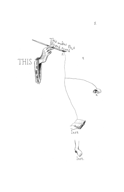
from Warren Craghead’s “This is a Ghost.”

For instance, this page from “This is a Ghost” shows a fragmentation of sentences, words, and imagery. The fragmentation creates a rhythm to the reading as one moves across the page through the multiple sizes and spacing of the text. You can note that the (admittedly out of context) sequence of images is not a “smooth” transition. Also, when read in full (see the references list below for a link to a pdf of the anthology), one finds a use of repetition (both word and image), braiding, and visual rhyme across the comic’s 14 pages. The comic tends to force a different type of reading than a conventional narrative comic that provides a very smooth and transparent reading. Craghead’s comic engenders a closer reading and a tendency to reread nonlinearly as one moves back and forth through the pages trying to decipher its layers (in a sense this echoes the hermeneutic code).
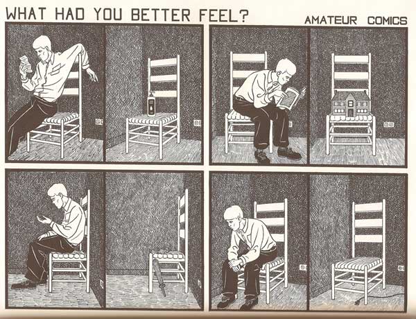
From John Hankiewicz’s “Amateur Comics.”

Much of John Hankiewicz’s work would also fit well as an example for Surdiacourt. For example, his “Amateur Comics” sequence makes use of segmentivity in an unusual way that could mirror McHale’s measure and countermeasure. Each page from the sequence is divided into four groupings of two panels. The groupings’ two panels are divided only by a single line, while the groups are divided by the negative space of the gutter. In most of the pages, the groupings divide up into a panel with a person in the left and one without a person on the right. The left and right also often show different views of the same scene, sharing view across all four groups. In this way, Hankiewicz disrupts one narrative sequence with another, creating a network of potential sequential and spatial readings of the 8 panels on the page. The spatial organization in conjunction with visual content, which at a general level shows alternating imagery, makes use of repetition and creates rhythm within the page and across the sequence of pages. Similarly the two lexias of text across the top of each image (a question beginning with a series of interrogative abverbs and a two word phrase in the form of “[something] Comics”) also form a consistent set of repetitions and variations that can be read across the pages. Without even discussing the specific content of the images, it’s fairly easy to see how one can read “Amateur Comics” as a form of comics poetry.

So, that’s just two artists off the top of my head, and neither are that obscure in the comics world. Both comics provide examples that are considerable more invested in the interaction of text and image in a “poetic” (let’s put my usage of this term aside for now) way than just the text by itself.

I wish that before he decided to posit something that he didn’t think existed, Surdiacourt would have looked for examples of that supposedly nonexistent thing. I’m sure if he looked around a bit he could have found some examples. Certainly, Rob Clough wrote about Hankiewicz’s work as “comics-as-poetry” in The Comics Journal (the online version is easily searchable), and there are often (mostly brief) examples to be found fairly easily.

Bianca Stone, who explicitly calls her work “poetry comics” and edits a poetry comic column at The The, was interviewed in The Comics Journal and shows a similar lack of knowledge of artists working in the comics world. Stone’s foregrounding of “poetry” in her terminology does point to her grounding in the poetry world rather than the comics world, so that could be part of the reason (none of the comics she explicitly mentions are outside the mainstream (be it superheroes or “alternative”)). The interview bears this out as she discusses being in an MFA poetry program and not having much interaction with the comics world. (There are a bunch out us out here, Bianca.)

Even her definition of poetry comics points to a focus on text as poetry: “Sequential art that uses poetry as the text.” I realize she is surely simplifying here to have a quick definition, but the concept makes it seem like the work is “poetry + comics” a kind of addition wherein the comics–the images and the iconography and grammar of comics–is an add-on to the poetry, which is text. Some of the work she’s put in her column has born out this conception. To her credit, Stone’s work in her I Want to Open the Mouth God Gave You Beautiful Mutant doesn’t totally play out that formula, though I think it does come through stronger as a poem via the text.

For this reason, I use the term “comics poetry” as a way to foreground the comics aspect, a more succinct locution than Clough’s “comics-as-poetry”. Comics poetry isn’t poetry as text with comics images; it’s the whole comic as poetry. The images, the words, the structure, the rhythm, the page, all of it is used together to create the poetry, to create comics in a poetic register. But, as I mentioned in the beginning, this gets tricky, since “poetry” and “poetic” can mean a lot of things to different people.

In the end that doesn’t really help us identify or discuss how comics poetry differs from any other comics. So, I’ll take that up in part two (later next month), looking at how a few other people have discussed comics poetry or the poetic in comics, and then I’ll offer my own thoughts on the matter with some more specific examples.

References:

  • Craghead, Warren. “This is a Ghost.” In Ghost Comics, edited by Ed Choy Moorman. Bare Bones Press, 2009. 151-164. Order the volume or read the pdf: http://edsdeadbody.com/barebones.html
  • Dueben, Alex. “A Bianca Stone interview.” The Comics Journal. 24 Aug 2012. http://www.tcj.com/a-bianca-stone-interview/
  • Hankiewicz, John. “Amateur Comics.” In Asthma. Sparkplug, 2006.
  • McHale, Brian. “Narrativity and Segmentivity, or, Poetry in the Gutter.” In Intermediality and Storytelling edited by Marina Grishakova and Marie-Laure Ryan. De Gruyter, 2010. 27-48.
  • Randall, Bill. “Deaf Ears: Poetry, Comics and the Poetry Foundation’s Comics Project.” The Comics Journal #288 (February 2008): 193-5.
  • Stone, Bianca. I Want to Open the Mouth God Gave You Beautiful Mutant. Factory Hollow, 2012.
  • Surdiacourt, Steven. “Image [&] Narrative #5: Graphic Poetry: An (im)possible form?” Comics Forum. 21 Jun 2012. http://comicsforum.org/2012/06/21/image-narrative-5-graphic-poetry-an-impossible-form-by-steven-surdiacourt/

A few more comic artists who might fit in this vein (for at least some of their work):

Julie Delporte, Oliver East, Franklin Einspruch, Allan Haverholm, Aidan Koch, Simon Moreton, Anders Nilsen, Jason Overby, John Porcellino, Alexander Rothman, Frank Santoro, Gary Sullivan, me, and surely others I am obviously forgetting.

Abstract Comics

Note: This review of Abstract Comics was written close to three years ago. It was proposed to Art in America in the fall of 2009 and submitted for publication that November or December. Overbooking in the book reviews department, I was told, delayed its publication. Finally the following summer, sensing its age as a review and the need to jumpstart things before it was too late, I offered to expand the article into a feature length essay on the wider subject of abstraction in recent comics, including figurative and/or narrative ones like Dash Shaw’s Body World, Joshua Cotter’s Driven by Lemons, and Brian Chippendale’s If ‘n Oof. That proposal was likewise accepted, but then the magazine’s head editor was ousted. The new head editor, after another six months’ consideration, finally paid me a kill fee. I thought I might write the expanded version nonetheless and submit it to an academic journal, but then got busy with other things and lost interest.

If I were to write on this topic today, there are many things I would change. It is, however, precisely this thinking that has kept this piece buried inside my computer, where it does no one any good. Thank you to Andrei Molotiu and Derik Badman for pushing me in recent months to publish the review regardless. So here it is, more or less in the state it was three years ago. Keep in my mind it was written for an art world publication. There were also word count restrictions, hence its clipped nature. What you see here, if I remember correctly, was already about 300 words over length. I said I would change many things today, including its tone, but the core opinions and suggestions I still stand by.

*******************
 
Since the 1990s, there has been a rising tide against the word in comics. It has begun to gel into something like a movement, made up of artists, critics, and editors alike, involving both the creation and promotion of new wordless comics in a variety of genres as well as the republishing and anthologizing of related work from the past.

So-called “abstract comics” is one of the more extreme fronts. It names a form of wordless comics that not only dispenses with the word, but also those things traditionally allied with it, like speech, sound, plot, and interiority. Abstract comics has been a fringe genre, disseminated largely through blogs and self-published and small press booklets. With the publication of Abstract Comics: the Anthology (Fantagraphics, 2009), it has gained a more secure foothold in print.

The book collects work from 1968 to the present. It includes comics luminaries like R. Crumb, Gary Panter, and Lewis Trondheim, but is focused on new names from the past decade. Most of the work is deeply indebted to modernist abstraction, from Kandinsky’s dispersions and Cubist papier collé, to the nested squares of Albers and Abstract Expressionist blots and drips – all typically set into narrative motion across a handful of panels or pages.

Museum modernism also weighs heavily on the framing of the anthology. In his introduction, Andrei Molotiu, artist, art historian, and blogmaster of the same-titled Abstract Comics site, describes the genre as a whole in terms derived from a mix of vitalist philosophy and a classical modernist model of reflexive reduction. He writes:

Reduced to the medium’s most basic elements – the panel grid, brushstrokes or penstrokes, and sometimes color – they [abstract comics] highlight the formal mechanisms that underlie all comics, such as the graphic dynamism that leads the eye (and the mind) from panel to panel, or the aesthetically rich interplay between sequentiality and page layout.

In the same vein, Molotiu describes standard narrative structure as an “excuse to string panels together” and abstract comics as a distillation of the medium to the “feeling of sequential drive, the sheer rhythm of narrative or the rise and fall of a story arc.” In the artist profiles at the end of the book, Mark Badger – contributor of a maximalist geometric abstraction in comics form – laments how images in comics are “unable to claim their real power” while subordinated to narrative or representation. “Hopefully,” he continues, “this book will be one shot in claiming back comics from the typists.”

Abstract Comics thus offers itself as a manifesto in the tradition of high modernist art, without the extremism of its historical predecessors, but nonetheless sharing their characteristic denigration of narrative and the verbal sign as well as their calls to power through purification. The anthology, unfortunately, does not make the strongest case for the vigor of the movement it promotes. Much of the collected work is visually weak, and the modernist formalist discourse to which the book is indebted ceased to have any real traction after the socio-political and linguistic turns of art in the 1960s. Molotiu expends much of the introduction excavating precursors for this “genre without a proper tradition” from the oeuvres of art-world masters like Kandinsky, DeKooning, Alechinsky, and Johns, with only passing mention of relevant precedents within the comics medium itself. Trying to legitimize comics vis a vis the art historical canon can sometimes be self-defeating, and here it has the unintended effect of casting abstract comics as little more than a super-belated reworking of formalist painting. Especially considering the online presence of “abstract comics” and the computer-based creation of many of the contributions, it would perhaps have been more fruitful to explore the relationship of the genre to the return of various forms of abstraction in the computer age, beginning with Neo-Geo in the early 80s and then internet art and laptop music after the 90s. Instead, the top two-thirds of each page of Molotiu’s introduction are given over to rows of dingbats, a cute waste of valuable space and another statement of preference for pure aesthetic form over verbal discourse. One is left to dig through the artist profiles of Abstract Comics and the personal webpages cited therein to get any real sense of specificity to individual works and the promise that some do hold.

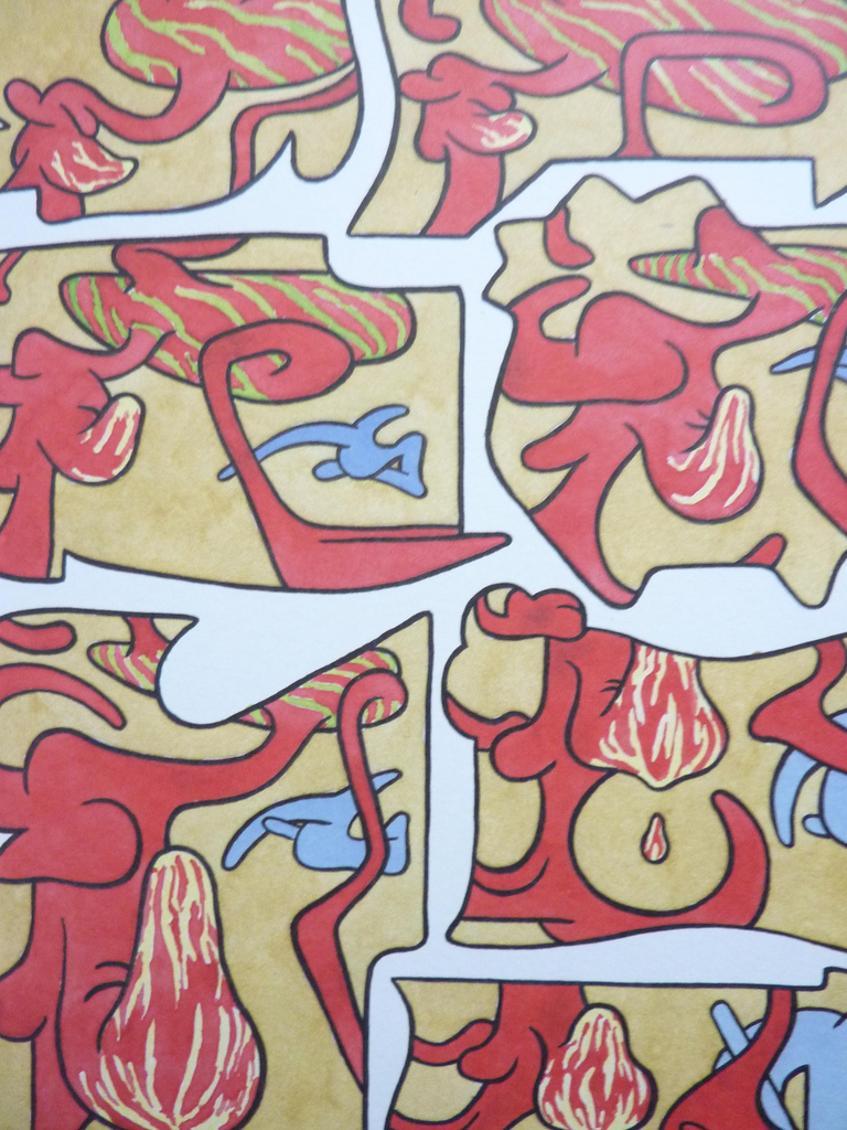
As is clear to any reader, the dominant trope of abstract comics is metamorphosis. Molotiu heralds work that “tells no stories other than those resulting from the transformation and interaction of shapes across a comic page.” Andy Bleck’s Haring-esque work is typical. Anthropomorphic blobs twist and tangle in goofball dances that are half cartoon tribal mating ritual and half protoplasm on a wet mount microscope slide. The contributions of the two most prominent Europeans in the anthology, Trondheim and Ibn al Rabin, make it clear that the defining figure of metamorphosis is the amoeba. Both of their works are short comedies featuring blobs swallowing nuclei and other blobs. There is a basic vitalist conceit at work here: to boil the comics medium down to pure formal dynamism entails exploring also the most basic forms of animate life.

by Andy Bleck

Most of the works are as entropic as they are dynamic, involving not only the transformation of form and energy, but also their disorganization and dissipation. Molotiu’s own works are a case in point. Produced with the aid of a scanner, “The Panic” begins with compound masses whose biomorphism once again evokes the biology lab. Over the course of a handful of panels, the masses pull apart into small globules.

Chaos, similarly, is a recurring motif. Alexy Sokolin’s “Life, Interwoven” layers ballpoint pen lines until almost the entire page is obliterated. Tim Gaze’s untitled collages are a gore-fest of inky smears and splatter, further mutilated through a technique similar to the cut-ups of William Burroughs and Brion Gysin. Billy Mavreas’ “Border Suite” again evokes the cut-up, now run repeatedly through a copy machine until all that is left is disintegrated borderlines and dispersed dust motes. In Abstract Comics as well as other statements on “sequential dynamism” in comics, Molotiu makes the musical analogy to opera. From these works, however, it is clear that noise and glitch aesthetics would be more apt in some cases.

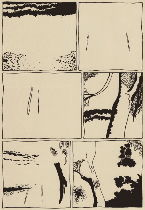
Other works also manipulate source material. Proprietor of the reliable MadInkBeard blog, Derik A. Badman’s Flying Chief is one of the more intriguing contributions to the anthology. He has redrawn panels from a 1950 Tarzan comic without the characters, words, speech balloons, or captions. More so than abstraction or entropy, this strategy of absenting is highly effective in frustrating the viewer’s desire for an organizing figure. Badman’s image of a world without human agency raises more pointed questions than other contributors’ protozoan land before time and scenes of cosmological chaos.

Derik Badman, “Flying Chief”

Noah Berlatsky also runs a comics blog, The Hooded Utilitarian. His two one-page works are also in this appropriationist vein. He has taken pages from Asterix and X-men and redrawn them in such a mutilated fashion that frames and figure-ground relationships are splayed and then refused into an abstract mesh. There is a strong bit of Kandinsky in the results, but it’s also important to perceive amputated bodies akin to those of early Dali or later Sue Williams.

In these, as in a number of works in the anthology, there is an interest in what might be termed a logic of “vestigiality”: the organ divorced from its original function but still maintained, so that it oftentimes comes to impose upon the organism that had abandoned it. Might this principle also underlie the metamorphic comics? After all, their plasmatic substances have a striking resemblance to the spongy, pneumatic contours of the speech or thought balloon. If so, it seems that the abstraction of comics against the word and its supports is never total, but rather marked with traces of partial amputation. Abstract comics share this feature with many wordless comics, from pantomime works that gesticulate histrionically to make up for the ban on verbal expression, to indie comics around themes of melancholia, speechlessness, and pre-linguistic primitivism.

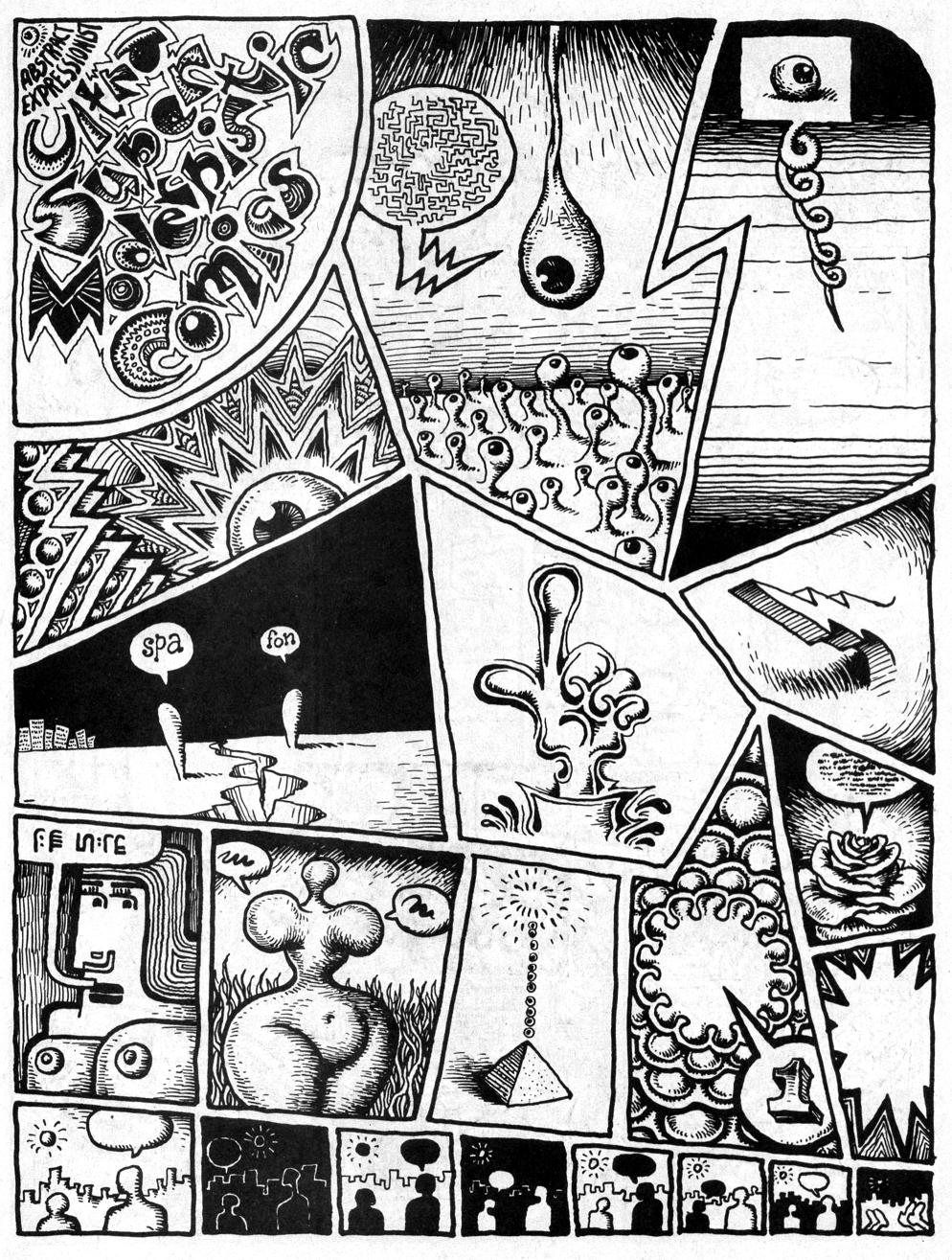
It is curious that Abstract Comics opens with R. Crumb’s “Abstract Expressionist Ultra Super Modernistic Comics,” first published in Zap Comix no. 1 (1968). First of all, its principle of non-sequitur juxtaposition is quite at odds with the smooth, linear sequentiality or serial modulation that characterizes most other works in the anthology. Secondly and more importantly, Crumb’s work was meant as a derisive parody precisely of the kind of genuflection to high modernism that Abstract Comics represents.

R. Crumb, “Abstract Expressionist Ultra Super Modernist Comics

Crumb is not alone. Burlesque has long served as a kind of prophylactic for comics artists against the perceived obscurantism and puffery of high art. A few years ago, designer Craig Yoe popularized an adequately lowbrow name for this mindset: “arf,” which is Popeye’s laugh, but comes off as a portmanteau of “art” and “barf.” At the very least, Abstract Comics represents a welcome willingness to look upon high art from the perspective of comics without such juvenile anxieties. One hopes that the future of the genre is towards aesthetic paradigms with greater contemporary relevance.

Voices from the Archive: Bill Randall and the Distorted Image of Tatsumi

This is a comment Bill left on an article by Ng Suat Tong.
_________________________

I’ll add that Tatsumi’s story in English is about marketing and a lack of context. D&Q has marketed Tatsumi and “gekiga” very well, though it’s worth noting that the term “gekiga” first appeared in issue 12 (1957) of “Machi,” a rental manga, as a blurb on a Tatsumi title page: “GHOST TAXI” has the title, “Mystery Gekiga” (Encyclopedia of Contemporary Manga, p. 62). It feels closer to “Ghost Taxi Mystery Theater” to me than, say, an equal of any of Kurosawa’s gendai-geki or jidai-geki from the period. Decades later, the gekiga “brand” and an unimpressive body of work have Dwight Garner in the NYTimes saying of Tatsumi’s work, “It’s among this genre’s signal achievements.” (At least Gary Groth, to his credit, never bought it: “I usually only interview artists whose work I like, and I didn’t feel entirely comfortable interviewing Tatsumi. I was troubled by a number of tics that comprised the backbone of Tatsumi’s aesthetic…” TCJ #281, p. 37)

I wanted to add a footnote from a couple Japanese sources: The Encyclopedia of Contemporary Manga, 1945-2005 (Shougakukan), ends its sole entry on Tatsumi with with the fairly tepid, “Recently, his esteem has also grown abroad.” (Just before its publication, in 2003 AX #34 presented an unpublished Tatsumi story with a full-page ad proclaiming his work would be published in the West. AX is from Seirinkogeisha, now the Japanese publisher of his work as well as others in that tradition.)

The rest of the encyclopedia’s entry was a plot summary of the short story “Man-Eating Fish” and a sentence noting how Tatsumi “deeply expressed the dead-end circumstances of men living in society’s lower reaches” (clunky offhand translations mine). A true documentary of those men would be more interesting, but he prefers tidy immorality plays. Even his images, some fine examples of which you selected, no more than equal those of his peers. It’s telling that another Japanese work, the critic Natsume Fusanosuke’s formalist critique “Why Is Manga Interesting,” chooses artists like Nagashima, Tsuge, and Sait? in describing the old gekiga style, but not Tatsumi. Would that D&Q had published five volumes of Shigeru Mizuki and a slim one of Tatsumi. The rest of their gekiga line’s quite strong, but the word’s not very helpful, and the brand even less if it means Tatsumi’s the touchstone for excellent artists like Ouji, Sakabashira, and Mizuki. Mizuki’s a giant; Tatsumi was forgotten until D&Q picked him back up. The result has been a distorted image of his work’s importance more than a valid reassessment, one that even the New York Times repeated uncritically.


Marie Severin’s Due

Click on images to enlarge

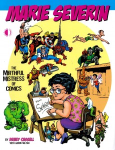
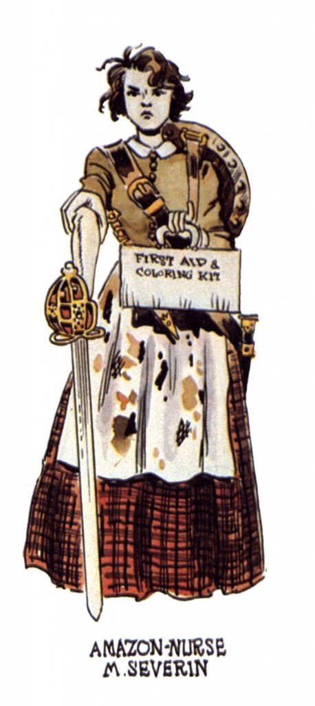
There can be no doubt that Marie Severin deserves a book about her lifelong efforts in comics. More recognition than that would be appropriate even if she wasn’t one of the few well-known female practitioners in the last century. One would think that for her essential role as E.C.’s colorist alone, Severin should at least have previously had an issue of Squa Tront dedicated to her, since a special edition of that beautifully-produced E.C. fanzine is thus far the only significant acknowledgement that her brother the late John Severin has recieved from the American comics industry to which he dedicated decades of consistently high-quality, naturalistic work. But so far, the only publisher to undertake the rightful honoring of Severin is TwoMorrows, the imprint that fan John Morrow grew from the humble beginnings of his first thin issue of The Jack Kirby Collector in 1994.

Not only is coloring a particularly misunderstood aspect of comics, but the efforts of women have been traditionally discouraged in the medium. And though there is now occurring an explosion of comics scholarship, those scholars are often more interested in analyzing printed comics than they are in talking to the humans who made them. Since the higher-end critical forums such as Fantagraphics’ Comics Journal and Todd Hignite’s Comic Art are now published annually or otherwise infrequently, the bulk of in-print documentation and discussion of previous generations of cartoonists has been left to such publishers as J. David Spurlock’s Vanguard Productions and Morrow’s TwoMorrows, which also puts out Roy Thomas’ zine Alter Ego, the primary venue for many elder cartoonists’ only (or final) interviews.

So, TwoMorrows has published a book about Marie Severin and for that I am grateful. Nonetheless, this book, which features interviews by Dewey Cassell and Aaron Sultan with the artist and her contemporaries, shows the best and worst tendencies of the explosion of unapologetically fannish tomes that TwoMorrows has been releasing in the last few decades. The bad is overshadowed by the good, so let me get the few outstanding deficiencies out of the way immediately. The most heinous offense committed here is that the book is subtitled The Mirthful Mistress of Comics.
 

Severin is known for having a clever and cutting sense of humor. However, in utilizing Marvel overlord Stan Lee’s nickname for Severin (“Mirthful Marie”) and adding the usually pejorative feminine descriptive “Mistress,” the artist’s versatility and the essential nature of her many and varied contributions to comics history are diminished, even as images of a sort of cackling floozy ensconced seductively in the predominantly male confines of the bullpen are conjured.

One is relieved that other books about Marvel’s artists don’t all similarly utilize Lee’s corny alliterations; that, for instance, the many books about Jack Kirby have in their titles avoided Lee’s appending of “Jolly” to the artist’s name, since it is an even less appropriate description of Marvel’s founding dynamo than the unbecomingly anti-democratic royalism of the more familiar “King”. Speaking of Kirby, a bizarre prejudice rears up when co-interviewer Sultan asks Marvel mainstay John Romita, “What about Marie and Jack Kirby? Did she ever resent his ego at all?” Romita sets Sultan straight in short order, telling him of Severin’s (and his other contemporaries’) absolute admiration of the humble and accessible Kirby.

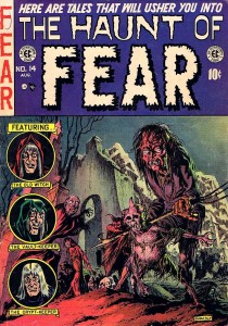
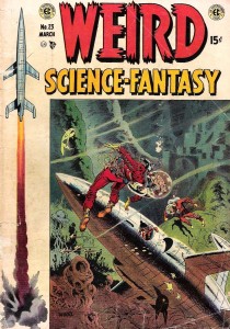
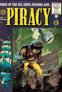
The other drawbacks here are lackluster book design and the counterintuitive use of the color section. For an artist known primarily if dismissively as a colorist, the decisions regarding color here are hard to fathom. Of 16 pages allotted for color reproduction, the equivalent of five of those pages are taken up by reproductions of original art, i.e. black and white linework and the other pages do not well represent  Severin’s best work. Her important and exemplary early E.C. coloring is shown in 4 small reproductions on a single page. Perhaps Cassell and TwoMorrows were unable to get the rights to use larger reproductions by those who hold the copyrights to her work for E.C., and so this specific disservice to Severin is not their fault. But as can be seen in the covers below, Severin added significantly to the art of such luminaries as Graham Ingels, Wally Wood and George Evans.

Graham Ingels, cover for Haunt of Fear #14, color by Marie Severin


Wallace Wood, cover for Weird Science-Fantasy #23, color by Marie Severin


George Evans, cover for Piracy #7, color by Marie Severin

The strength of TwoMorrows’ books is usually in the varied interviews and such is the case with Marie Severin: the Mirthful Mistress of Comics. The authors speak to her brother, to her childhood friends and to her surviving co-workers at E.C. and Marvel. I wish that there were comments by more of the now-deceased artists that Severin colored over the years and who respected her efforts such as Kirby and that her employers such as Stan Lee had graced the book with more than perfunctory tribute. However, there are substantial contributions by such reputable sources as Al Feldstein, Jack Davis, Jack Kamen, John Romita, Roy Thomas, Flo Steinberg, Herb Trimpe, Linda Fite, Ramona Fradon, Trina Robbins, David Anthony Kraft and Mark Evanier.

The E.C. section is particularly well done. Severin began coloring for them when editor Harvey Kurtzman wanted to upgrade the look of the books, in Severin’s words “to look more like Prince Valiant in the newspaper.” For the next few years she colored first Kurtzman’s war books, then the entire line, with the exception of some covers and stories colored by the perfectionist Kurtzman, as well as a few stories colored by the similarly autonomously-minded Bernard Krigstein (both of whom Severin typically characterizes as “artsy-fartsy”). When Cassell tells Severin, “you’ve been credited with a lot of the success of EC because of those vibrant covers,” she effaces herself to credit instead the quality of the “content,” but truly, covers are the primary selling factors on the newsstand and the color is the more significant part of the initial impact of the visuals on the reader. And, Severin’s interior coloring is no less sensitive and considered. Still, assisting Kurtzman on his comprehensive research, drawing caricatures on the fly of her co-workers and coloring were the art Severin was able to do at E.C.

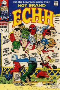
She was always capable of more, but it wasn’t until the 1960s and she had been working at Marvel for a while that she was given the opportunity to draw comics herself. It wasn’t the usually canny Stan Lee who realized her talents, either; instead it was Marvel’s publisher Martin Goodman that noticed how good she was when she did some superhero drawings for Esquire and so Severin began to draw sporadically for the company: a few episodes of Dr. Strange here, issues of The Hulk and Sub-Mariner there. Severin understands the comics medium well and her work can be as energetic and muscular as that of any male superhero artist, even on her many strips for the Marvel humor titles Not Brand Echh and Crazy.

Marie Severin’s cover for Not Brand Echh #9.

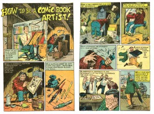
Marie Severin, from Not Brand Echh #3.

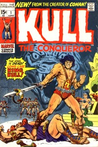
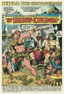
Perhaps her best known Marvel Comics work is her early-seventies tenure on their adaptations of the Robert E. Howard hero Kull the Conqueror; these stories are beautifully inked by her brother John. Their collaborative run is considered to be a classic of adventure comics and both siblings certainly deserve credit, but it is Marie’s great storytelling skills that drive the narratives. And, she is one of the few artists in comics who can match Kirby for compositional thrust, which is why she became the chief cover designer for Marvel for the next few decades.

Marie Severin solo cover for Kull #1.

Splash page for Kull #2 by Marie and John Severin.

The interviews in the book give a remarkable account of Severin’s career and personality, but one gets the sense that Cassell and Sultan don’t truly comprehend how difficult and abusive the workplace was for women in the last century. That may be in part because Severin herself tends to diminish progressive issues that might be seen to be about political correctness, but it is sometimes only by reading between the lines that a fairly full picture of what her life in comics was like emerges. There can be little doubt that the sexual innuendos in the office went beyond simply “forgetting” about the presence of women in the room, that unwelcome comments and physical advances were directed to them. And Severin definitely faced a glass ceiling.

She succeeded John Romita to operate as a virtual art director for Marvel, but the position was unheralded as well as unpaid. In the present volume, Romita actually details how in order to gain points with Goodman, Stan Lee took credit for the substantial extra work that he and Severin did in that capacity. This seems typical of Lee’s manipulative treatment of even his most stalwart workers (and there is even mention here of Lee claiming as his property substantial amounts of original artwork, a questionable provenance at best given the subsequent troubled legal status of those pages). Neither Romita nor Severin hold anything against their “fearless leader”—it seems that Lee casts a sort of magic spell of obvious bullshit to make the people he uses, but never sticks up for, still somehow love him. Later, when Jim Shooter  cut a vicious swath through Marvel’s  elder talent, he also disrespected Severin’s art directorship, calling her instead “head artist” and she had no choice but to endure; as usual, there was no one in upper management to take her side.

Flying against Severin’s conservative nature, Trina Robbins hails her as a true feminist and she surely is an example of a woman excelling in a male-dominated field through sheer perseverance. Severin had a career in comics, but was not facilitated as she should have been; it was with her sense of humor that she was able to shine.

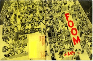
Marvel editor David Anthony Kraft on Marie Severin’s cover for the in-house fanzine FOOM #16: “That is exactly how the office looked….She’s got everyone in character, in the place where they were in the office, doing what they did.”

Severin’s ability to effectively nail her contemporaries is impressive, but these rare skills are unfortunately easy for some to underestimate; in the end she had to take what she was given and put a smiling face to it. Perhaps the most telling testimony to Severin’s skills and the misuse of her talents by the comics companies she worked so faithfully for is provided here by Mark Evanier. Firstly, in reference to MAD magazine, begun under the banner of her first employer E.C. and more recently published by DC Comics:

“People used to always say, ‘Marie belongs in MAD magazine.’ And she did…And I hate to think it’s true, although it possibly is, that the reason that she wasn’t was that she’s a woman. If you noticed, while Bill Gaines was running MAD magazine, they never had a woman artist there…Every so often, they would tap her for a coloring job, or a production job, but they never thought of her as somebody who could actually draw, say, a movie parody. And she would have drawn a better parody than a lot of other people they used. She obviously could do likenesses and at that time, MAD was paying ten times what a Marvel artist was getting paid for a page. It would have been fascinating to have seen her spend two days drawing a page of comics, as opposed to three hours. I would have loved to have seen what she would have done because it would have been amazing…she was considered family up there and they loved her, but she was family for production…I think she should have been drawing for MAD, because she was so good, and if a guy had been doing that same quality of work, probably would have been a regular in MAD. She probably would have had the job that Angelo Torres ended up getting…(doing) movie parodies up there.”

—and at Marvel:

“…I always thought she was an amazingly talented artist. She probably should not have been doing super-hero or adventure comics, but when she did, she always did a very fine job of them. I just thought she had this wonderful sense of humor…it is a shame, to me, that Marvel never really did a project where they let Marie Severin work exclusively on humor material, and develop her style more, and encourage her, and let her be as wonderful as she could be, because she had the skills, obviously, she had the sense of humor, and she had a unique viewpoint.”

Marie Severin by her brother John, detail of a watercolored drawing of Harvey Kurtzman’s E.C. war comics staff, from Squa Tront #9.

Shorter Utilitarian Review 8/23/12 — Vacation Edition


News

I’m going to be on vacation and away from the internets starting tomorrow…thus this early and short Utilitarian Review. The blog will resume regular posting next Tuesday, August 28.
 
On HU

Featured Archive Post: Kinukitty on Archie’s hideous transformation.

Me on the mysterious black metal evil of Funeral Mist.

Me on how Philip K. Dick anticipated his own crappy remaking.

Jaime Green on how the play Clybourne Park is lying to you about race.

Me on the Dark Knight Rises and the pleasures of self-actualizing billionaires.

Vom Marlowe reviews the Glades.

Me on the small as life pleasures of Say Anything.
 
Utilitarians Everywhere

At Splice I talk about Obama and the audacity of cravenness.

Also at Splice I weigh in on negative book reviews vs. positive book reviews.
 
Other Links

Robert Stanley Martin on John Cheever’s “The Country Husband.

Jeff Spross on how DKR is not really conservative.

Sarah Kendzior on how academia exploits its adjuncts.

The Atlantic sneers satisfyingly at Joe Paterno.

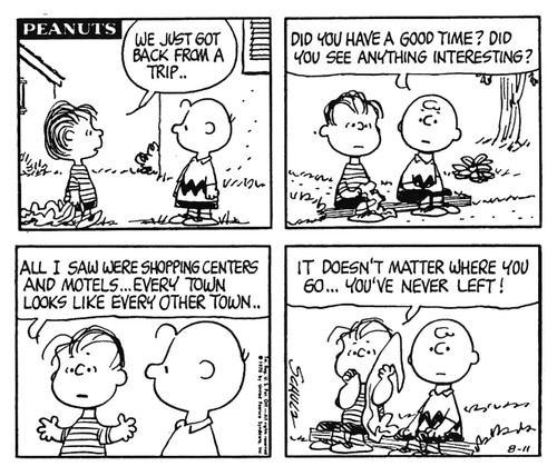
Ben Saunders is curating a exhibit of Charles Schulz’s drawings at the University of Oregon.