Finding the Dynamic in the Still: Paul Klee as Comics Artist

klee.insula-dulcamara

N.B. This post is a modified and revised version of a paper delivered at the 2014 meeting of ICAF (the International Comic Arts Forum) in Columbus, Ohio.
________

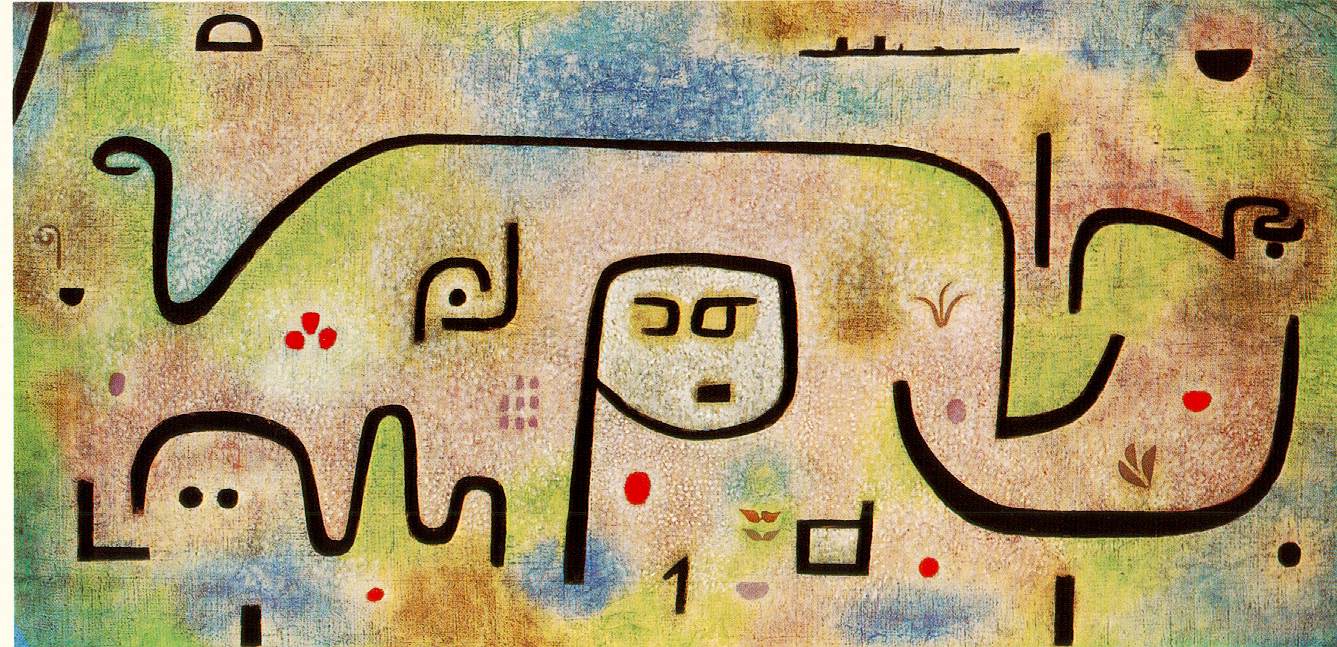
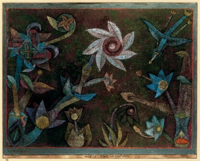
What interests me most about the urge to define and classify (What is and is not Comics? What is and is not Fine Art?) is never the end-points reached (determined criteria, essential characteristics, asserted and defended definitions) but, instead, how the process entails an ever-shifting set of priorities, and reveals, as much through its negations and dismissals as through its affirmations and acceptances, that the very act of classifying items—placing them here and not there—shapes the critical reception and the way that we see and read a work. Classify the 20th Century Swiss-German artist, Paul Klee, as a modern painter who experiments with color and line, and you will regard the 1938 painting, Insula Dulcamara, shown above, as a prime example of such experimentation. This will probably entail situating Klee’s paintings in certain early 20th Century movements, and engaging in comparisons to the work of other like-minded painters such as Wassily Kandinsky, Marc Chagall, and August Macke. But if you change context and ask whether his work shares any affinity with comics, you might find that new analytic approaches and comparisons become possible, and even valuable.

For me, an essential characteristic of comicsness is a certain kind of spareness; regardless of the degree of embellishment of figures and background, a good comic—through its non-realistic, two-dimensional representations—seems to offer “just enough” for me to regard, without delineating an object or a figure so particularly that its uniqueness overshadows its representative function.
 

ware-04

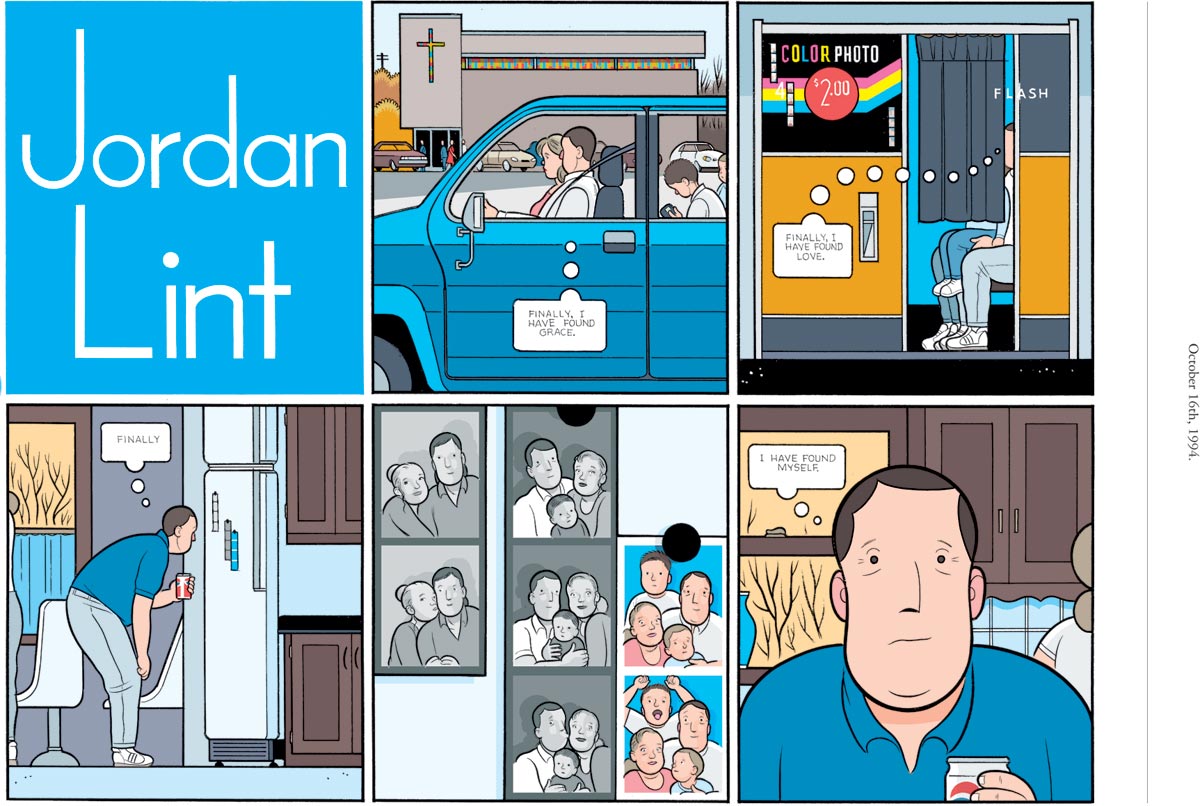
Jordan Wellington Lint, in Chris Ware’s Acme Novelty Library #20,
 

Asterios-Profile

 
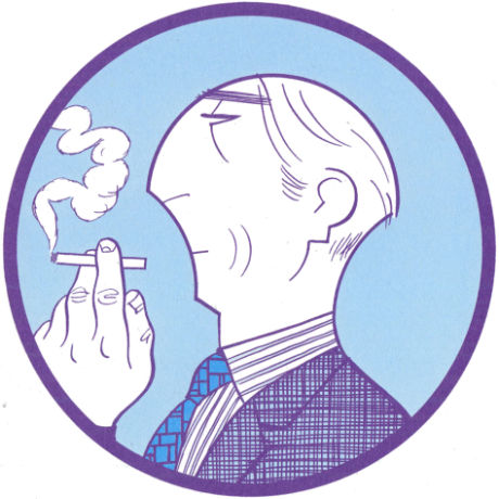
David Mazzucchelli’s Asterios Polyp,
 

wilson-graphic-novel-book-cover-01

 
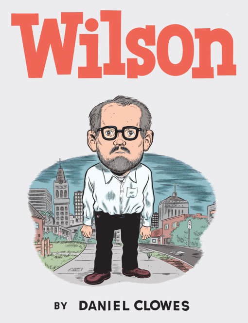
and Daniel Clowes’ Wilson are distinct, but they can also easily be read as a type: the middle-aged man at odds with environment, self-satisfied and self-loathing, simultaneously in search of, and in ironic detachment from, pleasure. Sometimes, reducing a characterization down to its core elements—a few lines, the evocation of a body position and its carriage, a repeated facial expression—can convey a state of being to a reader/viewer more effectively than might a realistic depiction.

For Klee, paring down to these essences was a critical aspect of his work, particularly his studies of nature. He writes:

“[Graphic art] gives the schematic fairy-tale quality of the imaginary and expresses it with great precision. The purer the graphic work, that is, the more emphasis it puts on the basic formal elements, the less well-suited it will be to the realistic representation of visible things.” (The Thinking Eye: The Notebooks of Paul Klee 76).

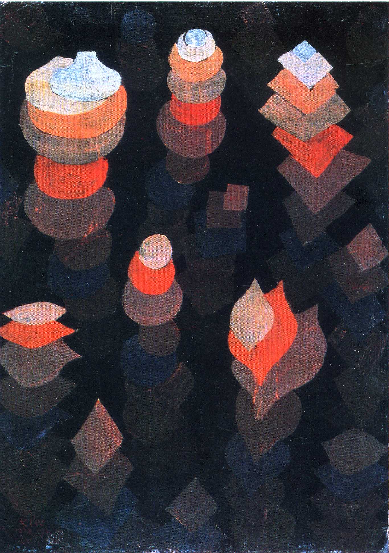
Freed from the demands of realism, Klee can consider how things work and of what they are composed (“The object,” he writes, “grows beyond its appearance through our knowledge that the thing is more than its outward aspect suggests” [63]), as he does here with a single leaf and a group of flowers.
 

IlluminatedLeaf.preview

Paul Klee - Crucifers und Spiral Flowers

 
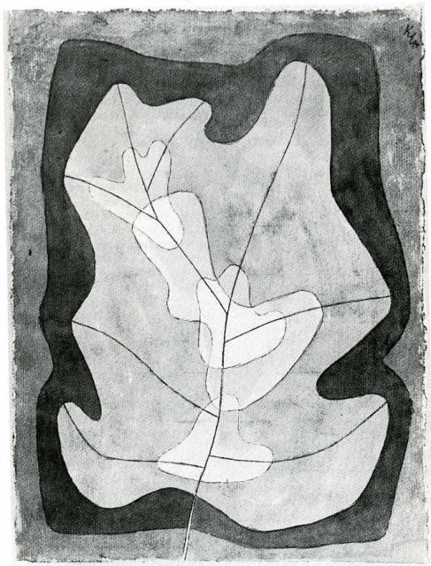
Klee’s flowers have been called primitive and childlike (and, by the way, Klee would have taken no umbrage at these designations; he often argued for the merits of so-called primitive art, children’s art, and the work of the mentally ill and believed they should be exhibited more often), and these two examples should give you some sense of Klee’s commitment to the distilled object. I am reminded of “amplification through simplification”—a key trait of comics for Scott McCloud, but I am also reminded of these lines from Wallace Stevens’ “The Idea of Order at Key West:”

She was the single artificer of the world
In which she sang.
And when she sang, the sea,
Whatever self it had, became the self
That was her song, for she was the maker.

“[Klee’s] flowers,” writes Richard Verdi in his essay, “Botanical Imagery in the Art of Klee,” “remain creatures of the imagination, calling to mind no known species and according instead with Klee’s preference for archetypal forms in nature – for images of organic life that are typical rather than individual and may thus evoke the patterns and principles that underlay much of natural creation.” (Paul Klee: Dialogue with Nature. Ernst-Gerhard Guse, ed. Prestel-Verlag, 1990: 25-26). Key to these principles is Klee’s understanding that dynamic movement and growth can be conveyed in still images, echoing the fact that our limited perception blocks us from seeing just how much may be happening under a seemingly still surface. “Pictorial art,” he writes, “springs from movement, is itself fixed movement, and is perceived through movements.” (“Creative Credo”) In his 1918 “Creative Credo,” Klee considers two examples from life: an apple tree in blossom and a sleeping person.
 

2011_bloom2 photographs-new-york-sleeping-man-48-53-2

 
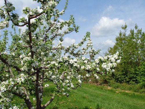
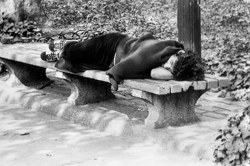
Though we see only stasis, each has multiple types of movement contained within: inside the tree, roots are drawing water and nutrients from the soil, xylem and phloem are circulating nutrients throughout the organism, reproduction is taking place in the flowers, trunk and bark and leaves are growing, photosynthesis is occurring… all at different rates and in different ways. Little of this is visible on the surface. Similarly, the sleeping person’s heart is pumping, blood is circulating, the digestive system is active, the lungs are expanding and contracting, the kidney is processing materials, and the mind is dreaming, but we see only a person who is not moving.

Comics recognize and exploit this notion of contained movement, hidden processes, and internal states. Obviously, the very nature of sequential art suggests this: carried from panel to panel, the reader experiences a dynamic narrative with spatiotemporal verisimilitude (time passing, action occurring, locations changing) despite the fact that the panels and pages are composed of still images. But there is more to this, as Sebastien Conard and Tom Lambeens argue in their 2012 article, “Duration in Comics” (European Comic Art 5:2 Winter 2012: 92-113). Taking Chris Ware’s Jimmy Corrigan: The Smartest Kid on Earth as their focal text, Conard and Lambeens explore the rhythm established by a particular page layout. Arguing that the rhythm of a work teaches “slow-down” to the reader, they write: “It is within the page space that musical repetition and alteration unfolds. As a result, there is the rhythm of the frames: small rectangles repeated and alternating with bigger ones. . . . In short, this page is a game of repetition and alteration of verbal, iconic, and spatiotopical elements. And so, the mechanics of the ‘slow down’ are clear.” (102)

Intriguingly, they posit that single panels—not just pages, or multiple non-contiguous panels linked by iconic solidarity, as Thierry Groensteen would offer– can do this too: “…[E]ven the frame can bulge with many micro-narratives. This means not only that a panel can contain many moments tangled up together, but also that it necessarily has a possible duration that each reader can unfold personally.” (105) It has always seemed clear to me that the panel is not the minimal grammatical unit of a comic, as many contain intra-panel elements that can be looked at independently of the panel, and certainly of the page. An eyebrow in Toufic El Rassi’s Arab in America, a brick in Herriman’s Krazy Kat, a shadow in David B.’s Epileptic or Aleksandar Zograf’s Regards to Serbia: each can be untethered from its panel for independent examination. But Conard and Lambeens are adding another dimension to this intra-panel scrutiny, and it accords with Klee’s sense that dynamism can be present in the still, or as Sarah Wyman puts it in “The Poem in the Painting: Roman Jakobson and the Pictorial Language of Paul Klee,”(Word and Image 20:2 2004: 138-154): “the crystallization of moments in motion.” (139) By suggesting that time—duration—is no more an inherent and fixed aspect of a panel as it is of a comic as a whole, Conard and Lambeens capture the special relationship between work and viewer, the unique and particular stretch of time that is simultaneously evinced by a particular image, and accorded by a viewer to that particular image.

For Klee, this same sense of duration maintains. Wyman continues: “Klee identifies time in his own paintings as implicit in the making and viewing of the works, as well as potential in the forms themselves.” (142)
 

growth-of-the-night-plants-1922(1)

 
So, when we look anew at Klee’s images of the natural world, we begin to see that it is not a single moment in time that is captured, but a complex interplay between the pictured elements and the viewer’s perception of both time and movement, just as takes places between comic and viewer.
 

klee.insula-dulcamara

 
Returning to Insula Dulcamara once more, we can ask a fresh set of questions of the painting. Might we have, as Conard and Lambeens notice in Jimmy Corrigan, “many moments tangled up together?” Perhaps we do; many art historians and critics have offered plausible connections between details within this painting such as the “steamer” in the upper-right corner, the autobiographical P (for Paul?) with a face in the center, the curve of lines that appear coast-like with key moments and aspects of Klee’s life, including an important trip to Tunisia in 1914, his intense study of Homeric tales during the last years of his life, and his excruciating condition of scleroderma. As recently as July, 2014, a persuasive theory for reading the seemingly pictorial elements of lines and dots as Arabic and Latinate letters cleverly distorted and resolving into the words “Paul Klee”—the artist’s signature– was put forth by Chris Pike in his article, “Signing Off: Paul Klee’s Insula Dulcamara” (Word and Image 30:2 2014: 117-130). Pike’s argument is particularly comics-affiliative in that it privileges verbal and visual interplay and notes a movement from letter to letter counter-clockwise through the pictorial space beginning at the central P. This movement must be initiated, traced, by a viewer who sustains his/her gaze for a period of time, just as a reader makes his/ her way around the panels and pages of Chris Ware’s work.

If comics theory can shed light on Klee’s work—and I’ve gestured at only a few of the many ways it does– it stands to reason that it may be profitably applied to other works of “fine art.” This could lead to an expanded notion of comics, yes, but it also might lead to something even more beneficial. If we practice looking at fine art – single works of art–through the lens of comics, we might return to individual comics panels and intra-panel elements with augmented attentiveness and some valuable resistance to the inexorable pull of narrative that drags us too quickly ever onward to the next panel and the next and the next.

Power Records Presents

I first posted this essay on my blog early in 2013, not long after I’d seen Baz Luhrmann’s version of The Great Gatsby. This year I wrote about the Power Records sets again for the zine Towards a Poetics of Man-Bat and for The Los Angeles Review of Books, so I thought it would be fun to revisit this older post. Happy holidays. 
_________

My first exposure to literature—to the “great books” I was asked to study in high school, college, and then in graduate school—came in the form of the book and record sets issued by Power Records in the 1970s.
 

Scan 4

The cover of Power Records Book and Record Set #12 (dated 1974), adapted from issue #168 of Captain America and the Falcon (Marvel Comics, December 1973), with a cover by Sal Buscema (pencils), John Verpoorten (inks), and John Costanza (letters).

 
One of my favorites was #14, an adaptation of Mary Shelley’s Frankenstein written by Gary Friedrich and drawn by Mike Ploog for Marvel Comics. Their comic book version of Shelley’s novel originally appeared in the first few issues of The Monster of Frankenstein, edited by Roy Thomas. Issue #1 has a cover date of January 1973. I was born in late November of 1973.
 

>Scan

Issue #1 of The Monster of Frankenstein (Marvel Comics, dated January, 1973). Cover by Mike Ploog.

 
“It’s fun to read as you hear!” proclaims the copy on the cover of The Monster of Frankenstein, which included a 45 rpm record. At the end of each right-hand page the record would beep, a signal to turn the page to read the next panel. Each set, I realize now, was a radio play. By the late 1970s, radio dramas were already a relic of the 1930s and 1940s, a form of entertainment that had barely survived the 1950s as television took hold as the means of mass communication.
 

>Scan 2

The 45 from my copy of Captain America and the Falcon.

 
The cover of The Monster of Frankenstein #1 is almost identical to the cover of the Power Records edition of the comic. Both promise a story of “The Most Famous, Most Fearsome Monster of All!” And, as drawn by Mike Ploog, Frankenstein’s creature is a hulking, ferocious presence: his enormous, cinderblock hands reach for his creator. The leather straps that held the creature to the dissection table fail to restrain him. A forlorn skeleton appears in the right-hand corner of the image, waiting for the inevitable struggle between the monster and his creator.

Mike Ploog’s granite-colored antihero is not the John Milton-reading, delicate, misunderstood romantic of Shelley’s text. In a famous sequence from Vol. II, Chapter 6 of Shelley’s novel, the creature stumbles across “a leathern portmanteau” that contains “several articles of dress and some books.” These books include Milton’s Paradise Lost, Plutarch’s Lives, and Goethe’s The Sorrows of Young Werther. In reading these books, Shelley suggests, the monster also learns what it is to be human:

The possession of these treasures gave me extreme delight; I could continually study and exercise my mind upon these histories when my friends were employed in their ordinary occupations. I can hardly describe to you the effect of these books. They produced in me an infinity of new images and ideas that sometimes raised me to ecstasy but more frequently sunk me to the lowest dejection.

When it came time in high school for me to read Frankenstein, I knew what I’d be studying. Friedrich and Ploog’s adaptation, despite the superheroic imagery and action familiar to readers of other Marvel Comics from the 1970s, is generally faithful to the novel.

I think this first exposure to literature in comics form shaped my expectations of the other classic novels assigned in middle school and in high school. I resisted The Catcher in the Rye and The Great Gatsby. My father insisted I would enjoy Salinger’s novel if I gave it a chance, but when I asked him to describe it to me, he could not remember the plot.

Most of the novels my middle school teachers recommended were about dogs—White Fang, The Call of the Wild. The Catcher in the Rye, I reasoned, must be about a dog.

Years before I read the novel, I imagined it: a young boy adopts a beautiful, spirited, bright-eyed retriever. They have adventures together. They follow the course of a major American river. They probably hop a train. Or they hitchhike. Later in the novel, the boy and the dog lose each other in a field of corn that sways in bright, clean, Midwestern sunlight. The sky is blue and cloudless as the boy observes his dog walking the field’s perimeter.

I don’t know, I told my dad. I don’t think I want to read about a dog. They always die at the end. Or they get eaten by something.

And, anyway, my family always had cats, not dogs.

The Catcher in the Rye’s oxblood cover was no help. It was blank except for the title and the name of the author. I took this as further proof that Salinger had written a kind of sequel to Old Yeller.

A few years later, I looked forward to reading The Great Gatsby, a novel about a famous escape artist and magician. To conceal his identity, the hero wears a mask and never speaks about his experiences in World War I. The first fifty pages of the novel describe his relationship with Houdini and with Walter Gibson, a pulp writer best known for his work on The Shadow in the 1930s and the 1940s. The Great Gatsby must be some distant relative of Doc Savage, I thought, except Fitzgerald’s hero probably falls in love and, as a consequence, loses his magic powers. He fights off a pack of dogs at the end. There’s always a dog. Also, he wears a gold mask and dresses in purple.

I still cherish my expectations of The Catcher in the Rye and The Great Gatsby. What I imagined each novel would be is still more compelling for me than the stories they tell. Some part of my imagination will always insist that The Catcher in the Rye is about a dog and that The Great Gatsby is about a spectacular, handsome, world-weary aviator and magician, sort of like this:
 

Scan 5

A June, 1972 paperback reprinting of the 1939 debut of pulp hero The Avenger written by Paul Ernst under the Street & Smith house name Kenneth Robeson. Author Lester Dent wrote the popular adventures of Doc Savage under the same pen name.

 
A friend asked me if Allison and I enjoyed Baz Luhrmann’s recent big-budget adaptation of Fitzgerald’s novel. Yes, I said, but I couldn’t bring myself to admit my disappointment that Luhrmann neglected to include the scene in which Gatsby, having failed to win Daisy’s love, dons his cloak of invisibility and vanishes, only to wash up a few days later on the shore of a volcanic island where he and his agents continue their war against various international crime syndicates.

Can a non-existent author be exploited?

Since roughly 2007, a number of artists in the francophone world who made their careers publishing autobiographical comics in the 90s began to diagnose what they perceived as a crisis in autobiography. Jean-Christophe Menu and Fabrice Neaud are the earliest and most vocal critics of recent autobiographical comics, which, they worry, have become too easily appropriated commercially by giant publishing houses while becoming locked into a codified genre that is depressingly safe and inoffensive. The two authors published an essay entitled “Autopsie de l’autobiographie” (2007). In it, Menu characterizes the crisis as “un appauvrissement, une caricaturisation vers une forme convenue de récit pseudo-intimiste tendant au dénominateur commun” (a thinning out, a caricaturization that leads to a pseudo-intimate, agreed-upon, narrative form that always tends towards the lowest common denominator). In the same essay, Neaud expresses concern that autobiographical comics seem to have lost their transgressive power: “[n]ous obtenons fatalement le résultat qui a fait florès: une forme d’autobiographie light, une autobiographie d’entre potes, cool et sympa, qui […] ne fait de mal à personne et pas davantage de bien.” (we fatally obtain the result, which now flourishes, a diet form of autobiography, friendly, nice, and cool, that […] neither hurts nor helps anyone).
 

139611156028674

 
Almost as if to illustrate their point, the Franco-Belgian comics world was shaken by its first highly publicized JT Leroy-style hoax a few years later during the 2011 festival d’Angoulême. Judith Forest, the author of an erotic confessional graphic narrative entitled 1h25, which had received critical acclaim from Arte (an artsy Franco-German television network) and les Inrockuptibles (France’s equivalent to Rolling Stone), was revealed to be a fiction invented by the editorial team at the Belgian press, La Cinquième Couche. What does it mean that Judith Forest, critically acclaimed comics artist, does not exist? 

One could make any number of comments here about how an editorially driven autobiography, absent of an actual autobiographical subject, makes literal the crisis in autobiography. But the reality is even weirder than that. As it happens, the authors of the hoax did so not with the intention of driving up sales but rather that of generating discussion about the value of authenticity and the limits of autobiographical comics. They were, like Neaud and Menu, working to diagnose and treat what they perceived to be a problem in the autobiographical vein of comics publishing in the Franco-Belgian sphere. And I don’t think the editorial team expected what one of them described as “a poor graphic equivalent of literary autofiction” to have such huge market success. They meant for it to be poorly written and formulaic, a comment on how perceived sincerity and authenticity can lead readers to overlook formal and narrative weaknesses. But the French-speaking market gobbled it up, along with “Judith Forest’s” second volume, Momon, and the editors at La Cinquième Couche ended up essentially caught in their own trap while also proving their point. Will they feel compelled to continue publishing Judith Forest’s intimate confessions? And if they do, will the lesson about market-driven codified genres lose its power? Who wins? The editors at La Cinquième Couche or the market?
 

2056698174

 
This all may be old news to readers of this blog, many of whom I know also keep track of the Franco-Belgian comics scene, but one discussion I find lacking in regards to the Judith Forest scandal concerns the association of autobiographical authenticity with male fantasized feminine sexual exploration. In the land of impoverished formulaic autobiographical narratives, the story that is imagined to have selling power is that of the sexually adventurous young woman. The all-male editorial team of La Cinquième Couche may or may not have succeeded in playing the market but whatever they accomplished, they did so on the body of a fantasized woman. If they had added a few lines about the gendering of authenticity to their elaborate critical discourse I might be more inclined to appreciate their hoax, but I am not convinced these editors are able to parse the critique of their porn-hungry male audience from that of the fantasized female author. They seem disdainful of both. Both elitist and misogynistic. And in that landscape of many-layered disdain, it seems the editors at La Cinquième Couche never thought to ask the question of whether their project might be exploitative of Judith Forest as a woman, real or not.

What do you think? Can a non-existent author be exploited as a sexual object? Has anything comparable occurred in the Anglo-American comics scene? Do you perceive a similar crisis in anglophone autobiographical comics? For the fun of it, I conclude by reposting Johnny Ryan’s comment on autobiographical comics published here in 2012.
 

johnny-on-autobio

How Do Comics Represent Ferguson?

2011-12-30_police_application-55db4646

Public outrage over the killing of 18-year-old Mike Brown in Ferguson, Missouri continues to amass its own tragic iconography. Handprints transform the so-called universal sign of surrender into a stronghold of dissent: “Hands up, Don’t shoot.” Hashtag memorials shape the interconnectivity of social media into a pictorial chorus of text: #BlackLivesMatter #JusticeforMikeBrown #ShutItDown. I think about my own son at two years old and already curling his brown fingers into Spider-Man web shooters, and vainly I hope that the right counter-visual will fix what’s wrong, or at least begin to impair what Matthew Pratt Guterl, refers to as “the familiar grammar of racial sight, through which a wallet becomes a gun or a Harvard professor becomes a burglar.”

I also had the chance to consider how the call for racial justice registers through image when I toured the exhibit on “The Long March: Civil Rights in Cartoons and Comics” at OSU’s Billy Ireland Cartoon Library & Museum last month. Among the stately commemoration of landmark firsts – including incredible pages of original art from Pogo, Wee Pals, and Green Lantern/Green Arrow – the corner of the room displaying the editorial cartoons seemed louder and more demanding in their effort to picture the raucous discord of the moment. We can learn a great deal from the way Pittsburgh Courier cartoonist Sam Milai uses the Junior Astronaut Helmet as a visual metonym for the aspirations of a middle-class African American family (below), only months after Neil Armstrong walked on the moon:

In another image, Bill Crawford speaks to fears over militant Black Nationalism in a cartoon that invokes the Ku Klu Klan to set the boundaries of acceptable (and respectable) protest in 1968:

So I’m interested in what editorial cartoons and other comics have to say about Ferguson. What images are deployed to convey the stakes of the debate, the challenge to people and institutions of power, and the costs of the status quo? Nationally-circulated examples can be found in features like Michael Cavna’s recent Comics Riffs column in the Washington Post on “15 of the Most Striking #Ferguson Cartoons so far…” while cartoonist Daryl Cagle is also maintaining an extensive archive on editorial comics about Ferguson on his website, The Cagle Post.

What surprises me when I browse through these cartoons, however, is how unsatisfying many of the images are, or rather how limited they appear to be in their imaginative scope. In the wake of the grand jury’s decision not to indict Officer Darren Wilson for Mike Brown’s murder, many of these editorials seem to recycle the familiar visual codes and contexts of justice denied. The irony of depicting Lady Justice, Uncle Sam, Martin Luther King, Jr., or President Obama with their hands up, unarmed, or being shot is frankly worn thin. (Though I admit to being fascinated by the current trend of depicting King as he appears in his national monument, which gives him the foreboding presence of an establishment figure or institution, rather than a fellow activist.)


Patrick Chappatte’s “Race in America” (above) is much more compelling.  President Obama is depicted in the center of the sepia-colored cartoon silently watching the Ferguson protests on TV. I’m struck by juxtapositions here, beginning with the President’s quiet reflection in an empty room against the noise and chaos of the live feed. While the Oval Office seal and desk mark his distance from the populace, he is seated on the edge of the chair, close to the screen. And finally, the fact the President is a black man watching racial injustice play out before him brings the title of the cartoon into conversation with multiple registers of power and powerlessness. There is contemplation, sadness, or is that disappointment? I like the understated complexity of this piece.

Several of the comics adapt iconography commonly associated with the racism and state-sanctioned bigotry of the American South. Among these, I appreciated Matt Wuerker’s efforts to complicate the way we think about privilege by replicating the familiar “White” and “Colored” entrances of Jim Crow alongside a new door marked “Blue” with an escalator accessible only to law enforcement.

Particularly problematic, however, are the comics that lean on images of the Ku Klux Klan like a visual crutch to characterize the nature of the treatment Mike Brown and his family have received. What role does region play in such a national epidemic of injustice? When I raised this concern among friends, I was reminded of the Klan’s national reach, especially in Midwest states like Indiana in the earlier 20th century. St. Louis, in particular, seems to defy geographic labels and has been called “the most northern Southern city and the most western Eastern city.” Cartoons such as Milt Priggee’s “Ferguson hood” or Rainer Hachfeld’s “Ferguson 24/11” may therefore have a point in placing the Klan hood over Uncle Sam and Lady Justice to condemn white supremacist rule beyond the Mason-Dixon line. But I don’t think the same can be said for a cartoon like “Southern Justice” by Jeff Danzinger (below). He appears to draw a more direct line between racial violence in the South and the circumstances under which an unarmed black youth could be murdered in 2014 without repercussion. It is perhaps because the Klan iconography is so highly charged that the kind of analogy attempted in Danzinger’s piece (or in Bill Crawford’s earlier cartoon) can be too easily muddled.

Finally, I want to call attention to cartoonist Keith Knight who, along with Matt Bors, is producing some of the sharpest satire about race and police brutality today.  (Many of their comics are collected at Daily Kos.) Knight’s work on Mike Brown so far includes “Blacker Friday”, “Sign of Progress?” and “White Riot.” He has been chronicling enough of these incidents that his comics about the shooting death of other black men such as Amadou Diallo, Oscar Grant, Trayvon Martin and Eric Garner are specific to each case and yet, virtually interchangeable. The cartoon at the top of my post titled “Police Application” first appeared in 2011, while the comic below was published in 2003.

Knight never takes his eye off the “familiar grammar of racial sight” and the disservice that this way of seeing does to our nation. In the comic called “41 Shots,” the way he places the famous Tootsie Pop commercial against the relentless visual BLAM of every bullet fired into Amadou Diallo’s body grows more chilling with each panel. Likewise, the hand in the parody of the “Police Application” cartoon is faced with what should be an easy question, but instead makes a devastating choice in refusing to see the humanity of people with black skin. Knight has turned all of these cartoons into a traveling exhibit – “They Shoot Black People, Don’t They?” – to call attention to the need to hold state and local law enforcement accountable, as he explains in this strip. He begins by saying, “every time I do a cartoon about police brutality, I hope and pray that it’ll be the last one I’m compelled to draw…”

So do I.

*

When Are Two Comics the Same Comic (Part V)

Owls

 
Recently, DC Comics has produced a series of re-issues of Batman stories – the unwrapped editions – that present the artwork in pencils-only form. The question I want to explore here is whether these works are instances of the same comic – that is, the same work of art – as the original inked and colored edition. I’ll use the unwrapped edition of Scott Snyder and Greg Capullo’s Batman: The Court of Owls as my example, although the questions raised could apply to any comics in this series.

It is worth getting one potential misunderstanding out of the way from the outset. The unwrapped comics appear, to be reproductions of the original art produced by Capullo. Now, it is tempting to think at first glance that this somehow gives us special access to the art – after all, when we go to comics-as-art exhibits at museums, it is usually the original art (often just pencils, although often pencil-and-inks as well), and not inexpensive floppies, that are hung on the wall for our viewing pleasure. Thus, it might seem like the unwrapped version of The Court of Owls is not only an instance of the same comic as the earlier, inked and printed version of the comic, but that it gives us particularly privileged access to this artwork in virtue of providing us with particularly privileged access to (accurate reproductions of) the original pencil art.

This, however, would be a mistake, I think. When we view original art at a comics exhibit, it is not obvious that we are even experiencing the relevant comic in the first place. Now, I am not denying that the original art pages are artworks, but only suggesting that they are not the same artwork as the comic that we experience when purchasing a floppy at our favorite comics dealer. The reason is simple: individual pieces of original comic art are singly-instanced artworks, while comics themselves are mass-produced, multiply instanced artworks. To mistake one for the other would be to ignore Nelson Goodman’s distinction, formulated in The Languages of Art, between autographic and allographic artworks. Of course, looking at the unwrapped version of The Court of Owls, or looking at the original art pages, might give us additional information relevant to interpreting the multiply-instanced inked-and-colored artwork that we experience when reading the comic. But that doesn’t meant that experiencing either the unwrapped comic, or looking at the original art pages, is a case of experiencing the comic itself. After all, facts about Snyder’s life and personality might be relevant to understanding The Court of Owls as well, but that doesn’t mean that learning about his life amounts to experiencing the comic, or that his biography is somehow a part of the work.
 

Goodman

There is another argument for the claim that the unwrapped edition of The Court of Owls is an instance of the same comics: we might point out that the original inked-and-colored version, and the unwrapped version, tell the same story. I don’t think this strategy works any better, however. In his essay “Making Comics into Film” (in The Art of Comics: A Philosophical Approach, Aaron Mesking and Roy Cook (eds.), Wiley-Blackwell, 2012) Henry Pratt investigates the criteria by which we might justifiably claim that a comic and a cinematic adaptation of that comic (or vice versa) might be said to tell the same story, despite minor changes in plot and the rather more major differences between formal properties and storytelling conventions in the two media. For this project to even make sense, it must be at least possible that a comic and a film can tell the same story. But if that is the case, then sameness of story told is not sufficient for being instances of the same artwork, since the comic and the film are obviously distinct artworks.

This is not to say that I believe that the unwrapped version of The Court of Owls is not an instance of the same comic as the inked-and-colored version. But I do think the question is a difficult one, and that the obvious quick strategies for defending an affirmative answer are flawed. In addition, we do have very different aesthetic experiences when reading the two different versions of the story, suggesting a negative answer isn’t completely out of the question. So, is the unwrapped version of The Court of Owls an instance of the same comic as the inked-and-colored version?


“Like Comics Without Panels”

“How are you with math?”

“What kind of math?”

Math math. Numbers.”

I have a standard response to this question: “I haven’t taken a math course since the original line-up of Guns N’ Roses was together.”

“How about a level?”

“No idea what you’re talking about right now.”

When I began work with my colleague Jason Peot on the comics gallery show that opened at Harper College this week, I had no idea I’d have to employ my rusty math skills. The show features beautiful work from John Porcellino, Marnie Galloway, and Edie Fake. Friends have asked me about my first experience as a co-curator. How do I feel about original comic book pages hanging from the white walls of a small gallery? How did Jason and I select the pieces? What are we trying to say about the relationship between comic book narratives and the fine arts? I find myself wanting to talk instead about dusting frames, centering images, and learning about Plexiglas and L-shaped nails. I even got to sandpaper the edges of the plex we used to cover pages from John and Marnie’s books. Actually, I’m pretty happy with myself right now for using the word plex in that last sentence.

>Gallery Show program cover copy

The cover of the program booklet for our show.

I’ll admit that I’m hesitant to call myself a co-curator. A couple of years ago, my writing students and I attended a lecture by two fairly well-known rock critics. One of them kept talking about “the curated experience.” The critic, he explained, is like a guide in a museum. Don’t we all look for a “curated experience” to know what’s good and what’s bad, especially in the arts? (I guess? Maybe? I don’t know.) He then asked the students in the audience how many of them liked the new Radiohead album. A room of vacant, late adolescent stares. “None of you listen to Radiohead?” Later that morning, one of my students confided in me: “Radiohead is music for old people.” I think she meant me, and she was right (right about the oldness but not about my favorite bands. I’ve never been much of a Radiohead fan. Or Wilco or Tom Waits or any of the music I’m supposed to like. I do enjoy the Radiohead song about the fishes, though). The phrase curated experience brought back a memory: my sister as a kid touching a Warhol on the wall of the Yale University Art Gallery in New Haven. The guard yelled at her. She withdrew her hand but she continued to stare at the painting. That image of her is fixed. In fact, it’s more durable than my memory of the Warhol. A brief gesture, a touch. I wondered if Jason and I might provide that moment of wonder for our students.

Our idea for the show is driven by two ideas Edie Fake has expressed in recent interviews. The title of the show comes from a conversation with Megan Milks published in Mildred Pierce in 2011, not long after Secret Acres released the complete Gaylord Phoenix. “I think I’m interested in space without panels, I guess, or things that are like comics without panels,” he explains. “I hardly use a space break on my pages. Things just kind of move from one thing to the next” (Milks 6). I picked up Issue #5 of Gaylord Phoenix at Quimby’s in 2010 because of the cover. The blue clouds and flowers reminded me of a still from a Jack Smith film. I carried Issue 5 in my messenger bag for the next several weeks. It was as magic and dear to me as that phantom memory of my sister and the Warhol. I wanted to live in the spaces inhabited by the book’s protagonist. If I carried it with me long enough, I thought, maybe the Court of the Gaylord would manifest itself, as lovely and ornate as it appears in the book itself. I also loved the colors, gold and orange and black and red.

Space without panels.” It could be a line in a poem, a note jotted in the margins of a commonplace book, or one of Brian Eno’s Oblique Strategies.

GP cover

The cover of Gaylord Phoenix Issue 5 (2010).

The second quotation that shaped our vision of the show is from another interview, this time from early last year. Edie’s show Memory Palaces, now also a book from Secret Acres, debuted at the Thomas Robertello Gallery here in Chicago last winter. In April 2013, Edie spoke with Thea Liberty Nichols about the show and about his artistic practice:

For as long as I’ve been an artist, I have felt part of communities where bartering and collaborating are critical parts of growth. Cross-pollinating is how ideas get spread and get expanded upon. Sharing what we can is how we help each other thrive on this messed up planet.

When Maryellen in our marketing office at school was editing the gallery program, she asked me for a quotation to introduce my essay, so I sent her a few choices. We both liked this one best. The community described here, the one Edie also talked about on the closing night of Memory Palaces when he discussed the influence of Samuel R. Delany’s Times Square Red, Times Square Blue on his art, is the community we’ve tried to imagine and celebrate in our gallery. A space of welcome, maybe a space of return. Always one of possibility and of love.

Before these possibilities could take shape, however, and before we could frame and hang each of these drawings, I had to bring a change of clothes. I started teaching when I was in my early 20s as a grad student at the University of Connecticut. I learned quick that to earn the respect of my students, especially the ones older than me, I’d have to dress up. This was ok. I’d gone to Catholic school for twelve years, kindergarten through college, so I was used to wearing a shirt and tie (my first day of college, I didn’t know what to wear. I felt overwhelmed. I decided to dress like one of The Replacements on the cover of Let It Be from 1984. Chuck Taylors and flannel. Cheap and simple). But, as I cleaned the frames for Marnie’s pages from In the Sounds and Seas, Volume I, I realized I’d made a mistake. My tie was getting in the way. I had plexi dust all over the place. I looked like an accountant or maybe (if I was lucky) somebody’s tour manager. The next day, I looked like Tommy Stinson (only not as cool, and only after I’d finished teaching my classes).

photo (21) copy 2

Two pages from Marnie Galloway’s In the Sounds and Seas, printed on large sheets of fabric (please note: hammer not included).

That was the day Jason figured out a system to frame and hang most of the loose pages, including selections from King-Cat Comics and Stories No. 73. I finally admitted the truth: “I’m not good at math.” He measured and leveled each image with meticulous care. We drilled pilot holes, a few of which were too wide for the thin, delicate L-nails that hold each piece of Plexiglas, each drawing, and each backing board to the wall. We had some wire left over from one of the frames. Maybe we could use that, wrap the nails in it? That would might give the nails some friction, Jason said. It worked.

Now John’s and Marnie’s images appear to float behind the clear, custom-cut pieces of clear plastic. Lights from the ceiling cast faint shadows.

A pedestal in the center of the gallery is covered with copies of Memory Palaces, In the Sounds and Seas, King-Cat. Leaf through the pages, read a few stories, but please return the books to the pedestal so other visitors can read them, too.

When I was in grade school my mom took a few art classes at Naugatuck Valley Community College in Waterbury, Connecticut, just a few miles from our house in Oakville. I’d sit and watch her draw still-lifes and perspective studies. I especially liked her portraits, drawn with Berol Turquoise HB pencils, each one so precise and perfect that, the next time I looked in a mirror, I saw more clearly the shape of my face, my ears, my eyelashes, my nose, my mouth. Maybe it was that sense of touch again—the feel of the sketchbook’s white pages covered in pencil and eraser shavings. These memories, like the one of my sister, flooded back as Jason and I hung the final set of drawings last Thursday.

photo (21) copy

On one wall of our show, you’ll see Edie’s original illustrations for Wallace Stevens’s poem “Floral Decorations for Bananas,” from the “Illustrated Wallace Stevens” roundtable right here at The Hooded Utilitarian, July 26, 2011. This series of drawings was also published as a zine in 2011.

And here’s the best part: for the next few weeks, when the gallery first opens in the morning, and before most of our students and other faculty have arrived at school (I commute from Chicago, so I’m on the road and in my office by 6 am to beat the traffic), I get to spend a little time with these precious and fragile works of art. If you find yourself in the northwest suburbs of Chicago in the new few weeks, look me up and I’ll give you a tour. But I don’t promise that I’m any better at math than I was two weeks ago.

Like Comics Without Panels: The Visionary Cartooning of John Porcellino, Marnie Galloway, and Edie Fake runs from now until November 13, 2014 in the Harper College Art Exhibition Space. Harper College is in Palatine, Illinois, just northwest of Chicago. All three artists will join Jason Peot and me for a Q&A on Thursday, October 30 from 12:30 until 2:00 pm. Contact me or visit this link for more details. The Q&A is free and open to the public. If you can’t make it to the show, email me and I’ll send you the program which includes images from the gallery and a short essay.   

>photo (21)

Another photo from the gallery: selections from Galloway’s In the Sounds and Seas, Volume I and Edie Fake’s “Stay Dead” (2007)

Work Cited: Milks, Megan. “Edie Fake’s Radical Bloodlust: The Comics Artist on Gaylord Phoenix, Queer Cartography, etc.” Mildred Pierce Issue 4 (February 2011): 6-10. Print.

Thanks to Allison for suggesting a way to approach writing about the gallery. Also, part of this post was inspired by Marnie Galloway’s fabulous essay on her dad. Read it here, and also pick up In the Sounds and Seas, Volume II, which was released last month.

How Should Tom & Jerry’s Ethnic Humor Be Packaged Today?

drw-mammy2shoes

Amazon Prime and iTunes have included a warning with their packaging of Tom and Jerry – Metro-Goldwyn-Mayer’s series of theatrical cartoons starring Tom Cat and Jerry Mouse. From 1940 to 1952, an African American female domestic servant appeared in episodes, and in that period the characters often appeared in blackface. These images undoubtedly are the reason why the warning says that the cartoons may contain “ethnic and racial prejudices that were once commonplace in American society.”

The warning has its detractors. Some of them find the disclaimer unnecessary because to them Tom and Jerry is not racist, and others dismiss the warning as another example of contemporary excessive political correctness. The problem is that detractors are using personal feelings to try to stop a potentially useful discussion about ethnic depictions in American entertainment. Their knee-jerk “It’s not racist” and “liberal political correctness” reactions are only opinions that disregard the facts concerning the cartoons.

In my book The Colored Cartoon: Black Presentation in American Animated Short Films, 1907-1954, I chronicled the servant character’s development from her debut to her final episode. I noted that in her twelve years in the series, MGM never changed her dialect. The writers of the scripts gave her the same mis-conjugated verbs and spelled her mispronounced words exactly the same throughout that period, refusing to develop her at all. Also, none of the scripts give the character a name. She is the “maid” or “colored maid,” and the denial of an identity is part of her lack of development over a decade’s time.

I also looked at the blackface scenes in MGM’s cartoons, most of which have a character darkened after an explosion. Again, the scripts are stereotypically charged, using phrases like “looking like a pickaninny” and walking “a la Stepin Fetchit.” Thus, the MGM artists made these cartoons with ethnic jokes at African Americans’ expense very much in mind. Even one of the series’ animators I interviewed called the maid an “outright racist cartoon character.”

tandj1

As for the cries of modern political correctness, it’s not that modern. In my book I note that civil rights groups protested the showing of Tom and Jerry episodes in theaters as early as 1949. They claimed that the exhibitions of the maid character harmed the minds of children, and they occasionally convinced theater-owners to withdraw the cartoons.

Such protests became so impactful to Hollywood that MGM eventually became proactive about the maid. The studio reanimated the 1948 episode The Little Orphan in wide-screen format as Feedin’ the Kiddie in 1957. The original episode featured the maid, but the remake omitted her entirely. Then in 1965, MGM prepared the series for Saturday morning network television by reanimating all of the maid’s appearances. The studio replaced her with a European American maid character in all of her scenes. In recent years, the original scenes returned for cable television broadcast on Cartoon Network and  Boomerang, bur MGM overdubbed Lillian Randolph’s stereotyped vocal performance with Thea Vidale’s dialect-free delivery.

_77912574_tomandjerry

The 2014 warning is just the latest attempt to make Tom and Jerry commercially viable in a changing ethnic American landscape. The disclaimer is a new approach in that it does not censor or gloss over but instead informs. It allows an opportunity for education about the films, while the detractors get to enjoy the uncensored original episodes.

Does the warning do enough to address the ethnic content of the series? Are other solutions besides disclaimers possible?