Clarity and Intent

A few books by some of comics’ (male) best and brightest of several eras. Some of these have been out for awhile, but I only just got around to them.

_____________________________________________

Jon Fury in Japan

Alex Toth’s only extended stint on a continuity strip was done for his post newspaper when he was stationed in Tokyo in the Army in 1955. Jon Fury was his first effort writing for himself. While he could brilliantly interpret the scripts of others, Toth faced nearly insurmountable difficulties to construct his own. He tried to emulate Milton Caniff’s narrative mastery, but he certainly didn’t “get” one of Caniff’s greatest assets: his use of female characters of depth and agency. Toth is strictly old boy’s club, but truthfully his male characters are not much better defined. The storylines feel forced and they are riddled with overlong exposition to the extreme.  Despite these drawbacks, his art is highly developed and constrained only by the sheer weight of text; these are dynamic, elegantly designed episodic pages in the Caniffian Sunday format. More than any of his contemporaries, Toth reached for clarity of comics expression and here he exhibits his mature style in a serialized form, where weekly deadlines dissolved the hesitations dictated by his perfectionism.

The late Toth did the work for black and white reproduction and so that is how it is seen in IDW’s recent Toth bio Genius, Isolated. The original art  was done in a process similar to mimeograph, basically drawn directly on waxy plates, which quickly begin to degenerate in the process of printing, even in such a small print run as these strips had, with the result that a complete pristine set is probably impossible to put together. The art restoration in the panel below from the slick color comic book version, Jon Fury In Japan, is definitely better than it is in IDW’s hardcover bio. In both recent versions, there are many minute amendments to the drawings by other hands; these are more pronounced in the color comic.


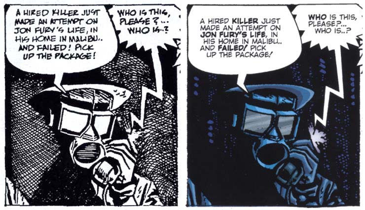
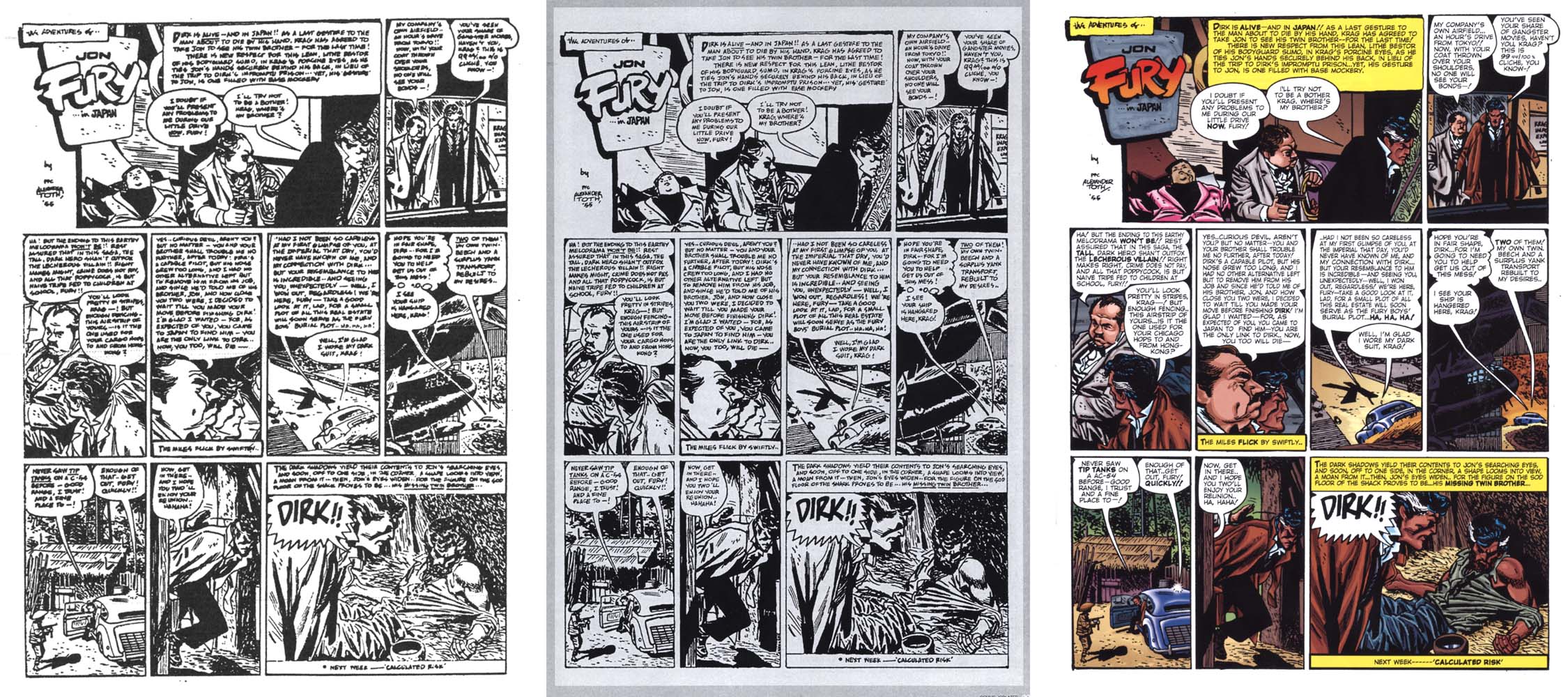
One panel’s restorations: left, from IDW’s version, right, from the comic.

IDW’s reconstruction of Toth’s original lettering of the later pages is readable, but in the comic book version, Toth’s lettering has been removed on most of the pages, which are re-lettered with a cold and inconsistently scaled digital font. This may read easier, but the artist’s hand is lost. And, emphasis via bold type has been added to Toth’s dialogue. As well, if art done for black and white must be colored, Toth’s is better suited to flatter hues, a four color comic book or Sunday strip-like color. The example shown above is atypical; overall, the too-plastic fades and color modeling feel anachronistic to the period piece. Plus, although effort is made to color the protagonist as a native American, many color decisions are counterintuitive, for instance in the pink jacket of the thug also seen on the cover.

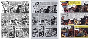
Left: xerox from the original printing. Center: IDW version. Right: color comic version.

Granted, the pages needed repair, but work so pared to its essence is subverted by overt interference, much less the overkill of the comic package. Fortunately, Jon Fury in Japan also contains Toth’s final interview, significant for its emphasis on his animation career. Other than a few questionable photos, this has a good selection of panels by Toth and his influences and the coloring imposed on these is more appropriately restrained. (Paul Power, $11.00)

_______________________________________________________

“Red Tide” in Dark Horse Presents #3

Chandler: Red Tide was released to the  book trade in 1976 as the first American original full-color mass-market graphic novel. It represents Jim Steranko’s longest, most ambitious auteur effort in the comics medium to date. The two-panel-a-page layout with dual type blocks underneath is constructed in such a way as to be unusually immersive; in the act of reading, the obviously separated art and text come to simultaneous apprehension. The art was drawn in pencil without feathering and with minimal holding lines; Steranko’s excellent comics-like color separations often define the forms. The original book has a pulpy chiaroscuro feel that echoes the great noir films to which the story effectively pays homage. The representations are likewise mostly typical of the hard boiled dick genre; for instance, the protagonist and the leading lady have a prior history and her passion is reignited when she senses “something more than anger behind” his slap. On the other hand, there are appearances by a lesbian cab driver.

A reissue of Red Tide enhanced by the author has been looming  for years and now here’s a taste with an excerpt of the first chapter, in Dark Horse’s slick house anthology title. Steranko expands the possibilities of digital color while reiterating that cartooning devices like holding lines, heavy outlines developed to contain badly-registered color inks, are no longer essential with tight full color printing. He transforms and rebuilds his images into layered digital paintings that greatly resemble the airbrushed Art Deco graphics and advertising art of the period depicted. There is an impressive depth to some of the images that far outstrips what he was able to do in the method of the first printing.  He is able to amplify the visual connection to Chandler’s milieu with contemporary tools while exploring the intrinsic qualities of those tools with imaginative verve.

Perhaps this new version puts undue emphasis on the images, in terms of the time involved in the readers’ perception of them relative to the reading time of the text. The expanded density of the art as well as the altered justification of the type blocks conspire to disrupt the 2/1 art-to-type ratio which is key to Steranko’s immersion formula, one of the most important virtues of the book.

Still, any new (or newish) comics by Steranko are welcomed. What he did with these pages is very interesting and no doubt the completion of the augmented edition will be impressive. I can see the amount of time and effort he has to put in to finish the whole book to the level of this excerpt though, and so perhaps in the meantime, Red Tide can be put out in a nice facsimile edition so it can get the attention it has long deserved and he can finish this new enhancement as he will, without pressure. (Dark Horse, $7.99)

_______________________________________________________

Is That All There Is?

I recently read a review of Joost Swarte’s collection of most of his comics work that complained of the scale of this small hardcover, but I think it has a jewel-like quality. It is a beautiful little book that one can delve into periodically to simply enjoy Swarte’s exactingly rendered, beautifully colored comics pages.

The art is the thing here. While there are some engagingly animated sequences, the stories seem mostly clever, sometimes flimsy cause-and-effect variations created as supports for Swarte’s meticulous cartooning science. As with Toth, the more interesting aspect of the work is the way that the art manifests the ideas, such as they are—Swarte is a master of page architecture and image construction and he also has a tendency to reflexively expose his practice, which is why he is so revered by comics structuralists such as Art Spiegelman. The Franco-Belgian clear line derived from Herge and his forms of representation have their most refined outlet in Swarte’s short absurdities, reprinted from his Modern Papier and a host of other comics periodicals here and abroad including Metal Hurlant, Charlie and Raw. (Fantagraphics,$35.00)

_______________________________________________________

Madwoman of the Sacred Heart

I love the recent translation of Alexandro Jodorowsky and Moebius’  Madwoman of the Sacred Heart. A black and white version published in the USA in 1996 contained only the first two parts (it was completed in 1998). This  full color trade paperback of the complete Madwoman shows the best efforts of both men, far outstripping their earlier collaborations on The Eyes of the Cat and The Incal trilogy. Jodorowsky’s scenario is hilarious, an incisive and compulsively readable satire of sex and religion, for starters, that offers Moebius the opportunity to draw his single most immersive work of comics storytelling. The seemingly effortless flow of Moebius’ panels here rivals the reduced clarity of the best of Alex Toth’s 1950s Dell comics.

The book is a prime example of text and art reading together as equal forces at the service of the narrative. There are plenty of places for writer and artist to shine, but one is rarely brought out of the narrative to marvel at the construction, even when it frequently veers to philosophical discourse or transcendent visualization. I usually complain if Moebius does not do his own coloring, but here several colorists did an effectively punchy but tasteful, organic job of it; even if it is digital, most of the color looks like painted bluelines.

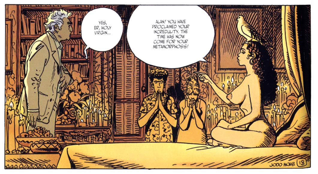
My first impression was that it takes some considerable suspension of belief to accept that the Heinleinesque protagonist (who is apparently an amalgam of the authors) holds such sexual magnetism for beautiful young women (and men), but Marguerite informs me that the French have such high regard for their intellectual heroes that an elder philosophy professor from the Sorbonne might indeed be considered quite sexy. At any rate, Jodorowsky and Moebius’ trangressively libidinous epic is played out so beautifully, without ever feeling forced, that the ride is taken willingly and has many rewards. (Humanoids,$24.95)
_______________________________________________________

Paying For It

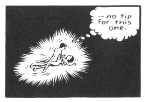
Chester Brown has represented freedom to me for such brilliant improvisations as his original complete version of Ed the Happy Clown and The Little Man and I also admire his Biblical adaptations and Louis Riel—but Paying For It is a constricted,  joyless business. As a comic by Brown this has a certain mastery of form and the art is technically as good as ever, but the reader barely notices it, because to a large degree the art serves only to drive the reader through the book. It is primarily a reading machine and one is driven to focus on what is being said in Chester’s voice in the form of a memoir.

I would have little interest in reading such a john’s-eye view in prose form and as johns go, I am not made to feel sympathetic to Brown. He frets briefly about the possibility of an undercover sting, but where prostitution is a crime, it is one that prostitutes are prosecuted for, not johns. He worries a lot about being robbed and the expense, the money. He is concerned about girls that look too young, but for his  liability alone, one assumes, because he can hardly tell if they are of the age of consent, or not:  he declines to have sex with any women above a very young age, although he himself is forty and stretched a bit tight, at that. I’m no oil painting either, but really, it can’t be much of an aesthetic experience for the women that have to deal with him and they could be his daughters.

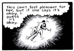
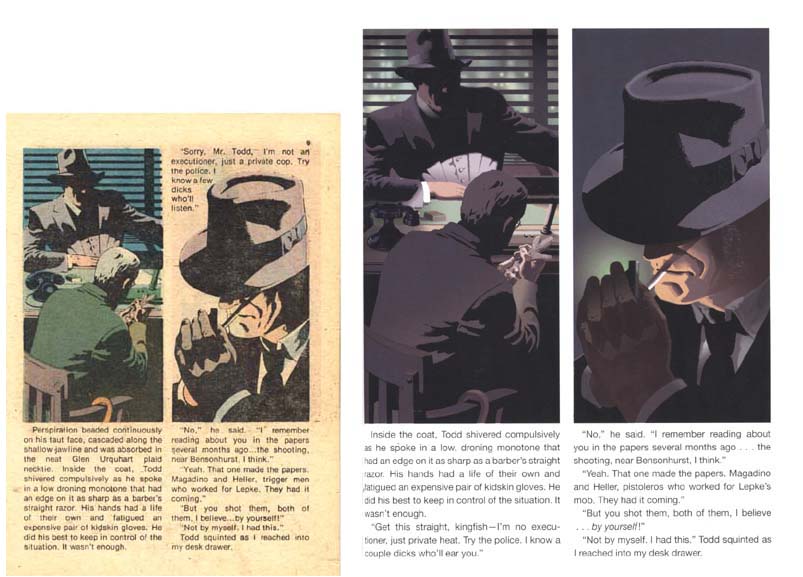
The exhibitionism here is similar to his ruthlessly honest explorations of his teenage years in the later Yummy Furs, but here, the whole gives off an aura of creepiness on the part of its author. Sex is to Brown reduced to a physical function, it’s all about him and his pleasure or release. Brown doesn’t draw the faces of the prostitutes he visits—well, except for panels such as those I scanned. Ostensibly for the reason of preserving their anonymity, his ploy effectively dehumanizes and reduces them to 3-dimensional versions of the bodies of the Playboy playmates he masturbated over in his youth. He essentially jerks off with real people! Actually, drawn as cartoons, they again become 2-dimensional and there is little variation to distinguish the progression of faceless women at all.

I don’t dispute the case he makes in his comic and annotations for the escorts, but the show of concern he makes for their circumstances. One gets the sense that Brown wouldn’t care about or do art about any of it, if he wasn’t trying to justify his involvement. In practice he seems devoid of empathy or affection. We are treated to many panels drawn from an overhead, Brueghelesque perspective of Brown banging away hell-bent for leather, getting his money’s worth. He can motivate himself to solicit prostitutes and then do the years of work involved in a graphic novel and share himself with the world, but he can’t get it up to fight for love. All the effort that goes into a relationship…who needs it?  In this case, listening to his friends might have helped; they all try to give him good advice. But, as his pal Seth says, “Chet’s a robot.”

He’s also a cheapskate:  he’s not the one “paying for it.” We who buy the book are and in addition, this thing was subsidized by generous grants! It’s fucking depressing. (Drawn and Quarterly, $24.95)

_______________________________________________________
“Amber Sweet” in Optic Nerve #12

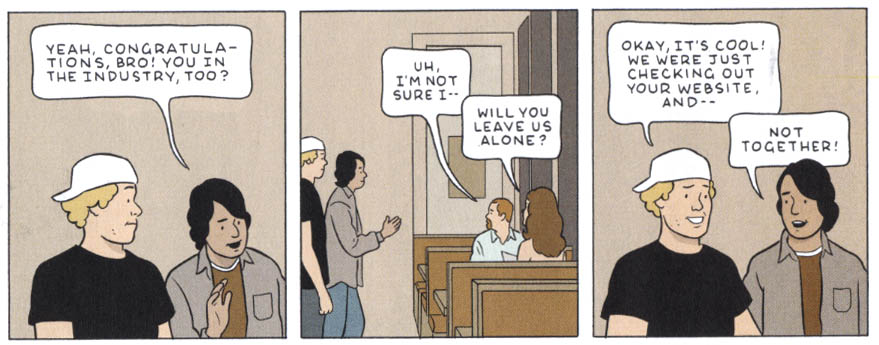
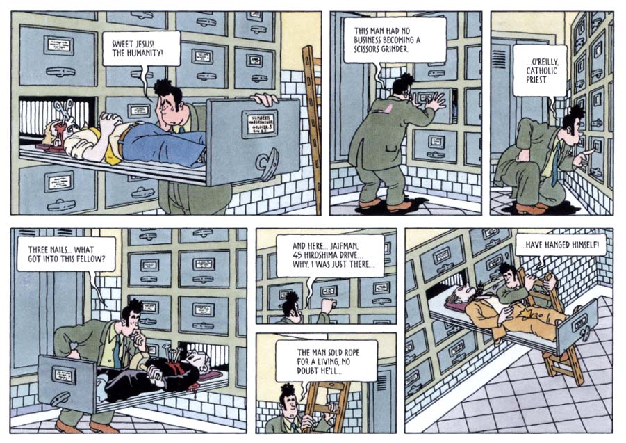
Adrian Tomine uses his work to thoughtfully explore multicultural and  interpersonal relations. His work exemplifies the reader immersion and simultaneous cool remove that a refined visual orchestration can lend to a narrative.  “Amber Sweet” is an expanded version of Tomine’s great piece from the massive Kramer’s Ergot #7. His concise and elegant drawings and color give a measured, airy tone to his ironic tale of the torments endured by a young woman because of her resemblance to a well-known porn star. When they meet, the contrast is telling: the real Amber is self-possessed; she handles her admirers with a blithe “Hey! What’s up?” or poses with them for a picture, butters them up a bit and then brushes them off. It is her choice to do what she does, but her choice has inadvertently isolated her doppleganger, who is continually harrassed by aggressive men. This destroys the relationships of “not-Amber,” whose eventual distrust of all men is often justified. This is underlined by Tomine in the scene below, in which two young men impose themselves upon her, denying the implications of their simultaneous wanking while assuming her companion’s complicity in their homosocialism. (Drawn and Quarterly, $5.95)


More is Never Enough, or Kant’s Numerical Sublime

Ah, the Kantian sublime stands a great craggy edifice,  its  very mention sends shudders through the soul. Well not so much…however, talking about Kant is always fraught. The very name “Kant” invokes the sublime as one tries to wrap one’s head around his prolific ideas. Thus, to discover relationships on the comic page from the mind of the great Kant, it seems like a good idea to break his ideas into panel-sized pieces.

Published  in 1790, Kant’s Critique of Judgment  proposes two aspects of the sublime, the numerical sublime and the dynamical sublime. His rigorous mind comes to these two forms from his discussion of aesthetics and they represent for him an attempt to grapple with the sublime. Even though the sublime experience happens in the body, technically the sublime is our experience of what we see, Kant offers a diagnosis of what might trigger an attack of the sublime. I defer to medical, psychological terms because the sublime is a disruptive force that disturbs the human mind and body. The sublime disturbs order, well-being, bienseance in the Enlightenment sense and represents a charged and potentially dangerous experience.

The feeling of the sublime is a feeling of  displeasure that arises from the imagination’s inadequacy, in an aesthetic estimation of magnitude, for an estimation by reason, but it is at the same time also a pleasure, aroused by the fact this very judgment of the inadequacy, namely, that even the greatest power of sensibility is inadequate, is (itself) in harmony with rational ideas, insofar as striving toward them is still a law for us.

So for those thrill seekers who love to be disturbed, disrupted and knocked out of complacency by comics, the question is where is it and how can I get more of it. For those who like to gaze at the stars and contemplate the enormity of space, actually you are engaging in both of Kant’s sublimes simultaneously, the dynamical unbounded, immense and the numerical that tries to count the stars and is blown away by the impossibility of the task.

At present, I want to count stars if you will, or more properly consider the improbability and achievement of representation of the numerical sublime in comics.

All that being said, it seems that there are self-evident reasons for artists not to want to draw crowd scenes, but there are some that thrive on the creation of minutiae. Phillipe Druillet for example undertook the task of representing Gustav Flaubert’s  Salammbo and the results are stunning.

In this image, the ziggurat panels and small inserts of emblems, add order and assistance to a series of complex, visually stunning images that refuse easy assimilation.

Druillet orders the panels so that the densely articulated depictions of soldiers become patterns. The patterns take on aspects of movement as the viewer struggles to rest his focus on any single aspect of the dense and lushly colored planes.  The panels allow us to fall into these impossibly detailed surfaces and  while his gesture is conceivably  an attempt to contain the sublime, we even add into the landscapes because we resolve the problem of the numerical sublime with an articulation of infinity.

Moebius his contemporary, also works with scale and prolific figures. This overhead spread literally gives the reader a birds eye view of the sprawling action. The detail draws the viewer into the depth of the landscape.

Further, Moebius constructs space in such a way as to open geographies with limitless potentials. At the same time, his vision manages to bring a plausibility to bear that gives a substance to the  fearsome scope of his world.  This image has a life outside of the panels.

His influence is readily obvious in this piece by Geoff Darrow for film  “The Matrix”. The narrative of the film suggests the  numerical sublimity of alternate universes or of unleashed and uncontainable technology. Darrow’s image suggests an unnerving numerical sublime.

Darrow’s work is compelling in its detail. Yet, a strange thing occurred when I began to seek the numerical sublime depicted in comics, the examples that I thought I recalled, were not there. Apparently, my imagination had filled in the blanks. I was surprised to find that the imaginary capacity to see  a more complex world in one’s imagination is not limited to words and reading, but it seems we are able to do this with visual data as well. We are able to store that imaginary information as though it we had seen it. I’m sure the experience of looking for an image that “one is sure is in the comic but just isn’t there when you look” is a commonly shared event.

I definitely thought there were more figures in this Frank Frazetta image for example, the movement and depth of field left me believing that I had seen more than was actually there.

As it turns out this is incredibly useful to the overworked artists who dread the hyper-multiple.  Milton Caniff shares this story about how he dealt with the the demand for the impossible:

The writer comes in sits down, sits at a typewriter and types out this paragraph to direct the artist. The artist comes in and has to draw a man and a woman standing on a windswept hill and 10, 000 Chinese communists coming up with drawn bayonets. Now when you’re the artist and the writer you do the same scene, but you show a fairly close up shot of the hero and heroine, some wind lines and clouds behind with a few leaves going by to show a windswept hill. The man has his arm around the girl, pointing outside the panel saying: “ Look! Here come 10,000 Chinese.” That’s when you’re writing. and drawing. And that’s to make the point.

SABA: You’re making it easier for yourself, is what you’re doing, (laughter).

Caniff: And that’s an exaggeration of the point, that the artist can control it. If he wants to he can draw the 10,000 Chinese soldiers, but usually he finds a way out.

All the same, Caniff takes the challenge:

These roiling compositions are rare, but notwithstanding, their accomplishment stays with the viewer long after they have been seen. It is as if they gather exponentially from the details and the superfluity that they offer.

Artist Tony Salmons offered pithy comments from his perspective in an interview with James Romberger about an artist’s  challenges when representing crowds :

Salmons notes three seemingly innocent words often seen in scripts, ‘a crowd gathers.’ Salmons says, ‘A writer scripts or merely plots this line down on paper and goes on to the next scene. I spend an entire day researching, casting, lighting and acting out that crowd. Is it an opium den? SF or Hong Kong? Texas? German beer garden? Rainbow room at 30 Rock? What kind of crowd? If I do it with total commitment the considerations can go way beyond this. And the writer’s contribution is 3 words, ‘A crowd gathers.’ No matter what the story requires, the artist must make it so.

Salmons is clearly up to the task. His ability to work with space and depth, through black spotting and line work shows off his skill in this sublime image. Movement in the figures seems to amplify the effect in the depiction of a multiple figure composition.

James is also able to produce a crowd:

There are artists who it seems are born to create numerical chaos. James’ image was created during the LA riots in 1992.  The numerical sublime seems to lend itself to revolutionary statements, both literally and figuratively. Consider how radically Gary Panter’s proliferating, unmoored marks assaulted  the parameters of comics.

This type of chaos; of uncontained, irrational imagination stood in direct opposition to the world of corporate comics. Yet Panter was not the first to explore the possibility of overloading the senses to fracture the present from its traditional past. The sixties brought us S. Clay Wilson and other underground artists who filled the page with so many marks in the attempt to  literally “blow our minds.”

It is hard to think of Captain Pissgums without his disturbing cohorts, or to image the revolting  Ruby without her subversive dykes. Wilson, by the sheer volume of  his outrages, insists on a dislocation from the anchors of  America’s received concept of civilization in the sixties. More is always more. These images enter our brains and continue to propagate, because the sublime works to replicate itself. The sublime is sublime, it just keeps adding to its own being.

Jack Kirby too played with sex and the sublime, recognizing the sensory, even erotic power of its energy. For him in the image below, the sublime offers as a site of irony, perhaps bizarrely preemptively and philosophically connected to the vision of  Wilson:

In Kirby’s vision, the senses demonstrated through a mania of eroticism, threatens the virility of Captain America and thus  destabilizes the rationalist  face of order to bring out a collapse of social coherence. While the gesture is not one that many feminists would at first relish, it is nonetheless  interesting for  its alignment of feminine energy with a romantic, revolutionary world.  It is a world slipping out of control.

The numerical sublime is exciting and dangerous, precisely because it is uncontainable. It is hard to achieve, yet ultimately desirable as a destination for many comic artists who seek to escape the confines of the panel and the comic pamphlet. Bernie  Krigstein discusses a project that he would like to undertake with John Benson in a special 1975 issue of Squa Tront and immediately falls into the abyss of the sublime as his concept multiplies itself into infinity:

BENSON: And you would adapt the entire novel?
KRIGSTEIN: Yes; maybe hundreds of pages, or whatever the number of pages it would run to. But as I look at these sample breakdowns, even then I didn’t do it the way I would do it now. I still didn’t give enough space to the pictures. I would make it even much more pictorial in proportion to the number of words that it has here. I’d expand this passage here, where he’s running desperately; I’d expand it much more. And this one passage here, where the regiment is swinging from its position, could practically be a story in itself.
I’d have broader monumental breathtaking sweeping panoramas of the armies. I’d want to convey the notion of the enormity of it and then the contrast of the microscopic things going on inside of this enormity. And I would expand these sequences in order to elaborate on the microscopic things happening to where they’d have the character of deep stories. And the whole thing would be a connection of many many stories into one huge monumental panorama. These roughs still do not convey my real approach, what I would do right now. But some parts of it I find very satisfactory anyway.
BENSON: Actually, you’d have to excise some portions of the novel so that you could treat other portions fully the way you wanted to.
KRIGSTEIN: Exactly. But on the other hand, while cutting out stuff from one point of view, I would insist on an open-ended expansion from an editorial point of view. It might take 100 pages; or I’d like to have the freedom to take 1,000 pages for the same amount of text. I’d like to have no limit on the amount of space for pictures. But now I’m fantasizing; what I’m saying now is pure fantasy.
That would be a monumental enormous project. It means that every single one of these panels has to be a picture, a real picture, without compromising. I couldn’t rely that much on close-ups, either. I’d make it much more pictorial.

Krigstein never manages to enclose the scope of his discussion or one imagines, of his project.  Its ability to continue to grow, exponentially and out of control is self evident in his comments and in his breakdowns for a proposed adaptation of Steven Crane’s The Red Badge of Courage. The depiction of these kinds of ideas present problems for the very best:

The lower left hand panel that represents the mass of troops has turned into an abyss of black marks. Chaos occupies the otherwise ordered mind and controlled hand of an experienced and competent artist.

I leave with an image by Hal Foster, who often composed panels with multiple figures and I invite you to consider whether his images are ordered or chaotic. Whether and how the force of the numerical sublime can be made to serve its master, or whether it inevitably escapes free to roam unchecked.

Getting Over the Hump: Sexing the Sublime.

Moebius from Upon A Star.

The sublime is slippery. Theorists of the sublime all agree at least on the “wow” of it, but can never decide where it resides, let alone come to agreement on the “what” of it. Jack Kirby for example offers plenty of “wow,” but at times as in Captain Victory’s “Fighting Foetus” there is confusion over the “what” of it. Moebius, likewise, later discussed here, gives “wow,” but opens doors for inquiry into the “what” of his work, as narratives such as The Incal bring one into proximity with transcendent images. In the following series, I propose to look into the sublime. No, I will not be climbing any mountains, visiting an ashram, or performing Cartesian gymnastics, but I will be examining the many theories of the sublime and looking at a variety of comics where I hope to find the WOW of it all. Moreover, I will peer into the theoretical abyss between images and words to seek answers to some of the questions that arise between the elder theorizations of the sublime and the most recent.

The Sublime, writ large, is frequently compared with the Beautiful, whose sound effect might be OOOh. More recently, since the post-modern secularization of the sublime, scholars like Caroline Walker Bynum attempt to slide Wonder into the mix so that the AAAh of the stained glass window and medieval religiosity can surreptitiously and seductively make an aesthetic entrance to recall the forgotten awe of the Gothic, which rightly belongs to the sublime. Nor can one forget that the “ridiculous” is often brought into proximity with the sublime as if it were obviously at the other end of an aesthetic spectrum. Since I cannot attribute a patently obvious sound effect invoked by “ridiculous,” it probably means that it deserves additional attention. Especially because it is self-evident that the ridiculous can be found in comics, though unannounced by any “Blargh” or the like.

But before we go further into the WOW, OOOh and AAAh of aesthetics, allow me to give the 50 floor elevator definition of the sublime and its problems.

For the early Western aestheticians the sublime was that which produced fear, awe and pleasure, in roughly that order. Concepts of the sublime appear in the first century academic treatises of Dionysus Longinus, who thinks about its oratory uses and writes how to create a sublime response in the hearer through rhetorical ravishment or even aural rape. His sublime finds expression in sights of grandeur, heroic deeds and the uncontainable idea of the infinite. Longinus believes that power is the essence of the sublime style, as it literally moves or transports its hearers, and he offers among many examples a rare reference to the Hebrew scriptures, Genesis 1:3, “And God said, Let there be light; and there was light.” Word and the power of the word are unified. Along the way in the seventeenth century, Thomas Burnet and Despereaux Boileau rediscover him and write about the sublime in apocalyptic terms of divine power and grandeur. The rationalists of the Enlightenment reframe the discourse to help theorize and classify the various categories of aesthetics (how they would have loved Chris Ware).

For the eighteenth century theorists, the sublime is of interest as a parallel to beauty, in that it gives pleasure, but arises out of the appreciation of the fearful forms of nature. After visits to the Alps, John Dennis and Joseph Addison talk about the way the terror of nature becomes agreeable. The vastness of awe-inspiring vistas of mountains connects emphatically to the experience and synthesis of ideas as to what constitutes the sublime. Addison comprehends the sublime as a primarily visual affect and not one of language. It is seen “out there.” It is objects that possess the qualities of the sublime; vastness and unimaginable scale, and not the man who merely responds to the stimuli. Inspired by their start, Edmund Burke notes the conflicting emotions of fear and attraction, and of the resultant pain taking a pleasurable form before the awe of the mountains. A ground shift occurs when Edmund Burke brings the sublime into the body through the eye. For him when terror is mitigated by distance, the human mind intervenes to supply language to what is seen and one is able to articulate the grandeur of nature, for example. He realized that the experience was an epiphany-of-self that could be transmitted through language and rhetoric and that it allowed for the expression of individuality in the personal experience of the sublime. However, his idea that the sublime was somehow a tension resulting from eye strain left him open to criticism, while his empirical approach held its ground.

Caricature of Edmund Burke.

When Immanuel Kant approaches the topic in the “Critique of Judgment,” his ordered mind delineates two forms of the sublime, the mathematical and the dynamical. In Kant’s sublime the unbounded and the limitless overwhelm the senses to such a degree that one is unable to grasp the scope of the experience. The human form is used as a measure against the scale of the object before it and when the imagination is blocked and at its limit, it starts to stall. Gilles Deleuze later identifies this moment as the “bend.” The mind is unable to find its ground and in the face of the unbounded or limitless, it then checks itself and the supersensible rallies to supply language that finally allows for pleasure to take place in the body, as one is now able to integrate the experience. Here, one must recall that the sublime does not happen outside of the individual; it is not in the external world. It occurs in the mind of the person for whom a set of stimuli are made apparent and which are unbounded in their scope so that they are at first impossible to grasp. Kant sees the sublime as a struggle as between the evidence of the senses, or the empirical domain as against reason and the supersensible mind. More significantly, the sublime is no longer “out there” in the grandeur of external creation. Now, it is internal as man’s mental mastery of his fears and his recognition of self in relation to the unbounded sublime introduce ideas of will and autonomy into the equation. For Kant, beauty has boundaries and form, while the sublime is formless and unbounded. Another of Kant’s criteria in the sublime experience is of a far less esoteric nature: one can only experience the sublime from a physically safe position.

Johann Wolfgang von Goethe follows on this path into the unbounded poetic mists of the transcendent imagination, as Friedrich Wilhelm Joseph Schelling stages a tragic sublime of dialectic problems as a catharsis for his audience. Schelling influences Samuel Coleridge, who in turn influences the British corpus of poets. Coleridge’s partner William Wordsworth manages to think through his own spectacular version of the sublime as he concludes that the sublime is within his imagination and memory and not up the mountain at the Simplon Pass or on Mount Snowden. Coleridge, a sublimist extraordinaire, in addition to theorizing a symbolic sublime, nails down an arguably loose Kantian point in the last half of this commentary:

I meet, I find the Beautiful-but I give, contribute, or rather attribute the Sublime. No object of Sense is sublime in itself: but only so far as I make it a symbol of some Idea. The circle is a beautiful figure in itself; it becomes sublime, when I contemplate eternity under that figure. The Beautiful is the perfection of, the Sublime the suspension, of comparing Power. Nothing not shapely …can be called beautiful: nothing that has a shape can be called Sublime except by metaphor.

(Coleridge 1995:597)

Excited sidebar: we can look forward to thinking about panel borders through both the Kantian and Coleridgean ideas of definition and metaphors and all of this in terms of the bounded and unbounded.

Rushing forward to point to the modernist and post-modern arena of the sublime, one finds Derrida’s quasi-transcendental concepts of divided order and chaos, Lyotard’s notion of the sublime as an instant that denies the mundanities of time and sensibility, and Barnett Newman’s spatial interrogation of the divine found in the illimitless meditation of the zip.

Onement by Barnett Newman.

The end for now is with Peter de Bolla, Jacques Lacan (the thing), and Slavoj Žižek. De Bolla works with language, drawing from Foucault and Derrida to suggest that everything is the “text.” For him, ideas of the impossible and possible and the extension of the infinite become immanent in thought, rather than transcendent as the Sublime is relieved of its Judeo–Christian concepts of the divine. Žižek is interested in the “lack” discovered as the desire for the sublime creates an ironic vacancy, as the search for “things” beyond mortal control slap us in the face and alert us to our ridiculousness.

In short, there is an unbounded divergence of ideas that proliferate like the mathematical sublime, which attempt to deal with the anxieties of our world both physical and metaphysical through a portal of aesthetics.

Sammy Harkham from Poor Sailor.

The same might be said of comics. Although at times they border on a Žižekian ridiculous as the superheroes, and yes, Superman heads this group, reach beyond our limits into other dimensions, while the question is always what does it mean to be human? Clearly, comics engage the question of what constitutes humanity directly and indirectly. Often, super abilities and zoomorphic transmutations stretch the notion of human to sublime limits.

The Problem of the Gendered Sublime.

Humanity comprises of numerous genders, I hazard there are some yet unidentified. But the Beautiful typically is gendered as feminine, while the male is housed in the unbounded terror and awe of the Sublime. Only when women become unruly, or become the mythological “hag” is the (deformed) female forced into a sublime figuration. The attribution of feminine characteristics as an aesthetic quality comes through the heritage of Greek aestheticians, who conflate beauty with truth. Together, these attributes are represented in the forms of symmetry, proportion, and harmony. Later, for Burke, these perfections of balance become unimportant. According to him, the qualities that comprise beauty include lightness, mildness, clearness, smoothness, gracefulness and gradual variation, and beautiful objects may be delicate and small. Burke writing at the age of nineteen concludes:

THE passion which belongs to generation, merely as such, is lust only; this is evident in brutes, whose passions are more unmixed, and which pursue their purposes more directly than ours. The only distinction they observe with regard to their mates, is that of sex. It is true, that they stick severally to their own species in preference to all others…The object therefore of this mixed passion which we call love, is the beauty of the sex. Men are carried to the sex in general, as it is the sex, and by the common law of nature; but they are attached to particulars by personal beauty. I call beauty a social quality; for where women and men, and not only they, but when other animals give us a sense of joy and pleasure in beholding them, (and there are many that do so) they inspire us with sentiments of tenderness and affection towards their persons; we like to have them near us, and we enter willingly into a kind of relation with them, unless we should have strong reasons to the contrary. But to what end, in many cases, this was designed, I am unable to discover; for I see no greater reason for a connection .  Sect.  X:  Of Beauty.

Kant and Burke both “relegate” the beautiful to a feminine position, which until recently remained unchallenged. The affect of beauty is less powerful than that of the sublime in this understanding. Kant’s rational runs thus:

Finer feeling, which we now wish to consider, is chiefly of two kinds: the feeling of the sublime and that of the beautiful. The stirring of each is pleasant, but in different ways. The sight of a mountain whose snow-covered peak rises above the clouds, the description of a raging storm, or Milton’s portrayal of the infernal kingdom, arouse enjoyment but with horror; on the other hand, the sight of flower-strewn meadows, valleys with winding brooks and covered with grazing flocks, the description of Elysium, or Homer’s portrayal of the girdle of Venus, also occasion a pleasant sensation but one that is joyous and smiling. In order that the former impression could occur to us in due strength, we must have a feeling of the sublime, and, in order to enjoy the latter well, a feeling of the beautiful. Tall oaks and lonely shadows in a sacred grove are sublime; flower beds, low hedges and trees trimmed in hedges are beautiful. Night is sublime, day is beautiful; the sea is sublime, the land is beautiful; man is sublime, woman is beautiful; …The sublime moves, the beautiful charms. The mien of a man who is undergoing the full feeling of the sublime is earnest, sometimes rigid and astonished. On the other hand the lively sensation of the beautiful proclaims itself through shining cheerfulness in the eyes, through smiling features, and often through audible mirth… Deep loneliness is sublime, but in a way that stirs terror. Hence great far-reaching solitudes, like the colossal Komul Desert in Tartary, have always given us occasion for peopling them with fearsome spirits, goblins, and ghouls. (46-7).

Even as women claim their aesthetic autonomy, the gendering of space, objects and even mood seem to escape any strenuous reappraisal.

Moebius, whose body of work has at its heart the question of the human condition, works with gendered landscapes to locate the Querelle des Anciens et des Modernes, understood respectively as literatures of order and chaos, which almost counterintuitively represent Beauty and Harmony as female forms, while the male is the infinite, unbounded Sublime (I set aside “order” as in “law and” for the moment). In “Dust,” a recent book of the “Lieutenant Blueberry” series, which is largely situated in a masculine narrative of the Old West, Moebius sites a picnic in a bucolic landscape where women are present.

From Dust by Jean Giraud.

In the image women sit with men shortly after a funeral and discuss issues of mortality. The setting ties to the transformative presence of the female in the archetypically male Wild West. The civilizing presence of the female is signaled by the taming of nature as a gently flowing river points to a path forward into a beautiful future. It is a progressive vision as the female (Beautiful) figures interact with the male (Sublime) cowboys to modify the wild landscape. One might say that the image of the picnic as an institution is as American as apple pie and there are thousands of comics, strips and one-liners on the topic to bear this out. Their existence might lead one to conclude that the beautiful landscape is inherent in the social experience of the picnic and that there is no other suitable locale. However, the reason the picnic in the feminized landscape draws so many humorous and romantic attacks, is precisely because the picnic is a site of erotic anxiety, with fears of regulation and constraint supported by the gendered landscape. The picnic occurs in a female terrain with the aesthetic of beauty as its marker. The transformation of the sublime through the aegis of beauty represents an emasculation of sorts as the wild and free domain is brought into abeyance by the tame and ordered.

Compare this image with the early nineteenth century painting The Cornfield by John Constable and one sees a similarly controlled vision of nature.

The Cornfield by John Constable (1826).

Although for Constable the image points to the anxiety of change and of nature threatened by progress. The narrative of the picture finds its currency in the political tensions between the land open and free, and the land bounded and restricted with enclosures. Moebius with his version of a late nineteenth century American picnic image mirrors similar anxieties. He references stresses between town and country where cattlemen distrust the town’s people and the backdrop to the period is the ongoing sheep and cattle land usage debate. What is less evident is the strange connection between domesticated land usage and the female as a constraining figure.

In contrast, in “The Ballade” in Arzach and Other Fantasy Stories, when the male (human) presence enters the female domain, Moebius sets as a backdrop a strong mountainous ridge behind an unbounded field of yellow savannah grasses. The huge scale of the space is indicated by the unending horizontal plane.

From Ballade by Moebius.

In the final image of the sequence, the dead female faun’s presence is replaced by a male presence made visible and supported in the sublime landscape. We never see the soldiers up close, but Moebius uses a gendered landscape to support a political juxtaposing of male and female energies. He insinuates the male in the terror of the advance. We as readers are able to experience a Kantian sublimity, since we are safely able to observe the scene from outside of the images. As the tanks roll forward having killed the female faun, the (Pooh) boy and his animal, pleasure taken in nature and poetry is obliterated by military progress and this sublime experience additionally codifies our assumptions of gender.

The text in the narrative only gives that the advancing troupes are human; one never sees or hears their gender.

Le Dejeuner sur L’Herbe by Edouard Manet.

In the image of the picnic, the unseen forces of capitalism assume a bourgeois guise. This is not Manet’s unrepentant le dejeuner sur l’herbe, but the domestication of an aesthetic that ties the female to false consciousness and consumerism. My point here is not to linger over these instances, but to alert the reader to the unspoken gendering manifest in aesthetic choices brought forward in any examination of image or text through the lens of the sublime.

No escape for Sammy Harkham’s Seymour.

Indeed, one might find this tension of constraint and repression repeated as a response to panel borders and the contained image in many comics. It can appear in direct representation, as Seymour in Sammy Harkham’s Crickets #3 escapes from the domestic space only to find himself societally constrained by the landscape of backyard walls or one finds the imagination of Jack Kirby fighting the repressive impulse of the panel border as his images dissolve and reform in unbounded expression.

Jack Kirby & Stan Lee’s Thor encounters the Enchanters, from Thor #144.

In this series of images, the viewer is invited to peer into boundless, hazy depth that frees him from the two-dimension surface and allows him to enter into the deep space of Kirby’s imaginary realms. The Enchanter’s face emerges, or coalesces from a formless space beyond the security of the formal space of the interior, outside the window, only to inexplicably enter the domestic space. While the reader enjoys the pleasure of the sublime, Thor responds by hurling his hammer into the abyss, which is also out of the panel, though literally abutting the panel border, which suggests that Thor is not as functional in this oddly informal domestic space.

As I said earlier, to operate within the confines of two genders seems to me to be intellectually stifling and erroneous, but for the moment I will remain within this rather binary opposition. Though Kirby messes this up as he births Paranex the Fighting Foetus, a story which causes many to wonder (not AAAH wonder) about Kirby’s sanity at the time of its creation. To me it is an inspired act, in which we see the sublime alternately gendered as female as a maternal source, or wait…was that more of a classical gesture, where the Gods spring fully formed from their father? All of this offers fertile grounds (or absence of them) from which to think about the pressing issues of Jack Kirby’s works of sublimity and to test his sanity or transcendence. In a sense it points to the central thesis here—the Sublime is a useful tool to interrogate a medium that engages multiple texts with multiple images in numerous panels, in unlimited configurations, in spreads, pin-ups and grid pages.

From The Smartest Kid on Earth by Chris Ware.

The compound image page in Chris Ware’s “The Smartest Kid on Earth,” also speaks to the anxiety of formal space in relation to gender. He multiplies the possible forms and panels and unifies the individual in domestic space as the proliferating dialectic of the smallest panels alerts the reader to the seemingly boundless possibilities for repression in relations between men and women.

Ware perhaps gives us a version of Frederic Jameson’s postmodern sublime:

…a distorted figuration of something even deeper, namely the whole world system of present-day multinational capitalism…in terms of that enormous and threatening, yet only dimly perceivable, other reality of economic and social institutions” (79, 80 Jameson cited in Redfield).

In the use of the window as a meta-panel within a panel, Ware, like Kirby, plays with the unbounded and bounded and raises interesting points about space implicated in gender. Ware energizes the problems of memory in respect to gender relations as the male protagonist lingers in his room, unwilling to engage the world. Ware’s ongoing resistance to the limitation of the panel forces an mathematical sublime of a Kantian order.

While Sammy Harkham offers us an inescapable domestic narrative of the female as repressive force, both for himself and his partner, Kirby gives us a sublime which invades the domestic space. In our consideration of the landscape as gendered and with respect to the anxieties of the contained as emblematic of authority, Kirby’s narrative rebels against the domestic space to destroy and overpower its constraints. For Moebius, the use of organic panel borders instead of the ruled lines of his work as Jean Giraud raises questions about gendered spaces that confront Kant’s idea of form as an attribute of beauty and the potential endlessness of panels without corners. I’ll leave this point for Coleridgean meditation and to contemplate what other genders and sexualities we might find in the pages of comic books.

Further, just as for marginalized or constrained viewers, an issue of not seeing oneself reflected in characters poses problems, the representation of an environment that either excludes or represses their presence is equally troubling. The problems of self-recognition in a gendered landscape are demonstrated intuitively by transgendered Vaughn Bodé in his book “Erotica Vol. 1.” Bodé negotiates his sense of ill-ease in the a world of gender-assigned geography though the aegis of his sexually and violently driven characters. In Bodé’s world, lizard men constantly strive to master unfriendly sublime, though softened landscapes. They are either accompanied by, or riding females who precisely meet the round and smooth Burkean criteria of beauty, while they confront the challenges of the alien landscape. The backgrounds are soft, the words are hard. The lizard and the female are almost invariably twinned in conflicts of desire and denial.

Vaughn Bode’s Soft, Sublime, Male Landscape from “Whorse Soldiers.”

Elsewhere, a theme in Bodé’s work is to make the female form stand in for the landscape and this points to his personal dichotomy with respect to self and his attempts to establish parameters of gender, either within himself or in the external world.

Vaughn Bode’s Female Body Landscape from “Climbing Abroad.”

For Bodé, despite a constant verbiage of erotic innuendo and stated desire, the images remain in a constant state of tension in an unyielding landscape of denial. One might infer from these images that the transgendered individual is not accommodated in the masculine sublime or the female realm of beauty. If we continue to gender landscapes, given that this gendering carries offensive political implications, then why not inclusive Gay, Lesbian, Bisexual and Transgender landscapes? Landlocked, out at sea, up a mountain, whichever it is, we are historically caught up in this western system of aesthetic values and its signs. As I type this, round and smooth in my chair, I am not Kantian smiling and bright, however I will share an ironic laugh at the ridiculous place where we find ourselves, and reflect upon the sublimity of the Fighting Foetus.

Paranex the Fighting Foetus by Jack Kirby from Captain Victory#10.

Bibliography.

Burke, Edmund. A Philosophical Enquiry.Oxford, New York: Oxford Press, 1998.

Boileau-Despréaux, Nicolas. Oeuvres de Boileau-Despréaux, d’après l’édition de 1729. Coulommiers: Paul Brodard, 1905.

Kant, Immanuel. The Critique of Judgment. Trans. J. H. Bernard. New York: Prometheus Books, 2000.

Kristeva, Julia. “Powers of Horror: An Essay on Abjection”. Trans. Leon S. Roudiez. New York: Columbia UP, 1982.

Longinus, Dionysus. “On Sublimity.” Classical Literary Criticism,‘. Eds, D.A. Russell & M. Winterbottom. Oxford, New York: Oxford Press, 1989.

Newman, Barnett. “The Sublime Is Now.” Tiger’s Eye 1.6 (1948): 51-3.

Redfield, Marc W. “Pynchon’s Postmodern Sublime.” PMLA, Vol. 104, 2. March: 1989. p. 152. Print

Shaw, Philip. The Sublime. London & New York: Routledge, 2006.

Smith, Daniel W. “Excerpt.” Francis Bacon The Logic of Sensation. Trans and with an introduction by Daniel W. Smith, Minneapolis, MN: University of Minnesota Press, 2003. 1-12.

Walker Bynum, Caroline. “Presidential Address,Wonder.” American Historical Review February. 1997: 1-26.Print.

Wordsworth, William. The Prelude [1799-1805, as printed in The Complete Poetical Works. London: Macmillan and Co., 1888]. Bartleby. July 1999.  Sept 2003.

Thor pencils courtesy of Rand Hoppe, Jack Kirby Museum.