Frank Miller Triumphant

Frank Miller (c. 2016) is the Donald Trump of comics. Not merely because he’s demonstrated some ebullient racism, not because he really hates Muslims, not because of his warped ideas about women, but because of the general incoherence of his vision. The sad thing is that Miller considers Trump a bit of a “buffoon.”

There’s a whole article to be written about Miller’s political beliefs from the 1980s to the 2010s: how a man who wrote a satire on Reagan and Nuclear Armageddon could transform (?) in latter years into such a reactionary (presumably he always was one); how an artist who created a comic about an all conquering female ninja and her masochistic, castrated male partner (he only gets an erection when he submits) could come to see women in latter years as harlots. I guess Freudians would put this down to a Madonna-Whore complex.

Frank Miller the thinker is a slightly knotty problem, but there’s nothing especially complex about the drawing hand of Frank Miller circa 2016. The one time master of dynamic movement and page composition has hit rock bottom and his fans aren’t amused.

DK3 4-35a

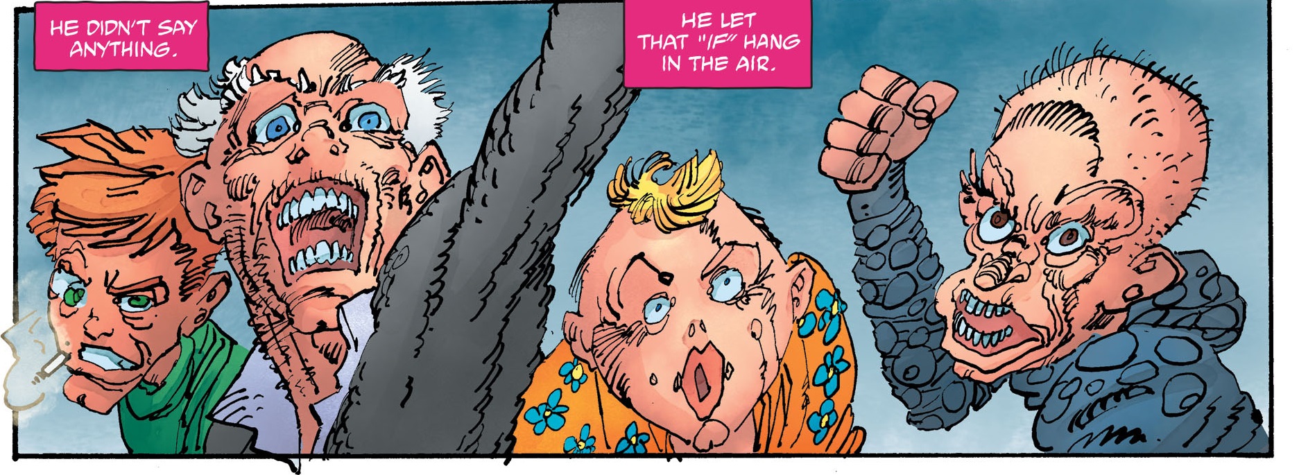
He has a 12-page back-up story in The Dark Knight III: The Master Race #4 which is little more than one big fight scene with some barely sketched out characters just limply hanging in blank space. Then Aquaman appears in all his shoddy glory and…the end. This is a rigorous reflection of the story in the main body of the comic which is also little more than an extended fight scene between Superman and his daughter, with Batman and Carrie Kelley as spectators. Remember the scene in The Dark Knight Returns where Batman beats Superman to a bloody pulp under some street lights like the lowlife street mugger he is? Well, the new comic is yet more fanservice for Batfans who think the Man of Steel sucks (Miller is the inspiration here, not the cause).

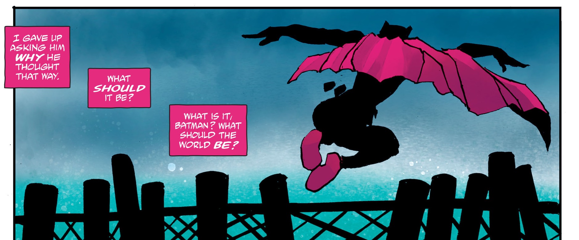
But it’s not all corrupt—if you take individual panels out of context you can still see some remnants of the old artist. A silhouette here and some adequate superhero posing there.

DK3 4-38a

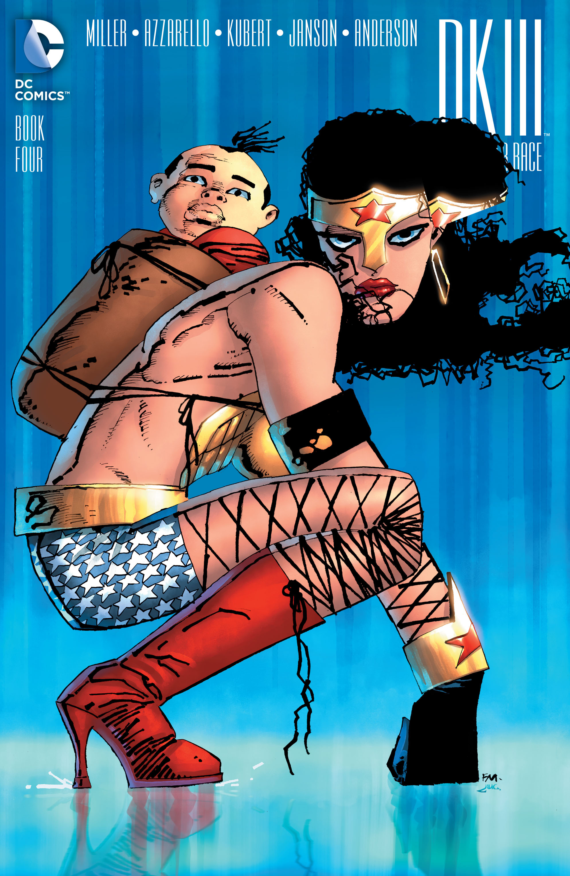
Still, no one really cares about Miller’s subliterate backup story; the internet is far more disgruntled by his series of covers for DC. The most recent culprit is his portrait of Wonder Woman for a DK3 #4 variant cover.

Miller WW Master Race 01

Yet for me, this seems closer to that time when Trump emerged from a relaxing spa a few months back and said that he would be friendly with Russia—which is infinitely preferable to World War 3 I should add.

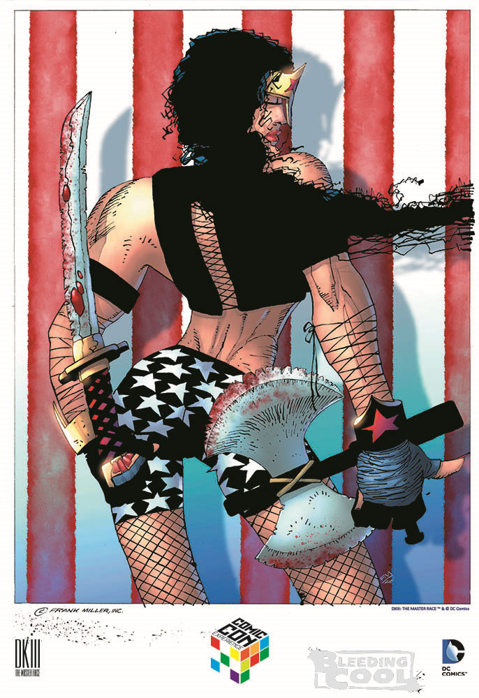
Yes, she looks a bit sullen but not everything needs to be fun and games a la Marston and Peter. He’s on song again because of the nostalgia he has for the warrior-child motif from his days as a fan of  Lone Wolf and Cub. The thing isn’t conventionally erotic or pornographic; this Wonder Woman doesn’t want to make love to you; she doesn’t even want to be tied up with her sorority girlfriends. She just wants to beat you up, hence the gorilla-like stance with her fists on the ground. The breasts are a wee bit big but they’re covered and it could just be the armor doing the talking. The bicycle shorts are cool and the stars quite well drawn. Anyone who knows anything about recent Miller will tell you that this is “decent” Miller as opposed to OMFG Miller. To wit:

Miller WW Master Race

I will accept intimations that this image is a natural extension of Miller’s penchant for night spots of all sorts in his sequential work, and thus a homage to drag queen clubs; maybe a bad homage but a homage nonetheless.

Every few months, Miller releases his new modernist vision of superheroes to the world to the general consternation of the Twittersphere. And every time, one of these images appears, the internet expresses equal parts astonishment, outrage, and delight that something so grotesque should exist in this universe. It’s like stepping on some dog poo just as you’re about to get into work—you have to tell someone because it just stinks. If you don’t, they’ll find out and then where would you be?

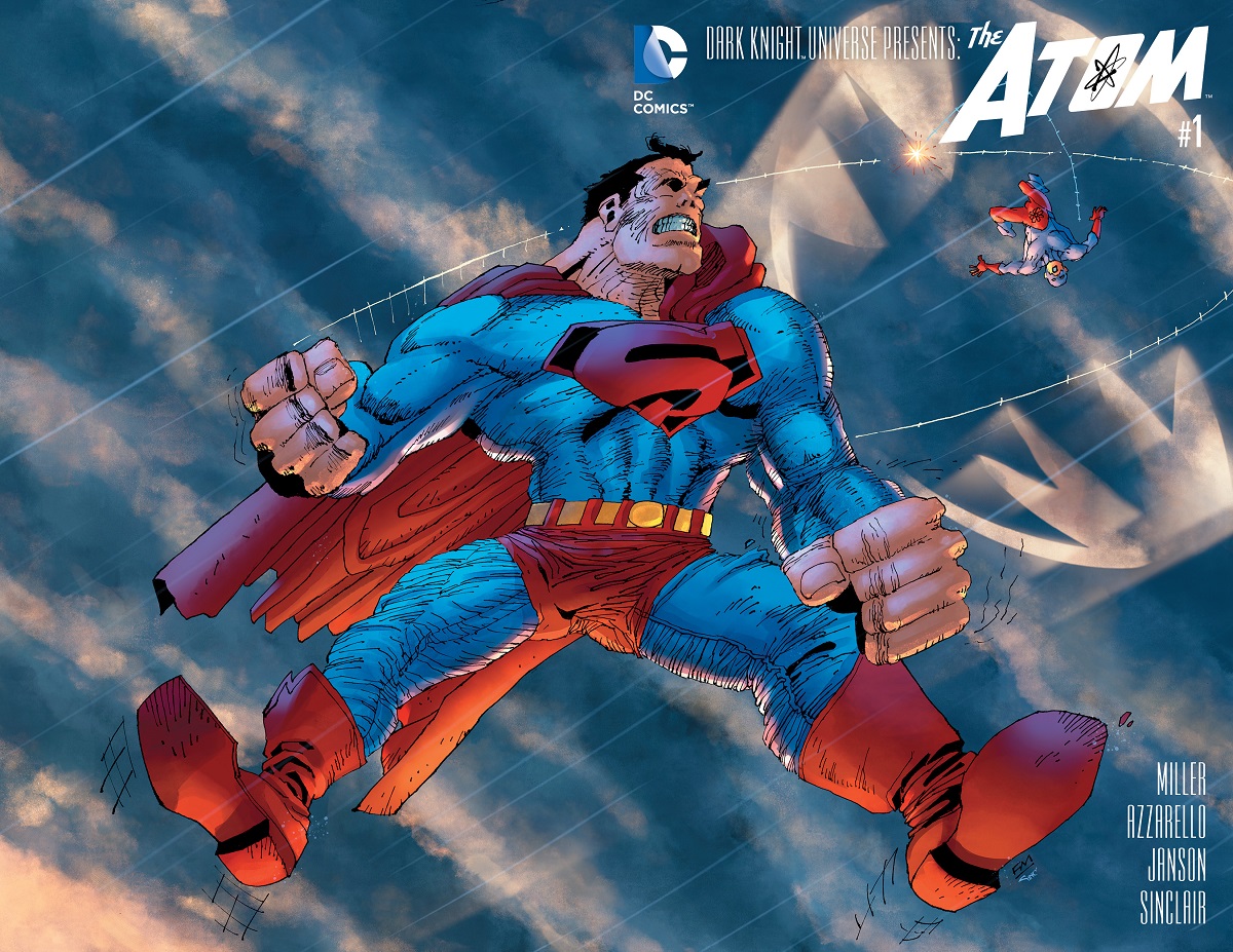
Everytime one of these things hits the stands, it’s as if Miller is pulling out his dick and saying, “Fuck you, DC! And fuck your pet rabbit!” The most obvious screw you was his infamous Superman with a package (he packs to the right) splash page/cover.

Miller Master Race Supes

Miller fans point to moments like these as expressions of his genius and his innate feminist instincts—the drawing hand may be withering but that brain! It still works and wants to let the supermen (and their cocks) have it as good as the superwomen.

The people who go to conventions and collect original art were well apprised of this paradigm shift in Miller’s abilities at least a few months in advance of the general public, with responses ranging from delight at owning a hand drawn masterpiece from the Master to earnest attempts at retrieving whatever vestiges of dignity remained in the art—the equivalent of trying to pick a really dry piece of snot from your nostrils. Utterly disgusting for all concerned.

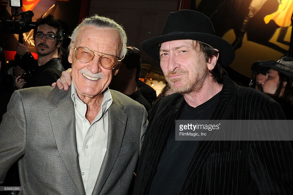
Any hesitation to declare this a sharp deterioration in artistic prowess does not simply reside in the level of respect Miller has garnered over the years from the fan community but the simple fact that you simply don’t make jokes about the afflicted. And Miller has looked pretty ill for some years (the exact nature of his ailment is a mystery). The internet gasped with incredulity when Miller took a photo with Stan Lee recently.

stanlee-frankmiller-170936-640x320

Miller stan lee

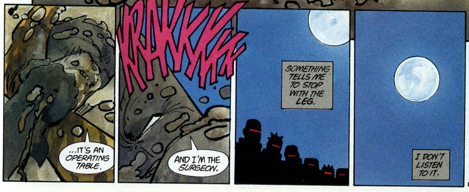
But there’s every indication that he’s on the mend. The recent photos while far from hearty are still a significant improvement over those from not so long ago. Like a mud-caked Batman in The Dark Knight Triumphant, Miller is having it out with the Mutant Leader. Something is telling him to stop with the art but he’s not listening to it; and that’s all for the best.

DKR Leg

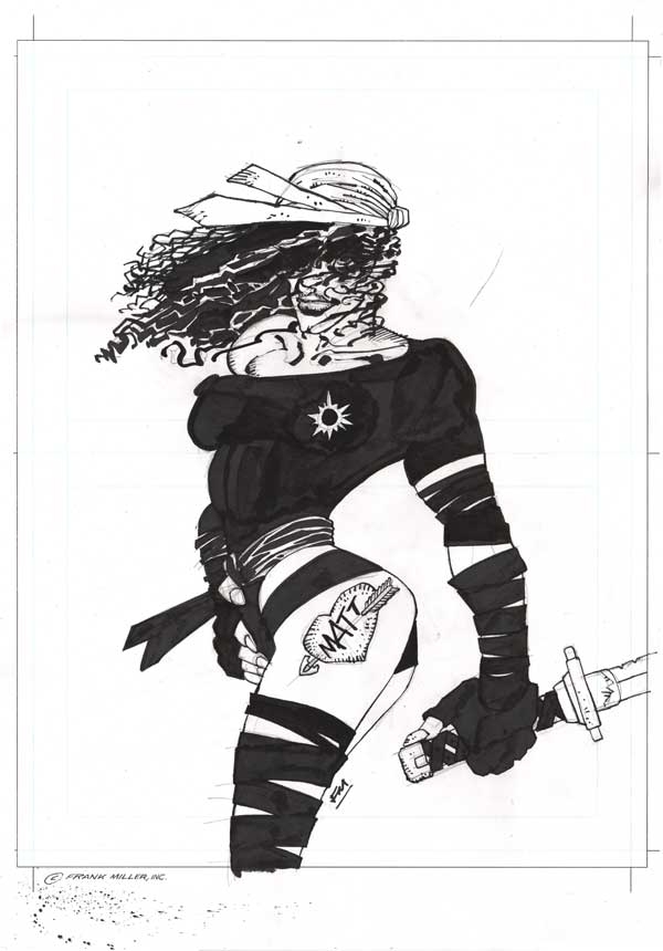
So if you’re sick (and there is by no means any public confirmation of this) and are still able to support yourself, I think more power to you. And if you want to do a Dark Knight IV all by your lonesome in years to come, well, I guess why not—DC deserves it, and fuck “artistic legacy.” But, you know, get Klaus Janson to help out a bit I think, now that you’ve both kissed and made up. Because there’s really no shame in getting help, especially when not getting help results in this:

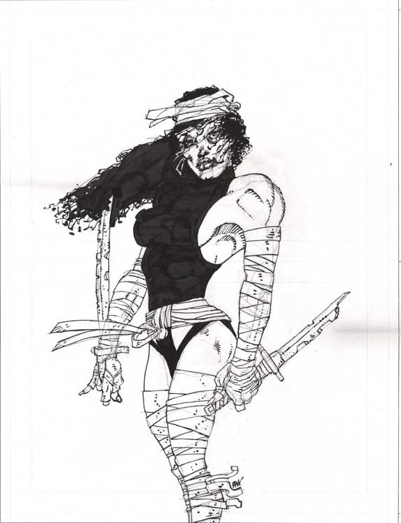
Miller Elektra 03

Miller Elektra 02


These monstrous ninja zombies are of course depictions of Miller most famous creation, Elektra; which sort of makes sense considering her resurrection in Miller’s early Daredevil comics. I guess if you created the character, you get to decide if the lady has flat-rectangular shaped nipples or has a tattoo of Matt Murdock on her left thigh or has glow in the dark areolae. There’s little doubt that Miller considers most of these images transcendent spank material.

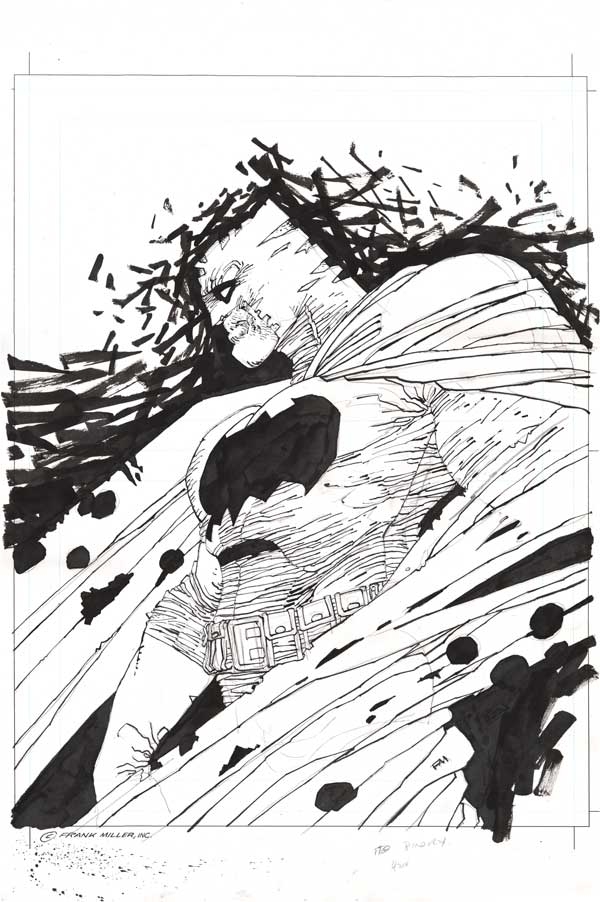
Speaking of which, how much do you think this wank material is worth? $2000 maybe? You need to account for the fact that we’ve had several suppositories of Quantitative Easing for close on 10 years (though with nary an effect on inflation). So maybe $4000-5000? Miller is a living legend in superhero circles afterall. Apparently a nice big Batman sketch like this goes for somewhere in the region of $10-12K.

Frank Miller Batman

The Elektras? 8.5-9.5K. There were nasty rumors circulating that customers who bought an Elektra stood a better chance of getting a Batman. When I heard about this from a fellow collector, I assumed it was a buy one and get one free deal. But no chance, Frank Miller (and his handlers) are nothing if not great businessmen.

Which only goes to show that you don’t need close readings or a smattering of comics history to understand the baseline ethic at work here.  When exciting new conceptions of the decaying female form  are greeted with ready wallets, then Capitalism dictates that we sell them. As for the rest, DC will just have to suck it up because they started it first.

Don’t hide your candle under a bushel, Mr. Frazetta. (NSFW)

“The internet is a toilet.” …..Plumb away!

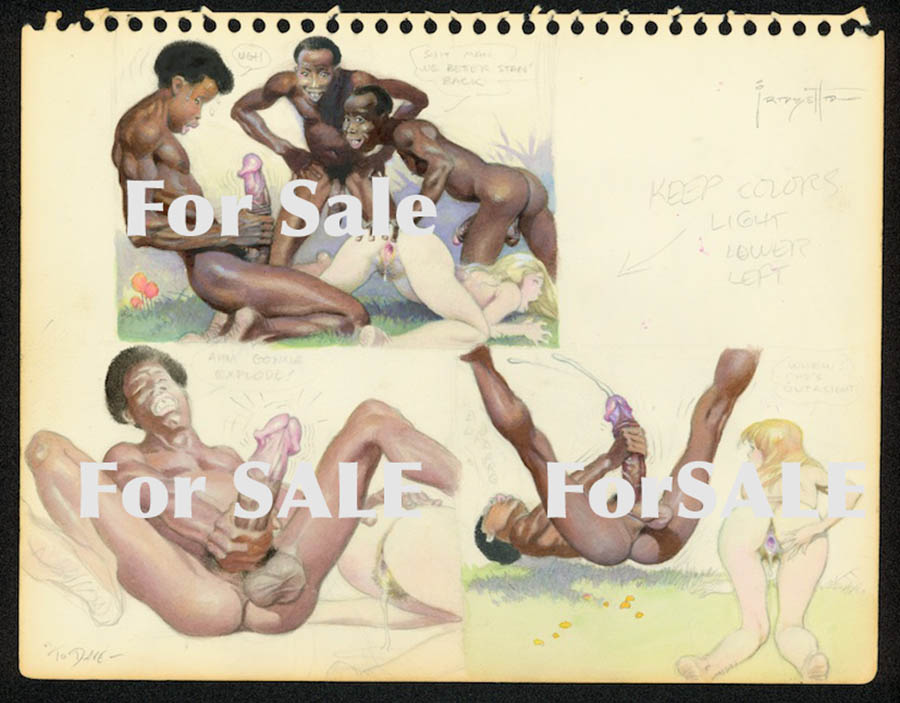
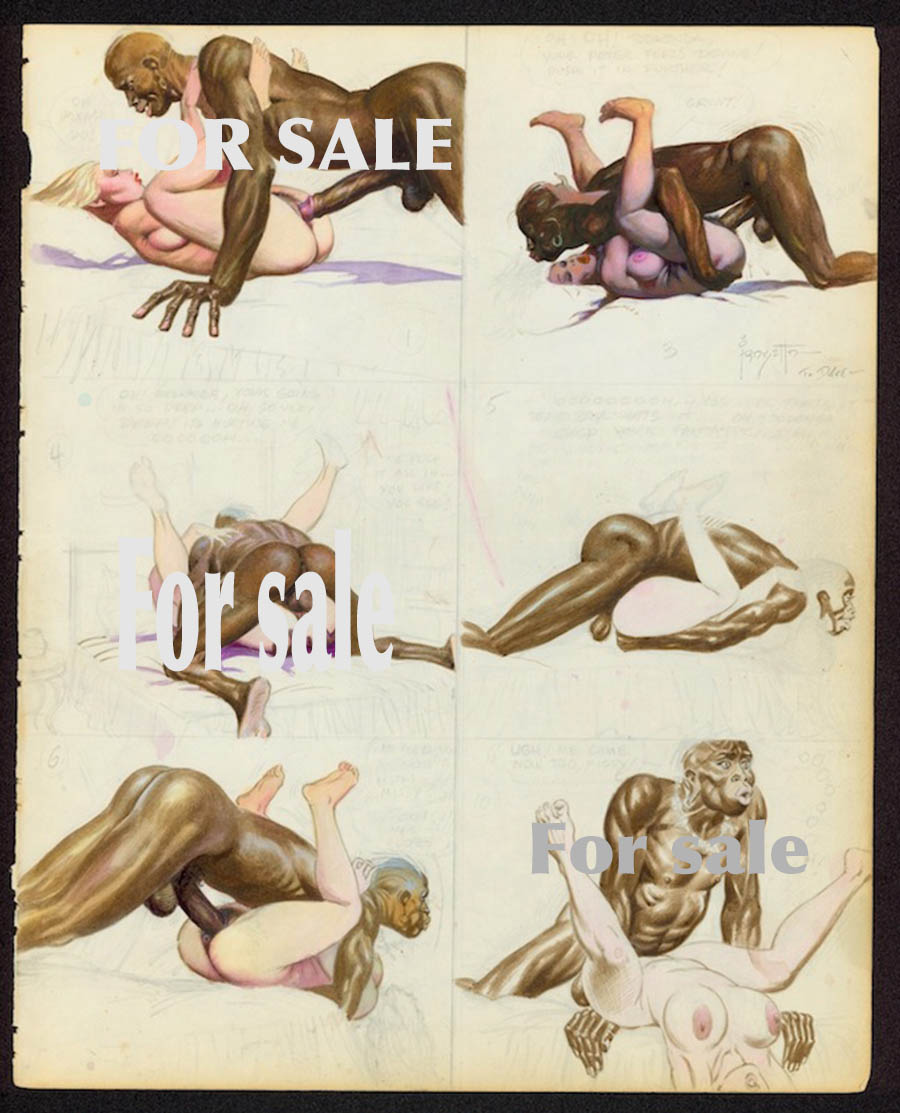
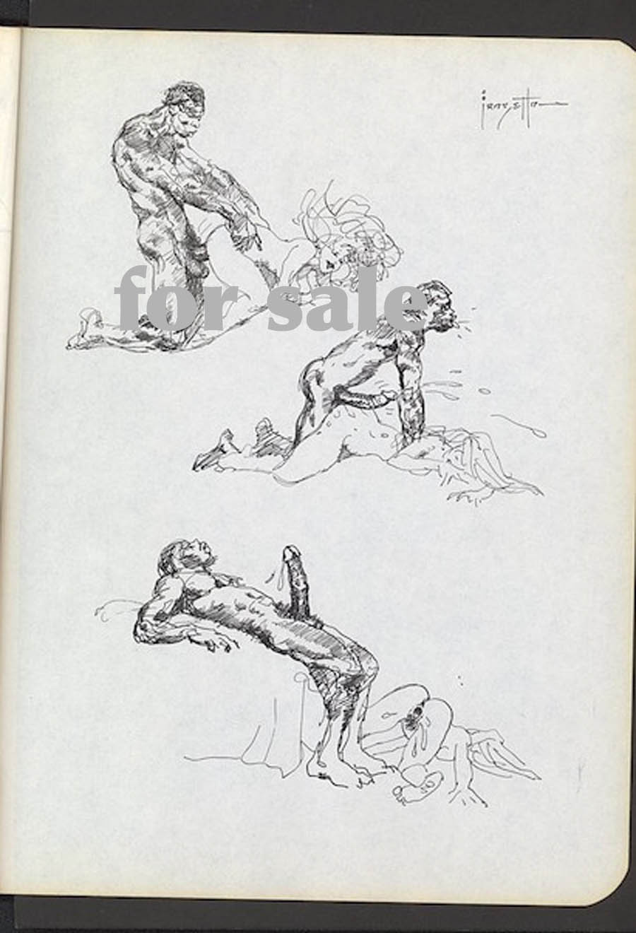
Background: There’s a hugely anticipated Frazetta auction due in early December 2015. Some nudie art could not be included in the printed catalog (and online) on the advice of the auction company and its lawyers. The chattering classes were rife with rumors and speculation. What could possibly be so disgusting that it could be auctioned but not included in the printed catalog? Surely nothing as pathetic as cunnilingus, female ejaculation, or facials. So perhaps bestiality or necrophilia? Don’t those horrible Europeans also sell Crepax doggy art? What’s wrong with that? As it turns out, it was nothing quite so gross, just a “simple” case of white slavery (+/- rape).

I wanted to preserve these on HU since the site is periodically interested in such things. I mean both Frazetta and the obvious.(The below is NSFW, if you hadn’t figured that out already.)


____


b

b2

b3

The “For Sale” signs were added by Roy Lichtenstein and Edward Ruscha in 1998.

Here’s the description from the blog that first published these images (link is temporary):

“Frank has always had a strong interest, a fetish of sorts, in black sexual stereotypes. Why would he spend so much time extolling the virtue of black sexuality if he disliked blacks? Makes no sense. What is his intent? The joy and delight inherent in sex. One must see the totality of these stories to appreciate fully their intent and idiosyncratic approach. He has other erotic art dealing with just whites, no blacks. A superficial and prosaic understanding is really worthless in appreciating this material.”

I don’t think this statement needs to be dismantled in any sustained fashion except to say that if you think Thomas Jefferson must have liked blacks because he had sex with Sally Hemings, then this art is for you.

My first thought when I saw these newly revealed images was why people needed to see them to realize that Frazetta had real problems with Africans (and perhaps blacks in general). The white slavery/inter-racial trope is a small corner of the porn world and usually presented in the spirit of fun and games; a fetish which Frazetta would no doubt have approved and appreciated. These new images, on the other hand, bring to mind Robert Crumb’s “When the Niggers take over America,” a work which has been interpreted with diminishing amounts of charity in recent years.

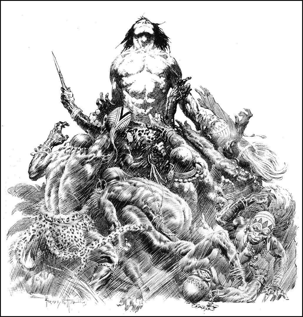
The illustration below, for example, is widely considered one of Frazetta’s greatest pen and ink works.

Frazetta Tarzan

There is nothing subtle about the content here which makes its wide acceptance altogether more distasteful. The Frazetta “porn” is a shameful business which we can all collectively shake ours heads at but the same worldview was ladled out  generously in much of his oeuvre.

The Tarzan of the comics (let’s forget about Burroughs for the moment) was, of course, deeply invested in white supremacy and purity; with the great apes afforded an even greater status than the Africans who appeared in them periodically. Hal Foster certainly couldn’t escape the siren (and, yes, racist) call at the core of the Tarzan narrative when he famously drew the character in the newspapers back in the 30s.

His acolytes like Frazetta could be seen trafficking in similar imagery in the pages of Thun’da towards the latter half of the 20th century. Russ Heath in the story, “Yellow Heat,” is yet another famous exemplar of this trend in adventure and horror comics. If there is any desire to heap praise on the laughable civil rights comics of the EC line, then one can look no further than these comics for their counter examples.

The standard defense for these images is that Africans “really” were that way—in that they really sharpened their teeth and really ate people. And, yes, were generally crowd surfed by white people (metaphorically speaking of course). Presumably, the images on display in Frazetta’s porn stash will be diagnosed as an acute insight into black sexuality or at the very least a liberating moment of self-revelation and self-parody; a plumbing of the very depths of the human soul. On this last point, at least, I think we can all find some space for agreement.

__________

Update: In comments, Frazetta’s images above have been compared to the tradition of Asian erotic temple art of which the most famous example must be the reliefs at Khajuraho. I guess there are worse ways to insult the Indians.

Khajuraho

The “Last” Outsider Cartoonist and the Ku Klux Klan

I ask Aline…

“Well, he is a sexist, racist, antisemitic misogynist,” she says.

Does he agree? “Oh, I guess all that stuff is in me, sure. I wouldn’t say I’m an out and out racist or proud or amused by the idea of racism but we all grew up in this culture…[…]…Those things are complex, y’know. They were as much about what was going on inside white people as their attitude to black people. I liked the idea when I was doing that stuff of making things that looked as if they were one thing but were actually something else.”

*          *          *

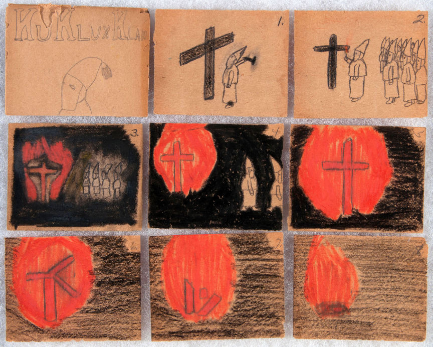
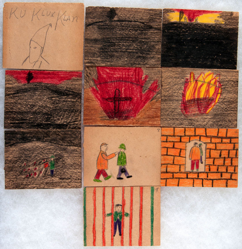
The first comic (c. 1920) by the “last” outsider cartoonist is morally ambiguous.

KKK 01

The artist’s name is Russel Deiner and the comic is presented in an envelope “made of the same folded and glued paper” as the drawings. Each envelope is crowned with a portrait of a Klansman and the title “Ku Klux Klan.” Their similarity with the comics of fandom do not end there. Each is stamped with a mark of ownership and authorship, as would be done by any self-satisfied artist.
The comic itself is almost subdued in its technical transcription if not facility.

The members of the Ku Klux Klan congregate to build a cross and burn it in the course of 8 panels. The wooden planks which make up the cross are depicted studiously but amateurishly in two dimensions as opposed to the attempt at depth in the depiction of the assembled Klansmen in the second panel.  There is a fitful interest in perspective. It seems of secondary concern.

The atmosphere here is not one of fear but of fascination—a deep enchantment with the lighting of the cross and its illumination of the encroaching darkness. Everything suggests an artist engaged in an attempt to record his own testimony or participation in an event which began in the moderate light of dusk before ending in early dawn; the bare backgrounds shifting from the white light of bare brown paper to the light crayon marks of half-daylight. The sixth panel captures the moment of disruption, when the supports finally break through and the cross crumbles to a heap of burning shards before wasting to embers in the final panel.
A “true” story perhaps. Or could this scene be a work of solemn imagination, the work of someone recording an event as one would a nativity scene during a celebration of the Advent?

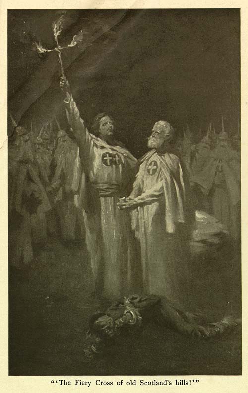
Arthur Keller’s picture of two Klansmen (from The Clansman) standing erect above a fallen black victim is presumably imagined but much more specific in its motivation.

Keller Clansman


The second story by the “last” outsider artist is more studied in its appreciation of the act of burning crosses.

KKK 02

Much more than in the first comic, it suggests above average powers of observation, beginning first with the yellow flames of initial combustion before simulating the diffuse light of the fire in the crimson night sky. Flames like a geyser of blood pour forth from the redeeming article of the cross.

The members of the Klan are largely absent, two shrouded figures seen considering the cross in the second panel, standing mute and inactive, a testament to the (falsely) avowed purpose of the burning cross as noted in Thomas F. Dixon, Jr.’s The Clansman and D. W. Griffith’s The Birth of a Nation—a call to arms.

Absent of course are the targets of this cross burning. They lie at the edge of darkness, quite unseen, perhaps looking defiantly out at this pageantry like the artist, charting the progress of the ceremony and its denouement. Perhaps cowering in their beds. Perhaps a mass of tangled lines like the mangled heap of brush strokes at the bottom of Keller’s infamous illustration.

Keller-Clansman 01

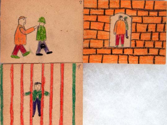
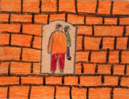
Then the fire is doused by a man dressed in green and the same man sent to prison.

KKK 02b

A seemingly innocuous act rewarded with incarceration.

The man is unhooded, perhaps acting against the will of his neighbors and disrupting the carefully orchestrated festivities. Or is this man dressed in green a Klansman, taken forcibly to a brick-lined labyrinth where he smiles placidly back at us with the satisfaction of a job well donethe Minotaur in his lair. Is the man in green the artist himself?

The auction description for these two items is considerably less cryptic:

“As a child of about six, Russel Deiner attended Klan rallies with his father and the scenes he witnessed inspired his child-like, but artful, renditions of what he saw. As an adult he was an influential member in his local Klan.”

Thus casting aside all notions of moral enigma.

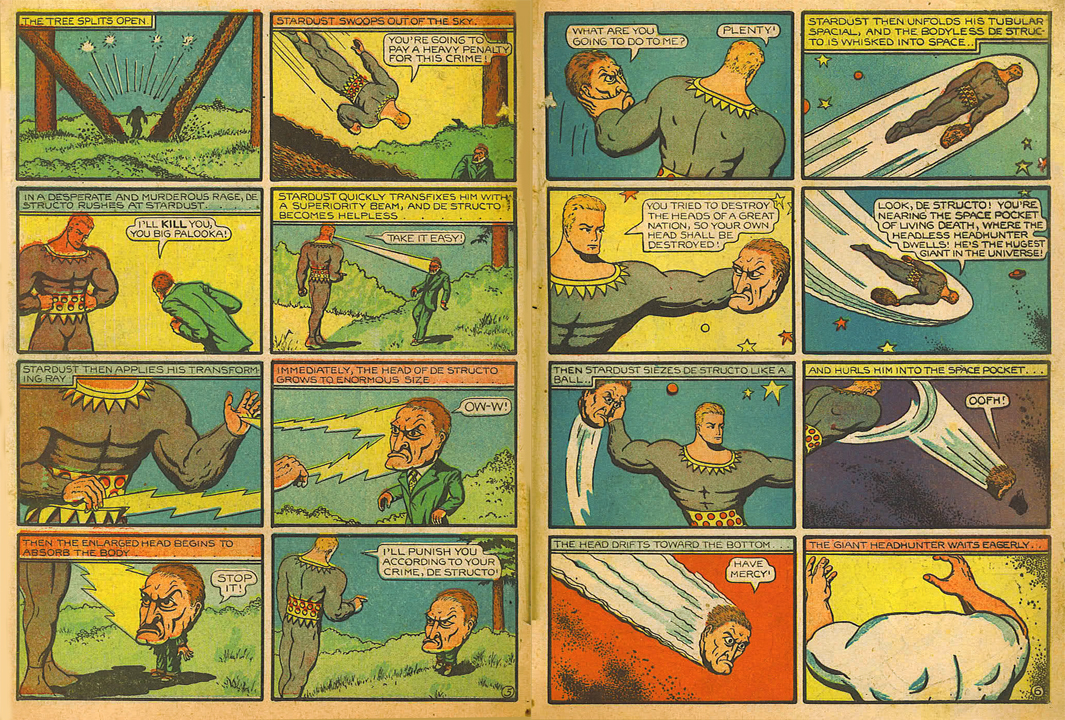
Hanks Stardust

The alcoholic and abusive Fletcher Hanks, Sr. (Stardust, Fantomah) was another outsider of sorts, a neurotic cartooning adept who produced eccentric comics similarly “free” of dubious intentions. Strengthened by biography, the comics have become products of a diseased mind interested in promulgating the concepts of terror, totalitarianism, death, and eternal punishment to his young readers—this once acceptable face of fascism since displaced in our more enlightened times by the charismatic and self-sacrificing leadership of the wealthy vigilante superhero.

KKK 02c

Hanks’ fantasy of justice is transposed to an earthly reality in Deiner’s Klan comics—an adventure in vigilantism which ends in pleasing imprisonment. Some readers will find in the eighth image of Deiner’s tale a portal into the dungeon of his mind; the panels of the comic forming windows into a self-contained reality.

These panels were hung behind a “country store style glass case…with other childhood memories such as jacks, marbles and a cap-gun.” The nostalgia of the true outsider; as uninhibited as any dauntless truthsayer and a premonition not only of the anti-Catholicism and xenophobia of Jack T. Chick but also of the tireless gnawing and prodding of the undergrounds and their adherents. Russel Deiner was the “first” outsider cartoonist; he was the “last” outsider cartoonist.


The Death of the Cartoonist: Simplistic Comics Econs Version

A fellow comic art collector sent me a link to an auction for a Buffy the Vampire Slayer cover a few days ago.

Buffy Cover 02

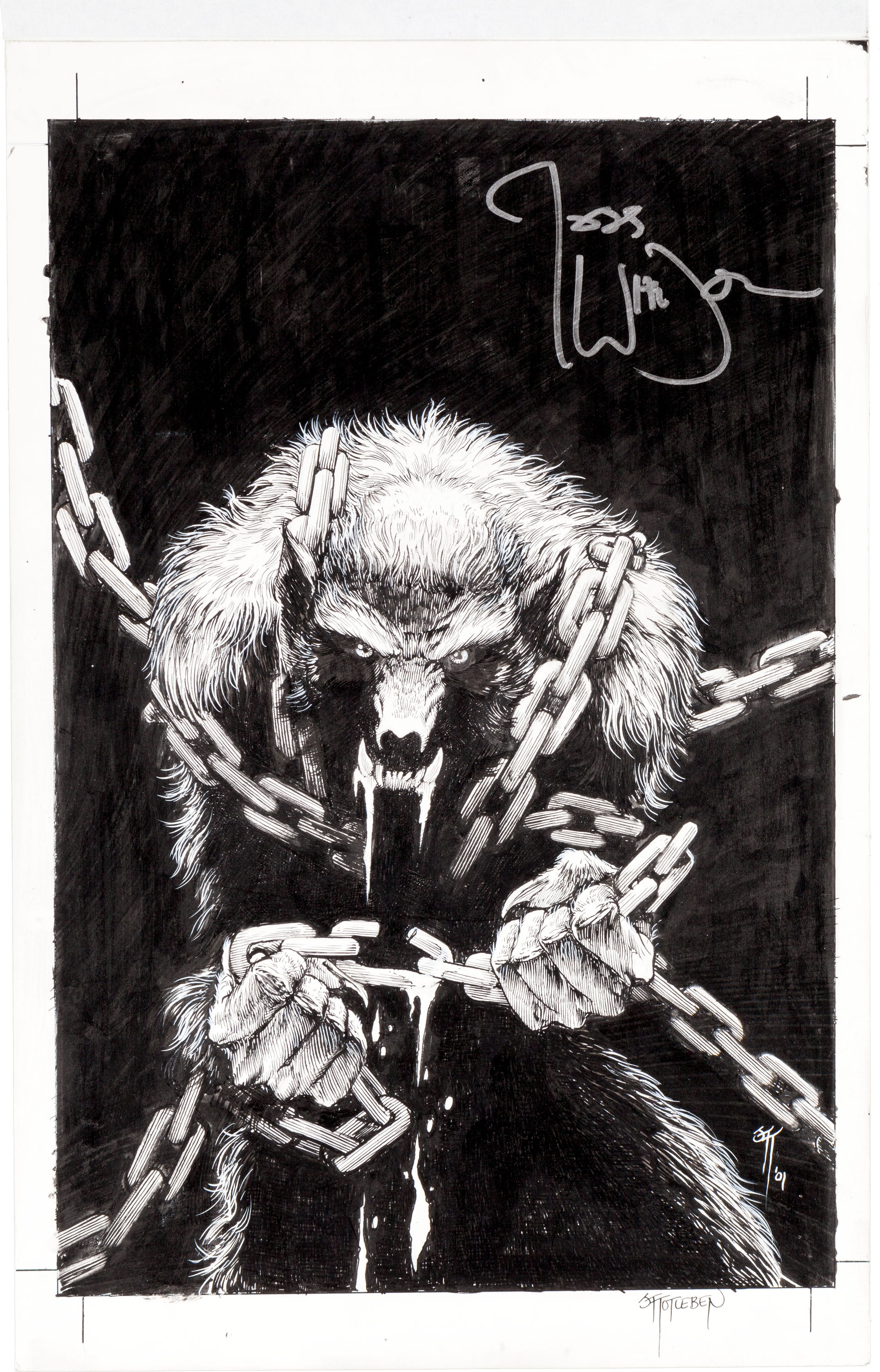
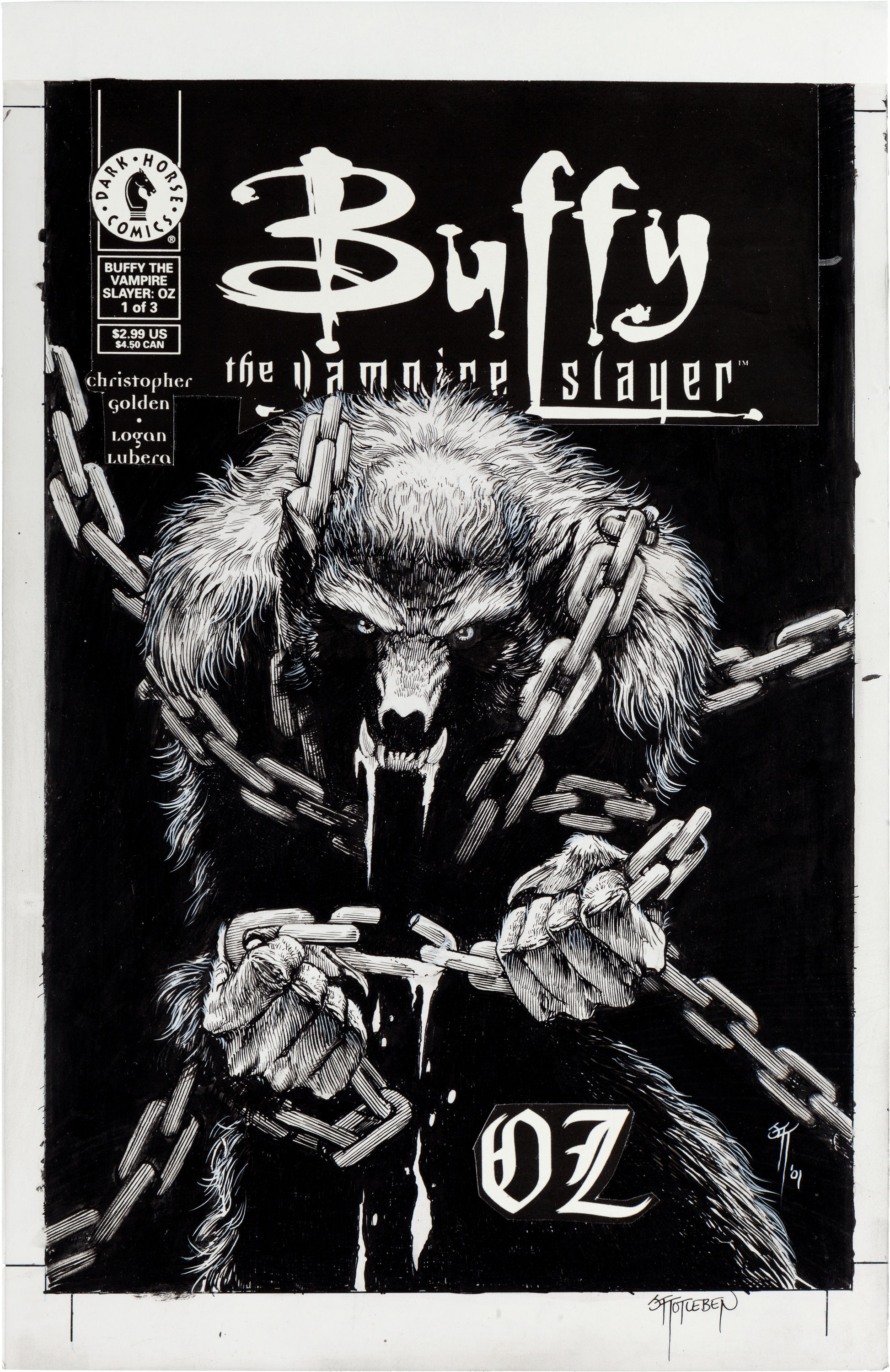
Cover to Buffy the Vampire Slayer: Oz #1 (without title overlay)

Buffy Cover 01

Autograph covered by title overlay

The drawing is by John Totleben and is, I presume, the image of a transformed Daniel “Oz” Osbourne who is played by Seth Green in the TV series.

Let me first state that I have very little interest in Buffy as a character though I have watched a sizable number (if not all) of the episodes of the TV series. I have never bought a Buffy comic nor do I have any intention of doing so. As for John Totleben, he was certainly one of the most skillful artists to have worked in comics during the 80s and 90s (when his output was at its height). It is clear that he lavishes a considerable amount of time on the projects that are bestowed on him by the movers and shakers of the industry, even those as slight and forgettable as Vermillion.

The first question we should ask of this object is if the autograph which reads “Joss Whedon” is genuine. If it is in fact a fake, all recriminations should fall to the forger.

If we assume the autograph is genuine, I think the best that can be said for this situation is that it is the result of ignorance (or perhaps genius?)  on the part of the owner (if the autograph was done to his specifications) or Joss Whedon.

If we assume it was the owner’s choice to have Whedon scrawl his signature in the middle of the art work, one can only conclude that the decision was made on the basis of increasing the value of the art. The signature occupies an area comprising 1/8 of the image area and acts almost like a title in the absence of the acetate overlay. So what would seem like just another werewolf image (in the absence of the overlay) by a skilled but under appreciated comics artist is now brought firmly into the Buffy universe—thus improving its value considerably. Whether the art has been disturbed or even defaced is probably secondary to concerns about monetization. Such is the nature of the business of art in all its forms.

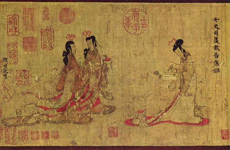
There are important examples of this in art history but few with as detailed a narrative as Chinese brush painting. Those viewing a Chinese painting for the first time might be surprised by the numerous red seals placed discretely or sometimes prominently within the area of the image.

Admonitions_Scroll 02

Admonitions Scroll (attributed to Gu Kaizhi, probably a Tang Dynasty copy).

Admonitions_Scroll 01

Seals on the Admonition Scroll. Orchid by the Qianlong emperor.

These were often placed by the artists themselves or collectors to denote ownership. As Yang Xin writes in Three Thousand years of Chinese Painting:

“Using seals, however practical, added aesthetic appeal to the paintings, as literati-painters realized. The scarlet stamp could enliven a picture otherwise dull in color, and the choice of seal indicated certain interests and values of the painter, often with subtle cultural, personal , or political implications….A painting is often the joint product of a painter, a poet, a calligrapher, and a seal maker.”

Later in the same book, James Cahill writes:

“…by identifying them [the seals] the knowledgeable viewer can ascertain which collections the painting has passed through. If these are well known and distinguished…the value of the work is correspondingly enhanced….Collectors of good taste kept their seals small and confined their use to the corners; arrogant collectors and emperors impressed large, showy seals in all the available spaces.”

How this applies to the considerably more humble art being discussed here is I think self-explanatory. There is every reason to believe that a tasteful autograph by Joss Whedon (like that placed by Totleben at the right bottom edge of the image; did you miss it?) would increase the value of this Buffy cover. Whether the more florid (almost titular) inscription would have a similar effect is anyone’s guess.  I wouldn’t buy the art either way.

If the decision on the placement and size of the autograph was entirely Whedon’s, it might even speak to where he sees himself in relation to these comics interlopers—the artists and writers not only being completely interchangeable (if not irrelevant) but possibly beyond his control.  He seems to have little say regarding all future film iterations of his creation as captured in this Guardian article from 2010:

“I always hoped that Buffy would live on even after my death. But, you know, AFTER. I don’t love the idea of my creation in other hands, but I’m also well aware that many more hands than mine went into making that show what it was. And there is no legal grounds for doing anything other than sighing audibly. I can’t wish people who are passionate about my little myth ill.”

This seems like a healthy attitude and no one doubts that this is the reality of working on a Buffy film (or comic; one should note that it appears that Whedon had nothing to do with writing these “Oz” comics beyond the creation of the original concepts).

This image presents itself as an adequate metaphor for the role of the hired hand in the comics business—even outside the remit of the larger comics companies among which Dark Horse (who published the Buffy comics) could certainly be counted. Even in this instance where Totleben did almost all of the work (I suppose a cover concept might have been communicated to him), Whedon’s signature is still five times larger than Totleben’s. Technique and Totleben’s “secondary”  imagination (he didn’t create the character) has become superfluous. The idea that Totleben drew this or that it could be a piece of art doesn’t even enter into the equation (or the mind).  An online image search suggests that the trade paperback edition dispenses almost entirely with drawn art and chooses to put images of Alyson Hannigan and Seth Green on the cover; the better to sell it one presumes.

Now some might see in this (and many other examples) an occasion for a small fit of pique quickly stifled. One might even interpret that large Whedon scrawl as just that—a moment of pique—because Whedon doesn’t actually own the rights to Buffy (they’re with Warner apparently). And who can begrudge them (and hired hands everywhere) those simple emotions? That quick stifling is probably of the essence—a necessary survival mechanism— for such stratifications and losses are as certain as getting wet in the rain. Parasols don’t seem particularly popular in the land of comics.


A Poor Investment: Frank King’s Gasoline Alley

Of late,  much of comicdom has been abuzz with the sale of the original art for the cover to Amazing Spider-Man #328 (by Todd McFarlane) for $657,250. Of this, I shall say very little. Suffice to say that the same auction house will be offering a small but similarly sized painting by Pierre-Auguste Renoir in November with a high estimate of $700,000. One presumes that this painting will sell for slightly more even if it isn’t the finest work in Renoir’s oeuvre.

Proceeding much more quietly over the last few months has been the gradual disposal of one of the finest collections of Gasoline Alley dailies in existence. The collection is not notable so much for its size (which while large, only numbers in the 100s at last count) but for the absolute significance of what they depict, their vintage, and their aesthetic merit. The auction house handling the sale has stated that all the art comes from the “Estate of Frank King”.

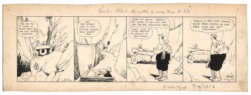
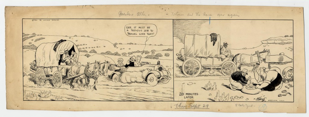
King’s skillful, light ink drawings can be found on modestly sized (about 6″ by 21″) sheets of  aging paper with traces of stains and browning. The paper itself seems roughly cut from larger sheets and is frequently in excess of the requirements of the art. King gave individual titles to each daily, often writing these concise commentaries in cursive pencils at the top or sides of the finished art. Their importance relates to King’s working methods and his intentions. For obvious reasons, these titles aren’t reproduced in the recent Drawn and Quarterly reprints though the original art would have contributed greatly to the quality of that reprinting. The smeared countenance (in the reprint) of the “first Skeezix” strip of 14th February 1921, for example, would also be pleasantly rectified by the original art to that daily (which is soon to be offered at auction).

The more I look at Gasoline Alley, the more it seems to me that it is the kind of strip which is best appreciated the way it was originally intended—as  a daily serial—and not read at length in the book collections which are undoubtedly welcome from an archival perspective. The passage of time is critical to the reader’s engagement with the strip. This can be easily appreciated if one considers that dailies acquired by a Gasoline Alley devotee like the collector C. E. in which we see Skeezix’s developmental milestones—from sitting (22nd September 1921) to standing (15th December 1921)—and his fateful meeting with his dog, Pal.

And if we treasure that moment when Walt finally gets engaged to Phyllis Blossom (the matriarch of a long line of Gasoline Alley characters)…

[Skeezix meets his brother for the first time.]

…it is only because of the couple’s long and chronologically drawn out process of courting, and the nefarious schemes instigated to pull the couple apart. The scenes of dark foreboding…

…contrasting with the almost saccharine, though not wholly preposterous, moments of cuteness.

While we may chuckle at these gentle scenes from another age of romanticism and worldly denial, King’s attention to detail is still striking. In the third panel of the daily above, Phyllis Blossom’s eye is subtly curved into an inverted U denoting delight and in the scene below where she is given her engagement ring, she suspiciously casts an eye out at the reader in the fourth and final panel.

***

I should add at this point that the acquisition of any fine collection of art has less to do with taste than with other factors. Far more important in the case of comics, is availability followed by price and financial ability. Only then does the collector face the question of taste. As far as Gasoline Alley is concerned, the choice (in the face of moderate financial impediments) lies between historical significance and aesthetic quality. No doubt the two often coincide in King’s famous strip but there are a number of instances where they don’t. There is nothing especially beautiful about the “first Skeezix” strip but it will surely be the most expensive Gasoline Alley daily ever sold when it comes to auction. Much the same can be said for the daily of 23rd Novemeber 1927 in which Walt gets full and final custody of Skeezix, one which I was hoping to acquire but missed out on due to a lack of stomach. The strip has little going for it in the art department but is pretty significant as far as what it portrays.

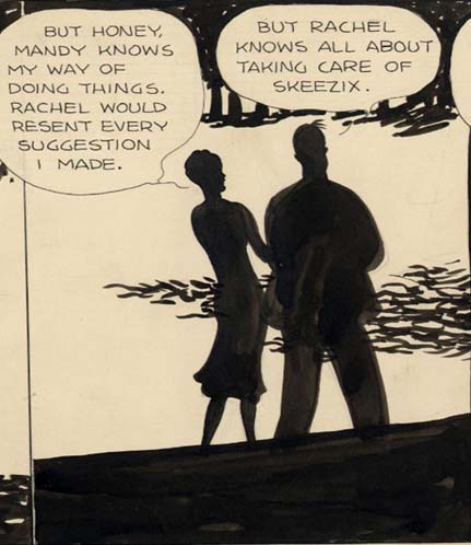
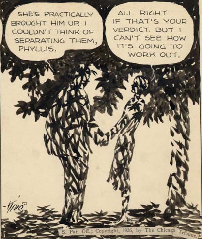
By comparison, if we consider the daily of 20th April 1926, we might say that there is almost nothing of significance being discussed; nothing except the fates of two black maids (for the uninitiated, the strip was hardly short of appalling “mammy” scenes in its early years).

Yet there can be little doubt that this is one of the most formally beautiful dailies that King ever drew. It is, of course, daring in presentation with little continuity in the backgrounds except for the impression of a forest. It is the two figures of Walt and Phyllis which push the narrative along, first proceeding down a path dappled with shadows, skirting the edges of an unseen jungle; then proceeding past the harsh vertical and diagonal lines cast presumably by a man-made structure; before settling on an Edenic scene under a tree.

[from the collection of Rob Stolzer]

There was ever this mix of industrialization and nature in King’s early Skeezix strips, the most notable example being the tour of various National Parks in 1921 in which King lightly played out the tension between the old and the new…

…and the concomitant change in values.

The words provide the context for this minor masterpiece in King’s oeuvre—a mild dispute which is finally resolved harmoniously—the interplay of emotions entirely carried by the workings of the forest light which flickers tentatively in the darkness…

…before reaching a kind of balance as Walt and Phyllis arrive at a domestic compromise.

And is it a coincidence that in this discussion of two working class African Americans, we should see the figures of the very white and Caucasian Walt and Phyllis turn from deep black to a variegated pattern of shadow and light?

***

But let’s return to the question of price vs. value which I mentioned at the start of this article.

While the sale of the McFarlane cover may seem a losing proposition as an individual investment, there is every reason to believe that the high price will be turned to profitable ends by the main players in this game—the auction houses and retailers who carry art of an equivalent “stature”. The rumor mill has not dismissed the possibility that the art itself will be sold quite magically for a profit in years to come, the highly manipulable art of price ratcheting now coming firmly into play.

In contrast, one of the famous Gasoline Alley “woodcut” Sundays—a masterpiece of the form—sold for just over $20,000 just a few months back. To put things in even finer perspective, if every one of the current crop of Gasoline Alley dailies (about 300 as of 13th August 2012) sold for $2000 (a handful have sold for more, most have sold for much less), the entire proceeds would still be less than the amount achieved for the aforementioned McFarlane Amazing Spider-Man cover.

Even so, this prime set of Gasoline Alley dailies, are very likely depreciating investments which will find it hard to keep up with the rate of inflation. The nostalgia value for these strips is almost non-existent, the collectors of these dailies being well worn and with at least a little toe (if not a foot) in the grave. The decision to sell at this opportune moment when the Drawn and Quarterly reprints have had time to settle in was probably wise though the rate at which they have been released is less possessed of the finest marketing sensibilities. And while it is excellent news for collectors that Americans disdain so much this small corner of their rich cartooning heritage, it does suggest that the greater part of this significant Gasoline Alley collection should have found a home in a comics museum the likes of which does not as yet exist. This rather than being scattered to the winds, bereft of the aesthetic weight of its size and the sheer breath of art, storytelling, and gentle humor.


Further Reading

Robert Boyd complains about the hopeless philistinism of the McFarlane purchase.


The Nearly “Worthless” Art of Howard Chaykin

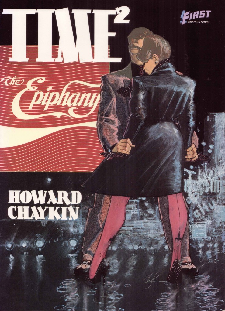
Time² was an opportunity for me to do a magic realist-fantasy fiction version of my life. The three guys—Max, Azriel, and Dani—are idealized versions of me and my brothers, and Rose is my mother. It was an absolute hoot. I loved doing Time². It’s my most personal work, my favorite work, and of course, nobody really responded to it.”

Howard Chaykin, Conversations

Howard Chaykin hasn’t gone back on his word. I’ve been told quite recently that he still has a fondness for that forgotten comic and holds his original art from Time² in high regard, only having recently been persuaded to part with the bulk of it. The pricing on those sheets of paper has barely managed to keep up with the rate of inflation. They were selling for little more than $100-150 (if memory serves) around the turn of the millennium and are now available at 200 Euros each (about $260), this pricing having little to do with their actual saleability or desirability (Chaykin’s early American Flagg! art is in greater demand among collectors).

Part of this has to do with the simple fact that the comic in question was one of Chaykin’s least popular, never managing to gain the critical acclaim of his work on American Flagg! or the notoriety (and multiple printings) of Black Kiss. It was allowed to fall out of print as soon as possible, the thin tomes with their horrendous glue binding gathering dust in innumerable back issue clearance bins ever since.

Yet it remains an impressive example of design and the use of narrative confusion—a technique which Chaykin perfected in the pages of American Flagg!—a magnificent synthesis of the planning and drawing of Howard Chaykin, the lettering of Ken Bruzenak, and the painted art of Steve Oliff. This is easily one of the high points of this collaborative team.

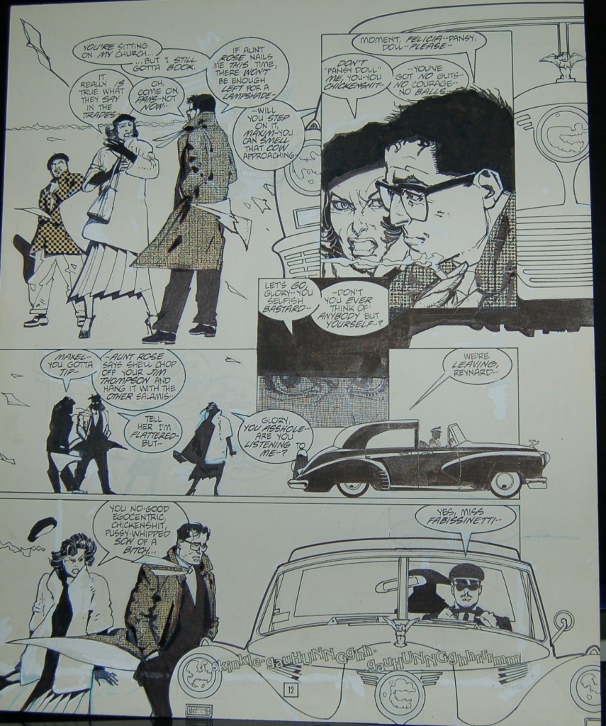
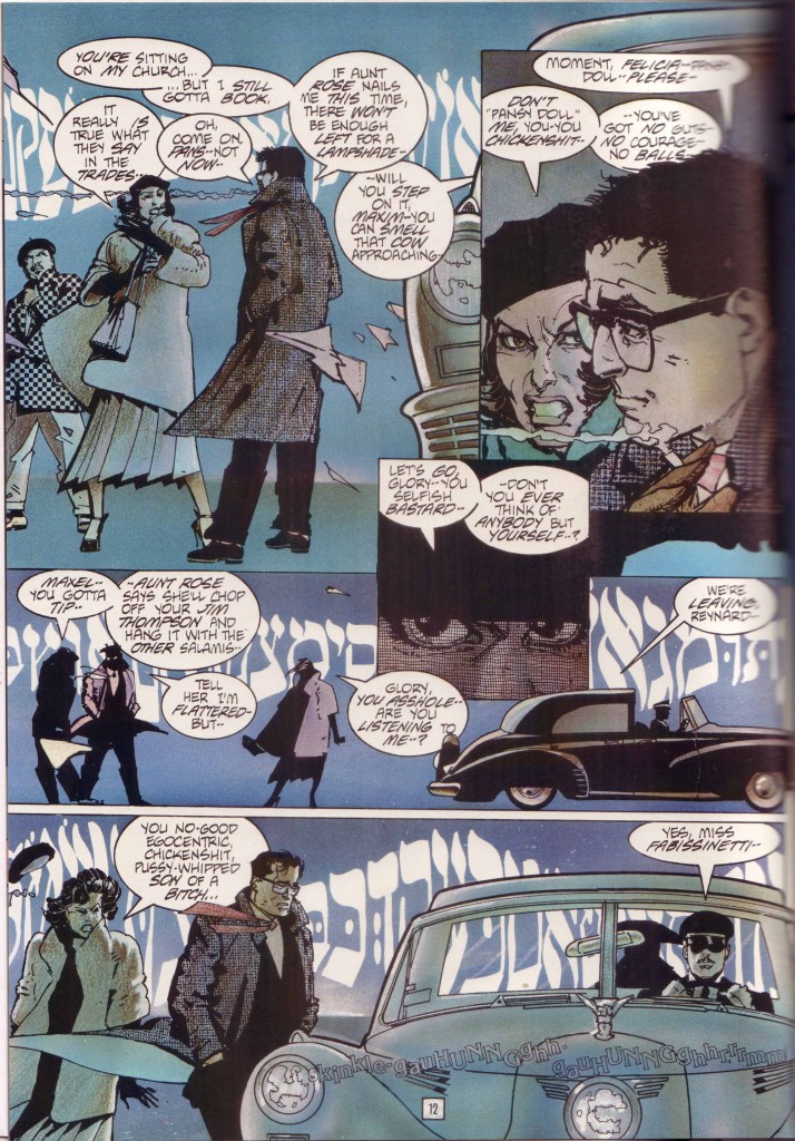
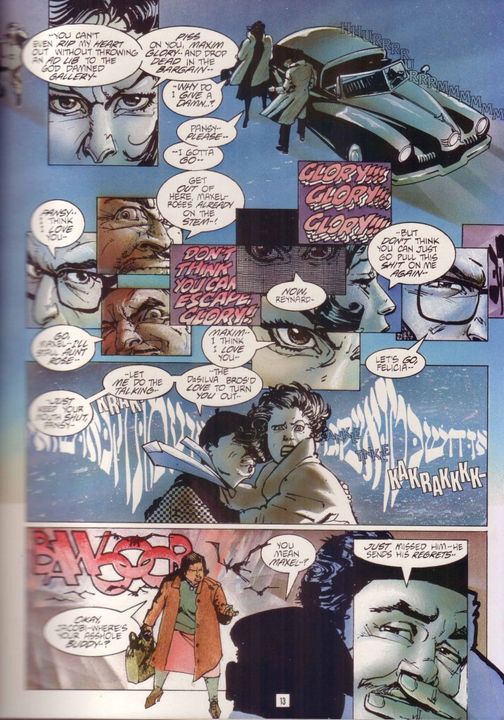
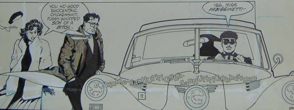
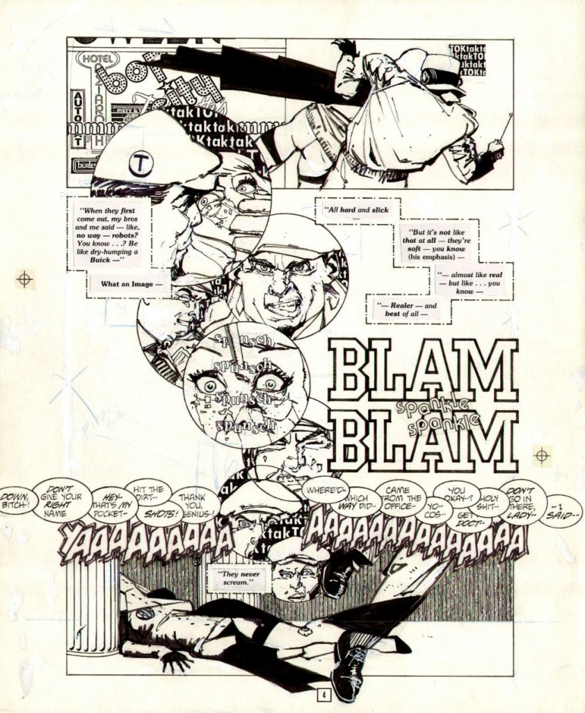
The original art itself is larger than your average modern day superhero board though not quite twice-up, bare and carrying with it all of the scars of production, as good an example as any of how the physical comic book is the final aesthetic object. The rest belongs to nostalgia, history, and scholarship. Consider page 12 (above) and its battlefield of whiteout marks, repositionings, and white spaces. The blue background denoting memory is confined to the bluelines created by Oliff as is the horizon line in the distance. The Yiddish radio transmission (or primal scream?) cutting through that space, unifying the facing pages, and signalling the imminent arrival of a crazed delicatessen owner is nowhere to be found.

This big mysterious flashback in which we see the protagonist (Maxim Glory) acting out his lines for the first time is now strangely quiet—strangled faces on aging paper. Much of Time² was built on the concept of double page spreads and this one will never tell its tale (or part of its tale) without its partner.

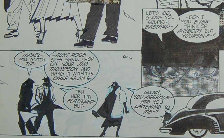
The correction marks and whiteout (that comics pentimento) suggest minor inking errors and space made for that Chaykin specialty—overflowing word balloons. Chaykin was never one to care about crushing a page with text and his words are cramped into a number of tight corners by Bruzenak. If anything it transforms from hurdle, to design element and hence to feature, like the controlled improvisations of a jazz artist.

In the second panel of page 12 we see the female figure moved to the right to make space for this dialogue, her words now protruding into the hatched lines of the center panel inset meant to denote a shadowy countenance and a veil of anger; the words “bastard” and “asshole” now inserting themselves into the schema as a central theme as it were.

So too the interaction between the silhouette in the back of the chromed luxury vehicle (Miss Fabissinetti) and her chauffeur, Reynard; the former’s dialogue straying into the edges of the first panel and her discourse with her driver shoved to the right border like an unwanted intrusion. All of this not making sense in the flow of dialogue, a distracting placement meant to mimic her encroachments into Maxim and Pansy’s conversation. The panel borders are removed in the bottom tier to balance the page and accentuate the prominence of the vintage automobile which dominates the entire right half of the art. Maybe Chaykin just liked drawing cars (he seems to have one on every other page), or maybe it’s a link between the robot killer and Maxim who negotiate and pepper their vehicles with acts of violence (physical and verbal) towards women.

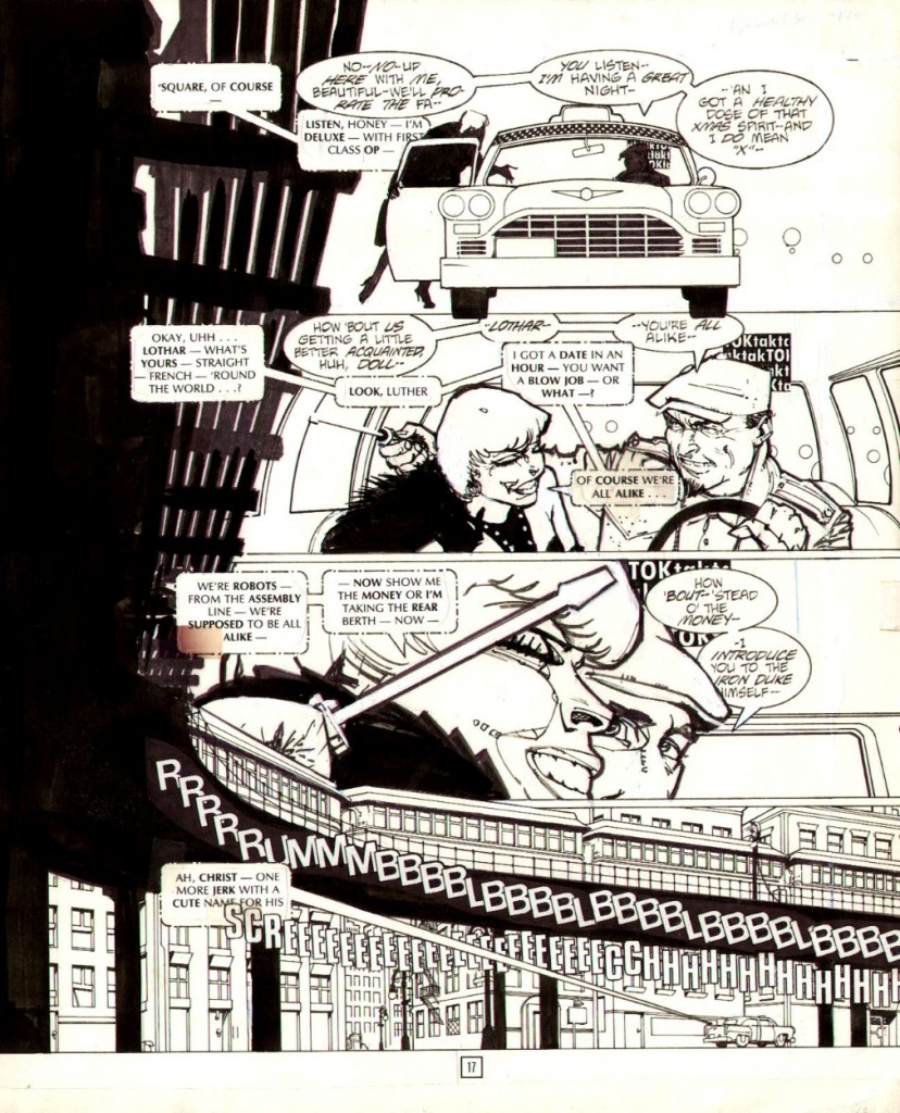
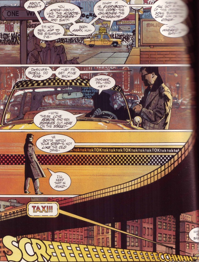
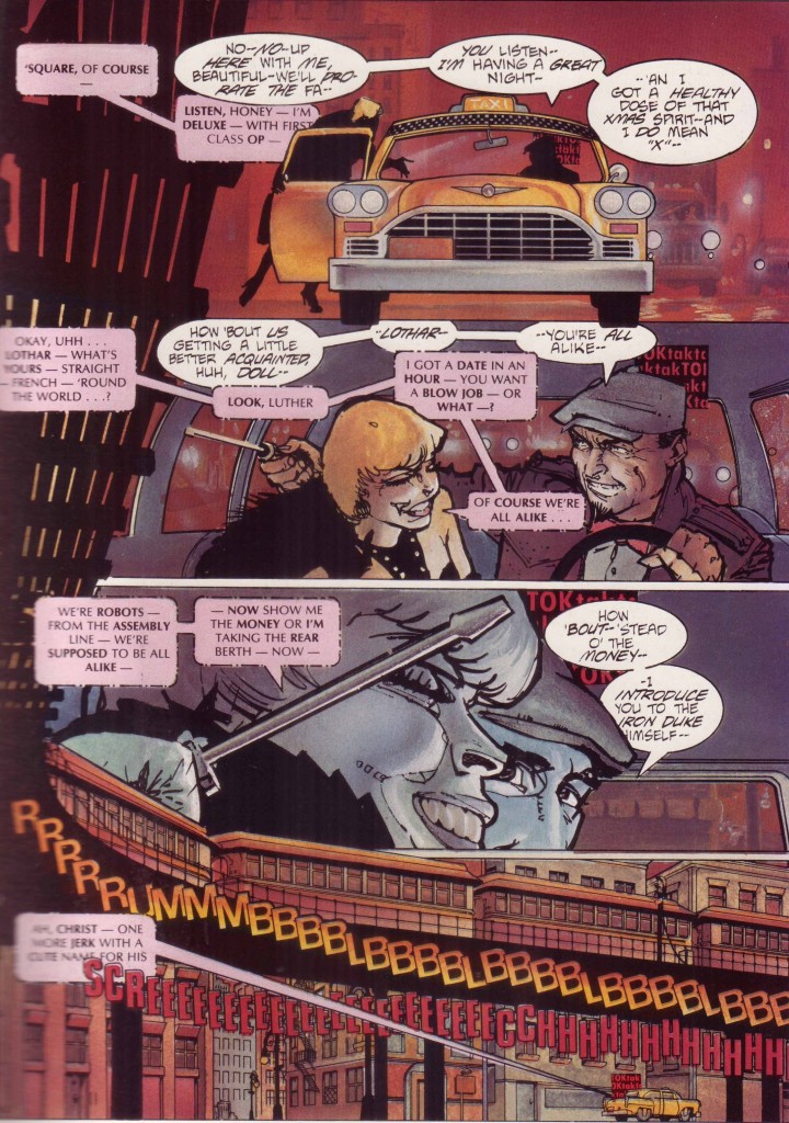
Such is the case with the double page spread on page 16 and 17, the original art for page 17 now available but orphaned from its partner.

The dividing line is a rattling subway train, the multi-hued congestion and city lights once again lost to the bluelines. The yellow streak of a taxi also disappeared.

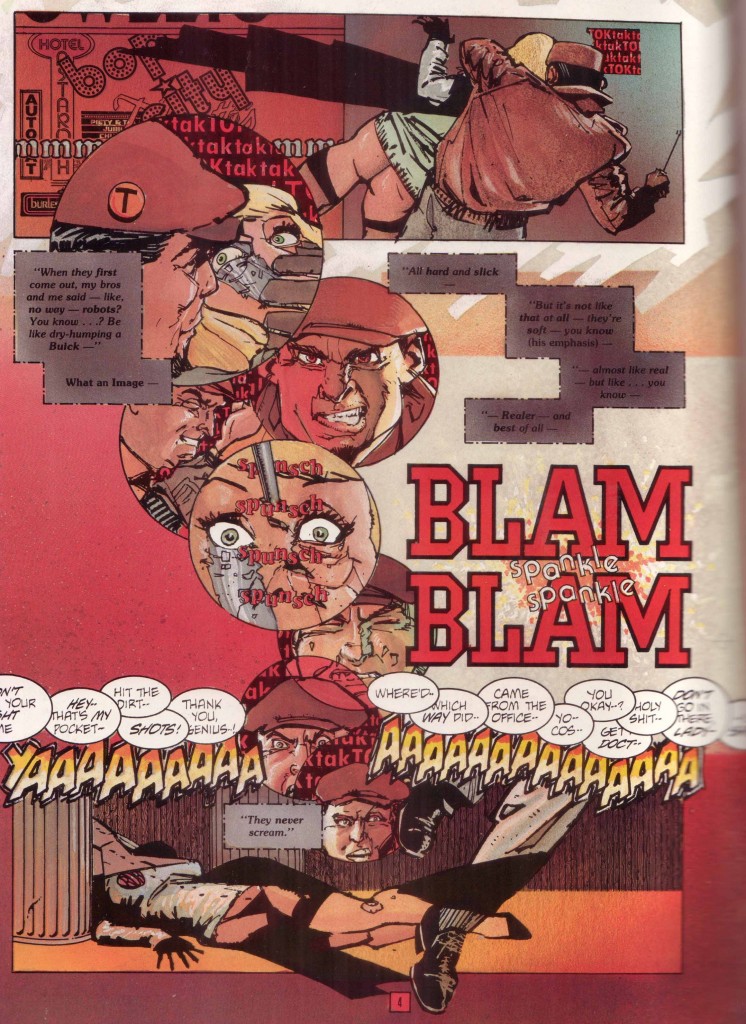
At other times, the original art reveals the joins in some of Chaykin’s bravura maneuvers. Page 4 is a smear of red neon and fury (not blood since robots don’t bleed).

Everything else comes to the fore once the parts are no longer unified by Oliff’s colors and the obscuring vision of the printing press,

The thick paste-ups of Bruzenak’s letters which seem so integrated in the comic are now seen in their rough state, the jarring changes in type (sizes, fonts, shape) a soundtrack for the city. The ink lines more clearly reveal their purpose—circular panels rising like thought balloons from the corpse at the bottom of the page, the killer’s face cracked and distorted in its final moments, the final cognitive dissonance of the android.

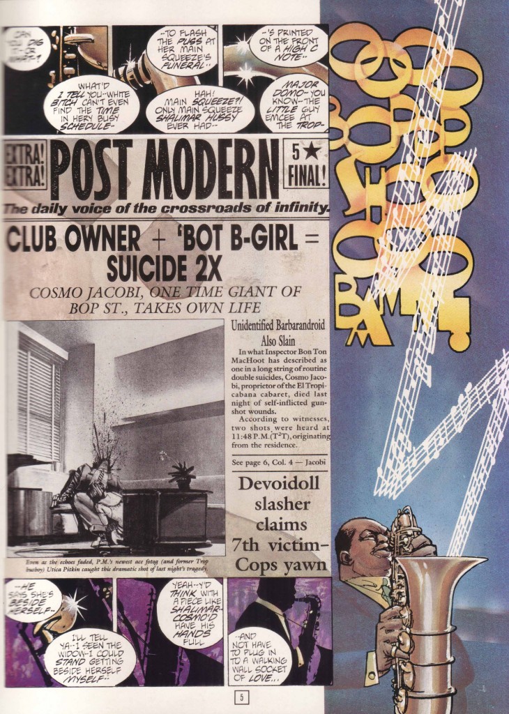
The string of disembodied dialogue sitting on the upper border of the bottom panel is a mystery to the first time reader, a cacophony floating across Time² and Chaykin’s world. That final word balloon (“-I said–“) connecting to the following page which announces the funeral and then the suicide of Cosmo Jacobi, this inverted revelation part of the Chaykin bag of tricks.

The murderer is using a screwdriver to do his work but gun shots ring out from an unknown source, for a moment overshadowing the “taktaktak” of mechanical parts and heels. A scream tears across the bottom of the page even as we’re told, “They never scream.” All of this applying to the opposite facing page: the double bang of a double suicide, the horror and morbid delight in its discovery. It is Oliff’s colors which form the dividing line between the grey marble interiors of Cosmo Jacobi’s office and the dirty red pavement of a back street killing. We might find something comparable in that confusion of sound and image seen at the start of Segio Leone’s Once Upon a Time in America where Robert De Niro remembers the past through an opium haze.

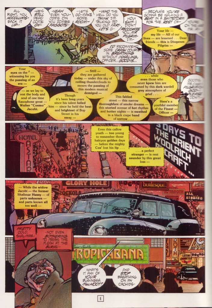
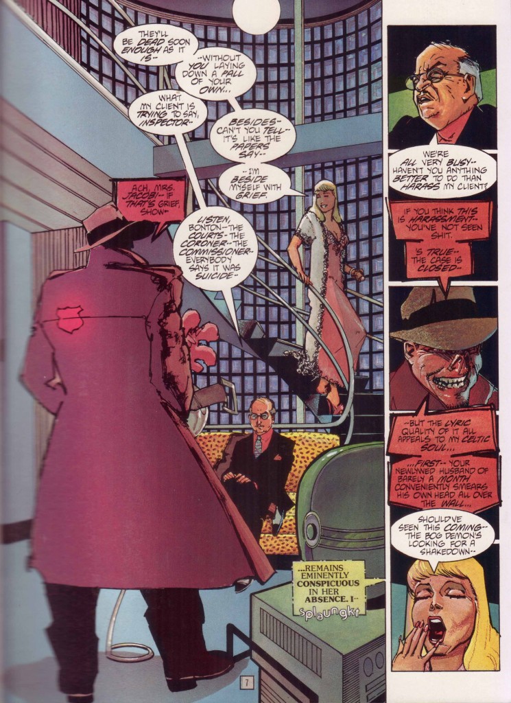
As the narrative of Cosmo’s death and the lack of despondency of his widow gathers pace, Chaykin continues to demonstrate his (over)confidence in his reader’s abilities. Page 6 begins with the neutral words of radio hack, Diogenes Pilgrim, passing through placid disconnected dialogue into anger with an unknown person, hence to a live radio transmission (colored yellow), an electronic signal (in dotted square balloons), and then the crackly end of a burbling radio in Shalimar Hussy’s apartment on the opposite page. So goes the rest of the comic, words from separate characters melding into each other as evidenced by the strangely adherent word balloons.

These are instruments singing from a score, a decadent and dissonant symphony of the city: the vanishing dialects of urban America; the genteel persistent cussing which never resorts to the word “fuck”; the elemental force of Jewish relatives; and the electric jazz cool which is (presumably) America’s greatest contribution to world culture.  Chaykin states that “at its core, what Time² is, is the underworld of the city of tomorrow as visualised in the 1939-40 New York World’s Fair.”   This is a world where matrons pimping demons from delicatessens are the norm, and religion and the after-life have been capitalized and released as IPOs; a lost America of the early 20th century with its bebop soundtrack, constructivist sculpture, fine dressing, and limousines with open driver compartments—a memory never never land of every time.

Jaime S. Rich links the innovations here to the work of J. H. Williams III:

“It’s a mash-up of art deco design, the seediness of old-school New York, and a cynicism about the idea of a better tomorrow. It is simultaneously nostalgic for a past Chaykin knows never was and a future that can never be….Chaykin is talking about the artistic process and living with one’s mistakes, about the clash of old-world superstition and new-world technology, about learning not to care about the stupid crap and also how to deal with relationships as an adult who actually knows a thing or two—again, heavy-duty stuff you’ve had to live through to appreciate.”

Rich sees a richer theme beneath this exercise in noise and style and I have no doubt that had Chaykin’s series reached fruition, that is exactly what we would have got. As it stands, and even with its sequel (the less satisfying The Satisfaction of Black Mariah) what we have in these 48 pages is dense prologue; a baroque joke where the punchline is totally inconsequential because its reason for being is ornamentation and counterpoint, a stream of consciousness tapped from Chaykin’s mind and life without neat ribbons or meaningful closure. As Jog puts it:

“[Time²] feels like an exercise in extended free-associative linkings of Chaykin’s internal iconography. Maybe that’s why it didn’t do all that well with readers. Proper plots do eventually emerge, more or less, but they are immediately submerged beneath the sheer import of existing in Chaykin’s universe, a pure pop surface cityscape that somehow feels achingly personal, if only through the way its creator lavishes his attention upon it.”

It is always painful when the public rejects that big personal statement and values it at rock bottom prices. A communal failing which should be seized upon gratefully by any comic art collector.


*          *          *

Notes from the web:

(1)  Bluelines as described at Steve Oliff’s site

“…. a full color method developed in Europe, which a few American publishers used in the years just before computer coloring became the industry standard. It involves coloring on an art board that has a blue version of the line art printed on it. Then the black is shot separately, and there is an acetate overlay to show the colorist what their final product will look like. These bluelines are the actual color that was photographically reproduced. The colors are opaque watercolor (goauche), acrylic airbrush paint, colored pencil and Pantone film. They are larger than guides, and fully rendered color…”

(2)  And from Frank Santoro’s inquiry into Oliff’s coloring:

“One of the main things that separates Time² from my earlier coloring jobs was that I mixed up my own special palettes of colors to airbrush, and then I used some of those same colors to paint with. Then on top of that, I was using some of the leftover frisket (a masking film) to create patterns of color. For instance there is a big shot of a girl sitting on a couch. The pattern on the fabric is mostly used frisket pieces. We used spatter and colored pencil extensively to give texture. I also used Pantone films to cast shadows over the colors once they were rendered. And finally, Howard came back in and gave a lot of the faces hard edged color. He felt some of my color edging was too soft, so he cut in some highlights.”

When We Had Moebius in Our Living Room

Moebius was one of the weirdest things my roommate had in our living room. He wasn’t weird in the way that the shrine to my former workplace janitor was weird. That is to say, he wasn’t weird in that stupid way early 20’s ironic décor is weird, which is not weird so much as dopey (think a vintage speculum or the rare can of Storm Malt liquor found at Grocery Outlet in downtown Oakland). Moebius was weird by virtue of his incongruity. He was worth more than everything we owned and maybe even the apartment we lived in. He was definitely prettier than anything else we owned, and we took better care of him as a result. My roommate and I destroyed glassware (glass performs poorly in the hands of drunks), three futons, a couple of lamps, a garbage disposal, and a bathroom sink. Most of our other books had coffee stains on them. The ones that didn’t had been soaked in other liquids, and their spines buckled as a result. Our lives weren’t very pretty either, though they lacked the level of degeneracy necessary to make them really interesting. This is all a long way of saying that while we weren’t miserable we weren’t quite happy, either, which is a way of explaining in advance why we kept Moebius around so long.

My roommate found Moebius on the floor of a movie theater in Sand Diego in 1995. Actually, an employee of his found Moebius. Knowing my roommate (who I’ll call Rob, since that’s his name) read comics, the employee brought him to him. He was a little, 4” by 6” black, and hardbound Moebius. He contained a bunch of little drawings on medium press paper that felt slightly rough to the touch. The drawings were put down in shiny black ink, their line weights uniformly uniform, and their subject matter various. The thing about the drawings is that they were so perfect the employee thought it was a facsimile of Moebius that some conventioneer had dropped. For a second Rob thought the same thing. But before he pitched it on the lost-and-found he realized it was real. A weird little colored-pencil doodle by Bob Burden and some children’s drawings in crayon were what gave it away.

The lost-and-found was no place for such a thing. The San Diego Comic convention had ended earlier that day. This was before everybody was on the Internet. It was before everybody knew what the Internet was. Rob did what was maybe the right thing. He put it in his bag and took it home. He moved into my Oakland apartment a few months later.

I was in the process of a protracted breakup and in need of a roommate. Like many young men my age I was a terrible person, though I maintain I had my charms. The least of these charms (but a charm nonetheless) was that I drew well enough to make others think I had a future in drawing. Although I hadn’t read comics regularly in some time, I was still looking for work in the field. What’s more, I had maintained an interest in the things. So when Rob moved in he unpacked Moebius and placed him in my hand. Upon meeting him I knew exactly who he was. Good to meet you in person, Moebius.

Those little drawings had an amazing way of making the tiny pages seem ten-times their actual size. There was a drawing of a canyon that you all but fell into. The drawing of a man plodding through the desert looked vast. The man was less than an inch tall, but he was fully formed and totally lost. There were lots of crystalline landscapes, many exotic hats, some beautiful women and some less than beautiful men. There were no pencil marks, no erasures. It was totally Moebius.

Moebius lived with Rob and me for almost five years. How the hell did we get so lucky? We certainly didn’t deserve him. More often than not he’d just hang out on the shelf. But he’d come out at critical moments, like when one of us was depressed, or when somebody with an interest in comics was over, when we wanted to show off how random the world could get.

Rob and I understood that Moebius couldn’t stay forever. He certainly wasn’t ours, and we knew we’d need to find him a way home. But we were also too lazy to write letters or call France. About two years later we did take Moebius to the local comic convention. We thought we might connect with a friend of Moebius who could help him out. After a few shady dudes offered to take him off our hands, I asked a friend who dealt in original art what we should do. He and a few pros took a minute with Moebius and they all agreed. Do not give Moebius to anyone other than Moebius.

I moved out the next year, but Rob, Moebius and I still spent a lot of time together. I was back in school and feeling better about my life. Ditto Rob. Moebius was the same as ever, though he was also coming to Oakland for a convention. When Rob found this out he called me to ask if I wanted to give Moebius back to Moebius. I had to work (or something) that weekend, so Rob and Moebius headed to the convention together.

When Rob got to the convention he found Moebius at the end of a long line of autograph seekers. He stepped into line. The guy managing the line, a Mr. Rory Root, was asking people what they were getting signed or explaining the rules or doing whatever he was there to do. I wasn’t there, and while Rob has filled me in on the details, they’re the sort of details that derail a good story. Anyway, Rory did eventually get to Rob, and Rob showed him Moebius. Rory took Rob and Moebius to the front of the line.

Moebius introduced himself to Rob, not knowing why he’d been brought to him. Rob, not knowing how to start the conversation simply introduced Moebius to Moebius. He explained really briefly where he’d been, and what he’d been up to. Moebius didn’t bat an eye at the explanation, but he did tear up. “They’re quite good drawings, no?” He thanked Rob, and Rob called me almost immediately after. We were going to miss Moebius.