
I’ve mentioned this a time or two on the blog, but for those of you who missed it, I have a couple of pieces included in the new Abstract Comics anthology out from fantagraphics, edited by Andrei Molotiu.
Though I got the honking tome a little while ago, I haven’t actually read it until this week. Part of that’s because it’s just big, and I had other stuff going on. Part of it, though, was a fear that I wouldn’t enjoy it very much. Though I do abstract drawings myself, I’m a bit leery of the idea of abstract *comics*. I talked about this on the blog a while ago:
In fact, I have a lot of doubts about “abstract comics”, both as a meaningful category and as an aesthetic project. It seems to me that when comics become abstract, they really cease to be comics and become, for all effective purposes, simply abstract art. One can argue back and forth about whether “sequential art” is the best possible definition of comics, but it’s certainly true that comics relies for its existence on relationships — between image and image and/or between image and text. Abstraction is based on removing relationships and referents — you can no longer tell how you got from panel A to panel B; in fact, in many cases, you can’t even separate panel A from panel B. But when you remove the relationships, you remove the comics. You’re left with a drawing, which exists most comfortably within the visual art tradition, rather than within the tradition of comics.
In addition…well, Tucker’s review was pretty devastating:
Abstract Comics is a tremendously random (as opposed to “diverse”) collection of graphic design pieces and black and white sketches, only a few of which might conceivably have a place in Kramer’s Ergot or one of those other anthologies people look at but don’t read. The rest are in the same category as the Buddha Machine, or Rafael Toral’s Space series–a specific, niche creation for a specific, niche audience. The only real difference is that the guys who make the Buddha Machine don’t start calling people idiots when they say they’d prefer a little more music with their purchase of sound.
That pretty much summed up my worst fears for the anthology: half-assed and pretentious. I figured I had to read it (My artwork doesn’t get published every day, let’s face it) but I wasn’t exactly looking forward to it.
And reading through the book: well, Tucker’s not completely off base.. There is definitely a certain amount of gratuitous pretension floating about here; Andrei decided to number the pages using a series of abstract symbols rather than, you know, numbers — as a result, there’s no table of contents, and navigating through the book is a needlessly giant pain in the whatever-that-is. And the author bios are a minefield — “Comics are perhaps the most complex act in the arts.” “On the macro level, here is the universal story of existence.” “There’s something about the chunks of space and time that comics are boken into, and there’s something about the way those chunks of space and time expand in the mind when read by the viewer, that really mimic the experience of actually living life, at least for me.” Less discussion of the aesthetic meaningfullness of it all, and more dry nuts and bolts explanations of process (pen and ink? paint? computer?) would definitely have been welcome.
Tucker also has a point about the semi-randomness of the collection. Andrei more or less admits as much himself in the introduction; he points out that abstract comics is more an incipient form than an actual movement. I’m not really in a position to kick at this myself though. If the anthology were more focused, or less willing to hoover up whatever was available, you can bet your squiggly bits that my work would be one of those that didn’t make the cut. (Not that I dislike my own art or anything. But I don’t think even my most ardent admirer (which would probably be me, actually) would argue that my work up to this point has been influential or important — or, indeed, even noticed.)
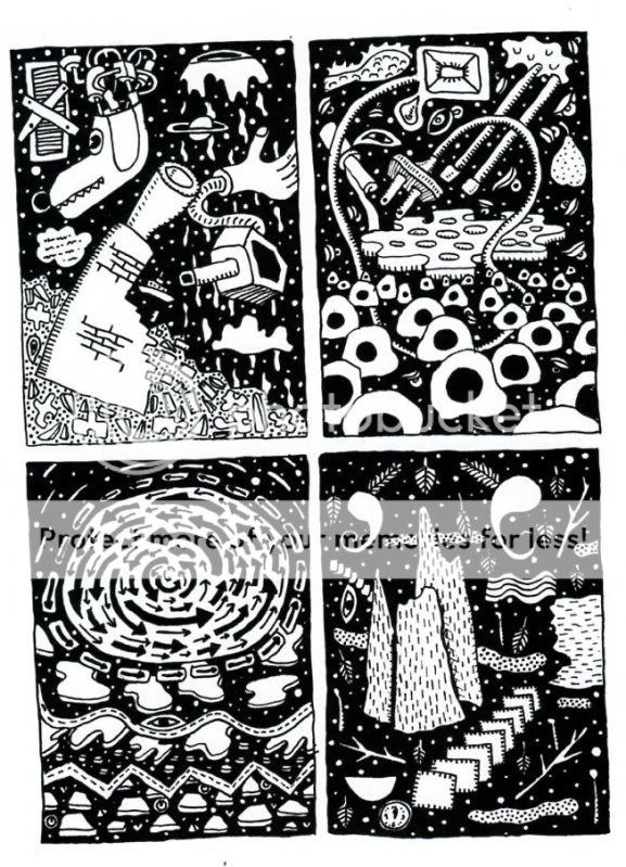
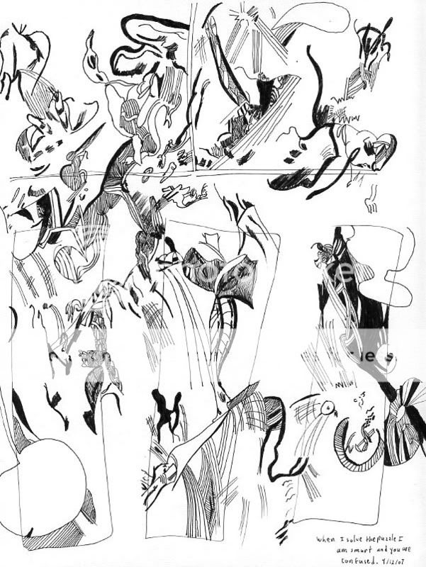
Stil…I have to say that, what with my low expectations, I was overall quite pleasantly surprised. In fact, what maybe most took me aback was how easy the volume was to read as comics. As I noted above, the combination of comics tropes and abstractions initially seemed to me like a bad and even unworkable idea. In fact, though, several of the strongest entries here are effective more or less for exactly the same reasons that a representational comic would be effective —because the creators are skilled cartoonists. For example, here’s one of a two page spread by Victor Moscoso:
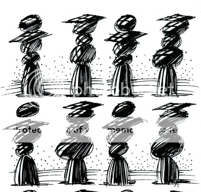
The amorphous nature of the action is part of the cartoony humor and the fascination of the drawing. It’s almost like one of those “find the differences between these two pictures” games, except there are an infinite number of differences…and there’s also a sense of sequence and movement. The rock piles/graduating seniors expand and contract and puff out from one instant to the next…or else bits of them pop up in surprise, as if some sort of gravity-defying secret is being whispered from one to the other. The figures are also, just in themselves, nice to look at — and again, that aesthetic pleasure (the inky scribbles, the humorous suggestions of motion ) suggests, or is linked to, the image’s status as comics.
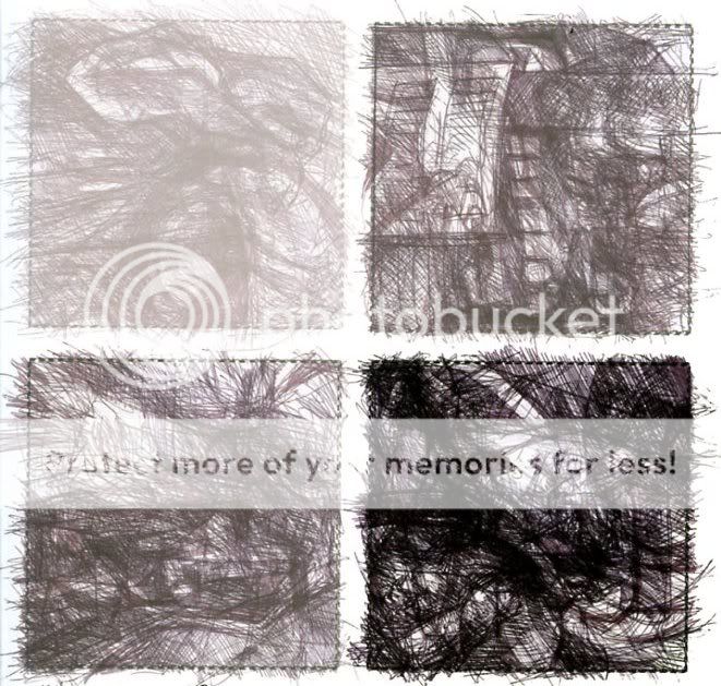
Lewis Trondheim’s efforts are make the point even more forcefully — he strips out the vast majority of representational or symbolic elements from his comics, and yet, somehow, retains all the features of his own style:
You look at that and say, “yep, that’s the same guy who did Little Santa” or whatever representational Trondheim comic you’ve seen. The amazing facility, the absolute mastery of comic pacing, even the insistent preciousness — it’s all there. The one difference is that these abstract efforts are, if anything, even more impressive than his regular comics. Anyone can make a cute story involving a penguin and an Abominable Snowman, but try doing it with just ink blots and shapes. Take that, Bushmiller.
That sense of wonder — how can you take away everything and still have so much left? — is a big part of the enjoyment of the book. Mark Badger’s “Kung Fu,” for example, turns a two page action sequence (I presume) into a bunch of what looks like copulating blocks. Yet somehow you still get the sense of motion and sequence — even of close-ups and long shots.
Richard Hahn’s pages of tiny panels, each with similar color blobs, are more clearly in a tradition of visual art…but, at the same time, they make sense in this collection, drawing a line between cubist experiments on the one hand and a series of stills on the other, so that comics ends up being a kind of intersection between visual art and animation.
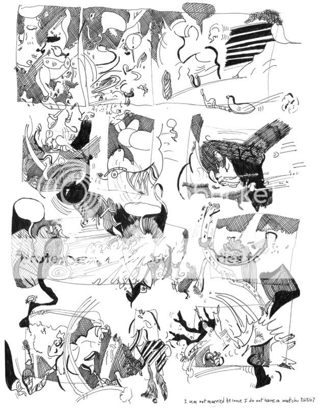
Even the less successful pieces are revealing:when they don’t work, they don’t work in the same way that bad, representational comics don’t work. One of my least favorite efforts was Jeff Zenick’s *Because. An excerpt is below:
Eight pages of that and I’m both bored and irritated. And the reason I’m bored and irritated is pretty much the reason I’d be bored and irritated in a more standard art comic. Namely…there’s just nothing going on here, either conceptually or formally. You’ve got your basic four panel grid on every page, and each panel is treated as a discrete unit; nothing is done to unify the page. Nor is there any progression from panel to panel. It’s just a bunch of doodles, randomly divided up, without any attention to composition or to much of anything else. I can imagine Jeff Brown doing something like this; it has that sense of pride in its own irrelevant dumpiness.
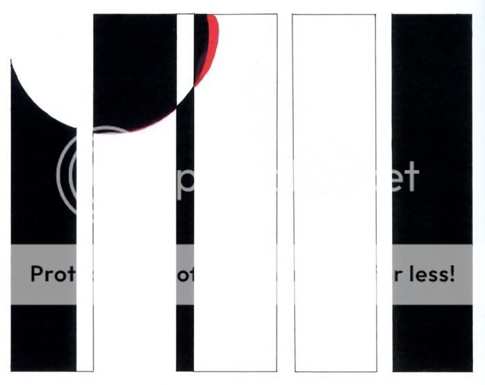
Another piece I wasn’t too taken with was Alexey Sokolin’s “Life, Interwoven.” This starts as a pale square with pale scribbly lines, and progresses with six pages to a giant dramatic image of black and white squiggles.
The penwork is actually lovely and fun to look at…but the progression seems overdetermined and melodramatic…bargain basement Anselm Keifer. On the other hand, Patrick McDonnell’s dramatic blank squares with pinkish shading and circles off to the side seem to sum up the worst bastardizations of Japanese design, from toothless impressionism to clueless mainstream comics.
In short, I think I have to retract. I said, “It seems to me that when comics become abstract, they really cease to be comics and become, for all effective purposes, simply abstract art.” But this anthology, in its best work as well as in its not-best, shows that that’s not true. Comics really are a coherent enough medium to support their own tradition of abstraction. That tradition doesn’t quite exist yet. But, in this anthology, Andrei shows conclusively that it could. That’s a pretty impressive achievement, and I feel lucky to have been a part of it.
_____________________
For the curious, here are my own drawings from the anthology
And, it seems only fair, all things considered, to add Dave Johnson’s acidic take on my art.
To be honest, most, if not all of your stuff I’ve seen so far looks like the work of someone sitting in boring business meeting with a blank sheet of paper and a ball point pen. Is it art? Sure, I guess. But I would put it the category of doodles as opposed to art. But I also feel that most of the art in Modern Art in galleries if, reduced down to 8″x11″ in size would feel the same way to me. Maybe you should move up to giant sized canvases. Added some paint splashes. Then, maybe I could look at it and say “well at least he put some effort into it.”
My own review will begin: " What does it say about a book when one of the contributors doesn't seem to buy the premise?"
..and I know for a fact that you're not the only contributor who balks at the idea of "abstract comics".
It seems like Andrei is certain that if that's not mentioned, and everything included is viewed as he says it should be — the beginnings of a "movement", just like you've read about!— and presented in something that looks like a really authentic art book ( the cover design is nice), he'll be able to make a genuine career out of it.
That wouldn't even bother me so much if he didn't exhibit such poor taste in general; if this is just about aesthetic thrill, which is the only real potential I see here, he's failed to provide it.
I think this'll go down in history as one of the biggest lemons the world of alt. comics has dropped. It's everything that could go wrong with a certain way of thinking about comics under one cover.
Huh. Well, you obviously like it less than I do. I found a lot of stuff I quite enjoyed. And I thought Andrei was fairly forthright about the fact that its not an actual movement so much as something he hopes will become a movement.
I think accusing Andrei of rank careerism seems kind of unfair. He's obviously passionate about this (whether you find it misguided or not). And it hardly seems like the quickest path to fame and fortune.
And as for your first line…I mean, the point of the review was that, after reading it, I kind of did buy the premise.
Nonetheless, I bet your review will be fun to read. Are you writing it shortly?
"It's everything that could go wrong with a certain way of thinking about comics under one cover."
Would you be willing to elaborate a bit more on this part, Uland? What's wrong with the thinking behind this book in your opinion?
I like that Jeff Zenick page, though 8 pages of random images would get on my nerves too. But the art isn't doodling; it looks pretty complex to me, and I like the effect it produces.
Offhand it seems a bit Julie Doucet-ish, though I'll leave that call to the people who know these things.
Greetings, Jeff Zenick here. I enjoyed reading your review.
I think Andrei's main purpose was to try to create a vehicle for the kind of artwork that he is naturaly inclined to do, a kind of art work that hasn't really existed before. It exists even if the so-called name "abstract comics" didn't exist, in the same kind of way so-called Surrealism existed before it was given the name surrealism.
I appreciate that my work moved you enough to mention it. I drew it in 1992. It was originally an 8 page mini-comic, 4 1/4" x 5 1/2".
I never refered to it as an abstract comic. I drew it one panel a day for 32 or so days, while sitting at Whattaburger drinking coffee, writing letters and drawing the back of people's heads in the same sketchbook. The process was a way of talking to myself.
Almost everything in "Because" is directly related to thoughts I was having. I cleared my mind, then noticed what I was thinking and put down a symbol for the thought, uncensored, noticed what I was thinking, put down another symbol for that thought. Some of it was symbols for the dreams I had the night before. Some of it has symbols for parts of dreams I had years before that I still remembered like the dream I had of birds that were carrying really old birds.
I purposely made most of the symbols indepherible. You might notice that some of the symbols repeat themselves on other pages. These are of reoccuring thoughts. of course looking at "Because" it is impossible to know any of this.
Looking at the page you printed, I can see the symbol I made for a path I was keeping myself from walking down [the boarded up door], the chimney of a burned down house I'd pass on my bike trips to visit friends in Georgia, more than one symbol, for sexual thoughts, A symbol for the passage o time [the squares in front of other squares]. A lot of it, I can no longer remember what the symbols are for.
Anyway, feel free to check out my new work on Ebay.com. Type "Jeff Zenick" into ebays search. I list new work a couple times a week. I've been fortunate to be able to make my living from my artwork these past 4 years.
Hey Jeff. Thanks for being so generous. I am impressed and envious that you've been making your living from your art; congratulations. Thanks for the explanation of your work, and for stopping by.
…he'll be able to make a genuine career out of it.
This ad hominem comment is silly, and cliched: the usual complaint about an avant-gardist who is pulling the wool over our eyes and trying to make a killing at the same thing. This notion has been repeated so often — the artist as charlatan — and it's an old, tired means of character assassination.
In fact Andrei Molotiu already has a career, or careers. He is an artist, art historian, and teacher. He is the author of Fragonard's Allegories of Love (Getty, 2008). The compass of his work is not limited to comics culture. To say that he's pushing abstract comics for careerist motives is asinine.
Why is it that criticism of art so often slips into the ideological? Why is it that the art that eludes us personally gives so much offense that it must be castigated for being pretentious or highbrow or morally wrongfooted? This response reads like bad rock criticism: attitude, attitude, attitude.