How to Pen and Ink (Comikers) and Inky Inky Ink (Our Blogger Asks For Feedback)

by Yasuhiro Nightow (Author), Oh! great (author), Satoshi Shiki (Author), Comikers (Author)
Currently available here for only seven dollars! It is otherwise sadly out of print in paper.

This is, hands down, my favorite art book. I have two copies, because I’ve worn out one.

If you’re curious about how a mangaka draws, inks, or tones, then this is the book for you. This is a compilation of various Comiker articles, tutorials, interviews, how-to-articles, and surveys. They include, among other things, a long list of responses of what various artists use to ink their manga (type of ink, type of nib, favorite pen, erasers, and so on). I love that kind of detail! It’s extremely useful to know, for instance, that some artists prefer quick drying ink because they draw more freehand and that others like slower drying but waterproof ink.

I solved some of my own difficulties by switching to a ink that worked better for the technique I was trying to use.

But besides being obsessively wonderful in detail, this book includes some pictures that are just damn cool. Want to see an artist go from basic layout pencil to perfected pencil to inked panels? They do this! And not just Joe Random Mangaka, they get great artists–Oh great, who does the back cover, is shown drawing and inking and toning the image. But it’s Satoshi Shiki’s work which makes my heart sing:


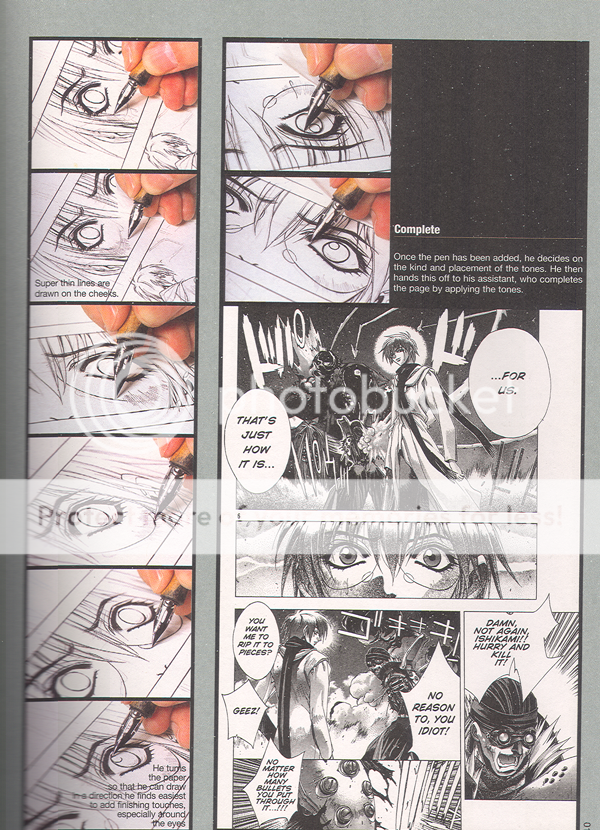
Check out the work on that eye! It’s fucking gorgeous. It just is. The line work! The thin-fat-thin! The eye lashes! The way the focus creates a widening eye effect! *happy sigh*

The previous page, which I didn’t scan but should have, shows him drawing the thing in pencils. *insert second happy sigh* Unfortunately, I cannot find any of his work translated into English and I’m not sure what magazine his current story is being run in. (Should some kind commenter know, I would be grateful for the info….)

Where was I? Oh yes. The purpose of the book and why the heck I’m talking about it.

The book focuses on training the artist to use pen and ink skillfully, and furthermore, to use it the way that mangaka use it. A technical college wrote a wonderful tutorial designed to teach these techniques. This mini-school is worth the cover price of the book. It covers thin-fat-thin, using the pens to draw speed lines, creating effect line, varying character emphasis, inking for emotion, and much more.

One thing I love about the Japanese art books that I own is their emphasis on practice and their slow and careful steps. This book, like many other Japanese books, suggests copying the work of your favorite mangaka in order to learn. This is useful because it allows the hands to learn how to compose a page. It is also wonderful because it does not require the budding artist to work on all the techniques (underdawing, composition, placement, plot, character development, and on and on), but instead allows the artist to focus on mastering a single skill, inking. They mention, in their tutorial or the introduction, that they assign student the task of just making long, smooth lines freehand. Page after page of them until the student can do it easily and freely.

That may sound restraining and lacking creativity, but if what you want is to know that you can trust your hand to create the images in your heart, then it is a wonderful way to learn.

So here is an example of the tutorial so you can judge for yourself:

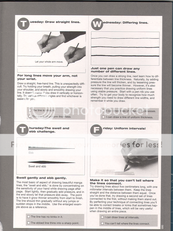
In any case, I feel strongly that this book is AWESOME. Which leads me into the second portion of my topic.

As you might guess, I’m a bit of an ink whore. I love ink. Adore it. Hug it. Collect it.

‘Uh, collect it?’ you may ask warily. Yes! Collect it. You see, in my copious spare time (when I’m not working overtime or going to grad school full time), I like to ink comics. I find it relaxing. I don’t, you know, post it anywhere. I ink and then when I’m done, I set the inked pages in a big box and when the box gets full, I recycle it. Sometimes I send it to friends. But mostly I don’t. Like I said, I just do it to relax. But like any good obsessive little comic addict, I have my preferences and my weird habits. So I have a lot of ink. I have, at last count, something like a dozen kinds of ink. Deleter 1-6 of course, and some Sumi ink, and some Higgins Ink, and my hoarded and beloved Pilot Drawing Ink (only available in Japan), and IC Comic ink, and um, some others that I forget. Windsor Newton and stuff? I don’t know. Not to mention the white ink.

So I’m going to review the inks. My thought was to draw a few panels in each ink, scan at least one page worth, and also draw some strictly technical panels (effect lines, for instance). I’m not sure if any artists read this or would find it useful, but I live in hope. I plan to include the following in each example page:

  • A character close up and one mid-sized
  • Something emotive
  • Place, building, interior
  • Effect lines or background hatching
  • Fine detail (flowers, fine shading)
  • Flowing lines (hair or clothing)

After I’ve reviewed several inks, I thought I’d have some cage matches. You know, put two inks together and draw the same thing with them and let you all vote as to which was better at hatching or speedlines.

What do you all think? Are there any aspects that would be most helpful? I plan to include in each review the strengths and weaknesses of the inks (to me), their waterproofness, their smear level, and how they work (ease of control, etc).

Gluey Tart: Prince Charming

Photobucket
Prince Charming, Akemi Takaido, 2007-2008, Digital Manga Publishing

I love Akemi Takaido’s drawing style. I love her pretty boys so much that she can almost do no wrong in my eye. Although I should explain that the three volumes of Prince Charming are her only works that I’ve actually read, as they’re the only ones that have been published in English. I do have a small stack of manga by her that are in Japanese, and they are beautiful, but I have no idea what’s going on. So I don’t actually know if Prince Charming is representative, story-wise. Being able to read this one did not enhance my Akemi Takaido experience as much as I’d hoped it would, though.

I’m not crazy about stories where high school teachers seduce their students, or vice versa. (Which is unfortunate for me, given the vast amount of yaoi centering on this plot device – or these two plot devices, if you’re like the Eskimos who supposedly have hundreds of words for snow.) (Which they don’t – not hundreds, anyway – and there aren’t exactly Eskimos anyway, much less one Eskimo language, and it’s all relative and stuff, but we shouldn’t let this sort of equivocation keep a good metaphor down.) If you do like these stories, and you haven’t read this series yet, I suggest you stop reading and just go buy it, because I think it’s a pretty good example of the genre. Otherwise, you’re going to need some more convincing. And I don’t know if that’s what I’m going to do, much as I’d love for so many people to buy this series that some publisher decides to scoop up all Takaido’s works and publish them in English. Or maybe I don’t want that at all. Maybe I’m happier not knowing what she’s saying.

The plot is pretty much exactly what you’d expect. There’s a debauched, hot, surly teacher. Students go for him. One student, Yuasa, catches him, using blackmail to close the deal. Yuasa winds up living at the teacher’s apartment, and the teacher obviously likes him, despite his curiously flat affect (the teacher’s, not the student’s). The student’s two friends are there all the time, and the teacher makes noises about wanting them to leave, but he never goes so far as making them go. The complications that drive the plot are that friend A wants the teacher, and friend B wants Yuasa. And you hope it works out that way, although that seems unlikely, since that’s not what happens with this particular yaoi plot device.

And that’s the rub, I guess. I quite enjoyed the complications re. who might end up with whom. I wanted the wrong people to wind up together. I was supposed to, and I did, and that made me feel kind of manipulated and cranky. And feeling manipulated by an obvious yaoi plot device is – well, stupid. I think my angst indicates that Takaido has something going on here. In general, I’m perfectly happy to go along with the conventions of various yaoi plot devices. I’m not one to whine about clichés. I think I wanted more here because the details of the relationships between the guys who aren’t supposed to get together are so compelling, while the details of the relationship between the characters who are supposed to be together don’t do it for me. But I suspect I’d be happier if I liked this convention more.

I spent the entire series feeling mildly perplexed about the two main characters. All the other characters are more appealing, even Nee-san, a random cutie we see a few times at the convenient underage gay club the three friends frequent. Friend A is surprising and sexy, and friend B is strong and stalwart. Yuasa – has nice hair, I guess. The teacher gives off a nice air of being about to completely fall apart and ruin his life, but his freakish lack of expression makes even that slightly bland and uninteresting.

Oh, but the art! Takaido does so much with so little. Look at these expressions!

prince charming

prince charming

Photobucket

While I’m gushing about Takaido’s art, here’s the panel that got me hooked (not from this series).

Photobucket

So clean. So perfect. (Happy sigh.) It’s probably just as well that the Prince Charming story didn’t thrill me to my core. It might have been too much. I might have spontaneously combusted. So, now that I think about it, whew! That was close! I’m a little disappointed, but at least I’m not a film of greasy black stuff coating my dim chambers, or a little green globule clinging to my drum set (depending on whether you favor Dickens or Spinal Tap). Hey, lots of people do spontaneously combust every year. It’s just not widely reported.

Face Down In The Mainstream: Supergirl

Supergirl #44 October 2009

Gates, Igle, Sibal

In my relentless quest to find interesting and readable mainstream comics that have female characters in plots that don’t make me reel back in horror, I picked up Supergirl. Oddly, I thought that since the comic was named after her, it would feature her character.

Just goes to show that I am ignorant about comics.

The comic begins with no introduction or backstory and focuses on a strange, large, lumpy man in lavender spandex. He’s been captured by someone and he wants out. Eventually, he fights a John McCain lookalike and frees himself:

His eyes glow red and he speaks in Zapf Dingbats, so you know he’s crazy or possessed.

We switch to a scene with the Supe himself, walking with Lois Lane, who is looking dumpy and strange in loose and unattractive eighties style modular knits. There’s talk between various big dogs while Supergirl (I had to guess based on her outfit), looks left out and or pensive. Eventually, they allow her to go talk to her childhood best friend, as long as she is chaperoned by some other guy.

Meanwhile, a female reporter in Frederick’s Of Hollywood hookerwear tries to find some leads.

Supergirl fights her childhood friend and gets possessed, which you can tell by the cover of the comic and the odd overlay of purple glowy light on her face in the last panel.

That’s it, really.

Lumpy men in gross purple bodysuits and a sad, forlorn, actionless and directionless mini-superheroine.

Ugh.

Note to comic writers: Come on. Who thought this was a good idea? The heroine takes no action. She has zero growth. No initiative. Hell, she has no character! And the art sucks.

Two and a Half Centuries of Failure

Donald Dewey
The Art of Ill Will
New York University Press
251 pp/b&w
hardcover
978-0-8417-1985-5

I suppose the title should have warned me, but even so, the sourness of Donald Dewey’s *The Art of Ill Will* rather took me aback. I guess I had assumed that you wouldn’t edit a sizable monograph on the political cartoon unless you actually liked political cartoons. My mistake.

Far be it form me, though, to condemn Dewey for his dyspepsia. On the contrary, his 75-page introduction (more than a quarter of the book!) seems to me to be just about on target. Over the course of a detailed historical overview, he makes the case that editorial cartoons occupy an almost impossible cultural position, trying simultaneously to be propaganda, popular entertainment, and art. As propaganda, there is little evidence that they’ve ever succeeded on anything but the most limited terms: even in the 19th century, it’s hard to tell whether Thomas Nast actually had that much of an influence on anyone’s voting habits. As entertainment, editorial cartoons have been in decline for generations; as Dewey points out, political junkies these days turn to blogs or John Stewart for their laughs, not to cartoonists. And as art…well, Dewey points out “cartooning has never been expected to be ahead of the curve artistically, to pioneer an aesthetic vision.” In fact, after reading this book, one is led to the conclusion that the only thing editorial cartoons have been able to do consistently, reliably, and well, is to disseminate and popularize vile ethnic caricatures. From happy darkies carrying watermelons to slant-eyed duplicitous Japs, from oily Catholic priests to oily Muslim clerics, if its stereotype and prejudice you’re after, editorial cartoons know no peer.

Of course, there are plenty of great editorial cartoons, and Dewey reproduces a number of them. I was struck, in particular, by the work of Joseph Keppler, a contemporary of Nast’s whose drafting skills are, if anything, even more astounding than those of his more famous rival. I’d seen Keppler’s “The Modern Colossus of (Rail)Roads” before, but it’s still amazing; an almost photographic realism combined with a Little Nemoesque mastery of scale. I was glad to see several examples of Theodore (Dr. Seuss) Geisel’s work included as well; his giant Hitler water-snake is as fancifully endearing as any Grinch or Floobooberbabooberbub. I wish there’d been more examples of Oliver Harrington’s work; I’d (embarrassingly) never heard of him before, but the one picture included here, of a mob lynching a school bus, is rendered with absurd tactile viciousness — it’s a lovely choice for one of the few color reproductions. And I’m always happy to see anything by Robert Minor and Art Young (though, unfortunately, the cartoons Dewey chose for the later are far from being his best work.)

Despite such standouts, though, the overall effect of paging through the gallery here is more irritation than wonder. As just one example, a cartoon labeled “The Providential Detection”, showing Jefferson, an eagle, and several bales of mail, is almost completely charmless: stiff, ugly, and boring, its incompetent without any of the *brio* or imagination that you sometimes see in the work of untrained artists. Of course, when this cartoon was published in the 1800s, the U.S. was a cultural backwater, so it’s not a big surprise to see third-rate work. More modern entries, unfortunately, don’t have that excuse. Ted Rall’s meandering Terror Widows cartoon is an inevitable low point: I actually had to look at it twice to reassure myself that, no, the reproduction isn’t messed up, he just actually draws that badly. Gary Trudeau (who Dewey unaccountably praises for his distinctive graphics) is represented by several cartoons, including one of his trademark “lets draw the White House over and over because I’m just that damn lazy” efforts. And numerous Jules Feiffer cartoons display all the smug, feeble irony of a M.A.S.H. rerun; the man is the Alan Alda of political cartooning.

Feiffer’s numbing glibness is an extreme example of his profession’s cardinal weakness. When political polemic reaches the level of art, it tends to do so because the polemicist has thought things through. People like Hogarth or Bosch, or Bernard Shaw, or Mencken each had a vision of society which was nuanced and consistent, and which gave their verbal jabs depth and resonance. Shaw actually believed in socialism; Bosch actually believed in Christianity; Mencken actually believed in art. Most political cartoonists on the other hand, try to generate opinions without believing in anything in particular. They’re like decapitated chickens chasing after their own heads not because they hope to find any ideas there, but just for lack of anything better to do. As a result, you get a lot of scrabbling and spurting, but not a whole lot of insight — which in practice means a lot of pretentious gag cartoons with unusually obvious punch-lines. “The Americans sure whipped the British in the War of 1812!” “Jerry Falwell sure is slimy!” “They execute a lot of people in Texas!” How cutting.

Dewey’s presentation doesn’t help matters any. To every single cartoon he has appended a short note, explaining the meaning. For example, beside a picture which contrasts tony landlords leaving church with images of slum dwellers, we find this:

“Taylor’s “Our Religious Landlords and Their Rookery Tenants* (1895) mocked the hypocrisy of New York landlords who found an hour for piety every Sunday in between week-long indifference to the misery of their slum tenants.”

Admittedly, many of the cartoons are dated enough to require some sort of annotation. But Dewey’s indiscriminate and obsessive limning painfully emphasizes the fact that a dull joke is not improved by exegesis. At moments, Dewey himself seems to feel the futility of the whole exercise. In at least two cartoons (one by Paul Conrad, one by Bill Mauldin) , he drops the original caption entirely, rendering the putative joke incomprehensible. It’s as if Dewey said to himself, “Aw, hell, who really wants to look at this stuff anyway?”

No doubt the dropped captions were an accident. But still, the slip seems Freudian. *The Art of Ill Will* isn’t really all that interested in the cartoons; it’s built around the author’s Introduction, not around the pictures themselves. The book is a thesis, meant to provide information and raise interesting questions. It’s only because it’s marketed and priced as a coffee-table art book that it seems disappointing. Visually, Syd Hoff’s out of print 1976 *Editorial and Political Cartooning* is tons more enjoyable, simply because Hoff approached the work as a fanboy, reproducing the work of the artists he most admired, and ignoring everybody else. Dewey’s view of the medium’s achievements and weaknesses is probably closer to the truth— but, alas, as every editorial cartoonist should know, the truth isn’t very pretty.

______________

This essay first appeared in the Comics Journal.
 

I have seen the future, and it is MOTION!

Spider-Woman: Agent of SWORD, Episodes 1-3

Written by Brian Michael Bendis
Art by Alex Maleev
Spider-Woman/Jessica Drew voiced by Nicolette Reed

This is my first foray into comics blogging, and rather than waste everyone’s time discussing primitive sheets of paper, I thought I’d take a look at the cutting edge of comics technology. Books are for Luddites, motion comics are the future, so what does the future look like?

Short answer: a really cheap cartoon with an impenetrable plot.

Long answer:
After her solo title was canceled in 1983, Jessica Drew vanished into character limbo while the Spider-Woman name got passed around to various heroines, none of whom found any lasting success. In the mid-2000s, Brian Michael Bendis pulled Drew from obscurity and placed her on his high profile revamp of the Avengers. Spider-Woman: Agent of SWORD is the first serious attempt at a Spider-Woman ongoing in more than 20 years, as well as Marvel’s first go at motion comics.

Considering that motion comics are sold through iTunes rather than the Direct Market, you’d think that Marvel would target the casual “I liked Downey, Jr. in that movie” fan. But Marvel is nothing if not predictable, and instead the story launches out of the last mega-crossover, Secret Invasion (also by Bendis). Jessica Drew was apparently kidnapped by Skrulls, a shape-shifting alien race, and replaced by the Skrull queen. So the Spider-Woman that readers had been following for the last couple of years in New Avengers was a fake. Now the real Spider-Woman is back and she’s understandably pissed. Lucky for her, Abigail Brand, director of S.W.O.R.D. (Sentient World Observation and Response Department), offers Spider-Woman a job hunting down Skrulls, thus allowing her to work out her issues and beat up illegal aliens at the same time. Spider-Woman’s first assignment takes her Madripoor, the crime capital of Asia. As these things always go, her mission quickly goes to shit and she’s on the run from HYDRA (like G.I. Joe’s Cobra, but no ninjas). And just when you think things can’t get more complicated, in episode 3 Spider-Woman is targeted by the Thunderbolts, a super-powered hit squad run by Norman Osborn, the Big Bad of Marvel’s current Dark Reign mega-crossover. In other words, it’s a story only a hardcore superhero fan could love.

Thankfully, Alex Maleev’s artwork is easier to appreciate. His penciling is fairly realistic and detailed, but he applies multiple layers of color to his work, causing every image to appear dark and washed-out. While the coloring can make certain details hard to see, it effectively establishes the mood and atmosphere of an espionage thriller.

The main attraction though of Spider-Woman: Agent of SWORD is neither the story nor the art, but the format. Each motion comic episode runs about 10 minutes, and consists of three types of visuals. The first type is a sequence of still images accompanied by dialogue and other sound. During conversation scenes, the images are frequently re-used. The second slightly more sophisticated visual involves moving an image in the foreground while keeping the background still. The third type of visual, which is used for the vehicle chase scenes, is just low budget computer animation (which seems like cheating to me).

Several critics have accused Spider-Woman, and motion comics in general, of simply being low budget animation, and there’s a pretty strong case for that. But comparing motion comics only to animation ignores their biggest flaw, namely that the subtle communication between artist and reader is sacrificed without replacing it with the advantages of actual animation. While it probably goes without saying, comics are a sequence of artistic panels usually accompanied by text. But there’s more to reading a comic than just proceeding from top-left to bottom-right. The layout of panels, their size, the level of detail, and the amount of text per panel are all part of the communication between artist and reader. Motion comics take most of that away. Every “panel” is now just another background that fits the standard aspect ratio. And the pacing of the story is set by the motion comic producers rather than the artist and readers. Motion comics, in short, are something less than comics AND something less than animation.

Of course, motion comics do have one element that comics can never have: sound. The music and sound effects in Spider-Woman are used quite well, adding to the atmosphere of the story but generally remaining unobtrusive. The dialogue and Spider-Woman’s inner monologue are another matter. Bendis has a peculiar approach to the English language, which seems to consist mostly of repetitions, redundant statements, and pointless asides. Presumably Bendis is going for realism, but I can happily say I’ve never talked to anyone who speaks as strangely as the characters in this comic. I feel pity for the voice actors who had to read his lines and try to make them sound like something non-assholes would say. Nicolette Reed, who voices both Spider-Woman and Madame Hydra, doesn’t seem to quite know what to do with her lines, so Spider-Woman comes across as flat (and British?) while Madame Hydra quickly becomes obnoxious. But her performance seems Oscar-worthy compared to her co-stars. Particularly shameful are the “actors” who voice the Madripoor police detectives, who seem to take the Breakfast at Tiffany’s approach to portraying Asian men.

So the execution of Marvel’s first motion comic is not so good. Maybe a better example would change my opinion of the medium, but I doubt it. Still, it gave Marvel an excuse to come up with another corny character theme song. Behold, the Spider-Woman music video!

Update: the entire first episode is available for free for a limited time on Youtube. Check it out if you’re interested.

Update 2: David Weman was kind enough to provide a link to an animated short based upon Edgar Allen Poe’s “The Telltale Heart.” It isn’t quite the same thing as motion comics, but it’s a similar combination of still images and simple animation. And needless to say, Poe is a somewhat better writer than Bendis.

Music For Middle-Brow Snobs: The Fool

Cheesy contemporary country and other tales of heartbreak:

1. Mariah Carey — Betcha Gon Know (Memoir of an Imperfect Angel)
2. Lee Ann Womack — The Fool (Lee Ann Womack)
3. Miranda Lambert — Greyhound Bound for Nowhere (Kerosene)
4. George Strait — She Told Me So (It Just Comes Natural)
5. Bonnie Raitt — I Can’t Make You Love Me (Luck of the Draw)
6. Emmylou Harris — Lovin’ You Again (Cowgirl’s Prayer)
7. Merle Haggard — Learning to Live With Myself (The Bluegrass Sessions)
8. Kieran White — Hummingbirds (Wayfaring Strangers: Lonesome Heroes)
9. John Villemonte — I Am the Moonlight (Wayfaring Strangers: Lonesome Heroes)
10. Pearls Before Swine — Morning Song (One Nation Underground/Balaclava)
11. ????? — Rashomon (????)
12. Sokai Stilhed — Howl (Second)
13. Arthur Rubinstein — Chopin: Mazurka #47 in A Minor, Op. 68/2, CT 97 (Chopin: 51 Mazurkas)
14. Brandy — Almost Doesn’t Count (Never Say Never)

Download: The Fool.

And if you missed it, last weeks download is here,

Awkward Introductions

Hey everyone. Having worked my way up the ladder from lurker to commenter, Noah graciously offered me a position as the newest associate utilitarian. I’m unprepared and completely unqualified, but I’m pretty good at bullshitting, so I hope you’ll all bear with me.

Quick bio: I’m single, late twenties, middle class, white, and male. The entire entertainment industry is built around catering to me. Sorry.

I grew up in northern Virginia, specifically Fairfax County. My educational background is in history and public policy. Like many of my classmates, I ended up working for the federal government (in case you’re wondering, your tax dollars have in fact gone into my pocket. No, I didn’t really work that hard for it. Sorry). I’ve specialized in immigration, having worked for both the Department of Homeland Security and the Department of Justice. If that sounds exciting to you, then you’ve clearly never worked in government.

I don’t have the typical comic geek background. For starters, I’ve never set foot in a comics shop. I started reading X-Men in my early teens, back when they could still be found in supermarkets, but I gave it up as soon as I got my first car. I didn’t care about comics at all until just a few years ago, when an old college friend lent me her copies of Sandman, Watchmen, and Maus. Being totally honest with you all, I never got past the first couple pages of Maus, but the other two books were enough to get me interested in comics again. And so I began reading everything I could find and looking for people on the Internet who shared my obsession. And it turns out that there are a freakin’ lot of people who blog about comics. So one more can’t hurt.

Thanks to Noah; hopefully I can contribute something to the HU.