Strange Windows: Draw Buildings, Build Drawings (part 3)

In the two previous parts of this essay, we surveyed the intersection of comics and architecture in a one-sided way: showing how comics draw on architecture.

But what do comics have to offer architecture in return?

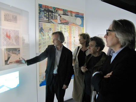
In conjunction with the Archi et BD exhibition reviewed in part 1, several architects were asked about their relationship to comics.

Francis Rambert and Jean-Marc Thevenet , curators of the exhibition

David Trottin, co-founder of the Peripheriques architectural collective:

“Many are the architects who have been marked by Gotham City and all those American cities you’d see in Strange [a French superhero reprint mag] and other comics. More recently, I’ve been attracted by the strips of Charles Burns or Daniel Clowes (…) I like this vision of the city, cleaving to reality while leaving the door open to the supernatural. These authors create a sideways banality (“un banal decalé”).

The city, anyway, is never so beautiful as when it is the medium of a story.

We architects are not supposed to tell stories.

And at the same time, our role is to imagine places for living. This debate about the ‘scripting’ of life in the architect’s work is extremely interesting.”

So it would seem that comics provide a source of inspiration, but also of reflection.

As Trottin indicates, narrative is inherent to architecture yet secretive, difficult to articulate; one can, however, follow possible architectural narratives in comics. Comics can serve as a sort of test lab for the liveability of a space. It is always a challenge, in an architectural drawing, to show how human beings will occupy and inhabit a space.

But if there’s one thing comics characters do well with architecture, it’s to inhabit it– and architects are very much aware of this.

Reza Azard, from the Projectiles studio that designed the Archi & BD exhibition:

“For architects, drawing is primordial, it even represents a great part of our work. Before construction, there’s the project that must be drawn and, in order to convince, the drawing must express life, emotions, things one finds in films and in comics, which are media that place man in his context. Many architects are inspired by films and comics.”

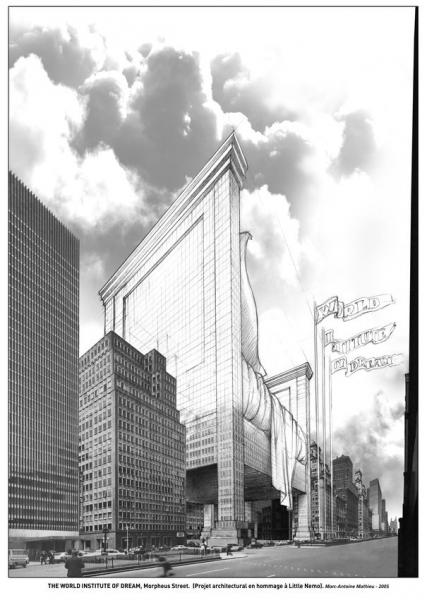
As a parodic, playful witness to this inspiration, this tribute to Winsor McCay’s Little Nemo by cartoonist Marc-Antoine Mathieu:

(Comics certainly are also useful for presenting the architects’ work: Trottin’s Peripheriques agency produced its 2003 catalogue in the form of a comic book. The same goes for the Danish agency BIG, which has sponsored a travelling exhibit of its work– ‘Yes is More’, a parody of Mies Van der Rohe’s dictum ‘Less is More’ — jointly with a comics-formatted catalogue; see the result here)

And architects also revel in the sheer invention and vitality of comics. Here’s the cover of a manifesto by the 1960s British architectural agency Archigram:

Yes, this draws on the Pop Art and Camp vibe of the times, but I prefer to think the Archigram crew was attracted by the brashness, the childishness, the sense of play of comics — of illicit creativity.

They certainly proposed fantastical projects that could, indeed, have come straight from the comics, such as their Walking City:

Norman Foster has done more than any other architect to bring to life some of the spirit, and even the fabric, of the optimistic, technologically underpinned world celebrated in the futuristic British strip Dan Dare by cartoonist Frank Hampson.

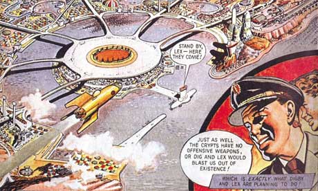
Foster is in no doubt that Dan Dare has been a genuine influence on his work. In 1983, he even commissioned John Batchelor, a former Eagle artist, to draw the new Renault Distribution Centre in Swindon as a pullout poster for the Architectural Review, which ran a feature on Foster’s approach under the headline: The Eagle has landed. (The Eagle was the comic magazine in which the strip ran.)

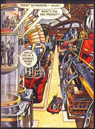
“I loved the coloured, cross-sectional, technical drawings that appeared in the middle of the Eagle after Dan Dare,” says Foster.

One Dan Dare episode features Big Ben housed in a Perspex sheath, shaped exactly like Foster’s famous Swiss Re building in the City of London, the so-called ‘gherkin’ (pictured above).

Laurie Chetwood, born in 1957, is one of Britain’s leading architects. His most recent proposal is a $300m space-age sanctuary for world leaders in the Nevada desert. It looks exactly like something Dan Dare would manoeuvre his rocket around.  Says Chetwood:

Architects don’t often seem to have had childhoods. Or at least, they pretend they can’t remember them, in case they appear to be less than earnest. My cousins handed me down their Eagle annuals, and I became a Dan Dare fan. I drew loads of space rockets and strange machines.

The draftsmanship skills required of a cartoonist and those required of an architect are similar– rigor, clarity, mastery of perspective and space, a controlled line, a good sense of measure and proportion.

(These skills, however, may seem less and less relevant to young architects in this age of computer-aided design; I once had a book entitled Perspective for Architects — incidentally the most useful book on drawing I have ever owned– in which the author scolds architects for their poor draftsmanship, comparing them unfavorably with illustrators and cartoonists.)

Many cartoonists have had training in architectural or technical drawing. Dave Gibbons, of Watchman fame, trained as an engineer ( he points out that not only could he draw a window, he could also build one), as did Jacques Martin, the author of the Alix series set in ancient Rome:

Jacques Martin, Alix

The late Marshall Rogers trained as an architectural draftsman, a fact readily apparent from his city backgrounds:

Marshall Rogers and Terry Austin, Detective Comics

Some cartoonists, however, go beyond depictions of buildings and get involved in building design and decoration.

The most basic way is the painting of exterior murals. And, indeed, the city of Brussels — one of the historic capitals of comics creativity — has commissioned 32 of them to adorn its streets with the works of popular cartoonists:

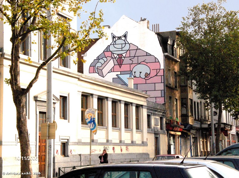
Le Chat, by Phil Geluck

Cory Moussaillon, by Bob De Moor

However charming these be, for the most part the murals don’t integrate well with the buildings — merely adding an illustrative layer on the facades– sometimes to add a gag:

Gaston Lagaffe, by Franquin

Here is a complete series of photos of this delightful urban phenomenon

But one in the series does seem to dialogue with its support:

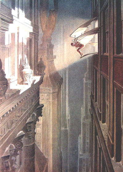
… and this doesn’t come as a surprise, for the comics artist who designed it has thought much about architecture over his three-decade- plus career’s span: François Schuiten.

A typical architectural fantasia by Schuiten

And another one

His most renowned series in that vein is Les Cités Obscures, written by Benoit Peeters.

Francois Schuiten and Benoit Peeters

These stand-alone but thematically connected works deal in an often fantastic or metaphoric mode with humanity’s relationship with the city and with buildings.

In Les murailles de Samaris (the Great Walls of Samaris) a mysterious city seems to be in a perpetual state of flux, with shifting walls and morphing buildings:


From Les Murailles de Samaris

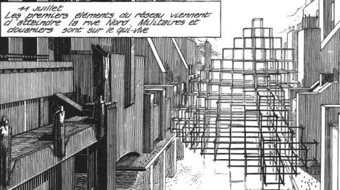
In La Fièvre d’Urbicande (Fever in Urbicand) two cities that have always been separate are joined by a strange grid that starts out as a desktop toy and grows slowly to immense size, overlaying the cities:

La Tour (The Tower) is Schuiten’s take on the Tower of Babel legend, with a nod to Borgès, featuring a Medieval-style tower of seemingly infinite height and depth.

All in all, there are nine Cités Obscures albums so far; several are available in English from NBM.

And another urban landscape…these are addictive

It comes as no surprise that an artist of his accomplishments should be solicited to realise those architectural “dressings” known as scenographies. And, indeed, Schuiten has done several; most spectacularly, a platform on the Paris Metro’s ‘Arts et Métiers’ subway station:

Schuiten’s preliminary sketch

The finished station

You step into a dream of “steampunk”, a Jules Verne setting made real, a way station in the Cités Obscures.

In walls of copper sheathing, portholes worthy of Captain Nemo’s Nautilus display models of marvellous inventions from the Arts et Métiers museum.

In the tunnel’s ceiling, we see the ominous edges of gigantic gearwheels…for what obscure purpose?

Schuiten has also designed scenographies for the Pavilion of the Grand Duchy of Luxemburg at the Seville World’s fair, and the Pavillon des Utopies (A Planet of Visions) at the Hanover World’s Fair.

World’s Fairs? How appropriate for a designer of architectural utopias.

Schuiten comments:

“The risk in drawing utopia, is that it isn’t incarnate, it distances itself from reality, that it is complacent in its own invention and detaches itself from the roughness of reality. So, when one works on worlds, one wishes to test them> my drift into scenography allowed me this, and in exchange has modified my draftsman’s gaze. This back-and-forth between the two forms of expression creates a new awareness of what drawing can bring and what reality cannot.”

What the heck, I can’t resist… Schuiten adapts Jules Verne’s ‘Paris au XXeme Siecle’

François’ brother and erstwhile collaborator, Luc Schuiten, has abandoned comics altogether and become an architect full-time.

His projects, though, show definite comics influences in their utopian designs:

Jean-Claude Mézières, the artist on the noted science-fiction series Valérian, was commissioned by the city of Lille, France — the European Capital of Culture for 2004 — to transform a boulevard into a spaceport landing strip: ‘ Le Chemin des Etoiles’ (The Way of the Stars):

The Dutch illustrator and cartoonist Joost Swarte is also known for the strong architectural presence in his drawings; he is yet another artist with training in industrial design:
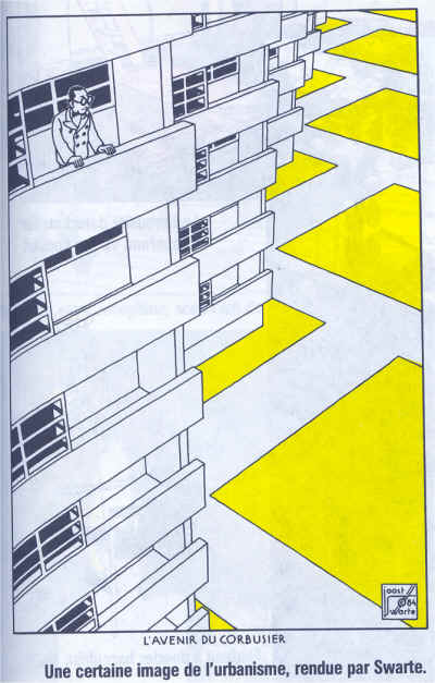
Joost Swarte


Swarte has collaborated with architects to actually design and realise buildings.

His first major project was the Toneelschuur Theater in Haarlem, in partnership with the Mecanoo agency:

Swarte:

“Architecture projects are big puzzles to be solved… An architect friend pointed out that a wall is a pen-line on paper, while it has thickness in the real world. I’d forgotten that when I had started organising the different spaces in the theater. But walls make up about 15% of a building’s area! Comics also have this advantage over architecture that you can launch a project with zero budget…”

The Swarte/Mecanoo design for the Toneelschuur Theater in Haarlem

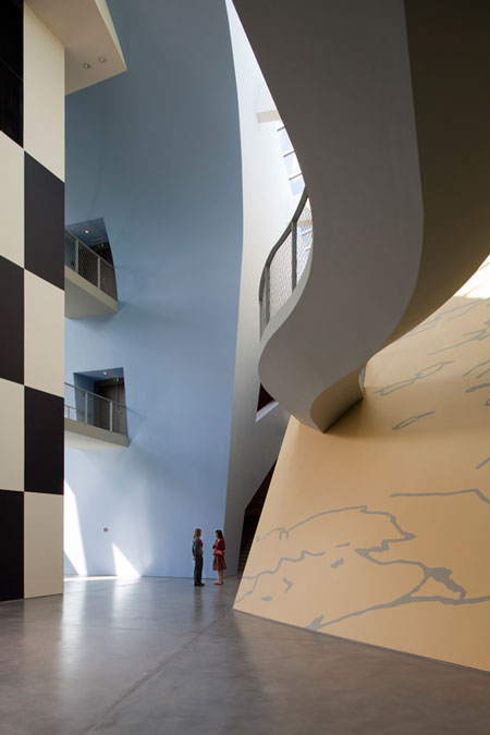
The director of the Hergé foundation, Nick Rodwell, then asked Swarte to design the Herge Museum in Louvain-la Neuve; with Thierry Groensteen — a man possessing great experience as a comics curator — and Philippe Godin, the foremost Herge scholar, as consultants, he came up with a design for the building that was completed by architect Christian de Portzamparc.

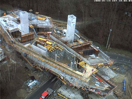
The Musée Hergé under construction

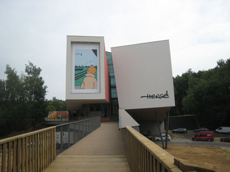
Front approach to the museum
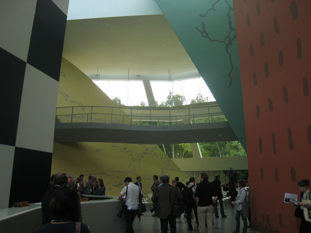
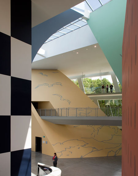
The main hall


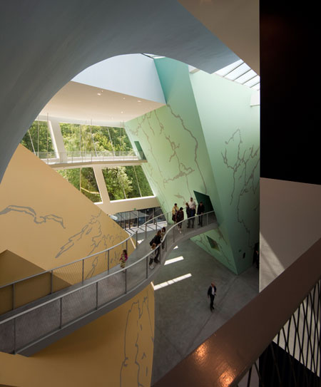
Footbridges link the four main exhibit rooms; Pontzamparc compares them to the gutters between panels


Note how the spaces reserve surprises and summon the spirit of exploration and adventure of a Tintin album:

Side view; note the colors, all carefully matched to those in the Tintin albums.


Swarte:

“It’s bizarre, but when I’m working on an architecture project, I think about the comic I could make of it. And on the other hand, when I’m doing a drawing, I start drawing facades, and imagine what I can put behind them. I can’t fight it! It’s natural.”
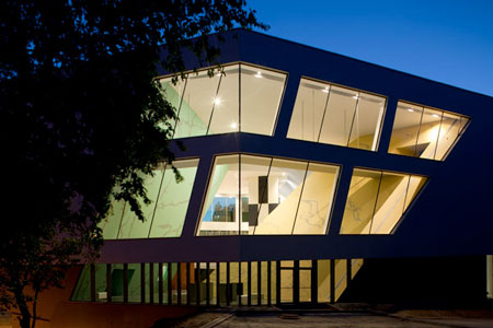
The Musée at dusk

Christian de Portzamparc:

“The Musee Hergé is perhaps the only example of a comic transformed into architecture. At least, it has materialised in three dimensions”.

Joost Swarte also designs for other media. Here he presents his tapestries at the Stadhuis (City Hall) of Haarlem

Hob-nobbing with architects is all very well, but why shouldn’t the guys who actually build the building inspire cartoonists? Why this snobbery towards the hard-hats? Cartoons may lead to construction, but can’t construction — with your own two hands — lead to cartoons?

The cartoonist Alan Weiss spent a summer on a construction site; it got him thinking about the lack of real proletarian heroes in mainstream American comics.

Thus was born Steelgrip Starkey, a genuine blue-collar fusion of Li’l Abner, Edison, and Doc Savage: a superhero who disdains violence for the kicks of building huge wicked cool projects the world over! Check out this quirky but good-natured series from Marvel Epic.

Yes, I know — the full title sounds like a porno movie. So sue me already.

***********************************************************************************

There is a final, compromised but creative way for cartoonists to “realise” their architectural ambitions, through a third artform: the cinema.

Directors and designers have not been slow to call on the creativity of comics artists. Ron Cobb designed the ship Nostromo’s interiors for Ridley Scott’s Alien; Mike Ploog designed for films such as Tomb Raider.

Two of France’s top science-fiction comics artists were the chief designers of director Luc Besson’s The Fifth Element, and that film’s futuristic New York: Jean ‘Moebius’ Giraud and Jean-Claude Mezieres. Here are a few of Mezieres’ preliminary sketches:

And here’s Meziere’s designs come to life:

Mèzière’s city comes to cinematic life in this clip.

Enki Bilal has gone further, directing as well as designing Immortel (Ad Vitam), an adaptation of his Nicopol series of albums:

A trailer for the film.

Another option for cartoonists who wish to concretise — if only virtually — their designs is video games. Such was the path chosen by Benoit Sokal, the creator of the anthropomorphic noir series Inspecteur Canardo.

Inspecteur Canardo, the police duck, in an introspective moment

Sokal was the designer behind the games Amerzone and Syberia.

From Amerzone

From Syberia

This concludes my essay on comics and architecture; as a valediction, this advice:

Architects, draw more; cartoonists, build more.

****************************************************************************

“Concludes”? I wish! this is too vast a subject.

Where, for example, have I mentioned Alan Moore’s and Eddie Campbell’s From Hell, in which architecture is used narratively in such an innovative way?

What of the Japanese comics masters?

In other words, I can’t exhaust this subject, and follow-up columns on it will appear from time to time; as ever, your suggestions are welcome.

********************************************************************************

This is part 3 of a 3-part series. Click here for part 2 and part 1

Time Capsule, Part 1

I turn thirty this month, which means I’m officially an old fart. And like all old farts, I enjoy reminiscing about the past when everything, especially comics, were better. It’s time for some good, ole’ fashioned nostalgia. And since nostalgia tends to be infantile, why not look back at the comics being published during my first days as an infant? For the next two weeks, I’ll be reviewing the mainstream comics of September 1980, starting with the output of DC Comics.

Batman #327
Writer: Len Wein
Pencils: Irv Novick
Inks: Frank McLaughlin

I don’t care for Irv Novick’s artwork. It’s genre hackery at its most tiresome: generally competent, but lacking any sense of location, character, or emotional intensity. Backgrounds are practically nonexistent, and not for any creative reasons that I can detect, but probably because Novick is lazy. To avoid drawing backgrounds, he brings the action close to the characters or fills the panels with talking heads. On the plus side, I’m amused that his depiction of Dr. Milo resembles an anorexic Moe Howard.

The shitty artwork is all the worse because it drags down a half-way decent story. Wein appreciates that Batman straddles the line between superheroes and pulp crime, and he liberally steals ideas from the latter genre. Rather than a straightforward hero vs. villain slugfest, the narrative is mostly a detective story with disguises, drugging, and identity confusion.

Unfortunately, the main story is only 18 pages long (to make room for a tedious Batman and Robin back-up), so Wein has to rush through the plot, spending just a few panels on each of the pulp crime tropes. The result is a story that practically begs to be a two-parter. On the other hand, that would require reading another issue drawn by Novick.

Action Comics #511
Writer: Cary Bates
Pencils: Curt Swan
Inks: Frank Chiaramonte

I’ll lay out my prejudices at the start: Superman is boring. He’s a boring character who stars in boring stories. Action Comics is probably not the worst comic being published in any given month, but I can’t remember when it was ever any good. And judging this comic solely as a superhero adventure, it largely confirms my bias. Lex Luthor goes good (I’m guessing it doesn’t last) and helps Superman in an unremarkable fight against two unremarkable villains. There’s also a section devoted to Clark Kent’s job as a TV anchorman, which is sadly no where near as entertaining as it could be. At the very least Curt Swan’s art  is attractive, but he can’t elevate tedious plot or characters.

But for all it’s faults, I was actually entertained while reading this comic, thanks to to the fact that it’s incredibly gay (more so than Superman usually is). The opening splash page features Lex Luthor relaxing in a room decorated entirely with pictures of Superman doing heroic things, like flying, punching, um … standing, and … I’m not quite sure what he’s doing on the right. Rolling up a newspaper? Maybe it’s supposed to be an iron rod (insert your own joke here).

Plus, it ends with manly hand-holding…

Bros 4 Life

And in-between, Superman and Lex fight a gay, space cowboy. I suppose unintentionally entertaining is better than nothing.

Wonder Woman #271
Writer: Gerry Conway
Pencils: Jose Delbo
Inks: Dave Hunt

Poor Steve Trevor. DC would kill him off, only to bring him back, and then kill him off again in a desperate bid to wring some drama from Wonder Woman. Apparently, issue 271 was a big deal, because Steve Trevor is brought back to life (again). Except it wasn’t the “real” Steve Trevor, but another Steve from a parallel Earth who crashed through a dimensional barrier.

I don’t give give a shit about the DC multiverse, but I approve of this plot point. If there’s any real benefit to having parallel Earths, it’s that they provide a quick and easy way to throw out the previous writer’s terrible ideas. And then the current writer is free to introduce his own terrible ideas, which comprise the rest of this issue.

Justice League of America #182
Writer: Dave Cockrum
Pencils: Dick Dillin
Inks: Frank McLaughlin

I really liked this, even though Dick Dillin’s artwork is uneven, and even though the the main plot was a rote conflict with Felix Faust that I already forgot. What stands out is the B-plot, starring DC’s premier asshole, Green Arrow. In the real world, nobody likes an asshole, but assholes are an essential ingredient for any great superhero team. Assholes get the best lines, assholes create drama, and, unlike the other good guys, the assholes possess something resembling a personality. And it’s always fun to see an asshole get his comeuppance.

The best part of this comic comes at the end. In an earlier issue, Green Arrow threw a temper tantrum and quit the Justice League. He spent most of this issue whining because he got stuck helping the other heroes save the world. After they defeat Faust, Superman offers Arrow a place on the League again, but, being an asshole, Arrow throws the offer back in his face. Then he reacts with outrage when he learns that Black Canary, his girlfriend/enabler, wants to have a life of her own in the League.

What an insufferable prick. I am entertained!

Jonah Hex #40
Writer: Michael Fleisher
Pencils and Inks: Dan Spiegle
Colors: Bob Le Rose

Even though superheroes dominated its line-up, DC never entirely abandoned the other genres. Jonah Hex was DC’s (ultimately unsuccessful) attempt to keep a Western in continuous publication. Why and how the Western genre declined across all media is a topic for another blog post. For the purposes of this post, I’ll note that Jonah Hex is a pretty good Western. Fleisher and Speigle don’t do anything groundbreaking, and they don’t have to. The tropes of the Western are simple, and they either appeal to the reader or they don’t: Indians, revolvers, saloons, and rugged individualists imposing order on a lawless environment. All Fleisher needed to do was take the tropes and construct a morality play where Hex acted tough and the villain was punished in a suitably ironic manner. Fleisher did just that, but he also added a comedic touch by treating Hex as a reckless idiot who managed survive mostly due to dumb luck.

I’m not familiar with Dan Spiegle, but his work on Jonah Hex is impressive, particularly the rich backgrounds and expressive faces. But much of the credit should also go the colorist, Bob Le Rose. Rather than the vibrant palette of the superhero genre, Le Rose used muted colors and earth tones that evoked an earthier, more “real” appearance for the Old West. And the colors add a darkness to the story, even during the daylight scenes, that echoes the darker, more brutal themes of the genre.

House of Mystery #284
Writers: J.M. DeMatteis (story 1), Carl Wessler (story 4)
Pencils and inks: Noly Zamora (story 1), Jess Jodloman (story 4)

That is a great cover.

House of Mystery was DC’s long-running horror/thriller/dark fantasy anthology. I’ve already talked at length about horror comics here, so I won’t belabor my earlier points. Suffice to say, comics are not an ideal medium for scary stories. Perhaps the best a cartoonist can hope for is to create a story that’s unnerving.

The lead story, “Ruby,” had some potential. DeMatteis crafted a decent plot about an evil little girl (20 years before the Japanese cornered the market on stories about evil little girls). Noly Zamora provided dark, atmospheric artwork. But at only seven pages, the story has no room to develop. Racing from one plot point to the next, what should be creepy descends into camp. And DeMatteis’ corny narration doesn’t help matters:

It’s worth mentioning that Alan Moore’s narration in Swamp Thing was equally overripe, and yet he somehow avoided diminishing his own story.  But perhaps that’s an unfair comparison.

The rest of the issue consisted of similarly disappointing short stories. The last one, “Deadly Peril at 20,000,” is memorably solely due to its unabashed sexism (women are prone to violent hysteria, and the best way to deal with hysterical women is to kill them).

________________________________

Overall, September 1980 seemed like a lean month for a struggling DC. Marquee titles like Action Comics were stuck in perpetual auto-pilot, and the company’s non-superhero efforts were a mixed bag.  But in November DC would launch New Teen Titans, which grew into an X-Men-sized hit.

And speaking of X-Men, next week I’ll take a look at what Marvel was doing 30 years ago.


Review: It Was the War of the Trenches

When two specks in the distance start shooting at Ferdinand Bardamu on the first page of Céline’s Journey to the End of the Night, he quickly comes to the unshakable conclusion that it is all a big mistake. His only viable option is to get out of that situation as soon as possible. The colonel overseeing his fate, a man with no use for fear, is deemed a “monster” and “worse than a dog”, but absolutely typical of the army as a whole:

“…I realized that there must be plenty of brave men like him in our army, and just as many no doubt in the army facing us. How many, I wondered. One or two million, say several million in all? The thought turned my fear to panic. With such people this infernal lunacy could go on forever….Why would they stop? Never had the world seemed so implacably doomed.”

Bardamu’s attitude is one of absolute revulsion for his commanding officers. The report that his sergeant has been blown up while going to meet a bread wagon is an occasion for celebration (“that makes one less stinker in the regiment!…In that respect you can’t deny it, the war seemed to serve a purpose now and then!”). The countryside? Even on the best of days “dreary” and godforsaken, “if to all that you add a war, it’s completely unbearable.”

Continue reading

Gluey Tart: Scarlet

Hiro Madarame, 2010, BLU

Pretty! Pretty, pretty, pretty!

That is all.

No, of course it isn’t. You didn’t believe that, did you? Really.

There are a couple of multi-chapter stories in Scarlet, and they are – odd. I honestly don’t even know what I mean when I say a yaoi story is odd – I mean, they range from full-on crack to quasi-realistic depictions of human existence (leaning heavily toward the crack, of course). I suppose this one is an unexpected mixture of the two. Which makes it not only pretty but worth reading, as well.

The first story arc, for which the book is named, kind of messed with me. It’s about Akio, who is a nice guy, and Ryo, who is not. But it’s not simple. Ryo looks like a beautiful, aloof womanizer, but he is in fact a shy, lonely mess. Well, he is beautiful, and certainly a cheat. But mostly a lonely mess. He starts following Akio like a puppy after Akio makes the only offer of friendship Ryo receives after moving to a new school. They become lovers, by Ryo goes out with any girl who approaches him. He has epically poor judgment and impulse control. He is also largely unable to take responsibility for himself, and he’s a big crybaby as well. One is left kind of wondering why Akio, who seems like a pretty normal, together guy, keeps putting up with this shit. Except that one might possibly remember what it’s like to be young and desperately in love.

Anyway, Ryo makes love to Akio and then leaves him hanging because some girl asks him out. The pattern repeats itself over and over, and Akio is pretty much OK with it. He obviously loves Ryo, and he understands that Ryo is fucked up, and that’s how it is.

Things more or less work out, until Ryo hooks up with Tae, who is one cold bitch by anybody’s standards. And a truly disturbing plot twist ensues. It’s more than hinted at on the first page of the manga, but I’ll just say there’s a bizarre and distasteful bit of violence, and the resolution, while played as a mostly happy ending, is perhaps even more disturbing for that. Because they wind up together, and Akio is, as I said, a nice guy, and Ryo is an unstable freak.

This all sounds unpleasant, and it is. But what intrigues me is that Madarame manages to also convey the love and the tenderness in this relationship. This story contains some really moving romantic bits. Some of the panels are breathtaking – beautiful lines, deftly physical poses, and very hot sex. Her kinetic style (did I really just write that? “Her kinetic style”? Good grief.) really conveys Ryo’s frantic clinging, and Akio’s helpless love for him. (There are also a lot of hyper-deformed panels – I mean, a lot a lot – which I’m not especially into, although I’d like it less if it didn’t fit so well with all the frenetic pushing and pulling throughout the story.)

The second story, “One Night Stand,” is much less worrisome, while retaining the troubled intimacy I liked so much in “Scarlet” (the story). Nobody appears to be mentally ill, for example. I don’t rule that out the way I do, say, a young-looking boy with big eyes and short shorts, but if the character does actually seems psychotic, that is, well, grueling. So I was ready for a break. The second story is all about repressed passion. A nondescript young salaryman, Harumi, watches a not-nondescript hottie in the elevator every day, working himself up into a (very quiet-looking) fervor. When he sees said hottie, whose name is Toki, in a gay club one night, he’s built up enough steam that he can’t help going after him. Toki is there on a dare, and Harumi isn’t wearing his glasses, and as everyone who’s ever seen Superman knows, people are completely unrecognizable when they have their glasses on. So Harumi assumes he’s safe; he’ll live his fantasy for one night, or try to, and go back to stalking Toki in the elevator with no one the wiser.

Um, sure. Whatever. Toki is interested and goes to a love hotel with Harumi, and some really nicely imagined and beautifully rendered sex ensues. It is lovely, gentle, and hot.

The next day, Harumi is shocked – shocked – that Toki recognizes him. Toki stays on the elevator past his floor, waiting for everyone to get off, and then says, “Good morning, Harumi.” Such small details, but the body language conveys the swirl of emotion they’re both feeling. Harumi tells Toki he must have him confused with someone else, and Toki says, “So that’s how it is. Sorry.” No! The agony! The longing! Oh, it’s delicious. Harumi wrestles with his disappointment and his need and his shyness after that moment, but he can’t get up the courage to change things. Until he sees Toki at the bar again one night, when all the bottled-up emotions come out and he makes a scene. Tender declarations and hot sex ensue. Very satisfying. There’s a short third chapter, an epilogue told from Toki’s point of view, which is less heaving with terrified lust and more, er, straightforward. Which is obviously the wrong word. But it’s a refreshing ending to a very cute story.

There’s another short sequence at the end, about a hot player who’s slowly and gracelessly coming to terms with having fallen hard for a dork. This appeals to me for obvious reasons.

Scarlet is a beautiful book. The cover is beautiful, the color splash page is beautiful, and the art is beautiful. I really hadn’t expected to like it; this was one of my “I’m so smitten by the cover I’m going to buy it anyway, even though I’ll hate myself in the morning” purchases. Sometimes those lapses in judgment work out after all.

Utilitarian Review 9/18/10

Submit to the Hooded Utilitarian!

As regular readers have probably noticed, HU has been taking tentative steps away from group-blogness and towards kind-of-sort-of-magazineness. I don’t think we’ll ever abandon having a regular roster of bloggers, but I do hope to continue to get more guest writers.

Which is where you come in. I would love to hear from new writers. If you have an idea for an article, please contact me at noahberlatsky at gmail. The best way to get a sense of what sorts of things we write about is to look back through the archives…but if you don’t see the kind of thing you want to write about there, don’t let that discourage you. We probably just haven’t gotten to it yet!

Also, this seems like a good time to announce that we are planning to debut several new columnists over the next couple of months.

Sean Michael Robinson, a cartoonist and art teacher (who you may remember from this article) will start with a new monthly column next week.

Stephanie Folse (aka Telophase), a former columnist for Tokyopop (and author of this article) will also be joining us as a monthly columnist starting in October.

Artist and critic Derik Badman will also be joining us. Derik is going to be organizing a feature where we reprint academic articles or (if we’re lucky) excerpts from academic books that focus on comics. We hope to run this feature once a month, if we can find willing academics (if you are such an academic, and would like to see an article of your reprinted on HU, please contact Derik Badman: first name . last name AT gmail dot com (no spaces, all lower-case)).

In addition, Domingos Isabelinho, Derik Badman and possibly Alex Buchet are working on some translations of French comic criticism, which we should be publishing over the next few months.

And we’ve also got several interesting guest posts lined up, as well as some roundtables and, of course, our regular bloggers will keep doing our thing. Thank you all for reading and commenting!

On to your regularly scheduled Utilitarian Review….

On HU

We started off the week with a long post by Matthias Wivel about the great mangaka Yoshiharu Tsuge.

Ng Suat Tong followed up with a post focusing on Tsuge’s manga Red Flowers.

Richard Cook discussed his experience at SPX.

Alex Buchet continued his series on comics and architecture, including a gallery and a half of examples.

Vom Marlowe discussed an anatomy book from ImagineFX.

I wrote about Alex Toth, minimalism, and realism, inspired by a post by Matt Seneca.

And death, sludge, doom, and some mud in your weekly music download.

Utilitarians Everywhere

At Splice Today I got paid to write poetry! Only five haikus, but still. This is the best one:

Drat. I have no pants.
The days are cold; the nights, cold.
Here I sit. Help me.

At Madeloud I reviewed the new album by the electronica outfit Dead Fader.

At the Chicago Reader I recommended an exhibit of Chinese Buddhist cave art at the Smart Museum.

Other Links

Robot 6 talked to Dirk Deppey about what he read last week.

Melinda Beasi continued the discussion of gender and shojo manga.

I enjoyed Tom Spurgeon’s review of the latest complete Peanuts volume.

And I thought Nicole Ruddick’s review of A Drunken Dream at Comics Comics raised some interesting issues.

Too Much Toth

During our ominously metastasizing roundtable on R. Crumb’s Genesis, one of the big questions that kept coming up was about whether you should compare comics to other things. Is it fair to set comics next to your meatloaf and say, “You know — comics. Not so tasty”? Is it okay to put them on the wall next to a crucified copy of Kierkegaard and then complain because your cloned angst-ridden philosopher is dripping blood all over a perfectly good Walt Kelly original, and you can’t appreciate the witty swamp patois because of the agonized ratiocinating?

In any case, I was thinking about these issues (more or less) while reading this piece by Matt Seneca. The post focuses on a single panel from Green Lantern #171, drawn by Alex Toth.

Cartooning is a white-knuckle walk down a tightrope with no end. The point of departure is illustrative drawing — the presentation of images from life, as observed in life. Plenty of artists never make it out of that realm, and as far as comics go there’s no reason why that has to be a problem. From Hal Foster to Jim Steranko, this medium has seen some fine realist artwork. But the realists ignore a fundamental challenge of the comics form: the creation of true picture-writing. Making the visuals simple and iconic enough that they carry instant meaning for the reader, with no contemplation required and no illustrative details slowing down the story. This hieroglyphic ideal is one of the more frequently stated goals of comics, I’d imagine because it separates the form from its two closest cousins, prose and illustration. Pictures that tell stories without words put comics outside the realm of the literary; and images used to inform rather than immerse fall beyond the illustrative.

But for all the hypothetical advantages of this “ideal” mode of comics, there’s an aspect of the medium it fails to consider: the sheer beauty of illustrative artwork. Charles Schulz and Jules Feiffer, to name the two artists who’ve perhaps gotten closest to a pure-iconographic realm of comics, read better, more smoothly, than pretty much any illustrative artist you care to name. However, I personally have always found something to be missing from the experience of their work as compared to that of Alex Toth, a devoted minimalist who nonetheless took pains to keep an inoculation level of illustrative information in his panels. All three of these artists searched relentlessly to strip excess pieces from their staging, excess lines from their rendering, excess detail from their shaping of forms. But where Feiffer typically dropped his backgrounds altogether, where Schulz indicated setting with sections of rigid fence post or bits of scrubby grass, and where both essentially drew everything with the same lineweight, Toth (along with the rest of his ilk, Mignola, Crane, Yokoyama) put just enough illustrative variation into devices like line and camera angles to give his version of iconographic minimalism the added verve of pretty pictures, of the visual world’s beauty.

Seneca goes on to argue that the split here between iconic/illustrative can be mapped onto that old standby, mind/body:

Schulz and Feiffer’s works (and those of R.O. Blechman and Ernie Bushmiller and, at times, Chris Ware) are comics of the mind, whether they be emotionally-based wanderings or dialectic ideas or even simple sight gags. But Toth drew action comics — comics of the body, of landscapes, of things that wouldn’t make sense if we couldn’t see them. This was his reason for shying away from the final pare-downs that the great strip cartoonists made: without the scraps of illustrative-comics grammar Toth employed, the environmental richness and kinetic cutting and hyperbolic figurework and variated lines, the material he drew simply wouldn’t have worked.

So, at first glance, you might say that this is an example of comparing comics to other things — specifically, the illustrative tradition.

The initial sentence, though, leads one to doubt. “Cartooning is a white-knuckle walk down a tightrope with no end.” That’s a statement of comics exceptionalism which, to me, doesn’t make a whole lot of sense unless you’re trying fairly hard not to think about other artforms. Cartooning is more white-knuckle than, say video art, which is poised between film on the one hand and the drop into television on the other? Or more of a tightrope than doom metal, poised between easy-listening fluff and the tectonic obliteration of your worthless soul? Or than performance art, poised between buckets of cow urine and tragic self parody? Any art involves difference — not that choice but this one, not this one but that one. That’s because communication and meaning are made out of difference. You might as well say asking for peas at the dinner table is a white knuckle walk, since you might slip and ask for corn or intimate sex acts instead. Indeed, Freud would actually say that (the bit about asking for peas being a white-knuckle ride, I mean, not the intimate sex acts. Though perhaps that as well, on second thought.)

Seneca then, is seeing comics as special. To do that, you need to don certain kinds of blinkers. In this case, those blinkers prevent Seneca from seeing illustration except in its relation to comics. Specifically, he argues that “The point of departure [for cartooning] is illustrative drawing — the presentation of images from life, as observed in life.” Illustration here, then, is realistic drawings meant to capture the look of life. This makes sense if you are talking about the pulp illustration that is important to the kinds of drawing Alex Toth does. It makes less sense, though, if you look at, say, this.

That’s an ink painting by Jiun Onko, an 18th century Buddhist priest. I wrote about it at length here. In this context, though, my point is simple…that’s an illustration.

Not only is it an illustration, but it’s a kind of illustration that is by no means marginal to the mainstream illustrative tradition. As you can see if you look at the below.

That’s Ooops! by Toulouse Lautrec, an artist who was consciously influenced by Japanese ink paintings…and whose drawings and posters, in turn, certainly seem to have been a forerunner of Toth’s style, even if they weren’t a direct influence.

So, if these are illustrations, then what does that do to the binaries Seneca has constructed?

First of all, it clearly calls into question the connection Seneca is making between illustration and realism. More than that, though, it upends the argument about the rationale for iconographic cartoons. Seneca is arguing that illustrative work is realistic and beautiful, but that cartoonists have to abandon that to make their pictures more readable. For Seneca, minimalism is chosen for ease of reading.

But if you look at the Jiun Onko and Toulouse-Lautrec drawings, it’s pretty clear that this is not a sufficient explanation. Jiun Onko, in particular, is more relentlessly iconographic than Schulz or Bushmiller; he provides less information. Indeed, he almost turns his image into a Japanese letter, or character. In that sense, his drawing is there to be “read” as Seneca suggests — but not in the interest of the sequential ease of information transmission. Rather, the image makes a connection between words, pictures, and reality — it’s an image which demands the reader/viewer/supplicant actively participate in constructing all three. Thus, the choice of an icon here is not utilitarian, but aesthetically meaningful. To draw iconically is not a default failure to incorporate the illustrative tradition. It’s an integral part of that tradition.

Drawings such as Toulouse-Lautrec’s and Jiun Onko’s also strongly call into question Seneca’s effort to make Schulz/Toth equivalent to mind/body. Look at this example of iconic artwork.

That’s a drawing by the wonderful children’s author and illustrator Mo Willems from Pigs Make Me Sneeze! Willems, as you see here, often includes dashed motion lines as part of his iconic, legible style. And what do you think my son often does when I’m reading him the book and he sees those lines?

It’s not hard to figure out; he traces them with his finger. If you look at the Toth panel up at the top there, though, nobody is going to trace that with your finger, because why would you? On the other hand, the Jiun Ito drawing or the Toulouse-Lautrec — you could see running your hand across those curves, in part because you can see the artist’s hand running across those curves. The same is true with a lot of early Peanuts; because the illustration is pared back and the linework is so instantly visible, you have the feeling of interacting directly with the hand of the creator.

On the other hand, slick illustrational work tends to place the viewer as an onlooker, rather than pulling you in for interaction. Take a drawing like Frazetta’s Cat Girl:

You are placed as voyeur; the flesh is on display. The image is a window, the surface the line between two separate worlds rather than the place where the creator and the viewer meet. In this sense, realism can be seen not as body, but rather as body exiled to mind, while the more iconic illustrational style can be seen as mind manifested, or embodied.

The point here isn’t that Schulz and Bushmiller are better artists than Toth, or that iconic is better than realism in illustration or cartoons. Realism can be great; I like Vermeer excessively, as just one for instance. But…well, here’s Seneca’s conclusion.

What’s illustrative is how much of this environment Toth sees, the amount of visual information packed into the panel borders, the panoramic shape of the frame itself. Toth gets to his place of realness, of beauty, by piling it on, adding subtraction to subtraction to abstraction until his minimal world holds as much as the real. As much shadow, as much light, as much texture, as much scope. It’s just arranged more subtly, seen more poetically, changed into something both familiar and strikingly different. It’s art, to make it simple.

Obviously, I disagree that illustration must mean a great deal of information. I also question the parallel made in the phrase “his place of realness, of beauty”, as if realness and beauty are one and the same thing. But the real (as it were) disagreement is that Seneca equates art with muchness. What’s great about Toth is that there is “as much shadow, as much light, as much texture, as much scope” as in reality. Moreover, this muchness is arranged even more muchly than in the world — “more subtly…more poetically…both familiar and strikingly different.” Toth’s art is about getting the whole world and magically turning less into more.

Surely, though, art’s beauty is as much about curtailment as replication; as much about emptying creation as filling it. The minimal is not beautiful because it manages to get all the essential and arrange it better; it is beautiful because of its absences. What makes that Toth illustration art is not that it gives us the big world sensitively arranged, nor that it fools the eye by packing in more than can possibly be there. Rather, the art is that it doesn’t fool the eye. Instead, the blocky shapes, the distant silhouettes, encourage us to participate in pulling something out of everything — the pleasurable act of creation, which is also the act of subtraction.

So now, having disagreed with everything Seneca said, I should, in theory, conclude by lambasting him for his too narrow vision; for relating comics only to comics, and so being confused about the nature of comics, of illustration, and of art. I’m not going to do that though because — well, I’ve just been praising subtraction, haven’t I? Seneca takes a small bit of the world, turns it over, cuts it down, and ends up with a panel of flatter, more circumscribed reality. The pleasure or art in his piece is not dependent on that flatter world including the whole of the real world. Rather, the beauty is in watching and engaging with the mind that moves within the arbitrary parameters. As I suspect Seneca would agree, the point is not just what you manage to include within the lines you draw, but how you draw them.

How To Draw and Paint Anatomy (ImagineFX Presents Series)

Various artists: Ron Lemen, Marshall Vandruff, Justin Gerard, Warren Louw and more.

One of my favorite things in the whole world is figure drawing.  The human form comes in so many wonderful variations: shapes and sizes, proportions, movements, gender differences and similarities, muscle types, ages.  I love to focus on the form and try (and inevitably fail, because human form is like understanding oceans, ever shifting) to reach understanding.

Comics as a medium embraces many aspects of figure drawing, sometimes well and sometimes (stock cape depictions of women, I’m looking at YOU) poorly.  As someone who draws comics for pleasure, I especially enjoy exploring the craft of figure drawing.

The challenge of comics, in part, is to draw a wide variety of people (including different body types, depending on the comic) in many poses, including action poses, from many angles and foreshortenings.  Plenty of traditional artists use references, either live models (if they’re wealthy or good at bribing friends with baked goods) or photographs.  Alphonse Mucha, for instance, had a stunning collection of reference photographs, including the Divine Sarah, for his paintings and prints.  Even I could make a pretty nice drawing out of this photo (half the work has already been done, really, what with the pose and the costume and the pre-existing anatomy).  Drafting a work from a reference is an important skill, and I am not knocking that skill!  It took me years to be able to do that well, and I’m quite proud of it.  However.

Most of us, unlike Alphonse, do not have a cadre of wasp-waist women who are willing to sit in such poses.  And even if we do have them, it wouldn’t do us much good if we were trying to draw an intersex swordsman in mid leap, decapitating someone with a katana.  (Yes, a recent drawing problem I wrestled with.)

One must be able to draw from the imagination in order to draw certain scenes.  Or have a friend in Hollywood with a Peter Pan flying harness and a willing Wuxia actor, I suppose.

Which brings me to my ever-reaching, ever-striving attempts to understand and embrace human anatomy in all its variations and forms.  The difference in approach is much like working from the inside (such as the spine) to the outside (skin), rather than from the outside (skin/clothes in a reference photo) to the inside.

There are many ways to go about the inside-to-outside approach, such as taking cadaver classes, studying Bridgeman, working with bones, and studying sculpture.

The How to Draw and Paint Anatomy piece that I’m reviewing includes a couple of methods.  The first main method is Industrial Design, which is probably to familiar to many artists but which is given a great treatment here.  The basic approach is to divide the figure into shapes and how those shapes function together.  You’ve probably seen some how-tos that say something like: use a circle for the head, use a box for the chest, use a circle for the hips, and so on.  That comes from the industrial design method.  I’ve used this method in variations for many years, and one of my most successful self-taught drawing projects was redrawing an entire ladies underwear catalog in such shapes, page after page.  (Undies=easy to see the body.)  One of the problems I’ve run into is that it can be difficult to get a good feeling of flow.  Making separate shapes is all well and good, but if they’re put together poorly, you kind of get this static feeling.  The figure might appear three dimensional, but it also appears stiff, even with a dynamic pose.

That’s where Ron Lemen’s series especially shines.  His approach to this method goes all the way back to its roots with Frank O’Reilly.  The first part of his series begins with the history of the method, basic how to steps, and some examples.  What I like about the way Lemen approaches the industrial design method is that he uses a lot of gestural flow and interconnects the working parts of the body that so they work as a functioning, smooth, dynamic flow.  Instead of blocky shapes that are frozen, the bodies begin to show movement.

Here’s a nice example from his section on drawing legs:

See how the muscles are balanced and connected?  There’s some lovely movement there, even though as poses go, it is quite static (just standing).

Lemen begins with the whole shape and then takes a deeper look at each of the main body segments: torso, legs, arms, hands, head.  Each section contains illustrations and suggestions for crafting workable poses from various angles and various movements.  Lemen discusses body types (including natural female anatomy, heavy set men, and so on) and how that impacts the shifting of weight, unlike many of the drawing manuals I have read where the best you can hope for is to stick some melons on the chest and call it done (pro tip: breasts, not actually ball shaped!  Who knew?).  I was enchanted to discover that Lemen realizes that breasts are more comma shaped.  Each of the sections also covers the figure in movement–what happens to the torso, for instance, when the body bends to one side?  The outer line of the curve is smooth, and the inner line of the curve becomes wrinkled.

Here’s another example from the legs section:

Again, you can see the connection from the bottom of the feet all the way up to the buttocks.  There is a distinct flow of lines and balance, as the weight is on the ball of the foot and the thigh muscles are tensed.

It’s a great series of articles.  The other aspect that I particularly find useful in this work is that it is not merely a magazine/book.  It comes with a DVD, and on the DVD are multiple files.  Lemen has includes various poses, so that an artist can manipulate, copy, play with, practice from, or study at larger or smaller sizes.  And the creme de la creme, a series of videos.

To me, the video series included in the work is well worth the entrance fee.  The videos are quite simple, but for someone like me, who learns kinesthetically and visually, it is priceless.  They show a plain shot of an artist’s arm and their large drawing board.  Beginning with blank paper and no references, the artist draws, free hand, a variety of lovely poses in the industrial arts style.  (Some of the poses are later shown in the book.)  There is not any time consuming erasing, it’s almost entirely free hand with dark pencil and the drawings do not take a long time (usually about three minutes or so per pose, even the complex ones!).  I found it utterly fascinating, because it is only by watching the actual process that I truly understand where the artist begins with each piece and how the lines become connected and what follows what.

There are over twenty minutes worth of such drawings on the DVD.  I’ve watched some of them more than once, and each time I learn something new.  (If you have access to a good art school and a great set of life drawing courses, you may not find this useful.   Me, I don’t, so.)

The second half of the book is taken up with Marshall Vandruff’s comparative anatomy series, which is completely different from Lemen’s, but utterly fun.  In it, Vandruff begins with several main body types: human, big cat, horse, and great ape.

(I apologize for the cut-off part in this scan.  I’ll replace it when I’m back to my scanner.)

He compares the bones, joints, and proportions of various types to create a working knowledge of animal anatomy (including human anatomy).  I found myself comparing my foot and my dog’s back foot, bending the joints and pointing my toes, trying to understand how both of us worked.  Ever since reading his articles (and boring my poor, long suffering Pookie), I’ve had a much better understanding of ankles.  My drawings of feet are connected to the legs more properly and no one is wandering around on what would have to be broken ankles.

Like Lemen, this series start with a broad overview and then tackles major muscle/anatomy groups in turn.  Necks, torsos, heads, legs, feet, and so on.  One of the fun parts is the homework assignments, which suggest, among other things, morphing an animal into a human and back again.  Great practice for comic artists doing supernatural works, or for any artist who wants to get a more distinct character feel to their people.   The examples of a woman with more catlike features compared to a man with bearish features was fascinating, even though both at the end had proper human anatomy, the feeling was utterly different.

Unfortunately my me, there are no videos of the artist drawing such pieces off the cuff.  But there are plenty of additional sketches on the DVD.

This work ends with a couple more short workshops and a fun practical Artist Q&A section, where pro artists answer anatomy questions.

It’s hard to say whether this a book or a magazine.  It’s produced by the folks at ImagineFX, the magazine, and I bought it in the magazine section at my Borders.  It does have compilations from earlier ImagineFX issues, but is not itself an issue.  It’s not bound like a book, but a magazine.  I’m hoping it’s still on the stands, because it appears to be out of stock already at its mother store.  I think it’s well worth hunting down, if you’re working on the craft of anatomy.