Strange Windows: Draw Buildings, Build Drawings (part 2)

What are the links between comics and architecture?

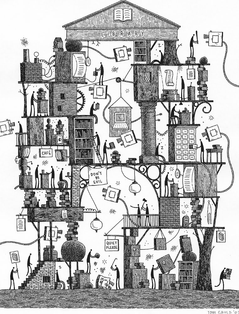
At first thought, not many, other than the banal facts that cartoonists draw a lot of buildings, and that a few modern buildings look like something whacky or sci-fi-like that could’ve come from a comic book.

I believe there are deeper connections.

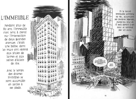
A strip cartoonist ‘builds’ a complex structure, manipulating space to organise time and impose a narrative.

An architect does much the same thing.

Consider a museum, a cathedral, an airport terminal: there is an implicit narrative in each, with the visitor “reading” the constructed space.

These resemblances even show up in technical vocabulary.

We speak of the “construction” of a script; both a building’s floor plan and the roughs for a comics story show a “layout“.

(Speaking of floor plans, cartoonist John Romita Sr revealed that the first thing he did before blocking out a scene was to draw a floor plan, prelude to his mise-en-scène of characters; doesn’t an architect do the same with regard to a building’s users?).

The Pritzker prize-winning architect Christian de Potzamparc (who collaborated with the cartoonist Joost Swarte on the Hergé museum) said:

“When I made the lodgings of the rue des Hautes-Formes in Paris, in the ’70s, I created a dozen successive perspectives. Like a film. […] It happens that this subjective vision is also the perception of the cinema but above all of comics.”

Rue des Hautes formes: lodgings designed by Portzamparc

Let’s now hear the thoughts of François Schuiten, a cartoonist who over his career has gained renown for his architecture- centred tales:

” [Between architecture and comics] there are identifiable meeting points. For example, one of the primordial things in comics is to bring the eye into the picture, and for this, architecture is a good tool, for it allows one to guide, to orient the gaze through the play of materials and light. What equally interests me is composition. The comics page — it resembles a topography, it plays on the relation between positive and negative space.

One can therefore compare the writing and composition of a page with an architect’s preoccupations.”

Lithograph by Francois Schuiten

“There are,” Schuiten goes on, ” in my stories, practically no drawings without a human character. I don’t get so much pleasure from drawing buildings for themselves. I like them to the extent that they can help me set a scale, tell a story, nurture fields of tension.”

Another Francois Schuiten cityscape

Schuiten often characterizes the city and comics as comparable systems:

“That’s what interests me. Benoit Peeters [Schuiten’s longtime scripter] and I track that: the character caught in a system. How an environment builds us, reveals us or destroys us. What organic links the city weaves to us. Those fractal links that arise between very small and very large things. Comics and architecture are good tools for discussing that. […] Small things must reflect the dimension of the system, detail becomes synecdoche, a carrier of meaning.

For me, there too, it’s possible to establish a link, if one wishes, between architecture and comics. Comics are the art of the sign, and through the staging of a building’s details, a lot can be expressed.”

(quoted from an interview with Stephane Beaujean; tr. from the French by A.B.)

Cover by Schuiten

Schuiten is articulate about architecture and comics for good reason; that has been his theme for over three decades. We shall return in detail to him in a later installment.

Architecture and architects are not that uncommon a theme in comics.

1983 saw the debut of Dean Motter’s comic book Mr X: the eponymous hero being the architect of a utopian metropolis, Radiant City, gone wrong; besides Motter, notable artists to draw it include Jaime Hernandez, Paul Rivoche, and Seth.

Mr X by Paul Rivoche

This dystopian approach didn’t prevent the artists from reveling in retro-futurist stylings; indeed, that seems to have been largely the raison d’être of the comic, whose real hero was the city itself.

Mr X art by Jaime Hernandez

In Hermann Huppen‘s Babette, we follow in great detail the building of a medieval cathedral:

click to enlarge

Jean-Marc Thévenet (script) and Frederic Rebena (art) have crafted a comics biography of Le Corbusier, the great Swiss architect:

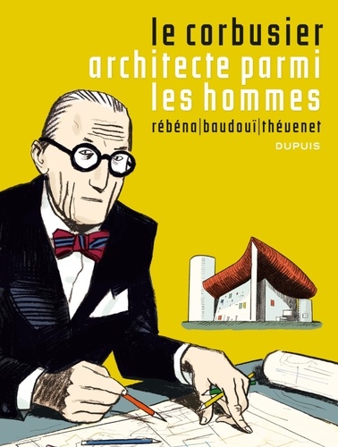
The album delves seriously into the process of creating architecture, and avoids hagiography:

Andreas appropriates the buildings of Frank Lloyd Wright for his 1995 Le Triangle Rouge, a strangely oneiric multi-layered tale not unlike this year’s film Inception; Wright’s buildings seem the only sure anchor for the reader’s understanding.

The architect as savior from chaos?

2009 saw David Mazzuchelli‘s Asterios Polyp, the story of a “paper architect”– one who never actually builds anything– who has lost his way in art as in life:

(Asterios Polyp was extensively discussed in a roundtable on this blog)

But for a devastating critique of architecture, of urbanism, and indeed of modern civilisation– nothing surpasses Robert Crumb‘s brief, wordless, building-haunted masterpiece, A Short History of America:

I find most admirable in Crumb, here and elsewhere, his unflinching observation of the ugly, the banal, the quotidian of the city that we erase unconsciously from our perception.

There is a telling scene in Terry Zwigoff’s documentary film Crumb where the artist shows an album of photos he’d commissioned, showing freeway intersections, clusters of lampposts, concrete islands… all the most boring and brutalist “invisible” patches of our urban environment. Crumb pointed out that there was no reference accessible for these despised spaces, so he had to have them documented himself.

This is a true artist: one who sees what we don’t want to see, and opens our eyes to it.

Sofia, Bulgaria, 1966, by R.Crumb

Crumb was far from the only artist from the ’60s–’70s underground comics movement to show an interest in architecture. Bill Griffith, in his Griffith Observatory and Zippy strips evinced a fascination with the bizarre and often garish building vernacular that characterises so much of America’s urban landscape — showing affection for the trashy and banal:

Griffith organised a campaign to have the ‘doggie head” sign that so inspires Zippy be landmarked…and lo! It was. Click image to enlarge.


Architecture, then, can be the subject of a strip or cartoon…but obviously,the great majority of comics do not deal directly with architecture.

How, then, do comics and architecture interface? How do comics use architecture?

The prime use is functional. Architecture and landscape are the setting wherein the cartoonist will stage the actions of his characters.

Many cartoonists will keep the architectural features spare, to the point of minimalism; this stems from a valid aesthetic that heightens the narrative in contrast to its context. ( Others will do so out of laziness or hackery).

Look at the buildings in these panels from Ernie Bushmiller’s Nancy:

They are reduced to their barest essence: just enough to convey the idea of “building”.

Consider the economy shown in this depiction of a shopping mall in Archie:


Click to enlarge

Just enough graphic information conveyed, and no more, to advance the story.

This aesthetic became a house style at Fawcett Comics’ Captain Marvel in the ’40s, as defined by C.C. Beck and encoded by the Jack Binder sweatshop; this page was drawn by Kurt Schaffenberger:


click to enlarge

In Europe, too, this stripped-down approach had many adherents. The ‘ligne claire’ (‘clear line) school of Belgium is famous for the detailed backgrounds of Hergé, E.P.Jacobs, or Jacques Martin; but it also featured more humdrum strips such as Chick Bill, by Gilbert “Tibet” Gascard that kept the architecture fairly spare and functional, though accurate:


click to enlarge

Beyond the purely functional, architecture in comics is illustrative. It complements and augments the story; it creates an ambience; it reinforces a fiction’s believability.

This is key for comics of historical fiction.


Renaissance Paris; fromLes sept Vies de l’Epervier‘, drawn by Juillard.


Prince Valiant, by Hal Foster. .


The above strip is a curious case; it combines scrupulous accuracy in depiction with heedless anachronism in setting. For example, the above drawing shows a typical 12th century castle and contemporary knight; but the action is supposed to take place in the 4th century!


Architecture is a capital component of science-fiction and fantasy comics, essential for establishing credibility.

Jean ‘Moebius’ Giraud: The Long Tomorrow

The veteran fantasy artist Mike Kaluta notes that the believability of drawn architecture depends on the artist being able to visualise the invisible parts of a building– its hallways, pipes, rooms– even if none of them are shown the reader.

Carson of Venus; art by Mike Kaluta

Sometimes past and future collide, as in Gene Ha’s richly imagined The Forty-Niners:

…where early 20th century architecture is augmented by futuristic buildings; a design approach reminiscent of that of Syd Mead on the seminal science-fiction film Blade Runner.

But Mead was anticipated in this by Enki Bilal, who perfected the “mash-up” of futuristic, contemporary, and past architecture:

Besides the historical past or the fantasised future, of course, architecture establishes the verisimilitude of the present. Certain cartoonists have so excelled at this that they have become indelibly associated with a particular city.

Jacques Tardi is the cartoonist laureate of Paris:

Jacques Tardi, ‘Nestor Burma’: Paris in the 1940’s

Jacques Tardi, ‘La Position du Tireur Couché’: Paris in the 1970’s

London arguably belongs to Carl Giles:

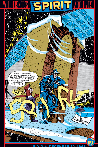
For New York, my choice would be Will Eisner.

I was born in New York and lived there for the first 14 years of my life. I can attest that Eisner’s rendition of the crusty, crumbly, fire escape-festooned tenements and elegant stooped brownstone townhouses of the Big Apple are the real deal.

New York view, by Will Eisner

Eisner’s yenta mom substitute bawling out the Eisner stand-in (en Français in this translation). From ‘A Contract with God’.

The cartoonist Chris Brunner notes about the above image:

“Worth mentioning is the way architecture can be used as a graphic device to create panels within panels. A couple of the images here touch on this (…) the Eisner fire escape shot- the man part of the outdoor environment, the woman framed by the window in a way that suggests its own panel.”

Mark also how New Yorkers appropriate the fire escape as a mixed private/public space.

Eisner again, in French again.. a lucid look at the impermanence of New York edifices. From ‘The Building‘.

There is, of course, a quicker and lazier way to identify a city: landmarks, such as the Statue of Liberty:

The Gift, by Alfredo Alcala

…or the Empire State Building:

A mean ol’ monster emerging from the Empire State Building, as sketched on the spot by Herb Trimpe (The Incredible Hulk), inked by Sal Buscema
… or the Eiffel Tower:

Star Trek, art by Alberto Giolitti & Giovanni Ticci

(This use of famed monuments has been thoroughly sent up by Scott McCloud in his Destroy!, where two rampaging superheroes demolish every famous landmark in New York:)

I call this use of architecture in narrative emblematic.

These landmarks can fulfil a metonymic function:

From Doonesbury, by Gary Trudeau.

The manor of Moulinsart (Tintin) by Hergé. Click image to enlarge.

The Batcave (Batman).


Snoopy’s Doghouse, from Peanuts (art by Carl Shulz)


The Daily Planet building (Superman) as rendered by Paul Rivoche.
Click image to enlarge.

The bard’s house (Astérix) by Uderzo

The Baxter Building (Fantastic Four) by Jack Kirby

(Compare with the Batcave: a staple of the ’60s superhero comic, the cutaway view of the hero/villain’s headquarters is but a memory now. You kids today…I just don’t know…)

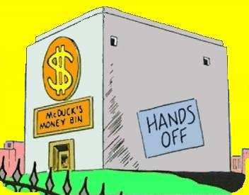
The Money Bin (Uncle Scrooge) by Carl Barks

Pop’s Chocolate Shoppe (Archie).

The above location also functions as what T.V. sitcom writers call a “crossover set” — a place where any of the characters can meet, and any plotlines intersect.

The Marsupilami’s nest (Spirou), by André Franquin

Superman’s Fortress of Solitude; art by Ross Andru and Dick Giordano

These recurring landmarks serve as touchstones for the regular reader, offering the reassurance of familiarity; much for the same reason that Donald Duck always wears a sailor suit, or that Superman wears tights, a cape, and his underpants on the outside.

Sometimes architecture is used to signal a genre.

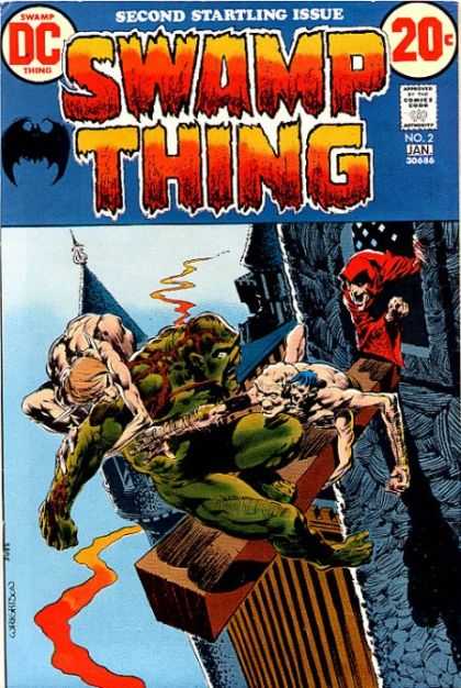
Arcane’s castle (Swamp Thing) by Berni Wrightson
Big spooky castle = horror comic

Nick Fury, agent of S.H.I.E.L.D. by Jim Steranko

Gratuitously futuristic décor = cool spy thriller.

The next function of architecture in comics I call expressive. The cartoonist uses architecture and landscape to evoke specific emotions in the reader.

See the expressionistically twisted yet realistic world of Alack Sinner, by Muñoz and Sampayo:

The harsh streetscape mirrors the sense of doom and injustice that pervades this noir series.

Less baneful, but as subjectively gritty and urban: Will Eisner’sThe Spirit :

Even the buildings are bent to the story– to the very logo:

Or consider Jack Kirby’s stunning imaginary cityscapes, such as Asgard:

click  image to enlarge

…or his Great Refuge:

…or his New Genesis:

Now, note that many, if not most, of the buildings in the above Kirby panels have no discernable function. Or, rather, their function is emotional– to instill awe.

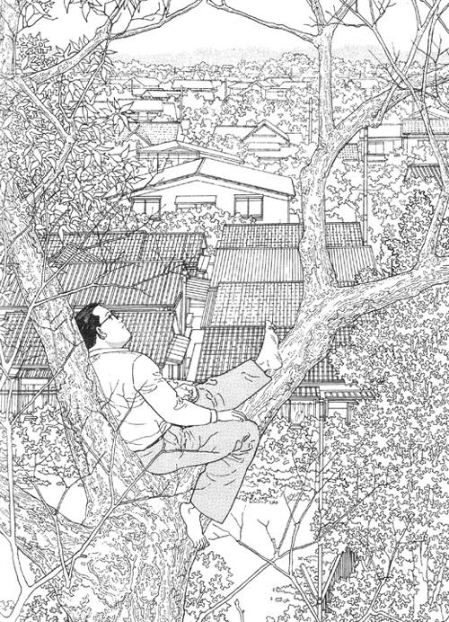
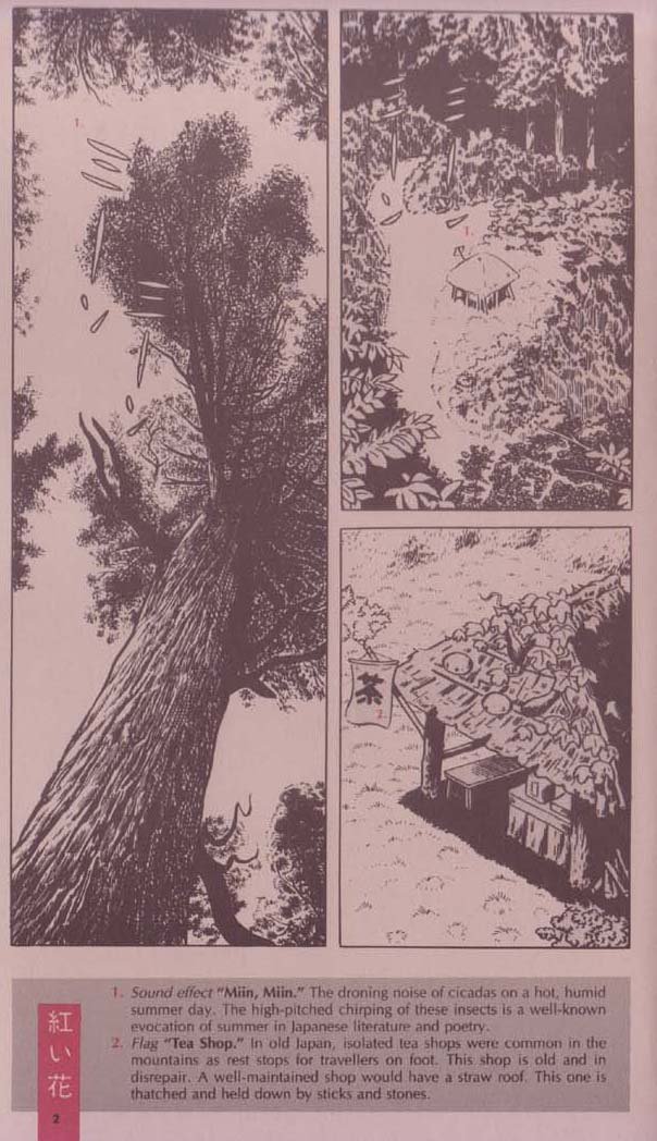
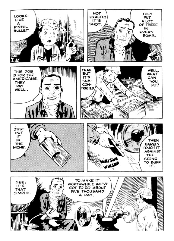
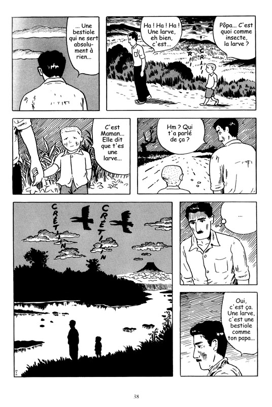
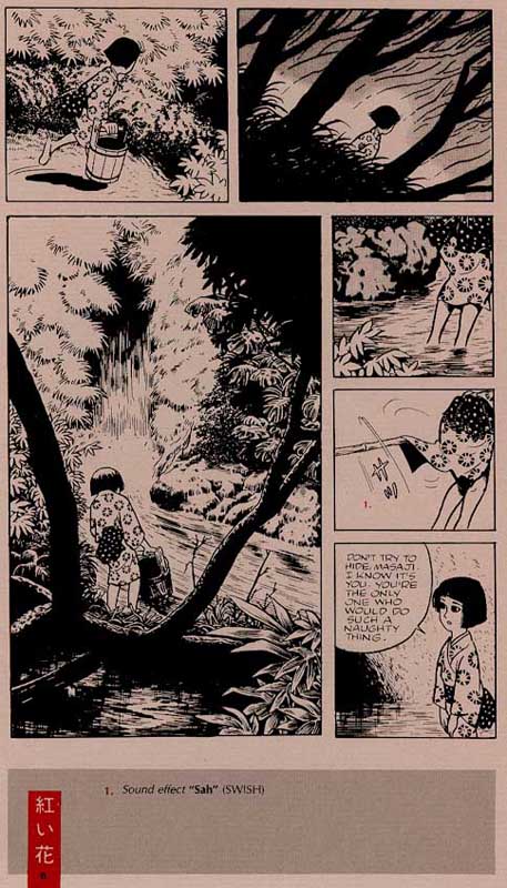
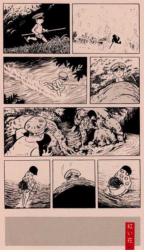
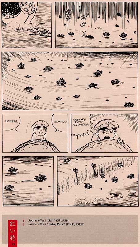
It’s far different emotions that are invoked by the quotidian landscapes of Jiro Taniguchi: peace, melancholy, mixed with a quiet joy.

The last use of architecture in comics celebrates the quiddity of the artist’s vision; for want of a better term, I call this use poetic.

How else to describe the quirky lunacy of George Herriman‘s ever-shifting buildings:

click image to enlarge…or the baroque hallucinations that Jim Woodring conjures up for dwellings?

Five categories, quite subjectively and idiosyncratically arrived at: functional, illustrative, emblematic, emotive,poetic. Of course, most comics architecture features more than one of these aspects, often all of them.

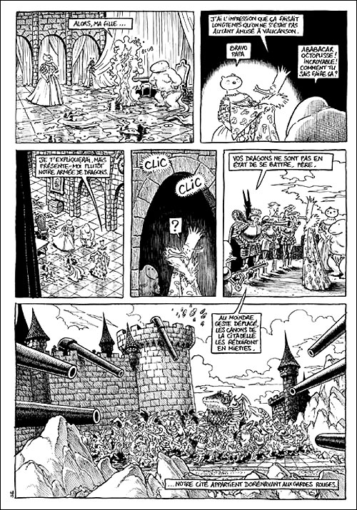
And this is nowhere truer than in Trondheim and Sfar’s Le Donjon series, where the titular dungeon, a seemingly infinite Gormenghastian source of terror and desire, dominates the actions of every inhabitant of its world.

It’s also obvious, merely from all the examples shown above, that architecture in comics can’t be considered in isolation: it relates to design, to landscape, to scenography, to narrative.

In this installment, we surveyed what architecture brings to comics.

But do comics have anything to bring to architecture?
We’ll examine that puzzle in part 3.

—————————————————————————————

This is part 2 of a three-part series. Click here for part 1 and part 3.

Here’s a link to a great recent post on notable comics places.
If you wish to see the work of one of last century’s true masters, this site collects a stunningly huge, searchable database of Giles cartoons. The “random cartoon” function is addictive!

Random Thoughts on SPX ’10

Last Saturday, I visited the Small Press Expo in Bethesda, Maryland with three of my friends. We spent nearly all our time wandering around the main convention floor, buying stuff, and occasionally chatting with the exhibitors. Here are some quick thoughts on SPX, in no particular order:

I can’t move!

I hope next year’s Expo rents a second convention room or moves to a larger venue. I’m not sure if they underestimated the crowds or if money is just tight, but the convention floor was far more crowded than it needed to be.

But I’ll give them credit for putting Kate Beaton near a door: she was far and away the most popular cartoonists there (she even put Jaime Hernandez to shame), and the line for her signature formed outside the doorway rather than clogging up the convention room.

There are girls! Reading comics!

And women too. Out of all the (nerd) conventions that I’ve been to, SPX had the largest percentage of both female attendees and exhibitors. This is a very rough estimate, but I’d say close to 50% of the attendees on Saturday afternoon were women.

One of my friends at SPX had previously accompanied me to the Baltimore Comic-con. She found SPX to be much more female-friendly. At the Comic-con, she complained that some of the vendors had stared at her like she was some alien creature. When I asked about it, she told me that what made her feel comfortable at SPX was not the number of female attendees, but the female exhibitors and vendors. In other words, if you want to sell comics to women, you need women who sell comics.

It’s all in the presentation, or lack thereof.

Most of the exhibitors seemed content to put a few books on the table, maybe a print or two, and then wait for the crowds to form. This works fine if the exhibitor is already popular, like Kate Beaton or Jaime Hernandez, but it doesn’t work so well for unknown artists. One of my friends was completely unfamiliar with comics, so she had no idea which artists she might like or what kind of content she was interested in buying. In other words, she’s the ideal consumer for an unknown artist, but they have to make an effort to get her attention. To be fair, some of the exhibitors were more than willing to engage with attendees and explain what their books were about, but others seemed either shy or bored. And in that moment when a potential customer is walking by their table, they need to do more than just sit there and wait for the money to flow in.

She wanted more free samples or excerpts from comics, not just so she could look at the art, but so she’d have a better idea what the comic was about and how well it read. Again, to be fair, a few of the webcomic exhibitors were handing out samples.

Another friend sent me her take on the exhibitors in an email:

“I think the thing I liked most (as someone who isn’t exactly a diehard indie comics fan) was the booths that were selling comics and misc. merchandise based off of the artist’s characters.  It was kind of like a comicon meets esty vibe – really neat to see what people came up with.  Some of it I thought ‘wow, I could totally make that myself’ (monster scarves) but the wooden puzzle guy and many of the poster/print options were truly impressive.

I was also pretty amazed by the mix of levels of, for lack of a better word, professionalism from booth to booth.  You could tell some of the folks there are fully supporting themselves on small press comics; others seemed to be using it as a way to show off their artwork – but they didn’t seem all that concerned about heavily promoting the comics part.  Then there was a booth or two where it seemed like the artist was using SPX as a way to promote his/her hobby.
I don’t think you were with me at the time, but I saw one booth with really neat stuff – an alphabet of imagined animals, pseudo-victorian faux scientific language, etc. The guy at the booth did the standard 10-second ‘this is what I do’ that everyone was doing.  He mentioned the alphabet thing was on his blog – so I asked if he had a card.  Apparently he had forgotten to bring any.  He offered me one of the little pamphlets he was selling [more on that below], mentioned suggested donation was $1.  I figured fine, I’ll pay $1 to find out about his stuff, and handed him a $5.  He didn’t have change.  The guy next to him didn’t either, so he gave me the brochure for free.  Very nice and everything, but the highly professional government worker over-achiever in me was *completely* horrified by the idea that someone would show up to exhibit at a convention and be that unprepared.
Also overheard two chicks at a booth chatting about their friend (the artist) who helped them get it set up, stayed a few minutes, then said ‘I got into webcomics so I wouldn’t have to talk to people” and vanished.’

Overall I very much enjoyed it, mostly for the novelty and the ability to nerd out a bit without feeling like the only girl in the room! :P”

Giving money directly to the artist gives you a warm, fuzzy feeling.

On the other hand, I always feel vaguely guilty when I walk by a table and the artist is just sitting there while no one buys their stuff. It’s a sad scene … until I remember that most of their junk is ridiculously over-priced.

Miriam Libicki seems to be doing well.

But she no longer follows the blog (sorry, Noah).

For those of you new to the Hooded Utilitarian, Miriam used to blog on the site back in its Blogspot days, but she’s far better known as a cartoonist and creator of Jobnik!, an autobiographical account of her time in the Israeli Army.

I bought one of her kitchen magnets and the latest issue of Jobnik!.

I love the cover. I haven’t had a chance to read the comic yet, so I can’t offer a review, but the prior issues were quite good. If you’re interested, it’s available for purchase on her website.

Consumerism, hurray!

What I bought:

Parker: The Hunter, written by Richard Stark and adapted into a comic by Darwyn Cooke. It’s not really all that “indie” (and IDW is hardly a small press) but I like detective stories, I like Cooke’s art, and it was being sold by the Comic Book Legal Defense Fund. Support free speech and all that.

Prison Pit, by Johnny Ryan. Violence and crude humor. ‘Nuff said.

Afrodisiac, by Jim Rugg and Brian Maruca. I love blaxsploitation as much as the next suburban white dude, and this book has gotten positive reviews from most of the critics I follow.

Masterpiece Comics, by R.Sikoryak. It’s an odd but potentially funny idea where classic writers are filtered through the tropes of classic comics.

Locas: The Maggie and Hopey Stories, by Jaime Hernandez. I haven’t read all of Love and Rockets yet, but the Locas storyline is what hooked me on the series (sorry, Gilbert).

Blazing Combat, by Archie Goodwin and assorted artists. Proof that I am susceptible to advertising. They kept running the banner ads for this book on tcj.com, and eventually I succumbed. Though I’ve also been looking for a war comic to review, and this fits the bill.

Pang: The Wandering Shaolin Monk, vol. 1, by Ben Costa. An engaging, cartoony style and a kung fu storyline. But what sold me was that the publisher is named Iron Crotch University Press. Well played, Ben.

What my friends bought:

Trickster, edited by Matt Dembicki with assorted artists. Its a collection of Native American folklore (about Trickster gods, naturally) with each tale illustrated by a different artist. Here’s a blog about the book for the curious.

A print by Emma Rochon, featuring mer-foxy things.

Two prints by Ulises Farinas, including bear-zilla,

and Lego Doctor Who, which efficiently combines two nerdy obsessions.

A large print (couldn’t find an image of it) by Sara L. Turner, author of the webcomic Ghosts of Pineville.

And a pamphlet by Nate Marsh, creator of The Obscure Animal Compendium.


Yoshiharu Tsuge’s Red Flowers

Red Flowers. Sayako Kikuchi is lying in the shade of her tea shop. It is a warm summer day and far too hot to count the meager takings from the morning. There is the sound of cicadas in the background and we gaze up at this incessant activity with the girl. The tree before us is as firm and immovable as nature itself. The tea shop is cradled in its grasp, nestling in a womb-like clearing with tendrils and fruit running through its thatched roof.

Continue reading

DWYCK: Ishoku

The opening page of "Screw-Style"

This is a slightly edited and translated version of a piece on the great mangaka Yoshiharu Tsuge that I wrote for the Danish comics magazine Strip! and my website Rackham back in 2004. Considering his importance to Japanese comics, Tsuge remains sadly underrepresented in translation. Plus his name has come up in discussions here at HU several times, so I figured an introduction to his work would be an interesting addition to the mix here.

A boy emerges from the sea in the shadow of a C-47. He presses his right arm against his side where a deadly jellyfish has torn apart one of his veins. Whenever he releases the pressure, blood trickles to the cold ground, which he treads like a sleepwalker, searching for a doctor to help him. He passes a forest of shirts, is trampled by the silhouettes of a marching band, wanders along railway tracks bordered by empty signs. A rusty locomotive runs backward, steered by a boy wearing a cat’s mask. The protagonist hears the faint tingle of a chime in the wind, reminding him of summer. With an old lady who may be his mother, he eats phallic sticks of kintaro candy topped by small, disgruntled faces.

In a bombed-out bunker, he finds a female gynecologist dressed in a kimono and sporting a head mirror. She speaks in white as empty as the signs along the tracks and they play doctor against the backdrop of a Midway-like naval battle. A wrench, seen earlier in the hands of a suit who “almost knew what he meant”, suddenly reappears in the hands of the woman who uses it to fit his torn vein with a safety valve. Thus saved, he sails away in a motorboat with the parting words “And so, whenever I tighten the screw, my arm grows numb.”

This happens in Yoshiharu Tsuge’s most famous manga, the 22-page ”Nejishiki” (”Screw-Style”) from 1968. Like most of his comics, it was published in the legendary alternative comics magazine Garo. It is regarded as a central work in Japanese comics history and its creator has gone from cult-figure to eccentric celebrity in Japan. Born in 1937, he retired from cartooning in 1987, leaving behind a modest but highly significant body of work: around 150 short stories produced over three decades or so.

These are comics of such strange originality that he is often given the sobriquet “ishoku” (‘unique’); it has contributed crucially to the understanding in Japan of comics as a personal and artistic means of expression. Only a few of his comics have been translated into Western languages, but the ones available still enable us to assess the contours of an oeuvre that one might imprecisely but poignantly compare to that of Robert Crumb in America.

“Screw-Style” reportedly records a nightmare Tsuge had one day while sleeping on his tenement rooftop. Characteristically for his generation of cartoonists, perhaps most notably his one-time teacher Shigeru Mizuki (b. 1922), he integrates cartoon characters, whose appearance often changes from panel to panel, into backgrounds that vary from the loosely defined to the carefully rendered, often photo-referenced. The story is a surreal tour de force, strong in its critique of civilization and deeply pessimistic, with the central metaphor being a open wound exposed to a denaturalized, filthy industrial environment darkened by ash clouds and haunted by the shadow of war. It exemplifies Tsuge’s preoccupation with the pollution of the soul, shown through bodily metaphor: the protagonist’s only salvation lies in fusion with a metallic object—the safety valve that numbs his arm.

From "Screw-Style"

Making his debut as a cartoonist in 1954, Tsuge spent the next couple of decades producing genre comics for the large rental comics market, which in the postwar decades functioned as a different and very substantial alternative to the Tokyo-based mainstream publishers who would eventually eliminate it and evolve into the manga industry we know today. From the beginning, his comics operated within the more realistic tradition nurtured in the rental market. These comics were dubbed gekiga by Yoshihiru Tatsumi (b. 1935), which translates roughly into ‘dramatic pictures’, marking a contrast with the ‘whimsical pictures’ of manga as published by the commercial industry and shaped significantly by its great creative dynamo, the “God of Manga” Osamu Tezuka (1926-1989).

“Screw-Style” however marked a shift towards the allegorical and the surreal. This has led to a frequent distinction between his “surreal” and “realistic” modes, both of which he continued practicing. But this seems an artificial categorization: his mature (1960s onward) work invariably hews closely to lived life, but simultaneously imbues it with allegory or poetry. His unique blend of these different levels of representation is central to his fame as the originator of so-called watakushi manga, or ”I-comics”—the manga version of literature’s shishôsetsu, the ’I-novel’. It is related to what we understand as ’autobiography’, but considerably broader in scope.

In the sense that it derives quite significantly from its author’s internal life to create a deeply-felt critique of his Japan, ”Screw-Style” is bona fide watakushi manga. In fact, Tsuge’s life and work generally seem so interconnected that his comics, as well as his illustrated travel diaries and other published writings, provide an access point for the public to a more or less consciously constructed mythological narrative of his life. Its foundation is his Tokyo childhood during the war and its aftermath, and in contrast to the post-war optimism of much of his generation, engendered as it was by the country’s reconstruction and modernization, he is strongly pessimistic, at times borderline nihilistic.

From "Screw-Style"

In comics one might compare his contemporary Keiji Nakazawa (b. 1939), who as a child experienced firsthand the bombing of Hiroshima and its consequences and told his story in his masterpiece Hadashi no Gen (Barefoot Gen; original serialization 1973-1974—later continued). Though strongly indignant, Gen is a deeply humanistic work. Tsuge, on the other hand, eschews this optimisim and instead charts the equally pervasive meaninglessness and alienation of post-war Japan, as well as the subsequent boom decades of the urbanized, high-tech 60s and 70s.

The Tsuge myth also includes the story of an absentee father and of a rebellious youth spent in abject poverty and haunted by bouts of depression. Dreams of escape pervade it: when he was 14, he was arrested by the coast guard for stowing away on a ship bound for America; when he was 20, he attempted suicide after a failed romantic relationship.

His 24-page story from 1973, ”Oba denki mekki Kôgyôsho” (“Oba’s Electroplate Factory”) is directly based on his brother’s experiences working at a factory as a child, having left school after the primary years. We witness the appalling work conditions and the inevitable cadmium poisoning suffered by the workers. One older worker literally excretes his life through a hole in floor of his shed while his children look on.


In contrast to the people around him, the young protagonist—who is portrayed with a mixture of sarcasm and genuine affection—is characterized by indomitable optimism. This despite the severe burns he suffers one day from acid used at the factory to sharpen shrapnel for American bombs. Even his eventual abandonment at the hands of the female supervisor, when she finally leaves the factory along with its only other surviving worker, does not faze him.

Among Tsuge’s most finely realized self-portraits in comics is the 200-page graphic novel Munô no Hito (’The Man Without Qualities’, with a possible nod to Robert Musil?). It was serialized in the magazine Comic Baku from 1984-1985 in 6 separate episodes and narrates the life of a man incapable of providing for his family. He dreams of making things work, and his dreams as rendered on the paper are beautiful, but reality ruthlessly confounds him. He simply cannot succeed. He is unable to take responsibility and continually rejects his only real source of income, comics, as a possibility. Instead he attempts unsuccessfully to make his way as a dealer, initially of second-hand cameras, then of rocks found along the banks of the nearby river. This “business” encapsulates the hopelessness of his industry and is—as his increasingly dejected wife never hesitates to tell him—emblematic of his life as a whole.

Tsuge renders this life in fragments, chapter by chapter. Each episode is self-contained, but when read together they form a beautifully structured narrative. The presentation, whether between chapters or within them, is not linear and a clear chronology never emerges. It opens at the nadir of the story, a moment of almost total hopelessness. The man and his wife are utterly estranged—Tsuge never show us her face, and in a heartbreaking scene she passes him on the street as if he were a stranger. The night closes in, the shrieks of the crows sound to him like “Looooser! Looooser!”, and he is drawn to leap into oblivion. His only lifeline is his young son, who every night comes down to his rockseller’s stall on the riverbank and takes him home before dark.

In later chapters we return to earlier times and come better to understand the disintegration of the small family. We meet them in happier times, when moments of warmth, tenderness and fun still occurred, despite the boy already exhibiting disturbing signs of neurotic behavior. We see the wife’s face, but already sense that her esteem for her husband is on the wane. Awareness of where it is all going make these passages painful reading.

Tsuge here renders the curse of poverty as intensely as in his earlier stories, but he is less emphatic in his social critique. The central tragedy is internal, self-inflicted—the story is a subtle, grinding portrayal of depression as both a mental state and a physical condition. It never delivers a conclusive diagnosis, being more self-contemplation than self-criticism. It describes a person in crisis by means of stark realism joined to flights of dreamy allegory, and typically for Tsuge, its poetic tenor is borne of equal parts irreverence and empathy. A fairly long, rather flowery exegesis on Buddhist notions of equilibrium and salvation between the protagonist and an acquaintance is rudely interrupted by a drawn-out fart from the latter’s sleeping wife.


And finally, parable of an alcoholic, flea-ridden mendicant who breathes his last breath reciting an enigmatic poem, his body covered in his own dried-up excrement, becomes the metaphorical shot in the dark that lifts the story from where it started, letting it transcend precariously its own circularity.

Tsuge’s work is animated by this combination of prosaic entropy and contemplative longing. His pessimism is tempered by fleeting moments of possible beauty. Sometimes the feeling is one of nostalgia, as if borne by a sense of loss, but ultimately his position seems to be that beauty, though acutely present, is unfathomable.

A particularly fine evocation of this is the 15-page 1967 story ”Akai hana” (”Red Flowers”). The protagonist is a young girl who has dropped out of school to manage her family’s tea house in a beautifully lush corner of the land, visited only by a lucky few. A man from the big city—apparently a wistful stand-in for Tsuge himself—is there to fish and comes to observe the unfolding relationship between the girl and a little boy two years her junior. He teases her because of her emerging pubic hair and voyeuristically observes her first menstruation. She lets the blood run into the river where it appears to transform into beautiful, red flowers before it disappears into a maelstrom.

With its vibrant depiction of the surrounding environment, its nostalgic but ultimately optimistic tone, and its loving portrayal of its characters, “Red Flowers” seems a distillation of the beauty present in all of Tsuge’s work, even the bleakest. As always, sex is an incontrovertible presence; as in “Screw-Style”, it is the catalyst that resolves the story. In contrast to that dark masterpiece, however, it is here the heart of a poetic celebration of change as a human condition. Tsuge drew these two stories within a year of each other and they combine to reveal the promise of his art.


Tsuge in translation

”Red Flowers” (”Akai hana”, 1967), in Raw vol. 1 #7. New York: Raw Books, 1985.

”Oba’s Electroplate Factory” (”Oba denki mekki Kôgyôsho”, 1973), in Raw vol. 2 #2. New York: Penguin Books, 1990.

”Screw-Style” (”Nejishiki”, 1968), in The Comics Journal #250. Seattle: Fantagraphics, 2003.

L’Homme sans talent (Munô no Hito, 1984-85). Angoulême: Ego comme X, 2004.

Links

List of works (Japanese language)

Great 1987 interview with Tsuge (French language)

Béatrice Marechal on Tsuge from The Comics Journal 2005 Special Edition.

Domingos on Tsuge and “Nejishiki”.

Gilles Laborderie on Munô no Hito for Indy Magazine.

Images from Tsuge’s early comics.
__________
Update by Noah: Ng Suat Tong just posted another lengthy essay on Tsuge.

Utilitarian Review 9/11/10

On HU

Erica Friedman started off the week by interviewing Comic Fusion’s Stacey Korn about Wonder Woman Day.

We then had a series of posts on comics and architecture, of all things.

Alex Buchet began with the first of a multi-part look running through the month on a comics and architecture exhibit at the French national museum of architecture.

Ng Suat Tong followed up with a look at the role of architecture in Josh Simmons’ House.

Caroline Small wrote about Morris Lapidus, postmodern curves, and the boxy modernism of comics.

I wrote about Alan Davis’ The Nail and why superheroes hate the Amish.

And I disputed R. C. Harvey’s assertion that criticism and art are about making you happy.

Twilight, Shojo, Genre and Gender

Melinda Beasi’s post from last month on Twilight and the contempt for female fans has sparked a bunch of discussion this week.

David Welsh explains why he agrees with Melinda and Melinda adds some thoughts about why it’s wrong to group all shojo titles together. Brigid Alverson argues that the issue is that genre isn’t that good, not that women are held in contempt. And finally Erin Ptah says she dislikes Twilight for lots of reasons that have nothing to do with female fans.

Murder, Misogyny, Multimedia

I’ve got an article about murder ballads up on Madeloud.

And to celebrate, I’ve uploaded a murder ballad playlist including all the songs I mention in the article. Revel in bloodshed!

Utilitarians Everywhere

At Splice Today I review the boring George Clooney vehicle The American.

Shortly thereafter, though, I began to have suspicions. So, as I do when such suspicions occur, I leaned over to my wife and whispered low, “He’s going to be redeemed, isn’t he?”

She looked at me over her glasses with mingled disgust and horror. “If he gets redeemed,” she said sternly, “I’m going to be upset.”

At Madeloud I review Wovenhand’s latest record.

Other Links

I enjoyed this essay by Rachel Manija about why it’s okay to write negative criticism.

And R.C. Harvey has a fun article about Wonder Woman’s costume changes over the years. I love the eagle cartoon.

I don’t know anything about Ke$ha, but this is really funny.

Oh, and Caroline Small is going to be on the critic’s panel at SPX today at 3:00 PM eastern time. If you’re attending the convention, go say hi to her!

Dyspeptic Ouroboros: Critics Are Not Here to Make You Happy

In response to last month’s comics criticism roundtable, R. C. Harvey has a post up on the main site in which he lays out his philosophy of criticism.

But, seriously, a critic does what he does for what is a very shallow reason.
When I first set out to make a living in the world, I did it by teaching English in high school. Years later, one of my former students wrote and asked me why I chose teaching English as a profession. I thought about it and realized that I had no messianic purpose. I liked literature and I liked talking about it with others who liked literature and liked talking about it. I taught literature because that was a way of creating others who could talk about it in ways that were congenial with my own passion. It was a way of creating a conversation I enjoyed.

Harvey adds, “The other thing that criticism does, apart from gratifying the passions of the critic, is to enhance appreciation of the art being critiqued. In fact, I suggest that enhancing appreciation is the only legitimate function of criticism (beyond a critic’s self-indulgence).”

Logically enough, he then goes on to argue that the purpose of art, like that of criticism, is essentially to increase enjoyment.

The function of art, to pursue this topic into tedium, is to enhance enjoyment of life. A wise man once said, “The more things you like, the happier you’ll be.” Makes sense to me. Art—drawing, painting, music, and so forth—provide an assortment of things that one can choose from to like, thereby fostering one’s chances at being happy.

Harvey’s argument, then, as far as I understand it, is, first, that critics write for reasons which are shallow — because they happen to like things. Critics who claim to be writing for a higher (or lower?) purpose — such as, for example, to influence people, are fooling themselves. Or as Harvey puts it:

It would also be nice, and highly beneficial to mankind and civilization as a whole, if everyone would do exactly as I tell them—if cartoonists reformed and perfected their practices in accordance with my prescriptions, if other so-called critics started talking about comics as a visual art form as well as a narrative one, and if the Grumpy Old Pachyderm became the GOP of “Yes.” But—well, I, like most critics, may be self-absorbed, but I’m not delusional. Not yet.

The only legitimate purpose of criticism, then, according to Harvey, is to enhance appreciation of art. The purpose of art, in turn, is to make people happy. Thus, for comics critics, the goals are, (1) don’t delude yourself into thinking you have a deep and weighty purpose, and (2) make people happy.

_______________________

I’m going to take the second point first. Harvey presents this dictum (make people happy) as a common sense, non-weighty point (as he says, “Makes sense to me.”) I don’t think it’s either of those things, though. On the contrary, the rule-of-thumb that the goal of art and/or of life is to make people happy, and that making people happy can be tied to quantitative measures ( “The more things you like, the happier you’ll be.”) comes out of a very specific philosophical tradition: utilitarianism.

Utilitarianism is usually described as “the greatest good for the greatest number,” and while it may seem common-sensical, it’s implications lead to all sorts of crazy places. For example, if you take the logic of utilitarianism seriously, you could end up suggesting that starving parents eat their children. After all, the children would die anyway; if the parents eat them, the parents at least will live. It’s a common sense solution, right?

That scenario is, of course, a thumbnail paraphrase of Swift’s “A Modest Proposal.” Swift’s essay is art, in the sense that it is imaginative. It’s also criticism, or at least a critique. And what it’s critiquing is, in part, utilitarianism.

So…is Swift attempting to make us happy with his essay? Or is he attempting to make us — particularly if “us” means utilitarian thinkers of his time — unhappy? Does he want us to laugh at his cleverness, or does he want us to recoil in horror at the logic he puts forward, in the hopes that, by making us unhappy with the world, we may act to change it? No doubt there’s some of both in there — but surely it’s an oversimplification to say that Swift’s purpose, or his effect, is geared primarily, or solely towards making people happy.

And, in fact, art can have many goals other than happiness. Art can glorify god. It can be part of an effort to create community. It can criticize society in an attempt to change it. It can advance particular political interests. It can be intended as a moral lesson. It can try to sell us crap. And so forth.

Caro made some of these objections in comments, and Harvey responded

Art wouldn’t work to do all the things you say it does, Caro, if it didn’t also, and probably primarily, enhance our enjoyment of life. We expect it to do that, and in that expectation, we attend to art even when it is chiefly selling us something or promoting a political position.

The problem here is the problem with all monolithic definitions of complex phenomena — it’s reductive. A gospel song which explicitly tells you to turn away from enjoyment of life and embrace a glorious hereafter — is that meant to enhance our enjoyment of life? You could say “yes”, I suppose, and argue that the gospel singers are deluded about what they’re doing, or that believing in a hereafter actually enhances our enjoyment of life…but why go through all those tergiversations? Why, in short, does the “enjoyment” have to be the base, the real thing, while everything else is a secondary superstructure built on top of it? If someone says their art is intended to glorify god, or to pursue truth, or to change minds…why are those reasons less valid or legitimate or more self-indulgent? Why do they have to be transferred to a paradigm of “enjoyment” if they are to win Harvey’s imprimatur?

Or, to put it another way, whose enjoyment is enhanced, in short, by a definition of art which makes enjoyment the highest purpose? Is the enjoyment of devout Christians enhanced? The enjoyment of starving Irish peasants? Or is what’s at stake here the enjoyment of those of us who have come out modernity’s backside, for whom art is a commodity and commodity is a fetish?

“A wise man once said, “The more things you like, the happier you’ll be.” Who is this wise man? It’s not the Buddha, who would presumably argue that the fewer things you like the happier you’ll be. It’s not Moses, who told his people they’d be happier if they engaged in elaborate dietary rituals which certainly limited the number of things they could like. It’s not Kant, who believed true happiness was tied to not liking things. It’s not Marx, certainly…and not even, actually, Adam Smith, who believed fairly strongly that acquisition was not a simple game of numbers, but needed to be moderated by moral considerations. Indeed, it doesn’t, even on a commonsense level, seem to be the case that the more things you like the happier you are. Liking things can be fun, yes…but surely, liking and liking and liking in an acquisitive orgy of increase can, at times, get in the way of more important things. Like, for example, love.

I’m not saying here that Harvey is always wrong, or that it’s illegitimate to write criticism the goal of which is appreciation, or to create art the goal of which is happiness. My point is, rather, that these aren’t the only ways to approach art and criticism, and certainly not the only legitimate ways to do so. Aesthetics is about enjoyment in part, but it’s also about love, and faith, and even perhaps loathing and despair. To make it solely, or primarily, about enjoyment, I would argue, robs it of its enjoyment — turns it into a utilitarian and rather ugly machine.

So, again I ask, why does Harvey make this argument? Is he enhancing our enjoyment of life by presenting criticism as shallow and art as about happiness? Perhaps in part. But surely he also is doing exactly what he disavows; pushing an agenda, with at least some hope that it will affect or convince his readers. Humility can be a tyranny, too. “Shallowness” for Harvey is not just descriptive, but proscriptive —a stricture enforced by the waiting censure of “self-indulgence” and the accusation of “delusion.” It’s worth remembering, though, that another name for the self can be the soul, and that what one person sees as delusion, another may see as art.

The Amish Plot Against the Superheroes

I’ve been reading The War of the Lamb, the last book written by John Howard Yoder. Yoder was the most important theologian of pacifism in the last century or so, I think. Appropriately enough for a pacifist theologian, he was a Mennonite.

And, of course, the subject of Mennonite’s made me think again (mostly to my sorrow) of writer and illustrator Alan Davis’ 1998 JLA alternate reality exercise The Nail. For those fortunate enough to have missed the series, it’s high concept is that John and Martha Kent ran over a nail on day that Superman’s rocket ship landed on earth. As a result, the Kent’s didn’t find the ship. Instead (as we learn towards the end of the book) an Amish family found it. Since the Amish won’t interact with the rest of the world and since they are (like most Mennonite sects) pacifist, the fact that this family discovered Supes meant that he never became a superhero; he just stayed on the farm. Without his iconic presence, superheroes (and especially aliens) are distrusted, Lex Luthor becomes mayor, no one is tough enough to stand up to Kryptonian technology…etc., etc. In short, things go to the bad, and it’s all because of the stupid Amish.

Most superhero comics are stupid, and The Nail is no exception. Still, there is something of the idiot savant about it. Davis was looking for a way to neutralize Superman and, by extension, all of superdom. What is the opposite of the superhero? The obvious answer is, a supervillain. Too obvious — and, incidentally, untrue. Superheroes and supervillains are part of the same world, the same milieu. Superman being a supervillain doesn’t remove or negate him; it just puts him front and center in a different role (Earth 3! And god help me that I know that….but anyway….)

So, supervillain is no good. But…what if you make him a pacifist? Then he’s ineffectual, irrelevant — he’s nothing. Which is to say, it’s not supervillainy that’s the opposite of superheroics — it’s pacifism.

The book in its final pages, then, glorifies superheroness not primarily through derring-do, but rather through a thumbnail repudiation of non-violence. This repudiation is sealed by the gratuitous and gruesome obliteration of Superman’s Amish parents, who barely get a panel or two to express their misguided philosophy before Davis reduces them to ash. That’s what you get for keeping Superman down, you religious weirdos!

Yes, that’s Jimmy Olsen as the supervillain. Don’t ask.

Anyway, following this sequence in which Supes sees his (Amish) parents killed, and then attacks the evil Jimmy superOlsen, the Supes and Jimmy battle. Unfortunately, Supes (being Amish and not good at fighting) can’t beat him. Luckily, though, Olsen spontaneously disintegrates because his powers are unstable (again, not worth explaining why.) In the aftermath, Superman decides to become a standard issue superhero, and the implication is that his innate awesomeness will defuse the anti-alien hysteria that has swept the world.

So…parents killed, check; vengeance inflicted, check; dedicate life to superheroics to honor parents, check. Except that, from the point of both the drama and the plot, Superman’s repudiation of nonviolence is completely superfluous, and even, arguably, detrimental. Supes could have just as easily handled Olsen through nonviolent means — getting in his way, or holding on to him. Since Olsen essentially disintegrated on his own, the outcome would have been the same — except that Supes would have actually kept faith with his parents rather than betraying their beliefs for nothing. Similarly, if the world is terrified of malevolent aliens, the sudden revelation of an even more powerful violent alien in their midst seems unlikely to calm things down. On the other hand, had Supes revealed himself to the world as a superpowerful alien who embraced nonviolence and noninterference in the affairs of the world…well, it seems like that might have been a more effective statement.

The logic of the story Davis has constructed, in other word — with Superman as Amish — seems to lead naturally to a parable about the triumph of nonviolence. After all, if the greatest hero in the world is a pacifist, it makes sense that you’d end up with a story in which pacifism is heroic. Unless, of course, you see pacifism and heroism as mutually exclusive, in which case the heroism comes, not from the pacifist witness, but from repudiating your entire past in order to embrace violence in the name of your dead parents who would, undoubtedly, be appalled.

Davis’ story also resonates oddly with broader arguments about pacifism. The usual dig against pacifism is that it is foofy pie-in-the-sky nonsense. As an ideal, it’s all well and good, but in the real world, violence is sometimes necessary. Davis’ story makes this argument by, in part, going out of its way to make the Amish impractical to the point of callousness. Not only do they advocate non-intervention, but they argue that their son shouldn’t help Batman in any way, even though he’s being beaten to death literally on their doorstep. This is surely a bastardization of Amish beliefs; the Amish, after all, can vote; they can interact with outsiders. The depiction here is a caricature, intended to make their position seem ridiculous…and unrealistic.

But the irony is that the world where Superman stays in his Amish community and doesn’t interfere in the outside world is actually more realistic. Because, you know, Superman doesn’t interfere in the world. Because there isn’t a Superman. Nobody has to resort to violence to defeat supervillains, because there aren’t supervillains. The DC Universe is unrealistically violent. The opposite of the superhero is the Amish not just because the superhero is violent and the Amish are not, but because the superhero doesn’t exist, and the Amish do. What happens at the end of The Nail is not an eruption of realism into the Amish fantasy of nonviolence. It’s an eruption of fantasy violence into the Amish’s realistic pacifist community. Perhaps that’s why the Amish parents have to be so summarily dispatched; if they were allowed to stick around, they’re solidity would have made Davis’ entire farrago of nonsense dissolve into mist.

In The War of the Lamb, John Howard Yoder talks a little about heroism, specifically in terms of Martin Luther King and Che Guevara. Both men, he points out, were killed; both have, as a result, been viewed as martyrs. Yoder points out that following King’s assassination:

] Many leaped to the conclusion that nonviolent alternatives had thereby been refuted. At the same time, all over Latin America, the fact that Che Guevera had been gunned down in the Bolivian mountains did not mean that guerrilla violence had failed. Why not?

The inconguity is even more striking when we remember that King…had expected to be martyred. This was true both in the general sense of the knowledge that nonviolence will be costly, undergirded by the Christian readiness to ‘share in the sufferings of Christ’ and in the more precise sense that King gave voice to ominous premonitions in the weeks and days just before his death. Che’s defeat, on the other hand, was not in the Marxist scenario. On the general level, for the Marxist the victory of the revolution is assured by the laws, as sure as those of mechanics of dialectical materialism. In the narrow sense as well, Guevara, just before he was captured and killed, was still expecting to win as head of the violent insurgency in Bolivia.

Is there not some flaw in the logic here? Of a man who predicted his death, who explained why he accepted it, whose work did not perish with his death, the critics argue that his view is refuted by that death. Of the other man, who premised victory and whose campaign did collapse with his death, his faithful proclaim his resurrection…. The Marxist believe that their hero’s death is powerful on some other level than his military defeat. Whatever that reasoning may be called, it is not standard Marxist pragmatism, but some kind of apocalyptic myth.

The Nail suggests that, for “apocalyptic myth,” we might substitute “genre fairy tale.” The narratives that justify violence are, predominantly, not about realism, but about revenge or excitement or masculinity — which is to say, they’re pulp. Perhaps, The Nail suggests, nonviolence isn’t wrong because its unrealistic, but rather because it gets in the way of the really quite embarrassingly stupid stories we like to tell ourselves.
____________________
For more on superheroes and pacifism, here’s my essay about Spider-Dove.