Too Much is Never Enough: Morris Lapidus’ Postmodern Curves

HU’s been preoccupied with architecture this week. In yesterday’s post, Suat noted that “the building shorn of its façade has long been favored by cartoonists in search of a structure which best encapsulates the comics reading experience in a physically possible form: the rooms and walls acting like panels and borders…” But it’s worth noting that the gridded interior which resonates most efficiently with the conventional comics form is a historically situated architectural shape: the rectangular multi-story urban dwelling, industrial tenement house or modernist skyscraper.

When architect Morris Lapidus was designing the 50-story Americana hotel in New York City in 1960, he needed to save his client the half-a-million dollars it would take to stabilize the high building against wind pressure. Lapidus’ solution was to bend the building so it would stand by itself, without support. First he illustrated the concept for his client using a calling card:

And then through illustrative drawings:

Basically, Morris Lapidus knew the limitations of a straight line. In the 1930s, living in New York and working as a merchandiser, he was already getting customers’ attention through curvilinear ornamental devices that an editor at Pencilpoint magazine described as “bean poles, cheese holes, and woggles.” [Woggles were amoeba-like shapes.] By the early-50s, during his rise to prominence in Miami Beach as the go-to architect for luxurious exotica, these features had become a signature style.

Lapidus himself defended the curves as natural — ”People don’t move in straight lines like an army — they meander. So, my plans meander” — but his protégé, Deborah Desilets, captures the more subjective experience of eschewing linearity: ”Mr. Lapidus knows how to give emotions physical form,” she said. ”His space swirls you; it prompts you to move; it’s an interactive architecture.”

Around the same time as Lapidus was swirling the glitterati through his Miami hotels, The Chicago Tribune was publishing a single-panel “comic strip” by Arthur Radebaugh called “Closer than We Think”, which traded on the same curvilinear futurist aesthetic.

Although explicitly futuristic, both Lapidus and Radebaugh stand in marked contrast to the stark modernism of the International Style and European futurism of the early to mid-century. Theirs is a decadent, utopian futurism, apolitical, indulgent, ultimately more pop psychology and marketing than technology and science. Contrast with the futurism of Metropolis or Marinetti: these spaces are futuristic environments for an affluent bourgeoisie, professional men and women, with an expectation of technological luxury (an expectation not unrelated to our current economic malaise). This is a characteristically American futurism, indicative of “The American Century” and redolant with the capitalist fantasies that propelled America’s mid-century economy as well as American’s mid-century style.

And that’s where Deborah Desilets has a point: those decadent curves really are more immersive, emotional, and interactive than their more starkly linear cousins. This is the fantasy formation that makes it possible for marketing to mask commodification. Decadent futurism feels so postmodern not just because it foregrounds non-linearity as the avant garde would have it, but because it puts that non-linearity in the service of a fluid, imaginative fantasy — an unanchored, forward-looking fantasy of possibilities rather than the nostalgic one of history and memory that’s more characteristic of modernism. It’s that futuristic fantasy that is characteristically postmodern, in contrast with modernism’s fascinations with history, autobiography, and the contours of the past.

Not that a curvy, luxurious, decadent aesthetic is inherently bad or even inherently capitalist; in pre-modernist art, it was certainly put to far more bohemian ends. And non-linearity certainly isn’t associated with capitalist success in literature — it’s remained avant-garde despite 30 years of experiments with it. But in visual culture, decadence has lost those bohemian connotations and become pretty thoroughly bourgeois. That narrowing of signification needs to be challenged.

By the most fully postmodern standards, comics with a few exceptions tend to be quite linear: narrative storytelling through panels, even at its most flexible, is essentially a medium of vectors and lines. Sometimes in comics conversations and criticism there’s a sense that the form of comics – that sequential narrative storytelling through panels – is somehow transhistorical, that it can be endlessly manipulated internally to speak to and resonate with many and any aesthetic paradigms. But that isn’t true for any other artistic form, so it’s probably not true for comics either. Sequential narrative-through-panels is an architecture, and architecture is as historically situated as anything else.

Review: Josh Simmons’ House

In an interview given in conjunction with Archi et BD, la Ville Dessinée (see Alex Buchet’s post), Jean-Marc Thévenet suggests there is in many comics “a psychological pressure suffered by a hero who is more often than not dominated by the environment in which they live.”  This is, perhaps, the most common manifestation of architecture in American comics.

At a more popular and utilitarian level, we have Marshall Rogers’ delineation of the ornamented skyscrapers, alleyways, fire escapes and bricks that make up the borders of Batman’s Gotham, casting the caped crusader into realistic space, Rogers’ occasionally clumsy anatomy and staging notwithstanding.

Continue reading

Strange Windows: Draw Buildings, Build Drawings (part 1)


Art by Nicolas de Crecy

Until January 2 2011, the official French museum of architecture — La Cité de l’Architecture et du Patrimoine — is hosting an exhibition on comics and architecture, Archi et BD: La Ville Dessinée in the Palais de Chaillot, Paris.

The museum,  in the red square, as seen from the Eiffel Tower

The exhibition, curated by comics scholar Jean-Marc Thévenet and architect Francis Rambert, showcases over 360 items in a witty scenography by the Projectiles agency that evokes the nature of a comic strip– the visitor being its hero. The works are hung on rippling walls of translucid, backlit PVC.

I found this not altogether satisfactory, as the backlighting of original art tended to render it also translucent, hindering its readability.

Floorplan for the exhibition (click to enlarge)


The exhibition kicks off with Il était une fois Winsor McCay (Once upon a time, there was Winsor McCay). McCay (1869 – 1934) and his marvelous work, from the turn of the last century, is a fitting chronological start; few cartoonists indeed have matched his astounding architectural inventiveness:

Winsor McCay et ses héritiers (Winsor McCay and his heirs) highlights the work of such contemporaries of McCay as George McManus and Frederick Opper, all pioneers of the comic strip– which had very strong urban overtones from the start. No wonder: the explosive growth of the great American cities coincided with the appearance of the comic strip in a mass circulation urban press.

From McManus’ “Bringing Up Father”

New York, première icone (New York, the first icon) is the next subsection, and the array of depictions of the Jewel of the Hudson is dazzling.

Broadway’s lights, from the strip ‘Mary Perkins: On Stage’, by Leonard Starr

New York street scene by R.Crumb

Aside from the American cartoonists, it was a surprise to see how much New York had inspired European ones.

From Hermann’s “Bernard Prince à New York”


From “Bernard Prince à New-York”

From “Blacksad”, by Juanjo Guardino

Art by Janry. Note the racism of the caricatures– the interior is even worse!


Les Superhéros des mégapoles américaines (The superheroes of the American megalopolises) continues the theme, with art by Jack Kirby, Gene Colan and Will Eisner, among others.

`Daredevil`, by Gene Colan

The notes point out to the European visitor how varied and dramatic the p.o.v. shots are in superhero comics, the better to inject melodrama into the story — something, as an American, I was so used to that it took a European to underline how unusual this was in the broader context of world comics.

This sub-section is marred by the looped projection of a 1940s Fleischer Superman cartoon; its theme music blares continually down the gallery.

The next major section, L’esprit moderne (The modern spirit), starts out with l’Exposition Universelle de 1958 et l’Ecole belge (The 1958 World’s Fair and the Belgian School). The aforesaid World’s Fair took place in Brussels, and coincided with a post-war generation of young Belgian cartoonists such as André Franquin and Will: both showcased the new, futuristic modernism, as expressed in gadgets, vehicles– and buildings.

From ‘Tif et Tondu’, by Will

This style has since come to be called the ‘style Atome’, lovingly re-created by younger cartoonists such as the late Yves Chaland:

La Ligne Claire (The Clear Line) showcases major exponents of the eponymous school of comics drawing, with examples from heavyweights like Hergé (Tintin), but also such modern practitioners as Ted Benoit and Theo Van den Boogaard; it’s a style that, as architect Christian de Pontzamparc points out, is ideal for depicting buildings– and is partly inspired by architect and engineers’ concept drawings:

Van den Boogaard: “Léon la Terreur”

I confess that my affection for the ‘ligne claire’ comics is tempered by a distaste for their excessive cleanliness– like a Swiss housewife’s–, their blueprint-like precision, in a word their coldness: frigidity is one of the most insidious and damning sins of art. After the neat streets of Hergé one may long for the scuzzy Harlem of R.Crumb‘s sketches. This coldness, of course, is entirely appropriate for the sardonic irony of a Swarte, or the retro stylings of a Benoit.

Pontzamparc joined the most celebrated contemporary practitioner of the Clear Line style, the Dutch cartoonist and illustrator Joost Swarte, to design the Hergé Museum (which is represented at the exhibition by a model).

The Musée Hergé

Theater designed by by Joost Swarte

The third section is Itinerances de la bande dessinee (Wanderings of the comic strip). This heading is a bit of a catchall, covering the notion of travel both literally (as in Joe Sacco‘s trips to Palestine, or Loustal‘s Carnets de Voyage) and figuratively (Chris Ware‘s psychological explorations).

Village from Loustal’s `Carnets de Voyage`

Here, too, is a genuine weak spot of the exhibition– the relative paucity of strips from Japan, despite the claim that Tokyo is the new capital of comics.

Jiro Taniguchi‘s lovely Walker is presented, though:

I was charmed to discover examples of modern Chinese comics, such as those of Zou Jian-Le chronicling the transformation of Beijing:

This is also the section for Utopies (Utopias), the wild urban landscapes of fantasy and science fiction, such as those of Jack Kirby or of Jean-Claude Mézières:

New York in the future, by Meziere

New York in the 23d century, by Mézières

Another Mézières city view

A stunning space city by Mézières…if I show so much of this artist, it`s probably because he was once my cartooning teacher!

A futuristic city by Jean ‘Moebius’ Giraud

This is also the domain of the future catastrophe, allowing strange visual depictions of current cityscapes, as in Nicolas de Crecy’s Période Glaciaire:

or in Jack Kirby‘s Kamandi:

Or consider the nightmare urban fantasias of Schuiten, as in his La Fièvre d’Urbicande:

Here, too, are exhibited some of the more “sci-fi-ish” projects of architects; always fascinating to see, though I am unconvinced of any links to comics:

Project by Yona Friedman, 1962

Undersea habitat project, Jacques Rougerie, 1973

Deepwater undersea lab by Rougerie, 1974

The final section, Regards Croisés (Crossed Viewpoints), is basically a mishmash of installations of various sorts and the nowadays-obligatory bank of computers for a set of boring interactive exercises.

Overall, a stunning experience. Here is surfeit for lovers of comics as well as of architecture; and matter for thought on the interaction of the two artforms, which we’ll explore in part 2.

—————————————————————————————————————

This is part 1 of a 3-part series. Click here for part 2 and part 3

Until January 2 2011, at the Cité de l’Architecture et du Patrimoine (1 place du Trocadero, Paris). Tickets: 8 euros — a steal. The museum is also well worth visiting for its stunning permanent collections, particularly its many architectural models.
PDF of the press release (French and English)
The museum’s website

Overthinking Things 9/5/10

In discussions of the “perfect comic shop,” in between delusions of comfy chairs and pink comic boxes to appeal to girls, the one thing that really stands out so often is the lack of  basic, barely minimal, much less decent, customer service. To make it worse, there’s dissatisfaction on both sides of the checkout counter.

I count myself incredibly lucky to know the owners of the Comic Store that blows the grading curve – Bill Meccia and Stacy Korn of Comic Fusion on Main Street in Flemington NJ.

Comic Fusion does not have great big comfy chairs and wide aisles – it’s a retail store on a main street of a little town. It has crowded shelves and walls, as you might expect from a comic book/collectibles store. But what Comic Fusion has that no other store has, are Bill and Stacy. Stacy is just about the nicest person you’ll ever meet.  She has been my “human relations” mentor for many years. If I can have a pleasant chat about nothing with a total stranger, it’s only because I learned how from Stacy. She’s a comics geek who likes people more than things, if such a thing can be believed.

When you walk into Comic Fusion, you are greeted by an old-school tinkling bell on the door, and a cheerful “Hello!” If you need help – they HELP you. No one is treated as anything less than a friend. And twice a year, Comic Fusion throws open its doors to men, women, children, random families walking by, artists, fans and people of all ages during their Free Comic Book Day and Wonder Woman Day events.

“I know what Free Comics Book Day is,” I hear you say. “What is…Wonder Woman Day?” Well, to answer all our questions, I’ve invited Stacy Korn herself to tell you.

According to Stacy, she and Bill started out with a Internet Store in 2003. After a few years they had so much inventory that they decided to open up a store front. Stacy is pleased to report that they get a lot of local families coming in with their kids – she thinks it is “very cool to be a part of parents sharing their love of comics with their kids.”

She’s just back from Baltimore Comic-Con and took a moment out of her schedule to answer a few questions for us.

What is Wonder Woman Day?

Wonder Woman Day was started by Best Selling Author Andy Mangels (who is a big Wonder Woman fan and wanted to celebrate the Wonder of Wonder Woman) in Portland OR, five years ago. One of our customers saw advertising for the event and asked if we would be interested in doing something similar. I had been looking for a way to help out our local Domestic Violence Shelter, SAFE in Hunterdon, and this seemed like a perfect fit!

How did it evolve into Super Hero Weekend?

Excalibur Comics in Oregon does Wonder Woman Day as a one-day event on a Sunday. Our town is pretty sleepy on Sundays, so I wanted to open the event up on Saturday as well. I also noticed that the few sketches that were not Wonder Woman got pretty decent bids [in the silent auction fundraiser]. I still wanted to honor Wonder Woman, but at the end of the day, the object is to raise as much money as possible for the shelter, so I opened the event up to include other Super Heroes. By doing Super Hero Weekend there is less confusion with our sister store in Portland, but by featuring Wonder Woman Day we still share the event with them.

What festivities are planned for the event?

We like having fun at Comic Fusion so we have folks dressed as Super Heroes for people to take pictures with, awesome Artists doing sketches for donations, a raffle with some great prizes. The main focus is spectacular artwork from people in the comic book industry for our Silent Auction.

We already have donations of great sketches from Legendary Sergio Aragones, the always Awesome Michael Golden, my personal Hero, David Mack, and Rising Star Charles Wilson III, just to name a few.

I am so touched by the generousity of all these artists. We also will be getting sketches from Superstar Adam Huges, Sketch Card Star Allison Sohn, Sports Card Star James Fiorentino, the Undead and Unbelieveable Ken Haeser and the list goes on! The Guest List is pending, but I am pretty sure we will have some incredible talent at the store.

What are your thoughts on Wonder Woman’s new costume?

To be honest, costumes come and go. Every writer and artist wants to put their stamp on the character. What is important to me is how Wonder Woman is portrayed. She is a strong, compassionate, intelligent woman. Writer Greg Rucka once told me that she is the strongest of the Big Three (Superman, Batman and Wonder Woman). She will do things her counterparts can’t or won’t. I agree with him completely! And if you haven’t read his run on Wonder Woman run out and get it! Awesome from beginning to end. He totally “gets” Wonder Woman.

Any message you’d like to share with readers about anything?

In hard economic times domestic violence goes up and charity funding goes down. You can help break this cycle and get a cool sketch in the process. A lot of the artists that donate will be future Super Stars! You can pick up a cool sketch at a affordable price, AND help out a worthy cause, AND have a great time! If you can’t make the event in person, bidding will begin online October 1st. Check out www.ComicFusion.com and click the Wonder Woman Picture to go the Wonder Woman Day page and see the artwork. Check us out on Facebook at Comic Fusion Fans and click the events page to go to the Super Hero Weekend Event. If you are local, some down to the store and enjoy the event. Any way you choose, you can still help out and get a great sketch!

I’m going to be predictable here and end this with the obvious – if there are any Superheros at this event, my vote goes to Stacy and Bill. They make every day at Comic Fusion Superhero Day.

Utilitarian Review 9/4/10

On HU

We started the week off with a guest post by James Romberger, who discussed the reasons for and the wrongness of the fact that artists often don’t get credited adequately in comics collaborations.

Melinda Beasi guest-posted about Twilight and the way some women try to distance themselves from fandoms that are too femme.

Richard Cook explained why The Girl With the Dragon Tattoo is lame.

Caroline Small reviewed comics and animation by Lilli Carré.

I talked about the eroticization of young Wonder Woman in Marston and Peters’ Wonder Woman #23.

I talked about class in Twilight.

And this week’s download is for Easy Lounging Hippies, featuring the Byrds, the Hollies, John Denver, and Italian soundtrack music, as well as other things.

Utilitarians Everywhere

At Comixology I talk about race and blackface in the work of R. Crumb.

In that sense, Crumb’s image for the song could almost be seen as parody; a vicious sneer at Joplin’s blackface pretensions, caricaturing her as both a wannabe black mammy and as the whining white entitled brat looking to the exploited other for entirely undeserved comfort. As I said, it could almost be seen as that — if Crumb hadn’t thrown in another entirely gratuitous blackface caricature in the bottom center panel, just to show that, you know, he really is exactly that much of a shithead.

At Splice Today, I talk about Raymond Williams and the apotheosis of advertising.

Williams notes “Advertising was developed to sell goods, in a particular kind of economy,” but, “Publicity has been developed to sell persons, in a particular kind of culture.” The two are related, the second an outgrowth of the first, and while advertising has (arguably) experienced some setbacks recently, publicity has gone from hulking behemoth to master of the universe. Once professionals organized advertising campaigns. Now those same campaigns are conducted by you and me and everybody all the time with our personal web pages and MySpace pages and YouTube videos and self-Googling. The media consumers have taken the means of media production, and they’ve used it to create a virtual world where identity and consumption are more indistinguishable than ever before.

Also at Splice, I talk about the disappointment that is Fumi Yoshinaga’s Ooku, volume 4.

For cultural goods, the analogue of planned obsolescence is called, as most everyone knows, “jumping the shark.” The phrase—which itself has jumped the shark—used to describe the moment when any serialized entertainment gratuitously abandons its dignity and begins to suck with an almighty suckage. Think of the episode of The Cosby Show where Cliff gives birth to a hoagie and a bottle of orange soda. Or don’t think of it. I’m trying not to.

At Madeloud, I reviewed the mediocre new album by Plants and Animals.

Other Links

Anne Ishii has a really funny interview with Johnny Ryan about the manga Detroit Rock City.

Tom Crippen has an excellent review of Alan Moore’s new Cthulhu mash-up project.

Via Dirk, Dan Raeburn’s classic comics crit zine, The Imp is now available online.

Tucker Stone and David Brothers continue their very entertaining look at the Black Panther.

Shaenon Garrity has a really superb essay about Cathy Guisewite’s comic strip Cathy.

And this is a fascinating essay about Netflix. I think there are some lessons there about digital for comics companies — not that anyone’s likely to pay any particular attention…..

Bite Marx

Since Melinda Beasi wrote about Twilight here earlier this week, I thought I’d follow up with this essay, which ran in an edited form at the Chicago Reader.
________________
Twilight fans always make a fuss about Team Edward versus Team Jacob, but they might as well be plumping for Team Effete Aristocrat versus Team Colorful Earthy Ethnic Stereotype.

As with all things Twilight, the tropes work not because of their subtlety, but because of the absolute ham-fisted earnestness with which they are deployed. Eclipse is the book where the Edward/Bella/Jacob triangle attains an apotheosis of melodramatic angst-ridden preposterousness. As such, it’s also arguably the book where the bone-headed stereotyping is most thoroughly exploited. What sets the tween heart racing is not that Bella has two boyfriends, but that she has two romance narratives to choose from — narratives of differing but equally venerable pedigree.

In this corner, there’s Edward Cullen. Edward is extravagantly cultured, and ridiculously wealthy. He composes classical ballads, writes in an immaculate hand, and buys his sister a Porche as an offhand gift. Like a real product of the upper crust, he lives with his brothers and sisters, who are all also paired up as husbands and wives. His family is, moreover, obsessed with blood, and has amorphous connections to Italy. He’s foreign, exciting, steeped in ancient traditions, and deeply, ludicrously white. He’s the noble prince come to whisk Bella out of her life and into a deliciously decadent life of luxury and romance. Meyer name-drops Darcy and Heathcliff and Romeo, but Edward has at least as much in common with Prince Charming.

And in this corner, there’s Jacob Black. Jacob is the opposite of upper-class. An Indian living on reservation land, he transforms simultaneously into a werewolf and a laundry list of invidious racial stereotypes. He’s literally hot-blooded — werewolves have higher than normal temperatures, just as vampires have lower than normal ones. Jacob also has massive self-control issues; whenever he gets angry or upset, he starts to shake violently and then turns into a giant deadly wolf. He’s also hairy, frequently bare-chested, and…good with tools! He also eats a prodigious amount — as opposed to the uber-cultured Edward, who doesn’t eat at all.

If Edward is the aristocrat who treats Bella like a delicate queen, Jake is the swarthy, sweaty working-class hero who won’t take no for an answer. Edward will barely allow himself to kiss Bella; Jake, on the other hand, literally overpowers her when he wants a smooch and she’s reluctant. With Edward, Bella always has to be careful; with Jake she gets to be a little bit wild — riding motorcycles, cliff diving, and generally getting in touch with her inner wolf/teen delinquent. If Edward’s the prince whisking away the scullery maid a la Cinderella, Jake is the virile commoner dragging the frigid aristocrat down into the sensual muck a la Titanic.

Romance as a genre has always been just about as obsessed with class as it has been with gender. Differences in social standing are both great drivers of plot (“I’ll never allow you to marry that piece of trash!”) and sexy in their own right. The boy next door (played in Twilight by Bella’s poor, ordinary, never-had-a-chance classmate Mike Newton) is dull — there’s nothing romantic about winding up with the person everybody expects you to wind up with. But a prince to pull you up to the castle or a gardener to drag you down in the muck — that’s an exotic tale to set the heart racing and the bodices ripping.

Meyer’s genius (if you want to call it that) is to have figured out a way to repurpose the same old clichés for an era in which not even tweens want to admit to fetishizing either those on the top of the social scale or those on the bottom. Edward is enchantingly attractive not because he has gobs of money and cultural capital, but rather because he’s an immortal mysterious vampire whose body goes all sparkly in the sun. Jacob is excitingly exotic not because Indians make better lovers, but because he’s an impulsive superstrong werewolf. And the two don’ t want to kill each other because of class or racial animosities (which would obviously be really distasteful), but because vampires don’t like werewolves. When Jacob calls Edward “bloodsucker,” it’s a literal description, not a Marxist critique. When Edward calls Jacob “dog,” it’s because he grows fur and runs around on all fours not — despite all appearances — because it’s a racial slur.

Ultimately, of course, the dog lies down with the bloodsucker; the alabaster prince and the dusky gardener both love Bella so much that they set aside their differences to defend her. Social harmony descends on a world which never had any class antagonisms to begin with. A triumph of tolerance and goodwill? Well, maybe not. Certainly, to see the same old idiocies revived and venerated under a thin PC patina is irritating. How many generations are girls going to be waiting for their prince, anyway? And when exactly are we going to stop shamelessly exploiting the minorities just so that we can tell ourselves how sexy they look down there on the dung heap where we have so summarily deposited them?

But, on the other paw…there is something to be said for that thin patina. If there are stupid fantasies to be disseminated, maybe it’s better to have them be clearly labeled as fantasies. Edward’s not a prince; he’s a vampire. Jacob’s not out of control because he’s an Indian, but because he’s a werewolf. That’s no doubt splitting hairs (as it were) — but those are hairs that I’d as soon see split as not. If there’s one thing that romance consistently tells us, after all, it’s that differences matter.

Bound to Blog: Wonder Woman #23

Wonder Woman #22 was probably the worst one of Marston/Peter’s run…so bad, in fact, that I wondered whether significant parts of it might not have been ghosted.

Issue #23 is much better. It’s not one of the series high points — and notably, like 22, it has three short stories rather than one long epic, a change which I presume must be related to Marston’s sickness (he actually died of cancer in May 1947, which is this issue’s cover date.) Still, whether Marston was writing shorter stories on his death bed, or whether these are leftover scripts that he had lying about unpublished (and they can’t be too old, because they’re post-war) the result is perfectly acceptable, if not great.

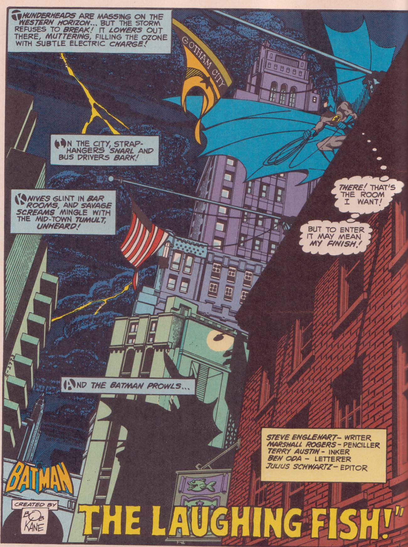
As the Holiday girl there in the lower right indicates, the first story is a paradise island adventure. All the more welcome since Harry Peter seems to be in fine form; that picture of WW sitting on the telephone wires waiting for her robot plane with the buildings slanting down vertiginously in the background is pretty fantastic.

Anyway in this story Amazons are disappearing from paradise island’s beach. This gives Hippolyta a chance to watch as her viewfinder presents her with a Perils of Pauline moment:

Anyway, the viewfinder breaks inopportunely, shattered by a bolt from Odin, whose Valkyries are flying down to Paradise Island to kidnap Amazons. Why you ask? Well….

Odin has captured heroes (i.e. veterans) and wants them to go to earth to incense others to fight. But the heroes are tuckered out; all they want to do is sleep. Since his Valkyries can’t get the men to fight, Odin tells them to kidnap Amazons so *they* can get the heroes to go to war again.

As usual with Marston, the gender politics are delightfully convoluted. Obviously, the main instigator of warfare is the sadistic male patriarch, Odin. But the male “heroes” are shown throughout as being soft, manipulable, and not especially violent — they need a strong female hand if they’re going to be effective fighters. So in some sense it’s really women who are the embodiment of military virtues.

The funniest panel here is the bottom one, where the male heroes claim to be sick of being ruled by women “who want us to fight” — the implication being that they’re perfectly happy to be ruled by women who don’t want them to fight.

The rest of the page is interesting as well, though; the Valkyries have encased WW and Amazons and Holiday Girls in energy to trap them and turn them into Valkyries themselves. The purple energy happens in this case to look like the outline of Russian dolls…and of course, standing stock still in their various outfits, the transforming women look more than a little like dolls themselves (with special wing attachments!) I talked about the connection between Wonder Woman and doll stories before. In this case, the Valkyries eroticized dominance/appreciation of the Amazons is both about enjoying femininity *and* enjoying martial virtues. In fact, there’s barely an *and* there; for Marston, the more effectively militant you are, the more feminine you are (at least if you’re a woman.)

Which is why, in the middle right pane abovel, Aphrodite emphasizes that WW and the Holiday Girls are “courageous, loving girls” — the point being that courage and loving femininity go together. The natural conclusion is shown in the bottom left panel, where Odin, the supposed wargod, just gives up and offs himself (throwing down his phallic sword) when WW robs him of his Valkyries.

That page is pretty great in other ways as well, with winged Holiday girls and winged Amazons flying about with sky kangas and that magnificently phallic spaceship that Steve is piloting. I especially like the way the spaceship in the upper left panel mirrors the motion of the sky kanga in the upper right — as if the ubermaleness is just an image of, or subsumed within, the undulating sea of femininity. Maleness seems part of the harmonious whole of femininity rather than an opposition to it.

I also love that middle left panel; the scribbly sky-kangas and the valkyries being tied up here and tied up there, with scale all off-kilter so everybody looks like paper doll cutouts. This is definitely one of Peter’s most Henry Darger moments.

And as long as I’m gushing about Peter — check out this horse.

Or this bizarre backlit Etta as femme fatale from the second story.

This weird Egyptian ghost rising from the tomb is pretty fantastic too….

And how about this ancient Egyptian headgear?

Storywise there’s not a whole lot going on here; Marston makes some noises about the evil dangers of superweapons and generally suggests he doesn’t want the world to go to war again. It’s fine…but the art is definitely the main thing here.

The third story is the most interesting of the lot. It’s a tale from WW’s childhood, explaining the origin of the giant sky kanga’s. Also, incidentally, it lets us know that before there were sky kangas, the Amazons rode on giant bunnies. What is the origin of the giant bunnies? That, alas remains a mystery….

As always, Peter’s animal drawings are something special. The lines of the giant bunny and the giant kanga flow sensuously; the whole page is filled with sensuous curves. And the sensuousness adamently includes the prepubescent Wonder Woman herself; her short frilly flared red dress placed in the center of the composition.

In Between Women: Friendship, Desire, and Marriage in Victorian England, Sharon Marcus argues that the eroticization of female children was a common iconographic trope of Victorian fashion illustration, as well as of Victorian society more broadly.

Victorian culture represented girls as epistemological paradoxes, so innocent that they could be intensively eroticized without raising comment. But unlike images and stories that eroticized girls for a mixed audience of men and women, fashion imagery displayed girls in erotic dynamics with adult women for the delctation of a female audience. In The History of Sexuality, Foucault argued that the intensification of family ties in the nineteenth century also sexualized them, and fashion plates show that in the process all cross-generational ties were eroticized, including those between adult women and girls…. Designed to be objects of an appreciative female gaze inside and outside the image, girls in fashion plates also embody a desire to look at and touch a woman, a desire figured as both self-abasing and self-important.

Marston reproduces this dynamic even more self-consciously than the fashion plates:

WW’s “childish tricks” (involving, essentially, disrobing at super-speed before her mother), lead Hippolyta to remember her daughter’s actual childhood. The eroticized affection between mother and daughter is then displayed (via film) for the delectation of an all-female audience.

In her discussion of the Victorians, Marcus follows her look at fashion illustration with an analysis of debates about corporal punishment in women’s magazines of the period. Said debates involved numerous women writing to the magazines to describe, in detail, their own experiences with corporal punishment — descriptions which dwelt on the removal of clothes, the physical sensations of whipping and being whipped, and other immodest details. All of this, according to one magazine editor “aroused…intense, not to say passionate interest.”

Here’s one letter which Marcus quotes.

I put out my hands, which she fastened together with a cord by the wrists. Then making me lie down across the foot of the bed, face downwards, she very quietly and deliberately, putting her left hand around my waist, gave me a shower of smart slaps with her open right hand…. Raising the birch, I could hear it whiz in the air, and oh, how terrible it felt as it came down, and as its repeated strokes came swish, swish, swish on me!

Marcus notes that “Corporal punishment is where pornography, usually considered a masculine affair, intersects with fashion magazines targeted at women.” She adds that “flagellation scenarios represented, interpellated, and excited women as well as men, and that the power differences inherent in scenes of discipline and punishment were erotically charged in any gender configuration.”

So here’s some scenes of the young WW being disciplined as little girls ought.

That upper right panel, in particular, eroticizes the adult mother and the child daughter in exactly the same way; both are bound side by side, with Peter’s stylized drawing and the wrappings deemphasizing the age difference; they look like different sized dolls rather than like mother and daughter.

Peter emphasizes the connection, and the parallel fetishization, of mother and daughter in other ways as well:

Mother and daughter both attack in the same way; leaping up to grab the antagonist by the neck. And in both cases, the attack is, I’d argue, fetishized; Hippolyta’s straight posed stiffness emphasizes the curves of her dress and of her breast. In the second sequence, Peter shows us, in both panels, WW’s underwear beneath that short miniskirt.

In addition, of course, any display of female power is eroticized for Marston, as is any display of female disempowerment. As with the corporal punishment fantasies Marcus describes, the woman empowered and the woman disempowered are both subjects of the fantasy. So it’s as exciting to see WW in the cage as to see her breaking out of it:

Note in the bottom left panel that we see her underwear again…and that her crotch is level with her mother’s face. The energized swoops of motion lines; the violent rescue of the damsel in distress — this is a typical erotic fantasy, not any the less so because it involves daughter/mother rather than hero/heroine.

You see it again here; the Amazon being unwrapped is decidedly butch; her shoulder-width emphasized by the narrowing of her lower body caused by the wrapping. Young WW, with her dress flaring up as always, is decidedly femme. But in this case the femme is rescuing the butch, rather than the other way around — a role reversal which I’m certain Marston appreciated.

And speaking of role reversals:

The sky riders who the Amazons initially assumed were men are, as it turns out, masked women. Thus Aphrodite’s law preventing men from setting foot on Paradise Island is not broken. Or, to put it another way, men are not the defilers of Aphrodite’s virgin soil — women are. Inevitably, the sky raiders are stripped to their underwear and bound under the watching eyes of the Amazon. In defeat, the powerful men are feminized — though, since this is Marston, the feminization is actually their triumph, as they will now (eventually) become reeducated and made Amazons (better than any man!)

Marcus notes that the Victorians created eroticized images of and narratives about women for women. The fashion plates allowed women to experience powers and pleasures around control and consumption of female bodies that were, in other areas, reserved for men. In a somewhat analagous way, it’s worth pointing out that the eroticization of children in WW is meant to be consumed primarily, not by adults, but by children. The hints of adult pleasure, power, dominance, and submission, leavened with childish adventure and playfulness — the very things that made Frederic Wertham choke up his soup — were, I’d guess, exactly the features which appealed to children of every gender.

Plus, of course, sky kangas.