Ignorant and Mean

David P. Welsh responds to my post about lit comics snobbery and the perils thereof, in a very manga-crit way. That is, instead of taking sides, he opens the floor for discussion:

It’s sent me off on a mental tangent, and I wonder how people would define their comics reading tastes if circumstances forced them to do so? I would categorize mine as eclectic, though I would be extremely reluctant to do so precisely because that adjective, neutral as it should read, feels somehow like I’m congratulating myself for liking more than one kind of thing. So I’d love to hear people’s thoughts on categorizing their tastes and the potential pitfalls and moral implications of doing so.

So since David kindly asks: I wouldn’t call myself eclectic (nor omnivorous, as Melinda Beasi does in comments. That’s not because I read only one thing — in fact, I read various sorts of things, whether comics or manga or books.

But eclecticism is a relative term. And however widely I cast my net, there’s lots more stuff I haven’t looked at, and even more I haven’t heard of. I see the stuff Domingos Isabelinho talks about for example…mostly European art comics…and I don’t even know the titles. For that matter, unlike Domingos or Matthias or Suat or Erica, I’m a monoglot, which really restricts what I’m able to process. And there’s whole swathes of comicdom I’m not that interested in (early proto-comics tend to bore me for example; I’m not especially interested in most yaoi, etc. etc.)

I got really into Thai pop music recently, and came out of that experience not feeling like I was especially eclectic or omnivorous, but instead feeling like I didn’t know anything. Entire giant stretches of the globe producing mounds of cultural products, and I can’t even get through the to-read stacks in my house. I know there’s a giant Mexican comics scene for example, of which I have read exactly nothing. I think (though I don’t know) that there’s a fairly large Indian comics scene too, and all I’ve seen of that is a crappy online porn comic that Dirk linked to once.

So if I were going to characterize my tastes, I would have to describe them as “ignorant.” Also as “mean” — because while I don’t know much, I can at least be nasty about what I do know, damn it.

And since meanness is in my portfolio, I might as well sum up by using this post to once again bash all and sundry. Obviously, I’m arguing here that, in terms of cultural consumption in particular, as well as perhaps more generally, we’re all fairly ignorant, from the mouth-breathing superhero fan all the way up to masters of cultural wu-tang like Terry Eagleton or Kim Thompson. Which is why lambasting others for not reading what you think they should read is such an empty exercise…and why even calling oneself eclectic is maybe a little presumptuous (a fact which David basically points out himself.) Event the most cosmopolitan of us are really just provincial hicks. Which is nice actually; it means there’s always some city we can wander into, looking about in wonder.

Strange Windows: The Adventures of Tintin in Otherland, Part 2

[Part One here.]

Wherever you look, you come face-to-face with the Other.

Other race, other religion, other sex, other age, other individual… you name it.

Reactions to the Other are complex and often self-contradictory: they run the gamut from instinctive loathing to fascinated attraction. The same person may be viciously hostile to, say, Indian immigrants, yet long to visit the Taj Mahal. (Excellent examples of this paradox are found in Edward Said’s book Orientalism.)

To deal with the Other, we can say that the best and most mature approach is empathy – fellow-feeling – as the common trope has it, putting yourself in another’s shoes. But there are far more common strategies: you can demonise the Other, as Hitler did to the Jews; you can ridicule him, categorise him, patronise him: in short, re-define him.

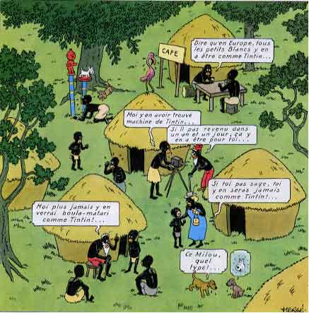
This range of responses is fully on display in Tintin ; perhaps more so than in any other popular entertainment of a like longevity. It’s telling, for instance, that (apart from the Bird brothers in The secret of the Unicorn), every single villain in the 23 albums is a foreigner.

To understand this, we can look at Tintin author Hergé’s life and career, and chart his evolution from rampant xenophobia to the empathy that emerges in his late works.

Georges Rémi—Hergé – was born in 1907 to a lower-middle class couple in Brussels, Belgium. He himself characterised his childhood as being ‘gray’, by which we may understand conventional and boring. He was a fervent Catholic.

Belgium harbors a culture that could pass for a caricature of normalcy and respectability, though not without its dark side. Hergé was comfortable in the most banal backwaters of this culture, never questioning its prejudices (something he looked back on, late in life, with a sort of rueful self-contempt.) He attended a Catholic school, and upon graduating age 18 went to work for a Catholic newspaper, Le Vingtième Siècle.

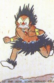
The brand of Catholicism that embraced him was deeply reactionary, royalist, violently anti-Communist, strongly anti-Capitalist (Moscow and Wall Street being seen as two sides of the same Judeo-Masonic coin ), unthinkingly imperialist. Hey, the Belgian Empire allowed the missionaries to convert all those benighted pagan Blacks.

The Vingtième was edited my a man who would have an immense and lifelong influence on Hergé, Father Norbert Wallez: an enemy of democracy which was seen as hopelessly corrupted by foreigners, Jews and Freemasons, an admirer of Mussolini.

Wallez tasked young Hergé with creating a children’s supplement for the paper, called Le Petit Vingtième. And it was here that Tintin was born.

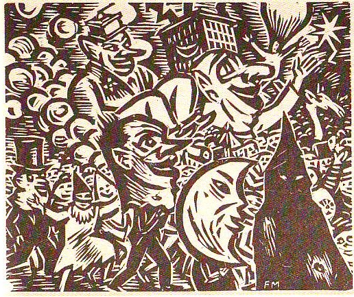
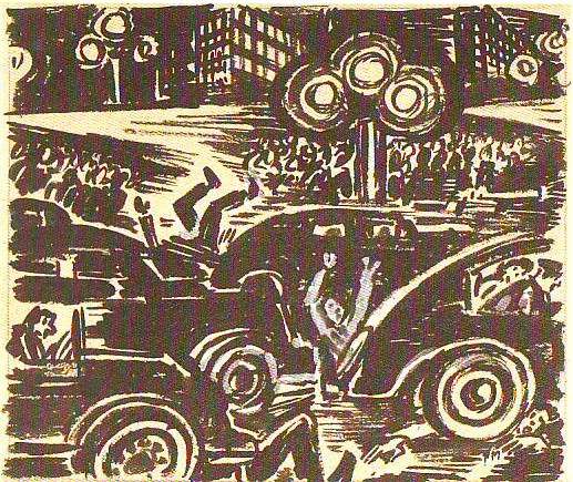
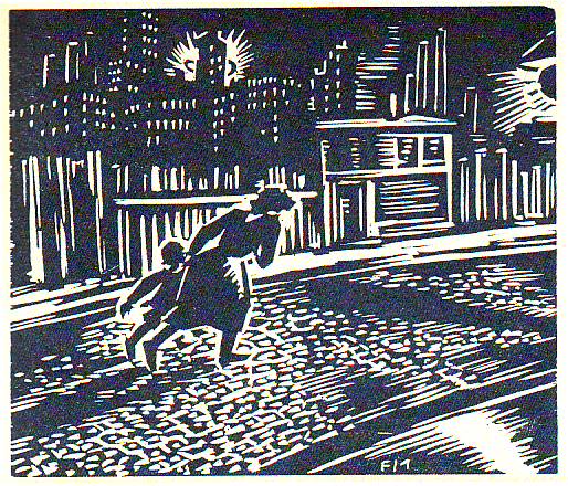
The first adventure was Tintin au pays des Soviets, a rollicking anti-Communist screed:


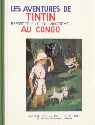
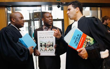
Next was the currently notorious Tintin au Congo.


When we think about the European colonial empires we remember those of Britain, France and Spain; in fact, even Denmark and Portugal had their colonies.

Little Belgium was dwarfed by its holdings in the Congo. It was infamous for the reign of atrocity inflicted on the Congolese by king Leopold II. You’d not think so reading young Hergé’s version: his Congo is a little paradise of merry, foolish darkies who love their benevolent Belgian overlords. (In 1946, though, Hergé had to tone down the imperialistic slant in his revision.)

Then  came Tintin in America, trotting out more stereotypes: a land of gangsters, greed-crazed businessmen, and tomahawk-toting Indians. (The latter, however, receive sympathy for their ill-treatment at the hands of despoiling Whites.)

Then Cigars of the Pharoah, whizzing through Egypt and India (fakirs, snake-charmers, etc.)

“In reality” said Hergé, “my early works are books by a young Belgian filled with the prejudices and ideas of a Catholic […] they are not very intelligent, I know, and they do me no honor.”

Herge at work


But the next book would show the beginning of Hergé’s move away from mediocre stereotypes.

He had announced the next Tintin adventure would take place in China. A monk with knowledge of the country sent him a young Chinese art student: Chang Chong-Chen.

Chang had a profound influence on Hergé.

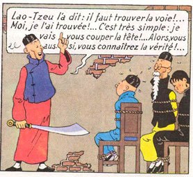
Here, for the first time in his life, the cartoonist met the Other he  depicted,  face-to-face. Chang exhorted Hergé to abandon his clichéd ideas of Chinese people and culture, to research seriously his subject. In return, Hergé put Chang into the strip:

Here, remarkable for its time and context, Tintin and Chang share a good laugh over the stereotypes Europeans bear about the Chinese – stereotypes that would have been typical of Hergé, had Chang not come along:

click image to enlarge

This Shanghai street scene shows a new feel for realism:

click image to enlarge

…but Hergè is not quite able to shake off the snares of cheap exoticism and cliché:

Hergé also seems, at this time, to be moving towards the political center, alarmed by Fascism and Nazism and Belgium’s own Rexism. Le Sceptre d’Ottokar depicts an idyllic Ruritanian-type kingdom threatened by a demagogue named Müsstler (Mussolini + Hitler).

But Belgium plunged into the cataclysm of World War II and German occupation, Le Vingtième Siècle disappeared, and Hergé began running Tintin in the ‘stolen’  collaborationist newspaper Le Soir. A move that would haunt him all his life.

The first Tintin adventure under the occupation was L’Ile Mystérieuse. This is the work that would dog Hergé with accusations of anti-Semitism, and small wonder:

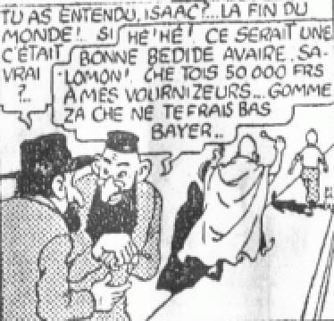
« You heard that, Isaac ? The end of the world !…What if it’s true?”

“Heh! Heh! It vould be good for business, Salomon! I owe 50 000 francs to my zuppliers… zis vay I von’t haff to pay…

That panel appeared only in Le Soir, and was excised from the 1942 album…for reasons of pacing, not of taste. (This was while the Jews of Belgium were being rounded up and sent to the camps by the thousand.)

The plot concerns the race to get to an asteroid that has crashed into the Arctic. On one side is a European expedition, with Tintin & co along for the ride; on the other is the villainous American expedition, with no thought for anything but profit. It is bankrolled by a New York banker named Blumenstein. After the war, he was renamed Bohlwinkel and America became ‘Sao Rico’:

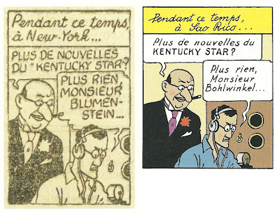
At left, the original, at right the postwar version

Top, nasty Yanks, bottom, nasty Sao Ricans

In 1969, Hergé would write:

“… you are a little too severe with me for this Blumenstein from the year 1940. I admit that I was wrong, but (and I hope that you will believe me) I was far from imagining that the Jewish stories that people told (and still tell today, like stories about people from Marseille, or the Scots […] would lead to such horrors.”

There’s more than a little cluelessness on display here, after Auschwitz. Hergé would always protest that “he didn’t know”, but was lucid enough to add:

“Perhaps I didn’t want to know”.

After the liberation of Belgium, Hergé was roundly reviled for propping up a collaborationist paper, and he was lucky to escape with his neck; as it was, he was banned for two years from any work in the press. It was this enforced idleness, and, no doubt, the need to put distance between him and his ultra-conservative views, that set him on the integral redaction of his albums – shovelling the dirt under the carpet, in the process.

Next: Approaching redemption.

All Tintin art copyright Studios Hergé/Moulinsart

_______________
The entire Tintin in Otherland is here.

Strange Windows: The Adventures of Tintin in Otherland, Part 1

The children’s comics album Tintin au Congo, by the  Belgian cartoonist Hergé, has been much in the news of late– and not in a good way.

In Britain, the Commission for Racial Equality has condemned the book’s “abominable” racism (and proving once more that there’s no such thing as bad publicity, its sales have jumped 5000% on Amazon UK). It’s been banished from the children’s section in bookshops and libraries across America and the UK, in chains such as Border’s.

Finally, following a lawsuit brought by a Congolese student, Bienvenu Mbutu Mondondo, a court in Brussels is to determine whether the book should be banned in Belgium. Similar lawsuits have been brought in France and in Britain.


So: just how racist is Tintin au Congo?

“And to say that in Belgium all the li’l Whites are like Tintin!”

“Me find Tintin’s machine…”

“If him no come in 1 year and 1 day it for you…”

“And if you no be good you’ll never be like Tintin!”

“Never again me him see a boula-matari [stone-breaker– the title given to Stanley, the white, conqueror of the Congo] like Tintin”

(Dog) “That Snowy…what a guy!”

Note in the upper left-hand corner: fetish statues of Tintin and Snowy before which a Black man kneels in worship.

I could post many more cringe-worthy excerpts, but why bother?

Yes, Tintin au Congo is racist. Whether it should be restricted or banned is a debate I’ll leave to others, although I certainly wouldn’t allow a child of mine near it.

“So what?” the informed comics reader might object.

It’s no new discovery that throughout comics history racist and bigoted content has permeated the art form. The Imp in Little Nemo:

Connie in Terry and the Pirates:

Ebony in The Spirit:

The first appearance of Ebony White; art by Will Eisner


…the list of offensive stereotypes is endless.

One balances a historical approach with a rejection of such inadmissible values, and one moves on.

But the case of Tintin — and of his creator, Hergé — warrants more thought.

First, unlike the vast majority of popular comics with racist elements, Tintin remains relevant.

The series of 23 albums has sold, to date, over 200 million copies in sixty languages and still sells briskly. It has spun off magazines, toys, television shows, feature films; Stephen Spielberg is now in post-production of a blockbuster adaptation of The secret of the Unicorn. Tintin isn’t enjoyed only by middle-aged fans, either; children respond just as eagerly to his adventures today as they did eighty years ago.

So a certain level of scrutiny is justified, simply because of Tintin’s effect on the culture, and on young minds in particular. Tintin au Congo is the most egregiously racist, but most of the other albums have disturbing aspects as well.

I’m interested in Tintin’s racism, xenophobia, and general fear of the Other for different reasons.

Tintin changed over the years. By which I mean that the individual albums were redrawn, rewritten, compressed and otherwise redacted, some more than once: L’Ile Noire (The Black Island) exists in three versions, from 1938, 1943, and 1965.

And in these redactions, the racism has been drastically toned down. Take this example, from (top) the original, and (bottom) the revised versions of Le Crabe aux Pinces d’Or:


And the above shows why I speak of a toning down of the racism, not of its elimination. The caricature of a brutal black is replaced, true – by the caricature of a brutal Arab.

Note that the above change was not made at Hergé’s initiative: it was his American publisher, Simon and Schuster, who demanded it (as well as the ‘whitewashing’ of four Black characters from Tintin in America. ) As Hergé sardonically remarked,

“What the American editor wanted was the following: No Blacks. Neither good Blacks nor bad Blacks. Because Blacks are neither good nor bad: they don’t exist (as everyone knows, in the USA.)”

Thus a racism of caricature is displaced by a racism of denial.

Indeed, the revised editions function as palimpsests—and as with all palimpsests, the ghost of the original text is sensed. Or shall I make a psychiatric analogy and speak of the return of the repressed? Whichever — I find the tension between the clean images and cleaner morals of the modern editions, and the nasty energy of the originals, gives the strip much of its strange and seductive flavor; something subterranean, something I only intuited until I came face-to-face with the older, rougher, uglier incarnation of the strip.

But the other changes in Tintin over time were rooted in the personal evolution of its creator. He progressed from a narrow-minded petty bourgeois stuffed with the ignorant prejudices of his time and caste, to a far more generous spirit eager to engage the world—and the Other—as it truly is. It took him a mere forty years.

In the next instalment (Update: now posted here), we’ll review the background of Georges Rémi aka Hergé, and the shocks to his world that caused his long climb away from simple bigotry; and in particular his meeting with a young artist from China.

____

The entire Tintin in Otherland is here.

All art copyright Studio Hergé/Moulinsart.

Komikusu, Selling Awesome Manga: Belated Conclusion

I was originally not going to write a conclusion for last week’s Komikusu discussion. But then I was chatting to Tucker Stone, and he mentioned that he’d enjoyed reading the roundtable.

This took me a little aback, because Tucker’s come out fairly strongly in the past against the “we must read more lit comics!” meme as it applies to Western comics. In an interview with Tom Spurgeon, for example, Tucker said:

There’s a temptation to label mainstream fans as being lazy for not caring about Swallow Me Whole or Blankets, to call them “bone-ignorant” — that’s just a bunch of horseshit. It’s an attempt by boring assholes to assign an overall meaning to a bunch of personal choices made by a group of people that those boring assholes don’t know anything about. On an individual level, I’ve heard a couple of people say they don’t want to read comics that focus on the mundanities of regular life, but I’m more often exposed to people who just like what they like because it’s what they fucking like.

I actually agree with that. Yet, at the same time, I’d like to see some more interesting manga titles succeed in the U.S. So…what’s my problem? Why does the push for more interesting comics make me itch in a Western context and not in a manga one?

Perhaps the answer is simply that I’m inconsistent. But, appealing as that solution is, I think there’s actually something else going on. Specifically, the way the debate is framed in a Western context tends to be different than the way the folks on this roundtable framed it. As an example, here’s Sean T. Collins discussing his wish that there was more discussion of western lit comics in the blogosphere.

I’ll tell you what my big question is: Why do superheroes dominate the online conversation the way they do? Last week saw the release of Jim Woodring’s Weathercraft and Tim Hensley’s Wally Gropius, two gorgeous and weird books that truly make use of the stuff of comics and contain the kind of material you can mentally gnaw on for days on end, but I guarantee you that no matter which comics blogs you read, you read more about Paul Levitz’s return to the Legion of Superheroes. And chances are good that if you’ve read about Daniel Clowes’s Wilson, what you read prominently featured that page where the character makes fun of The Dark Knight. What gives? If you want to make the argument that sheer numbers justify the choice of what bloggers and comics sites cover, I suppose that’s your prerogative. And don’t get me wrong — I read and enjoy multiple superhero comics every single week, and have lots to say about a lot of them. I also understand the need to make a living, which in Internet terms means unique pageviews.

But so much of the comics Internet consists of individual or group blogs where, presumably, there’s no editorial mandate to maximize hits. Indeed, the major selling point of the blogosphere is its lack of the traditional gatekeepers and incentive structures that bedevil mainstream journalism. Meanwhile, even the big group blogs owned by major communications corporations tend to be personality-driven, reflecting the interests and styles of their writers to a refreshing degree — and those writers tend to be interested in all sorts of comics, in their spare time at least. So yes, the nature of the coverage is often idiosyncratic, which is great. But why is that the comics being covered differ so little from what you’d read about on Marvel.com or The Source? Should those of us in the position to do so make an effort to broaden the scope of what we’re presenting to our readers as the comics worth buying, reading, and talking about?

And here’s Kate Dacey responding to Sean in that comments thread.

There’s a similar divide in the mangasphere as well: a lot of sites focus on mainstream shonen and shojo titles (the manga equivalent to tights and capes, I guess) while neglecting the quirkier stuff. To be sure, there are many sites that cover the full spectrum of titles, or focus on a niche, but the pressure to stay current with new releases and draw traffic discourages a lot of folks from waxing poetic about the stuff at the fringes. Looking at my own site stats, for example, a review of Black Bird or My Girlfriend’s A Geek will attract a much bigger readership than, say, The Times of Botchan.

Which brings me to the argument I’d like to see explored somewhere: how do we interest older readers in manga that’s written just for them? What kind of marketing support would, say, the VIZ Signature line need in order for some of those titles to crack the Bookscan Top 750 Graphic Novel list? Are there genres or artists we should be licensing for this readership, but aren’t?

Kate’s post there is what inspired me to organize this roundtable. And obviously there are close analogies between what she’s saying and what Sean is saying. But I think there are important differences as well. Mainly — Sean makes the dissemination of lit comics into a moral issue. “Should those of us in the position to do so make an effort to broaden the scope of what we’re presenting to our readers as the comics worth buying, reading, and talking about?” he asks, and the answer is obviously that yes, we should. The problem for Sean is that super-hero comics are taking up too much space because the people in the blogosphere aren’t doing their job in educating their readers about better fare.

Kate starts from the same place — how do we get more better manga out there? But she doesn’t bother with the moral question at all; instead she goes right to logistics. Not “you people should be doing more!” but, “presuming there are people who would like to read different kinds of manga out there, how do you reach them?”

Kate’s pragmatic approach was absolutely the one adopted by the roundtable. Erica Friedman tried to figure out how scanlations could be used legitimately to make more and different kinds of niche mangas available. Brigid Alverson, Deb Aoki and Kate herself talked about practical marketing steps that could be taken to reach new audiences. Peggy Burns pointed out some strategies that have worked for Drawn and Quarterly in the past. Ryan Sands and Ed Chavez tried to map out the historical lay of the land, explaining how manga has been categorized and sold in different ways at different times in both the U.S. and Japan. And Shaenon Garrity offered some more possible solutions, while also pointing out some possible pitfalls.

If you read through these pieces, though, what’s almost as noticeable as what is said is what isn’t. Nobody in the roundtable says that the problem is that readers’ tastes suck. Nobody says the problem is that bloggers aren’t doing enough to promote the right kind of manga. Both Shaenon and Deb mention Naruto in a “yep, the manga we’re talking about aren’t going to sell like that” kind of way — but they don’t seem resentful of Naruto’s success, the way Sean Collins seems resentful of superheroes (despite the fact that he reads them himself). In fact, unless I’m missing something, nobody in the roundtable says anything mean about mainstream, successful genre manga at all.

And why should they? The success of mainstream genre manga doesn’t hurt sales of To Terra or A Drifting Life or Travel or what have you. Because, as everybody in the roundtable seems to realize, the people who are buying Naruto — they aren’t the audience for Emma or Tramps Like Us. Not that nobody could possibly read or like all of those series, but simply that the demographic is different. If you want to increase sales of Oishinbo, the way you do that is not to go after readers of Gantz. The way to do it, as Shaenon says, is to get it into cooking stores.

Lit comics have had a lot of success in the U.S. precisely by finding different audiences. But the comics scene here is still so small, and still so defensive, that its vision still seems to be defined to a surprising degree by the mainstream. It’s not just Sean by any means — super-hero crap is, in general, seen as not just bad, but oppressive. There’s only room for so many comics, and the bad forces out the good. It therefore becomes every intellectuals duty to battle against the filth.

I don’t know that the manga scene in the U.S. is bigger than the Western comics scene. But it’s more demographically diverse, and it always has before it a pretty compelling vision of a possible world in which there are no mainstream comics, because comics themselves are mainstream. As a result, manga critics seem to have figured out what Western comics critics still have some trouble with. Namely, improved morals don’t sell comics; better marketing does.

Of course, just because manga folks have figured this out doesn’t mean that there will ever be more awesome manga available on these shores. But it seems like a good first step.
____________
The entire Komikusu roundtable is here.

Visual Languages of Manga and Comics

Hello!  I’m known as Telophase in various places online, and when I dropped a couple of comments about the visual language of manga on a post a couple of weeks month or so back, Noah asked me to make a guest post (originally during the time that HU was down, and rescheduled for today).  So here I am! My day job is an academic librarian, but I wrote a few posts on manga layout back in 2005-2006, when I was trying to figure out how to improve my own comics, and served as Tokyopop’s manga columnist for a while back in the day.

As a convenience, I’m going to use the shorthand of “comics” to refer to American comics, and “manga” to refer to Japanese comics, although there’s a strong argument to be made that “comics” is just “manga” in English translation. (What do Japanese call Spider-Man?  Manga!) It just means fewer chances for me to typo “American” and “Japanese.”

I also want to stress that I don’t consider either of the trends I’m going to discuss to be better or worse than the other – they’re both effective ways of telling a story, depending on the needs of the story, the audience, and the industry.

Usually when discussing the visual language differences between manga and comics, manga is discussed in terms of higgledy-piggledy shoujo panels, speedline overload, sweatdrops, and nosebleeds, and nobody pays attention to the way the art elements and speech balloons are structured to steer your gaze through the page, but I think this may be a more defining characteristic of manga than all the sweatdrops and nosebleeds in the world.

Comics appear to have a much less obvious push through the page, often relying on American readers’ style of reading left to right first, then, if needed, secondarily directing the reader’s gaze through the page by use of action lines and other cues in the art.

I think these differences, more than the art styles, form the core of the two visual languages of manga and comics.

Let me see if I can simplify these to some guidelines:

Japan: First, follow where the art and speech balloons are pointing you. If that fails, read right to left, then up to down.

U.S. First, read left to right and then up to down.  If that fails, follow where the art and speech bubbles are pointing you.

This is not to say that these guidelines are slavishly adhered to! There are many examples of the rules being broken, but I think they represent a general trend (and, perhaps, fundamental difference) in each industry.

How did this come about?  I think the structure of the manga industry is a major factor.  Many of the most popular (and thus influential) manga are published weekly in chapters of 15-30 pages, collected with other manga into phone book-sized anthologies called tankoubon. (Edit: I misremembered – tankoubon are the books the chapters get collected into later. Zasshi are the magazines.) Shounen Jump is one you’ve probably heard of if you’ve paid any attention to manga being translated and published in the States.  The publishers of tankoubon have an economic motive to get you to consume as much manga as possible as fast as possible, because they want you invested enough in the stories to purchase next week’s tankoubon. Because of this, there’s often strong editorial control over each manga, leading to more uniform layout techniques (and possibly even house styles, although I haven’t done any comparison between publishers).

Here’s an example, a spread from Bleach, one of the Shounen Jump properties and one of the most popular manga in Japan. The first image has the spread itself, while the second traces the action lines through the page, the path your eyes take as you read.  Note how every important facial expression and image is included in that line.

Bi-weekly and monthly manga are not as subject to this editorial control, and the mangaka have a greater degree of freedom to diverge from the standard and to experiment. I still see similarity to the weekly manga layouts, though – the biggest of which is that the main action lines through a page tend to steer your gaze across characters’ faces, or across important items or spaces in the art.

You can see this in the following spreads from a manga about ekiben otaku (ekiben = regional specialty bento [boxed meals] you can get in train stations; otaku = obsessive fans). I’m not sure of the title because I don’t read Japanese, but a friend thinks it translates to The Solitary Love of Ekiben.  I want you to note how the speech balloons often frame the character who’s speaking, or the piece of food being discussed.  (Also note the speedlines of AWESOME surrounding the bento in the second spread. The entire manga is nothing but ekiben porn, train porn, and landscape porn. It is the geekiest and yet best thing ever. And there are four volumes of it!)

Something in manga layout that I have yet to find in comics is the action line forcing you to read backwards through part of a page.  Note this spread from Fruits Basket.  At first glance it’s chaotic and if you’re not well-versed in the visual language required to read this, you may get lost.

But if you look carefully, you’ll notice that not only are the speech balloons positioned to pull you through the page, often the characters themselves are pointing you at the next stop on the journey through the page.  The characters’ bodies and speech balloons break panel boundaries deliberately, not randomly, and drag your eye across the portions of the art that emphasize the characters’ emotions or tell you what is going on.  In the third panel of both pages, you even read backwards – left to right – through the panel.

(As an aside: now that more and more Japanese are reading manga on their phones, I expect the layouts are changing to fit the new medium. I visited Japan in 2007 and a Japanese woman showed me a yaoi manga she had on her phone.  When you paged to the bondage scene, the phone vibrated.)

In the U.S., until the recent Graphic Novel Revolution the most common way to get comics was by purchasing individual monthly chapters (I am not familiar enough with older comic practices to know what the usual release schedule was before the 1970s and 1980s).  There’s no economic motive to push the reader through the book as fast as possible, so the layout doesn’t need to focus on reader speed and the artist can do other things with page composition and action lines.  I might even be able to make an argument that there’s a motive to slow reading down a bit, so that the reader feels she got her money’s worth. (That would be one reason I cut down my comics reading when I had to start paying my student loans back after grad school – I couldn’t justify $2.99 for ten minutes’ entertainment!)

Here’s a couple of examples from Whiteout and V For Vendetta. I acknowledge that these aren’t quite comparable to Bleach – I should be using a current bestselling comic for a true comparison, but I’m stuck with what’s on our shelves at the moment.  I think the general idea will hold, though.

In Whiteout, the speech balloons tend to float to the top of the panels as if they’re filled with helium.  In most of them, the reader is expected to read the narration or dialogue and then look at the art in the panel before going on to the next panel.  It reads in a more staccato way than the easy flow through Bleach, or even the less-easy but still flowing line through the panels in The Solitary Love of EkibenV For Vendetta bookends many of the panels with speech balloons, but the action lines that draw your attention to the important bits in the art are subtle, and the pages as a whole are subsumed to the rhythm of the grid that the panels are based on. In neither of the comics are the faces of the characters or specific pieces of the action deliberately highlighted in the way speech balloons frame characters and items in the manga examples I’ve shown you (forgive my wonky scanning: I’d rather not break the spines of the books).

This isn’t to say that comics don’t use dynamic action lines at all!  Witness this spread in Kingdom Come:

There’s a strong zig-zag action line in the artwork on the left-hand page that swings your gaze across and up directly into the splash-page layout of the right-hand page. The only sour note I detect is the placement of the tiny “Indeed,” speech balloon on the right-hand page. I believe it’s supposed to be right in your path as you read through the bottom panel on the left and scan over the faces, but the superhero splash page is so strong that you tend to skip it. (I didn’t even notice it was there until I drew the redline!)

In Transmetropolitan, I often find that cigarette smoke is used to highlight action lines or characters’ faces and emotions, as in this spread.  There’s an action line anchored by speech balloons, smoke, and white highlights that drags your view across Spider’s face several times in the left-hand page, but the action line through the right-hand page is not as active, even causing confusion in the transition from panel 1 to panel 2, because the figures in panel 3 are pasted on top of panels 1 and 2.  This is a perfect example of “read from left to right first, then read following the cues in the art,” because if you followed the cues in the art, you’d read panel 1, then panel 3, then panel 2.   (I  like how Spider’s and Yelena’s smoke trails flow off the page.  If you look closely, your mind connects them into one flowing line off-page.)

I think that’s a reasonably good illustration of what I see as the core of the different visual languages of manga and comics, and how if a reader is used to one language, it may take a little bit to get into the mindset of the other.

Thanks for letting me blather here!

Monthly Stumblings # 2: Frans Masereel

Frans Masereel’s Route des hommes (men’s path)

In my humble opinion the best Belgian comics artist is not Hergé… The best Belgian comics artist is Frans Masereel…

I vaguely remember mentioning this to a couple of Masereel’s fellow countrymen and I’ve got two different answers (I must add that, in my view, of course, I chose my collocutors well): (1) a nod of approval; (2) something like: In Belgium we don’t view Frans Masereel as a comics artist.

(Needless to say that, besides some puzzled expressions asking “who are those?,” most of my possible Belgian interlocutors would react in a third way calling me a lunatic, or worse, depending on the person’s degree of Tintinophily.)

The first reaction was understandable because said person is an artist himself and what he does is akin to Masereeel’s work. The latter one is more interesting to me at this particular moment because it permits me to enter one of the muddiest territories in comics scholarship once again (when will I learn, right?…), the old conundrum: what is a comic?…

I’m not going to answer that question because it can’t be done. All the answers that one can come up with are rigged because they depend on a previous particular view of what’s essential in a comic (and that’s not only prescriptive, that’s also arbitrary). To Bill Blackbeard, for instance, speech balloons and image sequences are essential so (even if there are older examples, namely, here or even, here) comics started with Richard Felton Outcault’s Yellow Kid in 1896.

Saying this though, doesn’t get us very far (my thoughts on the subject, are here, by the way). What interests me right now are two related points: (1) the sociological side of the problem; (2) anachronism. (1) Words have a (social) commonly agreed meaning. The dictionary tries to stabilize it, but significations aren’t fixed. There’s a reason why we call Maus a “comic.” The sense evolved to include serious work while the signifier stood still. Even so I accept that “comics,” to most people, don’t include Frans Masereel’s oeuvre. Perhaps it will, someday… (2) Frans Masereel didn’t view himself as a comics artist. As far as he was concerned he did wood engravings, that’s all… To call his cycles “comics” is an anachronism. Maybe so, but it seems to me that we are guilty of anachronism all the time and nobody cares. To go back to Tintin, the expression “bande dessinée” didn’t exist when Hergé started doing comics. Why do we continue to say that he did comics, then?… Did the Lascaux painters call what they did “painting?” Is that important? How logocentric can we get?…

As you can see in this 1915 illustration above Frans Masereel was a naturalist. But working for the pacifist newspaper La feuille in Geneva as a political cartoonist during WWI Masereel needed a less detailed, more urgent, style. As Josef Herman put it:

Working for La Feuille posed two main problems for [Masereel], both of a technical nature. One was that the drawing had to be done quickly, leaving no time for the careful, detailed draughtsmanship he had practised until then. The other was how to achieve maximum effect using poor quality paper, on which thin lines were simply lost. He solved these two problems with the true instinct of a man of genius. He avoided drawing with a fine pen and took a thick brush, in the process giving up the search for tonal texture. He now used large planes of intense black, drawing lines wherever needed with a brush. The emotional effect he achieved was staggering.

Maybe the times weren’t right for nuanced views of the world (?). I love Frans Masereel’s verve and variety (he did manga in the original sense of roaming drawings), but his ideological views and Expressionist style push him into a less than complex view of the world sometimes (the fat, jeweled, cigar-chomping capitalist, for instance, is a regrettable stereotype). You can see one of Frans Masereel’s political cartoons as published in La feuille below:

Frans Masereel was 75 years old when he published Route des hommes (1964). He did “novels without words” all his life (more than 50, according to David Beronä). Route des hommes is far from being one of his best (that would be Passionate Journey – 1918 – and, my personal favorite, The City – 1925).

Route des hommes is about the horrible and great things that happen to humankind. We find in the book Masereel’s usual topics: war, famine, exploitation, but also progress, team work, joy, etc…

The greatest thing about this edition of the Musée des Arts Contemporains au Grand-Hornu and La Lettre volée (2006) is that it shows both Masereel’s prep drawings and his wood engravings. In this way we have access to the artist’s creative process as never before.

We can see above how Frans Masereel cites another Belgian painter, James Ensor (ditto Jacques Callot at some point). It’s interesting how what seems to be a tree in the foreground of the drawing becomes a sinister figure in the wood engraving (death waits us all at the end). His composition changes (increasing the two background figures’ size) greatly improve his work.

Masereel used allegory a lot. In this drawing the cars represent careless rich people. The city lights aren’t just that, they connote poor people’s acceptance of the status quo: they’re hypnotized, alienated (as Marxists liked to say)…


…But, to tell you the truth, I prefer allegoryless Masereel. He could be very poetic, as we can see above…

Utilitarian Review 6/26/10

On HU

This week at HU was devoted to Komikusu, a roundtable on selling awesome manga. Contributors included Erica Friedman, Kate Dacey, Brigid Alverson, Ryan Sands, Ed Chavez, Shaenon Garrity, Deb Aoki, and Peggy Burns. Also lots of insightful comments from folks like Xavier Guilbert, Melinda Beasi, Sean Michael Robinson, and more. Thanks so much to all those who posted, commented and read. I learned a bunch.

Utilitarians Everywhere

Over at Madeloud I provide an introduction to doom metal.

Dooooooooooooooooooooooooooooom. It sounds threatening and, well, doom-like, but in fact doom metal is a giant furry mammoth that just wants to cuddle and roll all over you…inadvertently crushing you into a gelatinous blot of assorted fluids.

Maybe we should start over.

Other Links

When people think NSFW, they think of things like this.