
The previous contributions to our roundtable have raised important questions about Thierry Groensteen’s approach to page layout in Comics and Narration. While a rich array of images in Adrielle Mitchell’s post encouraged us to consider how frame irregularities produce meaning, Roy Cook set the stage for an important conversation about the values comics readers attribute to different panel arrangements. Roy’s post really got me thinking about the way Groensteen privileges the layout pattern of the “waffle-iron” by identifying stability, simplicity, and transparency as fundamental attributes of the orthogonal shapes. Groensteen further conceptualizes the grid in the narrative rhythm of comics as the “basic beat” against which the visual and verbal elements of comics can improvise.
From this perspective, it’s not difficult to see how one might characterize the grid as “regular” or “neutral” or “invisible,” but I remain troubled by the relative nature of these terms, who defines them and in what context. To complicate the issue, my first instinct was to seek out comics that delight in the wildly experimental layouts that Groensteen might find “more sophisticated (or more hysterical),” but Adrielle’s post provides several excellent examples already. So I thought I would ask instead about comics that use the grid, but in unexpected ways: how do comics adapt the basic panel layout in order to stray from what Roy described as Groensteen’s “waffle-iron way of truth”? When is a grid not just a grid?
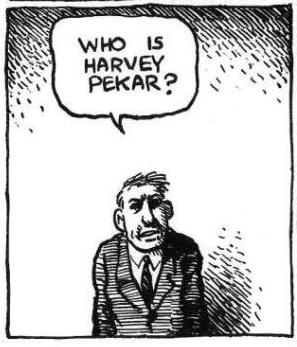
I wonder, for example, how a comic like “The Harvey Pekar Name Story” fits into our understanding of frame regularity and rhythm. Though we may be inclined to make assumptions about its uniformity at first glance, R. Crumb has not simply drawn 48 identical copies of the same man in the squares of this four-page comic about the different Harvey Pekars listed in the phonebook.
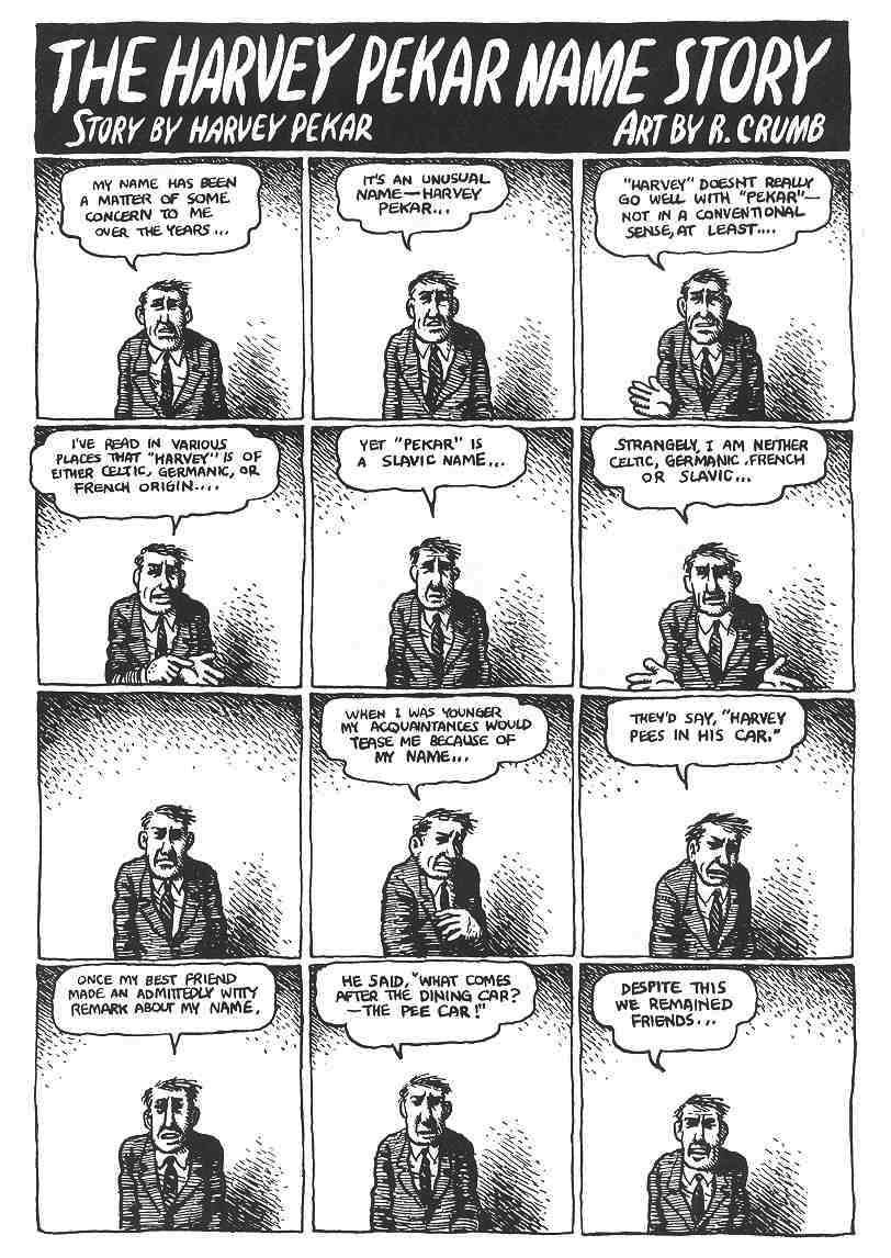
The text varies and so too do the hand-drawn panels that reveal each frame’s scratchy imperfections. The careful reader’s eye becomes attune to the nuances of Harvey’s expression and posture. It is a “basic layout pattern” and yet it has “irregularity as a common feature” (43) — a fitting contradiction for a story about Harvey Pekar’s search for his own unique identity. It seems to me that a comic like this one actually exposes the illusion of neutrality by calling attention to the grid’s own constructedness.
Another example that comes to mind for me is a two-page spread from Percy Carey’s graphic novel memoir Sentences: The Life of M.F. Grimm with art by Ron Wimberly. During Carey’s time in prison on a drug conviction, Wimberly uses the bars of the jail cell to structure the layout of the page, building barriers between us and the detained bodies, the narrative boxes, and the armed guards
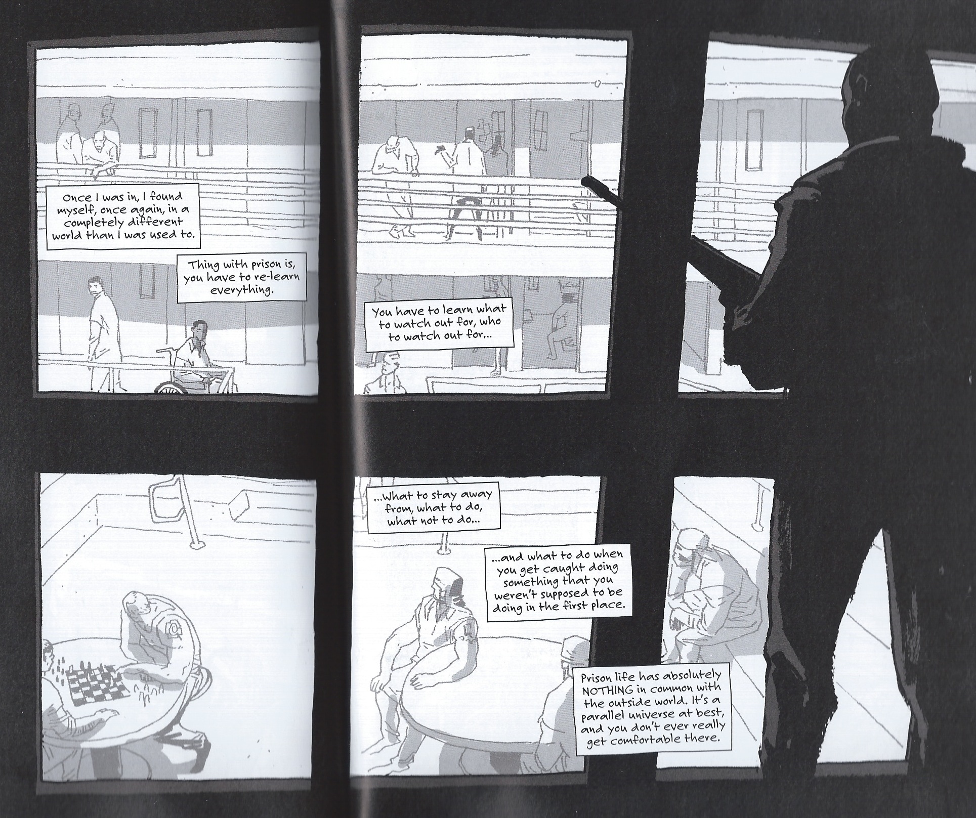
Groensteen describes the thick borders that Chris Ware uses in Jimmy Corrigan as having “an almost carceral appearance” (48) and given the emotional constrictions of multiple generations of the Corrigan family, Ware’s panel choices aid in the production of that meaning. Alternatively, Sentences is a comic that has an unpredictably fluid design with layered panels and splash pages to convey the early days of hip-hop and Carey’s experience with music, drugs, and violence during the 1990s. The waffle-iron pattern is not the norm by any means; when the grid above appears, it actually disrupts a narrative rhythm that the writer and artist have already established. The uniformity of the panels might also be said to reflect the carceral lens that would continue to follow Carey after being released from prison.
Is this frame neutral or invisible? How might the perspectives of these two comics help us to reconsider the notion of the “basic panel layout” in other comics?
Well, looking at it that way, i’d say that the layout in comics is not so much about
narrative flow or rhythm, but is in fact a way of setting the tone or mood? The key,
in a musical sense, if you will. The layout keys the viewer in, subliminally, to the
right mode in which to experience the sequence or piece. As an aesthetic instrument,
not a narrative one?
This is a fun post; you’re basically suggesting that style is part of layout, right? If Crumb’s wobbly lines inflect the grid, then straight lines would too…
Really enjoying this roundtable. I feel the question of neutrality of a page layout is related to the fact that we take in a page ‘twice’ – first as a whole, instantaneously and then sequentially, panel by panel. During the first pass the layout kinda works more like Ibrahim’s ‘aesthetic instrument’, whilst in the second it becomes a narrative tool. I still feel that the irregular panels in Qiana’s first example tend to disappear as we progress through them – but the aesthetic quality of the line registers on our first look at the page. Though I’d imagine this is all very subjective …
The page from Sentences is interesting. I used to love constructions like that, but now I find myself being too conscious of the fact that its a clever layout, and I find it detracts from the immersion. Very much a visible grid, to my eyes.
Qiana, interesting post. Thought you might find these examples relevant as well:
http://du9.tumblr.com/post/45274875843/cesarsebastian-chezniimura-gasoline-alley
Thanks for these comments, all. I’ve been preparing for my classes this week and haven’t been able to respond! Thom C’s idea about pages being twice-read, as a whole and in pieces, aesthetically and narratively – resonates with my thinking on this too. I’ve read an analysis of Watchmen that makes a similar case, but in reverse, that the comic is first read in pieces, then taken in as a whole. These are all choices that the writers/artists make. Even the notion of transparency and neutrality is a choice.
@afdumin: those pages from Gasoline Alley are incredible, thanks for the link!
I am going to offer something here that I couldn’t bring myself to include in my post last week. But I thought about that page above from Sentences when I saw the tweeted photo of Michael Brown’s body in Ferguson with the police officer standing over him, taken through the wooden rail slats on the steps. (Here is the link, and please note that it does include a graphic image of dead body: http://www.huffingtonpost.com/2014/08/15/witness-michael-brown-photo-dead_n_5683166.html).
I’d like to say something about this, but I’m not sure what. Obviously this is not a comic, it’s a photo. But the rail slats and the sidewalk are also a grid, a framing device for the image we are seeing and the carceral implications of these “bars” are chilling to me. I would like to think that maybe a study of page layout in comics could help us to read this is some way – not as a way to “make sense” of this senseless death of Mike Brown and the policing of unarmed black youth in general – but perhaps as a way to process and talk about how what we see in this moment impacts the public narrative. Here is a frame that makes visible a highly disturbing ideological perspective. (Groensteen may not be right person to help aid this reading, maybe Rusty Witek’s piece, which has been reference a few times already.) Any thoughts are welcome.
Qiana, glad you liked those. Here are two more really great ones:
http://theperiodicfable.wordpress.com/comics-index-of-multi-panel-pans-by-decade/1930s-multi-panel-pans/
Also, I’d highly recommend Joe Linton’s blog for some other wonderful examples of “multi-panel pan” comic pages:
http://theperiodicfable.wordpress.com/comics-index-of-multi-panel-pans-by-decade/
About a page being twice-read: highly subjective as this is, when reading the work of Philippe Druillet or Andreas Martens, or even the Moore/Bissette Anatomy Lesson, i feel the layout’s presence is so forceful that it never steps back, as it were, to allow its
narrative function to present itself ‘neutrally.’ The knowledge of the first reading is
continually present. The mood/tone inflects/distorts and becomes the narrative tool.
Or another approach: in Sienkiwicz’s Stray Toasters, the grid is about the only thing
that reminds one that it is a comic, he goes wildly overboard with all the rest,
the grid overlaying the page’s exuberance like a prison grille, at the same time pointing to that exuberance simply by contrast.
This is the last one, I promise(!) But this page from Chris Ware is just incredible (You can really see the influence Richard McGuire’s “Here” had on Ware):
http://michelfiffe.com/wordpress/wp-content/uploads/2012/04/BIG-TEX.jpg
Qiana, I agree with you that it’s hard to know what to say about that image. There’s a lot of photojournalism like that, though even more so in this case because it’s not a journalist taking it, just a bystander.
The link to imprisonment is hard to miss…doubly painful because you feel like the person who took the picture is looking through bars, right? The photographer is trapped by the image, and we’re trapped by it too, it seems like. The frame seems to almost serve an opposite effect from in comics; the grid in comics is a sign of the artist controlling the view, or what you see, whereas here it’s an obstruction, something you can’t get around.
One of the things you kind of can’t get around too, maybe, is that this is, or can’t help being read as, an aesthetic response in some sense, even though you feel like there shouldn’t be an aesthetic response here. This person was himself, and now he’s instantly turned into a symbol.
Ugh. I don’t know if that answers your question at all.
This is actually quite helpful, Noah. Thanks for helping me think through the image/photograph a bit more (and for providing a safe space on this blog for me to raise the question) even if I don’t end of doing anything else with it. The notion that the photographer and viewer are “trapped” by this grid is very compelling and like you, I am ambivalent about discussing an aesthetic response to this image if it takes away from Mike Brown’s humanity. Symbols are powerful and important, of course. But we’ve had quite enough of these symbols to last a lifetime.