Alien Narratives

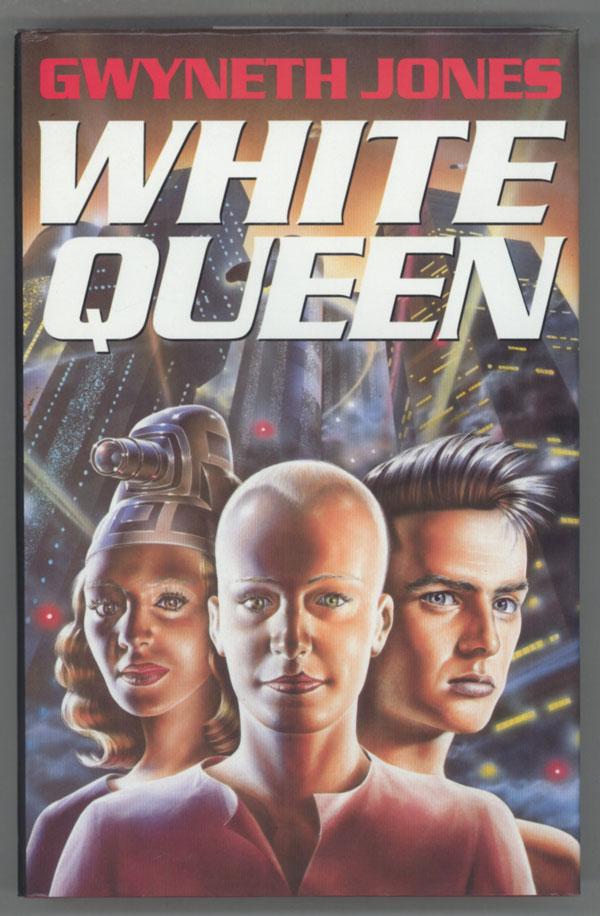
139906In Gwyneth Jones’ White Queen, a near future earth is invaded by a handful of aliens, called Aleutians. The Aleutians look almost exactly like humans. This results in confusion. On the one hand, the Aleutians themselves — who all share a kind of genetic consciousness with each other and their ancestors and their tools — assume that humans, too, are part of the one collective, and so are beings exactly themselves. On the other hand, the humans assume that the Aleutians are radically different from themselves — super-powered conqueror-saviors.

In Decoding Gender in Science Fiction, Brian Attebery argues that this split is indicative of, and thematizes, two of science-fictions strongest tendencies. On the one hand, science-fiction projects the self onto the cosmos — it turns space and time, future and past, into human metaphor. At the same time, science-fiction is built out of separating the self and the other, human and alien. The genre is therefore both obsessively totalizing and obsessively binary.

What Attebery does not say, but which seems clear upon reading White Queen, is that the misunderstanding between Aleutian and humans is deliberately replicated in the experience of reader and text. Attebery’s description of the book, his isolating of its metaphors and themes, is very lucid — but reading the book is anything but. Rather, both Aleutians and humans remain, throughout the course of the novel, a mystery, or a riddle, or often a joke. Both Aleutian and human society come into focus to some extent — you realize that Agnes, the first alien we see, is not actually a girl, for example; you learn more or less the nature of Johnny Guglioli’s disease. But is the Aleutian homeworld a ship behind the moon? Does that question even make any sense? Why in the last pages of the book does the human diplomat Ellen but on fake breasts and buttocks when she last meets with Agnes (now named Clavel) and why does he take that as a reprimand? What does happen to Braemar and Johnny after their first faster than light trip? Did they even go on a faster than light trip? What is the deal with the alien’s sanitary pads? And so on and on; like the aliens, or the humans, the book seems to tell you things only to emphasize its unknowability.

Eve Sedgwick argues that realist novels function as a kind of bargain of knowledge and power. The author reveals the world to the reader; in exchange for the reader’s belief in the authors knowledge, the reader is granted the same omniscience, the same sense of knowing. If that’s the case in realist fiction, it seems even more the case in sci-fi. You enter Jones’ novel knowing nothing; your map of the world is useless and even, in terms of the aliens, worse than useless. But as you read you know…and even the not-knowing is a kind of guarantor of knowing, the way that the photograph cut off by the frame is a guarantor or earnest that the rest of the world must be there. The Aleutians are more real because they are strange and you can’t know them; which is to say your not-knowing ensures the worth of what you know. The totalizing experience of the fiction is made more total because of the bifurcated strangeness; or, if you prefer, the bifurcated strangeness is enabled by the illusion of totality.

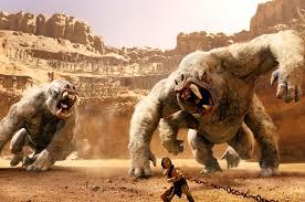
You can see this mechanism at work, too, in stories with what you might call meta-frames. The film John Carter is one; the hero flies across the cosmos to another body and another world of adventure, leaving behind only a diary to be read by his mousy relation. Octavia Butler’s Kindred is another; a black woman in the 1970s inexplicably finds herself falling backwards in time to the early 1800s, called back to involuntarily help her white slave-owning ancestor. In both these cases, the protagonist’s journey enacts both the immersive experience and the alienating strangeness of narrative; the sense of exhilarating, horrified disconnection (as when John Carter discovers his jumping ability on Mars), and the sense of exhilarated, horrified belonging. (as when Dana realizes she is beginning to think of the slave plantation as home.)

It’s perhaps telling that one of the last things Jones tells us about the aliens in White Queen is that we don’t know how they read.

Whatever the Aleutian did to serve as “reading,” it didn’t work like the human version. Perhaps his eyes sent out little mote to reconstruct, chemically, the ur-hieroglyphics behind the letters: something mind-boggling like that. Their physiology, especially the neurological part, was a bizarre mystery.

The joke (and Jones is almost always joking) perhaps being that human neurology is, also, pretty much a bizarre mystery — in describing their unlikeness to us, she is describing their likeness — and doing it even as we, Aleutians and non, read and understand, and don’t understand our understanding (or, for that matter, our not understanding.)

Not understanding the Aleutians reading is very similar to the way that the humans do not understand the Aleutian telepathy — a telepathy which Jones suggests may be more like non-verbal cues, or plot devices, or watching a silent movie, than like actually reading thoughts. Perhaps, too, as I’ve suggested, telepathy might be like reading, or any other entertainment delivery system, where another’s thoughts become your thoughts in a sharing of the minds. Such sharing can be a radical, totalizing sameness, or a radical recognition of difference and alienation. The two consciousnesses become one, or the unified one recognizes its own internal difference. The alien is recognized as the self, and/or the self is recognized as alienated. Every fiction is an Aleutian, the us that is and isn’t.
Utilitarian Review 4/5/13

News
 
The cartoonist Fred died this week. Take a minute to check out Domingos Isabelinho’s post looking at his work.

Th eweek of the 15th we’re going to start a comics and music roundtable. If you’ve got a post you’d like to write on that theme, let me know. You can email me at myname at gmail.

On HU

A brief post on comics that work in a gallery and those that don’t.

For Easter, a post on death metal and bluegrass gospel.

Featured Archive Post Fabrice Neaud on Aritophane’s Conte Dominaque. trans. by Derik Badman, intro by Domingos Isabelinho.

Jacob Canfield on the problems with animation adaptations of comics — particularly Axe Cop, Calvin and Hobbes, and Achewood.

Sarah Shoker on Harry Potter and multiculturalism.

I talk about comics vs. fashion editorials.

Domingos Isabelinho on the the blind man and the elephant, if the elephant was Jack Kirby.

Chris Gavaler on Clark Kent and the passive voice.

The Incredible String Band wants to know what music you listened to this week.
 
Utilitarians Everywhere

At Reason I review Peter Eichstadt’s new book about the mess that is Afghanistan.

At the Atlantic I talk about

Waldorf education and not sweating the gnomes.

hook up culture and my college experiences. Humiliating, though not quite in the way you may be expecting.

teaching kids to apologize.

—the Atlanta teachers scandal and how cheating is caused by high-stakes testing.

At Splice Today I write about:

— the awesomeness of fIREHOSE.

class and changing ideas of marriage.
 
Other Links
 
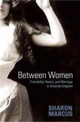
Sharon Marcus on comparative sapphism.

This Week’s Reading

Finished Octavia Butler’s Kindred; read around in Brian Attebery’s “Decoding Gender in Science Fiction”, and (on his recommndation) started Gwyneth Jones’ White Queen.

I also saw John Carter, the film, this week. Which was an entirely adequate sci-fi space opera. Not sure why people hated it so much?
 

images

Comics vs. Fashion Editorials

I wrote a piece on women’s magazines recently over at the Atlantic. While I was working on it, it occurred to me that fashion editorials are basically as series of images, linked by themes or characters. Which is to say, they are, in some sense, comics.

You can take that “in some sense” there more or less seriously, as you wish. Personally, I”m not necessarily all that interested in trying to figure out what does or does not qualify as a comic. I thought it might be interesting, though, to look at a fashion editorial from the perspective of comics, and vice versa, and see what the similarities and differences say about one or the other or both.
 

melody-monrose-by-mariano-vivanco-for-elle-us-april-2013-1

 
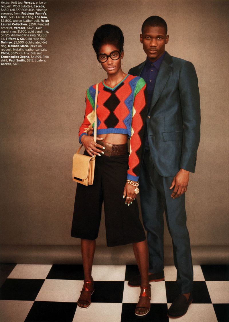
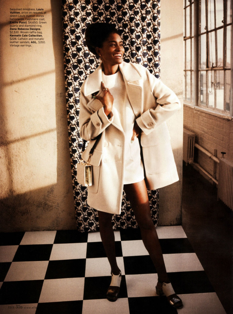
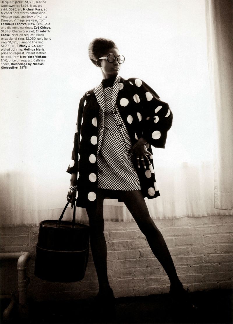
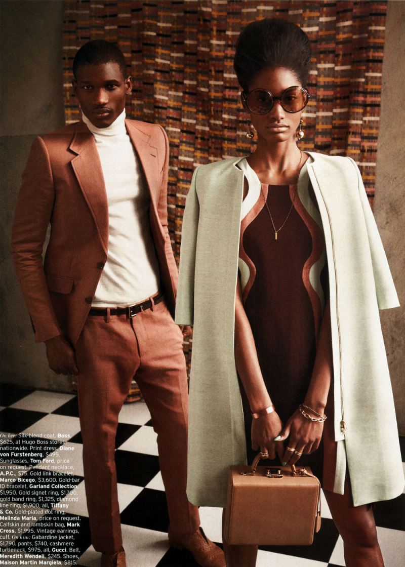
So, somewhat at random, and somewhat because I like it, I decided to talk specifically about Retro-fitted, an editorial in the April issue of Elle. I’ll be posting the images below, but you can see the entire thing at this link. The female model is Melody Monrose; the male model is Koné Sindou; the photographer is Mariano Vivanco, and the stylist is Beth Fenton.
 
This is going to be in the nature of brainstorming rather than thesis and argument…so I’ve separated it into some subtopics, and we’ll see how it goes.
 
Splash Pages

In a post last month, Kailyn Kent pointed talked about the way in which comics both fetishizes and can be nervous about splash pages. Kailyn linked this to the fact that the splash pages’ monumentality, and its focus on a single image, tends to replicate the look and experience of gallery art. Comics, then, likes splash pages because they suggest high status and seriousness. At the same time, creators like Chris Ware, attuned to the gallery scene and comics’ relation to it, sometimes seem uncomfortable with the splash page, or try to undermine it, precisely to turn away from its gallery connotations, or reassert comics comicsness.
 

melody-monrose-by-mariano-vivanco-for-elle-us-april-2013

 
As this suggests, though, there are other possible contexts for splash pages. Obviously, this page, with the title and credits positioned dramatically off to the side in the image’s negative space, strongly recalls title pages from comics. But really most images in fashion editorials — taking up as they do the entire page — would qualify as splace pages in comics.

Splash pages, then, recall, not just fine art, but advertising — which could arguably turn Kailyn’s analysis on its head. Splash pages could be, not upmarket, but down, connoting, not seriousness, but gaudy commodification — as, perhaps, attested by the fact that splash pages are often the most high-priced pages on the comics art market.

If monumentality is a sign of trash rather than class, that could in turn explain why high-quality literary comics like Maus or Persepolis prefer small black and white images and few, if any, splash pages. Part of the literariness, and of the highbrow credibility, is avoiding comics’ links to advertising’s garish boldness and drama.
 

melody-monrose-by-mariano-vivanco-for-elle-us-april-2013-2

 
I don’t think that Kailyn’s analysis and mine have to be exclusive — especially since fashion photography has its own complicated relationship with high art. But it does seem worth thinking about the ways in which the dialogue between comics and art isn’t always, or doesn’t always have to be, a dialogue. There may be other voices speaking.
 
Fashion of the Literaries
 
Oue recent roundtable talked about whether comics should be seen in relation to the literary or not. This ends up also being a debate about whether comics should be seen, or judged, as high art — with literary and narrative qualities seen as highbrow standards, and comicness being seen as evading them through the lowbrow energy of the image.

How do fashion editorials fit into that debate? Confusedly, since, while there are series of images, and perhaps even characters, there is generally not narrative. If comics’ essence is non-literary, then, it seems like in some sense fashion editorials might be seen as more essentially comics than comics themselves.
 

melody-monrose-by-mariano-vivanco-for-elle-us-april-2013-3

 
Part of that essential comicness, you could argue, is the way the images push away from meaning or language towards abstraction. In the tradition of Whistler’s Mother, perhaps, the woman in the image seems to be less there for herself than as an exercise in a musical distribution of space — the checked tile floor (a motif throughout the editorial), the broad vertical stripes of the dress, the grid of the chairback, the tight horizontal stripes of her sweater, carefully posed casual position, mirroring the chairs’ stiff curve, and the way she’s dramatically pushed off to one side. The patterns and the composition, are more important than what is being shown; she’s a surface rather than a body.

The body is surely important as well, though — as, for that matter, are the words, which may not tell a story, but do label the image, telling you price points for each not-surface-but-thing. The models position — head down, hand cupping her chin with the fingers almost shielding her face, suggests, perhaps, a kind of embarrassment at the crass commerce floating in white text over there on the wall. If writing is literary, then the literary here is not highbrow; rather it is distinctly low-culture. No matter how the image looks optimistically towards art, the words float leadenly behind it, staining abstraction with the nattering economics of signification.
 

melody-monrose-by-mariano-vivanco-for-elle-us-april-2013-4

 
What Are You Looking At?

Fashion photography presents bodies to be looked at. Those looking at the bodies are generally women…and the bodies looked at are, also, generally women.
 

melody-monrose-by-mariano-vivanco-for-elle-us-april-2013-5

 
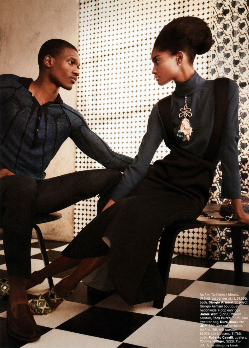
The image above — with a man and a woman looking at each other, doesn’t so much change this dynamic as underline it. The man looks at the woman with intense, romantic interest, just as the reader of the editorial has been looking at this same woman with romantic interest. The woman looks at the man with intense romantic interest — just as the reader of the editorial has been gazing with intense romantic interest. The fact that the mutual inter-gender erotic gaze is meant to accentuate, rather than supplant, the same-gender erotic gaze is emphasized by the strongest visual element of the picture — the almost comically dramatic, borderline yonic necklace dangling down the women’s front.

If the female gaze is eroticized in women’s magazines devoted to women’s bodies, it seems reasonable to suggest that the male gaze may be eroticized in magazines devoted to male bodies. “Men’s magazines devoted to male bodies” seems like a reasonable description of the majority of superhero comics. The fact that scantily clad, preposterously proportioned women frequent these comics as well, again, like the image above, merely emphasizes the fact that these magazines for men are devoted to erotic looking — occasionally at women’s bodies, but more often at male ones.

The point here isn’t that comics are homoerotic, necessarily. Sharon Marcus has argued that, in many cases, women looking erotically at women functions as a part of heterosexual female identity, not lesbianism. The same could be said of superhero comics for men. Men gazing intently at men is a standard part of male heterosexual identity for many comics readers — and, for that matter, moviegoers.
 
Bodies, Time, and Space

Fashion photography pretty much includes at least one body in every image.
 

melody-monrose-by-mariano-vivanco-for-elle-us-april-2013-6

 
To look at fashion editorials as comics is to realize that this is not something which separates the two. On the contrary, most comics are almost as obsessed with bodies as fashion is. You may get a few panels of setting the scene or camera-panning over landscapes, but in most comics, in most panels, you see a human being (or an in-some-way humanized dog or cat or funny animal.)
 

melody-monrose-by-mariano-vivanco-for-elle-us-april-2013-7

 
Generally, I think, this is seen as logistical; to show somebody doing something in comics, you have to show their body over and over. Repetition creates narrative and time.

Fashion editorials, though, make you wonder. They have no narrative, and there is no real sense of time passing. Yet they still often use the same body and the same face — the same person — repeated in image after image.

You could say that, again, it’s just logistics — one model modeling is easier to schedule/cheaper to pay than 12, or however many, models modeling. No doubt there’s something to that. But it’s also true, I think, that the familiarity and the variation is a delight in itself.

In the preceding three pictures near the end of the editorial, we see a full length, dynamic pose; a full length more demure pose — and then a dramatic close-up.
 

melody-monrose-by-mariano-vivanco-for-elle-us-april-2013-8

 
Much of the punch here comes from the bright color of the blouse and those dramatic expressive (Ditko?) hands, one eloquently touching her head, the other in the extreme foreground looking impossibly long and elegant— partially because of the nails, partially because the sleeve is pulled back from the wrist, and partially because the model just has amazing hands. But the image is also striking because it’s this woman, seen, up till now, mostly at a distance, and now, suddenly, brought forward.

Similarly, the last image
 

melody-monrose-by-mariano-vivanco-for-elle-us-april-2013-9

 
Relies for its effect to some extent on the contrast with what came before. Instead of bold colors and bright light, we have earth tones and shadows; instead of looking right at us challengingly, her pose is demure, her gaze indirect. It seems to me like a deliberate anti-climax; a quiet grace note — which, again, gets much of its allure from the sense, not just of intimacy, but of increased intimacy compared to what has gone before.

You could argue that contrary to what I said earlier, this suggests a narrative, or the passage of time. Indeed, I think it points to the extent to which any identity is implicated, or filled up with, time; part of what we recognize in a self, or in a body, is that it’s the same self, or the same body. As Lacan says, there’s a delight in that recognition, and energy in (what Lacan sees as the illusion) of making the self coherent.

But if the repetition of bodies inevitably makes fashion editorials into pleasurable narratives, you could also perhaps say that narratives inevitably make comics into pleasurable repetitions of bodies. Or, in other words, from the perspective of fashion, the repeated selves in comics are not a logistical byproduct, but a pleasure and a goal in themselves.
_____________

I think there are other topics to talk about here: the link between commodified images and retro-nostalgia, for example, or the differing place of race and tokenism in comics and fashion. But since I’ve now posted the last image from the editorial, this seems like a good place to end things. I am curious — has anyone ever seen any discussion of fashion editorials as comics, or in relation to comics? I figure I can’t be the first, but a quick google search doesn’t really turn up anything. If anyone has links or references, let me know.

Autopsy and Jesus

This first appeared on Splice Today. It seemed like an appropriate post for Easter.
_________

Everybody loves pop music that sticks it to the man. Whether it’s Dylan nasaling about how the times they are a’changing, Johnny Rotten extolling anarchy, or PE fighting the power, somebody (usually Greil Marcus) can be counted on to gush about the apocalyptic awesomeness of shaking your butt on behalf of the downtrodden and dispossesed.

Don’t get me wrong; I love Dylan and Rotten and PE too, and I don’t wish Greil Marcus on any of them. But it’s hard to ignore the fact that, despite all their enthusiastic anarchy and change and power-fighting — or, more likely, because of it — they’re all extremely popular and critically validated. They’re charismatic rock stars swaggering for freedom and equality…which makes them icons of liberal capitalism, not opponents of it. If you want something that actually questions the values we hold dear, it seems like you need something a little less individual, a little less mediagenic, a little less virile — and maybe, possibly, a little more dead.

If you’re looking for death in popular music, the go-to genres are (obviously) death metal and (perhaps less obviously) bluegrass gospel. Two recent releases one from each genre, make the point quite clearly. Autopsy’s massive retrospective All Tomorrow’s Funerals, collecting all their EPs, starts with the new title track “All Tomorrow’s Funerals,” five minutes of zombie-demon vocals and dry-heaving spasms of drums and classic rock riffs, closing out with a doomed trudge to the grave. Doyle Lawson & Quicksilver’s Sing Me a Song About Jesus gets to the afterlife almost as quickly; the second song, “The Rich Man,” is a quick, cheerful bluegrass rave-up with patented fleet-fingered solos about how the rich on earth better do some serious thinking before they face the judgment.

It’s not just their mouldering fascinations which link death metal and bluegrass gospel, though. It’s their resolute unhipness. It’s one thing to be ready to die for love or to burn out rather than fade away — it’s another to just be really excited at the idea of corpses. It’s hard to read through Autopsy’s track list without giggling: “Mauled to Death,” “Feast of the Graveworm,” “Squeal Like a Pig,” “Dead Hole.” On the one hand, Autopsy is certainly in on the joke — but that doesn’t exactly mean they don’t take it seriously. “Destined to Fester” from the classic 1991 EP Retribution for the Dead is like Rush hit in the head with a brontosaurus, the prog outlines slowed down into giant dragging Sabbath-slabs, Getty Lee’s high-pitched wails turned into garbled grunts, the flashing guitars thumped into detuned monstrosities — misshapen, but still too geekily awesome for cool.

Similarly, the Lawson track “Little Star,” narrated by one of the wise men, is every bit as clunky as that conceit suggests. “Twinkle, twinkle little star/how we wonder what we are/they say beneath your diamond glow/there’s someone we should get to know.” The music shuffles along in the folksy, polished, Prairie-Home-Companion vein that Alison Krauss has made the sound of contemporary bluegrass. Between those earnest lyrics and the we-wish-we-were-AOR-but-we’re-not-sure-how-to-get-there backing, it’s a fairly embarrassing package; one of those things that you want to listen to, if at all, with the car windows rolled up.

Both Autopsy and Lawson are, in other words, and in their own way, morbidly corny, like plaid body bags. The technical virtuosity at the heart of both genres is the nail in the coffin, whether it’s the perfect surging acapella harmonies on Lawson’s “Going on Home” or the tight quick-march tempo changes on Autopsy’s “Keeper of Decay.” In either case, there’s a deliberate deindividuation, a determination to disappear into the demands of their respective idioms. “No, I won’t sell out for money/fancy home or big fine car,” Lawson sings. Or, as Autopsy puts it, “Face chewed to bits/On my body they feast/Swimming in the rancid sewage/Spreading their disease.” For both death and bluegrass, the faith uses and consumes you, not the other way around.

For death metal, Autopsy is surprisingly, gloriously eclectic — from the mauled classic rock of “Broken People” to the punky hardcore of “Fiend for Blood” to the doom of “Retribution for the Dead,” to weird masterpieces like “In the Grip of Winter,” which stagger about the metal landscape with a lurching so intense it almost qualifies as zombie funk. Doyle Lawson, too has been an innovator, reaching out to other gospel traditions, most notably during his time with the Country Gentlemen on the great 1978 album Calling My Children Home. But while both certainly have star power and genius, they’ve also both turned that genius in many ways towards erasing themselves in the name of their particular faith and/or community and/or morbid obsession. Musicians aren’t meritocratic heroes whose rebel yawp frees us from regimental squareness. They’re just indifferently-dressed corpses marching into the pit like the rest of us, listening to those demon grunts and high-lonesome hallelujahs which someone else will be singing when we’re gone.
&nbsp

Autopsy_2012_large

Comics Turning Into Art…Or Not

This appeared a while back at the Chicago Reader
 
Comics are part of visual art — sort of. There aren’t too many comics pages in permanent museum collections…but on the other hand gallery shows featuring comics artists are more and more common. The MCA’s “New Chicago Comics” helps to explain why comics don’t and do fit on museum walls. On the “don’t” side is the work of Jeff Brown and Paul Hornschemeirer, both artists whose focus is insistently narrative. Brown especially, with his crude drawings and layouts and cutesy punch lines, doesn’t benefit from the venue’s close focus. Works by Anders Nilsen and Lilli Carré, on the other hand, seem liberated by being lifted out of their original context. A Nilsen page showing six panels of a small pigeon cursing in darkness before it suddenly sees a cave full of blind birds is not diminished by the fact that you don’t know where the story goes. On the contrary, it leaves you, like the pigeon, trapped in a mysterious subterranean landscape, where there is wonder and life but no escape. Similarly, Lille Carré’s stencil-like drawing Splits, showing a stylized woman in a teapot almost touching her own duplicate, folds comics’ panel-to-panel repetition back on itself. It’s as if a character turned around, saw herself across the gutter, and was instantly transmuted into art. The MCA show provides an interesting contrast between some comics which can’t, and are perhaps not even interested in, making that turn, and some which can and do.
 

images


Utilitarian Review 3/30/13

News

Chris Gavaler is joining us as a regular blogger. Welcome aboard Chris!

It’s about two years since our Victorian Wire post took over the internets.

On HU

Featured Archive Post: Alec Stevens on Christian Comics.

The 1993 Rolling Stone Record Guide. 2 Stars for Reign in Blood?

Saying the same thing over and over about gun violence.

Aishwarya Subramanian on Timpa, an Indian comic inspired by Tintin.

Alex Buchet on the strange collaboration between Steve Ditko and Eric Stanton.

Mahendra Singh on how Tintin is the perfect hero for Indian children.

Thomas Hardy vs. Charles Schulz. Bonk.

Chris Gavaler on Jack Kirby’s metafiction.

Erin Polgreen asks whether comics journalism can be funny.

Gary Groth appeared in comments to talk about Al Plastino’s Peanuts.
 
Utilitarians Everywhere

At the Atlantic, I talk about:

why women’s magazines treat women much like men’s magazines do. Sharon Marcus knows all.

why there should be less handwringing about expensive weddings. Bonus anecdote about how my wife proposed to me!

Megan McArdle’s silly argument that gay marriage will end the sexual revolution.

the uncanny valley awfulness of The Host.

On Splice Today, I talk about:

Child Ballads, and good and bad versions of ancient songs about murder and death.

A Civil Remedy, a documentary about trafficking, and different experiences of prostitution.
 
Other Links

Stop fat shaming Kim Kardashian. She’s fucking pregnant.

Nanette Fondas on myths about mothers who opt out.

Kate Losse on the downsides of leaning in.

Amanda Marcotte argues that Victoria’s secret sexy underwear for teens is fine.
 
This Week’s Reading

Finished David Graeber’s Debt. Read for review a preview of Jal Mehta’s excellent book about school reform, The Allure of Order. Started Octavia Butler’s Kindred.Also still reading The Two Towers to my son…got to the trek through Mordor, which I think is the best part so far….
 

images