A Reading, A Rereading, and a Question

About a month ago, I bought a comic book, read it, jotted down my response thoughts and moved on. As it happens I did not publish these thoughts. A little bit ago, I reread my written response. Then I reread the comic book itself. Then I set about crafting a new response. The second attempt at a response was worse than the first. The second reading of the text was less appreciative than the first reading. Time had passed. My opinion of the work had changed.

Since comic books are rooted in a periodical, serial paradigm, many of them are not even designed to be reread too many times. They become outdated the moment that a new installment become available for purchase. Those first impressions become our sole impressions.

________________________

One of my personal short term goals is to read fewer comics. Read fewer things but read them harder. Read deeper. Soak them up and find things that a Wednesday-evening spree-reader might overlook. Perhaps those somethings that I seek simply aren’t present in many comic books. That’s fine too. I need to do fewer things. I need to be less frantic.

I need to relax. In all possible senses of the idea.

But my enthusiasm for sequential art burns bright as always. What I think that I would like to do is attempt to focus my enthusiasm on a handful (or fingerhold) of things rather than attempting to shovel a stack of magazines into my face every Wednesday evening.

____________________

Cartoonists spend enough time making comics, the least we can do as readers is spend some time reading them.

____________________

What is gained? What is lost? What changes for you as you reread comics? Do you reread comics? I don’t mean skimming or flipping to favored scenes. Do you restart a comic book and read it straight through the way you did when you first encountered it?

Here is my prompt for you: which comics have spent the greatest amount of time reading? For academic reasons, for your job, for fun, for nostalgia, to settle arguments–what are the comics that you personally read and reread?

And why?

Bat History

Dark Knight Rises is an odd movie. It’s a mish-mash of Dickens, adventure stories, geek nostalgia, Hollywood bombast, and a smattering of “ripped from the headlines” topicality. The movie manages to be a fairly enjoyable diversion, but as other reviewers have noted, it’s a mess from both a narrative and ideological perspective. But its messiness isn’t entirely the fault of the filmmakers. The latest film is part of a decades-long process where a children’s adventure story was modified to appeal to an older audience, specifically an audience that remained attached to the childish elements of the story. Live-action Batman films (and TV) are required to satisfy both a nostalgic attachment to childish adventure stories while insisting that such entertainment is not childish.

In ancient times (i.e., before I was born) live-action Batman was a simple concept. No one would accuse the original Batman series (1966-68) of being too complicated. It was children’s television at its most basic: bright colors, catchy music, unvarnished plots, and violence that never went beyond a punch to the jaw. The series had no pretensions of being either great art or politically relevant, which is not to say that it was bad. In fact, Batman was and is consistently entertaining. The over-the-top performances of the villains, the deadpan earnestness of Adam West, and the 60’s camp were successfully mixed with the more ridiculous premises from the comics. But while the series became a cult classic, it had its share of detractors. Its unabashed silliness was less appreciated by the aging community of comic fanboys who wanted their Batman stories to cater to their adult tastes.

Comic book Batman entered a “grim and gritty” phase during the 1980s, and this was reflected in Tim Burton’s Batman (1989). Significantly darker and more violent than the TV series, the movie was clearly targeted at an older fanbase. It was also the first attempt to turn Batman into a Hollywood blockbuster, along the lines of Jaws or Star Wars. Blockbuster status meant lavish production values, fancy special effects (which haven’t aged well), marketing deals with fast food chains, and an A-list cast, including Michael Keaton, Kim Basinger, and Jack Nicholson. But the childish elements of the character remained: the Batmobile, the Batcave, and all those “wonderful toys.” Another director might have produced an incoherent disaster, but Burton cobbled together a reasonably entertaining, if shallow, film that satisfied both the fanboys and mainstream audiences.

The secret to Burton’s success was due to his idiosyncratic vision of Gotham City, a heaping dose of film noir with a touch of BDSM and goth sub-culture. Batman and its sequel, Batman Returns, could be described as noir-lite, lacking most of the typical noir preoccupations but relying on dark, brooding imagery to enhance a plot that relied on mood more than substantive content. The goth and BDSM influences factors more heavily in Returns, particularly during the famous origin sequence of Catwoman. Among the many superhero film franchises, the Batman films by Burton stand out as having a distinctive look.

Burton’s idiosyncrasies allowed the various pieces of the Bat franchise to co-exist, albeit uneasily: the fanboys got their “dark” story, mainstream audiences got an action film that didn’t look like all the other action films they had already seen, and the more juvenile elements appeared slightly less ridiculous if they were bathed in shadow. But in aiming for an adult audience, Burton could never fully embrace the most childish parts of the Batman franchise. Most obviously, Robin is nowhere to be seen (to say nothing of Batgirl, Bat-Mite, or Bat Shark Repellent).

The Bat-franchise went through a number of changes with Batman Forever (1995). Officially a sequel to Batman Returns, Forever could more accurately be described as a soft reboot, given that the film had a new lead actor (Val Kilmer) and a new director, Joel Schumacher. And Schumacher’s movies had a different visual style and a greater affinity for the childish content in Batman comics. This Batman film would have a Robin (Chris O’Donnell). Gadgets and other wonderful toys would be on full display, and Schumacher even worked in a joke with the “Holy ___!” exclamations made famous by the original Robin, Burt Ward. And the dark Gotham of the Burton films was replaced by a much more vibrant and cartoony city.

But many of these features were overshadowed by the presence of Jim Carrey (as the Riddler), who was at the height of his fame when Batman Forever was released. The next film lacked Carrey and his massive ego, allowing Schumacher to shape the Batman franchise to his own preferences.

Batman and Robin (1997) is widely regarded as the worst of the Batman films, and perhaps the worst superhero movie ever made. While my inner contrarian would love to defend the film, in truth it was fairly awful. Bad acting, worse writing, and not a single moment of genuine excitement. But for many fans, the movie’s greatest sin was that it was campy. It had Batman and Robin fighting on ice skates. It had godawful puns delivered by Arnold Schwarzenegger (as Mr. Freeze). And there were nipples on the bat-suit.

Schumacher’s great mistake was in assuming that Batman was a campy character for kids (and maybe adults who enjoy children’s entertainment). It’s an honest mistake, because Batman really is a campy character for kids (and kids are still interested in Batman, as demonstrated by more than one successful animated series). But something big happened over the course of the 80’s and 90’s – fandom got older and became mainstream. And over the past two decade superheroes went from being a niche product sold to young children and antisocial geeks to being a significant chunk of Hollywood’s revenue. People who had never picked up a comic were getting excited about the latest Batman, X-Men, and Spider-man films. But the mainstreaming of superheroes meant the contradictory preoccupations of fandom – a reverence for source material with an insistence that such material be updated for an older audience – also became mainstream.

The change was driven by a number of factors. Comic nerds may be a minority, but they are disproportionately likely to have disposable income and are fiercely loyal to certain intellectual properties, two things which make them an attractive market to the Hollywood suits who own those IPs. Also, the older distinctions between “children’s entertainment” and “adult entertainment” were declining, the result of the creation of the PG-13 rating in 1986. Previously, the MPAA ratings systems drew a stark contrast between films appropriate for children (G and PG) and films restricted to adults (R) because of sex or violence. But the PG-13 rating effectively created new genre of action movie – with just enough violence and sexual content to please adult males but not so violent or sexual that parents wouldn’t allow their kids (or at least their teens) to see them. And the “grim n’ gritty” superheroes preferred by older fanboys fit perfectly into this new rating. Tim Burton seemed to understand the new approach, so he toned down the goofier aspects of Batman. Schumacher highlighted that goofiness, and the fans never forgave him.

Which leads me back to the recent trilogy of Batman films directed by Christopher Nolan: Batman Begins (2005), The Dark Knight (2008), and Dark Knight Rises (2012). Superficially, Nolan’s films are similar to Burton’s. The three movies  are dark, both visually and figuratively. They were surprisingly violent, even by the standards of PG-13 movies. And many of the more juvenile elements of the Batman comics were either excised or downplayed. For example, Robin is largely absent from the trilogy (except for a brief reference at the very end of Dark Knight Rises). But the Nolan films went even further in the pursuit of seriousness. Batman was grounded in a realistic world, so his vehicles and gadgets became less fanciful and were explained away as next-gen technology (memory cloth!), persuasive to audiences as long as they don’t stop to think about it. And the outlandish versions of Gotham created by Burton and Schumacher were replaced with spliced footage from real cities such as Chicago and Pittsburgh. Nolan was also determined that his movies touch upon important current events. In other words, he wanted his films to be topical. In The Dark Knight, Batman uses an illegal surveillance system to track down the Joker, referencing the growing “surveillance state” in the U.S. and the obvious risks to civil liberties. Dark Knight Rises includes an homage to “A Tale of Two Cities,” and it’s not hard to see a link to the Occupy movement and growing inequality in the U.S.

Nolan went further than Burton in promoting Batman as a character that adults could appreciate, but at the end of the day he couldn’t ignore the childish roots. The character of Batman is still a boy’s adventure story, and the elements which make the Batman stories juvenile are the same elements that actually make them fun. So Batman still drove a rocket car, used cool (if less ostentatious) gadgets, and fought supervillains. And in the third film, Batman was flying around in a vehicle that was obviously pure fantasy, brawling with Bane, flirting with Catwoman, and prepping a would-be Robin. Altogether, Dark Knight Rises was actually rather “comic booky.” For all their pretensions at maturity, realism, and topicality, the Nolan films are still about a guy who dresses like a bat and fights supervillains.

So Batman can’t escape his goofy comic book origins. The various stabs at maturity will generally be in conflict with the juvenile appeal of superhero stories, namely the fistfights, the toys, and the empowerment fantasies. It is also extremely difficult to address political issues with any degree of nuance or intelligence, because boy’s adventure stories are not known for either of those qualities. But Batman will not be going back to the days of Adam West and the batusi. Given the huge success of the Nolan films (and the bitter hatred directed at the last Schumacher film) it’s clear that mainstream audiences have embraced the preferences of fanboys. Batman is going to be dark, violent, and pseudo-mature for the foreseeable future.

“Band” “of” “Outsiders”

Band of Outsiders is generally considered one of Godard’s most accessible and warmest films. In a review here a while back, Robert Stanley Martin, called it “an ode to the joie de vivre of adolescence,” filled with charm, and humor.

Robert’s review was a big part of why I rented the film. And I can see, at least in part, what appealed to him. “Band of Outsiders” is filled with the joy of moviemaking; the rush of turning on a camera and almost magically creating art. You can see this in the bravura sequences that Robert points to — the scene when the three main characters declare a minute of silence, and the soundtrack cuts off for 30 seconds, or the famous dance number, or the giddy race through the Louvre. But it’s there even in less flamboyant moments. For example, there’s one scene, shot from a distance, in which the protagonists have to step around two men carrying a rug. It’s nothing special, and barely visible, but the very gratuitousness of it is a kind of high spirits — a gleeful insistence on imitating the stochastic bumps of reality, and a kind of celebratory whoop that film makes that imitation possible.

But while, as I said, I can at least partially key into why Robert enjoys the film, I can’t say that I actually liked it myself. Part of the problem, perhaps, was that, where Robert appreciated the movie as an enjoyment of youth and adolescence, I had a lot of trouble doing that for the banal reason that the actors just didn’t seem young. Indeed, Claude Brasseur, who played Arthur, was 28 at the time of the filming, and looked older; Sami Frey, who played Franz, was 27; Anna Karina (Odile) was 24. As a result, much of their childish tomfoolery — passing notes in English class, for example — comes across less as cheerful high spirits, and more as a kind of decadent desperation. Karina’s blushing bashfulness and flirtatious eye-batting, which Robert (and I think many other critics) found winning, seemed to me like almost queasily self-parodic camp. The scene where, after Arthur’s suggestion, Odile mincingly changes her hair-style, suggests both drag and Pygmalion; a fantasy in which a woman becomes, or is possessed by, a suggestible girl.

Godard is a filmmaker obsessed with the filmness of film; as such, I’m sure that the discrepancy between the actor’s ages and the character’s ages was not an accident. Rather, I think Godard is celebrating not so much the dance of youth as the filmic potential of a dance of youth. The film isn’t about “real” adolescence, but about faux adolescence — especially about the power of film to provide a playground for adults. Thus, for example, early in the film Arthur and Franz engage in a mock gun battle; when Arthur is “shot” he performs an elaborate thrashing “death scene”. Towards the end of the film, Arthur is really (or should that be “really”?) shot, over and over again, by his uncle — and his death scene is even more ridiculous and extended than the fake scene from the beginning of the movie. That’s possible because, of course, the real scene isn’t any more real than the fake one. The kids playing around in the first are just like the adults playing around in the second, a truth only emphasized by the fact that the kids playing around in the first are actually adults playing kids playing around.

I’ve no objection to self-referentiality in itself — but the way Godard does it always leaves a bad taste in my mouth. Perhaps it’s the smirking deliberateness of his playfulness. Having the teacher read Romeo and Juliet while Arthur courts Odile couldn’t be much less subtle. And as for that oh-so-cheeky run through the Louvre, turning art into play into (by means of the cinema) art — you just wonder how he manages to even see the footage what with all that winking. The heist tropes, the romantic triangle tropes; their tropeness never functions as critique or even really as comment. They’re just “fun” because they’re “cinema”; nifty elements to manipulate, like the soundtrack. For me, “Band of Outsiders” felt less like an exhilarating romp, and more like an hour and a half of being lectured on what an exhilarating romp I was experiencing. Godard the self-referential lecherous control freak doesn’t entirely thrill me…but it seems at least less oppressively self-congratulatory than Godard the insistently whimsical maestro.

Araki Hirohiko at the Louvre (pt. 2)

A continuation of this post about Jojo’s Bizarre Adventure.  With the backstory out of the way, it’s time to talk about Rohan at the Louvre, a standalone art comic published – in English! – by the Louvre as part of its original graphic novel series.

The main character of this book is Rohan, a professional mangaka and assumed self-insert character for Araki Hirohiko, the mangaka of Jojo’s Bizarre Adventure.  Although Rohan is a character from Arc 4 of Jojo, he is most visually influenced by the themes of Arc 5 (the  Italian gangsters arc). This makes sense as Rohan in the Louvre is a graphic novel commissioned by – and set in – the Lourvre Museum in Paris. As one Amazon reviewer puts it: “The question of what art is, is central to the story. What emotion does art evoke in its’ viewers? What inspired the art? What part does the art play in history?”

I’m not sure I possess the visual knowledge to truly deconstruct this book, drawing as it does from Renaissance and Medieval art as much as from pulp and superhero comics. (That same Amazon reviewer says: “This comes highly recommended for art (almost Gil Kanish)… [it] reminds me of a Poe poem brought to life, almost the Casque of Amontilado”). Instead I’ll just post a bunch of scans and do my best to comment on what’s going on in them.

Here’s the first full illustration:

Araki is well-known for cross-hatch shading, odd poses and gestures, and (especially) garish color combinations. In this case, the book’s first plate continues the pink, green and blue theme of its cover. In a surprise move, however, the rest of the book is fairly restrained (in terms of its color use, anyway). Instead of combining three or four strong colors on a single page, each section of the book is dominated by a single color with perhaps another strong color acting as an accent.

(Read from right to left.)

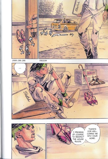
The book begins in the past, with a young, hot, aspiring (but not yet published) Rohan spending his summer vacation at his grandmother’s inn. The primary color of this section of the story is a faded parchment, fitting in with the flashback and Japanese countryside vibes, with Rohan’s green hair and a mysterious young woman’s pink shoes (and, later, kimono) serving as accent colors. Araki’s black and white art tends to feature a lot of heavy cross-hatch shading, which he draws in himself, by hand, at great speed, eliminating the need for assistants to add screen tone. The cross-hatching adds speed and dynamism to the drawings, but often makes individual pages look heavy and dark. (Or perhaps that’s just the way they look scanned in – the perils of reading unofficial translations.) The watercolor and marker coloring of this book, however, allow for more subtle and lighter shading. Most of the time the drawings look like fashion illustrations.

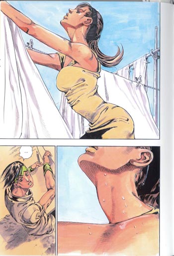
I’ve been making a big deal out of Araki’s beefcake men (see previous entry), but he is perfectly capable of drawing hot women too. Notably, his women as well as his men tend to have well-defined muscles. The close-up on this page is on a part of the body that’s sensual for both men and women.

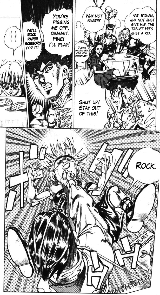
From these panels, you might be getting the impression that Rohan at the Louvre is a classy, largely wordless comic without much narration or dialog getting in the way of the visual storytelling. If you thought that, you’d be wrong:

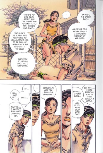
In fact, Rohan talks a lot!

So far all of these pages, while having that strong sense of movement necessary for a popular serialized manga (where the idea is that each page in a 200-page weekly “phonebook” anthology should take less than 10 seconds to read), have been laid out in a straightforward way, with square panels set at right angles to each other. This is the usual way of laying out shonen (boys’) manga, where panels tend to follow a clear sequence – useful for, say, action sequences – in contrast to shoujo (girls’) manga, which tend to play around a bit more with composition in order to highlight the emotional or inner life of the characters. With that in mind:

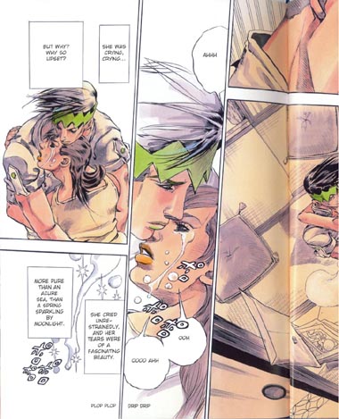
The panels are mostly still square, it’s just that the borders are bit tilted, giving a sense of action to the page. In this case, though, the action isn’t a battle scene or anything like that: it’s romance. I wanna call particular attention to the middle panel on the page – doesn’t it kind of remind you of that one Roy Lichtenstein painting? The one that’s all about highlighting the melodrama of romance comics as the woman sinks beneath the waves?


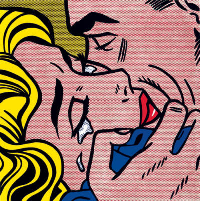
Something like this, right?

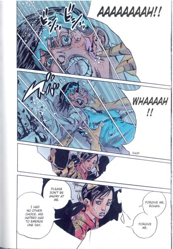
Actually, the resemblance to Lichtenstein is probably not coincidental:

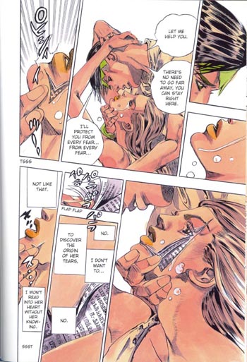
There are a few things going on here beyond the Lichenstein-level melodrama and (once again) shoujo-style askew borders. This is probably the most intimate scene in the book, as Rohan and his youthful crush gaze into each other’s eyes; it’s also the first scene where Rohan invokes his Stand, which allows him to open people up like books. As a part of this power, he is able to read their thoughts and life stories, and to write in his own words in their place. In Jojo proper, Rohan rarely had qualms about exercising these powers. In this case, however, he is a gentleman and exercises restraint.


Rohan’s unrestrained self in Act 4 of Jojo’s Bizarre Adventure

Not only are Rohan’s actions restrained on this page, but the art is restrained – or at least clean – as well. Although he is opening up her face, there’s no blood or gore; her face closes as neatly as it opens, with no scars left behind. Even the edges of the “pages” of her face are perfect right angles. People’s heads will explode in much more messy and permanent ways later on in the book, so keep this page in mind as you read on.

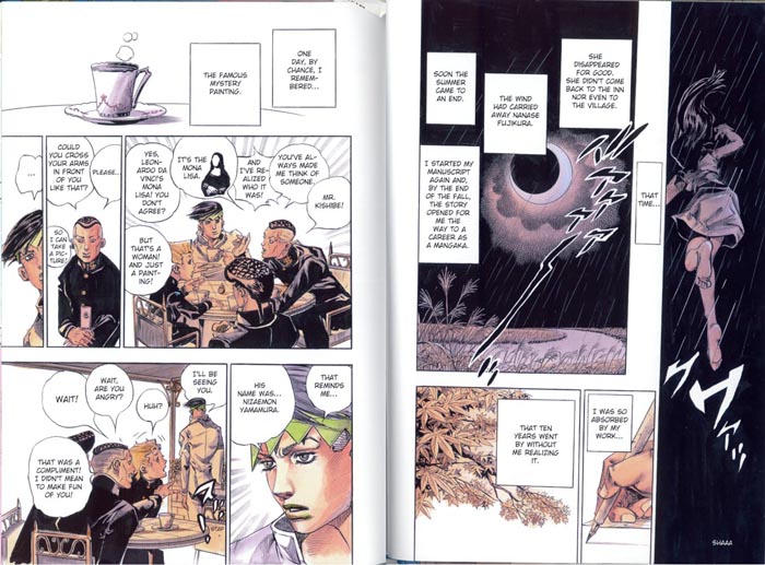
When she’s in a better frame of mind, the woman tells Rohan about a terrible painting, said to be made from the blackest cursed ink, which belongs to the Louvre. The painting is a good excuse to draw some great all-black panels, and the all-black panels help to set off the black school uniforms of the characters on the facing page, who like Rohan come from Jojo Arc 4. The connection between Rohan and the Mona Lisa is pretty tenuous, as one of the characters points out on the page (“But that’s a woman! And just a painting!”). But no matter! We are not concerned with the logic of chance in this comic, we are concerned with the logic of works of art, and of memory.

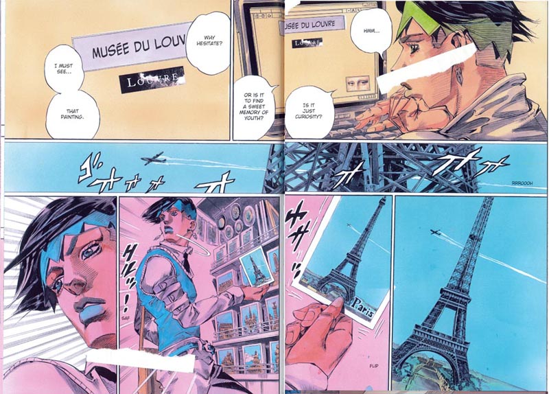
With that tenuous connection, we’re now on our way to Paris to find the painting so “black” it literally curses everyone who sees it. Along with the scene change, it’s time to change the color scheme: from now on the dominant color will be pink, with blue accents. Why pink? Why not? Perhaps it reminds Araki of an old picture postcard of Paris. (Sorry for the bits of paper covering up the art – I was in a rush when I scanned in this page.)

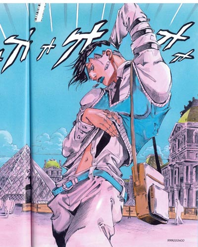
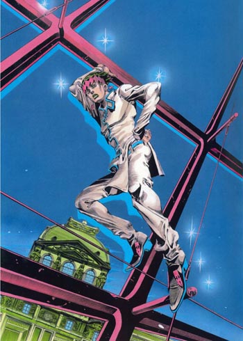
Here it is, the panel we’ve been waiting for! Of course I am talking about the one where a character in Jojo poses like a high-fashion model for no  reason. Although this is still an interior illustration – so the color scheme is still restrained – you can see all of the colors of the issue coming out here – pink Paris, blue accents and sky, some green on the buildings and even some of that parchment color from the flashback scenes. This page is purely a fashion plate, not meant to progress the plot in any way.

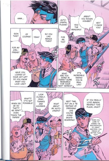
This must have been confusing for non-Jojo fans. But anyway, why go through the trouble of making a self-insert character, if not to make that character AWESOME with the AMAZING POWER OF INSTANT DRAWING? And of course, naturally, no authorial fantasy would be complete without adoring fans recognizing you even in another country and asking for an autograph – right?

(In fact, Araki has a lot of fans in Europe, especially in Italy.)

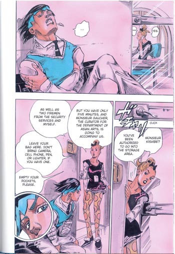
I’ve talked a bunch about how Jojo has a lot of different influences, some high-culture and some pulp. When Rohan arrives, there are a bunch of noir-ish panels, where he leans over the shoulder of a Louvre employee as she looks up the painting he is after on her computer, makes phone calls from her desk, etc. Instead of those panels, though, I wanted to highlight this one because it has the best view of her awesome polka-dot tights.  I want them!

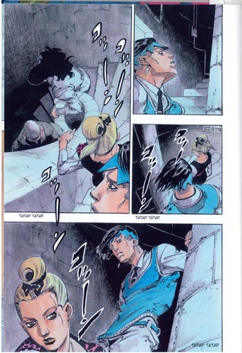
The story is set in the Louvre, but it would be a bit of a drag to have to draw the galleries of the Louvre over and over. So we quickly move the action to the vaults in the basement. There’s a three-dimensionality, a sense of space and perspective, to these pictures. The color scheme shifts to blue, with pink accents. There’s some black here as well, but actually the underground is going to be mostly blue and green. That’s because Araki needs to reserve black for the monstrous cursed painting made from the blackest ink.

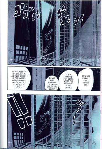
Now we’re getting somewhere. The painting is locked up in a dark vault. On this page you can see some great prison bars. Not only was one of Araki’s first manga series, BAOH, a horror manga set in a prison, but he also did an entire arc of Jojo in a woman’s prison. He’s a past master at drawing endless prison bars in perfect perspective, in other words.

Do you remember when I said that Rohan’s power allows him to open people up in a way that is very neat, very orderly, and doesn’t leave scars – there’s no harm because he leaves people exactly as he found them? Well…
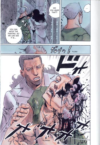
Victim #1.

There’s a couple things going on here, I think. One is the black ink seeping out of the security guard’s head, along with his brains and so on. (In case one explosion of viscera is not enough for you, Araki draws this scene three more times, from three different angles.) Another is, as I mentioned, the clear contrast between this scene, where someone’s head messily explodes, and an earlier scene, where Rohan neatly and cleanly opens up a girl’s head to read her memories (before thinking better of it).

In fact, the evil painting doesn’t just make a mess: it ALSO reads the memories of its victims, in order to create illusory zombies of their dead loved ones. These zombies walk around like bombs, killing anyone who touches them in the same way the zombies died themselves. The evil painting, in other words, has powers that are quite similar to Rohan’s powers; except that while Rohan is content to learn people’s secrets and then leave them the same way he found them, the painting wants them die in horrible ways.

In fact, the similarity goes even deeper than that.  When originally introduced, Rohan explained that his powers would only work on the first person who saw a finished page of his manga for the first time, and then only if the other person understood his art.  Eventually, he learned to use his power on anyone.  In a similar way, the painting in the basement of the Louvre exercises its voodoo hex powers only over those people who want to take a closer look.  It’s a dark mirror of Rohan’s powers, in other words; and a fitting power for a cursed Work of Art (which, while it can have good, neutral, or bad effects, does not have any effect on people who aren’t interested enough to really look).
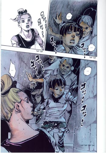
 

Zombies!

Along with prisons, exploding guts and brains, and people turning into cubes – or contorting themselves non-fatally into bizarre shapes – zombies are a reoccurring theme in Araki’s art. Last year, he published a book of essays on horror movies which included a list of his top 20 favorite horror flicks of all time. These films are (courtesy of my friend Sabina):

1. Zombie (‘78 director’s cut)
2. Jaws
3. Misery
4. I Am Legend
5. The Ninth Gate
6. Alien
7. Ring (TV version)
8. The Mist
9. Final Destination
10. Texas Chainsaw Massacre.
11. Deliverance.
12. The Blob
13. 28 Days Later
14. Basket Case
15. Sleeping With The Enemy (yes, the Julia Roberts domestic abuse psycho-thriller)
16. No Country (…surely he doesn’t mean No Country For Old Men?)
17. The Exorcist
18. Funny Games (‘07 US remake)
19. Hostel
20. Wrong Turn

Non-Jojo fans probably don’t care, but this list is interesting if you are a Jojo fan. (Sabina says: I’m surprised Final Destination isn’t higher on the list given it is basically Araki-bait.) You can see that zombies – and people’s exploding innards – have multiple places of honor on this list.

I feel as if I am probably giving too much of this comic away, so I’ll skip the rest of the inventive gore. Suffice to say that Rohan’s companions die in uniquely visually interesting ways. If you’re a horror manga fan, you might want to look into this even if you don’t know anything about Jojo.  The art in this section is awesome.

Eventually it’s Rohan’s turn to die:

This page is probably my favorite. Like the earlier page where the first guard died, it’s dominated by white. The speech bubble of Rohan’s final dying words and the bottom panel’s faceless silhouettes frame the page in a way that turns them into the background, and leaves the actual action of the page in the foreground, where it looks like a bubble. It’s as if Rohan’s final moments are just a thought, about to “pop” and disappear.

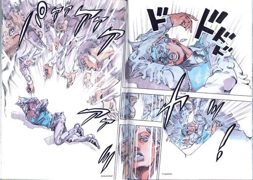
Some classic work of art must be the inspiration for Rohan’s pose here, right?

How does Rohan survive this onslaught of white – an unstoppable, all-powerful force that turns your own memories and history against you? I’ll leave it as a surprise for people who buy the book.

In conclusion, I’m really glad I bought this! Fifteen dollars for a full color Jojo standalone story on nice 8.5 x 11″ paper really is a bargain, especially if you’re a fan. The pictures look even nicer at full size.  The plot follows genre conventions fairly closely, but like every Jojo story doesn’t stay within a single genre. Araki’s art is adaptable yet distinctive, changing to match genre requirements while still being unmistakably his own. It’s funny and scary and idiosyncratic and weird.

Bottom line, if you’ve read this far: you really should consider reading Jojo. You can start from the Western comics style series reset (Steel Ball Run) if you don’t want to brave the earlier art. It’s even mostly incomprehensible to new fans, just like a Western comic series restart would be.

Or, of course, you could start with this.

Voices from the Archive: Melinda Beasi on the Bechdel Test and Nana

Erica Friedman did a post way back when on the Bechdel test. It prompted a fun comment thread, including a lengthy discussion by Melinda Beasi, which is reproduced below.

I’m glad you brought this topic back here after the conversation on Twitter. I think, in retrospect, why I reacted negatively to Mo’s personal taste being included as a criteria for the test, is that suddenly a test that I personally looked to as a guide for helping me find works I might enjoy (lists of manga, books, movies, etc. that fulfilled the letter of the test were popular when I was a regular on LJ) had essentially shut me out. Because while I always prefer stories containing strong female friendships and a significant female presence–the kind likely to emerge from following the letter of the test–by adding in Mo’s taste, nearly all the work I liked best was eliminated or at least deeply in question. So where was my list now? If the women I most identified with and most enjoyed reading about suddenly weren’t interesting enough for Mo, I felt thrown out along with them. It was as though after all the youthful years I spent being viewed by my peers as “not feminine enough” to be an acceptable girl were being followed up on with years in which I would be viewed as too girly to be an interesting woman.

Obviously, that’s an extreme (and inappropriate) reaction. Why should I care what Mo thinks of my books? I know why I like them and, whether she would read them or not, I gain strength and insight from the women within their pages. And it may be that I was simply mistaken to interpret the test as a guide for finding stories about women that might interest women. Perhaps it really is just intended to identify stories of interest just to women like Mo. So maybe what I’m really looking for is a different list. I, too, am interested in books where female characters are engaged with each other on issues other than the men in their lives. I think, though, that because the reality of my life differs so much from Mo’s, I’m looking for something a little different in my fiction.

I actually don’t think you’re wrong at all when you suggest that women are still socialized to be needy and that our fantasies are influenced by the expectations set up for us. This is our reality. This is my reality. So when I’m looking for characters I can identify with in manga, I’m going to find that in women who struggle with exactly those things.

For instance, one of the characters I identify with most is Nana Komatsu (aka “Hachi”) in Ai Yazawa’s NANA. While I’ve got a career drive that better resembles her friend Nana Osaki’s, like Hachi, I can measure my past in increments of ex-boyfriends. I’ve struggled, as she does, with being hung up on men, with needing to feel loved (even when it’s false), with needing to keep my real thoughts and feelings secret for fear of losing that love, and so on. I’ve come further than she has (*maybe*, that’s probably more appropriately discussed over beer) but while she’s a woman Mo might find tiresome, she’s one *I need to read about*. She’s relevant to my life. Not the life I maybe wish I had, but my actual life. What I love about NANA is that while Hachi struggles with these things, what the real story is about is how, ultimately, the relationship that Hachi and Nana have with each other is more real and more satisfying than their tumultuous relationships with men. Do they talk to each other about the men in their lives? Certainly. They also talk about their careers, their personal hopes and fears, each other, and everything else under the sun. These women reflect myself back to me, but they also provide a blueprint for female friendship in which I can find hope and inspiration. I can’t undo the person I am or the broken things in my own past. I can’t erase the way I was socialized or what that made me. So for me, seeing that addressed on paper is important. It’s what makes something more than fantasy for me as a reader. And because so many women still struggle with these things daily, I think these stories are important as stories for women, if not perhaps as stories for women like Mo. In my world, these women are heroic.

All that said (and perhaps to get around to your actual point), Blindmouse’s recent Top 12 Fictional Female Friendships inspired me to try to put together my own list focusing exclusively on manga. But when I sat down to write it, I had trouble coming up with more than five. Though I could think of many, many strong, inspiring, heroic women in manga, I could think of just a handful who actually appeared together in the same story. Perhaps that should not have surprised me, but it really did.

Monthly Stumblings # 17: Marco Mendes

Diário Rasgado [torn diary] by Marco Mendes

(1) Politics

 Marco Mendes, Diário Rasgado, May 2012.

What do you see above?

A dark, moonless night… two buildings on the middleground, more on the background on the right hand of the drawing… a wall and what seems to be the remains of a wooden door… a mural (or graffiti, if you prefer) on said wall… a wrecked car…

Examining the mural we can see people in some kind of demonstration. The one on the right is waving a flag…

If the sky is pitch black what is the light source? Most probably an out of frame street lamp. This is, unmistakably, the inospitable landscape of the human beehives: proletarian suburbia, the projects…

So far so good, right? My point though is that images aren’t as universal as some people seem to think. In order to fully decode them some context is needed. In this particular case you may also have guessed that this is political art… And highly sophisticated political art at that. Marco Mendes is a Portuguese comics artist and this is the last, and, not the most powerful, by any means, image of his uneven (more on that later), but great book Diário Rasgado

Going back to the image above lets concentrate now on the wall. What’s it doing there? If we go back a century or so Portugal’s economy relied mostly on backward agriculture. Portugal’s Industrial Revolution was insipid at best. Forty eight years (1926 – 1974) of a right wing conservative regime didn’t help to change anything. On the contrary: Salazar, the dictator, was an extremely religious fellow who wanted a country culturally stuck on the ancien régime. The popaganda of his time spread the image of an idylic rural community life (pretty much like the apple pie visions of America).

Jaime Martins Barata, Salazar’s Lesson: God, the Fatherland, Family, the Trilogy of National Education, 1938.

The above watercolor is a perfect example of Salazar’s ideology: after a day’s (or a morning’s) work the rural worker (using an archaic tool) comes back to his patriarcal, poor, but highly organized and clean, happy home. At the center of everyday life, holding the boat and assuring law and order, were the Catholic and State religions (look through the window at the Portuguese flag on top of a Medieval castle representing our glorious forefathers). Needless to say, such popaganda did hide a grim reality of exploitation, hunger, and gender inequality.

But I digress, maybe?… What about the wall in Marco Mendes’ drawing, then? It’s there because in the above described rural Portugal some wealthy families owned farms around the main cities. In time those farms were dismantled and invaded by greedy real estate entrepeneurs. Projects for the rich and not so rich multiplied like mushrooms because of a complete absense of planning policies (not to mention political corruption). Poor rural workers fled hunger-ridden rural areas hoping for a better urban life and each one of them needed a place to live after all (it’s a well know story everywhere). Maybe that wall is a standing mute witness to those old days when beautiful farms were part of the urban landscape.  Because of the mural on it it’s also a witness to radical changes in Portuguese society after the Revolution of April 25, 1974.

Anonymous political mural in Lisbon, 1977. Photo copyright Yves Benaroch.

Marco Mendes used a bit of a poetical license in his drawing because the murals of the revolution didn’t survive. Maybe there’s one or two still around, who knows?, but I don’t think so. I can’t imagine one in 2012 at least. For a couple of reasons: a left wing mural, reminincent of the Maoist one above has a different reading in Beijing and Lisbon. It can only mean what I think it means in Diário Rasgado, shattered hopes, because we are suffering by far the worst dictatorship that ever existed: the dictatorship of the financial markets, the dictatorship of the wolves disguised as lambs; the dictatorship of the Plutocracies disguised as Democracies. In Beijing the image could mean the exact same thing with a crucial difference: the people could say with propriety: beware with what you wish for!… Even if no one believes in future times of milk and honey now, the fact is that many Idealistic people did back then just to slowly fall into the (as Luís de Camões – 16th century  – put it in one of the best poems ever written) “disarrangement of the world” again…

Two final notes: the woman on the mural above should liberate herself (getting rid of the pinafore apron) before trying to liberate others; Marco’s drawing is a Deleuzian image-time linking the past and the future (time is cyclical): the wrecked car may be warning us that popular upheavals, like the ones that happened all over France in 2005 and the UK in 2011, are bound to happen in Portugal.

(2) Autobiography?

Well… not exactly…

It’s true that the title of Marco’s book mentions a diary… Plus: the characters who appear in the book are the personas of Marco, his friends (Miguel Carneiro, with whom Marco co-founded A Mula – the mule – art collective among them) and girlfriend, Lígia Paz, but that’s almost it… Marcos’ private life certainly inspires him, but that’s true for every artist, so, there’s almost no autobiography in Diário Rasgado (the exceptions being the stories including his family, his grandfather, mainly). Maybe Lynda Barry’s autobiofictionalography is what I’m talking about, after all… It doesn’t really matter though… We’ve long past those maverick days in which autobio meant being a mature and serious artist.

Marco Mendes’ first book (a mini-comic), Tomorrow The Chinese Will Deliver the Pandas (June, 2008),  was published in English with translations by Pedro Moura and Elisabete Pinto. There’s an imediacy in his first work that, as Lígia Paz put it in “The Introduction [to said mini-comic] Marco Made Me Write”:

In [Marcos’] comics work, the exploration goes to the rhythmic possibilities inherent to the format, the drawings are more explosive, emotional, and surprisingly funny. There is a vivid concern in letting words and events flow, in a continuous and frequently corrected, scratched, and unaltered text, as if there is no [erasing] rubber.

The drawing is sketchy and the little vignettes describe what happens in a house where bohemian art students live. The language is often coarse. Unfortunately some homophobia (still pervasive in Portuguese society), ableism and misogyny rear their ugly heads in Marco’s friends’ and girlfriend’s jokes. A light humor and a friendly atmosphere is the general tone of these early strips (Lígia Paz, again).

There was a house […] with a mythical living room: the setting of multiple parties, a ping-pong table, a famous sofa where so many have slept and [have] been portrayed, not to mention the walls, covered with drawings and several forms of confessions. […] In all the rawness of his social realism, without tricks or self-complacency, the representations and portraits of the surrounding friends are also a testimony of our current times and of his generation. There is also a very clear sense of sharing, identity and belonging to a community, united by common values, experiences, and eighty cent beer.

Lígia also mentions the “distance between the portrayed individual and the fictional character.” Which, methinks, is revealing and should be used to describe autobio artists. As Arthur Rimbaud put it: “je est un autre” (“me is another”).

Marco Mendes, Tomorrow The Chinese Will Deliver the Pandas, June 2008.


 Marco Mendes, Diário Rasgado, May 2012.

The small but significant differences between the two versions of the same page above are also symptoms of two different editorial policies. The first page (which can also be seen in Marco Mendes’ blog) is more messy: there are no gutters, graphic noise wasn’t cleaned up. The original layout was destroyed in the book version (the page was cut in half to become two landscape formatted pages); everything is a bit more clean.  It’s the difference between a DIY punk aesthetic and a more professional, slicker look.

And yet… Even as early as 2007, there are quiet, melancholy moments in Marcos’ oeuvre. His better work to date, done in the last couple of years, was created in that tone. (To be perfectly candid about it, even if I find Marco’s earlier work fine enough this post wouldn’t probably exist without the quality leap that are his amazing, more recent, color, mostly wordless, pages.)

Asked  what genre interested him more, humor or drama, Marco answered: “They’re both too close. I see no way of separating them.” What we can infer from his words is that Marco Mendes is attracted to pathos (see below)… Even so, pure drama also happens, but Marcos manages to avoid sentimentality…

 In Barcelona: “Socialist: ‘Give me a coin/ please… I’m/ a socialist/ I have no/ apartment, I/ can’t work…’ /’a coin please’ /’I’m/ a socialist, a /coin please…’/ ‘I’m a socialist…’,” Diário Rasgado, May 2012.

Melancholia: The ending of a long distance relationship: “Departure,” blog post, September 16, 2010.

At some point Marco started to mostly use a regular layout of four panels in which the last one is a kind of punch line. He prepares it by developing a situation which he then procedes to twist a bit at the end (a process that’s akin to Usamaru Furuya’s four panel comic Palepoli). In “Socialist” above he used a palette of warm slightly sickly colors and changing points of view to convey movement and disorientation. (Other times the city is a cold pale blue – see below.) Since Edward Hopper is one of Marcos’ biggest influences I can’t think of many comics artists who can convey as well as he does the feeling of loneliness in a big city. The self-deluded beggar, thinking that he’s entitled to a coin because he’s a socialist is one of those things that, I suspect, can’t be created from scratch (life has a lot more imagination than we do)… I may be wrong though, of course…

In “Departure” Marcos used the visual idea of shadowing the face of his character to convey his state of mind. Between him and his girlfriend we know who lost the most emotionaly when they broke up…

Marco Mendes, “Mutiny,” blog post, December 19, 2011. An Edward Hopper inspired shoe shop after a riot: another example of urban pathos?

A zoom out, but can we really escape these non-places? Marco Mendes, Diário Rasgado, May 2012. 

Meta-Dumb

This first appeared on Splice Today.
__________________________

Source Code marks a watershed moment in Hollywood’s assimilation of Philip K. Dick. From direct lifts like Blade Runner and Total Recall to bastardized second-hand derivations such as The Matrix, PKD’s obsessive relationship with reality and that reality’s breakdown has become a staple of Hollywood sci-fi.  At one time, a sci-fi movie meant ray guns and spaceships and hyper-warp-drives and green-skinned girls who needed to be taught the meaning of love. And I guess they can still be about those things, more or less…but generally everybody prefers it if the green-skinned girl is a mental projection of an android locked in a magic matrix. Heroism is best when sprinkled with paranoia, and technobabble is always improved when leavened with facile ontological speculation.

And so Source Code. This movie is not based on a PKD novel or story. It’s just a dumb Hollywood film, and a dumb Hollywood sci-fi film is now a sci-fi film that includes PKD as part of its DNA. Director Duncan Jones has nothing to say about being or reality—not even something stupid to say, like The Matrix. The PKD elements in this film have no meaning. They’re there for the same reason that Michelle Monaghan is playing a blandly spunky nonentity named Christina and for the same reason that Jake Gyllenhall has that stubble and raffish smile. None of it is intended to make a point or prompt a thought. It’s included solely because it’s what you want from your movies.

Not that I hated the film. After all, I’m a lot like everybody else. I think Michelle Monaghan is cute, and, what the hell, Jake Gyllenhall too. Moreover, there is something breathtaking in the film’s self-referential glorification of its own rampant insubstantiality. The pseudo-scientific explanations are delivered with an insouciant bone-headedness; someone babbles about parabolic logic and after-images in human brains and then, hey presto! Our hero Colter Stevens goes back to relive the same eight minutes in somebody else’s life before a Chicago commuter train blows up. Why? How? Is he reliving the actual destruction of the train? Is he reliving a memory? Who knows? Who cares?  The point is…err? What exactly is the point?

Diagetically, who knows? Extra-diagetically, though, the movie is mostly about patting itself on the back for its own wonderfulness in being a movie (starring Jake Gyllenhall!) Like an actor, Colter takes over someone else’s life (Sean Fentriss). Like a movie star, inhabiting another person doesn’t change his appearance at all; he still looks and behaves like the same Gyllenhall we know and love. And, as in all movie-making, the same scene is redone over and over again; Jake goes back on the train to relive the same eight minutes and back on the train to relive the same eight minutes and back on the train to relive the same eight minutes, all at the orders of the vaguely sinister, crippled (crippled=sinister!) director figure Dr. Rutledge (Jeffrey Wright.)

There are various ins and outs and you learn The Shocking Truth About Colter at one point and there are moral dilemmas and whatnot. But! Eventually Gyllenhall/Colter/Sean gets the scene perfectly right by (a) saving the world as per the action/adventure genre, and (b) acting all cute/nutty/in-touch-with-his-feelings and thereby sweetly connecting with the girl of his dreams as per the romantic comedy genre. The gratuitously preposterous manner in which the happy ending is dropped from a great height upon our protagonists is not a mistake or an oversight. It’s the film’s entire purpose.

PKD saw the gaps in reality as disturbing and ominous—a sign of our distance from God and truth. But Hollywood doesn’t fear unreality. On the contrary, ersatz pasteboard is Hollywood’s glory. Reality isn’t real, you say? That just makes it so much the easier to jury-rig the requisite inspirational conclusion! For Source Code the plot hole is the basic blueprint of existence. It’s the idiocy that assures us that—for half an hour at least, and in the movie’s own words—“everything is going to be okay.”