Utilitarian Review 9/11/09

A few people (well, okay, two) have mentioned that the blog is getting busy enough that it’s actually occasionally hard to follow everything. So I thought I would start trying to do a weekly roundup, both of business here and of my articles elsewhere. And, what the hey, I’ll throw in a couple additional links when I think of it. So here we go:

On the Hooded Utilitarian

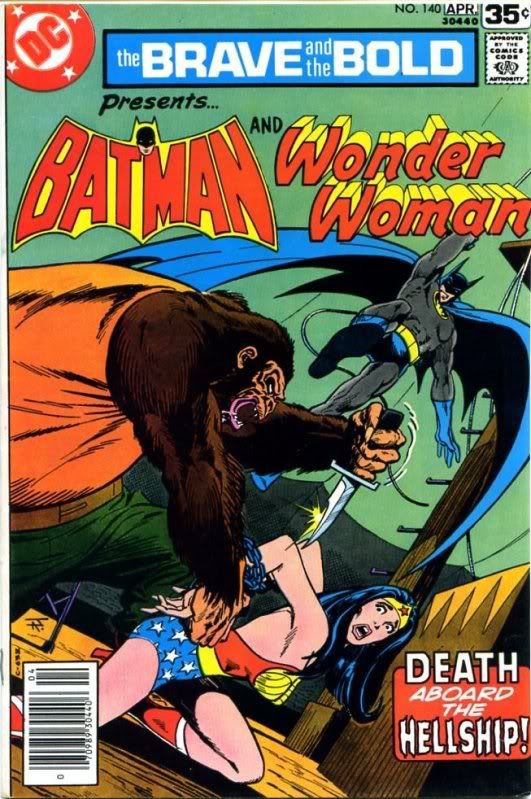
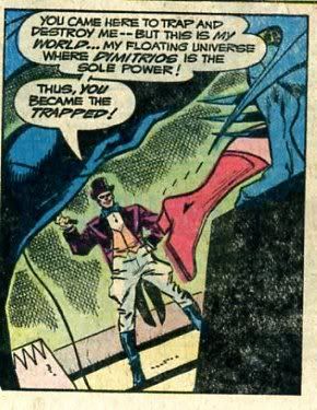
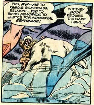
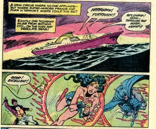
I had two Wonder Woman related posts, one about WW creator Marston’s not very good novel, the Private Life of Julius Caesar and one about Bob Haney and Jim Aparo’s Batman/Wonder Woman team up

Tom proceeded with Wiki Trekand incidentally explained why on earth he’s doing this.

Kinukitty tried to figure out how squicked out she was or was not by the skeevy age differences in the yaoi manga Kiss All the Boys.

Vom Marlowe tried her best to like an X-Men comic with Rogue in it.

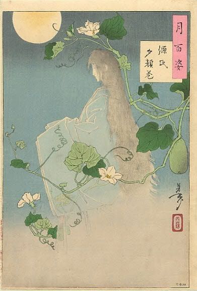
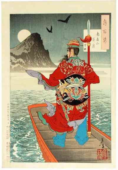
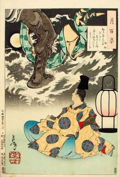
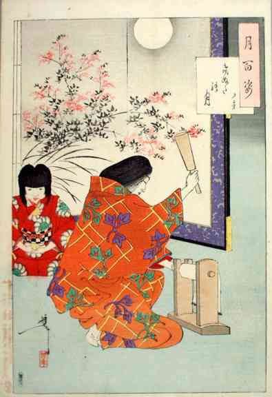
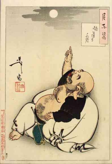
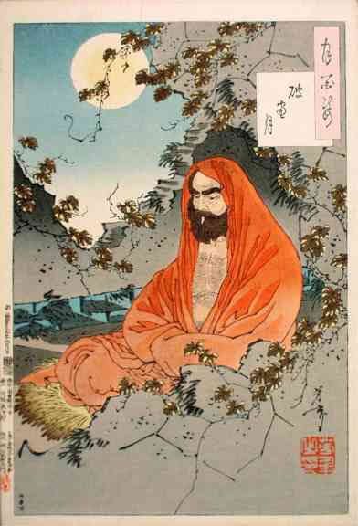
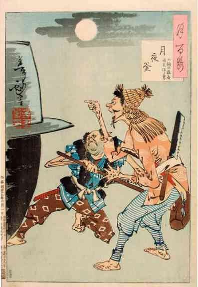
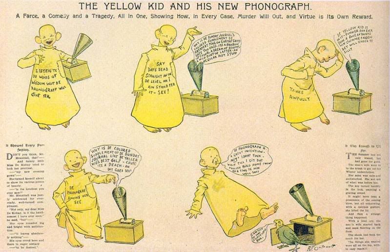
I reviewed the Andrei Molotiu editedabstract comics anthology (in which some of my work appears), and also wrote about the Japanese print series by Yoshitoshi 100 Aspects of the Moon

Finally, I posted my review of Mandy Moore’s album Amanda Leigh, which ran on Madeloud with some of its snark excised. And finally, I posted this week’s music download mix, featuring Chopin, Beyonce, Ol Dirty Bastard, and Johnny Cash, among others.

Utilitarians Everywhere

Over at the Comics Reporter, Suat has a lengthy and really entertaining article about how mainstream writers are overhyped while mainstream artists are underappreciated. I think this is my favorite bit:

Pia Guerra’s response to Brian K. Vaughan’s sparse and determinedly straightforward scripts (as presented at the back of the Y: The Last Man collections) are illustrations conveying as little mood or sense of place as is present in Vaughan’s instructions. The comic is left to succeed purely on the basis of Vaughan’s ideas and lively dialogue. That these ideas are at various times boring, nonsensical or just plain irritating is beside the point — I’m focusing purely on Vaughan’s mastery of the formal tools at his disposal. Vaughan’s stories in the early issues of Y are nearly bereft of devices unique to comics filled as they are with unsophisticated story structures, flat panel to panel transitions and the rote use of splash pages at the end of each issue. If anything, Y reads like an easy to understand sales pitch for comics-illiterate movie executives. Little wonder then that the words HBO and Y are so often uttered in the same breath.

I had a bunch of writing on music run this week. Over at the Knoxville Metropulse I reviewed the stellar new Raekwon album and the mediocre new album by the Vivian Girls. My essay about the greatness of Kitty Wells and the shittiness of Alison Krauss which ran on Culture 11 a while back, was reprinted over at a nifty site called Splice Today.

Splice today also ran an essay by me about Ukrainian nationalist black metal band Drudkh in which I explain why I like them even though they probably approve of burning my relatives:

I’m not trying to make the case that Drudkh is evil and should be banned. Rather, my point is that they seem clearly to be drawing from a nationalist milieu, which is proto-fascist if not actually fascist. And, moreover, it’s that milieu which gives their music its inspiration and its power. Microcosmos starts out with a Ukrainian folk tune on traditional-sounding instruments, and the whole set has a definite folk tinge-the riffing sonic blast on “Distant Cry of Cranes,” for example, is shot through with syncopation and melodic tinges that evoke traditional Eastern European music. This is made even more explicit halfway through the song, where the maelstrom falls quiet, and we get an acoustic guitar break leading into an almost funky dance segment. Similarly, the weird minor harmonics on “Decadence” (a thoroughly fascist-friendly title) point to folk sources. Even the classic rock soloing on “Everything Said Before” is under-girded by an odd, off-kilter rhythm, as if a village-full of toothless peasants had set upon and cannibalized Jimmy Page.

Finally, my comixology column is out today, in which I claim that Beyonce is really the best-selling super-hero of our time.

Super-hero comics are overwhelmingly made by, for, and about white guys. This is so thoroughly the case that you can actually watch the desperate, embarrassed scramble for a more multifarious façade whenever a property gets transferred to a different medium. Nobody gives a damn about John Stewart in those little pamphlet thingies, but on the tubes? He is Green Lantern, fanboy, because, hard as it is to believe, in the real world out there beyond the direct market people come in different shades and shapes and sizes, and gratuitous, pig-headed segregation is actually kind of bad for business.

Other links

Tom beat me to this one, but I really enjoyed Shannon Garrity’s article on the history of the Comics Journal.

Tucker has a great article on Cry for Justice, wondering why exactly DC thinks it’s an especially good idea to gratuitously murder scads of gay characters all at once.

Dirk dances on Paul Levitz’s grave as the latter is pushed out of the top job at DC.

And I haven’t read this, but am looking forward to it; the incredibly knowledgeable Jacob Austen writes about finding the first ever Michael Jackson recording.

So let me know if this is a useful innovation or not, and if so I’ll try to make it a regular thing.

Biting the Hand That Obscurely Vshzibmph, part 2

I’ve mentioned this a time or two on the blog, but for those of you who missed it, I have a couple of pieces included in the new Abstract Comics anthology out from fantagraphics, edited by Andrei Molotiu.

Though I got the honking tome a little while ago, I haven’t actually read it until this week. Part of that’s because it’s just big, and I had other stuff going on. Part of it, though, was a fear that I wouldn’t enjoy it very much. Though I do abstract drawings myself, I’m a bit leery of the idea of abstract *comics*. I talked about this on the blog a while ago:

In fact, I have a lot of doubts about “abstract comics”, both as a meaningful category and as an aesthetic project. It seems to me that when comics become abstract, they really cease to be comics and become, for all effective purposes, simply abstract art. One can argue back and forth about whether “sequential art” is the best possible definition of comics, but it’s certainly true that comics relies for its existence on relationships — between image and image and/or between image and text. Abstraction is based on removing relationships and referents — you can no longer tell how you got from panel A to panel B; in fact, in many cases, you can’t even separate panel A from panel B. But when you remove the relationships, you remove the comics. You’re left with a drawing, which exists most comfortably within the visual art tradition, rather than within the tradition of comics.

In addition…well, Tucker’s review was pretty devastating:

Abstract Comics is a tremendously random (as opposed to “diverse”) collection of graphic design pieces and black and white sketches, only a few of which might conceivably have a place in Kramer’s Ergot or one of those other anthologies people look at but don’t read. The rest are in the same category as the Buddha Machine, or Rafael Toral’s Space series–a specific, niche creation for a specific, niche audience. The only real difference is that the guys who make the Buddha Machine don’t start calling people idiots when they say they’d prefer a little more music with their purchase of sound.

That pretty much summed up my worst fears for the anthology: half-assed and pretentious. I figured I had to read it (My artwork doesn’t get published every day, let’s face it) but I wasn’t exactly looking forward to it.

And reading through the book: well, Tucker’s not completely off base.. There is definitely a certain amount of gratuitous pretension floating about here; Andrei decided to number the pages using a series of abstract symbols rather than, you know, numbers — as a result, there’s no table of contents, and navigating through the book is a needlessly giant pain in the whatever-that-is. And the author bios are a minefield — “Comics are perhaps the most complex act in the arts.” “On the macro level, here is the universal story of existence.” “There’s something about the chunks of space and time that comics are boken into, and there’s something about the way those chunks of space and time expand in the mind when read by the viewer, that really mimic the experience of actually living life, at least for me.” Less discussion of the aesthetic meaningfullness of it all, and more dry nuts and bolts explanations of process (pen and ink? paint? computer?) would definitely have been welcome.

Tucker also has a point about the semi-randomness of the collection. Andrei more or less admits as much himself in the introduction; he points out that abstract comics is more an incipient form than an actual movement. I’m not really in a position to kick at this myself though. If the anthology were more focused, or less willing to hoover up whatever was available, you can bet your squiggly bits that my work would be one of those that didn’t make the cut. (Not that I dislike my own art or anything. But I don’t think even my most ardent admirer (which would probably be me, actually) would argue that my work up to this point has been influential or important — or, indeed, even noticed.)

Stil…I have to say that, what with my low expectations, I was overall quite pleasantly surprised. In fact, what maybe most took me aback was how easy the volume was to read as comics. As I noted above, the combination of comics tropes and abstractions initially seemed to me like a bad and even unworkable idea. In fact, though, several of the strongest entries here are effective more or less for exactly the same reasons that a representational comic would be effective —because the creators are skilled cartoonists. For example, here’s one of a two page spread by Victor Moscoso:

The amorphous nature of the action is part of the cartoony humor and the fascination of the drawing. It’s almost like one of those “find the differences between these two pictures” games, except there are an infinite number of differences…and there’s also a sense of sequence and movement. The rock piles/graduating seniors expand and contract and puff out from one instant to the next…or else bits of them pop up in surprise, as if some sort of gravity-defying secret is being whispered from one to the other. The figures are also, just in themselves, nice to look at — and again, that aesthetic pleasure (the inky scribbles, the humorous suggestions of motion ) suggests, or is linked to, the image’s status as comics.

Lewis Trondheim’s efforts are make the point even more forcefully — he strips out the vast majority of representational or symbolic elements from his comics, and yet, somehow, retains all the features of his own style:

You look at that and say, “yep, that’s the same guy who did Little Santa” or whatever representational Trondheim comic you’ve seen. The amazing facility, the absolute mastery of comic pacing, even the insistent preciousness — it’s all there. The one difference is that these abstract efforts are, if anything, even more impressive than his regular comics. Anyone can make a cute story involving a penguin and an Abominable Snowman, but try doing it with just ink blots and shapes. Take that, Bushmiller.

That sense of wonder — how can you take away everything and still have so much left? — is a big part of the enjoyment of the book. Mark Badger’s “Kung Fu,” for example, turns a two page action sequence (I presume) into a bunch of what looks like copulating blocks. Yet somehow you still get the sense of motion and sequence — even of close-ups and long shots.

Richard Hahn’s pages of tiny panels, each with similar color blobs, are more clearly in a tradition of visual art…but, at the same time, they make sense in this collection, drawing a line between cubist experiments on the one hand and a series of stills on the other, so that comics ends up being a kind of intersection between visual art and animation.

Even the less successful pieces are revealing:when they don’t work, they don’t work in the same way that bad, representational comics don’t work. One of my least favorite efforts was Jeff Zenick’s *Because. An excerpt is below:

Eight pages of that and I’m both bored and irritated. And the reason I’m bored and irritated is pretty much the reason I’d be bored and irritated in a more standard art comic. Namely…there’s just nothing going on here, either conceptually or formally. You’ve got your basic four panel grid on every page, and each panel is treated as a discrete unit; nothing is done to unify the page. Nor is there any progression from panel to panel. It’s just a bunch of doodles, randomly divided up, without any attention to composition or to much of anything else. I can imagine Jeff Brown doing something like this; it has that sense of pride in its own irrelevant dumpiness.

Another piece I wasn’t too taken with was Alexey Sokolin’s “Life, Interwoven.” This starts as a pale square with pale scribbly lines, and progresses with six pages to a giant dramatic image of black and white squiggles.

The penwork is actually lovely and fun to look at…but the progression seems overdetermined and melodramatic…bargain basement Anselm Keifer. On the other hand, Patrick McDonnell’s dramatic blank squares with pinkish shading and circles off to the side seem to sum up the worst bastardizations of Japanese design, from toothless impressionism to clueless mainstream comics.

In short, I think I have to retract. I said, “It seems to me that when comics become abstract, they really cease to be comics and become, for all effective purposes, simply abstract art.” But this anthology, in its best work as well as in its not-best, shows that that’s not true. Comics really are a coherent enough medium to support their own tradition of abstraction. That tradition doesn’t quite exist yet. But, in this anthology, Andrei shows conclusively that it could. That’s a pretty impressive achievement, and I feel lucky to have been a part of it.

_____________________

For the curious, here are my own drawings from the anthology

And, it seems only fair, all things considered, to add Dave Johnson’s acidic take on my art.

To be honest, most, if not all of your stuff I’ve seen so far looks like the work of someone sitting in boring business meeting with a blank sheet of paper and a ball point pen. Is it art? Sure, I guess. But I would put it the category of doodles as opposed to art. But I also feel that most of the art in Modern Art in galleries if, reduced down to 8″x11″ in size would feel the same way to me. Maybe you should move up to giant sized canvases. Added some paint splashes. Then, maybe I could look at it and say “well at least he put some effort into it.”

100 Aspects of the Moon

I recently bought a book collecting all the prints from One Hundred Aspects of the Moon, a series from the late 1800s by Yoshitoshi, the last great classic ukiyo-e artist.

It’s a fascinating series for lots of reasons. I mentioned in my discussion of Kuniyoshi a while back how the Japanese print series prefigure manga, and the enthusiasm for manga in Japan, in a lot of ways. The most obvious way is that some of the images could actually be manga; the influence is so clear it’s a little uncanny. For example:

Those delicate tendrils, and the clarity against the ghostly figure, the precious crystalline, overwrought emotionalism — this couldn’t scream “shojo!” any more clearly. (The commentary on this site says that this design was known in Europe and influenced art nouveau as well, which is certainly believable.)

Beyond the clear visual influence, though, there’s also a kind of overarching formal influence. When talking about Kuniyoshi, I pointed out that the artist clearly thought about each series as a series — there wasn’t a sequential narrative, as in comics, but the work was unified by moods and themes in a way analogous to (if not mapping exactly onto) the way that comics unify image and text. You see something similar here as well. Obviously, the moon itself is a unifying visual motif, appearing as it does in almost every print (sometimes moonlight is just referred to in the text.) But even beyond that, there are a number of rhyming themes and scenarios which recur through the series. For example:

This is an image of a great Chines general Cao Cao, crossing the Yangtze river on the day before his defeat.

And this is the same place, eight centuries later, Su Shi, a poet, composes a verse by moonlight about, or inspired by, Cao Cao.

The two images aren’t contiguous in the series…they were made four years apart, apparently. But you have to think that Yoshitoshi remembered the first while he made the second, and that they’re meant to nod to each other, at least. Certainly, they complicate or expand on each other; in the first Cao Cao, in full glorious color, sails towards a tragedy he doesn’t know. But the poet (in a much less elaborate, less brighter image) does know it; the boat in fact almost seems to be sailing back, returning in the opposite direction to Cao Cao’s voyage. You can almost see the Cao Cao and the poet looking at each other, one not seeing (turned away), one seeing…but both transient compared to the ever-cycling, singular moon (and it is singular, since the moon in the first print actually seems to provide the moonlight for both images.)

I like this juxtaposition as well:

In the first, a courtier watches the moon rise when he hears the sound of cloth being pounded. He recites a verse about the sound…and then a demon appears to recite an answering verse. In the second, (again composed a number of years later), a wife whose husband has been away for years pounds cloth all night in the hope that her husband may hear her and come home. As in the first pair, you can imagine this as a kind of call and response; perhaps the courtier heard the woman’s pounding…or the demon did. The sense of reaching out and not knowing what will answer, of people separated by distance, who can perceive each other but not communicate, and the evocation of the uncanny in both images — it all ties in fairly clearly to the moon itself, shining in the distance, remote and unattainable, but nevertheless present (and again, one moon seems to suffice for both images, as if it’s light is illuminating both images.)

Or there’s this:

That image is called “Moon of Enlightenment” and it shows Hotei, who is drawn here (at least partly) in a quick, inky gestural style typical of zen calligraphy and illustration. According to my collection (edited by Tamara Tjardes, incidentally) He’s pointing to the moon, indicating the Zen teaching that the finger that points at the moon is not the moon, and so the search for enlightenment is not enlightenment itself.

The drawing itself is pretty spectacular (how can you *not* look at that beautifully drawn hairy arm and finger?). But Yoshitoshi also uses it (it seems to me) as a kind of gravitational center around which other images collect and revolve. For instance, this one (done earlier than the one above) is called, “The Moon Through a Crumbling Window.”

It shows Bodhidharma, the founder of Zen, meditating for nine years in his quest for enlightenment while the moon shines down on him. Contrasted with the drawing of Hotei above, it’s hard not to see a kind of ironic comment here — what are you meditating for! The moon (enlightenment) is right behind you, dope! And, of course, that kind of joke/insight/pratfall couldn’t be much more zen (or so Alan Watts told me, anyway.)

This is a nice rhyme too. It’s called “An Iron Cauldron and the Moon At Night.”

Like the Hotei drawing, this one is done in a more cartoony, comical style. The illustration is supposedly showing two crooks who try to steal a giant iron pot, but don’t realize that the full moon shows their efforts all too clearly. The finger pointing very much recalls Hotei…though, of course, it’s pointing to the wrong place; at the pot, not the moon. You won’t find enlightenment there…except zen might argue you sort of would. Certainly, there’s a parallel between the crooks who don’t notice the moon and the Bodhidharma in the previous picture who doesn’t notice the moon…and also between Hotei who points and the fool who points. Sages and criminal blunderers are more alike than not to the moon.

There’s at least one other finger pointing in the series…but I’ll let you find it for yourself if you’re so inclined. I wonder if that sort of game — searching for thematic rhymes, or just for repeated images — was part of what made a series like this so popular: people would apparently line up the night before a print was released to get a copy, like fans at a Twilight opening.

In any case, you look at this series and you can see why American and Japanese comics are so different. Narrative in this series isn’t important at all; it’s held together with a different glue. And that’s the case with a lot of manga as well, as far as I can tell. Not that they don’t have narrative, but they don’t tend to insist on it in the same way; they don’t really care if you follow the story exactly. Images and symbols and emotions are more important, or more trusted. Three or four generations ago, folks in Japan were accustomed to sleeping out in the cold all night to pick up the latest in a series that didn’t even both to tell a sequential story. Around the same time, folks in the U.S. were reading stuff like this:

No wonder we love our text boxes.

Mandy Moore, Senselessly Butchered

Well, I just read all the way through my review of the new Mandy Moore album at Madeloud and discovered that the editors have more or less randomly butchered it…for length, I presume. Anyway, I thought I’d reprint it here to try to restore the corpse some semblance of dignity.

_____________________

Mandy Moore
Amanda Leigh
[Storefront]

I was swept away by the first rapturous chords of Mandy Moore’s last album Wild Hope — and I’ve been more or less bitterly falling out of love with it ever since. I can’t resist those folk-pop tunes under the layers and layers of pristine production and the slightly hoarse vocals — but, gah, the remorselessly earnest phrasing…the self-help lyrics…and, for that matter, the saccharine folk-pop tunes under the layers and layers of pristine production. It’s like drifting off to sea in a romantic coracle with your one true love and then becoming desperately seasick and barfing over the side. And then you realize your true love is actually a rotting zombie mannequin — but jeez, she doesn’t look so bad, does she? And then, hey, it’s time to vomit over the side again. And then back to the not unpleasing zombie mannequin. And so on and on, over and over again. Oh god, make it stop.

Moore’s latest, Amanda Leigh, does nothing to free me from my painful and embarrassing dilemma. The album does head for a slightly different neck of the pop sugarscape : Moore has said she was inspired in part by Paul McCartney’s Ram, and as that would indicate, the languorous washes are leavened with a good bit more pep and fuss. But the basic algorithm remains the same: seduce, sucker punch, repeat — and not in a good way. “Song About Home” is a fine, jazzy Joni Mitchell impersonation; “Love to Love Me Back” on the other hand, demonstrates with a numbing finality that even mixing in Joni Mitchell can’t redeem crappy country radio tropes. “Merrimack River” is a pretty enough melody with an importunate and irritating waltz tempo; “Merrimack River (Reprise)”, though, resets the tune from guitar to piano and strings, adds some minor tunings and for a minute or so you’ve got a nice collision between Debussy and a carnival. “I Could Break Your Heart Any Day of the Week” is another absolutely egregious country radio clunker. “Those calendar girls, they got nothing on me!” Moore throbs, with a calculated spunk that she really seems to be clueless enough to have mistaken for sexy. The song is complete and utter crap…except for an odd dissonant bridge about 1:40 in, where the anthemic cheer shakes, stutters, and almost dissolves into something Syd Barrett could recognize. If only it would last…but no, our five seconds are up and we’re back to the shiny, happy people shit.

Amanda Leigh, in other words, is a fickle flirt. Avoid her siren song altogether and listen to something you can trust, like Linda Perhacs or, hell, Pat Benatar. But…if I have to pledge my troth to one track on this album, I guess it would be “Everblue,” an aching dirge soaked in amorphous longing and regret. Moore’s singing is her finest on the album. From the moment she comes in a perfect half-beat early, she emphasizes her breathing, and the heavy in-out seems to slow the pace even more, until even nonsense doggerel like “I have felt the ground, I’ve seen the seeds /Out of which grew golden wings” seems weighted down with meaningful melancholy.

Of course, some genius sprinkled in additional sighing wind effects, which are both dumb in their own right and tread dangerously close to self-parody. It’s probably just as well, though. If too much of my faith were restored, I might be tempted to buy her next album. No good could come of that.

Brave and Bold #140 — Batman and Wonder Woman

I love Bob Haney and Jim Aparo’s run on Brave and the Bold; I have an unhealthy obsession with Wonder Woman. So Brave and Bold featuring Batman and Wonder Woman — that’s got to be good, right?

Well, not exactly. Haney and Aparo both seem more or less on autopilot here; it doesn’t suck, or anything, but neither is there any particular inspiration. Haney pulls out one of his usual plot gimmicks (some old geezer offers to give millions to Batman’s favorite charity if pointy-ears will rescue his daughter. It’s amazing how often this happens.) So Batman goes off, and there’s the usual Haney twists — malevolent, intelligent gorilla surgeons; Gotham City replicated on a floating barge; double-crossing heiresses, that sort of thing. Wonder Woman shows up, and Haney does his best to figure out why her presence doesn’t make Batman irrelevant. Maybe, I don’t know…she could not know her own strength until seeing Batman in danger causes her to free her inner Amazon? Sure, what the hell, that works. Meanwhile, Aparo entertains himself by drawing the protagonists from the boots down….

So good fun…but it never really fulfills the kinky promise of the bizarre splash page:

There’s some bondage/mind control for you in the best Marston tradition! Aparo seems to be especially having fun getting WW to twist around like a cat, curling up her fingers into claws. We get some more on the next page:

And…unfortunately that’s it for the super-heroes-as-mind-controlled-wild-animal subplot. It’s never actually even explained why Batman and WW are behaving like that; there’s one panel where Bats speculates vaguely about drugs or hypnosis, but it’s never followed up. Of course, the real reason is simply that Haney thought it would be cool/funny/sexy and make a good lead in. And then he just dropped it, because he got distracted. Haney doesn’t really write plots anyway; he just writes plot holes.

Still, I have to say; as far as versions of Wonder Woman go, this one has a certain aphasiac appeal. Haney doesn’t seem to have any great affinity or even enthusiasm for the character; he just sort of picks her up and drops her into one of his usual nutty plots, gratuitously noting each of her powers along the way (invisible plane! magic truth-telling lasso! amazon speed!) because that’s what you do in a comic. In that context, the scene at the beginning comes off in a similar, check the boxes kind of way — if you’ve got a Wonder Woman story, you throw in some bondage. And you might as well tie Batman up too, because, hey, he’s there, and why not?

And there’s something to that. Maybe it’s just the extent to which Haney so obviously doesn’t treat these characters as Mary Sues, or really as icons at all. He doesn’t want to honor them; he doesn’t want to desecrate them; he just wants to race through his story and have some laughs and come out the other end and get a paycheck. In that context, an Amazonian feminist avatar decked out in bondage gear isn’t any more or less ridiculous than a guy wearing a bat suit. Most latter-day Wonder Woman writers are tripped up because Marston’s WW is more coherent than your average super-hero, so when you try to put her into a storyline that functions differently than that propounded by her creator, things go awry. But Haney’s plots aren’t coherent; they don’t work anyway. Wonder Woman still looks like a nutty non-sequitor…but, in Haney’s world, that makes her fit right in.

_______________

This is part of an occasional series of posts on latter-day iterations of Wonder Woman. You can read the whole series here.

And since arbitrary links are sort of in the Bob Haney spirit — I’ve been posting some downloadable music mixes over the last couple of weeks. The last one is titled Book Radio Mixer, the one before was called The Old Gospel Ship. Click through the links for tracklists and downloads, if that appeals.

Bound to Blog: The Private Life of Julius Caesar

Marston published his one novel, The Private Life of Julius Caesar, in 1932, nine years before he started his Wonder Woman series.

It’s…pretty bad, honestly. Marston’s cloying prose, which can be kind of charming when sprinkled about amongst pretty pictures, is well-nigh intolerable over 300-plus pages.

“I love you dear,” she said simply, “it’s an awful funny feeling — as though you were blown up with feathers that tickle you inside from head to foot! I never felt that way before. Do — you love me — a little?”

See? Even a sentence or two is too much.

Moreover, the Mary Sue aspect of his version of Julius Caesar is gag-worthy, not to mention deadly dull. Caesar sleeps with this slave girl, Caesar saves that slave girl, Caesar fights off twenty men, Caesar pardons that evil-doer, everybody hails Caesar, and on and on. The ruthless, battle-hardened, ambitious tyrant ends up as a invincible do-gooder, motivated mostly by chivalric gallantry towards the fairer sex.

That chivalry gets at the heart of why this early Marston vision is so much more irritating than his work on Wonder Woman. In “Caesar”, as in WW, Marston is devoted to showing the superiority of all things female. Caesar himself is repeatedly described as effeminate (high voice, delicate, etc.), and that effeminacy is clearly meant to demonstrate his superiority) Further, Julius Caesar (like WW after him) is a worshipper of the God of Love (Venus, in this case), and Marston’s goal is to show that all the great things Caesar did were inspired by women. For instance, Caesar broke the strength of the pirate fleets because they captured one of his loves; he made Octavius his heir rather than Brutus at the behest of his female political advisor and lover, a British barbarian princess, etc. etc. There are other girl-power notions tossed about…for instance, it’s revealed that women are more disciplined and effective (and perhaps even stronger) galley slaves than men (is that girl power exactly? well anyway…)

But, of course, effeminate or not, and lover of women or otherwise, the protagonist is still male, and the whole “man is inspired to great deeds by woman” narrative is just a lot more tired, and a lot less feminist, than having women cut out the middle, er, man, and just do the great deeds themselves. Marston very much wants to turn chivalry into feminism — to make the case that love of and fetishization of women translates into power for women. Unfortunately, that’s just pretty much nonsense; love and fetishization are as likely as not to translate into oppression, not power…and if that weren’t true, you’d have a Julia Caesar on the throne, not a Julius.

The historical setting, in other words, is a real problem. The feminist and imaginative strength of WW, I’d argue, is that it’s aspirational — it’s a utopian vision. That freedom is what gives it its ideological force (“women can do anything!”) and its vertiginously nutty dream logic (flying octofish! gorillas evolving into apes! peace-bestowing venus girdles! etc.) In writing about actual people and events, though, Marston is more constrained…to using a male ruler, for example, rather than the numerous female ones he would sprinkle about in his WW stories. (He does have a female barbarian princess, but we don’t get to see her do much ruling.) And, you know, no seal men, or magical lassoes, or invisible airplanes, or space kangaroos, or…well, you get the idea.

Perhaps even more importantly, the historical setting is bad for Marston because dealing with the real world simply isn’t his forte. As a thoroughgoing crank, he’s best when expounding the nuttiness occurring between his ears. When it comes to real gender relations, or how people actually interact with each other in any situation, or how power actually works — he kind of doesn’t know jack. Visionaries can certainly make great visionary art…but you don’t want Henry Darger writing “The Prince.” Oh, sure, it sounds kind of fun in the abstract…but the Private Life of Julius Caesar demonstrates pretty conclusively that, in practice, it doesn’t work out so well.

Though it is a failure in most senses (aesthetically, entertainment wise, etc.), “The Private Life of Julius Caesar” does provide a couple of interesting insights into Marston’s thinking. He doesn’t like eunuchs, for example…and the utter absence of male homosexuality from a milieu in which it did in fact exist suggests, perhaps, a level of discomfort there as well. Most telling, maybe, is the lesbianism, which is a lot more explicit in this than in the WW stories. For example…

“Woman is made for love. She knows how to love, and how to be loved. Consequently, if a loving couple is composed of two women, it is perfect.”

There are several examples of such loving female couples in the book…and though there aren’t sex scenes, per se, there is at least one instance of impassioned canoodling. After reading this, it becomes very, very difficult to believe that Marston was unaware of the lesbian implications of Paradise Island, or of his other female-only communities in general. And, yes, it also suggests fairly strongly that the polyamorous relationship between Marston, his wife Elizabeth, and their live in friend Olive Byrne was a triangle that was, shall we say, aware of lesbianism as a possibility.

Music For Middle-Brow Snobs: Book Radio Mixer

No metal this week. Instead we’ve got a couple classical tracks, a couple other things…but mostly contemporary R&B. Albums are in parentheses.

1. Artur Rubinstein — Chopin: Mazurka #19 in B Minor, Op. 30/2
2. Sian Alice Group — First Song-Angelina (Troubled, Shaken, Etc.)
3. The Observatory — Incastrate (Dark Folke)
4. Pierre Boulez —Webern: Pieces for Orchestra, Op.6, No. 3
5. Pierre Boulex — Webern: Pieces for Orchestra, Op.6 No. 2
6. Ang Song Ming — Book Radio Mixer (Anthology of Chinese Experimental Music)
7. Beyonce — Diva (I Am…Sascha Fierce)
8. ISYSS — Stood Up (
9. Brandy — Who Is She 2 U (Afrodisiac)
10. Raekwaon Ghostface Killah, Masta Killa & Blue Raspberry— Glaciers of Ice (Only One 4 Cuban Linx)
11. Ciara feat. Chris Brown — Turntables (Fantasy Ride)
12. Nivea feat. Rasheeda — Quickie (Complicated)
13. Ol’ Dirty Bastard — You Don’t Want to F**k With Me (N***a Please!)
14. Kelly Rowland Feat Eve— Like This (Ms. Kelly)
15. Instant Funk — You Want My Love (The Funk Is On)
16. The 5th Dimension — Carpet Man (Magic Garden)
17. Johnny Cash feat. Glen Campbell — Gentle on My Mind (Unearthed)

The download is here: Book Radio Mixer

And in case you missed it, last week’s download is here: The Old Gospel Ship.