Utilitarian Review 9/25/09

On the Hooded Utilitarian

This week started out with me posting on Marston/Peter Wonder Woman #17, the Sailor Moon manga and what parents talk about in the park when they talk about comics.

Vom Marlowe did the first in a series of posts about Batwoman.

Suat wondered why on earth people like to collect racist comic art.

And finally Kinukitty wrote about the yaoi manga Future Lovers.

Utilitarians Everywhere

I’ve got a long review of Jennifer’s Body up at the Chicago Reader. Here’s a quote:

Jennifer’s Body is different. The film centers not on Jennifer and her male oppressors/victims but on Jennifer and her BFF, Anita, or “Needy.” Jennifer and Needy have remained friends since nursery school, even though Jennifer has blossomed into Fox, one of the sexiest women in the world, and Needy is played by the merely gorgeous Amanda Seyfried—a geek by Hollywood standards. Jennifer is shallow, dominant, and demanding; she drags Needy away from her boyfriend and out to bars, verbally shoots down guys, and runs around after indie rockers best left alone. Needy is sensitive, smart, and cautious, always careful not to upstage her friend, and . . . well, you know the drill. Over the course of the movie, Needy realizes that she and Jennifer have grown apart, and that the friend she once loved is now a jealous bitch, not to mention a demon from the pits of hell who wants to eat Chip (Johnny Simmons), Needy’s sweet, long-suffering boyfriend.

Also, I’ll be speaking at Randolph-Macon college on Wonder Woman at the end of October. I’ll probably announce it again closer to the date so you can all leap on planes to attend.

Other Links

I found a really entertaining comics blog by one Michael Buntag called NonSensical Words. Among the articles I enjoyed: a takedown of the recent Wonder Woman arc and an essay about the mistreatment of Captain Marvel.

Jog’s lovely review of the upcoming Johnny Ryan battle comic.

I like this Wonder Woman drawing.

Haven’t read all of this, but it looks like a great Alan Moore interview.

And finally an awesome retro 80s video by Toya. B-boys in space!

Gluey Tart: Future Lovers

future lovers

Future Lovers, Saika Kunieda, 2008, Deux Press

Cover: Do not like. Everything else: Love, love, love.

I guess I could stop right there and call it a day, but that would be lazy. Even I see that. And despite lazy being my middle name (Kinu L. Kitty, as it says on my driver’s license), this two-volume series deserves better and, by God, I resolve to rise to the occasion. Or at least say something remotely coherent.

(brief pause as I contemplate the existential implications of the endless whirring of the blades of the ceiling fan)

This one does everything right. Except the cover. The art is good, and the faces are so expressive, I was done in by that alone. The stories are well told, kind of silly and harebrained and a wee bit angsty for spice, and utterly romantic in a big, goofy grin-inducing way that is the hallmark of really fine yaoi. This leads us to the third item on the checklist, the sex. Which can be fine, glorious, even, as long as the art is good – the story itself doesn’t have to be there for the sex to work. But when it all comes together, you have something that makes you stop and stare, thinking about what you’re reading and appreciating what you’re seeing, something that makes you reorganize your brain a little bit to make room for something you’ve learned about life. You want to read it again before you’ve finished it the first time. That was kind of sentimental, wasn’t it? Sigh. That’s the thing about falling in love. Ask REO Speedwagon.

The characters in the first story just got me. There’s a complicated, sly, sexy uke (who is small and blond and gay) and a big, uncomplicated lug of a formerly straight seme. (Let’s call them Akira and Kento, since those are their names.) There are angry grandparents. There are hilarious screwball comedy complications, and there is the word chorkle. There is romance and very, very hot sex.

I went back over some of the sex scenes several times and stared at them for minutes a shot, trying to figure out why they work so well. So I could tell you about it. The things I’m willing to do for you guys, huh? Here’s what I came up with, as it were. The drawing is deftly done. Skillful and clever about the details it reveals, whether that’s Akira’s flushed, upturned face (cliched? yes – but a favorite for a reason, in the hands of a good mangaka), or Kento’s hand clutching desperately at Akira’s hair after they fall into bed.

The story is filled with revealing touches. The facial expressions are priceless, constantly and fluidly shifting along every nuance of surprise, horror, jealousy, desire, and love. The reactions are played broadly for a sort of zany sitcom feel – sort of like “Three’s Company,” if “Three’s Company” had been any good.

future lovers

(Spoilers ahead.) The characterizations are also rich. Akira tells Kento that he was only attracted to him because Kento looks like his lover who died three years ago. And then they run into said lover, with his terrifying wife and three kids. Not dead at all. And he looks like a doofus. Akira also does little things to spite Kento’s much-loved grandparents, and he’s moody and kind of bitchy, but also pretty sweet, sometimes. Sort of like a real person. And Kento is believably kind of a well-intentioned but emotionally clumsy guy’s guy who is, at the beginning of the story, firmly stuck in a self-centered and juvenile worldview. And they fall in love and make each other better people. It’s funny and exaggerated, but the real power is in how real Kunieda makes these characters.

The second story, “Winter Rabbit,” isn’t as good as “Future Lovers.” It’s shorter and less well developed. The drawing isn’t as good. It’s more hackneyed, and the characters don’t feel as well thought out. It isn’t a washout, though. The characters don’t do exactly what you expect them to, and the well-worn finish – the two characters get together at the end and promise to live happily ever after – plays a little less trite and a little more kinky to me because the couple in question were raised as brothers. (That’s a fairly common yaoi plot device and I don’t think it’s meant to seem as odd as I find it.) Also, the snow rabbit – that is quality cuteness.

future lovers

The author’s notes at the end of Volume 1 deserve a shout-out, too. These are the best author’s notes I have ever read. She discusses men’s underwear and asks why in the 21st century would a man wear white briefs, and then goes on to discuss what kinds of underwear her characters would wear. This is all illustrated, by the way. Then she moves on to a meditation about men’s body hair: “Characters that I think would have underarm hair, leg hair and chest hair really trouble me.”

future lovers

Chorkle.

A Nostalgia for Racism?

A few months ago, I chanced upon a piece of art which was up for sale at one of Russ Cochran’s on-line comic art auctions. It was a Hal Foster drawn Tarzan Sunday which is usually an event in original art collecting because of the rarity of such samples.

As you can see, it is a fairly reasonable example of Foster’s art on Tarzan. It was, however, a no-go area for me whatever my feelings for Foster’s artistry. The reasons are simple: this piece of art would not have given me any pleasure and I would have been embarrassed to put it on display in my apartment. I simply don’t have the blindness or nostalgia for racism which allows for an enjoyment of this kind of art. There’s the Aryan beauty standing before the squat depravity that is the Cannibal Chief and later the rather simian qualities of the cannibal tribe as they howl for blood. I have as little passion for the subject matter as I would a depiction of bestiality. There are many pit holes in collecting original art but this particular aspect is less often highlighted. After all, wouldn’t most comic art collectors salivate over the original art to this Frazetta-drawn cover…

…with its razor-toothed natives within an inch of pawing at the white female’s succulent breasts? Any objections would be easily dismissed with the notion that these were more gentle and less enlightened times where such stereotypes were the norm. And clearly they were. The fact that the art displays beautiful draftsmanship and is historically important ensures that such aspects are easily brushed under the carpet. A collector friend of mine who finds such images unpleasant was less happy with this easy acceptance which obviates concerns for subject matter. He placed a comment on this Frazetta cover (when it was displayed on Comic Art Fans) comparing it to Alan Moore and David Lloyd’s depiction of Storm Saxon in V for Vendetta.

As many readers will know, there is a whole area of collecting known as Jungle Girl art of which one of the prime examples must be this particular piece by Dave Stevens:

It’s all in good fun, both mocking homage and parody. It would seem churlish by some to find these items in any way offensive. There are of course people who collect “coon” art for historical purposes (which is absolutely valid) and others because it gives them pleasure. I don’t find the latter aspect particularly respectable.

Another story in the same vein which I chanced upon recently is “Yellow Heat” by Bruce Jones and Russ Heath from Vampirella #58 (Mar. 1977) the scans of which can be found here). The entire story was sold at a Heritage auction for $4370 in 2002

The story is one of Jones’ best remembered from Vampirella in part because of Heath’s lovely hyper-realistic art but mostly because of its twist ending. [I would suggest that those unfamiliar with “Yellow Heat” read the story before continuing with this article.] You’ll find two appreciations of “Yellow Heat” here and here. The Comics Journal message board regular Mike Hunter describes the effect as such:

“Bruce Jones and Russ Heath wreaking havoc with our “we humans are all alike, after all” expectations in “Yellow Heat”.”

Jones uses a number of tricks of sleight of hand to achieve the shock ending in this story. Part of the justification for the ending would appear to lie in the first page where a sort of incipient famine and breakdown in society is described. Jones’ script in the first panel would however suggest that the famine has not arrived and that these are much more bountiful times. The Masai warriors don’t look malnourished in the least which lessens the impact of this early description and any expectations of its relevance. There is also the description of the captive lady as a “beauty” and Heath’s great depiction of the same which effectively throws off the reader.

The confluence of a familiar coming of age story mixed with an unexpected twisting of facts and sensibilities is also a factor. These issues would be further heightened for readers familiarizing themselves with this story for the first time in the 21st century. With a greater appreciation for distant cultures, many readers would be cognizant of the fact that the Masai do not practice cannibalism and would not expect such a denouement. Others would realize that such accusations of cannibalism were often used by white colonialist as an excuse for their excesses thus eliminating such a possibility from their minds. Nor would the modern day reader (or one during the 70s I suspect) expect any writer to produce such blatantly racist caricatures of Africans in the final two panels. Readers perusing a Warren magazine in the 70s would probably be familiar with the elevated ideals of the EC line where stories like “Judgment Day” saw publication. Few readers would expect a backward looking ethos and this makes the ending that much more surprising. Perhaps it might be a useful exercise for readers to imagine a gentle story about Jews taking care of orphaned children during the Black Death before eating them in the story’s final panel. Children aren’t as delectable as beautiful African women but you get what I mean.

While I haven’t read any interviews with Campbell or Heath concerning the genesis of “Yellow Heat”, my suspicion is that there must be some explanation for the strange sensibility on display here. The story was, after all, created during the 70s and not the early 20th century when popular art was considerably less informed. It is entirely possible that “Yellow Heat” was created out of naiveté and plain wrong-headedness but it is also possible that it was born of a flippant underground sensibility – a remark on the excesses of the past (though it has to be said, nothing in the story even suggest this). In many ways, it is much more educational to read these stories “blind” than to rely on any form of stated authorial intent.

There are better examples of these kinds of cultural jibes from more recent times like Robert Crumb’s “When the Niggers Take Over America!” which is so hysterical in its excesses, all but the most simple-minded would mistake it for anything but satire.

There’s also the notable example of Chaland’s An African Adventure where every form of jungle imbued racism is brought forth.

There are the malevolent natives…

….and there’s this scene where a tribesman is slapped:

It should be clear to most readers that the only person taking a slap here is Hergé and Tintin in the Congo.

On the other hand, it would appear to many readers that Jones, Heath and Foster were drawing from the same well with respect to their imagery – the corpulent chief and malicious cannibals in both Tarzan and “Yellow Heat” being the prime examples. On a purely textural basis, Jones and Heath’s story is truly ambiguous in its racial sensitivity. Is “Yellow Heat” actually quite factual (this seems impossible), the product of a more enlightened age where having fun with racial stereotypes is perfectly acceptable (perhaps a satire; I’m sure certain African Americans would find it harmless enough) or is it symptomatic of something much less wholesome?

Face Down In The Mainstream: Batwoman

Batwoman Reborn: Batwoman in Detective Comics; 854 August 2009 (Part One of Three)

Greg Rucka ,writer

J H Williams III, art

This….This is art.

Beautiful, interesting, compelling art.

I picked this comic up because I heard it featured Batwoman, lesbian socialite by day and crime fighter at night, and I figured that I couldn’t go too far wrong there.

The story isn’t that exciting, so far, but I don’t really care. The art is absolutely exquisite. *flails hands around*

The plot is pretty much this: Batwoman is trying to find the person who is leading this religion of crime in Gotham. They’re organized by covens, and sometime in the past they caught her and tried to kill her. The leader is coming into town, and Batwoman plans to be there. Dun dun dun. Or whatever. I don’t even care.

The episode starts with a lovely little fight slash victim interrogation. Just look at this page:

The top panel is especially nice. The body torsion is correct and the leg is right, unlike my last foray into current comics, and the pose works well with the page as a whole. There’s kind of a weird, bat shaped panel thing going on, which is clever, but which I liked rather than hated. The comic takes some odd approaches to panels in general, but I very much like the way the artist moves into and out of the frames, zooming and then pulling back, choosing key bits—like her hand—to focus on.

What I like about this page is the movement. It goes from frenetic, chaotic, to quiet, wham, focus on her hand and his face, and the whole mood changes.

The comic deals with both sides of Batwoman’s identity. Her crime fighter night life, as above, and her daytime self. This is a page where she’s talking to Pop (her father I assume, but haven’t really read far enough to know for certain).

There are several fascinating things about it. One, she’s wearing crummy sweats that make her butt look big. This is not an attractive outfit; it’s the kind of thing a real woman would wear to workout in, though, if she was at home. It’s intimate and real; showing a different and fallible, human, breakable side of her.

The colors are all of a piece in the home scenes: her bright red hair fits in with the rest of the landscape of skin, wood floors and warm walls, sunlight. Very alive.

It’s quite a contrast to the fight scenes where she looks like a fetish dom.

There’s a heavy sexual element to this comic, and so far I’m finding it both sexy and well done, rather than skanky (unlike, say, Amazing Spiderman, which I picked up and would have stomped on except then I would have had to buy it). The villain—but maybe I should talk about the villain next week. No, I’m sorry, I cannot resist talking about her now:

Look at this villain! What a fantastic and fun artistic contrast. The previous pages (which I have resisted scanning, but only barely) often focus on Batwoman’s dark red lips. The villain also has painted lips. And a fetish outfit. White and innocent, very frilly and girly compared to Batwoman’s butch femme dom outfit. The boots, too, are a contrast. These boots are white and tightly laced; Batwoman’s boots are red red red with a bat in the sole.

The villain is a beautiful foil for Batwoman. When they fight—Ah, but that is a tale for next week.

In short, I thoroughly enjoyed this comic and I do not care that it was 3.99 and I do not mind the ads or the weird and badly drawn extra or the fact that I had to drive someplace special to get it. I only hope I can talk lots and lots of you into reading it and discussing it with me. My only real complaint was some truly random bolding in the dialog. Nobody would have emphasized those words in speech, but that’s kind of a quibble.

Sailor Moon

The manga Sailor Moon is the series that demonstrated, once and for all, that American girls will read about super-heroes with great enthusiasm. It features a young-looking aggressively typical school girl named Bunny. But then, one day, Bunny meets a talking cat, who turns her into… a super-hero Princess! With long hair! Nifty jewelr! Lots of deferential friends, and a handsome, dashing, mysterious true love! And, of course, she gets to keep the talking cat.

Needless to say, this abject wish fulfillment went over quite well with the target demographic; Sailor Moon manga and anime were huge in Japan, and were one of the early big manga successes in the U.S. as well. Thanks to its influence, Marvel and DC quickly leaped at the chance to reach the heretofore untapped female audience. Marvel released a Spider Girl title where the protagonist improbably turns out to be a Princess and seeks for magical jewels with companions like Grasshopper Girl and Ladybug Girl, while DC devoted its entire Minx line to sugary SF adventures in the Sailor Moon vein.

Or, you know, possibly it didn’t happen quite that way. But be that as it may…as somebody whose been incessantly blogging about at least one female super-hero, I’ve been thinking that I should read Sailor Moon for awhile. I finally managed to get to it this week, and….

Well, I wish I could say that I liked it. Obviously, it’s not intended for middle-aged guys, so my disapprobation isn’t all that surprising. Still, just because something is aimed at teen girls doesn’t mean I’ll hate it. I appreciated the naked wish fulfillment in Twilight. I adore the sugary glop that is contemporary R&B. I even enjoyed, with reservations, the manga series Cardcaptor Sakura, which is a fairly naked Sailor Moon rip-off.

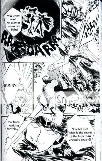
Sailor Moon itself though, or at least the three volumes I managed to get through, is just not very good. In the first place, Naoko Tekeuchi’s art just doesn’t do a whole lot for me. It’s not horrible, or anything…the drawing is certainly more consistent than is often the case in American comics, and while the cartoony stylization can be a little cloying, it’s at least done professionally. Her pages, though, can get really cluttered and messy.

Clamp’s work for Cardcaptor Sakura, as a comparison, is a lot better.

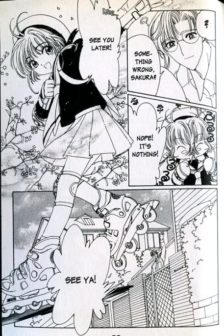
As with Sailor Moon, Clamp breaks panel borders and works with different size images all jammed into one space. But they balance that by not using extraneous background detail; by using lovely, controlled patterns (the tree branches with blossoms are especially nice), and by using the panel breaks to move you thorough the story (you follow the girl’s body down to oversized legs and into the next panel of the narrative.) It’s just much more deftly done; the difference between artists with an aesthetic sense and one without.

The wriitng in Sailor Moon is similarly muddled. Bunny, or Sailor Moon, couldn’t be a much more generic or less interesting character. She’s really more a collection of traits than a person; we learn she likes video games and sleeping, that she’s terrible at school, and that she whines a lot…but cutely (at least in theory.) Her personality, as such, never takes shape beyond these not-especially-appealing tidbits — and, moreover, even these vague delineations are quickly abandoned. By the third volume, we learn that Bunny is actually Princess Serenity reincarnated (or something), and her returning memories more or less obliterate the Bunny we (barely) knew. This would be, perhaps, an improvement, except that Serenity’s only character trait seems to be mooning after her crush object, Prince Endymion.

As for the narrative itself…it’s really less a plot than a series of disconnected cliches, drawn about equally from video games and mid-drawer fantasy. There’s an eldritch evil, there’s a crystal that needs to be protected, there’s an ever escalating series of helpful sailor scouts who must be awakened, each with their own sailor power; there are battles which inevitably end in victory…etc. etc. etc. There’s some vaguely kinky mind-control too, but it’s hard to much care as fractured scene after fractured scene rushes by. Is Endymion in thrall to the evil overlord forever? I’ll never find out, since I can’t stand to read the fourth volume…but, still, I’m guessing not.

So yeah; not good — though it could be worse, certainly. There are certainly appealing moments; the gratuitously cute totem cat, for example, is in fact cute. Sailor Moon’s battle cry (“On behalf of the moon, you’re punished!”) is charmingly corny; the sort of thing you could imagine a little girl actually yelling in battle. And, though the plot is an incoherent mess, it’s a welcoming, open incoherent mess. American super-hero comics are often involuted and incomprehensible because they draw on a mass of useless continuity trivia that’s (A) stupid and (B) of no interest to anyone who hasn’t read American super-hero comics for the last twenty years. Sailor Moon, on the other hand, makes no sense not because it’s insular, but because it’s so extraneous. Sailor Moon has no background…even from volume to volume, anyone can pretty much start anywhere on any page and you’ll be as at home as you would be anywhere else. You’ve got cute girls fighting evil; you’ve got crushes; you’ve got nifty special effects; you’ve got cute cat; you’ve got gratuitous wish fulfillment. That’s it. There’s really nothing else going on — not character, not plot, not themes, nothing. In some sense, I wonder if that’s part of the reason for the series’ success. If you’re a girl, it might be easy to imagine yourself as Sailor Moon, since Sailor Moon is barely there. It might be easy to imagine your own adventures, since the adventures on offer barely exist either.

Sailor Moon gets the pander right, and given that, additional specificity might well get in the way. The books, in short, remind me a little of McDonald’s — they aren’t good in the usual sense, but you have to admire the way they identify a need and fill it with maximum efficiency and minimal frills.

Comics in the Park

As a parent, I spend a fair bit of time in parks talking to other parents while we all rather desperately try to ignore our offspring. These conversations often start out with “so what do you do when you are not herding rugrats?” And, since at least one of the things I do is write about comics, I sometimes end up talking to strangers about funnybooks.

I had two such conversations this week, both of which were pretty entertaining. The first was with a woman from Columbia, who’d also spent some time living in Mexico. She told me that Wonder Woman in Spanish is “Mujer Maravilla”, which is pretty great. She was also interested to know what I thought of the Hernandez Bros. — she said she had trouble reading their stuff because she found it so sad (I think she was talking particularly about the Palomar books.) Maybe most interesting, she told me that there was hardly any native comics industry in Columbia. Instead, what comics there were were all Spanish translations of American super-hero comics. When I asked her if there were any imported Spanish-language comics from Mexico, she said, emphatically, no — which surprised me.

The second conversation was with an English documentary filmmaker; we’ll call him D. D. had once been very interested in comics, but hadn’t followed them in a long time. He explained that when he was a kid in London, he used to buy 2000 A.D. regularly, often shopping at the great London sci-fi and comics store Forbidden Planet. Anyway, one day when he was 13 or so, D. was in the store when a couple his age walked in. The girl was stunning; D said he looked at her and knew that this was it; a girl like this was what he wanted out of life.

Meanwhile, the guy who actually was with the girl walked over to a wall of comics, spread his arms, and said, half-joking-but-not-really, “Here it is! This is my life.” D. was watching the girl’s face while her boyfriend made this declaration — and that was it. D. walked out of the comics store and never went back.