CLICK ON IMAGES TO ENLARGE
Greg Sadowski and Fantagraphics’ Setting the Standard is perhaps the best book on Alex Toth that has been published thus far, because it represents the complete body of Toth’s 1950s work for Standard Comics, reproduced as closely as possible to its original printed color form (1). Toth did his art with the intent that it be colored and so, even though the colorists at the time ignored the artist’s color notations and most often made uninspired color choices, still the art can only be considered complete in the form for which it was intended. For this volume, editor/designer Greg Sadowski meticulously cleaned up the pages of the original comic books.
Sadowski takes a straightforward, comprehensive approach and so Setting the Standard can rest comfortably on the bookshelf next to Fantagraphics’ other excellent recent collections of essential comics such as Hal Foster’s Prince Valiant, Roy Crane’s Captain Easy and Buz Sawyer and Carl Barks’ Disney epics. The Valiant and Easy volumes set a high bar for the reproduction of classic, beautifully colored Sunday strip pages, but comic books present a different set of difficulties, due to cheap, misaligned printing and often perfunctory coloring.
Recoloring might help, but as can be seen by various reprints where older works have been slathered with airbrushy digital effects, restraint is to be desired. Some options are the semi-faithful recoloring that Barks recieves in the handsome, just released Lost in the Andes, or the recoloring that Sadowski has been having Marie Severin do for his Bernard Krigstein books, though these approaches are dependent on access to clean copies of the black and white art. For Setting the Standard, Sadowski went back to the source to provide another practical model for the reproduction of old school four-color comics.
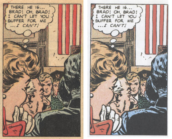
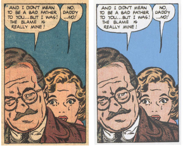
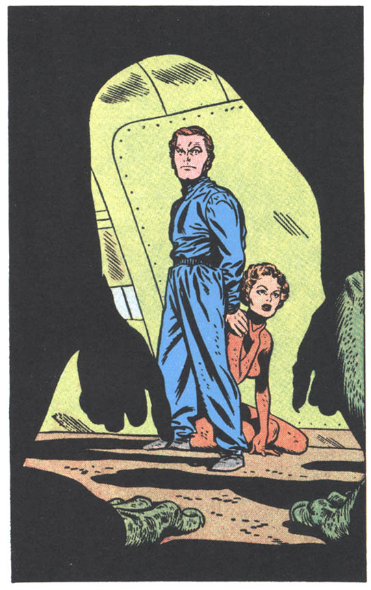
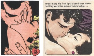
I have Best Romance #5 which contains Toth’s first job for Standard, “My Stolen Kisses”, which is also the first story in the Fantagraphics book. This particular comic is dog-eared and scotch-taped but the color is actually not badly registered, however, comparisons of panels from it and from the collection still show the effort that Sadowski put in:


Left: panels from the original comic. Right: Sadowski's cleanups
Sadowski painstakingly corrected the images where the color in the original comics was off-register, minimized the bleed-through of “ghost” images from the printing on the reverse sides of the pages (in some cases he replaced mottled single color backgrounds with clean areas of color) and restored the areas around the images and behind most of the lettering from the color of decomposing newsprint to white—daunting efforts when one considers that he did some 400 pages worth.
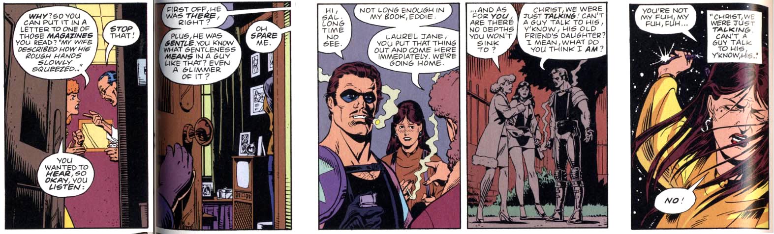
The stories themselves are not stellar, but that was “standard” for the time. This type of presentation is effective for the work of non-writing art stylists of 4-color comic books such as Toth, who all worked with scripts that were rarely intended to be more than cheap pulp entertainment; the onus was largely on the artists to make the material resonate. Here we are treated to many tales that are dignified only by Toth’s determination to wring feeling from them.
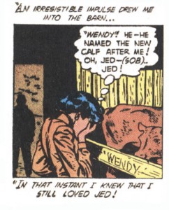
Even the best stories here are redolent of the banal false consciousness of 1950s America. They are mostly forgettable junk—humans prevail over the world domination plans of implausibly gullible aliens, foolish criminals get their just desserts, a woman is charmed when her suitor names a cow after her:
Or, they can be offensive junk: vengeful soldiers bury dehumanized “gooks” alive with a bulldozer, a woman struggles to prove to her husband that she can do better housework in order to preserve her marriage.
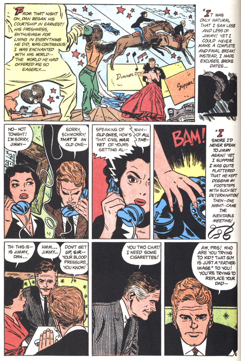
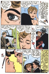
Toth’s oft-cited praise for the Standard scripts of Kim Aamodt falls flat when one actually reads them. A story described as one of Aamodt’s best portrays a woman torn between an older and a younger man. The dilemma is resolved when the older man bows out because “you kids…belong together.” Okay, it’s efficiently written and it is a great art job:

Page with my favorite Toth montage, from Man of My Heart
But, as in the other stories here, women are not allowed to make their own decisions. More so than Toth’s other assignments, the romance comics do give the artist a chance to draw a range of emotions and choreograph more intimate stagings, but they are also intended to program young girls to be subservient. In most cases, it is only that Toth drew these stories that elevates them from a justified place in the dustbin of comics history.
There are a few interesting stories though and thanks to Toth, many passages of thoughtful comics storytelling. The romance work is often brilliantly articulated and visualized with glamorous drawings that rival those of the illustrators famous for depictions of beautiful women who inspired Toth’s interpretations, Al Parker and Jon Whitcomb.
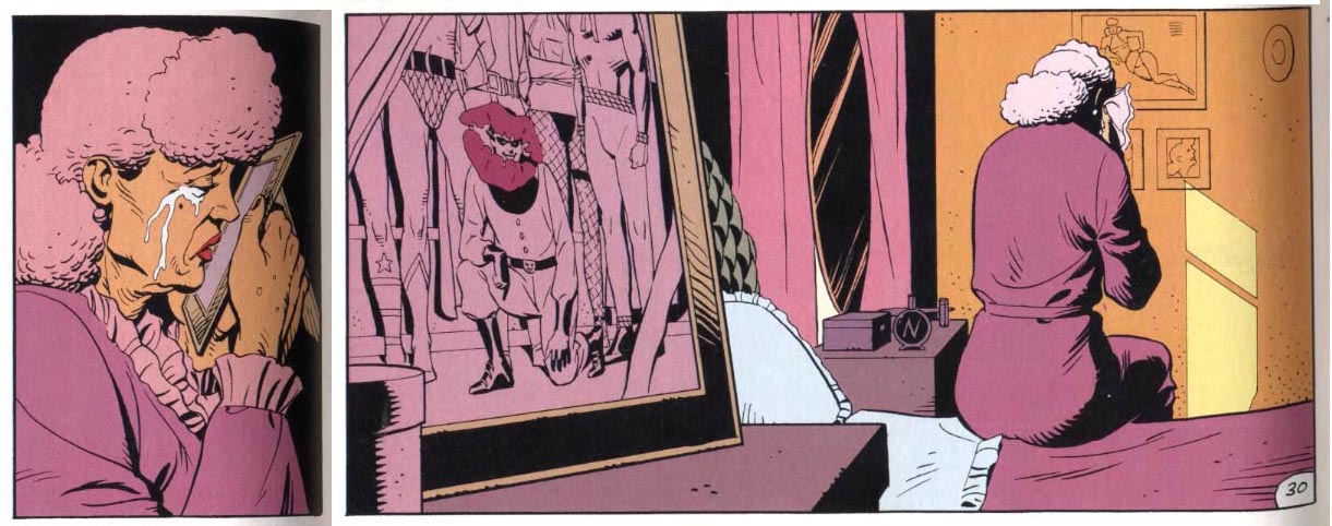
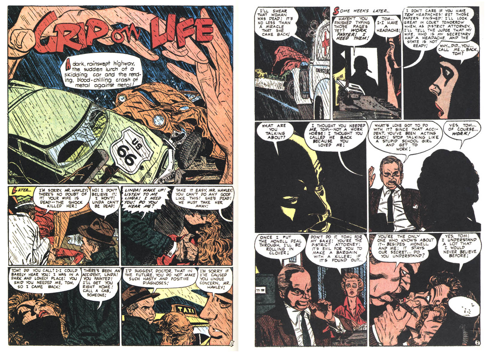
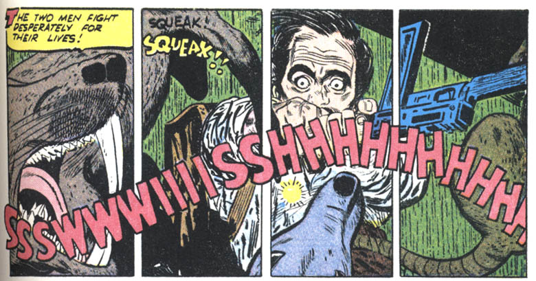
Toth’s handling of horror and suspense is intuitive, sometimes harrowing and exhibits his more radical inventions. “Grip On Life” is one story that sticks with me; it is a brutal rendering of an abusive husband who brings his wife back from the dead to serve him. Here and also in the shadowy peripheries of “The Shoremouth Horror” and “Galloping Chad Burgess”, Toth’s compositions are partially obscured and his extremes of emotion barely glimpsed.
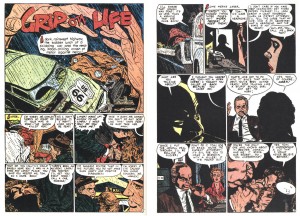
A simultaneously realistic and abstract splash leads to atypically explicit abuse
IDW’s Toth biography proves its value as a companion to collections like this. In examining Genius, Isolated‘s appended timeline of published work for this period, one begins to see the progression of Toth’s efforts to address the critique of DC production ace Sol Harrison: “You don’t know what to leave out.” One sees the artist vacillating over years as he goes back and forth from clutter to simplicity and back and forth again. 1952 sees him end his first tenure at DC Comics with some beautifully realized collaborations with inker Sy Barry including the affecting “Queen of the Snows”, to move on to these works for Standard and his concurrent collaborations with Harvey Kurtzman at EC.
The three EC stories are spread over the same three years Toth was at Standard and form a learning curve of themselves. Kurtzman’s practice was much more sophisticated than anyone else Toth ever worked with and it seems that he absorbed a lot of storytelling information from acting in the subservient role that Kurtzman’s autonomy demanded of his artists. In the first, “Dying City” from 1951, Kurtzman inked Toth’s pencils and Toth appreciated that the inking “simplified my drawings and dropped in some blacks that I hadn’t even figured on. He made it simple, and powerful.”
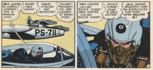
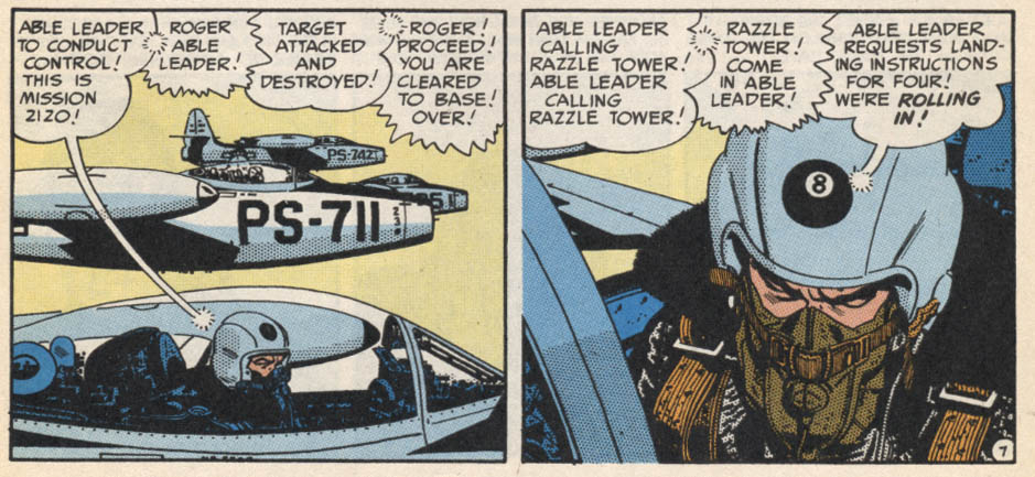
Thunderjet, 1952: together, Kurtzman and Toth achieve a high level of realism.
Kurtzman knew his stuff and Toth took the lesson on board, to the point that he alienated Kurtzman on their third co-effort two years later by dropping in some blacks that his writer/designer/editor hadn’t figured on in “F-86 Sabre Jet”, 1953. To further the narrative intent, Toth’s silhouettes accentuate the disorientation experienced by the pilot protagonist (2).
At Standard, with a sympathetic art director/ inker in the person of Mike Peppe and with publishers who seemed to appreciate the value of Toth’s efforts, in the space of a few years profound changes take place in the artist. In particular, he has an epiphany of idiosyncratic simplicity in 1952 with his interpretation of the unfortunately now-anonymously written “The Crushed Gardenia”, which allows him to transcend his influences and find his own most pure style.
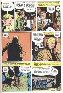
The Crushed Gardenia
The storytelling and drawing in this story is minimalist and oblique, with extremely cropped images in panels that are clearly designed with the interrelationships of the whole page compositions in mind. It furthers a tendency for distortion seen earlier, for example in the misproportioned splash of “Triumph Over Terror”:

Um, that's weird
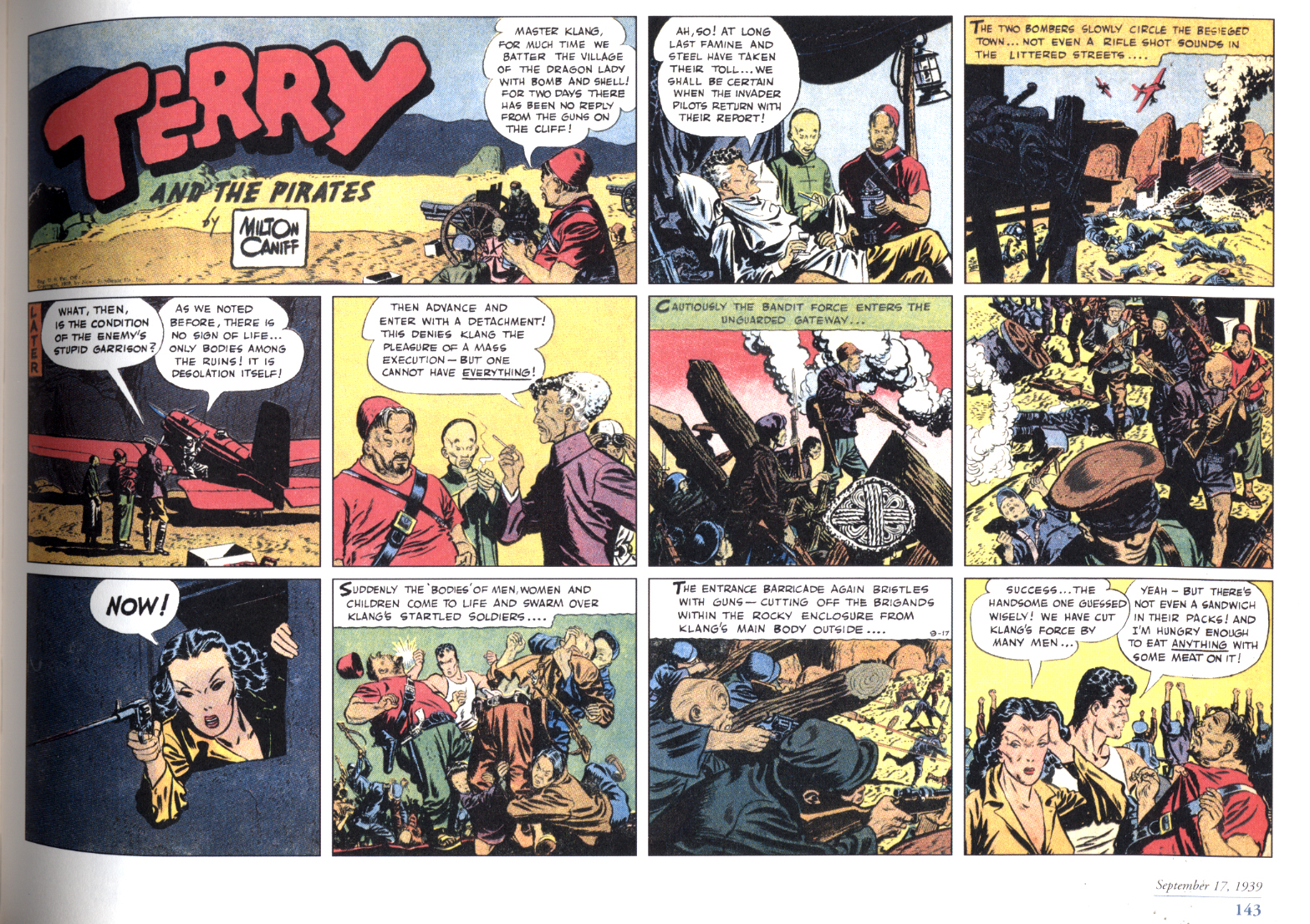
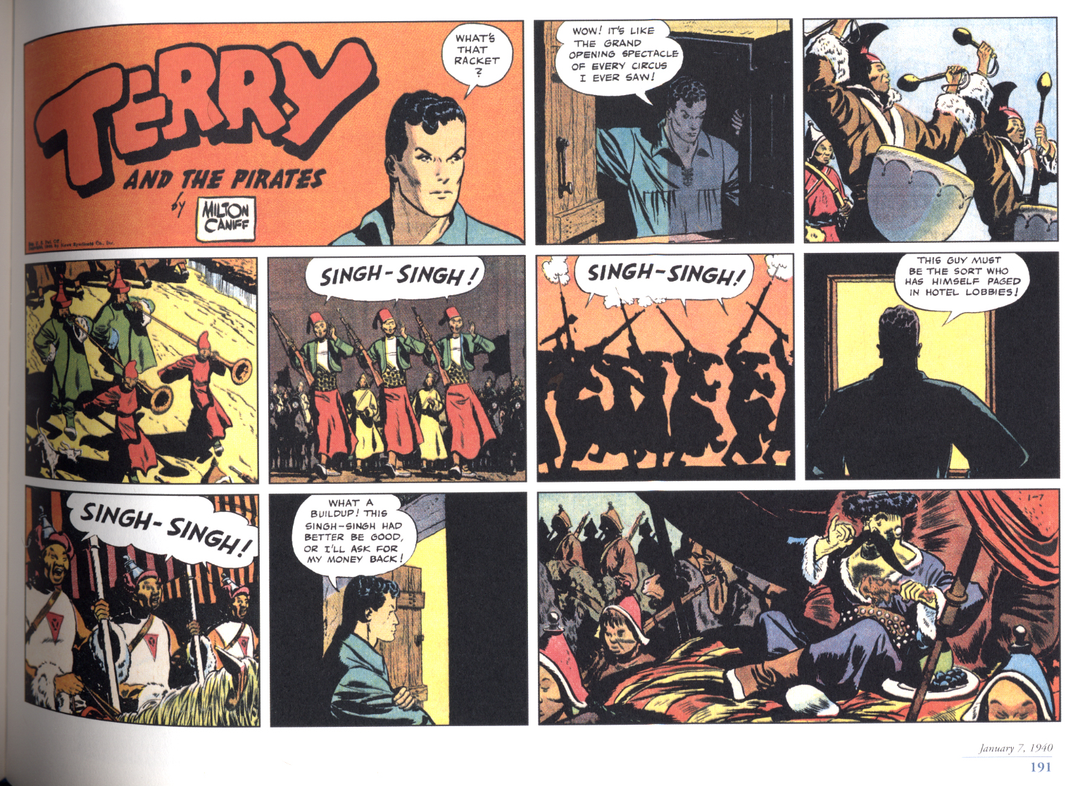
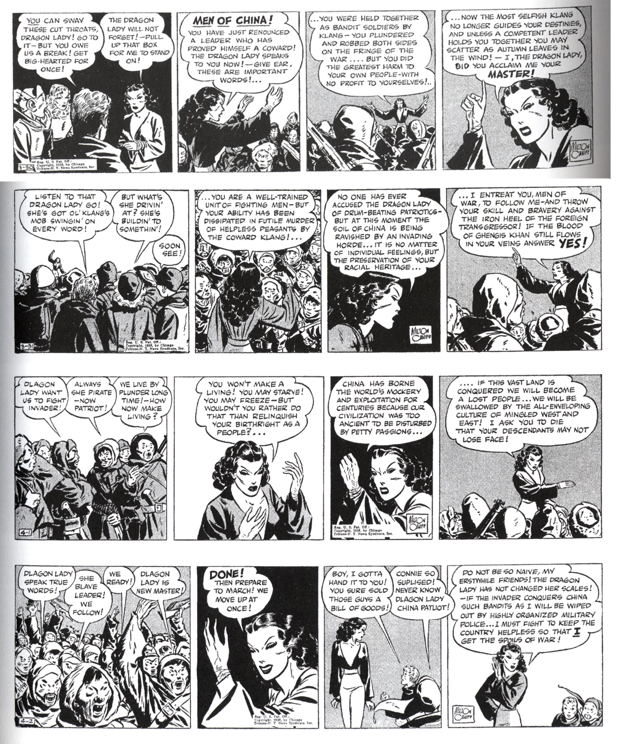
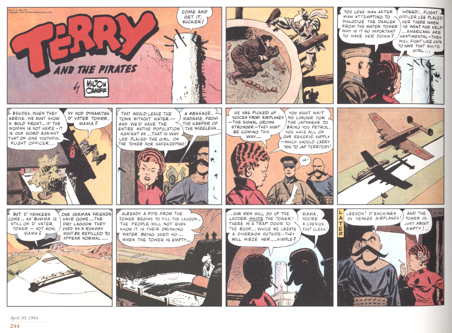
The characters in “The Crushed Gardenia” have squarish heads with the features crushed into the center, which remind me of Milton Caniff’s year or so on Terry and the Pirates where everyone takes on what I’ll call a Flip Corkin aspect: compressed figures with boxy heads.
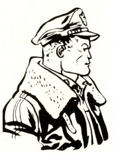
Caniff's Flip Corkin
The art in “The Crushed Gardenia” is so freshly reductive that it looks as if it might have been drawn yesterday, but a few months later Toth is drawing the densely composed “Geronimo Joe” which reflects the influence of Albert Dorne, later still the elaborately detailed “Lonesome for Kisses” which begins to resemble Neal Adams(!). There are plenty of experiments throughout the Standard stories, but the attenuated drawing of “The Crushed Gardenia”, that represents Toth at his most innovative, will hardly rear its head again until the 1960s.
Toth’s Standard period ends when he is conscripted into the Army, where he formulates his more elegant mature style in his solo Jon Fury strips for his post’s newsletter. After his discharge, he works on book-length stories for Dell and is forced to simplify further, at times drawing with a breezy, nearly generic realism, sans experimentation, then in the early 1960s he begins working for DC again and the drawings become more muscular, the panels become overstuffed with detail. This clutter may have been dictated by Toth’s DC editors, but Sol Harrison must have been scratching his head. Soon though, as the decade progresses through to the cusp of the seventies, Toth will hone it down.
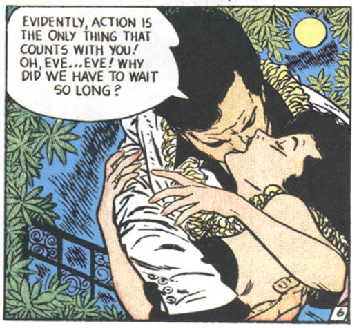
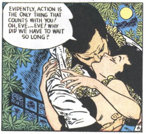
Back at Standard, Mike Peppe is one of Toth’s better inkers and he does a credible job on such concisely pencilled stories as “The Eggbeaters”, “Geronimo Joe”, “Free My Heart” and “The House That Jackdaw Built”. Still, the greatest stylistic cohesion is seen in the instances where Toth inks and letters his own pages such as in “The Crushed Gardenia”, “I Fooled My Heart” and “Too Many Cooks”. But it was Toth’s romance work that was most influential to his contemporaries; John Romita and Ross Andru are noted here, but also for example one can see echoes of Toth’s “I Want Him Back” from Intimate Love #22, 1953 in Frank Frazetta’s Standard romance tale “Empty Heart” from Personal Love #28, 1954:
Toth and Frazetta did some hella good kissing scenes
I’m not claiming this is a swipe, but the first time I saw the Frazetta panel years ago, I immediately thought he’d been looking at Toth. I am inclined to think that Toth exhibits some influence himself, from Bernard Krigstein, in the linear qualities of “The Mask of Graffenwehr” and “Images of Sand”. Then, there is the odd 4-panel split image in “The Phantom Ship”:
The singular tier
This compound panel is a single image broken to imply the passage of time between the individual component panels; the sound effect superimposed on the whole thusly becomes more protracted and the frenzied scene takes on the qualities of an epic battle. It’s a very unusual effect that resembles Krigstein and probes into areas later explored by Steranko. Toth did a romance story with Peppe, “I Do…” in 1955 for Atlas that also has some layouts that remind me of Krigstein.
I had believed that a clue to Mike Peppe’s inking was that it was he who would ink noses with a line along the edge of the nostril that defines a plane between the side of the nose and the underside of the nostril. It is present in the stories attributed to Peppe and it looks wrong to me….it wasn’t something that Toth would do, I thought.
Inked by Peppe, with too-sharp nostrils
Yet in “I Want Him Back”, which Toth signed alone and so is thought to have inked, there’s lines on the nostrils! And maybe I’m crazy, but the main figure in the opening panel of that story looks to me like someone else drew it. Perhaps Toth didn’t ink everything in some of the stories he is credited with? Or, maybe there were editorial changes to his work?
Toth inked five full stories and a few odd pages here. Apart from the two episodes of Joe Yank, which are inked by his best DC inker Sy Barry (with the main characters’ faces reworked by Art Saaf), the rest are credited or attributed to Mike Peppe and John Celardo. The hands of Mike Sekowsky and Mike Esposito are noted as present in some of the many stories attributed to Peppe; the book also mentions Ross Andru as a possible inking assist, plus I believe I see Carmine Infantino in a few places as well. I noticed this previously in Greg Theakston’s two-volume black and white Standard collections Toth: Edge of Genius, but I was unable to get Infantino to confirm or deny this when I asked him at a con a few years ago. Some of these questions may be addressed now that this work is readily available to be absorbed by the public and comics scholars.
In Setting the Standard, the choice of supporting material is excellent. The fairly comprehensive interview with Toth from Graphic Story Magazine (and later, The Comics Journal #98) is reprinted with a new selection of reproductions, including appropriate pages by artists who influenced Toth such as Irwin Hasen:
Left: the Hasen repro. Right: my scan of Toth's much later, very Golden Ageish and Hasenesque version of the character
The stories are also annotated in the back with a selection of relevant or at least semi-relevant quotes from Toth’s letters (3).
In the end, interpretive cartoonists such as Toth must be judged by the quality of their realizations of the scripts they were given, good or bad. Isolated or excerpted pages don’t give any idea of the work; only whole stories can provide the intended reading experience. In Sadowski’s book, Toth’s work speaks for itself and the artist likewise. The book’s assemblage and design are very well done to make a package which is pulpy but tasteful, not cheap nor overly slick, not high/low cute or old-boy sentimental. It provides a complete and important body of work by a great cartoonist.
___________________________________________________
Footnotes
1. My other favorite Toth book is Manuel Auad’s One for the Road, which collects all of the black and white comics Toth did for Pete Millar’s 1960s hot rod magazines, which I like for similar reasons: it collects an entire body of often-outstanding comics from obscure periodicals, that would be exceedingly difficult and expensive to track down, which can now be read/appreciated in their entirety. Similar collections of Toth’s Warren and DC Comics work should now be published.
2. I only found one mistake, one that has been replicating in Toth books for a while: Frontline Combat # 12 is actually dated May/June 1953, rather than November 1952 as it is listed in Jim Vandeboncoeur’s Toth index; when corrected, “F-89 Sabre Jet” comes after “The Crushed Gardenia” in the timeline. Their proper placement clarifies Toth’s progression; that is, apart from the possibility that either story was held for a time in inventory by their editors.
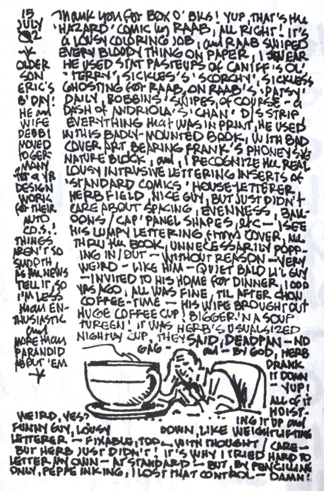
3. In Setting the Standard there are references to Toth’s annoyance with the efforts of Standard’s chief letterer Herb Fields. In researching this article, I came upon a letter in John Hitchcock’s compendium of his Toth postcards, Dear John, which amusingly depicts and describes a visit the artist had with Fields: