Are Some Panel Layouts Inherently Superior to Others? (Groensteen and Page Layout Roundtable)

This is the second installment in the PencilPanelPage roundtable on panel layout and Theirry Groensteen’s work (The System of Comics, Comics and Narration). Check out Adrielle Mitchell’s first installement in the series here!
 
ComicsNarrationIn Comics and Narration Thierry Groensteen introduces a four-part taxonomy by which we (or at least he) categorizes comics in terms of the nature and structure of panel layout. The taxonomy consists of different ways in which the payout of the panels might be more or less regular:

  1. Do all pages have the same panel layout (or are they all variations on a single such template, etc.)?
  2. Are all the tiers of panels on a particular page (or all the tiers in the comic, etc.) the same height?
  3. Are all the panels within a single tier (or all the panels on a page, or all the panels in the comic, etc.) the same width?
  4. What is the number of panels placed on each page (i.e. what is the density of the page)?

A page for which the answer to (2) and (3) is affirmative is a waffle-iron grid. Further, the more variation with respect to (2) and (3) found on a page, the more irregular the page. Factoring in (1), we also have a criterion for measuring (roughly) the regularity of the panel layout of an entire comic.

WaffleThe density of panels on a particular page – i.e. criterion (4) – while discussed at the same time as the first three criteria, is somewhat orthogonal to measuring the regularity of a page although variation in density from page to page obviously increases the irregularity of the comic in the relevant sense. Clearly, however, if the number of panels on a page varies from page to page, then as a matter of geometrical fact their layout must as well – thus, with regard to measuring regularity criterion (4) is redundant, subsumed under criterion (1).

This taxonomy is interesting, and allows us to categorize comics in terms of three distinct (although not completely independent) dimensions: the regularity of panel height (on a page), the regularity of panel width (in a tier or on a page), and the uniformity of these when considered page-to-page. Taxonomy is, of course, a wonderful tool for analysis and explanation, but a taxonomy is only as good as the explanation of, and analysis of, the relevant phenomena that it provides.

McCloudLayoutDigression: One pet peeve of mine is the tendency of scholar in the humanities – comics scholars definitely included – who propose taxonomies as if a system of categories is an intellectual end in and of itself (and as if they are following a more ‘scientific’ methodology). A taxonomy is a tool, however, not a result.

So, the obvious question is this: Are there any theoretical questions that can be answered by attending to the complex geometrical framework for analyzing comics panel layout provided by Groensteen? Groensteen seems to think so: he argues that, in general, the more regular the panel layout, the better the comic and its narrative (all else being equal). His argument for this claim is somewhat indirect – he identifies a regularity-eschewing ‘movement’ in comics, which he calls the neo-baroque and characterizes as preferring:

… the destructuring of the hyperframe by images that bleed off the edge of the page and intrusions into the gutter, the use of multiple insets, the maximization of the contrast between large background images and the inset panels, the vertical or horizontal elongation of panels (as if to achieve a shape as far removed from the square as possible!), and the frequent stacking of very narrow horizontal panels… (Comics and Narration p. 47).

Groensteen stridently disapproves of such strayings from the waffle-iron way of truth:

It is as if the simple succession of panels was no longer deemed sufficient to ensure the production of meaning: the apparatus must become more sophisticated (or more hysterical) by piling special effect upon special effect (Comics and Narration, p. 47).

It is worth noting that Groensteen’s complaints have a bit of a Euro-elitist tone to them: He explicitly blames the neo-baroque movement on the pernicious influence of manga (pp. 47, 61) and 1980s American superhero comics (p. 47, fn. 17, p. 61).

Setting this aside, however, it is worth asking whether Groensteen could be right: Are some panel layouts (and maximally regular waffle-iron grids in particular) better suited for effective narratives than others? There are two possible questions one could ask here:

  • In general, are comics better the more regular their panel layout?
  • If comics had to restrict itself to a single layout, would a more regular layout be better than a less regular one?

WareLayoutGroensteen seems to think the answer to the first question is affirmative, but I just can’t see how this could be the case. As many scholars have argued (and see the predecessor to this post by Adrielle for some evidence) panel layout can be carefully attuned to the type of story being told and the way in which the teller is telling it, resulting in narrative effects that are both theoretically interesting and likely unachievable by other, more ‘traditional’ means. Chris Ware’s work, for example, would be far less compelling had it been produced in a regular 3×3 grid (interestingly, Ware somehow gets a pass from Groensteen, despite his vast deviations from panel regularity in Groensteen’s sense.)

More promising, perhaps, is the second question (although it is not, I think, what Groensteen himself has in mind): If all comics had to be produced with the exact same panel layout, would a regular one be preferable? The answer here might be affirmative – it might be the case that a regular waffle-grid is neutral in a certain formal sense, so that it is amenable to functioning in all sorts of different narrative environments in a non-interfering manner (although the positive contributions of panel layout of the sort mentioned in the previous paragraph would be ruled out). Of course, certain metafictional comics that make direct use of panel layout would be impossible. But the second weaker claim regarding super-regular waffle grids does not seem immediately absurd in the way the first does.

So, are some panel layouts inherently superior to others?
 

Can Rhetorical Layout Modulate Narrative Momentum? (Groensteen and Page Layout Roundtable 1)

The entire Groensteen and Page Layout roundtable is here/


lp everything2


“…[T]he experience of reading a comic is a function not only of what is contained within each panel, but also of the size, shape, and design of the panels themselves as well as the spatial relations among them.” (Joseph Witek, “The Arrow and the Grid,” in Heer and Worcester’s A Comics Studies Reader, 155)

 
I have a foundational question to ask before heading into the first of our five Pencil Panel Page posts responding to Thierry Groensteen’s exploration of page layout and rhythm in his recently translated work, Comics and Narration (Mississippi UP, 2013, trans. Ann Miller), especially Chapter Two, “On a Few Theories of Page Layout.” Are we selling traditional (i.e. non-abstract) comics short by foregrounding them as “sequential narratives” first and foremost? I wonder if, by privileging narrative momentum, that forward-thrusting gesture of story that we are so wired to detect and to favor, we have occluded the equally compelling possibility of nonlinear composition and meaning-making on the comics page. So many discussions of page layout, including Groensteen’s to a great extent, are predicated on propulsion, i.e. asking how the reader’s eye is drawn from panel to panel to make sense of the narrative. This narrative accretes; if the layout is effective, the story is built up (Ware allusion intentional, yes) from its component parts (the panels), and the reader is drawn across the pages, actively cooperating in its construction: “The multiframe lures the reader ever onwards, it designates in advance the images still to come; the reader therefore feels summoned by them and rushes headlong after the forthcoming narrative segments, as if running down a flight of stairs.” (“The Rhythms of Comics,” Comics and Narration, 136)

This underlying metaphor is seductive. Why wouldn’t we favor a formal model that upholds comics as a vigorous, agentic medium that grabs readers visually and verbally and carries them into the story? Why wouldn’t we favor a formal model that applauds the skilled comics reader for his/her ability to catch the wave and move in rhythm with the text? Kinda sexy, no?

‘Cept maybe it’s not the only game in town. Groensteen’s exploration of the multiframe (the page; in System of Comics, this was sometimes translated as “hyperframe”) in Chapter Two relies on the privileging of narrative thrust, but it does gesture at another possibility, even if it doesn’t explore it fully. This possibility is not limited to abstract or wordless comics, which in a later chapter (Chapter 7) are offered as the [only?] comics forms that escape the regular “beat” of linear progression (“In narrative comic art, rhythm is no longer part of the content itself [as it may be on some pages of abstract comic art] but merely a mode of narration.” 135). The possibility that intrigues me is the page composed of “rhetorical” panels: “the technique that molds the shape or size of the panel to the action that it encloses.” (46). Groensteen attributes this term and concept to Benoît Peeters (Lire la bande dessinée [Reading Comics]) and suggests (too briefly) that interesting tensions can be created when regular patterns are interrupted to visually echo diegetic material (e.g. dialogue that extends beyond a panel border or the occasional use of symbolic panel shapes). Joseph (Rusty) Witek, in his important essay, “The Arrow and the Grid,” (in Heer and Worcester’s A Comics Studies Reader, Mississippi UP, 2009), offers another term–“gestalt” — for such panels, defining this layout process as one in which the “overall shapes of the panels take on narrative or thematic significance” (154). Witek offers early Jack Kirby Captain America pages as an example, and here’s a simple example from David B.’s Epileptic:
 

epileptic_page

 
(Incidentally, these two pieces of criticism work beautifully in conversation with each other, though neither references the theory of the other; perhaps this is one answer to a question posed for the forthcoming Comics/Graphic Narratives Discussion Group MLA 2015 roundtable on comics theory: “Now that many Franco-Belgian works of comics criticism are available in translation—The System of Comics, Comics and Narration by Groensteen, to name two—are we beginning to see a blending of Anglo and French comics theories, or do these seem to be two separate lines of thought?”)

Both Groensteen and Witek see the regular pattern of layout as the basic structure of the comics page (for Witek, it’s a “grid,” for Groensteen it is the “waffle-iron”) and both discern relative degrees of complexity in any disruptions offered by comics creators, beginning with the “easiest,” which is based on the simple “elimination” of vertical or horizontal borders to create larger panels that still adhere to the basic structure, and in a modular form, insert smaller or larger panels into the given space of the grid. Groensteen conceives of this as “nested regularity,” and offers Chris Ware’s work as the quintessential example:
 

U_21_390066527146_ACME_20_sample

 
Interestingly, there is a bit of tension here: on one hand, Ware is acknowledged as tightly controlling the rhythm by disciplining the reader to recognize the basic pattern and then follow it as it shrinks Fibonacci-style, yet readers can and do fight this highly controlled regularity, as Orion Martin did in his June 6, 2014 Hooded Utilitarian post, “I’m Lost: Path-Finding in Comics“:

“Recently, while reading Chris Ware’s Building Stories, I found myself completely ignoring the path that he had imagined. Instead of a narrative progression, I read the pages as clouds of remembered moments, letting each fall into place in due time.”

(Here, Martin has hinted at exactly what I’m hoping for: perhaps we don’t have to stay narratively inclined while reading narratives!)

More sophisticated versions of experimental layout that still do not reach the gestalt/rhetorical stage are other types of play on the regular grid; for example, occasionally altering the expected number of panels (“density”) in an otherwise regular album (book)–splash pages, landscape panels, etc.–, changing the very shape of the page from the usual rectangle to another shape,
 

mouse-guard-v3-the-black-axe-preview-pg11

 
(see David Petersen’s enlightening discussion of why he believes the square page works best for his Mouse Guard), or making the grid slightly irregular– an “offset grid,” offers Witek—as Alison Bechdel uses here:
 

alison-bechdel_fun-home_oven

 
Or how about combining bordered and borderless panels, while also varying the number of panels per line, as Seth does here:
 

scan0011

Here’s Joe Sacco doing even more clever things with the offset grid:
 

footnotes_in_gaza_

 
Finally, we approach rhetorical panel layout, which not only takes into account what is happening diegetically, but also assists the reader in exploring thematic and tangential meaning on the page (i.e. keeps us on the page, and perhaps beyond the page/beyond the comic, rather than simply propelled forward in the narrative), as in this fine example from Jason Smith’s The Jumper:
 

20130205-OnTheVerge-TheJumper-38

“…I mean what happens when the story actually calls for some kind of different layout?” Smith wonders in his meditation on the layout choices he made for The Jumper.

“The layout actually gets the reader to do two things that most comics don’t normally ask you to do: 1. read up the page from top to bottom [sic; I think he meant bottom to top], and 2. read from right-to-left.”

Though he doesn’t explore this gesture fully in his blog post, Smith does show how it is possible to significantly break with the grid in order to exemplify something fundamental to the story. I’ll be interested to see what Barbara Postema has to say about this in her chapter, “Concerning the In-Between: Layout in Frames and Gutters,” in the promising Narrative Structure in Comics: Making Sense of Fragments (RIT Press, 2013), which I’m hoping to get to before (*#$^!) the fall semester crashes into me.

Want to hear a comic artist think about rhetorical panel layout experimentation in a complex, legible way, without even once mentioning Groensteen? Read the creator of Dresden Codak, Aaron Diaz’s post, “Advanced Layouts: Paneling Outside the Box,” on his blog, Indistinguishable from Magic. Diaz offers us clear and compelling examples of nontraditional layout in order of difficulty. It’s a far less turgid exploration of the topic than the post you are currently reading, and well worth the jump. Go now.

Charles Johnson’s “It’s life as I see it” and Single Panel Cartoons

Johnson 3

The cover of Johnson’s 1970 collection.

Note: This essay on Charles Johnson’s Black Humor is a cross-post from my blog. It’s also a preview of a roundtable on Thierry Groensteen’s Comics and Narration that will begin here at Pencil, Panel, Page in a few weeks. 

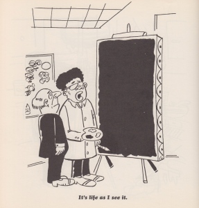
Early in Chapter Two of Comics and Narration, theorist Thierry Groensteen extends some of the questions he first posed in The System of Comics, also available in an English translation from the UP of Mississippi. “Can an isolated image narrate?” he asks. “Can it, on its own, tell a story?” (Groensteen 21). I’d like to consider this question in relation to “It’s life as I see it” from Charles Johnson’s 1970 collection Black Humor. Groensteen borrows some ideas from film theory in order to explore the narrative potential of single, static images: “Some film theorists,” he points out,

most notably André Guadreault, have asserted that an intrinsic narrativity is associated with movement, because it implies a transformation of the elements represented. Obviously, the same cannot be said of the still image. Given that its narrative potential is not intrinsic, it can only arise, where it does arise, out of certain internal relationships between objects, motifs, and characters represented. (Groensteen 21-22; English translation by Ann Miller)

With Groensteen in mind, I’d like to consider the “internal relationships” of the “objects, motifs, and characters” in this single-page cartoon, in which an African American artist explains his work to an older, white visitor. As I took notes on Johnson’s work, I thought again about Qiana’s “What is an African American Comic?” from earlier this year on Pencil, Panel, Page. I am thinking about how theories from African American literary theory and philosophy might inform our readings of comic strips, comic books, and graphic novels. But I also have larger questions in mind—what secrets will Johnson’s cartoon reveal when also read as part of the tradition of American literary discourse? What affinities might we discover, for example, if we juxtapose Johnson’s “It’s life as I see it” with Phillis Wheatley’s poem about the work of artist Scipio Moorhead, for example?

Of course, by writing about Johnson’s cartoon, I’m cheating a little. Is this really a single-page comic? It might be read as a work containing at least three panels—the image itself, as well as the artist’s two paintings: the one hanging on the wall and the other work-in-progress on his easel. So I should revise what I asked earlier: how do we read a single panel or page like this one that includes other, smaller images embedded within a larger frame? Here is “It’s life as I see it” from Black Humor:

Johnson 1

 Johnson, as Tim Kreider points out in his 2010 TCJ essay on the artist, is best known as one of the most influential and visionary American novelists of the last thirty years. Middle Passage, which won the National Book Award in 1990, is now a perennial text in 20th century American and African American literature courses—I’ll be teaching it again in one of my classes this fall—and Dreamer, his 1998 novel about Dr. Martin Luther King’s experiences in Chicago in 1966, is, like Edward P. Jones’s The Known World, one of the most complex and evocative historical novels of the last two decades.

Scan 5

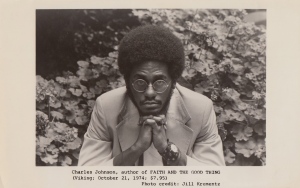
Jill Krementz’s 1974 publicity photo of Johnson for the
writer’s first published novel, Faith and the Good Thing (Viking).

 Writing about Johnson’s early work as a cartoonist, Kreider writes, is like trying “to give a magnanimous little career boost to a struggling unknown cartoonist named Wolfe or Fellini.” But as his introduction to Fredrik Strömberg’s 2003 book Black Images in the Comics makes clear, Charles Johnson has a deep affection for comic books and comic art. In the conclusion to his essay, Johnson includes a discussion of the kinds of comics he would like to read:

I long—as an American, a cartoonist, and a writer—for a day when my countrymen will accept and broadly support stories about black characters that are complex, original (not sepia clones of white characters like “Friday Foster” or “Powerman”), risk-taking, free of stereotypes, and not about race or victimization. Stories in which a character who just happens to be black is the emblematic, archetypal figure in which we—all of us—invest our dreams, imaginings and sense of adventure about the vast possibilities for what humans can be and do—just as we have done, or been culturally indoctrinated to do, with white characters ranging from Blondie to Charlie Brown, from Superman to Dilbert, from Popeye to Beetle Bailey. (Johnson 17)

Johnson’s argument here raises interesting questions about the page from his 1970 book. As readers, with whom do we identify? With the artist who shows his work or with the man who stares at the black canvas? Do we immediately identify with one or the other based on our race? What role does gender play? Do we identify with neither but find ourselves observing what Groensteen calls the “internal relationships” between these two men and the objects that surround them? I think an answer to these questions might lie in the juxtaposition of the artist’s two canvases. One is abstract. The other, the one on the easel, is the more realistic of the two, although it is less figurative than the one hanging on the wall. “It’s life as I see it,” the artist explains.

I find myself working in collaboration with Johnson as I read this page. First of all, where are we? This appears to be the artist’s studio. Is this a studio visit by a curator? By a patron? Why is the middle-aged, balding man so startled? Was he expecting something else? The artist’s other work appears more conventional—a variation on Pollock’s Abstract Expressionism. Now the artist is a minimalist. Then again, I don’t know if the painting on the easel is finished. Maybe it’s still in progress. The painter, after all, is holding a palette and brush and he is wearing a white smock.

The questions raised by Johnson’s cartoon are also present in Charles W. Mills’ “Non-Cartesian Sums: Philosophy and the African-American Experience,” the essay that opens his 1998 book Blackness Visible. In the essay, Mills describes the obstacles he faced as he designed a course on African-American philosophy. First, for example, he “had to work out what African-American philosophy really was, how it related to mainstream (Western? European/Euro-American? Dead White Guys’?) philosophy—where it challenged and contradicted it, where it supplemented it, and where it was in a theoretical space of its own” (Mills 1). Mills turned to Ralph Ellison’s Invisible Man as a guiding text. As he reflected on the experiences of Ellison’s narrator, Mills began to formulate a conceptual basis for his course:

African-American philosophy is thus inherently, definitionally oppositional, the philosophy produced by property that does not remain silent but insists on speaking and contesting its status. So it will be a sum that is metaphysical not in the Cartesian sense but in the sense of challenging social ontology; not the consequent of a proof but the beginning of an affirmation of one’s self-worth, one’s reality as a person, and one’s militant insistence that others recognize it also. (Mills 9)

In Johnson’s cartoon, the artist asserts his subjectivity. The painting, like the cartoon’s caption, is a simple statement of fact: life as he sees it. The painting breaks the silence that Mills refers to in this passage. The humor in this cartoon—the disconnect between what the man in the suit expects to see and what he finds on on the easel before him—is part of Johnson’s narrative, I think: a cartoon is a work of popular art that challenges our notions of fine art, just as the painter’s canvas challenges the observer’s narcissistic complacency.

This new painting, then, is like a course in African American philosophy, one that makes certain demands on the curriculum as it articulates “a (partially) internal critique of the dominant culture by those who accept many of the culture’s principles but are excluded by them. In large measure,” Mills continues, “this critique has involved telling white people things that they do not know and do not want to know, the main one being that this alternative (nonideal) universe is the actual one and that the local reality in which whites are at home is only a nonrepresentative part of the larger whole” (Mills 5-6). The subject of Johnson’s narrative is the dissonance between what the observer believes and what the artist knows to be true.

As I look at the cartoon, I also wonder if I might trace its origin to one of the earliest collaborations of words and pictures in American literature, that of Phillis Wheatley and artist Scipio Moorhead.

Wheatley’s poem about Moorhead’s work appears in her 1773 book Poems on Various Subjects, a text that includes an engraving based on Moorhead’s portrait of the poet (you can read more about Wheatley and Moorhead here and here). “To S.M. A Young Painter, On Seeing His Works” opens with a question as the speaker studies one of Moorhead’s paintings:

To show the lab’ring bosom’s deep intent,

And thought in living characters to paint,

When first they pencil did those beauties give,

And breathing figures learnt from thee to live,

How did those prospects give my soul delight,

A new creation rushing on my sight?

An important difference between Johnson’s cartoon painter and Moorhead, however, is that Moorhead’s work, with the exception of his portrait of Wheatley, has not survived. As we read this poem, we must imagine his drawing, the evidence of his “lab’ring bosom’s deep intent” which has brought life to these “characters” and “beauties.” After a detailed description of her response to Moorhead’s work, Wheatly concludes the poem with a plea:

Cease, gentle muse! the solemn gloom of night

Now seals the fair creation from my sight.

But while night and shadow might obscure Moorehead’s drawing, it remains vivid and startling in her memory. When I first saw Johnson’s cartoon, I immediately thought of Wheatley’s poem (and of Adrielle’s early Pencil, Panel, Page essay on comic scholarship and ekphrasis). At the end of the poem, as night falls, the speaker can no longer see Moorhead’s painting, so she does the next best thing: she writes it from memory and, therefore, gives her friend the lasting fame that Shakespeare’s speaker promises to his subject in the Sonnets. The poem, like Johnson’s panel, is filled with light and meaning that some observers, like the old man in the suit, might fail or refuse to see.

Johnson’s “It’s life as I see it” is an interesting test case for Groensteen’s theories, not only because it is a single image that narrates, but also because it is part of a collection of other cartoons. At the end of Chapter Two of Comics and Narration, Groensteen discusses Frans Masereel’s woodcut novels and Martin Vaughn-James’s The Cage (see Groensteen 35). These examples, of course, are not collections of single-page cartoons, but Groensteen’s suggestion on how we read and respond to these texts might shed light on how we read a collections like Black Humor. “In works of this type,” Groensteen explains, in which “there are never more than two images visible to the reader at any one time, split across two pages,” the reader’s imagination and memory play a crucial role: “The dialogue among the images depends on the persistence of the memory of the pages already turned” (Groensteen 35).

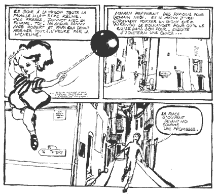
The next page in Johnson’s book, for example, shares affinities with “It’s life as I see it.” An older white gentleman and his wife listen to a Beethoven recital. The pianist, his hands perched dramatically over the keyboard, is about to begin. A gray-haired old man in the audience whispers, “Psst, he’s a mulatto…pass it on.”

Johnson 2

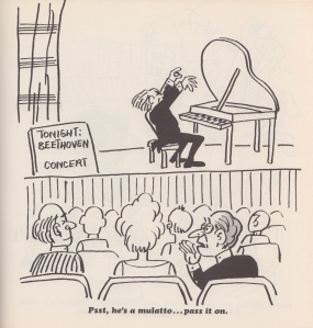
The cartoon that appears on the page opposite
“It’s life as I see it” in Johnson’s Black Humor.

By placing these two cartoons together, Johnson, according to Greonsteen’s theory, is also challenging the reader—how does our reading of one page shape our understanding and recollection of the images on the pages that preceded it? Both of these cartoons invite us to consider two African American artists–a painter and a musician–and the white audience members who observe them.

But how do you read “It’s life as I see it”? Is it a single-panel cartoon , and, if so, what can it tell us about “the persistence of memory,” as Groensteen describes it?

References

Groensteen, Thierry. Comics and Narration. Trans. Ann Miller. Jackson: UP of Mississippi, 2013. Print.

Johnson, Charles R. Black Humor. Chicago: Johnson Publishing Company, Inc., 1970. Print.

Johnson, Charles. “Foreword” in Fredrik Strömberg, Black Images in the Comics: A Visual History. Seattle: Fantagraphics, 2003. 5-18. Print.

Kreider, Tim. “Brighter in Hindsight: Black Humor by Charles R. Johnson.” The Comics Journal. January 18, 2010. 9:00 am. Web.

Mills, Charles W. Blackness Visible: Essays on Philosophy and Race. Ithaca: Cornell University Press, 1998. Print.

Wheatley, Phillis. “To S.M. A Young African Painter, On Seeing His Works.” Poetry Foundation. Web.
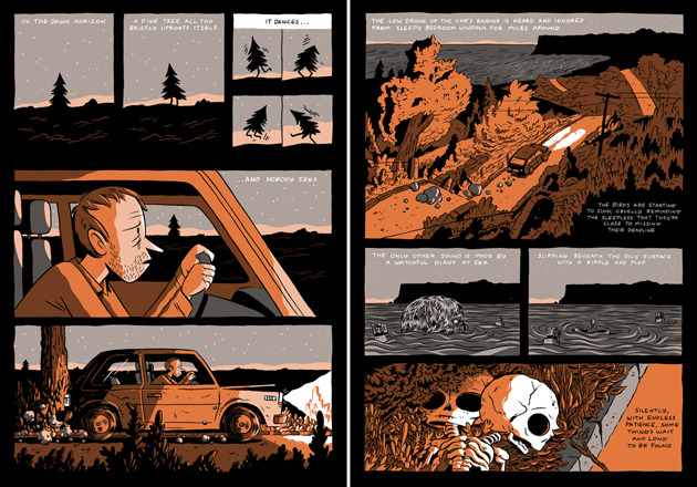
When should a comic series end?

wm001

A few months ago, Ross Campbell posted an update to his blog about his ongoing comic series, Wet Moon. After reassuring readers that he was making progress on the seventh installment, he shared the news that volume eight will likely be the last. “I’ll be calling it quits after that, at least for a while,” he writes. And though he hints at the possibility of some kind of spin-off, Campbell seems pretty clear about his need for creative breathing room away from Wet Moon, and perhaps even some closure. His remarks are what prompted my question this week: when and under what circumstances should a comic series end?

Oni Press first began publishing Campbell’s series in 2005, so as he mentions in his post, it’s been nearly a decade since Cleo, Trilby, Audrey, and Mara started their first year at the art school in their hometown of Wet Moon, somewhere in the Deep South. The comic’s young aspiring poets, playwrights, and illustrators are chain-smoking goths and metal heads, young vegan swamp things who hang out in coffee shops and indie video stores between classes. Not surprisingly, a sense of panic, self-questioning, and irrepressible curiosity underscores their transition from high school to college. Even more interesting, though, is how Campbell’s narrative and aesthetic style values intersectionality in ways that the characters themselves are still struggling to appreciate. In the generous curves and angles of their bodies, gender, race, sexuality, ability, and regional identities are alternatively extolled and effaced according to the shifting cultural attitudes and language of youth. Elements of horror and mystery add even more energy to comic’s coming-of-age drama.

wm003

Having just read the six volumes of Wet Moon on a weekend binge last year, Cleo and the other characters are new friends of mine. I’m still in the early swoon of fandom and quite satisfied to linger here a while before venturing into more scholarly analysis. But Campbell has lived with the story for ten years or more, and his discomfort with this fact can be instructive for those of us who study comics. His post concludes:

i don’t know if it’ll be career suicide to end Wet Moon, but it seems like the right thing to do. i love the characters but i’ve felt more and more crushed underneath all the storylines i’ve woven together, i feel like i’m paying for the decisions my 24-year-old self made, and i need to wipe the slate clean and move on. other reasons are i feel like i’m always trying to repurpose Wet Moon to fit with myself as i get older and change as a person, people change a lot in 10 years, and also that with each new book, WM gets more and more inaccessible, i don’t want it to become like long-running superhero comics or those Japanese comics that you’re interested in until you find out they’re 25 volumes long and counting. bleh.

Campbell’s concerns could easily apply to any form of storytelling with recurring characters, from Sherlock Holmes mysteries to daytime soaps or the prequels and sequels of Star Wars. Yet comics struggle with the pleasures and burdens of serialization in distinctive ways. The form’s most popular genres, such as the long-running superhero comics that Campbell references, are often bound to the creative decisions of the past and to the fans who want to keep it that way. As Danny Fingeroth explains, “We learn and grow – we change – from experience. For the most part, serialized fictional characters do not. This is at once a great strength and a terrific weakness for them.” Clearly the same can be said of their creators too.

Campbell cites the complex continuity in Wet Moon and the related issue of inaccessibility, along with his own personal growth as reasons to risk what could be “career suicide.” (Given his recent work on TMNT, the weekly updates to Shadoweyes, and everything else he’s done, I don’t see that happening.) But Wet Moon offers its own evidence of the rewards that can come with taking such a risk. Consider the way Cleo’s friend Mara slowly sheds her brooding intensity over the course of the series along with her nose rings, leather mini-skirts and black lipstick. “Just felt like it,” she says to Audrey in book 3, but Mara’s journal reflects her frustration with a life in which everyone seems to be changing except her: “i took out a lot of my piercings too, it seemed like the right thing to do, i was getting sick of them… sometimes lately i feel like i don’t know who i am anymore. i know that sounds totally lame and emo or whatever, but it’s true and i can’t lie about it.” If being able to see people like Mara learn and grow and change from their experience means that the series won’t last for 25 volumes and counting, then I guess – to borrow a phrase from both Campbell and his serialized fictional character, it does seem like “the right thing to do.”

wm002

Writer Brian K. Vaughan puts it another way:

Most people who love comics, we’re used to things like Spider-Man and Batman, things that have an illusion of a third act. There will never really be a last Spider-Man story or a last Batman story, even though people have tried it. It’ll never really end. And we get spoiled that way. But I think finales are what give stories their meaning. The stories need endings because all of our lives have endings.

When I think of a series that ended on a high note, Neil Gaiman’s work on Sandman comes to mind (although he has produced spin-offs and a new mini-series since the mid-1990s), not to mention Vaughan’s own Ex-Machina and Y The Last Man. On the other hand, I think Aaron McGruder’s social and political interests developed as a cartoonist during his time on The Boondocks in ways that did not reflect well on the quality of the strip. And I wonder about a series like The Walking Dead now that the television adaptation has become more well known than the comic. While superhero comics are obviously relevant here too, I’m more interested in creator-owned titles or story arcs created by a single writer and/or artist who is inextricably linked to the series’ identity.

So let’s talk about endings. Which creators or titles get them right? Where are the missed opportunities? We could even consider the larger implications of Campbell’s concerns about the inaccessibility of long-running serials or Vaughan’s suggestion that comics storytelling can sometimes suffer without the sense of finality that endings provide.

How Do We Interpret Comic Book Covers?

Fairest3Comics are both a substantial art form and a commercial industry.  Thus, it is not surprising that the cover of a comic can play multiple roles. The cover is usually the first (and sometimes only) part of the work seen by consumers before purchase. Nevertheless, covers are not purely merchandising: A cover is also a part of the work of art proper, and thus should (or, at the very least, legitimately can) be taken into consideration when interpreting, evaluating, and decoding the narrative contained in that work. Given that comic book covers are often created by someone distinct from the artists who craft the narrative portion of the comic found between the covers, interesting questions arise with regard to how the content of the cover art influences our interpretation of the work as a whole.

Two questions arise immediately:

  • What role should the content of the cover art play in our interpretation of the comic as a whole when the cover seems to conflict with the narrative found inside the comic?
  • What role should the content of the cover art play in our interpretation of the comic as a whole when the cover references other comics (or other pictorial art)?

She-Hulk37Of course, sometimes the cover of a comic is just a playful exercise in metafiction, with broken fourth walls and other types of silliness that usually (although not always) are meant to have no real bearing on our understanding of the story contained inside the comic. Such is likely the right reading of this She-Hulk cover (although,given that the She-Hulk often engages in metafictional strategies within the narrative proper, the right reading of this example is likely more complex). But in other cases, things are more involved. Let’s look at two sorts of example. The most obvious sort of case is where the content of the cover can outright contradict the the content of the interior pages. This can happen in three ways, all three of which are illustrated by Adam Hughes’ cover for Fairest #3.

  1. The narrative content of the cover can conflict with the narrative found in the interior pages: Hughes Fairest cover depicts the Snow Queen playfully writing the word “Fairest” on the frosted window. But this contradicts the interior content in two ways: It is unlikely that the character in question is the sort to do anything playfully, and there are no panes in the windows of her castle as depicted in the interior pages.
  2. The appearance of characters on the covers can conflict with their appearance within the interior pages: On the same cover, the Snow Queen is depicted with pink skin, but within the interior pages she is consistently drawn with bluish-white skin.
  3. The cover art can incorporate the title of the comic into the art itself (thereby implying that the characters have metafictional knowledge of the title of the comic in which they appear, and thus have knowledge that they are fictional characters). The Snow Queen’s inscription of “Fairest” on the window functions this way, while there is no indication within the interior pages that there is any sort of metafictional fourth wall breakage.

Given these sorts of conflict between cover and interior content, we are (or at the very least, I am) left wondering exactly how the content of this cover is meant to fit into an overall interpretation and assessment of the narrative. Is the Snow Queen playful, or not? Does she have blue/white skin, or pink skin? Does she know she is fictional?

WolverineLEGOAnother sort of question arises when cover artists reference other (typically iconic or important) comic covers. A particularly interesting example of this phenomenon arose with the LEGO minifig covers that appeared on Marvel comics as part of a tie-in with the Marvel Superhero LEGO sets and videogame. These covers raise interesting questions about the appearance of characters: Are we meant to imagine that Wolverine (the canonical Marvel character) temporarily looked like a LEGO minifig? Or that he could have? In short, if the cover is a legitimate part of the work as a whole, and thus provide some information regarding the appearance of the characters, exactly what information should we take from this cover?

There are other questions that arise from this sort of cover, however. The LEGO Wolverine cover references the iconic cover to the first issue of the seminal Wolverine limited series. Is this merely to be taken to be an homage? Or should we interpret the narrative within the pages of the most recent issue with the older limited series especially in mind? These questions are raised, but seem to be left unanswered, by the cover art itself.

So, how should we interpret covers in mainstream superhero comics?

Query the Artist? Comics Creators Commenting on their own Projects

angouleme3

 
For those of us who care about the “single vision” (Hillary Chute) of the comics creator who both draws and writes his/her comic, a related problem arises: shall we rely exclusively on the work itself to make meaning, or supplement (augment, complicate, tease out) this meaning by listening to the author’s comments on process, on intention, on effect? It’s an old question in literary criticism, and, of course, the answer is influenced by many things, including a) the availability of direct commentary from authors (interviews, journals, essays, forewords, etc.), b) prevailing approaches to texts in a given region, era, school of thought (contrast, most obviously, the penchant for psychoanalytic criticism at the beginning and end of the 20th century against the fetishization of the text alone by New Critics in the mid-20th century), and c) individual reader inclinations to treat works of art as ends in themselves (products) vs. a view of artistic creation that sees any particular text as a small manifestation and minor component of a larger artistic, or thought, project (process). Lately, I’ve been reading works of natural science more than those from humanities disciplines, and I think an apt biological analogy for what I’m describing would be the genotype/phenotype distinction.

If one examines the work of art (a given comic) as a unique entity deserving of close scrutiny, a world in itself, it might be argued that one is engaging in phenotypic study (i.e. exploration of the particular expression of an artistic gene, one of a kind as we humans are [purportedly] each one of a kind). Phenotypical study of single-creator comics also naturally allows for text-to-text comparison (inside a creator’s oeuvre as well as against works by others) but would eschew contextualizing the particular work of art in the self-espoused larger project of the work’s creator. A genotypical approach, in contrast, would expand out from the given work (which is, by its very nature, a limited, flawed, and partial expression of an author’s vision) to ask larger questions of the author: what is your artistic project? What is your process? In what ways does your work of art reflect or distort the concepts you are driven to illuminate by creating comics? No fear of intentional fallacy along this view; it becomes not only acceptable, but also necessary to query the author about the imagined ideal.
 

9780226099446

 
If you value the latter, you’ll find Hillary Chute’s latest publication, Outside the Box: Interviews with Contemporary Cartoonists (Chicago UP, 2014) essential reading. Chute is one of our premier comics scholars, combining a fine eye for formal comics criticism with a deep commitment to showcasing the human beings who create those very comics. This respect for creator and form has earned her an unusually trusted position in the art-comic community, softening the divide between academia and fandom. Leveraging this trust, Chute has gained direct access to some of our best: Chris Ware, Joe Sacco, Art Spiegelman, Alison Bechdel, Lynda Barry and others. These artists allow her to ask layered, intimate questions about their lives and their work; they allow her to broadcast and to print their responses. Outside the Box not only makes available these rare conversations, it also features excellent production values and graphics: the book is filled with full-color and sharply rendered black-and-white exemplar panels from each of her subjects. Even the paper and font is lush; it’s a really beautiful book. More importantly, however, it gives Chute a place to gather the thoughts of contemporary comics creators contiguously so that we can see more clearly that there is a synthetic thread aligning their projects, despite stark differences in their work; as Chute notes, “What is so riveting about the group of artists included in Outside the Box is how imbricated they are with each other–and yet how radically different all their work looks from each other’s.” (3) Chute clearly cares about genotypic concerns, with meta-reflection on the evolving form of comics as her primary aim: “The exhilarating feature of my interviews with cartoonists—for me, and hopefully for others—is that they capture moments of practitioners reflecting on the form as it is being shaped [emphasis hers] in contemporary culture.” (2)
 

HillaryChute-teaser

 
Here are, for me, some of the highlights of those conversations, in light of the question I raised earlier in this post (is it valuable to listen to what comics creators say about their process and their products? Judge for yourself):

Françoise Mouly: “And because comics are a window into the thinking process of the artist, a revealing ‘automatic drawing’ as well as a distillation in concise terms of the author’s story, the object of the printed book integrates many crucial aspects.” (187)

Joe Sacco: “I think I understand how history works. I understand why one people are battling another people. I understand that they both want land. But ultimately there’s a level that I haven’t really got to yet. I’m touching on motive in places, like what makes someone pull a trigger? What makes one person beat another one to death? I know we can dehumanize people…. But I think I need to go in another direction after this book. What am I going to do after this? Keep detailing massacres? For me, personally, I think I’m not going to get anything out of it anymore. I’ve come to the end of that.”

Hillary Chute: “You mean in the arc of your career?”

Joe Sacco: “In the arc of my understanding of why people do things and how things develop the way they do. It’s not that there aren’t other incidents I could detail and make a great book about—an interesting book. It’s just that for me, personally, it won’t lead me anywhere new, and it’s kind of about me on some level. If you’re a creative person, it has to be, I think.” (143-4)

Daniel Clowes: “[Wilson]’s certainly got my history to some degree. I’d sort of like to keep that as vague as possible, because some of what he’s about is exactly me and some of it is the opposite of me. I mean, everything is made up for the most part. There’s a grain of truth to it all, and everything is made up. That’s why I never wanted to do autobiography, because it’s so much easier to make things up.” (113)

Daniel Clowes: “I certainly know when I sit down to re-read all my comics, I’m overwhelmed by how much more personal they are than I ever thought they were.” (114)

Alison Bechdel: “To go back to your touch question, I feel like the book is in a way me, my self, my body. And I’m asking the reader to hold me not just figuratively, in the sense of an analytic ‘holding environment,’ but literally. “Hold me!” It is so pathetic! What was I thinking?”

Hillary Chute: I really love this response. You and I are teaching a course together on autobiography, and one of the books we’re teaching is Roland Barthes by Roland Barthes. He discusses his idea that ‘one writes in order to be loved’—and then he says this idea is endurable only if you first find it touching, then imbecilic. Then you are finally free to find it accurate. But I love the idea of writing in order to be held.” (174)

Empathy and Iconicity, cont’d

My most recent post on Lefèvre’s and Guibert’s The Photographer received some insightful, but contentious, comments that I haven’t had a chance to respond to. And since I don’t have much else to post about at the moment (copies of Chloé Cruchaudet’s Mauvais Genre and Rutu Modan’s The Property are both in the mail), I will respond belatedly to these comments, which came from Noah and Suat, here in the form of a post.
 

figure4

Didier Lefèvre, Le Photographe

 
Noah’s comment:

I think there’s in general a question about whether empathy in these situations is helpful or useful. I think Suat wrote about this recently; engaging the West’s attention/sympathy isn’t always such a great thing for people experiencing war or human rights violations. Sometimes having us pay attention or having us put ourselves in your place is really dangerous/bad. (I think in general the Middle East probably wishes we’d stop paying attention to them, for example.) So, I guess I wonder whether the combination of photography/comics really changes the ethical calculus all that much. Obviously, failing to help a little girl in front of you is pretty repulsive, but framing the issue in terms of “if you don’t help you’re repulsive” — is that accurate? Or does art’s tendency to make geopolitical issues into a personal “you-must-help!” actually increase our tendency to try to solve other people’s problems by dropping bombs on them?

Probably the biggest thing we could do to help people in need throughout the world is (a) open our borders, and (b) end our crop subsidies. Neither of those really have much to do with representing the suffering of others in comics or photographs…which I agree raises really uncomfortable ethical questions.

Suat’s piece on the Walking Dead does make a powerful argument along these lines and I agree completely that humanitarian aid projects often hide pernicious forms of cultural and economic imperialism, whether you’re talking about immediately harmful cases such as US evangelicals driving hate legislation in Uganda or, more subtly, the way in which humanitarian aid from NGOs in post-conflict states like Sudan and Liberia has eroded their sovereignty by creating economic and political dependency. And certainly much of the funding for these humanitarian aid projects is generated through photography, video, copywriting, and art that aim to draw sympathy from their Western donors. So it is actually important, even necessary, that we be suspicious of cartoonists and photographers such as Lefèvre and Guibert (and while we’re at it, why not add Guy de Lisle, Joe Sacco, and company, to the list?) who deal in ethnographically oriented representations that seek an empathetic response from their readerships. But I don’t think the fact that discourses of humanitarian empathy are co-opted by American imperialist politics should lead us to dismiss or abandon artistic projects that elicit empathy towards those who suffer in faraway places. If anything, it should be the opposite.

However, it also doesn’t excuse artists from being uninformed about the perverse global circuits of “empathetic” Western cultural imperialism in which their work will inevitably find itself complicit. And so I guess another way of saying this is that what I meant by “ethical response” is very different from an impulse to simply donate or volunteer at, say, Red Cross or Doctors Without Borders. I mean it in a more absolute sense, I suppose. A fully ethical response would involve exactly the kind of delicate critical concern that Noah’s comment demanded. Of course, one can only fail in the face of such an absolute demand but this shouldn’t stop people from working towards it. I also agree completely with Noah’s point that opening borders and ending crop subsidies (or de-commodifying food) would make a more meaningful impact on people in need throughout the world. But the world of representation and the world of “ethical action” are always caught in a dialectic with one another, so we shouldn’t pretend that they can be thought of separately.
 

scan0035

Guy Delisle, Pyongyang

 
Suat’s response to Noah’s comment:

Scott McCloud’s assertions about the iconicity of simple cartoon drawings are one of his more lasting contributions arising from Understanding Comics but I would also say that they are quite unprovable (how many things are in art?). In fact, from my point of view, the idea is anecdotally false or at least constitutes only a small part of the equation. For example, I found Persepolis thoroughly unmoving but found the Iranian movie, A Separation, considerably more humanistic and emotionally engaging. At least part of this is down to Satrapi’s poor cartooning skills. The idea that readers give life to stripped down iconic forms is nice but fanciful.

Similarly, Noah will be glad to hear that Lefevere and Guibert’s War Photographer stands very little chance of engaging anyone’s empathy. It’s been a few years since I read it but the lasting impression I have of it is my sheer irritation at the reading experience. For one, Guibert goes out of his way to make Lefevere a thoroughly unlikable person especially in the second part of the comic. More importantly, as is made clear in your article, the comic is entirely obsessed with his work as a photographer. It’s very much a “look at me” kind of comic. It has very little time for the people being photographed and one would be better served reading a book on the subject. I think this may be a subset of the self-centeredness elaborated on at length later in the comic.

I do agree that Lefèvre is almost as unlikable as Kevin Carter. But the narrative does insist on outlining a process of self-mortification and eventual transformation, which makes him, at the very least, forgivable. More importantly, I wasn’t trying to argue that Lefèvre is a sympathetic character. I think of him rather as a kind of focal point for the reader’s empathy towards the Afghani war wounded during the Soviet War. I might go as far as to say that it is somehow Lefèvre’s failure to be a good person that opens up a space for the reader’s empathy towards the latter’s photographic subjects. (And of course, the depiction and thematization of this failure is only possible through the addition of Guibert’s drawn panels).

stassen_jeanphilippe

Jean-Philippe Stassen, Deogratias

As for iconicity, I don’t know how to defend my use of the term other than by calling on my own reading experience, which may not be generalizable. I do however believe that a correlation between iconicity and reader empathy might be proven through some sort of psychological experiment. Reader empathy has already been the subject of psychological experimentation, experimental designs are already in place, and it wouldn’t be too hard to add “iconicity” to the mix of variables, so why not? But I also don’t think iconicity is the only mechanism through which readers give life to drawn figures in comics and I worry that I may have sounded as if that’s what I think by opposing photographic realism and cartoon iconicity in such stark terms. And I certainly don’t think that iconicity is necessarily a defining characteristic of comics. Some of the most moving graphic novels I’ve read are those of Edmond Baudoin, which are more painterly than iconic. Let me add that my interest in these questions comes less from the angle of formal definitions concerning the nature of the medium than from the angle of empathetic reading. I’m interested in how it is that artists engage the empathy, and to a further extent, the ethical responsibility, of their readers. So I will need to reframe the question to reflect that better.

baudoin_eloge

Edmond Baudoin, Éloge de la poussière