Fabrice Neaud’s Journal and Autobiographical Comics

The following post is a barely updated version of a paper I presented at the International Bande Dessinée Society in London in 2007, entitled “Fabrice Neaud’s Face Work.” What drove the paper was two combined hunches, that 1) comics are generally concerned with, and comics are the newest instantiation of, masks as a social phenomenon (presentation of self, social roles, etc.) and 2) Fabrice Neaud’s unique focus on his face, and the faces of others in his autobiographical comics, is essentially a kind of “face work” an artistic effort to portray his “self” through a work on his “face.” I’m not sure how successful my argument was, and it may seem out of date at this point, but I have been thinking about autobiographical comics in more depth lately and I continue to believe that “face work,” while not unique to the comics art form (Proust, for example, was a master of face work while a certain number of comics artists, of course, avoid the face as a focal point), is nonetheless intimately bound to comics as an art form. If this essay seems out of date or irrelevant, I hope, at the very least, that it will encourage readers to become intimate with  Fabrice Neaud’s Journal and, eventually, that editors will consider publishing an English translation. It is, from my point of view, one of the greatest works of autobiographical comics that has been published to date, certainly up there with David B’s masterpiece, L’Ascension du Haut-Mal (1996-2003).
_________

Fabrice Neaud’s autobiographical project, Journal, spans 765 pages total, covering the period of Neaud’s life from February 1992 to July of 1996 with a fifth volume that Neaud finally decided not to publish. What distinguishes this project from other autobiocomix is the fact that Neaud conceives of it as a journal. There is no preconceived unity to the project, no preconceived end. Unique to French BD at the time, Neaud is uncompromising in representing his sexuality. Also, there is a very persistent meta-bd level of discourse throughout the Journal, a constant interrogation of the conditions of representation, which makes Neaud’s work interesting for any scholar interested in the question of autobiocomix.

07 blog-fabrice-neaud 49154451 3c7d007d3628f3703e576552d2b55770 FNeaud3 emile FNeaud2 journal4

The title of this conference, The Innovative Form, inspires all manner of questions about the novelty of the medium. To begin with, “what’s new in BD?” that is to say, what new kinds of things are happening in the medium, but also “what’s new about BD?” that is to say, what is the potential of this form? But of course these two questions are dialectically related: we need innovations in the form before the potential of the medium itself can be fully realized. And I think Fabrice Neaud has some interesting points to make on the question posed by the title of this conference. His own discourse about BD both asserts optimistically the potential of the form and maintains a cautious provisionality as he works to reveal the potential of BD to do new things. In the fourth volume of his Journal he writes the following:

Dans le meilleur des cas, ils [les post-modernists] nous feraient même croire que la bande dessinée est le dernier refuge du dessin académique. Je ne me sens pas pour l’heure capable de démontrer le contraire. Mais j’ai bien l’intuition qu’il s’y passe autre chose, une autre façon de percevoir le réel. Une nouvelle manière de hiérarchiser les souvenirs. (Tome IV)

[In the best case scenario, they (post-modernist academics) would have us believe that comics are the last refuge of academic drawing. For the moment, I am not in a position to prove the contrary. But I sense that something else is happening here (in comics, as an art-form), another way of perceiving the real. A new way of classifying and prioritizing memories. (Volume 4).]

Neaud asserts that the potential of the form lies in its capacity to give a new and singular mode of access to the real. In the case of his own Journal, the question of perception of the real is directly connected to the enterprise of autobiographical self-representation, to the “real” of Neaud’s own life. For Neaud the mode of representation must always remain in a kind of dialectic with the “real” of the “represented,” in this case, his life. Or to put it otherwise, the work he does with the constraints and potentialities of this mode of representation is also part and parcel of a certain work on the self. He explains this process in an interview with Jérome Lepeytre:

Ainsi le journal est-il, en plus d’etre un simple témoignage ou compte-rendu d’un vécu, d’une experience, d’anectotes, un travail formel qui interroge les moyens qu’il se donne et le medium qu’il utilise: la bande dessinée: C’est un laboratoire: laboratoire sur le “moi”, laboratoire sur la vie et laboratoire formel allant jusqu’a utiliser des contraintes “oubapiennes” quand j’en ressens la nécessité.”

[Thus my journal, beyond simply being the account of a life lived, or of a personal experience, or of anecdotes, is a formal work that interrogates its own means of representation and its own medium. Comics are a kind of laboratory, a laboratory of the “self,” a laboratory of life, and a formal laboratory that will go to the extreme of using “oubabien” constraints when I feel the need to do so.]

The Journal is subject to a certain kind of work. More to the point, Neaud conceives of the journal as a laboratory. This is a very strategic choice of words here. A laboratory is a place where work and experience (and I’m thinking of the double meaning of the word expérience in French) come together to produce new perceptions of the real. I also want to underline Neaud’s use of the word travail, because this is where my reading of his Journal begins. For Neaud, it is only through the painful process of work, through an intense engagement with representation, that BD will be able to reveal its novelty, its potential to provide any kind of new access to the real. In the same interview, when trying to describe the singularity of his project, (the open-ended nature of a journal as opposed to an autobiography) he uses the English expression, “enfin, c’est un work in progress … les outils qui servent à l’élaboration du projet sont élaborés au fur et à mesure des besoins de ce projet.” He insists on underlining the contingent and improvisational nature of the project, using a language that makes one imagine Neaud’s work on the journal more along the lines of manual labor. Further on, Neaud describes the way in which the project of the journal has altered his way of “taking notes” sur le vif. Whereas he began by drawing from a written journal, supplemented by photos and a sketchbook (“carnet de croquis”), the work of the Journal has brought him to begin “thinking” within the representational constraints of the form. This is how he describes the process:

C’est-à-dire que nous n’y avons plus simplement des croquis accompagnés de notes écrites, mais bien un prédécoupage direct en sequences, quitte à ce que celui-ci soit extremement sommaire et ne se charge que de légender des cases parfois vides. Ce travail de notes me permet au moins de penser en bande dessinée. Il me parait important de souligner ici ce qui est à l’oeuvre: le travail de la bande dessinée.

[In other words, we are no longer dealing with sketches accompanied with written notes, but rather a direct pre-breakdown into sequences, even if it is true that such a pre-breakdown is cursory and is concerned with not much more than the labeling of often empty panels. This work of note-taking allows me, at the very least, to think in comics. It seems important to me to underline what is at stake here: the work of comics.]

For Neaud the work proper to BD, “le travail de la bande dessinée,” is a way of thinking in the form “penser en bande dessinée,” and it is a working towards the realization of the medium’s potential to reveal a different perception of the real. His description of his work method makes it clear: Neaud’s own perception of reality is filtered through the medium – his initial representations of recent memory are already distributed into panels. As he works on the journal, it works on him.

This “work” then happens in the journal across a broad range of representational fields: rhythm, place, word-image relation, register, symbol.

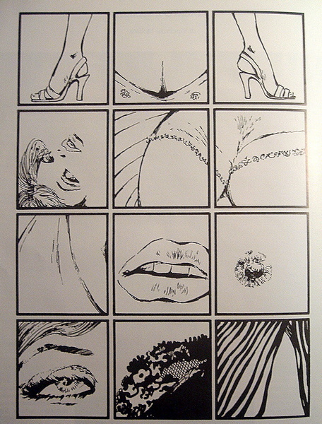
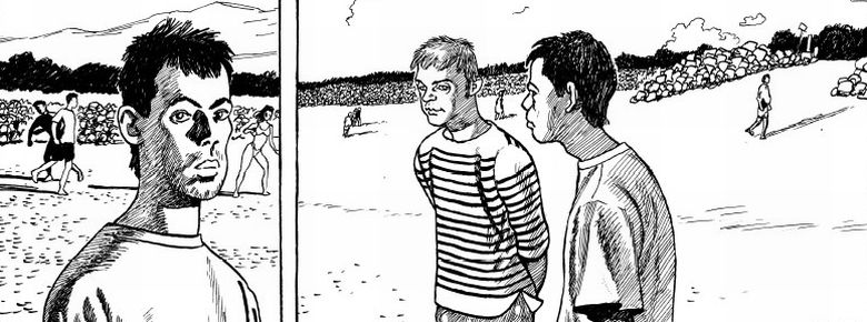
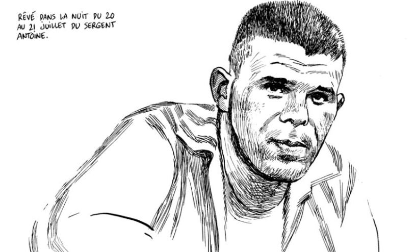
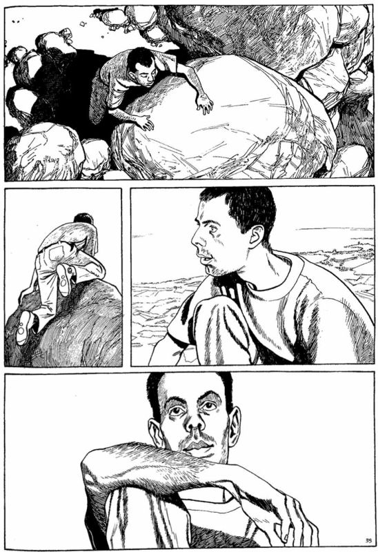
What I would like examine here is Neaud’s work on the face. There is a marked, idiosyncratic, kind of work being done on both the autobiographical face and the face of the love object (called “image” when it is the face of the other) in his Journal. [We might even say that this is the signature of Neaud’s work, this attention given to the face]. It is a kind of work that takes place both on a verbal and visual register. And it is a work that is engaged with the possibility of representing the real of Fabrice Neaud’s life. The face asks, it interrogates, the question of the real. Thierry Groensteen in his preface to vol. I of the Journal refers to Neaud as a face, as “ce visage qui nous interroge” [“this face that questions us”]. What kind of access to the real of the life of Fabrice Neaud does the face of Fabrice Neaud give us? While his more or less realistic (as the French would say, “classique”) style of drawing would seem to promise a relatively straightforward autobiographical representation, the particular attention he gives to his own face, suggests he is concerned with the way the autobiographical face might authenticate self-representation (like a signature), and thus complicates the presumed simplicity of self-representation.

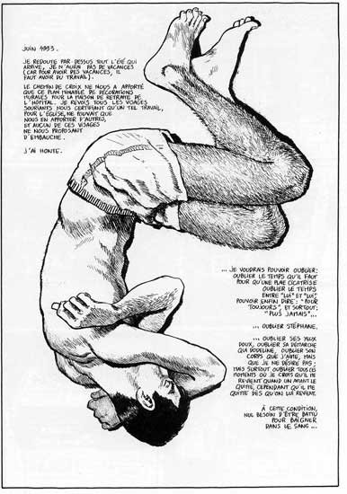
We have from the very first pages of volume I of the Journal a complex discourse on the face. When he writes about his nocturnal sexual encounters in the jardins publiques, he criticizes the safe hypocritical anonymity of the kinds of sexual encounters that take place there, encounters that happens without face. Neaud claims to refuse the anonymity of faces, “je refuse l’anonymat des visages” [“I refuse the anonymity of faces”]. And a few panels later, “je tiens à assumer jusqu’au bout: circuler à visage découvert sans être obligé aux clichés que ceux qui viennent … se sont imposés à eux-même” [“I am committed to claiming my identity to the extreme, to circulating with an exposed face, without being forced to acquiesce to the faces that those who come [to the cruising park] have imposed on themselves”]. Neaud’s discourse on the face is haunted by a metaphorics of masks. As he explains it, while he claims to show his “true” face, in other words to fully assume his homosexuality, he nonetheless also refuses to “wear the mask” of gay clichés. But this is hard to do when faced with an insistent deontologizing heterosexual gaze, a gaze that itself imposes masks on its other. Confronted daily with a heterosexual gaze, he steadfastly refuses to present a legible face – refuses to provide a comfortable or digestible face for the other to have a (faux) ethical encounter with.

The legibility of the homosexual face is presented as a question in the opening pages of the Journal. A sort of “flash back,” the scene takes place in a park, 1975, where the young Fabrice is chased and violently forced to pull his pants down to “show that he’s not a girl.” [And here already at the beginning he is very deliberate in his representation of the face]. This primal scene of the journal returns to haunt another scene that takes place, significantly, also in a park. Discussing his nocturnal wanderings, describing the various types of men who frequent the park in an anthropological (or almost more zoological) manner, Neaud describes a certain type of married man who frequents the park. A set of four panels show a faceless, anonymous man, presumably a married man seeking easy sexual gratification in the safety of his car. When Neaud refuses him, the man insults him, calling him “pédé” [“faggot”]. The insult, is both an interpretation, that is, a reading of the face, and an interpellation, that is, a giving of face. Here he compares these faceless men to his childhood bullies:

Ce sont eux. Ce sont les mêmes qui me traitaient de “tapette” alors qu’ils ne savaient même pas ce que ça voulait dire … tout simplement parce que je n’aimais pas leurs jeux … Ce sont les mêmes qui m’ont fait tant douter quand “tapette” je suis devenu, et que j’ai cru qu’à m’insulter de la sorte … ils l’avaient lu sur mon front.

[“Those are the ones, the same ones who called me a queer even though they didn’t even know what that meant… just because I didn’t like their games… the same who made me doubt myself when I did become queer and who, in insulting me thus, convinced me that they had read it on my forehead”]

[Neaud is haunted by the thought, this childhood conclusion, that his homosexuality is “written on the face.” And here we have a rewriting of the primal scene in which he gets up from of his abject (fetal) position and faces his interpellators returning the insult… But although he able to rewrite the scene and “face” them, his face here is scratched out, de-faced. Why does he do this here? At least one way to read this is as part of a general project to render his face illegible in the face of this interpellation of the heterosexual gaze – here the gaze and the insult are one and the same, by the way]

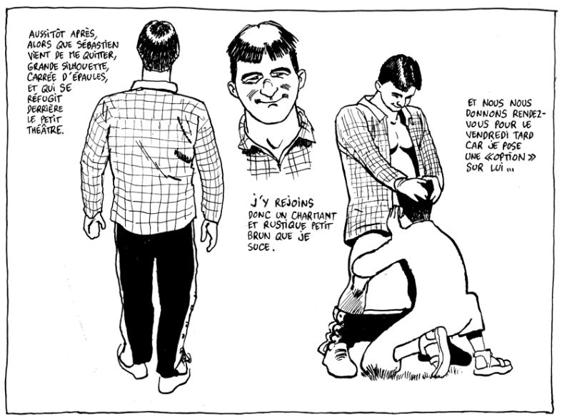
And this is a general condition of Neaud’s life, both in private and in public, he finds himself fighting constantly against the deontologizing tendencies of the straight people in his milieu. Even his “liberal,” non-homophobic friends expect Neaud’s work to “reveal” a certain truth about homosexuality (the word dévoiler (reveal, unveil) is used a lot in relationship to the word pudeur (prudishness) as though only Neaud, the only gay person in the association, must bear the sole burden of confronting societal taboos). His friend and collaborator Loïc Néhou, now the general editor Ego Comme X, suggests that Neaud might tell the story of his “petites ballades nocturnes” [“little nighttime excursions”]. In a rather funny scene that takes place in Journal IV, Neaud depicts a radio interview in which the radio announcer claims that the subject of his journal is “homosexuality.” Neaud responds violently.

“Sinon, faut dire quand meme que ton sujet principal, c’est l’homosexualité. T’as un message à faire passer? // Je n’ai aucun message à faire passer sur l’homosexualité!! Il n’y a plus grand’chose à dire sur l’homosexualité!! Est-ce que Roméo et Juliette a pour sujet principal l’hétérosexualité? NON! … Je parle de mon quotidien … // […] Et mon sujet principal, c’est plutôt … le portrait de mon modele: “Stephane”!

“In any case, your main subject is homosexuality. Do you want to convey a message [to my listeners]?” / “I don’t have any message to convey about homosexuality. There’s nothing left to say about homosexuality!! Is heterosexuality the main subject of Romeo and Juliette? NO!!! I just write about my daily existence… and my primary subject is more precisely that of my model, Stephane.”

So I would suggest that Neaud’s work on the face resists presenting any kind of intelligibly gay subject, and in resisting the imposed “masks” succeeds in presenting a new perception of the real. In effect, all of Neaud’s most intense face work appears in the chapters of his Journal most explicitly concerned with the question of gay identity. His resistance to and cynicism towards the autobiographical signature is finally impossible to separate from his refusal to produce the effect of an intelligible gay identity in his autobiographical Journal.

On a visual level, the face-work occurs in a number of different modalities. I will describe four of those modalities, although there would be many more, and these could and should be further nuanced:

1) The photographic punctum, the “snap” photo effect. Neaud does not hide the fact that he works off of photographs to draw himself and those in his entourage. In fact, in all four volumes of the journal he shows himself photographing those around him. Also at various moments we see him sorting through his archive of slides and printed photographs. In one very memorable panel, he shows himself projecting a slide of his love object. He stands inside of the projection so that his face is distorted, almost monstrously, by the image of his love object’s face projected onto and overlapping with his own. But it is not just through the narrative that we learn about his use of photographs. We can also see it very clearly in his drawing of the face, from his choice of photographs to draw from… Neaud uses a lot of bad, “snap” photography, in which eyes are closed, the face is caught awkwardly in the moment, or made to appear monstrous through unflattering angles, bad lighting, flash, etc.

But why incorporate the photographic into his face work when photography would seem to only reflect the deontologizing gaze of the other? In other words, all of the photos Neaud uses to draw of his own face were taken, that is framed, by others. If Neaud is working to resist the heterosexual gaze, making his face illegible, as I’m claiming here, why use photography? I think the answer lies in the way he uses photography – using it in such a way as to refuse to suture the inhuman eye of the lens. So more than using photography, he marks this use in interesting and even radical ways. By choosing bad, unflattering, snap photos, the autobiographical face is made ugly, not through a process of distortion but on the contrary through the photographic process of representing too faithfully. Making reference to the inhuman eye of the camera lens is one way of resisting the appropriative gaze of the other, because it reveals the extent to which that gaze is subjectivized. It’s like he’s saying “yes, you ultimately frame me, but I can also continue to remind you that you are doing this, that this is not a “natural” process but rather an imposition”. The bad snap shot also highlights the dramatic fleetingness of the moment (rather than “capturing” the moment, the bad snap photograph marks the moment as “past” “dead” already lost… etc. therefore there is no “face” that could be said to transcend time, etc.).

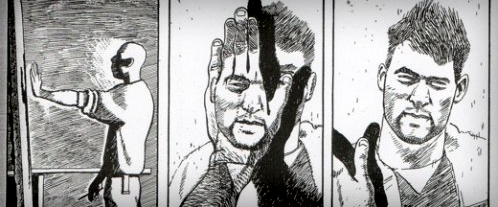
2) Defacement: At various moments throughout the journal, Neaud defaces himself, erasing parts of his face (his mouth or eyes or both), rubbing out his facial features so the face is smudged, scratching it out, or leaving it blank. This is a more “obvious” way of rendering the face illegible and I interpret this particular mode of face work in the vein of a refusal. By defacing the autobiographical face, Neaud is simply saying “no” every time the reader might need or want the attenuation of a face.

3) Displacement, metonymy: Another modality of face-work could be called the displacement of the face. There are a number of scenes in which the rhythm of the panels creates the expectation of a face when we have, appearing in its place, something else, another body part, a concrete object, a blank panel, sometimes enacting a complete shift of representational orders (like going from faces to mathematical formulas, which occurs in a few panels)… The use of other parts of the body – such as the back of the head or of a hand, or in one case a stomach –where his face is expected.

4) Mask, prosopopeia: the trope of the mask (highly specific to the form and history of comics) in Neaud’s Journal includes his use of caricature, borrowings of representational modes (such as that of Francis Bacon), and his self-consciously recycled repertoire of facial gestures. As much as he claims to “circuler à visage découvert” [“circulate with an exposed face”] he also reminds the reader that there is a process of “masking” that happens in the writing of the journal (a kind of medieval idea, masking in order to unmask, in order to show the true self … this could be said in a way to be the most important aspect to his process of self-representation … and also points to something specific about bande dessinée, that if there were a master trope of bd, it might be said to be prosopopeia, the trope of the mask, the talking mask.)

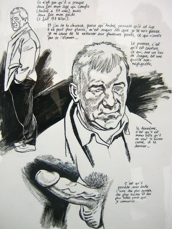
Rather than concluding, I’d like to gesture towards a more critical reading of Neaud [more critical of Neaud, I mean] that would have to do with a different kind of face-work — his work on the faces of others, and more specifically the faces of his love objects (namely Stéphane and Doumé). Recall the radio interview, when Neaud angrily denies that the subject of his journal is homosexuality, he suggests instead that the true subject is more likely his love-object, or as he puts it “Et mon sujet principal, c’est plutôt … le portrait de mon modèle: “Stephane”! [this is in reference to volume one]. I think his use of the word “portrait” (which implies the representation of a face) is significant here. I suspect that his work on face of the other ultimately comes to obscure his work on the autobiographical face. On a purely visual level, his work on the face of the love object (esp. in vols 1 and 3) is most elaborate. He works more on the face of the other. Both on the visual and verbal levels. He deflects the deontologizing gaze of the other by intensifying (and justifying) his own.
_______

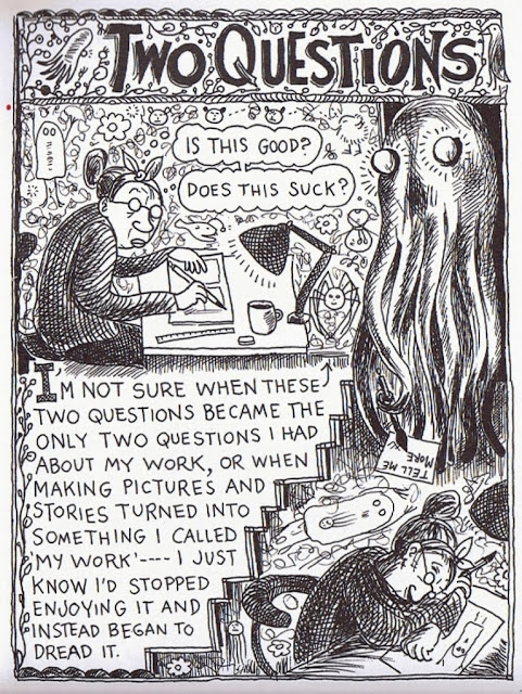
I’m sorry to recycle old work but I also hope that there might be some useful nuggets for those interested in autobiographical comics who might not have access to the franco-belgian tradition.

Do You Teach Banned Comics?

Lynda Barry Two Questions 1 p1

Lynda Barry (2008)

Earlier this year I was asked to lead a workshop on comic books for 4th and 5th graders. I had organized activities like this for kids in the past, but never for a group quite this young. So I trimmed a few points in my presentation notes about comics history and highlighted examples of how the art form is used to tell different kinds of stories. I simplified the drawing exercises and group activities in order to encourage the students to make comics of their own.

While I was preparing for the workshop, news broke that that South Carolina House Ways and Means Committee had approved budget cuts against the College of Charleston that would effectively penalize the school for assigning Alison Bechdel’s comics memoir, Fun Home, for their freshman reading program. The state representative that proposed the bill claimed that the comic’s depiction of homosexuality “could be considered pornography” and that the college’s selection was tantamount to “pushing a social agenda.” Shocked and outraged by this move, I complained to friends and colleagues. But I also looked again at the packet of course materials I had prepared for the elementary school students in my comics workshop. Along with a new Adventure Time comic, I had included excerpts from Krazy Kat, Astonishing X-Men,  American Splendor and a short comic by Lynda Barry. It was this last one that began to worry me.

Barry reflects upon the self-doubt and judgment that can paralyze creative expression in “Two Questions” from her 2008 collection, What It Is. She recalls the playfulness and experimental energy of her own childhood drawings, drained by the onslaught of those two questions: “Is this good?” and “Does this suck?” The doodles, vines, and swirls of text that surround Barry in the four-page comic make her internal conflict visible in a way that beautifully illustrates the interplay of the word and image. But reading it again, I became concerned about how the vernacular phrase “Does this suck?” would be received. I worried, too, about the moment when Barry’s describes the monstrous manifestation of her insecurity as a pimp that says, “I don’t steal nothing from the girl except her mind!” Would I be prepared to address these references and if asked, to explain the sexual connotations that shaped their meaning? What might their parents think? Or the South Carolina state legislature? Would I allow my own kids to read this comic?

As it turned out, the workshop was incredibly successful. The kids were enthusiastic and full of ideas, excited mostly about superhero comics and anime, but open to learning about other genres too. During the first break one started talking about The Walking Dead. Other kids sat up in their chairs and nodded in agreement. I was stunned by how many knew (or claimed to know) the comic and the TV series. Soon they were reeling off their favorite characters in comics. Deadpool was a huge hit, along with the Dark Knight (the movie). A couple had read Watchmen. But some of these comics are incredibly violent, I teased – do your parents know you’re reading this? The students nodded and shrugged, although there were a few guilty smiles.

By the end of our day together, it became clear to me that these 4th and 5th graders had been handling more mature material than I could have ever imagined. They negotiated the complexities of the page impressively too. We had fun playing around with interpretations of aesthetic and formal elements in our readings of comics. I realized that Barry’s “Two Questions” would not be too much of a challenge for this group — that is, if I had let them read it. I had taken the story out of the course packet at the last minute and told myself that I would find something better. I never did.

img_00051

The Walking Dead

Comics and graphic novels are the focus of this year’s Banned Books Week, an initiative supported by organizations such as the American Library Association and Comic Book Legal Defense Fund to celebrate the freedom to read by calling attention to titles that are being challenged in schools and libraries across the country. That Jeff Smith’s Bone, Art Spiegelman’s Maus, Craig Thompson’s Blankets, and other comics by Alan Moore, Neil Gaiman, Frank Miller, and Howard Cruse have been targeted may come as little surprise to comic book readers and critics. Often the issue of age-appropriateness is the central question for the complaints against the violence, sexuality, or cultural conflict depicted in these titles. I’ve had the opportunity to teach many of the comics that have been challenged over the years in my university classes where I try to approach controversial material as a source for an enriching exchange of ideas and to consider how discomfort can enable deeper inquiry into the world we all share.

But when I had the chance to put these ideals into action with a younger audience through “Two Questions,” I made a different, safer choice. It felt all too complicated, especially since I was dealing with elementary school students and their parents in a volatile political moment. I didn’t want to invite unnecessary scrutiny or cause problems for the program director that asked me to teach the workshop. My excuses all sounded reasonable at the time. The proposal to defund the College of Charleston’s first year reading program did not succeed in its original form, but I had reacted as if it had. Now I feel more than ever that I cheated the students by censoring my own reading list. Does this suck? Yes. Yes, it does.

The horrible irony about all this is that creative freedom is exactly what Barry’s comic is about. Her images speak directly to the risks we don’t take and the limits we place on ourselves out of fear. Ultimately the comic celebrates the courage to make mistakes, to create even when you don’t have answers to the two questions at the ready: “To be able to stand not knowing long enough to let something alive take shape! Without the two questions so much is possible.” It would have been a terrific lesson for those kids, but now I guess it’s turned into a different kind of learning experience for me.

So in honor of Banned Books Week, I’m asking about your encounters with banned or challenged comics. Are there controversial comics that you have chosen not to read or share with others? If you’re an instructor, how do you assess the risks and rewards of using this material in the classroom? How do your students respond? And while you’re thinking: read Lynda Barry’s “Two Questions” here.

Was Spider-Woman Harmed in the Making of this Cover?

SpiderWomanSo everyone is no doubt aware of the Milo Manara Spider-Woman variant cover art controversy that occurred a couple of weeks ago. Marvel’s commission of the cover, and its subsequent reaction to the backlash, was sadly typical of a mainstream comics industry that seems to want to embrace its large and growing female readership yet seems utterly incompetent when it comes to actually doing so.

Now, I don’t want to talk about Manara’s Spider-Woman cover art for any of the standard and by now familiar reasons. I don’t mean to suggest that the issues relating to the depiction of females in comics raised by the incident are not worth attending to – quite the contrary. But one public comment regarding the incident got me thinking about a different issue.

On September 2, Kelly Sue DeConnick – the current writer of Captain Marvel – made the following statement in an interview when asked about her take on the cover:

“The thing I think to bear in mind is Jess is not a real person – her feelings are not hurt by that cover.” (full video interview here)

Now, this is certainly true.

ManaraBut we shouldn’t forget certain claims are objectively (even if only fictionally) true of a fictional character (e.g. Jessica is a superhero) and other claims are objectively (again, even if only fictionally) false of fictional characters (e.g. Jessica lives on the moon), regardless of the fact that the character is question doesn’t actually exist. In particular, the production and publication of Manara’s cover now makes it fictionally the case that Jessica (at least once) poised herself atop a building, in a body-paint version of her costume, ‘presenting’ herself (in the biological sense of the term) to anyone in the city who might want a look. Regardless of how we might want to re-construe or reinterpret the art, this is what it in fact depicts.

Of course, as DeConnick notes, Jessica’s feelings aren’t hurt by this – not even fictionally. She isn’t fictionally aware that an artist decided that she would expose herself this way. On the other hand, she now just is the sort of (fictional) character that – perhaps in a single moment of questionable judgment – is willing to engage in some rather extreme exhibitionistic behavior. In short, the incident depicted on the cover is now part of how we understand what sort of person Jessica is.

Given this, we can meaningfully ask: Did the Manara cover (fictionally) harm Spider-Woman? And I think the answer here is uncontroversially “yes”. Whatever Jessica’s motivations for engaging in the behavior depicted in Manara’s art, this contribution to Spider-Woman’s narrative seems to be a negative contribution to her character – a representation of vice, not virtue.

The more important question to ask, however, is perhaps this: Independently of the other kinds of harm undeniably caused by the cover (and well-covered elsewhere), should Manara feel bad for producing this image because it (fictionally) harms Spider-Woman (or should Marvel feel bad for commissioning the image, or should we feel bad for consuming it)? Have we (i.e. Marvel, or Manara, or readers, or some combination of the three) done something morally wrong by adding this incident to the story of Jessica’s life? In short, should we care that we have done something objectively (albeit fictionally) harmful to a fictional character? Is there any sense in which we have moral responsibilities to fictional characters at all?

Of course, characters are harmed via depicting them doing non-virtuous things (making them non-virtuous characters) all the time – we call them villains or antagonists, and we need them for at least some sorts of story. But here the fictional harm done to Spider-Woman was not done in the service of any identifiable narrative needs. It was done for no reason at all, except presumably titillation. So unlike the case of villains, there is no story-related reason to alter Spider-Woman’s character in this negative manner.

So, was Spider-Woman harmed in the making of this cover?

Note: I have simplified a number of issues in the above in order to facilitate my main question:

  1.  The narrative content of cover art does not always straightforwardly depict events that we are meant to take to have actually occurred in the narrative contained within the comic – cover art can play all sorts of other commercial or aesthetic roles in addition to straightforward storytelling (see my previous post here).
  2.  I have assumed that unsolicited exhibitionism is, all else being equal, morally bad (since, for example, it might harm those exposed to it against their wishes).

If one is unwilling to grant me the simplification in 1, or refuses to grant 2 for the sake of argument (since the questions I am trying to raise is a larger one about the moral properties of fiction), then feel free to imagine a relevantly similar depiction of a until-now (mostly) heroic fictional character engaging in morally unacceptable sexual behavior for no reason other than, perhaps, the sexual gratification of the reader, and where that incident is depicted in the main body of the narrative.


Who is Doing Good Science in Good Comics?

Climate_Changed

 
Right now, I’m reading Philippe Squarzoni’s Climate Changed: A Personal Journey through the Science with great interest and satisfaction. Squarzoni walks us through his own navigation of the complex topic, and thereby provides us with at least two things simultaneously: the record of one man’s autodidactic process in the face of a phenomenon he wishes to understand more fully, plus a primer for all of us to use for our own education in climate science.
 

climate-changed-philippe-squarzoni-abrams-03

 
The book is elegantly drawn, with calm, clear-line precision (a helpful contrast to the messy and disturbing nature of the topic itself), and the text has elements of memoir, reportage, and speculative essay, offered to English-speaking readers through the smooth translation of Ivanka Hahnenberger. I feel like I’m reading something important and timely as I move through Squarzoni’s graphic narrative, and it is an added bonus to hear and watch Squarzoni grapple with the implications of his research for himself, for his family, and for all of us sharing the planet with him.

This experience got me thinking about other works in comics format (digital or print)–suitable for adults–that take up scientific or mathematical concepts while using the medium advantageously. I found it difficult to think of many off the top of my head, and this seemed to contrast with the lengthy list I could produce if asked to consider cultural and political issues presented in graphic reportage format. We have a bumper crop of the latter (which is great), but far fewer of the former. In light of our recent PencilPanelPage roundtable on Groensteen and panel shapes, an additional criterion presents itself: who is doing good science in their comics, but also good comics while they do good science? Who is innovating layout and breakdown in service of scientific concepts? This question isn’t rhetorical; let the recommendations flow in the comments section!

So, here are the science comics I’m familiar with:

Anything by Jim Ottaviani. I’m a fan: Ottaviani and his various illustrators do justice to both the history of science and to scientific concepts, in works such as Two-Fisted Science, T-Minus: The Race to the Moon (with Zander Cannon and Kevin Cannon), and, recently, Feynman (with Leland Myrick).
 

1tminus6

 
Another major player: Larry Gonick, with his Cartoon Guides to . . . (Physics, Chemistry, the Environment, etc.).

The Manga Guide to . . . series (various authors and artists) put out by No Starch Press offers another take, but I’m not sure I’d include either of the previous two series in a short- (or long-) list of avant-garde comics qua comics.

On the webcomics front, I am fond of Rosemary Mosco’s Bird and Moon, which offers charming doses of ornithology and botany,
 

Screen Shot 2014-09-10 at 10.17.09 PM

 
and Katie McKissick’s Beatrice the Biologist, which is a multimodal blog that uses video, comics, and traditional text to explain scientific concepts and promote scientific literacy.
 

Screen Shot 2014-09-10 at 10.16.11 PM

 
Another talented science popularizer is the Dutch cartoonist, Margreet de Heer, who produces webcomics at her site,
 

Screen Shot 2014-09-10 at 10.20.23 PM

 
and whose Science: A Discovery in Comics is available in English translation from NBM Publishing.
 

science04

 
Apostolos Doxiadis and Christos Papadimitriou paired up to produce Logicomix: An Epic Search for Truth, a compelling—and by now, highly esteemed—graphic narrative that explores mathematical concepts and features Bertrand Russell as its main protagonist. You’ve probably read it, but here’s a sample page anyway:
 

logicomix2

 
Logicomix has great “crossover appeal,” and is read across disciplinary lines, with humanists as interested as mathematicians, not to mention lay people who enjoy intellectual biographies and origin stories. Text and image work well together in this work, both offering a sophisticated, inviting intimacy for the reader, but the general adherence to basic grid format does not allow for a layout that particularly and specifically suits the concepts it presents.

Here, on the other hand, is a work that just might qualify for the “good science, good comics” designation: Jonathan Fetter-Vorm’s Trinity: A Graphic History of the First Atomic Bomb. Look at these two pages:
 

08RWBooksTrinityf3-1345663400687


FatMan

 
Trinity, in fact, is full of pages that differ from each other, and each has been carefully constructed to echo and enhance the presentation of certain types of information. Fetter-Vorm (albeit not a scientist) is on to something, I think, working with panel shapes actively, making them serve and clarify the idea presented (panels are collapsed, eliminated, intentionally shaped, imploded, broken)—how perfect for explaining the mechanics of Fat Man and Little Boy!

So, as much as I admire the works I’ve mentioned above for different reasons, I was only able to offer a single example of avant-garde comics layout housing accurate and instructive science. What am I missing?

Thierry Groentseen, densité, and Carol Swain’s Gast

Scan 2 

Carol Swain’s new graphic novel Gast (Fantagraphics, 2014)

 
After finishing Carol Swain’s Gast a few days ago, I found myself returning to Thierry Groensteen’s discussion of densité from Chapter 3 of Bande dessinée et narration (see pages 44 and 45 of the original French edition and page 44 of Comics and Narration, Ann Miller’s English translation). Gast, like Elisha Lim’s 100 Crushes (which I hope to write about soon), is a comic I’ve been enthusiastically recommending to friends. Swain tells the story of a young girl name Helen who, with the help of two dogs, a sheep, and a few birds, searches for clues about her neighbor Emrys and his sudden death.

I want to say very little about Helen and the small Welsh village where she and her family live. The mystery of Emrys’s life and death should reveal itself to the reader in the same slow, deliberate fashion that Helen comes to understand it. I’ll focus my attention instead on some of Swain’s page designs so as not to give away too much of the story. In Gast, the “density” of Swain’s compositions suggest the distance between Helen and Emyrs, a character who haunts the narrative. Like the protagonist of Chris Ware’s Jimmy Corrigan or Art Spiegelman’s Maus, Helen has the impossible task of piecing together the fragments left behind by a man reluctant to tell his story. Swain conveys Helen’s joy and confusion in a series of regular, nine-panel grids. These repetitions convey the density, I think, of Helen’s curiosity and of Emrys’s loneliness. At times, in fact, it is not clear where one begins and the other ends—an important point to consider, especially for the reader, who, like Helen, is left to decide why Emrys took his own life.

In order to apply Groensteen’s idea of densité to Gast I am thinking phenomenologically. Doing so opens up a number of theoretical possibilities, especially if the densité Groensteen describes can be read as synonymous, for example, with the density philosopher George Yancy examines in his recent book Look, a White! First, let me quote from Ann Miller’s English translation of Bande dessinée et narration before I consider density in relation to Yancy’s discussion of race: “A further consideration for the critical appreciation of page layout needs to be introduced,” Groensteen explains.

This is density, alluded to above. By this I mean the variability in the number of panels that make up the page. It is obvious that a page composed of five panels will appear less dense (as potential reading matter) than a page that has three times as many. (Groensteen 44)

What role does density serve, then, for both the artist and for the reader? Later in the chapter, Groensteen argues that, in Chris Ware’s comics, these dense and complex page designs have an expressive purpose: “Symmetry, in particular,” Groensteen argues, “is used by Ware to heighten the legibility of the binary oppositions that structure the spatio-temporal development of the story, such as interior/exterior, past/present, or day/night. But when two large images mirror each other on facing pages,” Groensteen adds, “this can also signify other oppositions or correspondences” (49-50). The “binary oppositions” Groensteen discusses here are also present in Gast: male/female, old/young, urban/rural, animal/human. The use of words and pictures to convey meaning in comics also implies the phenomenological density of consciousness itself: the sudden awareness of the self in relation to the other.

In Chapter 1 of Look, a White!, Yancy argues that what he describes as “the lived density of race” (17) demands new forms of expression. Although he is writing here about philosophy, I am interested in how we might apply his ideas to the  comics we create, read, and study:

To communicate an experience that is difficult to express, the very medium itself may need to change. On this score, perhaps philosophers need to write poetry or make films. When it comes to a deeper, thicker philosophical engagement with issues of race, the medium has to change to something dynamically expressive, something that forces the reader/listener to feel what is being communicated, to empathize with greater ability, to imagine with greater fullness and power. (Yancy 30)

Notice that in his second sentence Yancy refers to poetry and film, two forms with close ties to comics (see, for example, Hillary Chute’s recent essay from Poetry Magazine). How might a page filled with words and pictures, for example, enable “the reader/listener to feel” with greater intensity? For Yancy, of course, this affective experience must accompany or inspire real change. Feeling something is one thing. Acting on a feeling of identification requires radical selflessness and love.
 

Scan 5

Page 127 of Gast

 
For Helen, the gradual shift from theory—her curiosity about Emrys’s life and death—to praxis takes shape on page 127, where she finds one of her neighbor’s books. In the first panel, we see a copy of Zane Grey’s Riders of the Purple Sage. The book is fragile. In the second panel, she tears the illustrated cover from its binding. “This book belongs to Emrys Bowen,” reads a note written on the back of the cover. In the fourth panel, she tucks that slip of paper beneath her arm, and holds the book in her hand in panel #5. She runs her fingers across the pages. Bits of paper fall like leaves.

Like Gatsby’s worn edition of Hopalong Cassidy in the final pages of Fitzgerald’s novel, Emrys’s copy of Riders of the Purple Sage reveals, perhaps, the dream image he cherished of himself. But, then again, no—as Helen tosses the book aside in the next panel, she implies that Emrys refused to play the role of the rugged cowboy. She conceals the torn cover in her bag.

Swain implies that, as readers, we would be wise to be suspicious of allusions. This sudden reference to another text cannot convey the full complexity of Emrys’s consciousness. As I read Gast, I thought of another writer who spent his career recording the silences of rural spaces. Most of the late John McGahern’s novels are set in Country Leitrim in northwest Ireland, not far from Yeats’s home of Sligo. In the introduction to his 1974 novel The Leavetaking, McGahern, who revised the novel in 1984, discusses the challenges of writing both self and other. “The Leavetaking was written as a love story,” McGahern explains,

its two parts deliberately different in style. It was an attempt to reflect the purity of feeling with which all the remembered “I” comes to us, the banal and the precious alike; and yet how that more than “I”—the beloved, the “otherest,” the most trusted moments of that life—stumbles continually away from us as poor reportage, and to see if these disparates could in any way be made true to one another. (McGahern 5)

Like Yancy, McGahern suggests other terms we might use to describe the density of experience expressed on page 127 of Gast: where do the “I” and “the ‘otherest’” meet?

As I study the last three panels on page 127, I find myself wishing I could retrieve Emrys’s copy of Riders of the Purple Sage. What if we missed something? What if the book contains the key to understanding Emrys? But the grid prevents me from turning back. I must follow Helen as she walks to Emrys’s house, just as I must follow McGahern’s narrator as he moves from rural Ireland to Dublin to London and back again (as I try to disentangle the real from the imagined in McGahern’s autobiographical fiction, most of which takes place in the same region of Ireland where my paternal grandmother, Mary Anne Bohan, was born in 1910).

Both McGahern and Swain tell their stories with clarity and compassion. Swain’s use of the grid, I think, is a reminder of the inevitable barriers between the subject and the object being observed. These barriers, like the borders that separate one panel from the next, suggest that densité is both an aesthetic choice and a phenomenological imperative: the storyteller and the reader must take into account what McGahern calls “the banal and the precious alike” in order to make less terrifying the space between the “I” and “the ‘otherest.'”

Can we read Groensteen’s densité, then, as a synonym for the density that Yancy describes? Can you think of other page designs that seek to express the phenomenology of the self? Do comics provide a means of eliminating the distance between the two?

References

Groensteen, Thierry. Bande dessinée et narration: Système de la bande dessinée 2. Paris: Presses Universitaires de France, 2011. Print.

Groensteen, Thierry. Comics and Narration. Trans. Ann Miller. Jackson: UP of Mississippi, 2013. Print.

McGahern, John. The Leavetaking. London: Faber and Faber, 1984. Print.

Swain, Carol. Gast. Seattle: Fantagraphics, 2014. Print.

Yancy, George. Look, a White! Philosophical Essays on Whiteness. Philadelphia: Temple University Press, 2012. Print.

This is a cross-post from my blog. Thanks to Qiana and Adrielle for inviting me! Thanks also to my dad’s cousin Oliver Gilhooley of Mohill, Co. Leitrim, for taking us to the John McGahern Library at Lough Rynn Castle in the summer of 2012. Oliver, a great storyteller himself, also gave us a suggested reading list of McGahern’s fiction.
 

>photo

The McGahern Library at Lough Rynn. Photo courtesy of Allison Felus.

An Erotics of Page Layout?

This is the fourth in a five-part roundtable on page layout in comics. I recommend reading the first three here if you haven’t already. And be sure to scroll down to the comments where you’ll find some good discussion about the merits of various approaches (neutral vs. baroque, artificial vs. natural, narratively-driven vs. dream-rebus-like) to layout. It seems the terminology we use to describe different layouts (“rhetorical,” “neutral,” “regular,” etc.) poses some problems, as does the assumption that there is such a thing as “natural” or “easy” reading. This is perhaps the result of the fact that we tend to experience our ingrained reading habits as natural even though they are shaped by the reading culture we were raised in. But there is no such thing as a layout that is not “rhetorical” (i.e. “motivated”) or “artificial” in this sense. The most challenging layouts force readers to confront the cultural constructedness of their reading habits in ways that can feel discomfiting. Comics scholars and artists, in trying to identify an underlying grammar or semiotics of comics, do often conflate pure description with prescription. And we should be suspicious of “pure” description since there cannot be such a thing, rigorously speaking.

In any case, I don’t have much more to add to the debate(s). But, picking up on Adrielle Mitchell’s discussion of rhetorical panel layout experimentation, I thought it might be fun to reflect on the example of Guido Crepax, the Italian comics artist known specifically for his erotic narratives and his surreal McCay-esque experimentations with page layout.

tumblr_mjk2o90FBw1qi7w1po3_500

 
As phallocentric and macho as he appears to readers today, Crepax was a great innovator of narrative and visual techniques meant to delay the reader’s erotic gratification. His experimentation with page layout seems to have been intended to slow time down, to break the erotic moment and the body into endless fragments. Belgian comics scholar and Tintin specialist, Pierre Sterckx, describes Crepax’s work in these terms:

Commençons notre analyse en nous intéressant au retardement par le dessin : Crepax faisait son dessin en noir et blanc, ce qui produit un retardement du plaisir par rapport à un dessin colorisé et en volumes. Faites un dessin en couleurs et en volumes et ça devient du porno. Crepax a un trait extraordinaire, qui oscille entre la caresse et la flagellation.

Il existe un très beau texte de Roland Barthes consacré à l’œuvre de Crepax et dans lequel il dit qu’en parlant, les personnages retardaient leurs actes. Il y a une sorte de contrat qui s’installe entre ses personnages : entre la femme et son bourreau ou entre le maître et l’esclave. Dans ce contrat entre les deux, il y a la parole. C’est une autre manière de retarder l’action, qui est une méthode scénaristique chez Crepax. C’est quelque chose d’assez rare dans la BD. Ainsi, Crepax exalte le masochisme car il sépare le désir du plaisir et il place la douleur entre les deux.

Let’s begin our analysis [of Crepax] by paying attention to the delay [of gratification] through drawing: Crepax drew in black and white, which brings about a delay in pleasure compared to a colored drawing with depth. If you draw something in color and with depth, it becomes pornography. Crepax has an extraordinary line that wavers between a caress and a whipping. 

There’s a lovely text by Roland Barthes devoted to Crepax’s work and in which he say that the characters delay their [sexual] acts by speaking. A sort of contract emerges between these characters: between the woman and her executioner or between master and slave. In this contract between the two there is speech. This is [yet] another way of delaying action; it is a plotting method for Crepax. And this is quite rare in comics. In this way Crepax exalts masochism because he separates desire from pleasure and places pain between the two. 


2_Emmanuelle

 
His page layouts are superb and often disturbing. I love how the round panel superposed on the rectangular panel, where a Concord jet is foregrounded by a heron-like bird in flight, suggests an organic erotics of acceleration. The gravity of the page layout centers on Emmanuelle’s pelvis where the reader is compelled to share in her erotic enjoyment of the Concord’s takeoff. More than just delaying gratification, the page layout here mirrors the reader’s body, directs the reader’s corporeal response down to the pelvis. Meanwhile, the bottom of the page opposes three sets of eyes and three sets of lips in two columns of three panels between which we see a single panel that frames the flight attendant’s face as an erotic object caught incommensurably between the scopic and oral drives.
 

tumblr_lu3forNv8Q1qzekceo1_500


Valentina-by-Guido-Crepax

 
The panel above juxtaposed with the page layout above it (where the proliferation of panels slows the apprehension of even a highly explicit BDSM scene) suggests an interesting rapport between the constraints of panel arrangement and the techniques of BDSM. The cages and intersecting lines in the above panel echo comic book page layouts of various sorts, ranging from the geometrical to the organic. The vegetal art nouveau lines of the bed seem to refer visually to some of the page layouts we see in Windsor McCay’s work while the superposed grids as cages (or decoration?) seem much more autoreferential.
 

maurymoore-2010073131656-021-original

 
I wanted to conclude with at least one (rare) example of a regular waffle iron type layout in Crepax’s work. The above page layout, composed of twelve evenly spaced cube-shaped panels, is far from neutral. If anything, the geometric regularity of this page layout points to the synechdotal/fetishistic violence of (masculine?) desire and links that violence to the comics art form. More specifically, it links the representational violence of the medium to cadrage, or framing. The top three panels of the above page layout present what looks at first to be a relatively spatially coherent presentation of Valentina’s body (two outwardly pointing high-heel clad feet framing her bust) but the rest of the panels flit from erotic liminal zone to erotic liminal zone, from parted lips to a single erect nipple, from the edge of a lace bra to a hairline. The overall effect is one of scopic violence, as erotically compelling as it is disturbing, but it also reads as experimental and “rhetorical” (or “motivated”) in its imposition of a fetishistic erotic gaze onto a regular grid layout.

When is a Grid Not Just a Grid? (Groensteen and Page Layout Roundtable)

pekar

The previous contributions to our roundtable have raised important questions about Thierry Groensteen’s approach to page layout in Comics and Narration. While a rich array of images in Adrielle Mitchell’s post encouraged us to consider how frame irregularities produce meaning, Roy Cook set the stage for an important conversation about the values comics readers attribute to different panel arrangements. Roy’s post really got me thinking about the way Groensteen privileges the layout pattern of the “waffle-iron” by identifying stability, simplicity, and transparency as fundamental attributes of the orthogonal shapes. Groensteen further conceptualizes the grid in the narrative rhythm of comics as the “basic beat” against which the visual and verbal elements of comics can improvise.

From this perspective, it’s not difficult to see how one might characterize the grid as “regular” or “neutral” or “invisible,” but I remain troubled by the relative nature of these terms, who defines them and in what context. To complicate the issue, my first instinct was to seek out comics that delight in the wildly experimental layouts that Groensteen might find “more sophisticated (or more hysterical),” but Adrielle’s post provides several excellent examples already. So I thought I would ask instead about comics that use the grid, but in unexpected ways: how do comics adapt the basic panel layout in order to stray from what Roy described as Groensteen’s “waffle-iron way of truth”? When is a grid not just a grid?

I wonder, for example, how a comic like “The Harvey Pekar Name Story” fits into our understanding of frame regularity and rhythm. Though we may be inclined to make assumptions about its uniformity at first glance, R. Crumb has not simply drawn 48 identical copies of the same man in the squares of this four-page comic about the different Harvey Pekars listed in the phonebook.


PekarNameStory

The text varies and so too do the hand-drawn panels that reveal each frame’s scratchy imperfections. The careful reader’s eye becomes attune to the nuances of Harvey’s expression and posture. It is a “basic layout pattern” and yet it has “irregularity as a common feature” (43) — a fitting contradiction for a story about Harvey Pekar’s search for his own unique identity. It seems to me that a comic like this one actually exposes the illusion of neutrality by calling attention to the grid’s own constructedness.

Another example that comes to mind for me is a two-page spread from Percy Carey’s graphic novel memoir Sentences: The Life of M.F. Grimm with art by Ron Wimberly. During Carey’s time in prison on a drug conviction, Wimberly uses the bars of the jail cell to structure the layout of the page, building barriers between us and the detained bodies, the narrative boxes, and the armed guards

sentences

Groensteen describes the thick borders that Chris Ware uses in Jimmy Corrigan as having “an almost carceral appearance” (48) and given the emotional constrictions of multiple generations of the Corrigan family, Ware’s panel choices aid in the production of that meaning. Alternatively, Sentences is a comic that has an unpredictably fluid design with layered panels and splash pages to convey the early days of hip-hop and Carey’s experience with music, drugs, and violence during the 1990s. The waffle-iron pattern is not the norm by any means; when the grid above appears, it actually disrupts a narrative rhythm that the writer and artist have already established. The uniformity of the panels might also be said to reflect the carceral lens that would continue to follow Carey after being released from prison.

Is this frame neutral or invisible? How might the perspectives of these two comics help us to reconsider the notion of the “basic panel layout” in other comics?