Listening to the Incredible String Band again…my son really thinks this one is funny.
So what are you listening to this week?

Listening to the Incredible String Band again…my son really thinks this one is funny.
So what are you listening to this week?
I can restart the Israeli-Palestinian peace process in three words.
But first a lesson in grammar.
Passive voice. Ever heard of it?
Super-grammarian Geoffrey Pullum has. Daily Planet editor Perry White has too. But White, according to Pullum, has no idea what it is. In J. Michael Straczynski and Shane Davis’ Superman: Earth One, Mr. White explains to cub reporter Clark Kent: “Active sentence structure versus passive structure. A good reporter always goes for the former, never the latter. It’s ‘A dog was killed last night,’ not ‘Last night, a dog was killed.’”

And then Pullum swoops in through a window: “It looks as if the editor of The Daily Planet thinks that it is passive sentence structure to use any adjunct constituent set off by commas. So he would condemn sentences like Michael Corleone’s You’re out, Tom, or Today, I settle all family business, for being passive!”
In his Chronicle of Higher Education article “Passive Writing at the ‘Daily Planet,’” Pullum bemoans the sorry state of grammatical knowledge among not just fictional newspaper editors. Your “freshman-comp TA” and writing gurus Strunk and White get it wrong too. Pullum considers it a serious educational issue.
I teach first-year composition, but my concern isn’t educational. It’s moral.
Passive voice is evil.
If you accept Stan Lee’s superhero prime directive, “With great power comes great responsibility,” then passive voice is a supervillain’s weapon of choice.
Which might explain why politicians use it so often. The Fat Man and Little Boy of literary examples were both launched by the Nixon administration. When press secretary Ron Ziegler was discussing Watergate, and when Secretary of State Henry Kissinger was discussing Vietnam, both deployed the same phrase:
“Mistakes were made.”
Who made the mistakes? Impossible to say. The sentence is missing its subject, the agent, the actor of the action. And there lies the villainy. Passive voice erases responsibility. It’s how bad guys make their escape.
Look at Mysterio. He routinely eludes Spider-Man by dropping smoke bombs and ducking away in the confusion. If you rewrite the sentence
“Mysterio dropped a smoke bomb,”
as
“A smoke bomb was dropped,”
then Mysterio (subject and villain) vanishes twice. He ducks away in the syntactical confusion. Passive voice writes him right out of the sentence.
Perry’s example, “A dog was killed,” actually IS passive voice (whether it happened last night or not), because the sentence masks the identity of the dog-killer. Did Mysterio kill the dog? Did Richard Nixon? Nobody knows.
Which is why reporters like Clark Kent sometimes use passive voice. The police, like the readers of the sentence, are still searching for the killer.
But what if the information is known and the writer obscures it?
That’s where things get ugly.

Reaching past my shelf of comic books, I have The Palestine-Israeli Conflict in hand. Instead of dual-statehood, Dan Cohn-Sherbok and Dawoud El-Alami settle for dual-authorship. And that’s about all they agree on. Each pens his own history. The book is a journey down the same river twice, but in very different boats.
When describing events of 1948, Dawoud El-Alami writes: “Jewish terrorist organizations . . . carried out a massacre of men, women and children in the village of Dier Yassin.” That’s active voice. The subject of the sentence carries out the massacre. In contrast, Dan Cohn-Sherbok describes the same incident with the phrase: “the policy of self-restraint was abandoned.” That’s passive. Who abandoned self-restraint? His syntax doesn’t want to tell.
Cohn-Sherbok goes on to describe a similar incident from 1982: “More than three hundred refuges were massacred.” Passive again. And Dawoud El-Alami, to no surprise, employs active voice again: “The militia massacred between seven hundred and one thousand people (some reports say two thousand).”
Technically, the two pairs of sentences don’t contradict (even mathematically, since two thousand is “more than” three hundred). But Cohn-Sherbok employs passive voice at its immoral worse. His syntax erases responsibility.
Now I’m not suggesting that the “Palestinian Perspective” half of The Palestine-Israeli Conflict is any more accurate than the “Jewish Perspective.” Dawoud El-Alami has his own array of rhetorical maneuvers for ducking blame.
If you’re wondering about my political biases, I find myself agonizingly sympathetic to both sides. The most guilty party is England, who, desperate to fight Nazi Germany, promised the same homeland to two different aspiring nations. The results were horrifically predictable.
But if you don’t think England is responsible, then this is a job for passive voice:
“The Jews and the Palestinians were promised the same land.”
Promised by whom? By Mysterio’s trademark cloud of syntactical smoke.
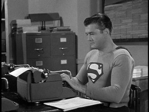
At least Clark Kent isn’t fooled. He recently escaped the grammatical misinformation of Perry White to strike out on his own as a blogger. It was big news. Last November, after a discussion of the Israel-Hamas cease-fire, NPR’s Talk of the Nation host Neal Conan explained:
After more than 70 years as a mild-mannered reporter, Superman quit his day job at The Daily Planet. A fed-up Clark Kent delivered a diatribe in front of the entire newsroom on his way out the door. ‘I was taught to believe you could use words to change the course of rivers,’ he said, ‘that even the darkest secrets would fall under the harsh light of the sun.’

Are you listening, Dan and Dawoud? Your words are changing the course of rivers. Take responsibility for your subjects, even their darkest secrets.
That’s the first step in this English professor’s plan for world peace:
Ban passive voice.
[And for the super-grammarians out there, I should point out that both “The dog was killed” and “The dog was killed by Richard Nixon” are examples of passive voice, even though the second sentence apprehends the killer. Only the first, the agentless subgroup of passive voice, is evil. The second is just criminally clumsy.]
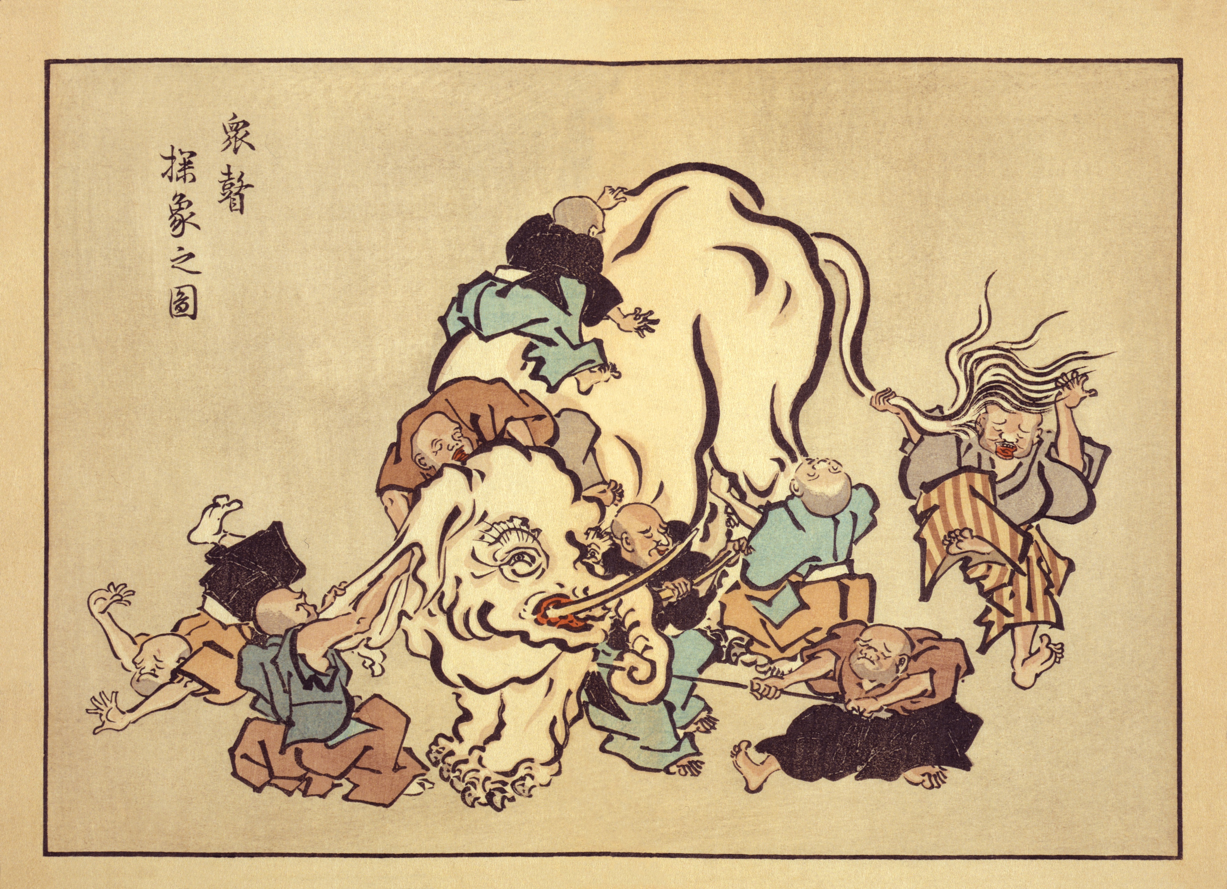
Hanabusa Itcho, Blind Monks Examining an Elephant. Itcho, by the way, not Hokusai, contrarily to popular myth, coined the word “manga.”
Speaking of stories… you know the parable: the blind men feel different parts of an elephant’s body and, afterwards, they disagree on what an elephant looks like. Such is the nature of truth; knowing only part of it we can’t grasp… speaking of pictures, the whole picture. In another version the men and the elephant are in a dark room, so, as the great Mevlana Rumi put it in this version: “If each had a candle and they went in together/ The differences would disappear[.]” If you didn’t get it already, and there are absolutely no reasons for you to know where I’m heading, I’m referring to the Eddie Campbell vs. Suat Tong or the “picturaries” (as I called them) vs. “literaries” controversy. I guess that the differences of opinion can be extended in an “us vs. them” kind of way to The Hooded Utilitarian (the non-essentialists) vs. The Comics Journal (the former Comics Comics – a great name to describe their philosophy echoing Eugeni Dors’ “painting-painting”). As I see it there are really two disputes, not just one: the aforementioned “various ways to look at an elephant” (Eddie vs. Suat) and the essentialist debate (THU vs. TCJ). I’ll try to address the two.
I’m worlds apart from Rumi’s greatness and I don’t believe that the differences will be solved by my saintly intervention, but, in a true meta-critical stance, I’ll try to do my best. I’ll state from the start that, obviously, I’m an interested part in this debate. Coming from a “picturaries” background, I graduated in Studio Art, I pass as one of the literaries. I don’t see myself as one, though. To explain why let me examine the core (as I see it, of course) of the text that started the whole thing: Eddie Campbell’s “The Literaries” at TCJ’s website:
What appears at first to be taking a more stringent view is in fact applying irrelevant criteria. It dismantles the idea of a comic and leaves the parts hopelessly undone.
See that elephant over there? Besides, this is where the two debates converge: essentialist Eddie views literary criteria applied to comics as misguided because the true applicable criteria must be about pictures. And yet, what does Eddie consider to be literary specifically? The story or, the plot. The only problem is that in comics the drawings are the story too. To prove it I don’t need to go any further than Lee and Kirby’s (et al.) case in point below, given to us as an example of non-literary excellency in the aforementioned “The Literaries” blog post:
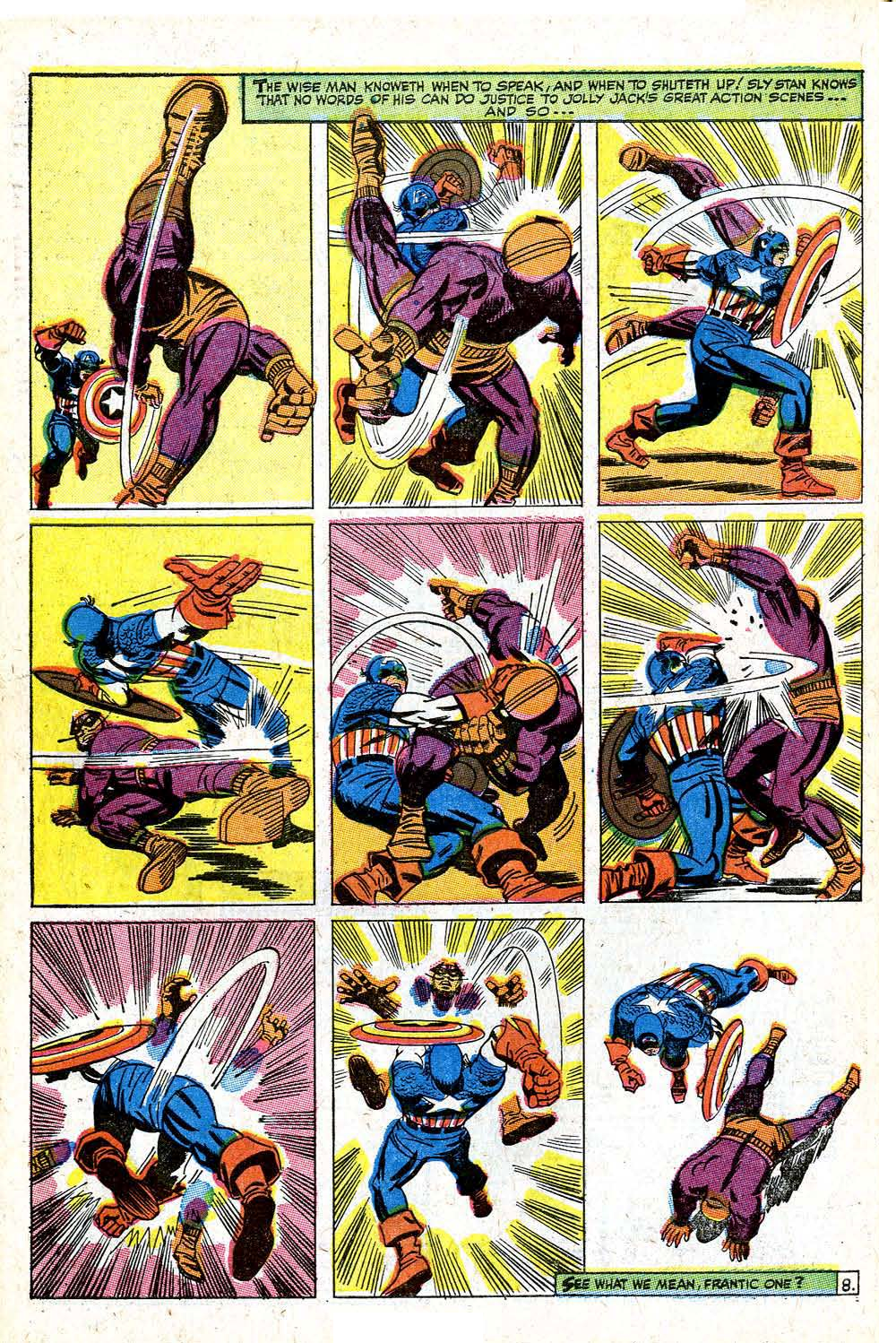
Stan Lee (w), Jack Kirby (p), Frank Giacoia (i), Sam Rosen (l), anon. (c), “The Blitzkrieg of Batroc!,” Tales of Suspense #85, January 1967 (page # 8).
Curiously enough in the above example it’s the words that are self-referential and non-diegetic while the images tell the whole story: two characters beat the crap out of each other. If story equals literature who’s a literary now? Eddie Campbell himself inadvertently acknowledges this when he says:
Now, I am cognizant of the fact that the multitude of kids reading that Captain America were just thinking about what Cap and Batroc were doing to each other.
Exactly so because they were reading a story (the use of the word “reading” is, if you ask me, a co-option by the literary field because those putative kids were interpreting images). Why did this co-option of everything narrative by literature occur? Eddie Campbell didn’t invent it. It’s one of the dogmas of Modernist art of the Greenbergian kind. But Clement Greenberg didn’t invent it either. Here’s what Paul Cézanne said according to Joachim Gasquet, writing in 1912/13 (not exactly a reliable source, but still…):
I don’t like literary painting. […] [T]o want to force the expression of nature, to twist the trees, to make the stones grimace like Gustave Doré, or even to refine like da Vinci, that’s all still literature.
And yet Eddie Campbell doesn’t go that far. What he likes in the above page is clearly the expression (here’s what he says about a performance by Billie Holiday; we can’t compare comics with literature, but, apparently, it is OK to compare comics with literature if in a song; Eddie isn’t much of an essentialist, after all, even if he used the very word “essence” below):
I’m not talking here about technique, a set of applications that can be learned, or about an aesthetic aspect of the work that can be separated from the work’s primary purpose. The performer’s story is the essence of jazz music. The question should not be whether the ostensible “story,” the plot and all its detail, is worth our time; stories tend to all go one way or another. The question should be whether the person or persons performing the story, whether in pictures or speech or dance or song, or all of the above, have made it their own and have made it worthy.
So, Eddie Campbell wants us to pay attention to the artist’s expression (Cézanne/Gasquet would call him a literary I’m afraid). That’s one blind man feeling the elephant and I don’t deny his importance and value. But what about the other blind men? Don’t they feel equally important parts of the beast? Why this rage against the story?
I can’t talk for others, but what I value in a comic isn’t the story per se. What I really value is the meaning. This may be clichéd, but so be it: I believe that great artists reach some kind of truth. (They may be as blind as Itcho’s monks, but they’re very good feeling the little part of reality that interests them.) Doing so I considered already that the technical skills of the artists and writers, their ability to convey feelings (their expression or lack thereof because an artist may choose to convey ideas mainly) were capably handled. This isn’t an either or kind of situation. That’s why the claim that we literaries value Fun Home over Cliff Sterrett doesn’t make any sense (it’s an obvious straw man). Besides, meaning can be found in every mark that the artists and writers create on the page. I don’t see why meaning has to be associated with story and why story has to be associated with literature. By claiming meaning for my main criterion am I calling it the whole elephant? Maybe I am, but I’m as biased as the next guy. Why choose this elephant instead of that one is my next question?
That leads us to the essentialist problem (counseled reading: Leonardo da Vinci’s Paragone): why can I compare a comic with another art artifact? Because meaning is something that we can find in every work of art. Exalting the comicness of comics to us non-essentialists doesn’t make much sense: yes, a comic is not a piece of music, but can’t we find cadences, internal rhythms in a comic? Again, why do we accept that those qualities are in music alone and not everywhere? Yes a drawing in a comic may be read in a narrative context (so, now the story is important again?; Eddie goes in and out of his philosophies as it suits his arguments), but aren’t these drawings lines and textures and compositions as all other drawings?
I could go on, but I prefer to analyze Lee and Kirby’s (et al.) page above from my point of view. I must acknowledge first the fact that it is a segment of a larger story (ten pages). I never write about stories that I’ve never read or are in progress, so I’m breaking one of my rules here… for now… This is wrong because, I don’t know?, judging a comic by one of its pages is the same thing as judging a book by its cover, isn’t it (that’s what Eddie kind of did in Kurtzman’s case)? Also, doing so, it seems to me, dismantles the idea of a comic and leaves the parts hopelessly undone, right? Gérard Genette said that there are two readings in a comics page:
in [visual] forms of narrative expression, such as the [fumetti] or the comic strip (or a pictorialstrip, like the pre-della of Urbino, or an embroidered strip, like the “tapestry” of Queen Matilda), which, while making up sequences of images and thus requiring a successive or diachronic reading, also lend themselves to, and even invite, a kind of global and synchronic look—or at least a look whose direction is no longer determined by the sequence of images.
(As a side note: it’s interesting to realize that the great critic and theorist, one of the literaries if I ever saw one, acknowledges the existence of visual narratives while Eddie doesn’t or tactically avoids acknowledging them.) The successive diacronic reading (what Pierre Fresnault-Deruelle called the linear reading) of words and images gives the reader the succession of events, the narrative. The global synchronic look (what Fresnault-Deruelle called the tabular reading) gives the viewer more of an aesthetic feeling. Both readings exist in all comics and the latter is what Eddie and Noah are talking about when they speak of “something else” and “ab ex.” I doubt that many will read the above page in a linear way (what’s the point: it’s just two guys in funny costumes fighting), but I will do just that:
What we have here is a nine panel grid, a static page layout if there ever was one, which isn’t bad for the intended purpose: the page layout contrasts with the action going on inside the panels. The first panel shows Batroc in one of Kirby’s famous foreshortenings. Another of Kirby’s tropes is the character invading the gutter as seen subtly here. What’s interesting in these three panels is Batroc’s leg in the air pointing up. In the second strip what’s pointing up are Captain America’s hand (when he receives a blow) and, again, Batroc’s arm and hands. Those who have limbs pointing up are losing balance and, hence, are losing the fight. The last strip is pretty much the consummation of the scene with Batroc falling on his back. The last panel depicts post-action fatigue and domination if you know what I mean. The guy who fell into the passive role in the missionary position was feminized and lost the fight. Also interesting is the back of Batroc in the second panel mirroring Cap’s back in the 7th, but with opposite meanings: powerlessness in Batroc’s case and absolute power for Cap. So, not only do these images tell a story, maybe it’s not exactly the story intended for the frantic one (i. e. the infant reader).
What does the global synchronic look tell us, then? First of all there’s a rhythm of circular speed lines and straight shock lines (notice how Cap’s are a lot more powerful than Batroc’s sissified ones) constructing a texture that gave Noah the ab ex aspect that he mentioned. These are there to underline the violence and speed of the actions, but, more than that, to unify and create a relentless cadence in the page design. Here, again, the page functions differently in the three strips: a vertical thin speed line is counteracted in the next panel by a more powerful also vertical one. Things begin to change in that very panel though because the rhythm becomes horizontal until, at the end, returning to vertical completing a full circle with Cap’s might (in crescendo) replacing Batroc’s frailty. The full shot is consistently applied, but the feet deny that on panels one, two, five, six, seven, eight (it’s a device used by Kirby frequently: the characters don’t fit – as a curio see here the same effect used in 1109!). Cap starts on the viewer/reader’s opposite side to end up near his/her standpoint inverting positions with Batroc, in a kind of dance, as we have seen above. The 180 degree rule is broken from panel two to three. The point of view changes around the fighters. There’s a curious symmetry in the page with a kind of knot at the center. The last panel has no gutter (or has a virtual gutter) to show that something changed: the positions are now the same as those in the first panel, but Cap circles his prey in triumph (the symbolic order was restored; citizens may calmly eat their freedom fries again – Batroc, if you don’t know, is French and speaks with a heavy French accent – notice also the stereotypical pencil moustache and beard; I know that Europe was a female, so, it’s only natural that Batroc had to lose in combat against a macho American hero). The colors are loud and out of sync at some places. The background colors divide the page in, more or less, a dynamic diagonal. (If you allow me a personal note I always liked the imperfections of the old coloring.) Cap is garbed in white and primary colors (red and blue), Batroc is secondary colored (orange and purple). Looking at their colors alone no one can deny who will win. All this may seem exhilarating to Eddie, but I suspect that nostalgia plays a role also: “for me this page, and others of a similar stripe, opened up a whole new different way of thinking about comics (I was nine; I’d been thinking about them for quite a few years).”
Who are these people though? From now on Eddie will call me a literary, I’m afraid, but I insist, how come?, I analyzed drawings until now, nothing else! When Eddie asks and answers quite absurdly “how does that Marvel comic stand up if you take away the pictures? It doesn’t.” I say it does, a bit, but not that page above and why is that? That’s right: because if the pictures disappear the story disappears too. Storywise it’s interesting to note the micro-use of the known formula of popular tales (identified by Propp) “win-lose-win.”
“The Blitzkrieg of Batroc!” is a superhero ten-pager with the usual macho boasting, dick waving contest and misogyny of old comics. The plot (oops!) is simple enough: Cap fights Batroc to save Agent 13 of Shield (aka Sharon Carter). After a plot twist Batroc and Cap team up against agents of Hydra to save the mam’selle who, obviously, has an infatuation for the gallant Nationalist hero. How many times do we need to read another damsel in distress kind of story? I want my time back! See how those nine pages did lack for a full appreciation of the comic?
Am I denying all the good compositional things that I said above about page 8? Of course not, but why should I forget everything else either? And isn’t the final product more important than just an aspect of the whole thing? What’s the meaning of this comic according to your truly? Woman, even if they’re agents of Shield, are frail little creatures who need the strong Nationalist hero to save them from the bad bad guys (that Manicheism again! Jeez!). Jack Kirby may have made the superhero genre his own, but he certainly didn’t make it worthy.
Even worse: the apparently good things said above about page 8 aren’t ultimately in the service of a formula as noted already? (As I said elsewhere, the game is rigged: the dashing Nationalist hero always wins.) And how about the innocuous violence? Isn’t it going to give the impression to the frantic ones that it’s OK to beat the crap out of the bad guys (violence is an abstraction, after all)? Are the frantic ones, or their modern day descendents, doing it right now somewhere, on this poor planet Earth, in the holy name of the plutocracy?
I wrote a piece on women’s magazines recently over at the Atlantic. While I was working on it, it occurred to me that fashion editorials are basically as series of images, linked by themes or characters. Which is to say, they are, in some sense, comics.
You can take that “in some sense” there more or less seriously, as you wish. Personally, I”m not necessarily all that interested in trying to figure out what does or does not qualify as a comic. I thought it might be interesting, though, to look at a fashion editorial from the perspective of comics, and vice versa, and see what the similarities and differences say about one or the other or both.

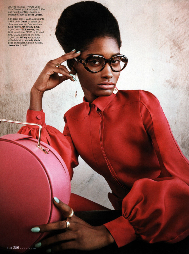
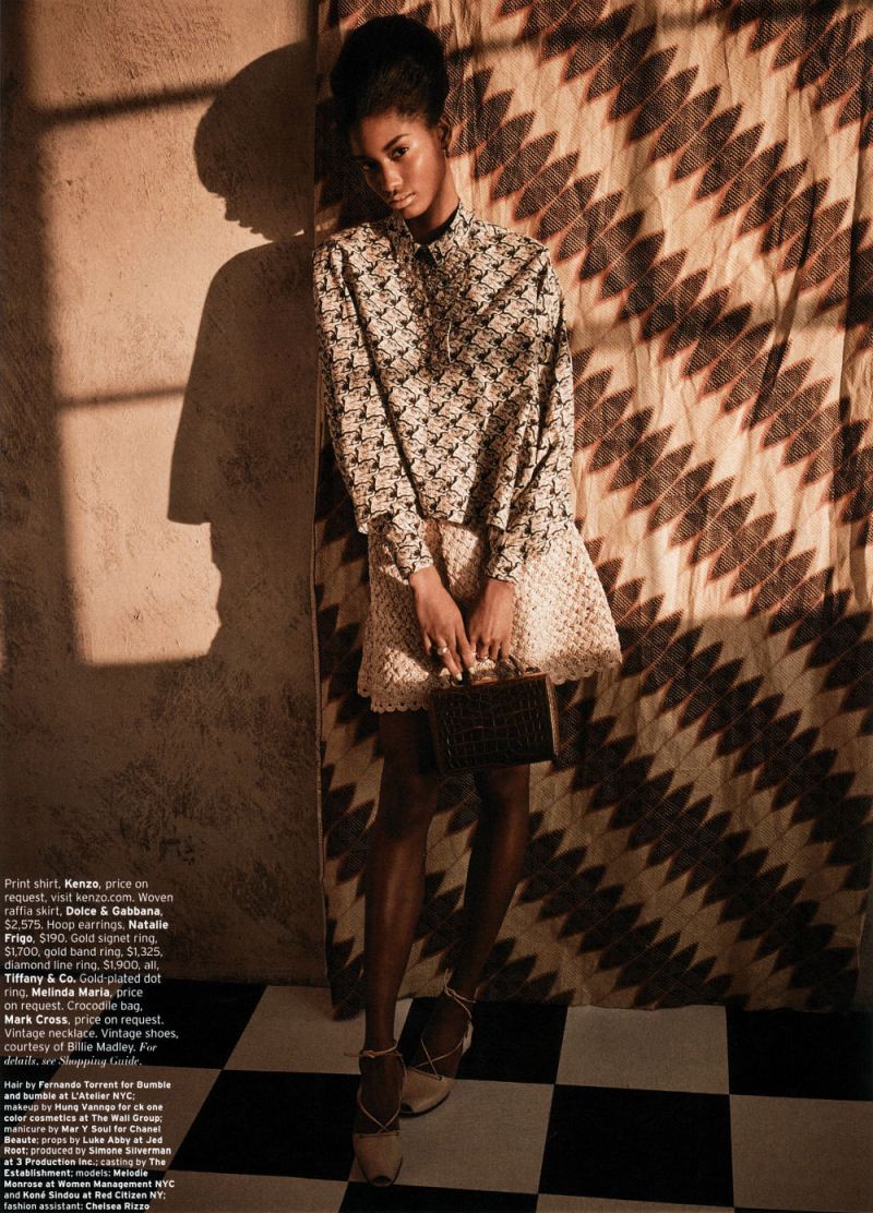
So, somewhat at random, and somewhat because I like it, I decided to talk specifically about Retro-fitted, an editorial in the April issue of Elle. I’ll be posting the images below, but you can see the entire thing at this link. The female model is Melody Monrose; the male model is Koné Sindou; the photographer is Mariano Vivanco, and the stylist is Beth Fenton.
This is going to be in the nature of brainstorming rather than thesis and argument…so I’ve separated it into some subtopics, and we’ll see how it goes.
Splash Pages
In a post last month, Kailyn Kent pointed talked about the way in which comics both fetishizes and can be nervous about splash pages. Kailyn linked this to the fact that the splash pages’ monumentality, and its focus on a single image, tends to replicate the look and experience of gallery art. Comics, then, likes splash pages because they suggest high status and seriousness. At the same time, creators like Chris Ware, attuned to the gallery scene and comics’ relation to it, sometimes seem uncomfortable with the splash page, or try to undermine it, precisely to turn away from its gallery connotations, or reassert comics comicsness.
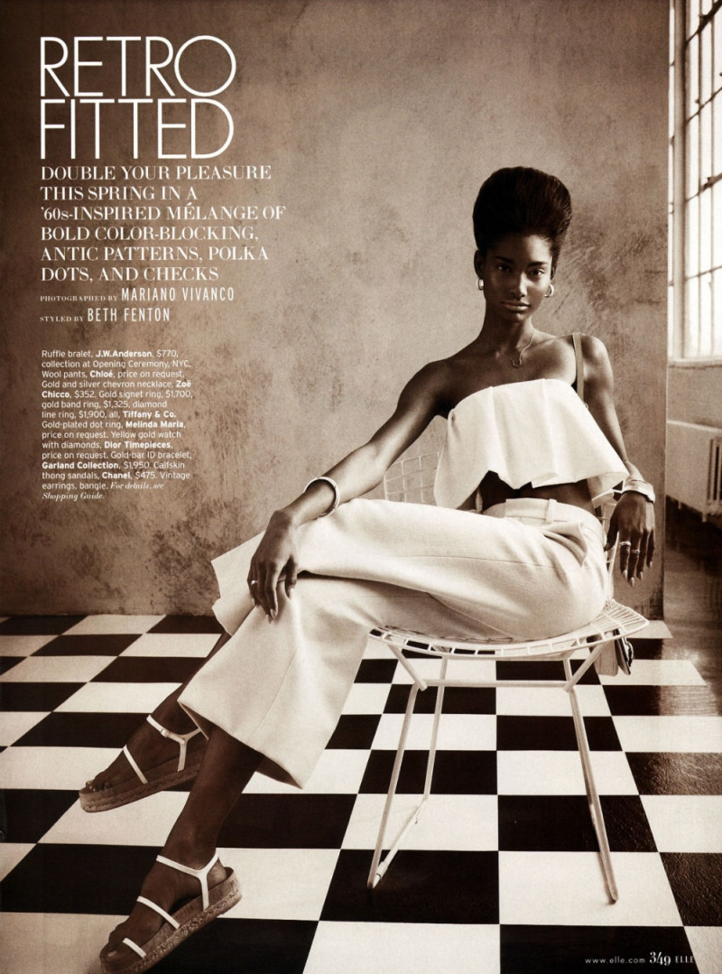
As this suggests, though, there are other possible contexts for splash pages. Obviously, this page, with the title and credits positioned dramatically off to the side in the image’s negative space, strongly recalls title pages from comics. But really most images in fashion editorials — taking up as they do the entire page — would qualify as splace pages in comics.
Splash pages, then, recall, not just fine art, but advertising — which could arguably turn Kailyn’s analysis on its head. Splash pages could be, not upmarket, but down, connoting, not seriousness, but gaudy commodification — as, perhaps, attested by the fact that splash pages are often the most high-priced pages on the comics art market.
If monumentality is a sign of trash rather than class, that could in turn explain why high-quality literary comics like Maus or Persepolis prefer small black and white images and few, if any, splash pages. Part of the literariness, and of the highbrow credibility, is avoiding comics’ links to advertising’s garish boldness and drama.
I don’t think that Kailyn’s analysis and mine have to be exclusive — especially since fashion photography has its own complicated relationship with high art. But it does seem worth thinking about the ways in which the dialogue between comics and art isn’t always, or doesn’t always have to be, a dialogue. There may be other voices speaking.
Fashion of the Literaries
Oue recent roundtable talked about whether comics should be seen in relation to the literary or not. This ends up also being a debate about whether comics should be seen, or judged, as high art — with literary and narrative qualities seen as highbrow standards, and comicness being seen as evading them through the lowbrow energy of the image.
How do fashion editorials fit into that debate? Confusedly, since, while there are series of images, and perhaps even characters, there is generally not narrative. If comics’ essence is non-literary, then, it seems like in some sense fashion editorials might be seen as more essentially comics than comics themselves.
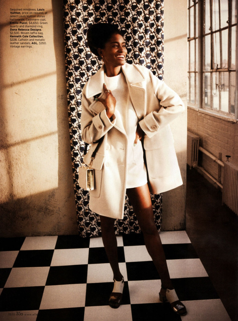
Part of that essential comicness, you could argue, is the way the images push away from meaning or language towards abstraction. In the tradition of Whistler’s Mother, perhaps, the woman in the image seems to be less there for herself than as an exercise in a musical distribution of space — the checked tile floor (a motif throughout the editorial), the broad vertical stripes of the dress, the grid of the chairback, the tight horizontal stripes of her sweater, carefully posed casual position, mirroring the chairs’ stiff curve, and the way she’s dramatically pushed off to one side. The patterns and the composition, are more important than what is being shown; she’s a surface rather than a body.
The body is surely important as well, though — as, for that matter, are the words, which may not tell a story, but do label the image, telling you price points for each not-surface-but-thing. The models position — head down, hand cupping her chin with the fingers almost shielding her face, suggests, perhaps, a kind of embarrassment at the crass commerce floating in white text over there on the wall. If writing is literary, then the literary here is not highbrow; rather it is distinctly low-culture. No matter how the image looks optimistically towards art, the words float leadenly behind it, staining abstraction with the nattering economics of signification.
What Are You Looking At?
Fashion photography presents bodies to be looked at. Those looking at the bodies are generally women…and the bodies looked at are, also, generally women.
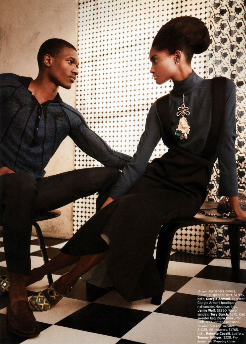
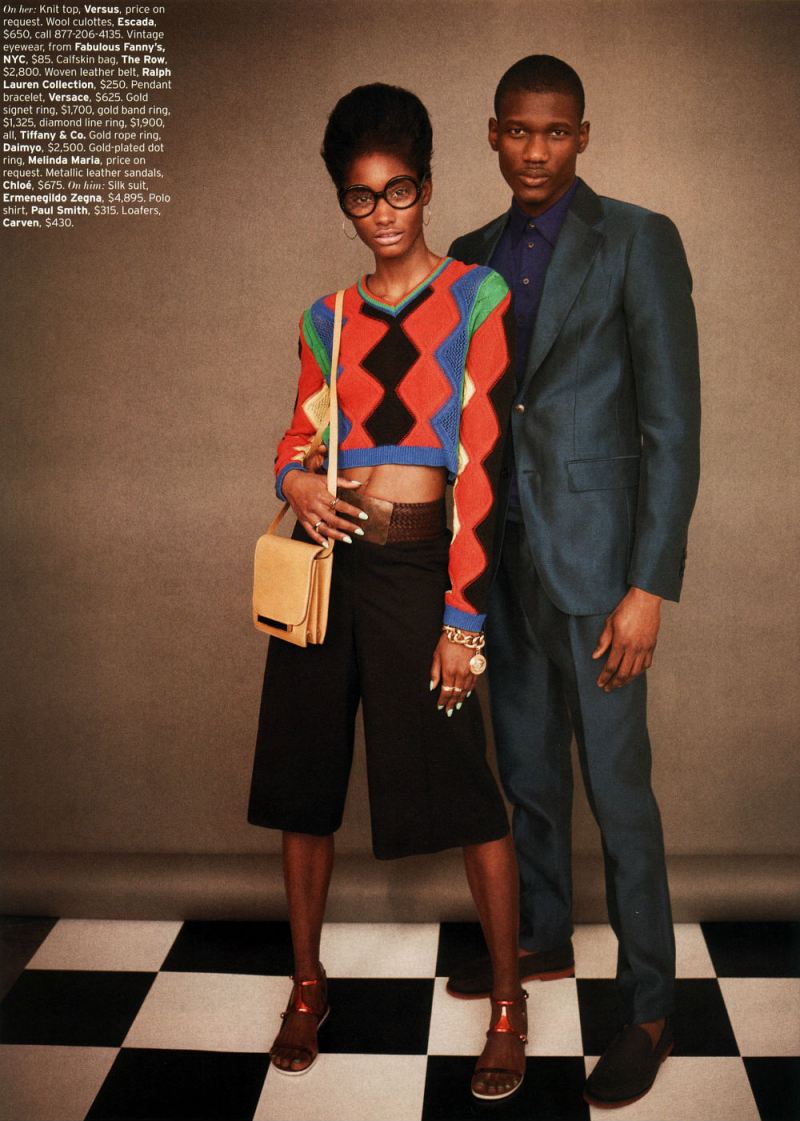
The image above — with a man and a woman looking at each other, doesn’t so much change this dynamic as underline it. The man looks at the woman with intense, romantic interest, just as the reader of the editorial has been looking at this same woman with romantic interest. The woman looks at the man with intense romantic interest — just as the reader of the editorial has been gazing with intense romantic interest. The fact that the mutual inter-gender erotic gaze is meant to accentuate, rather than supplant, the same-gender erotic gaze is emphasized by the strongest visual element of the picture — the almost comically dramatic, borderline yonic necklace dangling down the women’s front.
If the female gaze is eroticized in women’s magazines devoted to women’s bodies, it seems reasonable to suggest that the male gaze may be eroticized in magazines devoted to male bodies. “Men’s magazines devoted to male bodies” seems like a reasonable description of the majority of superhero comics. The fact that scantily clad, preposterously proportioned women frequent these comics as well, again, like the image above, merely emphasizes the fact that these magazines for men are devoted to erotic looking — occasionally at women’s bodies, but more often at male ones.
The point here isn’t that comics are homoerotic, necessarily. Sharon Marcus has argued that, in many cases, women looking erotically at women functions as a part of heterosexual female identity, not lesbianism. The same could be said of superhero comics for men. Men gazing intently at men is a standard part of male heterosexual identity for many comics readers — and, for that matter, moviegoers.
Bodies, Time, and Space
Fashion photography pretty much includes at least one body in every image.
To look at fashion editorials as comics is to realize that this is not something which separates the two. On the contrary, most comics are almost as obsessed with bodies as fashion is. You may get a few panels of setting the scene or camera-panning over landscapes, but in most comics, in most panels, you see a human being (or an in-some-way humanized dog or cat or funny animal.)
Generally, I think, this is seen as logistical; to show somebody doing something in comics, you have to show their body over and over. Repetition creates narrative and time.
Fashion editorials, though, make you wonder. They have no narrative, and there is no real sense of time passing. Yet they still often use the same body and the same face — the same person — repeated in image after image.
You could say that, again, it’s just logistics — one model modeling is easier to schedule/cheaper to pay than 12, or however many, models modeling. No doubt there’s something to that. But it’s also true, I think, that the familiarity and the variation is a delight in itself.
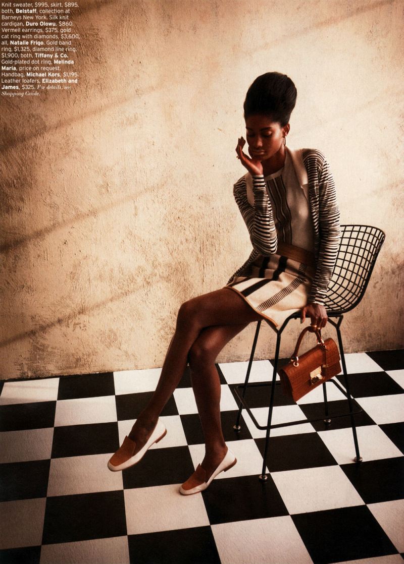
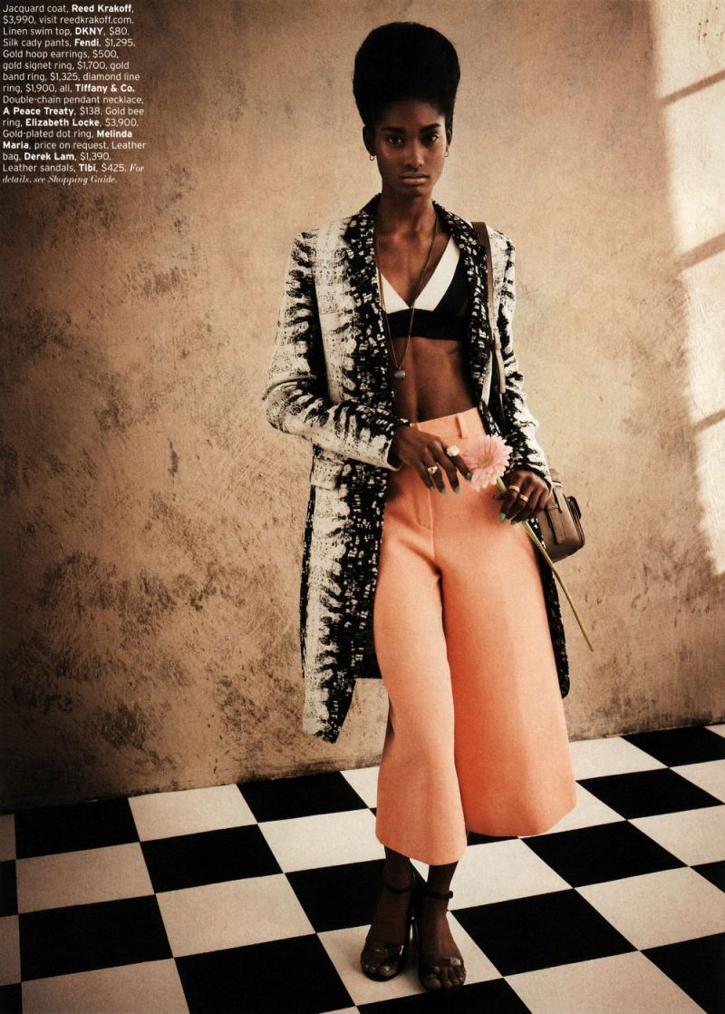
In the preceding three pictures near the end of the editorial, we see a full length, dynamic pose; a full length more demure pose — and then a dramatic close-up.
Much of the punch here comes from the bright color of the blouse and those dramatic expressive (Ditko?) hands, one eloquently touching her head, the other in the extreme foreground looking impossibly long and elegant— partially because of the nails, partially because the sleeve is pulled back from the wrist, and partially because the model just has amazing hands. But the image is also striking because it’s this woman, seen, up till now, mostly at a distance, and now, suddenly, brought forward.
Similarly, the last image
Relies for its effect to some extent on the contrast with what came before. Instead of bold colors and bright light, we have earth tones and shadows; instead of looking right at us challengingly, her pose is demure, her gaze indirect. It seems to me like a deliberate anti-climax; a quiet grace note — which, again, gets much of its allure from the sense, not just of intimacy, but of increased intimacy compared to what has gone before.
You could argue that contrary to what I said earlier, this suggests a narrative, or the passage of time. Indeed, I think it points to the extent to which any identity is implicated, or filled up with, time; part of what we recognize in a self, or in a body, is that it’s the same self, or the same body. As Lacan says, there’s a delight in that recognition, and energy in (what Lacan sees as the illusion) of making the self coherent.
But if the repetition of bodies inevitably makes fashion editorials into pleasurable narratives, you could also perhaps say that narratives inevitably make comics into pleasurable repetitions of bodies. Or, in other words, from the perspective of fashion, the repeated selves in comics are not a logistical byproduct, but a pleasure and a goal in themselves.
_____________
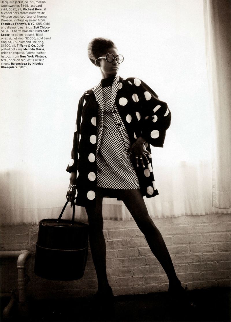
I think there are other topics to talk about here: the link between commodified images and retro-nostalgia, for example, or the differing place of race and tokenism in comics and fashion. But since I’ve now posted the last image from the editorial, this seems like a good place to end things. I am curious — has anyone ever seen any discussion of fashion editorials as comics, or in relation to comics? I figure I can’t be the first, but a quick google search doesn’t really turn up anything. If anyone has links or references, let me know.
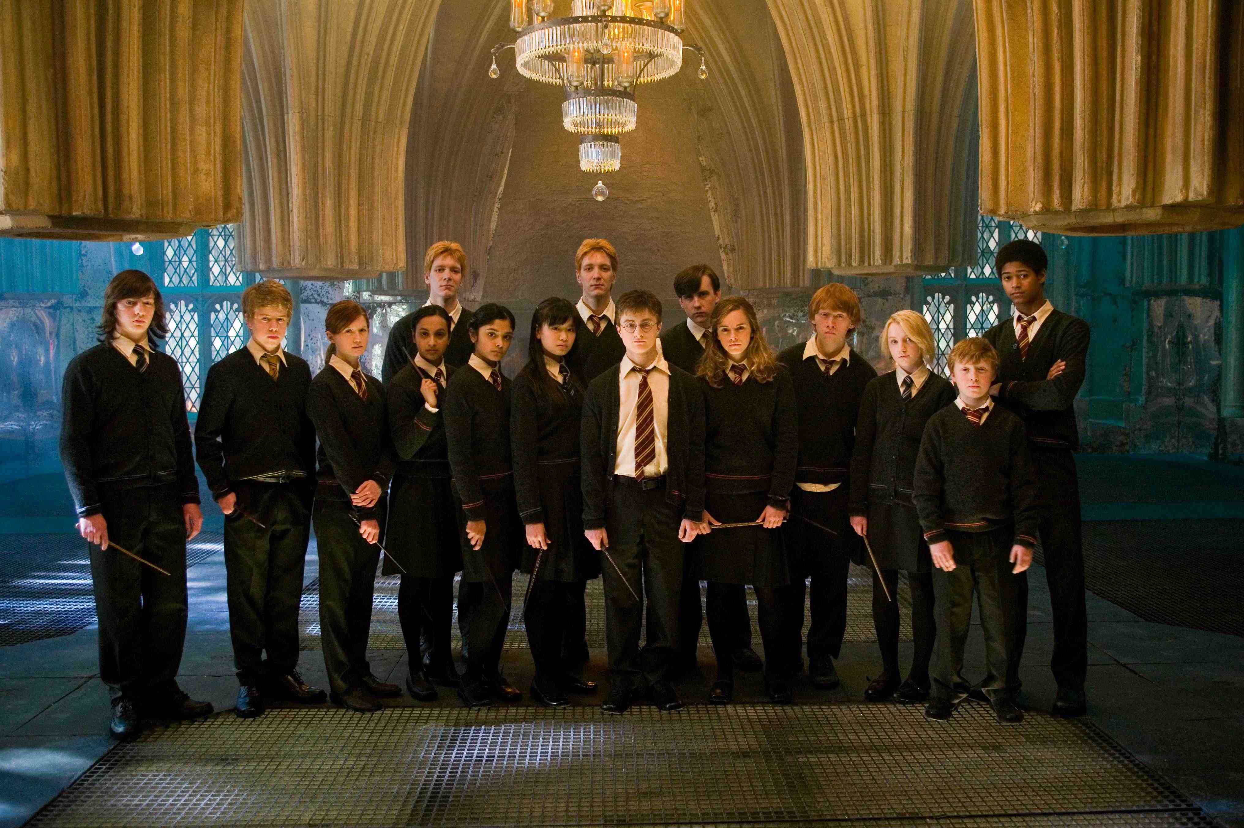
Hagrid’s half-Giant identity is a plot arc in Harry Potter and the Goblet of Fire, so too are the House Elves and Hermione’s crusading, if not paternalistic, attempts to free them from oppression. In the Deathly Hallows the penultimate “other” becomes the mudblood, a term we first hear in Chamber of Secrets. The final book, too, revolves around non-wizarding creatures of, as the Ministry of Magic and Dolores Umbridge put it, “near human intelligence,” and Harry is labelled as a very odd, special, and different wizard by Griphook the Goblin because he treats non-humans with courtesy and respect. The books are dedicated to highlighting the fallacy of “the other” but, and file this under uncomfortable truths, all the human characters of colour are relegated to the sidelines.
JK Rowling has called her books “very British” in a number of interviews, and has even stated that they are a “prolonged argument for tolerance.” However, I can’t help but draw parallels (note: I’m drawing parallels, not determining causality) from her treatment of race and “otherness” in the books to the conversations about multiculturalism and race theory that have occurred throughout British history and continue today.
Rowling has been very explicit about the connection between Pure Blood Wizarding ideology and the Nazism that led to the holocaust. But race theory, the belief that attributes and abilities could be determined by the socially constructed notion of race, was equally dominant in the United Kingdom. Weeding out “undesirables” wasn’t particular to Nazi ideology and was common across Europe.
British identity was partially constructed using internal colonization, where Welsh, Scottish and Irish minorities were subsumed into Britishness, an identity which still remains ambivalent and dynamic. Britishness was also constructed in opposition to a number of external European threats and was only reinforced through colonialism, which was justified by applying race theory.
Even after the Second World War, Great Britain restricted entry to Jewish refugees while simultaneously citing its own tolerance. Jewish bodies were and continue to be racialized, but even though Rowling has been explicit with her works’ connection to the Holocaust, racism is constructed as pureblood witches and wizards versus muggles, mudbloods, and magical creatures.
I’m not the first person to note that the fantasy genre has a history of replacing PoCs with monsters and magical creatures. Writing for Fantasy Book Review, author Lane Heymont states:
…[I]t feels like white authors have an easier time, or are more comfortable, writing from the perspective of dragons, ghosts, elves, Minotaurs, and other non-humans than another human being. Seems ironically odd, don’t you think? And the writing suffers for it, as does the cause.
I target fantasy specifically because I know that Rowling has the ability to write from a PoC’s perspective as evidenced in The Casual Vacancy, but her fantasy works imitate most of the genre: There’s a brilliant ability to create non-human cultures and magic systems, but fantasy novels with people of colour as main characters are sadly rare.
If these books are “very British” and the quintessential “others” in British society are racialized minorities, than why has race been rendered invisible? Whether intentionally or not, side-lining characters of colour matches the British multicultural model that defines racial integration as near invisibility.
Racialiazing “otherness” has been part of the British experience, and Rowling, with her progressive roots, seems to be reacting towards this kind of cruelty by dedicating seven books and several years of her life to combatting it, only to create works that replicate the systemic exclusion of minorities. To clear up any confusion, I’m not saying that Rowling had to talk about how it feels like to be black at Hogwarts, but what it feels like to be Dean Thomas at Hogwarts. (Incidentally, I was disappointed that while Thomas’ backstory was potentially up for inclusion in the official cannon, it eventually had to be axed due to editorial limitations. I look forward to reading more about him in Pottermore.)
As a series that practically begs the reader to take it personally and that has birthed devoted communities and fan conventions, issues of representation and inclusion become incredibly important: fans want to know that they’re allowed in, and if you’re aiming for an emotional reader response, then this is a reaction that should be taken seriously. Further, the exclusion of active people of colour in fiction constitutes a form of erasure that undervalues their construction of and contributions to both fictional and real societies.
As it stands, we know that Hogwarts plays host to a variety of people of colour (Cho Chang, the Patel sisters, Dean Thomas, Blaise Zabini, Kinglsey Shacklebolt etc.) but they are, in a sense, rendered invisible. Their races are so invisible, in fact, that they’ve become model minorities; their races do not detract from their Britishness.
The idea of integration as a key to a successful multicultural policy stems back to the Second World War. British politicians knew, especially after Kristallnacht, what Germany’s Jews were facing, but still worked actively to limit the number of entries into the country. In 1965, Roy Hattersley, a Labour politician argued that “without integration, limitation is inexcusable, without limitation, integration is impossible,” the idea being that immigration should be restricted because it might rile the emotions of British citizens, the same rational for restricting entry to Jewish refugees. Minorities became responsible for the resentment directed towards them.
The subtle casuistry of this linkage of a commitment to “harmonious community relations” to necessary restriction on immigration and immigrants has continued to be employed by successive British governments. It has a wonderfully corrupt, but popularly acceptable rhetorical formula which argues that:
More recently, government officials stated that the reason the London Bombers carried out the 2005 train attacks was because they were insufficiently integrated into British culture, even though the evidence pointed otherwise, thus starting a firm government push to ensure that Britain’s Muslims were also “well-integrated.”
In 2003, in response to the Labour government’s proposed legislation on asylum seekers, British tabloids exploded with accusations that immigrants were abusing the system and dirtying the country with AIDS, Hepatitis B, and TB. These accusations don’t seem so far off from the hearings held in the Ministry of Magic, where we saw a witch being accused of stealing a wand (stealing from the system) and not being sufficiently magical (British.) While Rowling’s stories may have been inspired by the holocaust, they still play out in Great Britain today. They are indeed “very British” books; Rowling is both prescient and astute when she highlights government and media sanctioned oppression and she’s at her strongest when she writes these scenes.
Only last week The Guardian published a piece by David Goodhart, who accused liberals of favouring a highly-individualistic identity that transcended the boundaries created by the nation state, roughly defining certain liberals as being pro-immigration and therefore anti-community.
This individualistic view of society makes it hard for modern liberals to understand why people object to their communities being changed too rapidly by mass immigration – and what is not understood is easily painted as irrational or racist…If society is just a random collection of individuals, what is there to integrate into? In liberal societies, of course, immigrants do not have to completely abandon their own traditions, but there is such a thing as society, and if newcomers do not make some effort to join in it is harder for existing citizens to see them as part of the “imagined community”. When that happens it weakens the bonds of solidarity and in the long run erodes the “emotional citizenship” required to sustain welfare states.
According to Goodhart, the very presence of immigrants destabilizes allegedly harmonious British communities with resentment (a romanticized fallacy, especially when looking at Britain’s long history of class warfare), their bodies becoming symbols of chaos that disrupt a cohesive national identity. To be a racialized minority is to have people assume that you are unwilling to emotionally integrate into British identity and society. Some conservatives argue that under multiculturalism people will abdicate working together towards a common collective goal known as nation-building; however, the examples above show that Britain’s ideal form of multiculturalism has always been assimilationist.
Rowling is progressive, clearly pro-immigration, and the Harry Potter series illustrate a typical liberal approach to race blindness. Her works still presuppose that integration is synonymous with invisibility, but she also argues for the potential success of Britain’s multicultural model. Their well-integrated and invisible races ensure that Cho Chang, Dean Thomas, and the Patel sisters can be British without disrupting British identity with their racialized bodies. While I appreciated that Cho Chang became a sobbing mess in Order of the Phoenix without her emotional deterioration being tied to her ethnicity, I can’t separate issues of representation from the larger systemic trend found within the fantasy genre. (Cho is the character of colour with the most screen time. One chapter is dedicated to her character in Order of the Phoenix, where she spends most of the time crying, and she receives a few sentences here and there from books 4 to 7. When we meet her, in book 3, she doesn’t say much of anything.) That characters of colour are in the background allow the reader to know that Hogwarts is Very Diverse, but their importance to the plot is minimal. As the very worst possibility, they act as ornaments to Hogwarts’ status as a Very Progressive School.
This integration-as-invisibility approach is distinctly different from the movie adaptations, where the characters of colour wore clothing representative of their ethnic backgrounds to the Yule Ball, whereas the same characters in the books wore dress robes like everyone else. Except…children of immigrants don’t uniformly wear clothing from their parents’ home country. While the Potter books erase ethnic difference, the movies champion essentialism which, to her credit, Rowling can’t be accused of doing.
Rowling spends seven books opining about the importance of diversity, while replicating the systemic sidelining of characters of colour. The characters in the Harry Potters books are proof of multiculturalism’s success, but the structure of the books imitate systematic issues concerning racial representation. There’s tension in this approach: on one hand, it becomes exhausting to have one’s entire identity defined by ethnic background (something we can’t choose) and being able to choose one’s identity through acquired membership (identity markers we can choose, eg. being part of an SF/F fandom) can be a highly liberating experience. On the other hand, if Rowling believes in anti-otherizing, then why isn’t the quintessential British “other” given more screen time, not to discuss race, but to simply be? While a British progressive may envision a rainbow utopia of immigrants and new citizens, we know that their invisibility exists to comfort us while we pat ourselves on the back for being progressive. When it comes to screen time for characters of colour, their stories are still marginalized. The Harry Potter books are in no way the worst offenders in the genre—and I still remain a loyal fan—but there’s a serious cognitive dissonance that needs to be analyzed when a book series extolling the virtues of diversity are not particularly diverse themselves.
This first appeared on Splice Today. It seemed like an appropriate post for Easter.
_________
Everybody loves pop music that sticks it to the man. Whether it’s Dylan nasaling about how the times they are a’changing, Johnny Rotten extolling anarchy, or PE fighting the power, somebody (usually Greil Marcus) can be counted on to gush about the apocalyptic awesomeness of shaking your butt on behalf of the downtrodden and dispossesed.
Don’t get me wrong; I love Dylan and Rotten and PE too, and I don’t wish Greil Marcus on any of them. But it’s hard to ignore the fact that, despite all their enthusiastic anarchy and change and power-fighting — or, more likely, because of it — they’re all extremely popular and critically validated. They’re charismatic rock stars swaggering for freedom and equality…which makes them icons of liberal capitalism, not opponents of it. If you want something that actually questions the values we hold dear, it seems like you need something a little less individual, a little less mediagenic, a little less virile — and maybe, possibly, a little more dead.
If you’re looking for death in popular music, the go-to genres are (obviously) death metal and (perhaps less obviously) bluegrass gospel. Two recent releases one from each genre, make the point quite clearly. Autopsy’s massive retrospective All Tomorrow’s Funerals, collecting all their EPs, starts with the new title track “All Tomorrow’s Funerals,” five minutes of zombie-demon vocals and dry-heaving spasms of drums and classic rock riffs, closing out with a doomed trudge to the grave. Doyle Lawson & Quicksilver’s Sing Me a Song About Jesus gets to the afterlife almost as quickly; the second song, “The Rich Man,” is a quick, cheerful bluegrass rave-up with patented fleet-fingered solos about how the rich on earth better do some serious thinking before they face the judgment.
It’s not just their mouldering fascinations which link death metal and bluegrass gospel, though. It’s their resolute unhipness. It’s one thing to be ready to die for love or to burn out rather than fade away — it’s another to just be really excited at the idea of corpses. It’s hard to read through Autopsy’s track list without giggling: “Mauled to Death,” “Feast of the Graveworm,” “Squeal Like a Pig,” “Dead Hole.” On the one hand, Autopsy is certainly in on the joke — but that doesn’t exactly mean they don’t take it seriously. “Destined to Fester” from the classic 1991 EP Retribution for the Dead is like Rush hit in the head with a brontosaurus, the prog outlines slowed down into giant dragging Sabbath-slabs, Getty Lee’s high-pitched wails turned into garbled grunts, the flashing guitars thumped into detuned monstrosities — misshapen, but still too geekily awesome for cool.
Similarly, the Lawson track “Little Star,” narrated by one of the wise men, is every bit as clunky as that conceit suggests. “Twinkle, twinkle little star/how we wonder what we are/they say beneath your diamond glow/there’s someone we should get to know.” The music shuffles along in the folksy, polished, Prairie-Home-Companion vein that Alison Krauss has made the sound of contemporary bluegrass. Between those earnest lyrics and the we-wish-we-were-AOR-but-we’re-not-sure-how-to-get-there backing, it’s a fairly embarrassing package; one of those things that you want to listen to, if at all, with the car windows rolled up.
Both Autopsy and Lawson are, in other words, and in their own way, morbidly corny, like plaid body bags. The technical virtuosity at the heart of both genres is the nail in the coffin, whether it’s the perfect surging acapella harmonies on Lawson’s “Going on Home” or the tight quick-march tempo changes on Autopsy’s “Keeper of Decay.” In either case, there’s a deliberate deindividuation, a determination to disappear into the demands of their respective idioms. “No, I won’t sell out for money/fancy home or big fine car,” Lawson sings. Or, as Autopsy puts it, “Face chewed to bits/On my body they feast/Swimming in the rancid sewage/Spreading their disease.” For both death and bluegrass, the faith uses and consumes you, not the other way around.
For death metal, Autopsy is surprisingly, gloriously eclectic — from the mauled classic rock of “Broken People” to the punky hardcore of “Fiend for Blood” to the doom of “Retribution for the Dead,” to weird masterpieces like “In the Grip of Winter,” which stagger about the metal landscape with a lurching so intense it almost qualifies as zombie funk. Doyle Lawson, too has been an innovator, reaching out to other gospel traditions, most notably during his time with the Country Gentlemen on the great 1978 album Calling My Children Home. But while both certainly have star power and genius, they’ve also both turned that genius in many ways towards erasing themselves in the name of their particular faith and/or community and/or morbid obsession. Musicians aren’t meritocratic heroes whose rebel yawp frees us from regimental squareness. They’re just indifferently-dressed corpses marching into the pit like the rest of us, listening to those demon grunts and high-lonesome hallelujahs which someone else will be singing when we’re gone.
 
This appeared a while back at the Chicago Reader
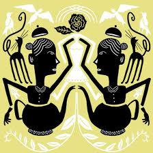
Comics are part of visual art — sort of. There aren’t too many comics pages in permanent museum collections…but on the other hand gallery shows featuring comics artists are more and more common. The MCA’s “New Chicago Comics” helps to explain why comics don’t and do fit on museum walls. On the “don’t” side is the work of Jeff Brown and Paul Hornschemeirer, both artists whose focus is insistently narrative. Brown especially, with his crude drawings and layouts and cutesy punch lines, doesn’t benefit from the venue’s close focus. Works by Anders Nilsen and Lilli Carré, on the other hand, seem liberated by being lifted out of their original context. A Nilsen page showing six panels of a small pigeon cursing in darkness before it suddenly sees a cave full of blind birds is not diminished by the fact that you don’t know where the story goes. On the contrary, it leaves you, like the pigeon, trapped in a mysterious subterranean landscape, where there is wonder and life but no escape. Similarly, Lille Carré’s stencil-like drawing Splits, showing a stylized woman in a teapot almost touching her own duplicate, folds comics’ panel-to-panel repetition back on itself. It’s as if a character turned around, saw herself across the gutter, and was instantly transmuted into art. The MCA show provides an interesting contrast between some comics which can’t, and are perhaps not even interested in, making that turn, and some which can and do.